What is Racing Form Guide?
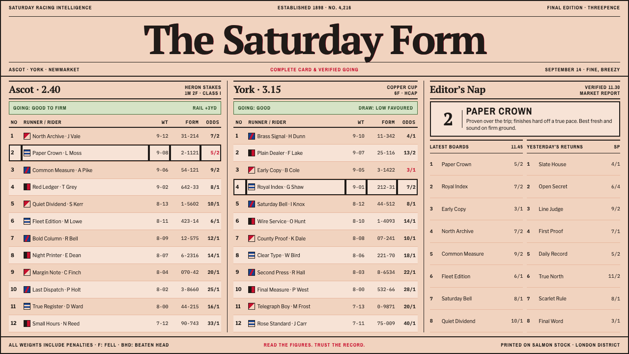
The racing form guide proves that density can be a form of trust: agate figures, hairline rules and salmon-pink newsprint, with nothing on the page that is not information.
Racing Form Guide in brief
The racing form guide style is the visual language of the horse-racing press: salmon-pink newsprint, past-performance tables set in tiny agate figures, narrow columns divided by hairline rules, and a scatter of flat, two-colour jockey silks as the only colour on the sheet. It belongs to a family of tinted sports newspapers that, from the nineteenth century onward, turned race cards and results into a weekly habit for readers who wanted facts, not atmosphere.
Its governing principle is that density earns trust. In a form guide, blank space is not generosity but lost information. The reader is a cross-checker who wants every runner's weight, form figures, jockey and trainer within a single glance, and who judges the paper by how much of that it delivers. Abbreviations are cut to the bone, numbers are right-aligned so they can be compared down a column, and the page is organised by alignment rather than by gaps. The density is an efficiency, not a stylistic restraint.
To a casual eye the result first looks like noise and then resolves into structure. That is its appeal for modern interfaces: it shows how a very crowded surface can stay legible when every column has a rule and every figure has a place. The style suits data tables, fixtures, leaderboards, schedules and price comparisons, any page where the more information it shows, the more credible it feels.

Where does Racing Form Guide come from?
The tint began as an economy. In 1865 the Sporting Times, a London sporting paper, went to press on pink paper for the dullest of reasons: under-bleached stock was cheaper. The colour stuck. The paper became known as the Pink 'Un, and pink became the badge of racing journalism, a signal recognisable across a newsstand that this was the sheet with the form, the tips and the results. What began as a cost saving became one of the most durable identity devices in newspaper history.
The idea travelled. The Financial Times copied the pink paper in 1893, and the Sheffield Star's Saturday sports sheet took a different tint, a green that earned it the name Green 'Un. These Saturday sports papers were a ritual product, built to get the day's results into readers' hands quickly. Colour was the fastest way to tell them from the weekday paper, and tinted sports newsprint became a genre in its own right, with its own rhythm of publishing.
The typography mattered as much as the tint. Racing papers developed a tradition of agate-setting. Agate is the smallest standard size of newspaper type, kept for results, tables and statistics, and compositors learned to set past-performance tables in narrow ruled columns, with each runner reduced to one dense line. Weights and form figures, the strings of numerals summarising a horse's recent finishes, were right-aligned; the names of jockeys and trainers were abbreviated hard; and the thin vertical rule between columns did the work that padding does on screens. The Daily Racing Form, on the American side of the story, built its identity on the same statistical page, treating the past-performance table as the product itself.
From the mid-nineteenth century to the 1950s the genre grew steadily, peaking in the interwar racing press, when form guides, tipsters' columns and results tables could fill whole pages on race days. Jockey silks supplied the only colour permitted inside that grid: flat, two-colour thumbnails, never photographs, standing in for the coloured jackets that owners register so that spectators can follow their horses at a distance. Photography, colour printing and later digital data eventually displaced the paper form guide, but its structure survives in betting sites, fixture lists and every dense, ranked table in modern software.
What defines the Racing Form Guide look?
Salmon-Pink Newsprint
The ground is a warm, slightly dull salmon-pink, the colour of under-bleached newsprint rather than a designer pastel. Ink is black, and nothing else competes with it. The tint is a recognisable signal and a working surface at once: it carries the sense of cheap, fast, trustworthy paper, made for people who will fold it into a pocket and mark it up with a pencil.
Agate Figures
Type is small, compact and tightly set, in the manner of agate newspaper setting. Names sit flush left, numerals flush right, and digits line up so that weights, ages and form figures can be compared at a glance. Emphasis comes from weight and capitalisation rather than from colour or large jumps in size. Hierarchy is thin because everything on the page is data, and the reader is trusted to find what they need.
Hairline Rules
Narrow columns are divided by hairline vertical rules, and rows by even finer horizontal ones. There are no cards, padded boxes or shadows; the rule is the only boundary. A table here is a ruled grid printed directly onto the paper, so that the density feels organised instead of chaotic.
Near-Zero Whitespace
Whitespace is almost nil, and that is deliberate: it is page efficiency, not design restraint. Lines of data sit close together and are separated by alignment and rules rather than by gaps. The impression is of a page that has been used to the last line, with every available row carrying a runner, a weight or a result.
Jockey Silks as the Only Colour
Colour beyond ink and paper is reserved for jockey silks: tiny, flat, two-colour marks that identify a runner in the way a badge identifies a club. They are never rendered as photographs and never given gradients or outlines beyond what is needed. Because they are the only chromatic elements on the sheet, they become a code the eye learns to scan, one mark per row.
Abbreviated, Right-Aligned Data Logic
Everything is abbreviated to the bone: age, weight, jockey, trainer, distance and previous results are compressed into short codes and form strings that regular readers parse instantly. The logic is consistent from column to column: left-aligned for text and names, right-aligned for numbers, always in the same order. Once a reader learns the grammar, a page that looked impenetrable becomes the fastest way to compare many runners.

Who shaped Racing Form Guide?
The Sporting Times is the paper behind the tint. It moved to pink paper in 1865 because under-bleached stock was cheaper, and its nickname, the Pink 'Un, turned an accident of economics into a brand. In design terms it is the origin of the idea that the colour of newsprint can be an identity system: not a theme chosen for taste, but a working fact of production adopted as a badge.
The Daily Racing Form is the American counterpart in this story, and a reminder that the aesthetic is as statistical as it is chromatic. Its signature is the past-performance table, a dense grid summarising each runner's previous races. The style borrows that discipline: columns are meant to be read, compared and cross-checked, and the product earns trust by showing more evidence than it asks the reader to take on faith.
The Sheffield Star's Saturday sports sheet appeared on green paper and became the Green 'Un, showing that tinted newsprint was a genre rather than a single paper's quirk. It belongs to the culture of Saturday sports publishing, in which results and fields were printed quickly and recognised on sight by colour. Its presence in the story keeps the style from being read as only pink.
The Financial Times copied the pink paper in 1893. The shared tint is evidence that the aesthetic of density and ink travels well: whenever a paper's job is to carry tables of numbers, the same visual contract of small figures, thin rules and a distinctive ground applies, whether the numbers describe horses or markets.
How do you use Racing Form Guide today?
The racing form guide style belongs wherever trust is built through completeness: data tables, fixtures and results, leaderboards, price lists, rankings, changelogs, schedules and comparison pages. It is an excellent choice for products that serve expert readers who scan rather than browse, and for brands that want to look like they have done the work. It is a poor choice for emotion-led storytelling, where its density would compete with the message.
In presentations, the style turns the table into the hero. A cover can read like a masthead: a ruled title strip across the salmon ground, perhaps with a fragment of a dense table running beneath it as texture. Content slides work best as a single well-ruled table or a stack of tightly aligned lines, not as a bullet list with a decorative icon. Data slides should prefer tables to charts, or charts drawn with the same hairlines, with small flat two-colour marks used only to identify categories or entities.
For web interfaces, the style suits dashboards, leaderboards and pricing comparisons. Use a compact table density with right-aligned numerals, hairline row dividers, sticky headers and tiny flat badges as the only colour. A pricing page can be rendered as a form-guide table, with plans as runners and features as columns. The essential translation is to borrow the logic of agate density rather than its literal print size: keep text compact but comfortably legible on screen, keep contrast high, and let alignment and rules do the organising.
For editorial and marketing work, the style gives ranking pages, annual league tables, results roundups and data-led case studies an instantly credible look. A Saturday-edition feel suits newsletters, weekly digests and comparison guides: a salmon masthead, a ruled grid of results and a short column of commentary. Photographic imagery is better kept out; the only pictures this style needs are flat colour marks that identify entities.
The most common mistake is to keep the density but lose the alignment, producing a page that is merely crowded. The grammar is what makes it work: consistent columns, right-aligned numbers, tight but systematic rules. The second mistake is to soften the sheet with generous gutters, rounded cards, drop shadows or pastel gradients, which turn newsprint into a generic app. A third is to spread the jockey-silk colours over headings and backgrounds; they are meant to be tiny identifiers, not a palette. Finally, do not treat the pink as a cute pastel brand colour. It is under-bleached paper, and should look like it.

Racing Form Guide — FAQ
Why is the paper pink?
Because it was cheaper. In 1865 the Sporting Times printed on pink paper since under-bleached stock cost less than white. The colour then became the badge of racing journalism and was copied by the Financial Times in 1893. In this design system the pink is used for the reason it was first adopted: it is a working paper tone, not a decorative one.
Is dense design bad for accessibility?
Density is not the same as illegibility. The form-guide approach works because of strict alignment, consistent columns and high-contrast ink on a plain ground. On screens, keep type compact but comfortably legible, honour users' text-size settings and preserve contrast. The aim is to borrow the agate logic of organised density, not to shrink text to its printed minimum.
What colours can I add to the sheet?
Very few. Black ink on pink paper is the base, and flat two-colour marks in the manner of jockey silks are the only accents. Use them as identifiers for entities, teams or categories at thumbnail scale, never as large fills or as a decorative palette.
Is it only for horse racing or betting?
No. Racing supplied the vocabulary, but the underlying idea, past performance in compact, comparable form, applies to fixtures, scoreboards, financial listings, schedules, benchmarks and any product where users compare many items across several attributes.
How is it different from Swiss or Bauhaus-style minimalism?
Those traditions treat whitespace as a design material and use it to create calm and hierarchy. The form-guide style treats whitespace as lost information and uses alignment, rules and abbreviation to create order inside a very full page. The two can look alike in their devotion to the grid, but their attitudes to space are opposite.
Related design styles
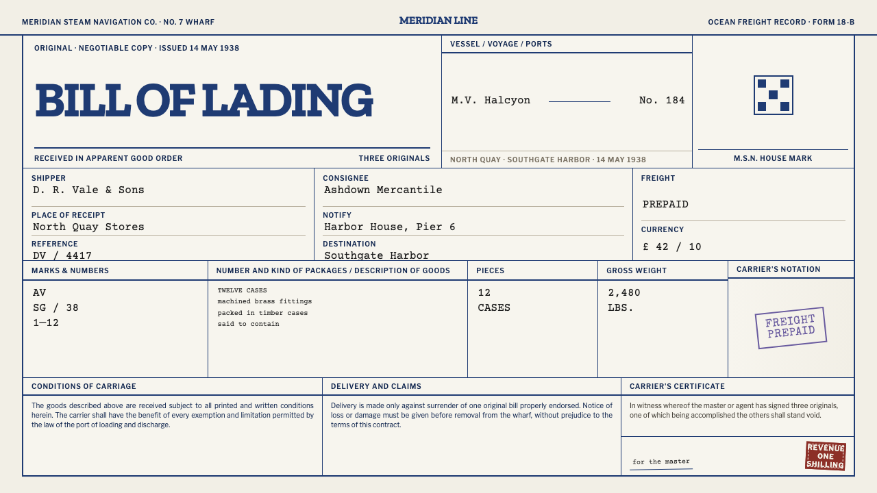 Bill of LadingRecords become an artefact. Blue rules, typewriter black, violet and oxblood…
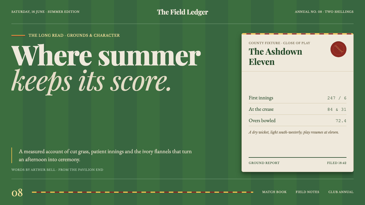 Cricket Whites FlannelsSummer, kept in good order. Ecru serif and fine club trim cross a dark mown g…
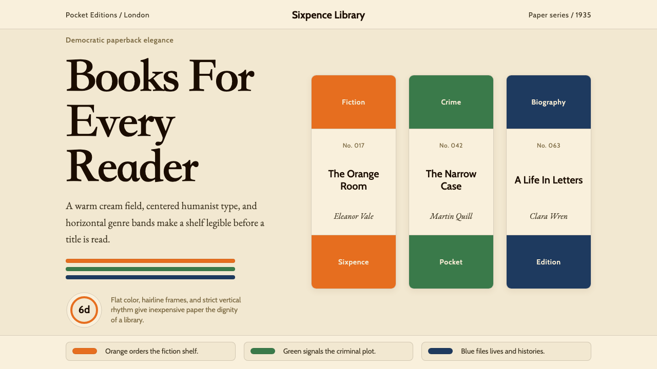 Penguin Books (1935)Paperback democracy. Cream stock, Cabin type, and orange-green-blue bands mak…
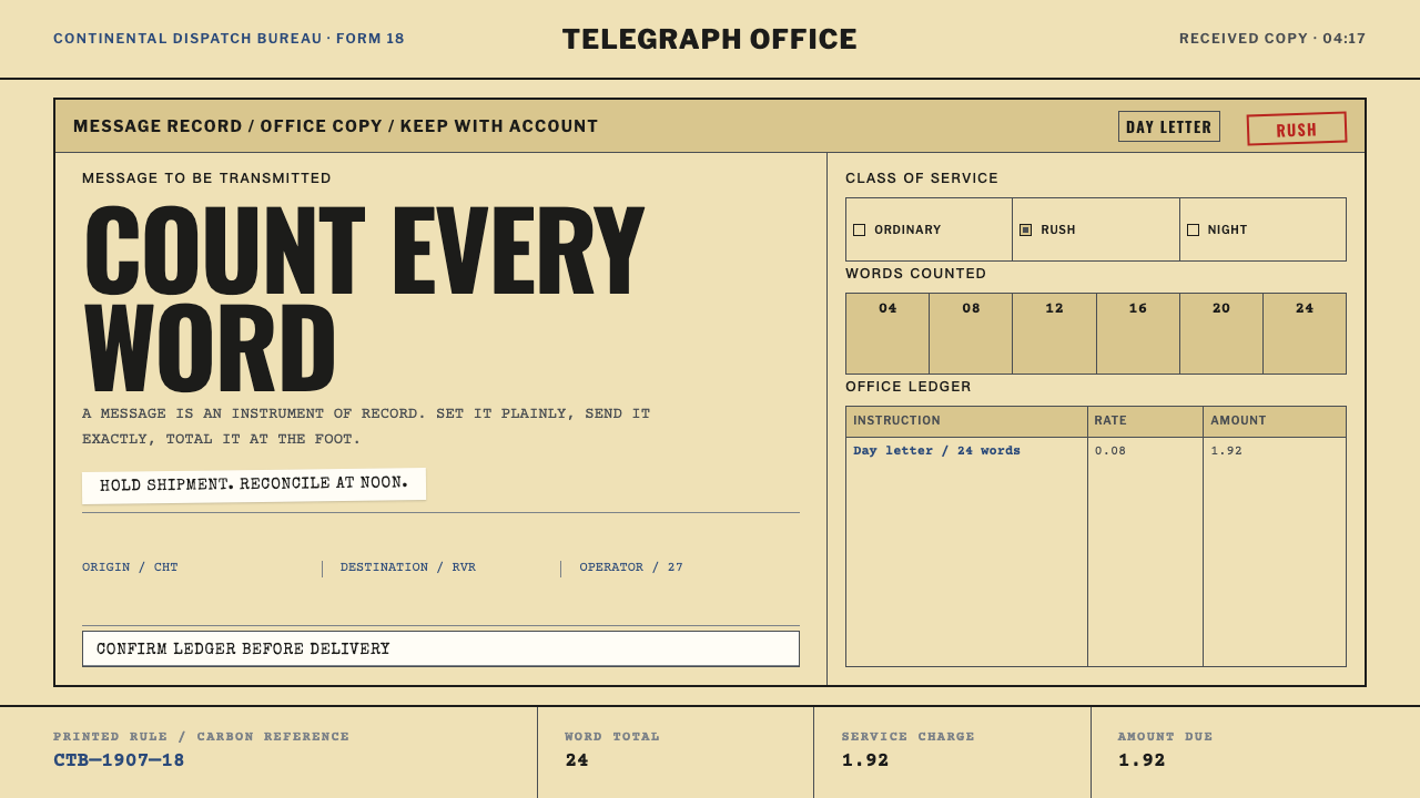 Telegraph Office FormA page that counts. Yellow pulp stock, all-caps type, and ruled charge fields…
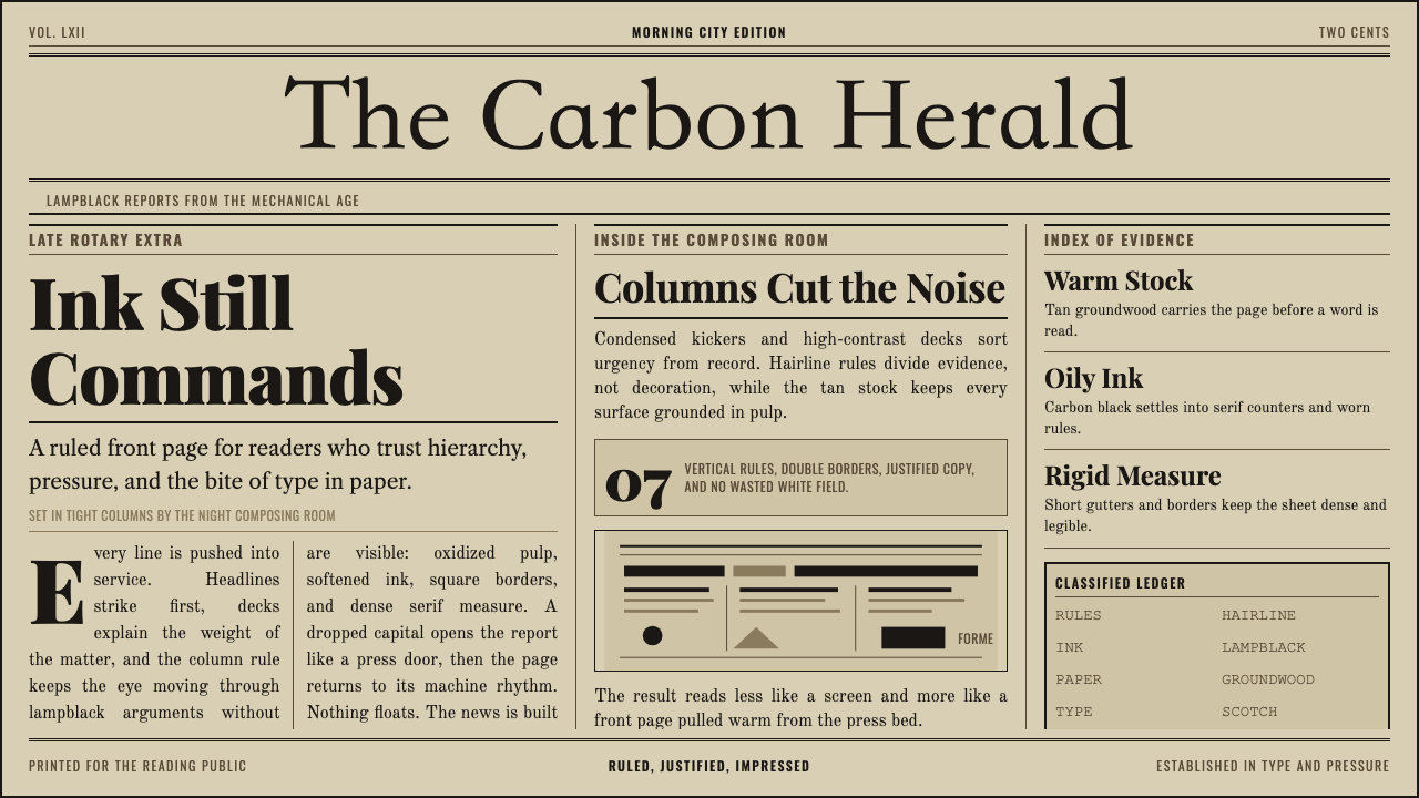 Broadsheet LetterpressAuthority in ink. Lampblack serif decks lock into tan paper with strict ruled…
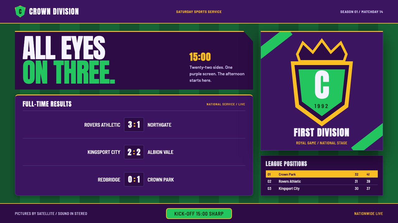 Premier League (1992)Heraldry meets the results page. Aubergine, pitch green and gold frame tabula…