What is Bill of Lading?
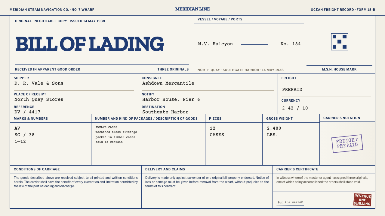
A bill of lading was never meant to be looked at, and that is why it looks so good: four layers of blue engraving, violet stamp ink, typewriter black and a red revenue stamp, stacked slightly out of register on aged office paper.
Bill of Lading in brief
The Bill of Lading style is drawn from the shipping document that accompanied cargo on steamship routes in the first half of the twentieth century. The original was a legal instrument printed to fill a sheet: an engraved house crest at the top, a rule-boxed table of shipper and consignee, marks and numbers, goods and weights, and blocks of clauses set in type so small that they were never meant to be read. Then a clerk rolled it into an Underwood typewriter and filled in the blanks. The design system keeps that whole sequence: blue ruling, typewriter black, violet and oxblood overprints.
What survives on a real bill of lading is not one layout but four, stacked out of register. There is the engraved blue print of the form itself, the purple ink of a rubber stamp, the black of the typewriter ribbon, and a red revenue stamp gummed over everything. Each layer was applied by a different hand, at a different time, with a different tool, and none of them lines up perfectly with the others. The style treats that misalignment as its main source of character. The page looks like a record because it was assembled like one.
The result is a record that becomes an artifact. Dense hairline ruling, agate-sized legal text and monospaced fill that lands slightly off the printed line give pages a serious, bureaucratic texture, while the aged paper, the creases and the crooked stamps make them human. It is a style for content that wants to feel documented, authentic and handled, and it is useful anywhere that tables, fields and small print are the heroes rather than the problem.
Where does Bill of Lading come from?
The bill of lading belongs to commercial shipping in the first half of the twentieth century, and the record places this style between 1900 and 1950. It comes from the transatlantic and Pacific steamship trade, with American and British lines as its home. The form was a receipt for cargo, a contract of carriage and a document of title in one sheet, which is why it had to carry so much text. Its governing frame was legal: the Uniform Bill of Lading Act of 1916 and the Interstate Commerce Commission forms codified in 49 CFR Part 1035.
Its look came from the printing trade, not from graphic designers. Commercial job printing and engraved letterpress forms produced these sheets in volume. The house crest at the top was engraved, the ruled boxes were printed in a single color, and the dense clause blocks were set in the smallest practical type. The result is a well-known example of American form design, a discipline in which layout exists to be filled in. The form's job was to be unambiguous and to leave a space for every fact a clerk might need to enter.
The typewritten layer arrived after printing. A clerk fed the form into a typewriter and tapped out the vessel's name, the voyage, the ports and the particulars of the goods. Typewriter characters rarely land exactly on the printed line; they sit slightly above it, slightly below it, or at a slight angle. Then came the stamps: a violet rubber stamp, often crooked, and a red revenue stamp stuck over the whole. The layers were added at different stages of a shipment's life, and each leaves a trace of when it was applied.
The named institutions give the document its world. The Interstate Commerce Commission stands for the regulatory side, Cunard Line for the British transatlantic trade, and Matson Navigation Company and Dollar Steamship Line for the American Pacific trade. The paper that survives is the paper of the archive: white office paper left for decades in a warehouse in a southern port, yellowed, creased and fibrous. The design system recreates this whole chain, from engraved original through typewriter to stamp to storage, as a stack of visible layers.
What defines the Bill of Lading look?
Engraved Blue Ruling
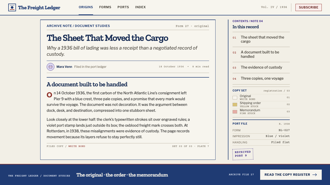
The printed form is carried by dense, hairline-fine blue rules that box the table of shipper, consignee, marks and numbers. The blue is the engraver's single ink color: cool, a little faded, and used for every line that belongs to the form itself. Boxes are tight, many and precise, and they give the page its skeleton. Structure, in this style, is always drawn in blue.
Typewriter Fill
Filled-in information is set in a monospaced, typewriter-black face that lands slightly off the printed line. Each character occupies the same width, the rhythm is mechanical, and a few letters sit a little high or low. This is the human layer of the page: names, ports and figures typed into spaces the printer left empty. It is the style's voice for any data a user supplies.
Violet Stamp Ink
A violet rubber stamp is pressed on the sheet at an angle, its edges slightly uneven, its ink heavier in some places than in others. Violet is the color of approval and processing: received, passed, cleared. In an interface it works for status marks, confirmations and labels, applied as an overprint on top of the structure instead of a box beside it.
Oxblood Revenue Stamp
The red revenue stamp is the final layer, gummed over the rest, and the style renders it in a dark oxblood tone rather than a bright red. It is used rarely and carries the most weight: a seal, an official mark, a total. Because it comes last, it overlaps the other layers, and the overlap is part of the charm.
Agate Legal Text
Clause blocks are set in a very small, tightly packed type, arranged in two columns and never intended to be read at a glance. They work as a gray texture, signaling legal weight without demanding attention. In this style small print is a visual material in its own right, and a block of it can fill a margin or close a page the way a bar of tone would.
Misregistration
Four layers do not line up. Blue lines, black type, a violet stamp and a red revenue stamp each drift a little from their intended positions, so edges overlap and colors mix where they cross. The drift is small and controlled, and never so large that it harms legibility. It is the main source of authenticity: a clean alignment would make the page look printed all at once.
Aged Office Paper
The ground is white office paper that has sat in a warehouse for decades: warm, slightly yellowed, with visible fibers, soft creases and a dry, matte feel. It is a light system, and the paper does a great deal of the work, because every layer of ink reads against it. Edges can look handled, but the surface is never dirty or decorative.
Who shaped Bill of Lading?
The Interstate Commerce Commission is the regulatory presence behind the form. The record cites ICC forms in 49 CFR Part 1035 alongside the Uniform Bill of Lading Act of 1916. Its relevance to a designer is that the form's rigid structure was not a stylistic choice: it was set by rules, which is why the sheet looks the way it does.
Cunard Line stands for the British transatlantic steamship trade. A bill of lading from a line like Cunard would carry the engraved crest of a company that expected its paper to look established and serious. The crest at the top is the part of the form that most clearly belongs to a house, and it gives the style its sense of institutional weight.
Matson Navigation Company is named as one of the American lines in the Pacific trade. It represents the same document under a different house crest and a different route, which makes a useful point: the bill of lading was a shared genre, and the style is a family of forms rather than one particular page.
Dollar Steamship Line is the third named line, again in American shipping on Pacific routes. Together with Cunard and Matson it frames the style's geography as ports on both sides of the Atlantic and the Pacific, and its era as the long middle of steamship commerce, when paper moved cargo as surely as ships did.
How do you use Bill of Lading today?
Bill of Lading is a style of records, forms and fine print, best used where information is dense and the content benefits from feeling documented. It rewards discipline rather than decoration. The core principles are simple to state: draw structure in blue, fill in data in typewriter black, add stamps as overprints, and let the layers drift slightly out of register.
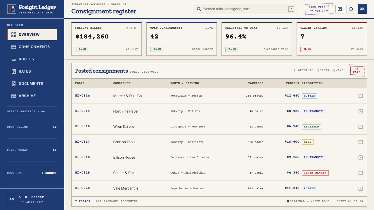
On presentation slides the style suits covers, appendices, process diagrams and any slide built around a table. A cover can look like a form header, with a crest-like mark, a boxed title block and a violet stamp placed across one corner. Content slides work as ruled tables with typewritten entries, and a data slide can present figures as filled-in fields rather than charts. A red stamp can mark the single conclusion that matters. The style is particularly strong for logistics, trade, finance and archive topics.
For web interfaces the style fits invoices, order tracking, shipment and logistics products, document portals, legal and compliance tools, and any product built from forms and tables. Fields can have blue-ruled boxes with monospaced fill; statuses can appear as violet stamps; totals and approvals can take an oxblood seal. Dense tables are an asset here. The main care needed is legibility: keep the misregistration small, and keep actual input fields easy to read and use.
In editorial and marketing work the style gives history, trade and archive stories an immediate sense of provenance. Articles can be laid out like documents, with ruled boxes for captions and marginal notes, a stamp to mark a key quote, and a clause-like block for credits and sources. Campaign pages for archives, museums, shipping history and craft-of-record projects benefit most, because the style turns paperwork into a visual pleasure.
The most common mistake is to over-distress. Designers pile on grunge, coffee stains and heavy noise, and the page turns into a generic vintage texture with none of the structural logic. The second mistake is making the layers align perfectly, which removes the sense of four separate applications. Keep the ruling precise, keep the drift small, and use each ink color for its own job.
Bill of Lading — FAQ
What is a bill of lading?
A bill of lading is the shipping document that accompanies cargo. In its classic early twentieth century form it was a printed legal instrument with an engraved house crest, a ruled table of shipper, consignee, marks and numbers, goods and weights, and small-print clauses, filled in on a typewriter and then stamped. Its legal frame included the Uniform Bill of Lading Act of 1916 and ICC forms in 49 CFR Part 1035.
Why are there four colors of ink?
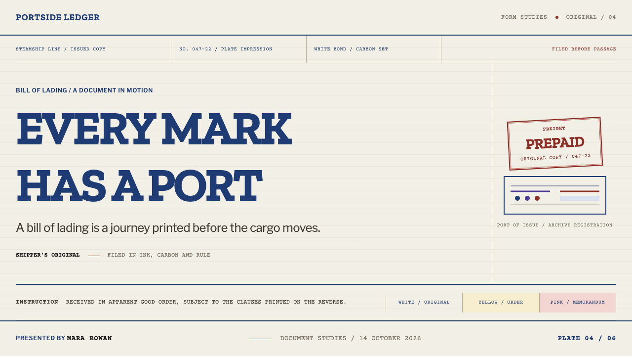
Because the original document carried four separate applications. The form itself was printed in engraved blue, the clerk typed in black, a violet rubber stamp was pressed on, and a red revenue stamp was gummed over the sheet. Each color corresponds to a different stage and a different tool, so using them as the style's palette means every color has a job: structure, data, approval and official seal.
Should the layers really be out of register?
Slightly, yes. The misregistration is the main source of the style's authenticity, since the original layers were applied by different people with different tools. The key is control: keep the drift small and consistent enough that text remains legible, and never so large that boxes and fields become hard to use. If everything aligns perfectly, the page looks printed at one time and loses its character.
Is this style only for shipping or logistics products?
No. It suits any content built around records, fields, tables and fine print, including invoices, archives, finance, compliance, legal tools, museum and history projects, and editorial pieces that want a documented tone. Its shipping origin is a useful hook for logistics and trade brands, but the logic of ruling, typed fill and stamped approval travels to any product where information is the hero.
Can I use it on a dark background?
It is built as a light system, because the aged white paper is what makes every ink layer readable and what gives the page its sense of age. A dark version would lose that. If you must use a dark surface, treat it as a reproduction of the document, keep a paper-toned sheet on top of the dark field, and let the ink layers live on the sheet instead of on the background itself.
Related design styles
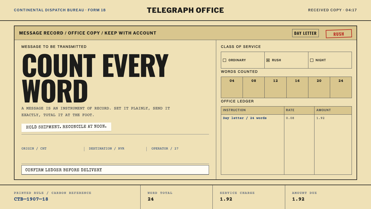 Telegraph Office FormA page that counts. Yellow pulp stock, all-caps type, and ruled charge fields…
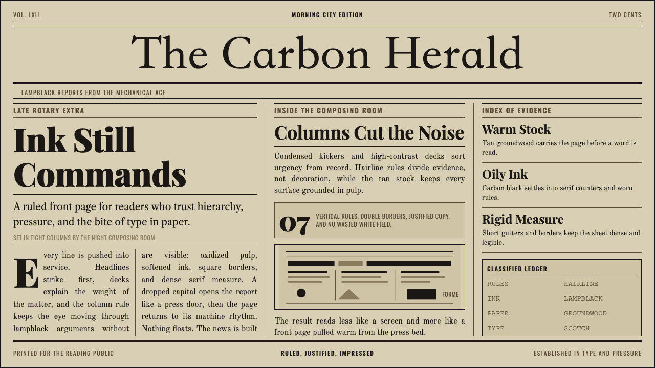 Broadsheet LetterpressAuthority in ink. Lampblack serif decks lock into tan paper with strict ruled…
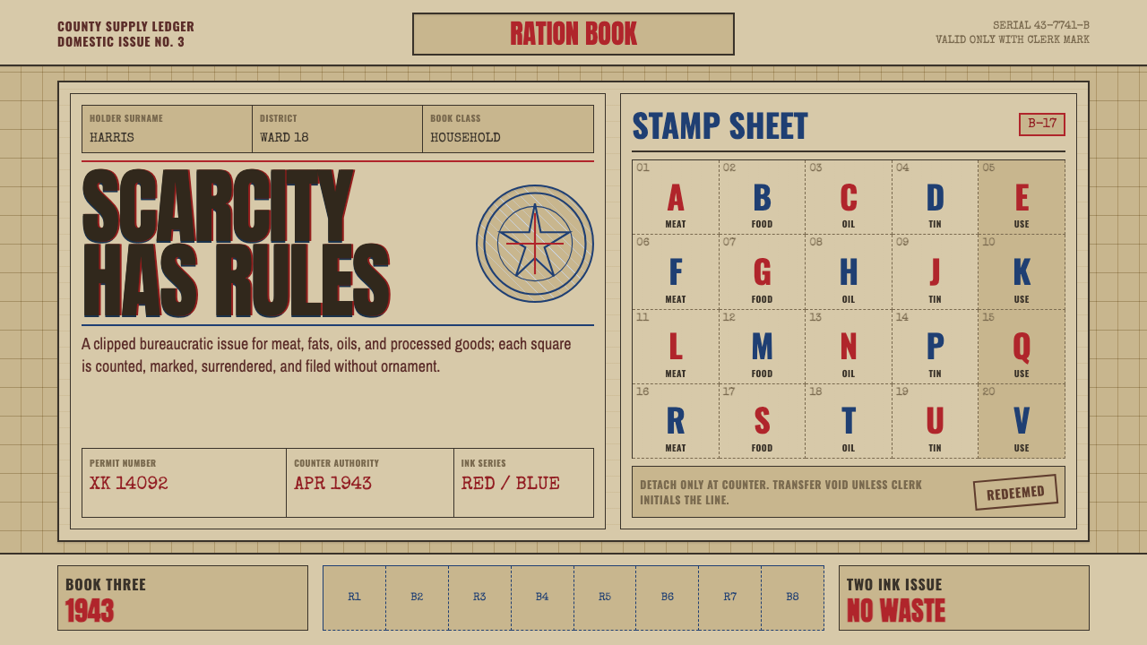 Wartime Ration CouponScarcity made visible. Buff card, red-blue overprint, and perforated grids do…
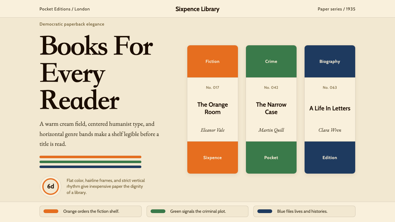 Penguin Books (1935)Paperback democracy. Cream stock, Cabin type, and orange-green-blue bands mak…
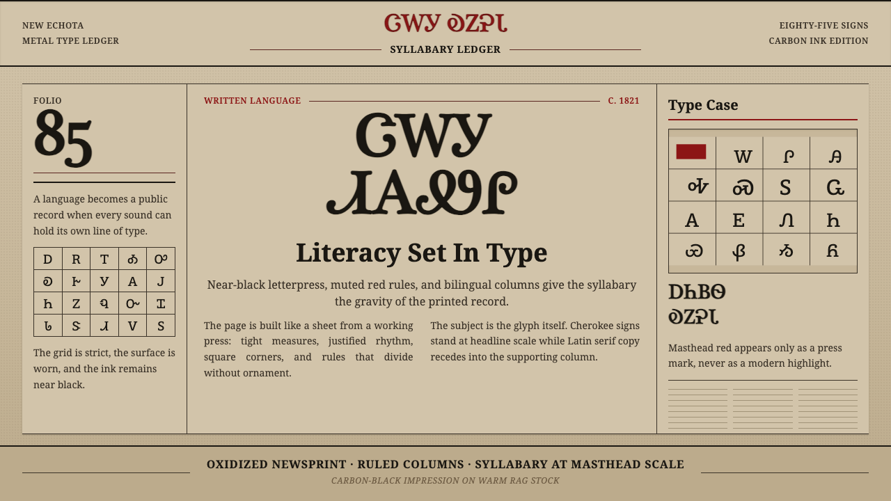 Cherokee SyllabaryLiteracy as inked record. Carbon type, muted red rules, and syllabary on tan…
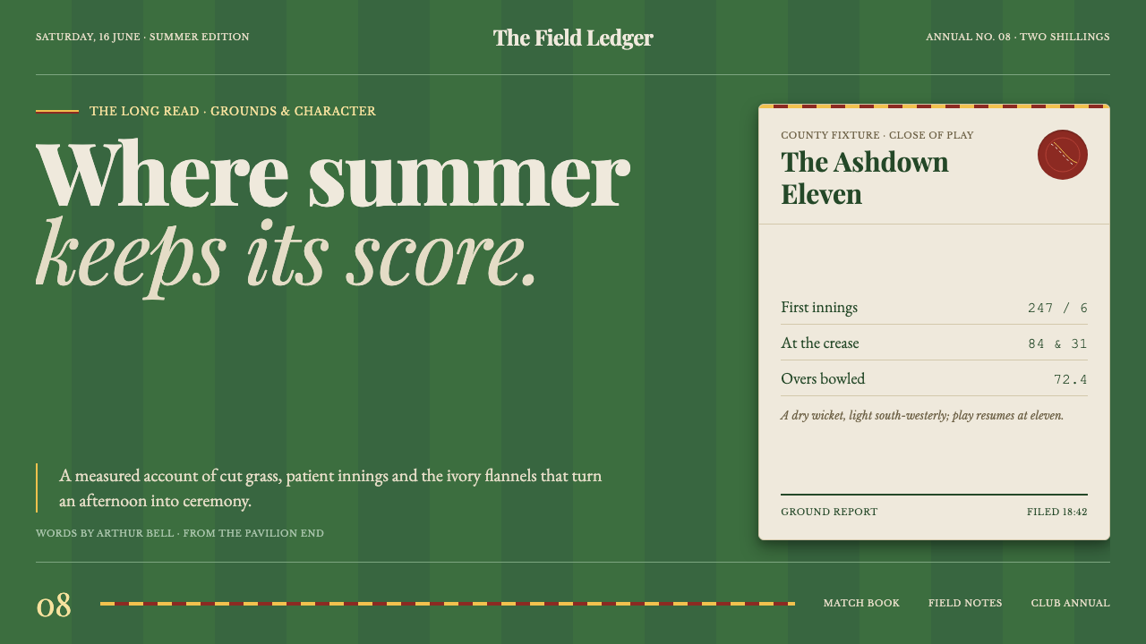 Cricket Whites FlannelsSummer, kept in good order. Ecru serif and fine club trim cross a dark mown g…