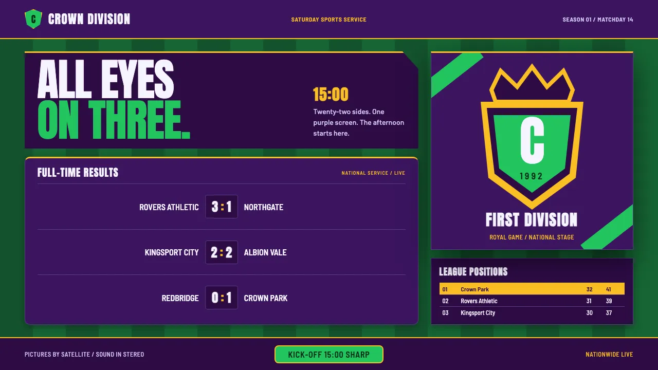
About Premier League (1992)
This is the design language of English football's breakaway top flight in its launch season — a crowned-lion crest, a purple-and-green colourway, and the first broadcast graphics package built for satellite TV. It fuses the pageantry of a club badge with the cold precision of a Saturday fixture grid: deep aubergine ground, mown pitch-stripe greens, and dense numeric scorelines set like a teletext results page. Everything reads as a matchday programme crossed with a broadcast lower-third — heavy condensed capitals, gold trim, and tabular league tables that carry from across the room. Kick-off is at three o'clock, the lion is on the badge, and the whole nation is watching the same purple screen.
- Origin
- England (London HQ, broadcast nationwide via Sky and the BBC)
- Era
- 1992–1997 (founding season 1992–93, the Carling-sponsored early years)
- Key figures
- Rick Parry · Sam Chisholm · Greg Dyke · Trevor East
- Movements
- early-90s satellite sports broadcast graphics · heraldic sports crest design · teletext/Ceefax results-page typography
Premier League (1992) design spec
Colors
Typography
The other 11 sections — buttons, cards, spacing, motion, techniques and more — open once you unlock. Download the DESIGN.md or send it to your AI in one click. Unlock once, yours forever.
Sign up nowStyles similar to Premier League (1992)
Also inspired by brands & products, with a close feel.
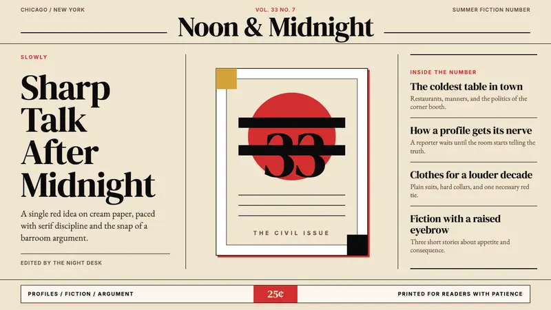 Esquire MagazineConceptual punch on paper. Cream stock, black hairlines, and one saturated red idea.
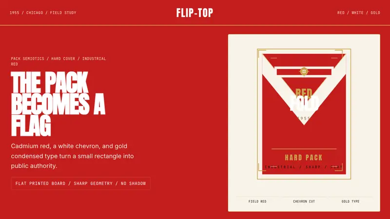 Marlboro Red Flip-Top (1955)Authority in one fold. Cadmium red, white chevron, and gold type read like a flag.
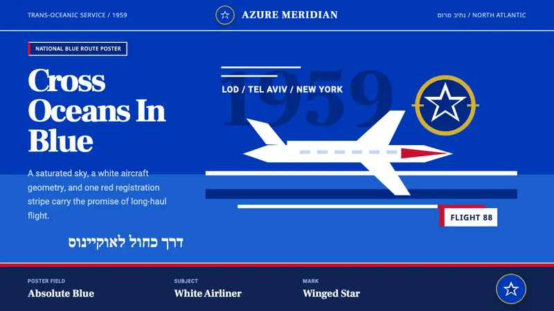 El Al Israel Airlines (1959)National blue takes command. White aircraft geometry cuts a flat jet-age poster sky.
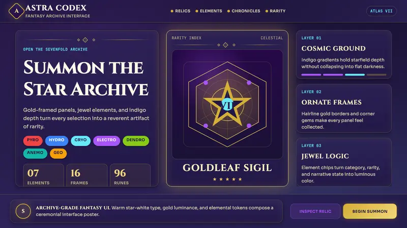 miHoYo Game UIFantasy UI feels ceremonial. Indigo starfields, gold frames, and jewel chips layer rarity.