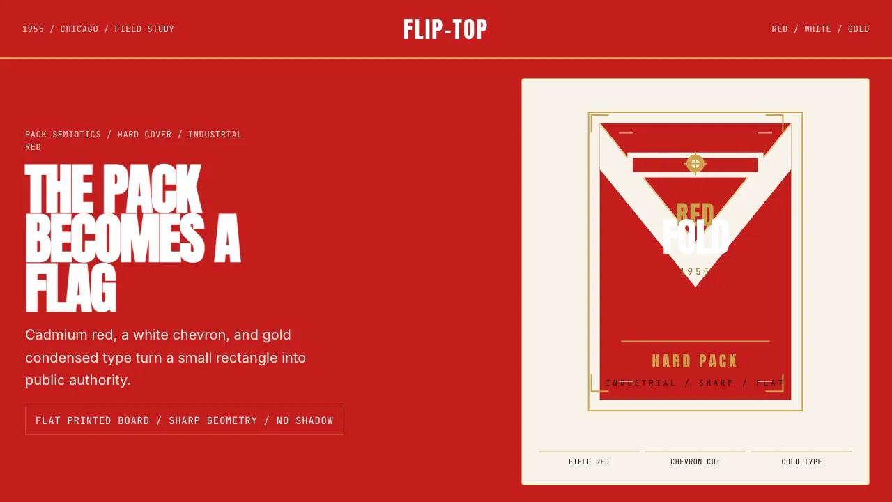
About Marlboro Red Flip-Top (1955)
The 1955 Marlboro flip-top hard pack is one of the most enduring exercises in packaging semiotics ever produced. Frank Gianninoto's design for Philip Morris compressed an entire brand mythology — frontier masculinity, unapologetic boldness, flag-like pride — into a palm-sized rectangle of saturated cadmium red, a sharp white chevron, and gold-shaded condensed lettering.
This design system extracts that red-ground language: the inverted-V negative space, the industrial condensed type, the gold filigree accents, and the flat, shadow-free materiality of printed cardboard. It is a study in how a single dominant color, wielded with geometric precision, can project authority without complexity.
- Origin
- USA — Chicago & Richmond, Virginia
- Era
- 1955 launch; visual identity continuous through 2024
- Key figures
- Frank Gianninoto · Leo Burnett · Philip Morris
- Movements
- postwar consumer brand reinvention · durable-flag packaging · semiotics of masculine identity in advertising
Marlboro Red Flip-Top (1955) design spec
Colors
Typography
The other 11 sections — buttons, cards, spacing, motion, techniques and more — open once you unlock. Download the DESIGN.md or send it to your AI in one click. Unlock once, yours forever.
Sign up nowStyles similar to Marlboro Red Flip-Top (1955)
Also inspired by brands & products, with a close feel.
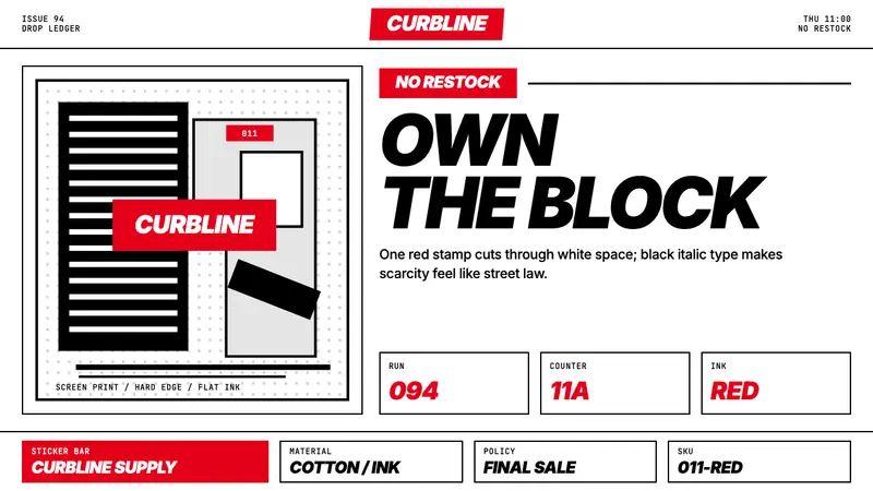 Streetwear (Supreme red)Militant minimalism. A single red box, white field, and black italic grid do the work.
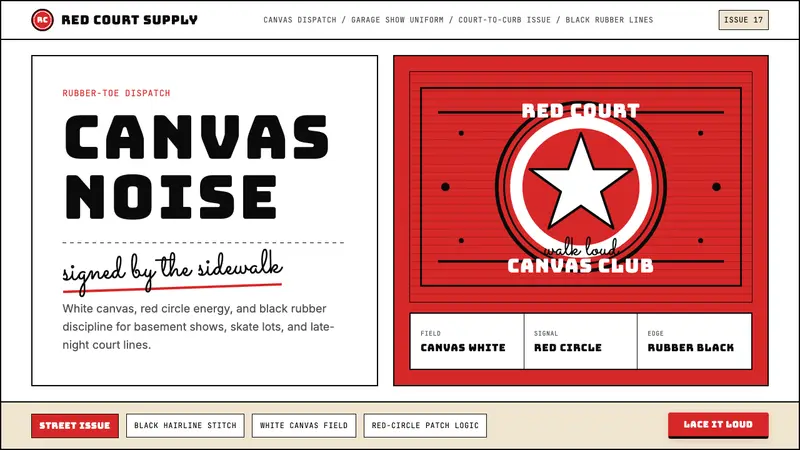 Converse Chuck TaylorPopulist and loud. Saturated red circles, Bungee type, black stitch lines on white canvas.
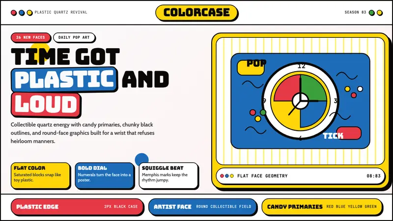 Swatch Watch (1983)Pop plastic optimism. Bungee type, candy primaries, round dials and squiggles snap loud.
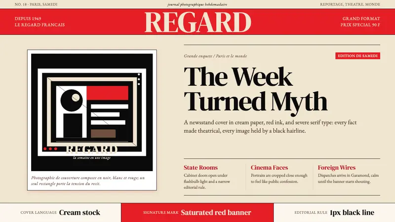 Paris MatchThe cover shouts in one red slab. Cream paper, serif headlines, and black rules stage drama.