What is Pokémon GO?
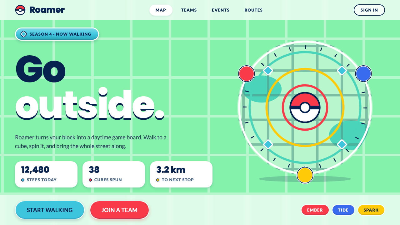
Pokémon GO turned a real street map into a bright game board: mint ground, cyan supply cubes, round red buttons and navy type.
Pokémon GO in brief
Pokémon GO turned real neighbourhoods into a daytime game board. On screen, streets became dark teal lines on mint-green land, parks turned a deeper teal, and cyan cubes spun on posts wherever a mural or a post office stood in real life. The style built from this game takes that map and turns it into a UI kit.
The page itself is mint, actions are round and filled, and navy carries every label. Cyan is used only as a fill, never as a text colour. Red, blue and yellow are given to the three teams, so they read as identity colours rather than general accents. Nothing is square and nothing is dark: the whole system is bright, clean and slightly bouncy.
The mood is outdoor, social and playful. It is built around the idea of looking down at your phone while moving through a real place, so everything needs to be legible in daylight and tappable with a thumb. It feels like a friendly guidebook for a neighbourhood adventure.

Where does Pokémon GO come from?
Pokémon GO launched on 6 July 2016, and the core map and capture interface that this style is based on were in use from 2016 to 2019. The game was created by Niantic and The Pokémon Company, with studios in San Francisco and Tokyo as the key places of its making, and with John Hanke among the figures most closely associated with Niantic.
It sits at the crossroads of several movements. One is location-based augmented-reality mobile gaming, in which the physical world is the playing field and the phone the lens. Another is the Ingress portal network of 2013, an earlier Niantic game whose real-world landmarks provided the foundation for the supply points and gyms. A third is the flat mobile UI of the mid-2010s, which favoured clean shapes, bright colour and big touch targets.
Tsunekazu Ishihara and Junichi Masuda, both closely linked with the Pokémon franchise, are named among the key figures, alongside Tatsuo Nomura. Their presence reflects the collaboration of Japanese and American teams that brought one of the most beloved game worlds into the street. The result had to feel like Pokémon yet also like a map.
That double requirement explains the look. A map must be calm and legible, and a Pokémon game must be playful and rewarding. The designers answered with a mint-green base for the map, rounded filled buttons for the game and navy type for clarity, then used red, blue and yellow for team identity. The summer of 2016, when people everywhere were walking with their heads down to find creatures in their own streets, made the map look instantly recognisable worldwide.
What defines the Pokémon GO look?
Mint map ground
The base is a daytime mint green, like land on a map. It feels fresh and light, and it separates the interface cleanly from dark teal streets and parks. The system has no dark mode in its identity.
Teal streets and parks
Streets are dark teal lines, and parks are a deeper teal field. Used for lines, borders and map detail, this teal gives the layout a structure without needing heavy outlines.
Cyan supply cubes
Cyan is the colour of supply stops, the spinning cubes on real-world landmarks. It appears as fill in icons and highlights, never as text, which keeps type crisp and avoids low-contrast reading.
Round filled actions
Buttons are pills and circles, filled with colour, easy to hit with a thumb. The capture throw and the main action are round, and nothing in the system uses sharp, square corners.
Navy Poppins type
Every label is set in navy, in a friendly geometric sans such as Poppins. The deep blue holds enough contrast on mint and white to stay readable in bright sunlight, which matters for a game played outdoors.
Team colours
Red, blue and yellow are reserved for the three teams, standing for bravery, wisdom and instinct. Because they carry identity, they should not be used decoratively or mixed in all places at once.

Who shaped Pokémon GO?
Hanke is the figure most closely connected with Niantic and its location-based games, including the earlier Ingress, whose portal network underpins the real-world map of Pokémon GO.
Nomura is named among the key figures associated with the project, which brought together teams from San Francisco and Tokyo.
Ishihara is a leading name in the Pokémon franchise, and his involvement represents the link between Niantic's technology and the established world of Pokémon.
Masuda is a long-standing figure of the Pokémon franchise and is among the names linked to the creation of the 2016 game.
How do you use Pokémon GO today?
Pokémon GO is a style for products that happen outdoors, in daylight, and with a social or playful goal: fitness apps, event and festival guides, city tours, community challenges and anything that uses a map as its main screen. It is also a good fit when you want a bright, optimistic interface that feels modern but not cold.
For slides, use it on covers and map-like diagrams. A mint background with dark teal line work and a navy title looks fresh, and a single round red or blue shape can serve as the focal point. Content slides should keep to rounded cards with navy text, and data slides suit filled round or pill-shaped bars with the team colours used for categories.
For web and app interfaces, start with the mint page and white or lightly tinted cards. Primary actions should be round, filled and large; secondary actions should be pill-shaped and outlined. Keep all text navy, use cyan as an icon or highlight fill only, and keep red, blue and yellow for categories or states. Map-style layouts, location lists and progress rings all fit naturally.
For editorial and marketing work, it suits summer campaigns, outdoor events, sports and travel content. Use large, rounded shapes, short energetic copy and imagery of streets, parks and landmarks. The tone should be inviting and slightly adventurous.
A common mistake is to use cyan for text or thin lines, which creates low-contrast labels that are hard to read in sunlight. Another is to introduce square corners or dark backgrounds, which break the bright, round identity. And finally, using the team colours as decoration blurs their meaning as identity markers.

Pokémon GO — FAQ
When did Pokémon GO launch?
It launched on 6 July 2016. This style is based on the core map and capture interface used from 2016 through 2019.
Why is the page mint green?
Because the game board is a map. Mint green stands in for land, dark teal for streets and deeper teal for parks, which gives the interface an immediate geographic feel in daylight.
What do red, blue and yellow mean?
They belong to the three teams, standing for bravery, wisdom and instinct. They are identity colours, so they work best when reserved for categories or team states.
Can I use cyan for text?
No. Cyan is a fill colour for supply-stop cubes and highlights. All text should be navy so it stays legible against mint and white, especially outdoors.
What kinds of products fit this style?
Outdoor, map-based, sports, event and travel products, or any interface that should feel bright, round and friendly. It is a poor fit for dense financial dashboards or night-mode tools.
Related design styles
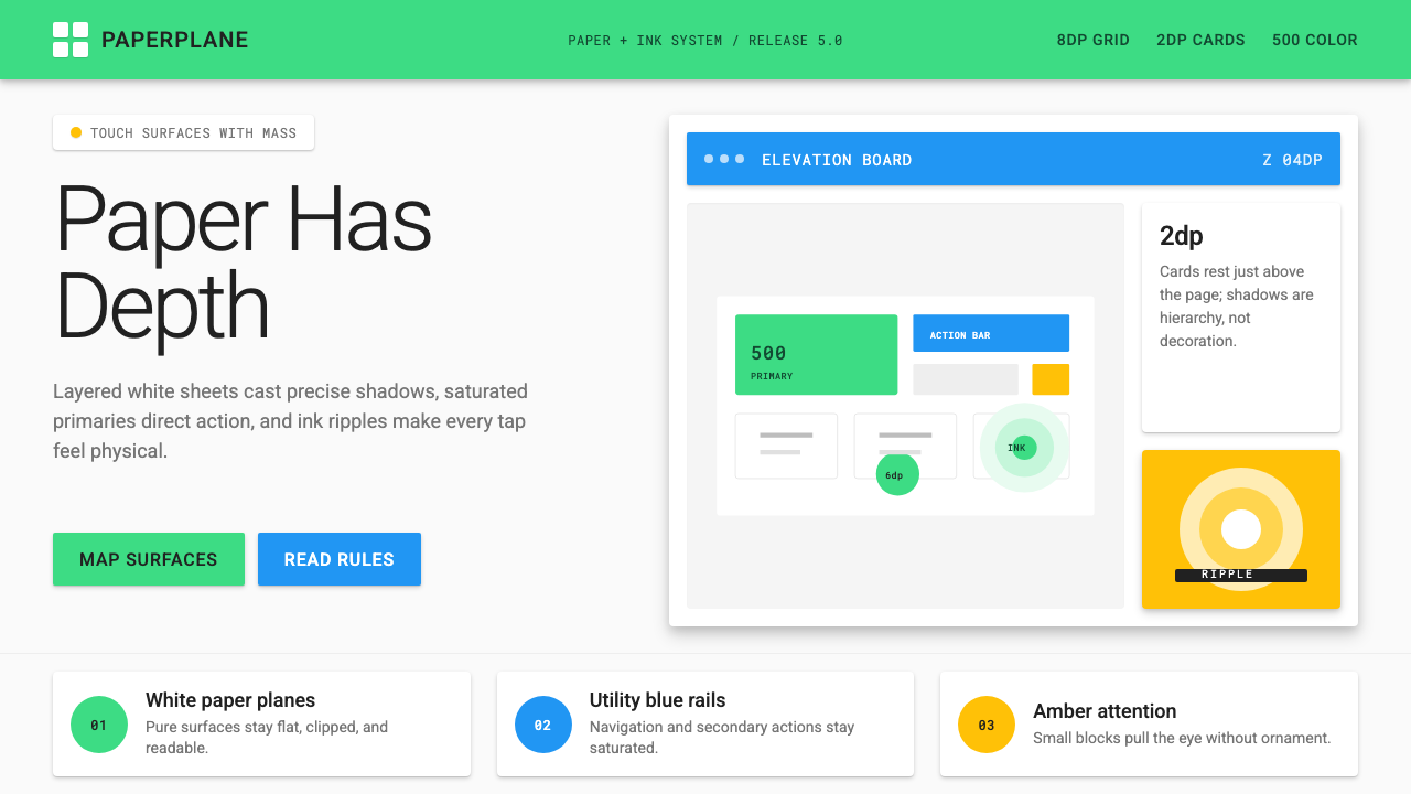 Android Lollipop (Material 1.0)Paper becomes physical. Roboto, green FABs and sharp shadows give white cards…
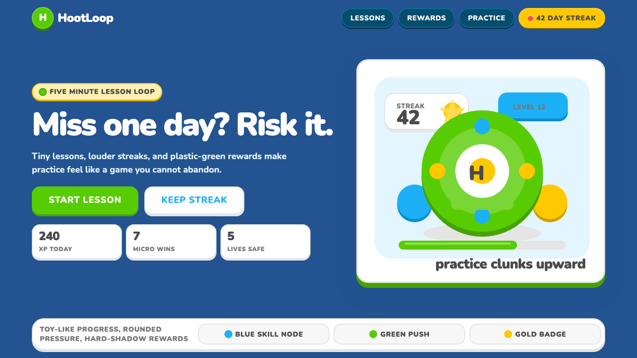 Duolingo 2024Adorable pressure wins. Feather Green, Nunito heft, rounded push-shadows gami…
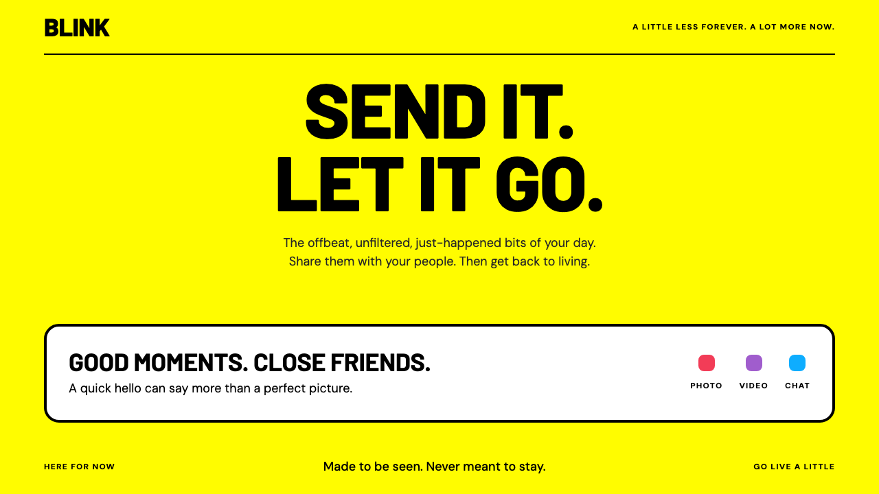 SnapchatBright, brief, unapologetic. Full-field yellow and loud black Barlow make the…
 Discord 2024Blurple cozy. Charcoal grounds, illustrated characters — every surface says '…
 Duolingo Green Owl MascotFriendly guilt goes loud. Saturated green, Nunito heft, and press-shadow butt…
 Mexican Fintech StartupNeobank, not legacy bank. White rounded cards float on near-black plum, lit b…