About Pokémon GO
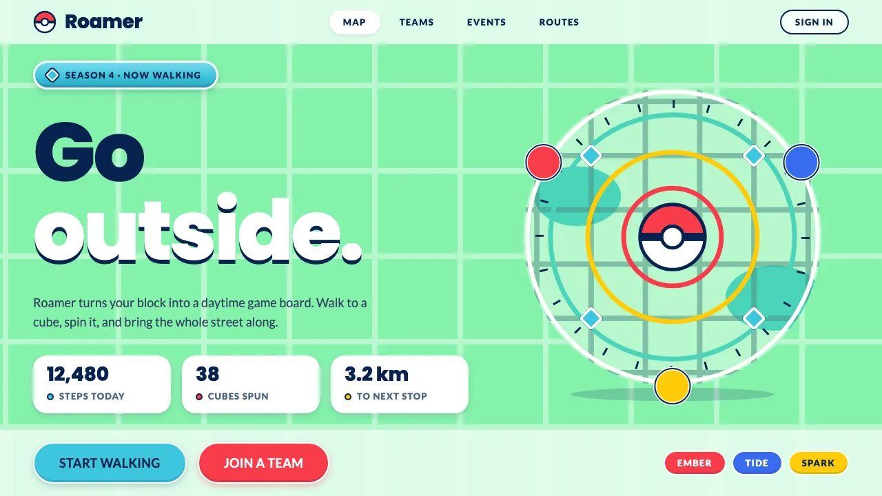
Pokémon GO turned real neighbourhoods into a daytime game board. Streets became dark teal lines on mint-green land, parks turned a deeper teal, and cyan cubes spun on posts wherever a mural or post office stood in real life.
This system takes that map and makes it a UI kit. The page is mint, actions are round and filled, navy carries every label, and red, blue and yellow belong to the three teams. Nothing is square and nothing is dark.
- Origin
- San Francisco, United States / Tokyo, Japan
- Era
- Launched 6 July 2016; core map and capture UI 2016–2019
- Key figures
- John Hanke · Tatsuo Nomura · Tsunekazu Ishihara · Junichi Masuda
- Movements
- Location-based augmented-reality mobile gaming · Ingress portal network (2013) · Mid-2010s flat mobile UI
Pokémon GO design spec
Colors
Background
Surface
Primary
Secondary
Accent
Text
Typography
PoppinsHeadings
LatoBody
Roboto MonoMono
Unlock for 1 credit
The other 11 sections — buttons, cards, spacing, motion, techniques and more — open once you unlock. Download the DESIGN.md or send it to your AI in one click. Unlock once, yours forever.
Sign up nowHave an account? Sign in
Styles similar to Pokémon GO
Also inspired by film, games & music, with a close feel.
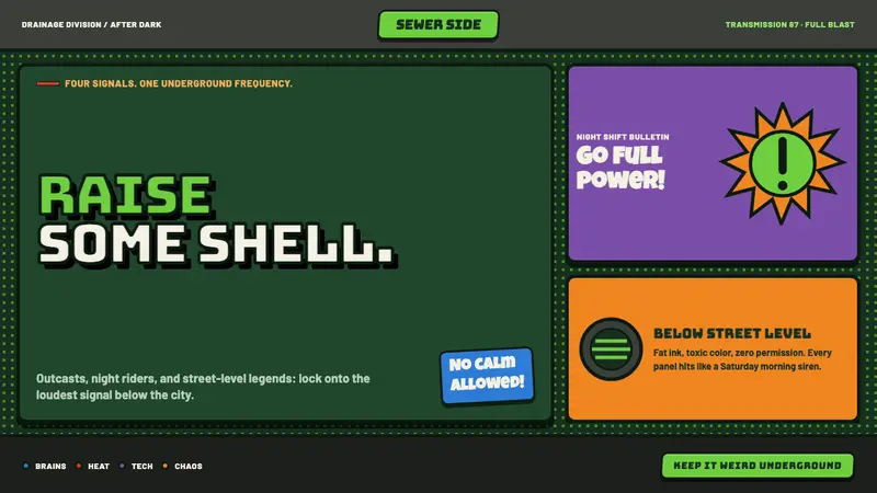 TMNT (1987 Saturday-Morning)Saturday-morning chaos, full blast. Sewer green, bandana brights and clogged halftone dots.
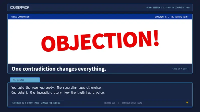 Ace AttorneyQuiet testimony. One red shout breaks the navy calm, with bitmap dialogue below.
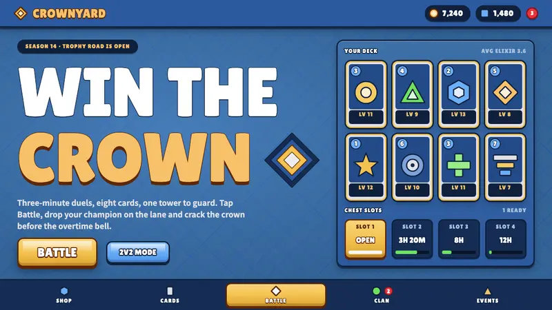 Clash RoyaleBuilt to be tapped. Gold Battle slab, thick-outlined white caps, royal-blue diamond tiles.
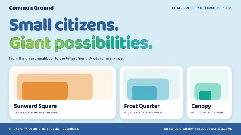 ZootopiaBelonging at every scale. Rounded blue type meets orange, cyan and green districts.