What is Pocari Sweat?
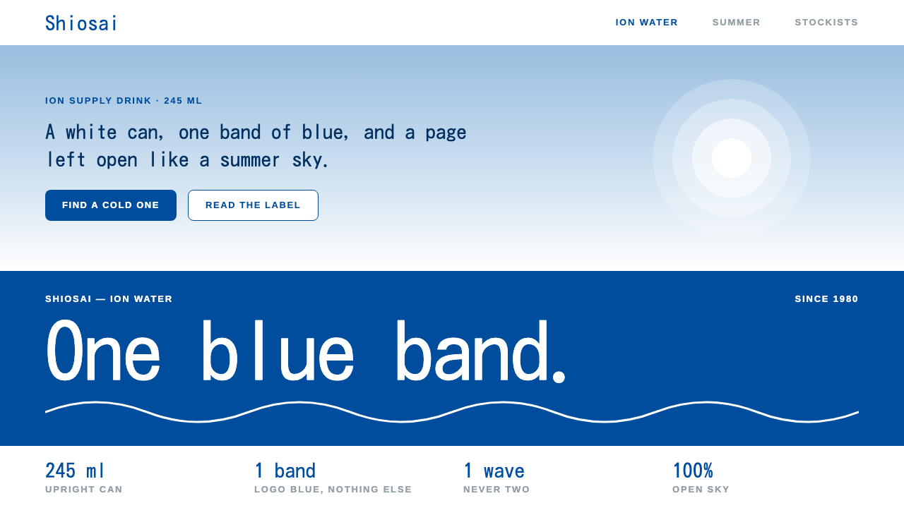
Pocari Sweat turned a can into a climate: one blue band, one white wave, and a page left open like a summer sky.
Pocari Sweat in brief
The Pocari Sweat style is a blue-and-white design language drawn from the can that Otsuka Pharmaceutical launched in April 1980 and from the summer advertising built around it. The can is white, crossed by a single deep blue band, and inside that band sits a white wordmark with one white wave line running through it. More than four decades later the scheme is still recognisable at a glance, which is rare for any consumer packaging.
As a visual system it is defined by restraint. Pages are white. The logo blue appears as one confident band rather than as a wash across the layout. Pale sky tints fill large areas where other styles would use a dark surface or a heavy shadow, and the type stays calm, open and generously spaced. Most of the page is deliberately left empty, so that the empty part reads as sky rather than as unused space.
What the style communicates is cleanliness, refreshment and trust. It descends from Japanese pharmaceutical-clean packaging and from the seishun, or youth, imagery of Japanese summer commercials: bright light, white shirts, open skies and sea air. It suits any page that needs to feel clear, light and credible without looking clinical.

Where does Pocari Sweat come from?
Pocari Sweat arrived in Japan in April 1980 as a can of drink from Otsuka Pharmaceutical. The product belongs to a Japanese category of functional ion-supply drinks, beverages positioned as a way to replace what the body loses when it sweats. That functional promise shaped the look from the start. A drink sold on the idea of balance and recovery needed packaging that looked clean, cool and dependable, and a pharmaceutical company already had a visual habit for exactly that: white grounds, a single disciplined colour and plain lettering.
The can itself is the foundation of the whole style. A white body, a deep blue band across the middle, a white wordmark set inside the band and one white wave line moving through it. There is almost nothing else. The designers of the original can chose a very small number of elements and let each one carry weight, and because the arrangement never became busy it never needed redesigning. The source material records the blue-and-white scheme as unchanged from 1980 into the 2020s, which makes it one of the longest-running unaltered colour identities in Japanese consumer goods. Rokuro Harima is among the names associated with this visual identity, alongside Otsuka Pharmaceutical itself.
The second source of the style is the advertising that grew up around the product. Over the following decades the brand's summer campaigns turned the two colours of the can into an image of Japanese youth: wide blue skies, white school shirts, wind off the sea and bright, transparent daylight. This is the tradition often called seishun summer advertising, in which the season, the sky and the feeling of being young are the real subject and the product is almost a quiet witness. In that imagery the blue is the sky and the white is the cloud, the shirt and the surf, and the can's colour scheme became a shorthand for that whole mood.
Taken together, three currents meet in this style: the functional ion-supply drink, the seishun summer commercial and the clean packaging language of Japanese pharmaceutical companies. A design system built on them keeps the discipline of the first and the last and the openness of the second. That is why the style feels more like weather than like decoration. It does not ask the viewer to look at ornament. It offers a clear field, one band of colour to anchor the eye, and room to breathe.
What defines the Pocari Sweat look?
Color
White is the ground and blue is the signal. The deep logo blue is reserved for a single band, the way it is on the can, instead of being spread across the whole layout. Pale sky tints take over wherever a large area needs some tone, giving the page a gentle, airy gradation of blues without ever becoming a dark or saturated surface. Accent colours are almost absent, because a second loud colour would break the idea of one band and one sky.
Typography
Type is calm, open and lightly set, using a rounded, friendly Japanese sans-serif in the Kosugi family. Letterforms are spaced generously and headings do not shout. Hierarchy comes from size and position rather than from heavy weights, so a page reads the way a clear summer morning feels: easy, unhurried, and without visual noise competing for attention.
Space
Emptiness is the main material. Most of any page is left open so that it reads as sky, and content floats in it with plenty of margin on every side. Blocks are separated by air rather than by rules or boxes. This is the quality that most separates the style from busier commercial layouts: the white is not a gap between things, it is the thing itself.
The band
The single horizontal band of blue is the structural device of the system. It borrows directly from the can, where a band carries the wordmark across the white body. On a page it can hold a heading, a navigation strip or a call to action, but there is only ever one confident band in view. Repeating it would turn a signature into a pattern and lose its authority.
The wave line
The white wave that runs through the wordmark gives the otherwise static system its only gesture of movement. It can echo as a soft curved divider, a gentle edge between sky tints, or a small underline motif. Used lightly, it suggests water, breeze and the liquid refreshment that the original product promised, without any need for illustration.
Depth and shadow
Shadows are avoided wherever possible. Instead of dropping a dark blur behind a card, the system lays a pale sky tint beneath it, so separation comes from colour value and not from simulated light. The result feels flat in the best sense: bright, clean and without the heaviness that shadow tends to bring to a light page.

Who shaped Pocari Sweat?
A name tied to the visual identity of the original blue-and-white Pocari Sweat can in the source record.
The company that launched Pocari Sweat in April 1980; its pharmaceutical-clean packaging habits shaped the look.
How do you use Pocari Sweat today?
For slides, the style works best on covers and section dividers. A white slide with a single blue band carrying the title, and nothing else, is an immediate, confident opening. Content slides should keep that discipline: one idea, a generous margin, and sky-tinted panels where a block needs emphasis. Data slides benefit from the same calm. Use a restrained blue family for charts, keep gridlines faint, and avoid filling every bar and wedge with a different hue, since the style rewards one colour family and punishes a rainbow.
For web interfaces, the style is a natural fit for health, wellness, hydration, fitness and everyday utility products, and for dashboards that want to feel trustworthy instead of dense. Navigation can sit in the single blue band, cards can be pale sky tints on white, and primary actions can use the band blue. Pricing pages are served well by the open layout, because plans and prices have room to be compared without borders competing for attention.
For editorial and marketing work, the style suits summer campaigns, seasonal launches, newsletters and landing pages that want to feel light and young. Large photography of sky, water or people in white clothing sits comfortably inside it, and the wave motif can bridge text and image. Because the palette is so narrow, the imagery should carry the energy: let the photographs be bright and uncluttered and let the layout stay out of their way.
The most common mistake is to treat the blue as a general-purpose brand colour and spread it over backgrounds, buttons, icons and borders at once. That erases the band, which is the whole point, and turns the page into an ordinary blue interface. The second mistake is to fill the white space with extras because it feels empty. The emptiness is the feature. Add shadows, extra accent colours or dense decoration and the sense of open sky disappears.

Pocari Sweat — FAQ
What is the Pocari Sweat design style?
It is a blue-and-white style based on the Pocari Sweat can launched in April 1980 and the summer advertising around it. Pages are white, one band of logo blue anchors the layout, pale sky tints fill large areas, and type stays calm and open so that most of the page reads as sky.
Where does the style come from?
It comes from Japan and draws on three sources: functional ion-supply drinks, seishun summer advertising with its skies, white shirts and sea air, and the clean packaging language of Japanese pharmaceutical companies. Otsuka Pharmaceutical launched the product, and the blue-and-white scheme stayed unchanged from 1980 into the 2020s.
Why is there only one blue band?
Because the band is the signature, copied from the can where a single band carries the wordmark. Repeating it would turn the signature into a pattern. Keeping to one lets the eye find an anchor while the rest of the page stays open.
What kinds of projects suit it?
Health, wellness, hydration and everyday utility products, trustworthy dashboards, summer campaigns, seasonal landing pages and decks that want a clean, calm opening. It is less suitable for projects that need drama, dark moods or dense information.
How does it handle depth without shadows?
It uses colour value instead of simulated light. A card sits on a pale sky tint rather than casting a dark blur, so separation comes from a gentle step between white and tint, which keeps the page bright and flat.
Related design styles
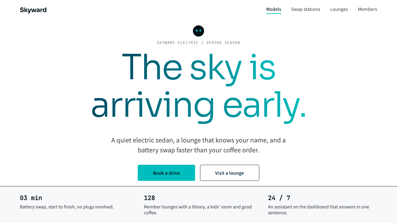 NIOQuiet premium with the sky in the headline. White pages, navy ink, one teal-t…
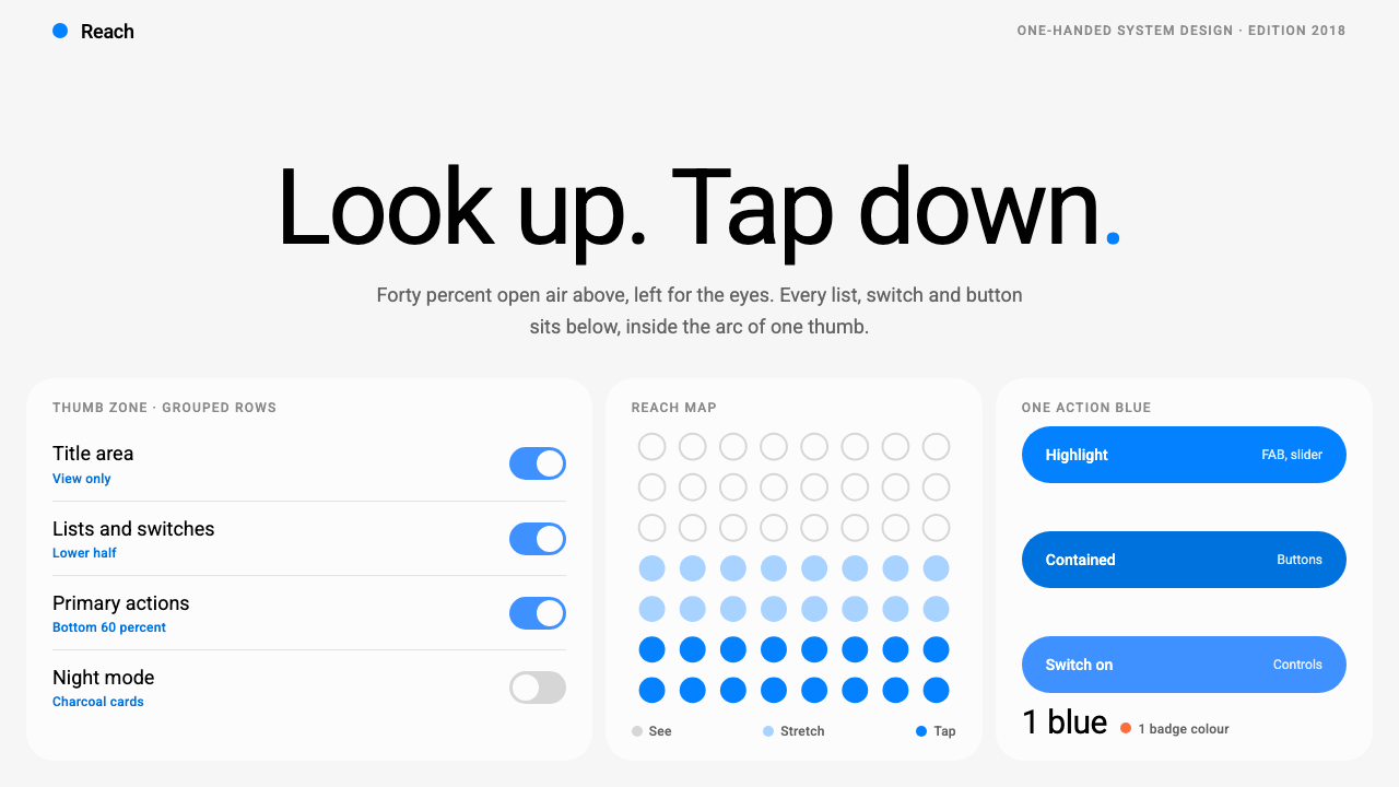 Samsung One UILook up, tap down. Giant Roboto title in open air, white 26px cards on grey,…
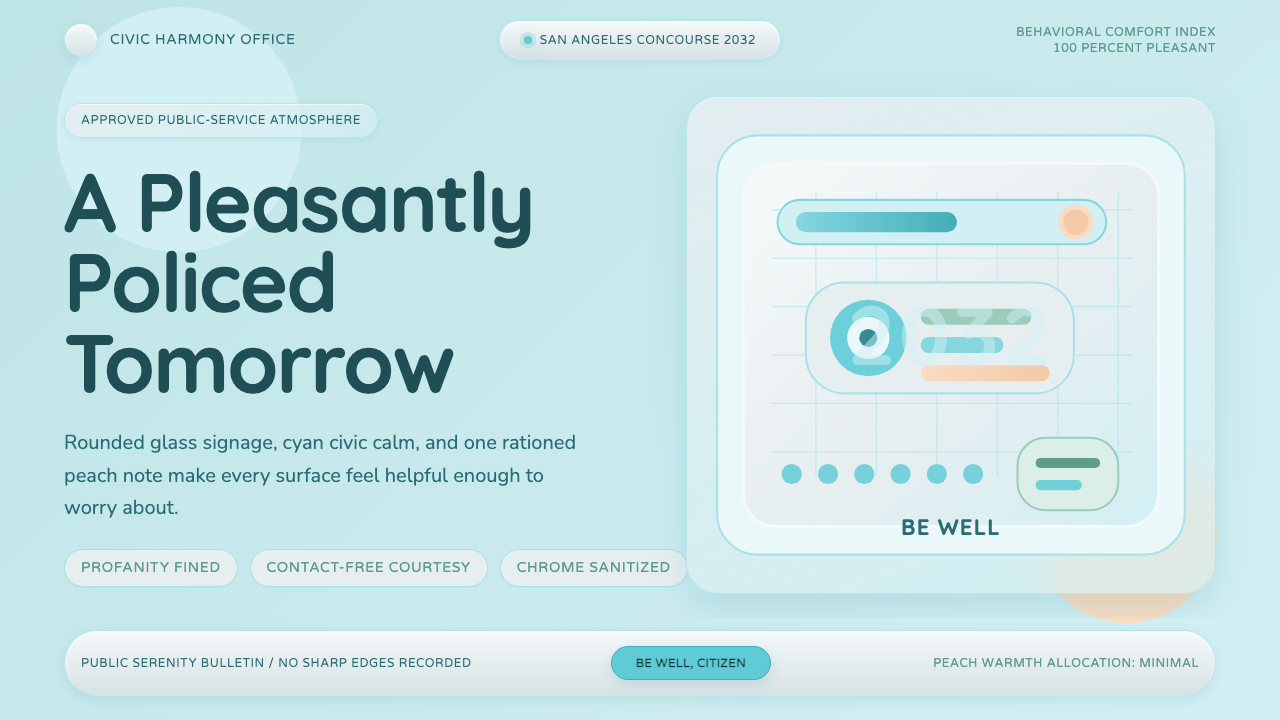 Demolition ManToo clean to trust. Pastel cyan glass, rounded civic signage, one peach warni…
 FeishuQuiet density, one blue. White panes split by 1px grey lines; blue marks only…
 Fukasawa Without ThoughtHand reaches before mind decides. Milky cool-gray plastic, rounded squares, o…
 HarmonyOSOne blue for everything you can touch. White 24px cards on cool grey, navy te…