About Pocari Sweat
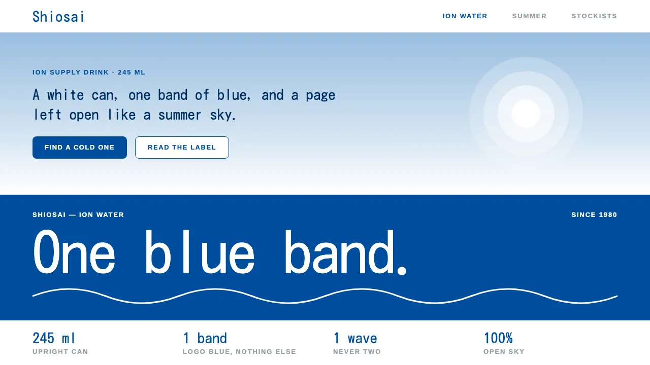
Pocari Sweat arrived in April 1980 as a 245 ml can from Otsuka Pharmaceutical: a white body, a deep blue band, a white wordmark and one white wave line running through it. Forty-odd years later the can still looks almost the same.
This system is built from that can and from the summer advertising around it. White pages, one confident band of logo blue, pale sky tints instead of shadows, and type that stays calm and open. Most of the page is left as sky.
- Origin
- Japan
- Era
- April 1980 can launch; blue-and-white scheme unchanged from 1980 to the 2020s
- Key figures
- Rokuro Harima · Otsuka Pharmaceutical
- Movements
- Japanese functional ion-supply drinks · Seishun summer advertising · Japanese pharmaceutical-clean packaging
Pocari Sweat design spec
Colors
Background
Surface
Primary
Secondary
Accent
Text
Typography
KosugiHeadings
ArimoBody
ui-monospaceMono
Unlock for 1 credit
The other 11 sections — buttons, cards, spacing, motion, techniques and more — open once you unlock. Download the DESIGN.md or send it to your AI in one click. Unlock once, yours forever.
Sign up nowHave an account? Sign in
Styles similar to Pocari Sweat
Also inspired by brands & products, with a close feel.
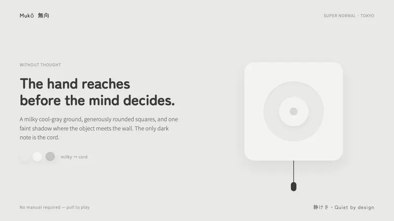 Fukasawa Without ThoughtHand reaches before mind decides. Milky cool-gray plastic, rounded squares, one faint wall shadow.
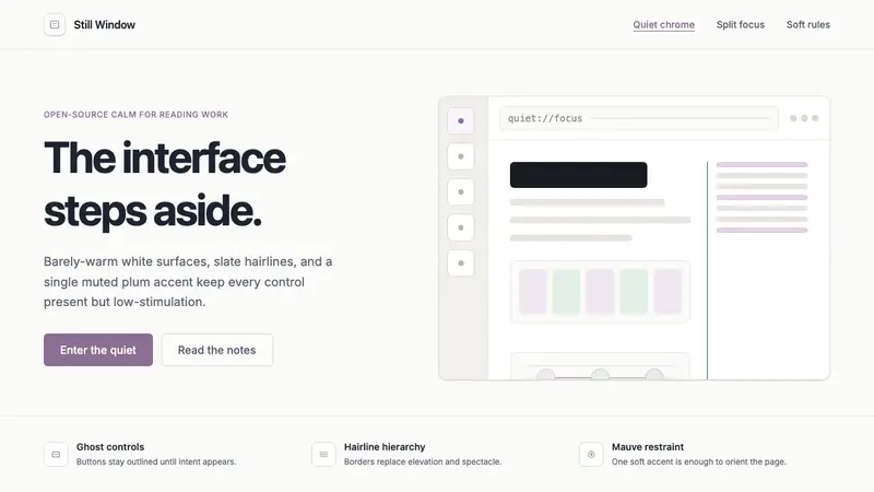 Zen BrowserSoftware steps aside. Warm white, slate hairlines, and muted plum carry the calm.
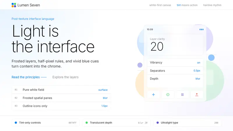 iOS 7 FlatThe day skeuomorphism died. Bright tints on white, hairline separators, frosted-glass layers.
 Kavak MarketplaceUsed cars, finally trustworthy. Kavak Purple on violet-tinted white, green certified pills, rounded sans.