What is PNG Highlands Bilas?
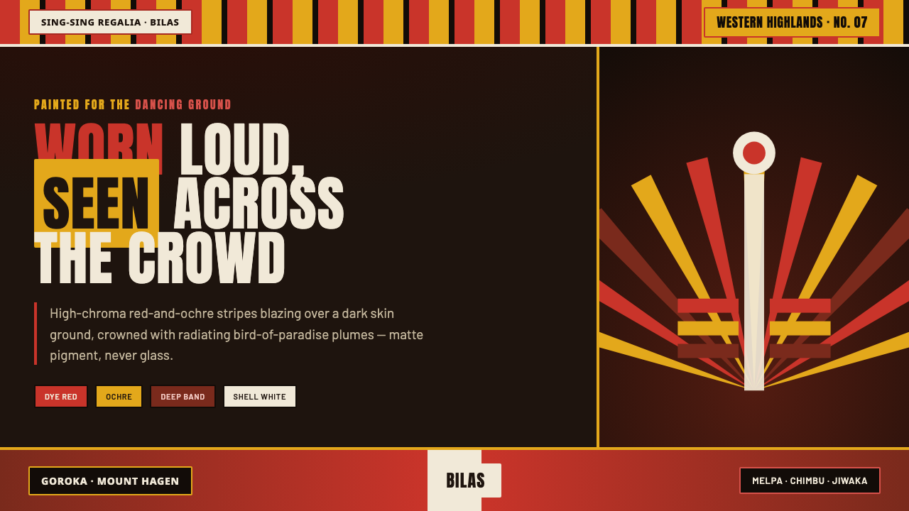
PNG Highlands bilas brings the visual force of sing-sing regalia to the screen: crimson and ochre stripes burning across a dark ground, held inside the upward spread of a feather crown.
PNG Highlands Bilas in brief
PNG Highlands bilas is the ceremonial body adornment and regalia associated with sing-sing gatherings among the Melpa, Chimbu, and Jiwaka peoples of Papua New Guinea’s Highlands. Its defining image is made for collective space rather than quiet inspection: faces marked with vivid red and yellow-ochre bands, black charcoal and crushed-seashell white, then crowned with iridescent bird-of-paradise plumes. It is an appearance designed to remain legible through movement, distance, music, and a crowd.
As a screen design language, bilas does not mean copying ceremonial dress into an interface. It translates the visual logic of that regalia: a dark skin-like field rather than a pale neutral canvas; broad saturated bands that read immediately; deliberate facial and body symmetry interrupted by stripes; and feather-like radial framing that turns a central subject into a public signal. The result should feel matte, charged, and ceremonial, never glossy, pastel, or softly atmospheric.
The style is strongest when it treats color and pattern as identity-bearing structure. Ochre and crimson do not behave as incidental accents scattered over a generic dark layout. They arrive as bands, marks, and focal fields against darkness. White is a sharp highlight, black is both ground and outline, and radiating forms concentrate attention around a title, portrait, emblem, or key action. The visual energy should resemble adornment assembled for visibility, not decoration added after a layout is complete.
Where does PNG Highlands Bilas come from?
The visual source for this style is the Highlands bilas worn at sing-sing gatherings in Papua New Guinea, particularly across Western Highlands, Chimbu, and Jiwaka. Documented sing-sing and festival traditions from 1950 to 1990, including the Goroka and Mount Hagen shows, made such collective displays visible to wider audiences. Within the source material, bilas is not presented as a single uniform costume but as a shared ceremonial vocabulary of paint, plume, contrast, and group presence.
For Melpa dancers, Chimbu clan groups, Jiwaka sing-sing performers, and other Western Highlands clan groups, the body is the immediate surface of display. Local dyes mixed with oil produce bright red and yellow marks; charcoal supplies black; crushed seashell provides white. These materials establish a compact but intense visual vocabulary whose effect depends on the relationship between painted face, dark ground, and feathered crown.
Bird-of-paradise plumes provide the vertical and radiating silhouette that distinguishes the regalia from paint alone. Their iridescence adds a living visual dimension, but the screen translation should not attempt to imitate every feather literally. The important principle is the fan: repeated directional elements extending outward from a central head, emblem, or message, making the center appear ceremonially framed and visually larger than its physical bounds.
The contemporary design system therefore draws from documented public regalia and its conditions of viewing. It does not claim to reproduce a particular clan’s exact arrangement, ritual meaning, or ceremonial role. Its responsible use lies in retaining the specificity of Highlands sing-sing paint and plume vocabulary while avoiding invented symbolism, generic tribal fantasy, or indiscriminate mixing with unrelated Indigenous visual traditions.
What defines the PNG Highlands Bilas look?
Dark Skin Ground
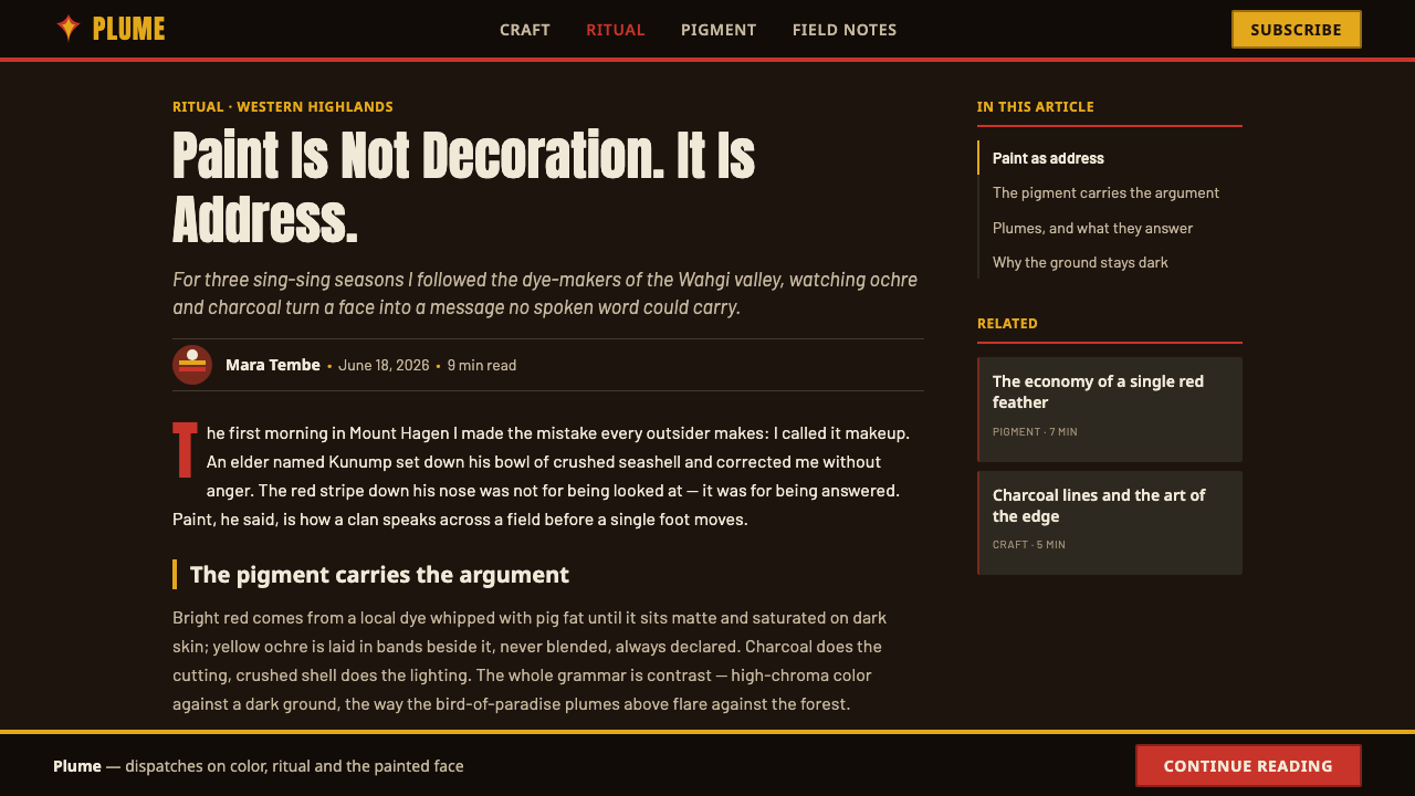
The ground is decisively dark: closer to charcoal, deep earth, and the visual depth of a painted face than to a conventional black interface backdrop. It is not empty negative space. It is the surface on which paint becomes visible. Keep large areas quiet and matte so the warm bands and white details appear applied, marked, and physically present.
Crimson and Ochre Bands
Red and ochre should appear as broad, purposeful bands rather than tiny decorative highlights. Their power comes from contrast with the dark ground and from the directness of their placement. Use them to cross a portrait, separate editorial zones, lead the eye toward a title, or distinguish a key choice. Let one warm hue lead and the other answer it; uncontrolled alternation weakens the ceremonial force.
Painted Mark-Making
Marks should feel painted, pressed, or laid across a surface, but not rendered as wet digital brushwork. Favor clear stripes, confident edges, and slight irregularity only where it supports a human-applied feeling. The style does not call for watercolor haze, metallic shine, or artificial texture. Its material character is matte pigment meeting skin, contrast, and movement.
Radiating Feather Fans
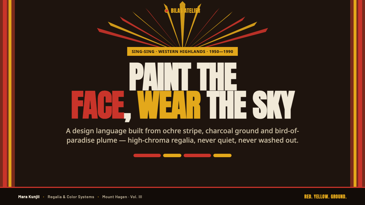
Feather regalia becomes a framing system. Repeated tapered or line-like forms can radiate behind a central circle, portrait, wordmark, or product image, directing attention outward and upward. The fan should read as a crown or halo of motion, not as a generic sunburst. Keep its rhythm disciplined so that the center remains sovereign and the surrounding spread amplifies rather than competes with it.
Face-Led Focality
Because the source vocabulary begins with face paint and head adornment, composition benefits from a clear central focal field. A portrait, emblem, title, or primary data point can occupy that role. Surround it with bands and radial structure instead of burying it under many equal cards. The hierarchy should feel like a decorated presence entering the dancing ground: immediately located, then gradually understood.
Ceremonial Contrast
The palette is compact but high in contrast: dark ground, hot warm color, charcoal black, and incisive white. White should function as paint, glint, or separation rather than a default page field. This restraint makes each bright passage feel intentional. If every component is vivid, the system loses the distance-readability that makes bilas powerful in a crowded visual field.
Who shaped PNG Highlands Bilas?
Melpa dancers are named in the source material as bearers of Highlands bilas. Their appearance anchors the style in sing-sing performance rather than in an abstract pattern library: paint, plume, body, and public movement operate together as regalia.
Chimbu clan groups locate the visual vocabulary within the Highlands’ collective ceremonial context. Their inclusion is a reminder that the screen style draws from group display and adornment, not from a single anonymous decorative motif detached from people and place.
Jiwaka sing-sing performers represent the performative condition behind the imagery. Their regalia is meant to read amid music, gathering, and movement, which explains why strong bands, sharp contrast, and head-centered framing are more faithful translations than subtle ornamental detail.
Western Highlands clan groups broaden the source beyond any one performer. They point to bilas as a regional body-adornment and plume-regalia vocabulary associated with communal presentation, and they set an important boundary: designers should name the Highlands source rather than flatten it into a universal exotic style.
How do you use PNG Highlands Bilas today?
For presentation covers, use a dark field with one central title, emblem, or portrait and let a crimson or ochre band establish the main directional gesture. A controlled feather-fan arrangement can rise behind the focal element, giving the cover the silhouette of a ceremonial crown. On content slides, reduce that gesture: retain the dark ground and one warm identifying band, but give writing enough unmarked space to remain easy to read. The cover announces presence; the content page carries information.
Data slides work when the visual system treats emphasis as a ceremonial hierarchy. Place the primary figure, comparison, or conclusion in the strongest central position, reserve warm color for the values that matter most, and use white marks sparingly for labels and separators. Charts should be simple and broad enough to read from a distance. Avoid filling every segment with competing bright hues; the eye needs a dark field against which the important marks can declare themselves.
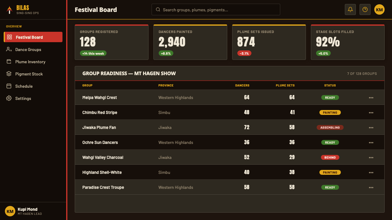
For web interfaces, bilas is best suited to editorial landing pages, cultural-program pages, dashboards with a strong central metric, and pricing or membership pages that need an emphatic sense of entry. Use dark panels as the persistent surface, warm bands to identify sections or active choices, and radial motifs only at high-value moments such as a hero, account state, milestone, or featured offering. Utility controls should stay restrained and legible rather than becoming miniature ceremonial illustrations.
In editorial and marketing work, the style can give a campaign, event guide, feature article, or poster-like page a memorable public presence. Lead with a large image or title field, use bands to create chapter changes, and allow a feather-fan motif to frame only the principal story or call to action. Pair the visual language with direct, respectful copy that identifies the Papua New Guinea Highlands source. Do not use generic language that turns living cultural regalia into a vague mood.
The common mistake is reducing bilas to dark background plus random red, yellow, and feather icons. That removes the source logic of face paint, plume silhouette, group visibility, and concentrated focality. Another mistake is rendering it as luxurious fantasy with gloss, gold-like shine, dense texture, or ornamental excess. Keep the system matte, high-contrast, and selective; name the cultural source; and avoid implying that a screen treatment reproduces the ceremonial meaning of the original regalia.
PNG Highlands Bilas — FAQ
Is PNG Highlands bilas a generic tribal design style?
No. This design language draws specifically from documented sing-sing regalia and body adornment associated with Melpa, Chimbu, Jiwaka, and Western Highlands clan groups in Papua New Guinea. The word bilas refers to adornment and regalia in this context. It should be named with that regional and cultural specificity, not used as a catch-all label for unrelated Indigenous aesthetics.
Why must the background remain dark?
The dark ground is central to the source vocabulary described here: saturated ochre and crimson bands are painted over a dark skin-and-face ground, with black and white contributing contrast. Moving the system onto a pale default surface changes the relationship that makes the marks powerful. A dark field lets the warm paint-like bands appear applied and visible, rather than merely colorful.
Can the style use bird-of-paradise imagery directly?
It can refer to the radiating plume silhouette, since iridescent bird-of-paradise plumes are part of the supplied regalia description. But direct illustration should be used with restraint. A repeated fan or crown structure usually communicates the design principle more effectively than filling a page with literal bird imagery. The focus is the role of plumes in framing and visibility, not wildlife decoration.
What makes a respectful contemporary application?
A respectful application identifies PNG Highlands bilas and sing-sing as its source, keeps the visual translation focused on documented paint, dark ground, and plume-regalia relationships, and does not invent ritual claims or clan-specific meanings. It also avoids flattening the work into a generic exotic theme. The goal is not to stand in for ceremonial regalia, but to acknowledge a specific visual vocabulary while building a distinct contemporary composition.
Related design styles
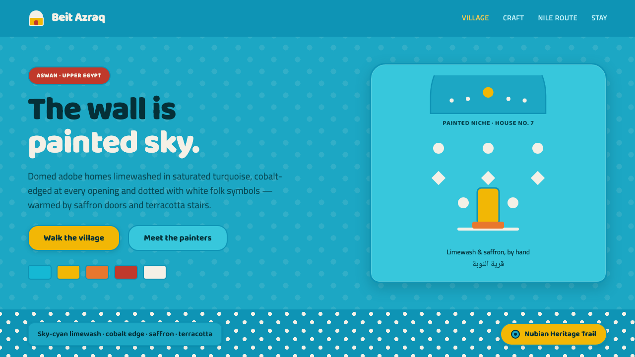 Nubian House BlueThe wall is the page. Sky-cyan limewash, cobalt-edged niches, white folk dots…
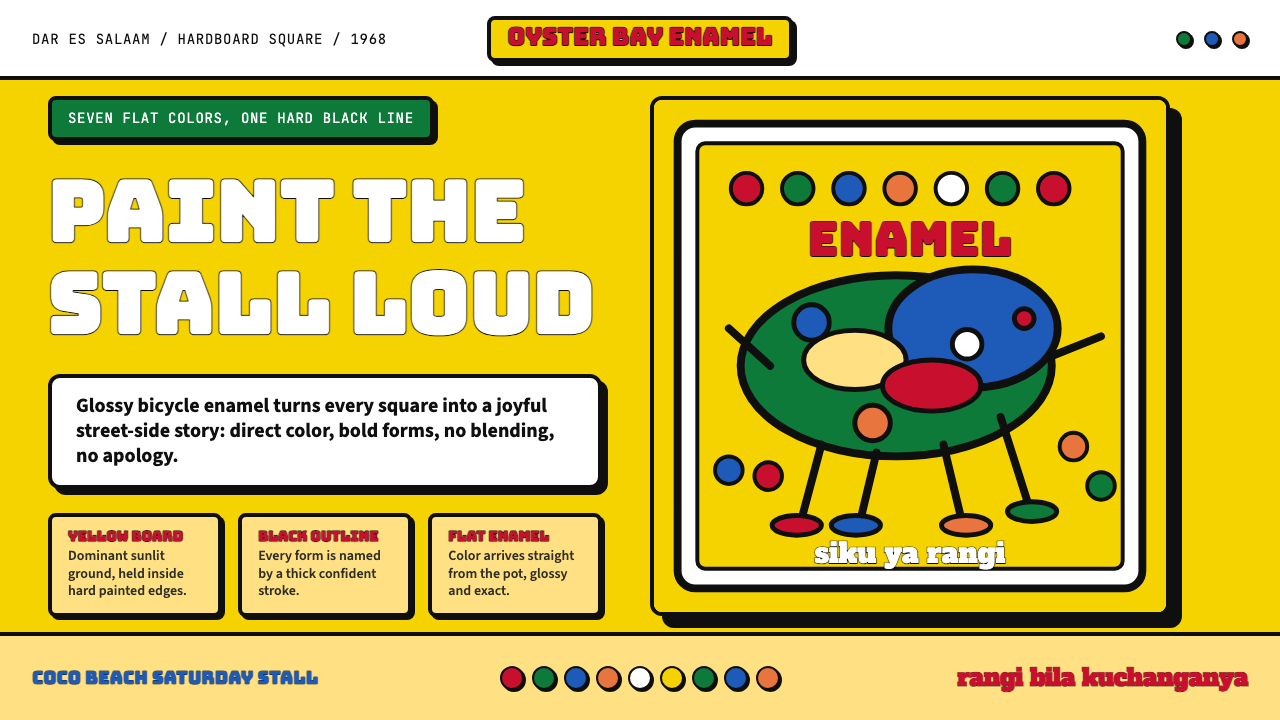 Tingatinga PaintingJoy refuses blending. Enamel yellow, Bungee strokes, and black-outlined flat…
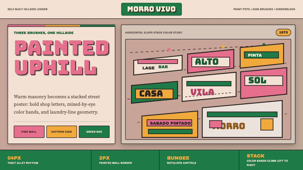 Brazilian Favela Rocinha 1970sHand-built warmth. Pink, saffron and green stripes climb cinderblock in rotul…
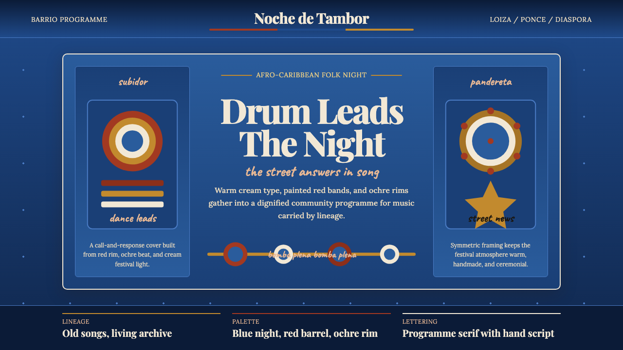 Puerto Rican Bomba & PlenaNight festival dignity. Drum-red stripes and cream Playfair type on deep trop…
 Uruguayan Candombe LlamadasCandombe after dark. Indigo ground, ochre drum circles, crimson banner type.
 1970s Earth TonesWarm maximalism stays muddy. Bulbous slabs, avocado bands, and harvest-gold r…