What is Playtime?
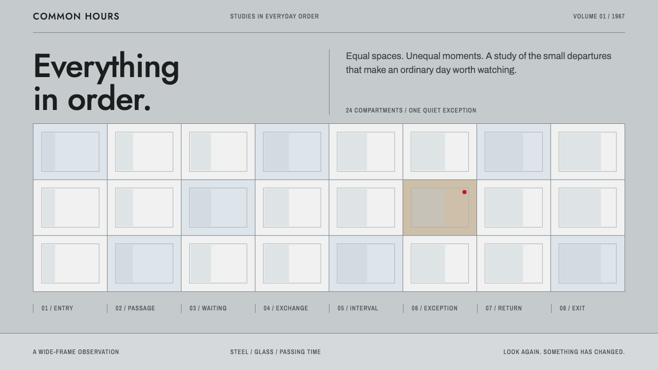
The Playtime style is a glass-and-steel city turned into a grid: pale steel greys, equal cells, geometric type, and a single red light allowed to break the order.
Playtime in brief
The Playtime style takes its look from Tativille, the glass-and-steel city that Jacques Tati built on the edge of Paris for his 1967 film Playtime. Although the film was shot in colour, it reads almost as black and white. The ground is pale steel grey, partitions are a slightly darker steel, reflections lean toward a cool steely blue, and people and text are black. The style makes that restrained, near-monochrome palette the basis of an interface.
Its layout logic is the cubicle maze seen from above. Cells are equal in size, gaps are equal in width, and content is spread across a wide field without a central hero. Only one cell at a time is allowed to stand out. Red is saved for something as small as an intercom light, and green is kept for one special status. The reader has to explore the page, like a visitor wandering through an office building.
The style is both funny and austere. It looks like a rigorous modernist system, yet it exists to point at the human exceptions inside it. The grid is the straight man and the single red object is the joke. That is the same relationship Tati's film has with modern architecture: admiration for its order, and affectionate attention to the people who do not quite fit.

Where does Playtime come from?
Playtime was made between 1964 and 1967, and the whole of Tativille was built and shot over three years, with the film released in December 1967. Jacques Tati, already beloved for his character Monsieur Hulot, spent enormous resources building a modern city set on the outskirts of Paris, with glass towers, steel frames, lobbies and offices. The scale was so large that it effectively became a studio-built metropolis. Its ambition was to show a modernised Paris in which a bewildered visitor could drift, and where the most important performances would be those of architecture and furniture.
The look draws on the International Style, the glass-and-steel modernism that dominated post-war office architecture. Its characteristics are plain: curtain walls, repeated modules, uniform partitions and a refusal of ornament. Tati was amused and a little alarmed by how much it flattened human experience, so the film is full of rows of identical windows, identical desks and identical doors in which small human disruptions stand out. Eugène Roman and Jean Badal are the key names connected with its architectural and set design, and their work gave the city its hard, repetitive geometry.
Playtime is also a landmark of wide-frame cinema, shot on large-format 70 mm film. That format let Tati fill the screen with simultaneous action, so that a viewer's eye decides what to follow. There is no single protagonist and the gags often happen deep in the background. The design system inherits that approach: content is distributed across a wide plane, and meaning arises from the reader's choice of where to look rather than from a forced centre of attention.
The film's publicity also had a strong graphic character, and René Ferracci is a key name associated with its posters. Their clean, geometric, type-led approach matches the system's emphasis on straight lines and simple lettering. Put together, the style stands at the junction of post-war French film comedy, International Style modernism and wide-frame cinema, and it turns a famous critique of the modern city into a layout method.
What defines the Playtime look?
Steel-grey ground
The page ground is a pale steel grey, the colour of glass and polished floors in Tativille. It is cooler and flatter than paper white, and it makes everything feel measured and administrative. Panels and partitions step darker by small degrees so that depth is suggested through tone, not shadow.
Steely blue reflections
A cool steely blue stands in for reflections on glass. It appears in secondary surfaces, hover states, subtle highlights and chart fills. Because it stays within the cool family of the grey, it adds variation without breaking the near-monochrome mood.
Black for text and silhouettes
Type, icons and figures are rendered in plain black. Silhouettes of people or objects against the grey field echo the film's tiny figures walking across vast interiors. The strong contrast makes text crisp and gives the page a graphic, poster-like clarity.
Equal cells
The layout is a grid of equal modules with equal gutters, like office cubicles from above. No cell is larger than another unless the content strictly requires it. This democratic structure makes the page calm and legible, and it is the reason a single highlighted cell is so striking.
One red light
Red is saved for a single object, as small as an intercom indicator. It signals the one thing the reader should notice or the one place something is wrong. Used once per view, it is a punchline; used often, the joke is lost and the page turns into a warning panel.
Geometric type
Lettering is geometric and sans-serif, built from circles and straight strokes, in the manner of mid-century signage and corporate wayfinding. It reads as neutral and slightly bureaucratic, which is the right voice for a city in which everything is labelled and nothing quite works as planned.
No hero, wide field
Content is scattered across a wide field, as action is scattered across the film's wide frame. Rather than a single large hero banner, the page offers many small, equal moments, and the reader finds the story by moving through them. This suits pages that reward browsing and discovery.

Who shaped Playtime?
Director, writer and star of Playtime, and the creator of Tativille. His comic study of a modernised Paris is the conceptual source of the whole style.
A key name in the film's architectural and set design. His work helped define the city's hard, repetitive geometry, which the style translates into equal cells and straight lines.
Another key name connected with the sets of Tativille. Together with Roman, he is part of the reason the city reads as a convincing but slightly absurd modern world.
A key name associated with the film's graphic identity and posters. His clean, geometric, type-led approach matches the system's straight lines and plain lettering.
How do you use Playtime today?
In slides, the Playtime style is excellent for decks about systems, operations, architecture, workplace design and data. A cover can be a pale grey field divided into equal cells, with the title in one cell and nothing else competing. Content slides should use one cell as the focus and leave the others quiet. Data slides are its strongest territory: a grid of equal tiles each holding one metric, with red reserved for the one number that needs attention. The page reads like a control room, and an audience quickly learns where to look.
In web interfaces, the style suits dashboards, admin tools, internal portals, documentation sites and architecture or design practices. A modular card grid is the natural component, with equal tiles, equal gutters and thin steel dividers. Navigation can be a compact grey bar in black geometric type. Pricing pages work well as three or four equal columns with one highlighted. Because red is rationed, error states and critical alerts keep their urgency, which is a practical advantage over interfaces that use red everywhere.
In editorial and marketing work, it fits reports, annual reviews, architecture features, posters for modernist exhibitions and brand identities for technology or engineering firms that want to look orderly and a little witty. A poster can set a grid of identical windows with one lit in red. The style rewards a dry sense of humour, so copy should be plain, precise and occasionally deadpan. It can also support photography of interiors and cityscapes, which share its geometry.
The most common mistake is to treat it as simply grey and boring. Without the single exception, the grid is only a grid, and the style loses its reason to exist. Another mistake is spreading red or green across many elements, which destroys the punchline. A third is breaking the cell structure with arbitrary sizes and uneven gutters, which removes the order the exception depends on. Finally, avoid soft shadows and rounded decoration, which belong to a different, friendlier era than the steel-and-glass world this style describes.

Playtime — FAQ
What is the Playtime design style?
It is a design language drawn from Jacques Tati's 1967 film Playtime and its glass-and-steel set, Tativille. It uses pale steel greys, steely blue reflections, black type, equal grid cells and geometric lettering, with a single red accent allowed to break the order.
Why does the film look almost black and white?
The film was shot in colour, but its set is built from glass, steel and grey surfaces, with black for figures and text. The few colours that appear are rationed, so the overall impression is close to monochrome. The style reproduces that restraint.
Which projects suit the Playtime style?
Dashboards, admin tools, documentation, architecture and design studios, annual reports, data-heavy presentations and brands for technology or engineering firms. Anything that benefits from an ordered grid and a single, well-placed exception fits it.
How should red be used?
Once per view, on one small object, such as a status light, one number or one critical alert. If red appears on many elements, the exception stops being exceptional and the style loses its punchline.
Does the style work for pages that need a strong hero?
Not naturally. It deliberately has no hero and spreads content across a wide field. If you need a focal point, give one cell a different tone or a single red mark rather than enlarging it, so the grid remains intact and the page still feels like Tativille.
Related design styles
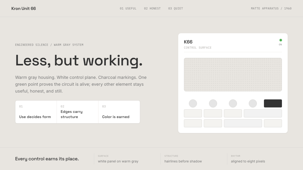 Dieter Rams / BraunQuiet by design. Warm gray, white panels, hairline grids, and one earned gree…
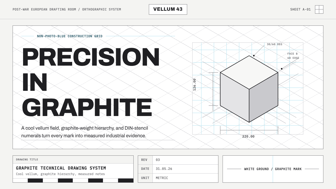 Graphite Technical DrawingDrafting-room precision. Non-photo-blue grid and graphite DIN lettering do th…
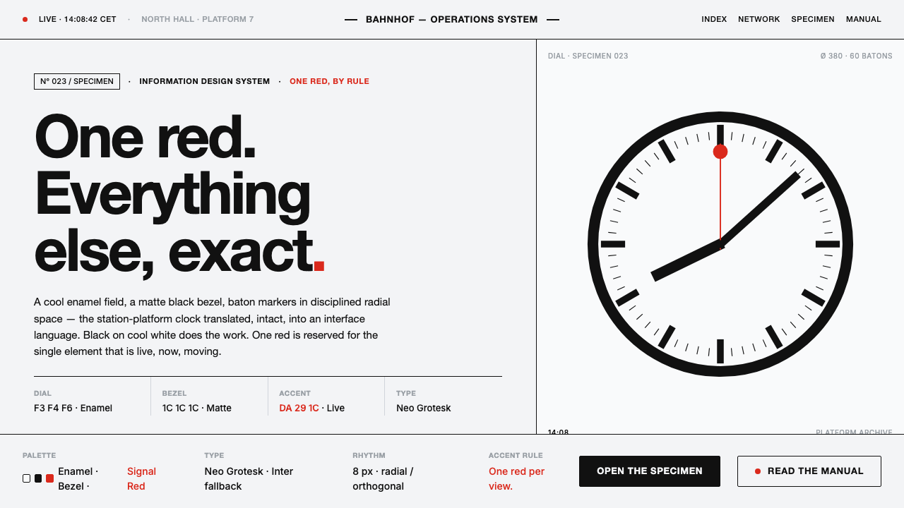 Hilfiker Railway ClockEverything exact, one thing live. Black hands on cool enamel white — one red…
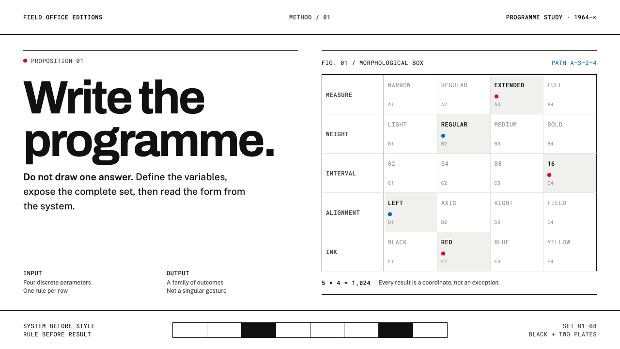 Karl Gerstner ProgrammesDesign becomes a programme. Black hairlines and a strict matrix turn paramete…
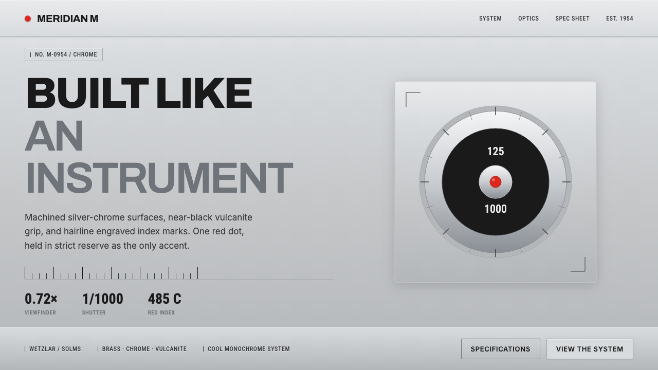 Leica M Silver ChromeBuilt like an instrument. Brushed silver-chrome on near-black vulcanite, one…
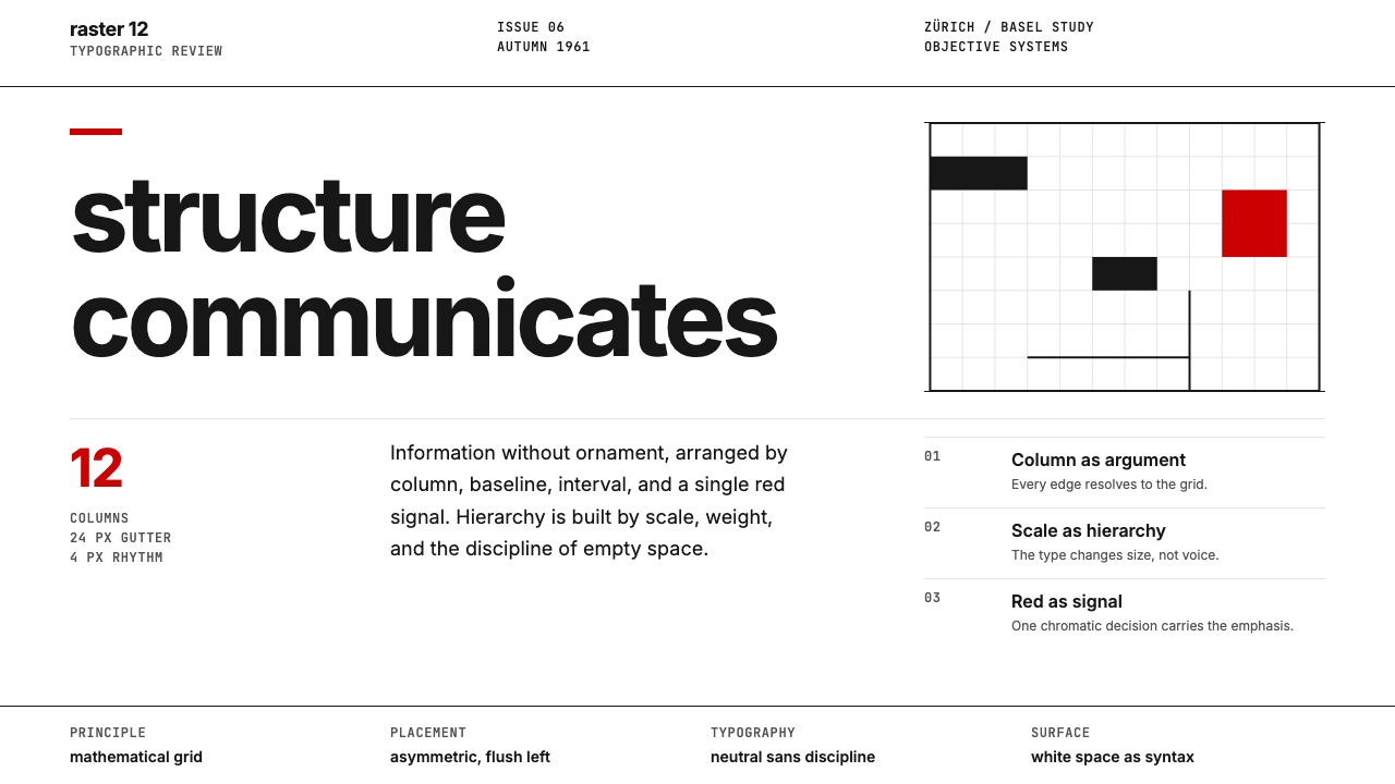 Swiss International StyleObjectivity made visible. Inter scale, white space, and one red block expose…