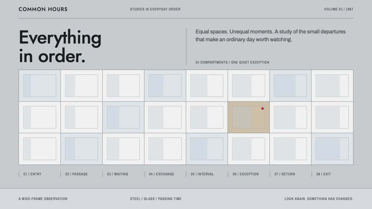
About Playtime
Playtime takes its look from Tativille, the glass-and-steel city Jacques Tati built on the edge of Paris for his 1967 film. It is a colour system that reads almost black and white. Pale steel grey sets the ground, steel partitions frame the grid, steely blue stands in for reflections, and black is used for text and silhouettes.
Everything sits in equal cells, like the cubicle maze seen from above. One cell at a time is allowed to stand out, and red is saved for a single object on the page.
- Origin
- Paris, France
- Era
- 1964–1967 (Tativille built and shot over three years; released December 1967)
- Key figures
- Jacques Tati · Eugène Roman · Jean Badal · René Ferracci
- Movements
- International Style glass-and-steel modernism · Post-war French film comedy · 70 mm wide-frame cinema
Playtime design spec
Colors
Background
Surface
Primary
Secondary
Accent
Text
Typography
JostHeadings
ArchivoBody
Archivo NarrowMono
Unlock for 1 credit
The other 11 sections — buttons, cards, spacing, motion, techniques and more — open once you unlock. Download the DESIGN.md or send it to your AI in one click. Unlock once, yours forever.
Sign up nowHave an account? Sign in
Styles similar to Playtime
Also inspired by film, games & music, with a close feel.
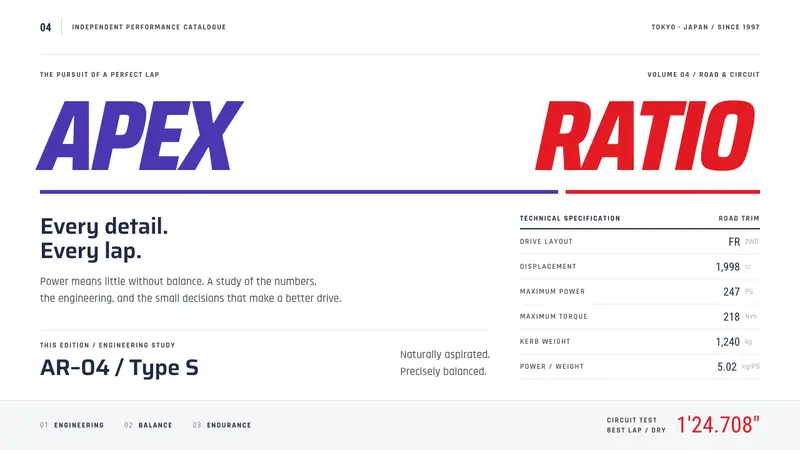 Gran TurismoPrecision without noise. Slanted violet-red type and hairline spec rows on showroom white.
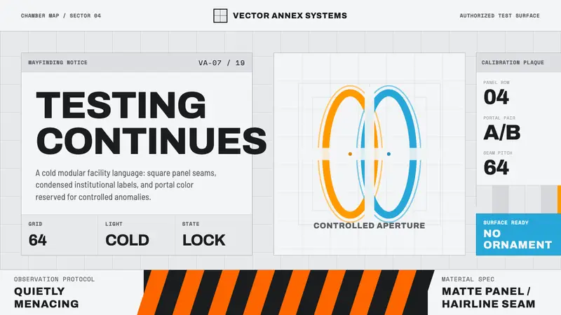 Aperture ScienceSterile authority. Cool panel seams, Archivo signage, and sparse orange-blue rings.
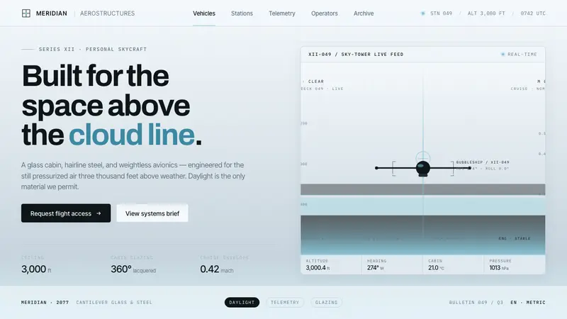 Oblivion Sky TowerSterile daylight futurism. Cool sky-grey glass, hairline steel mullions, a single cloud-cyan glow.
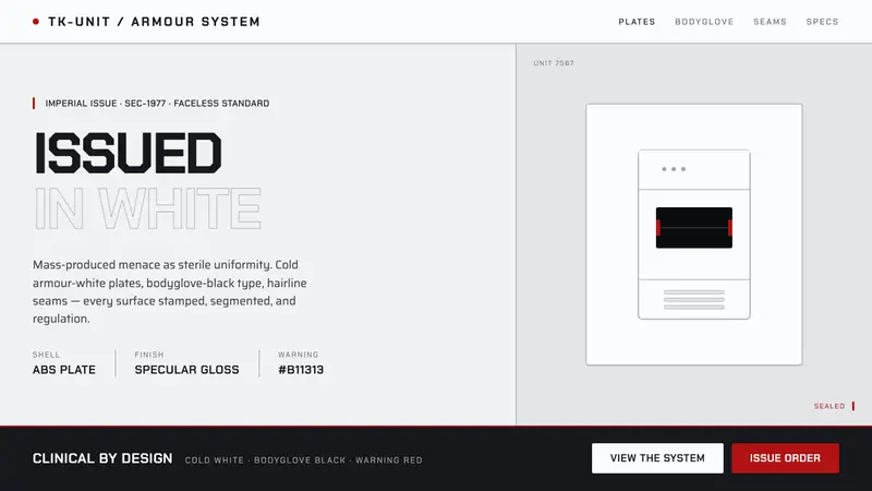 Stormtrooper Imperial WhiteMass-produced menace, sterile. Cold armour-white plates, bodyglove-black stencil, lone warning-red.