What is Banig Pandan Mat?
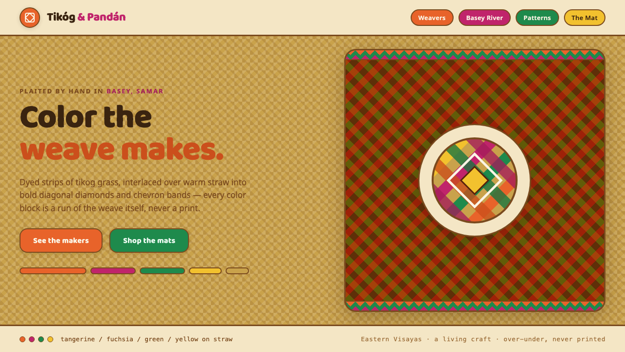
Banig Pandan Mat brings the bright, rhythmic logic of Filipino handweaving to the screen: dyed strips, straw warmth, and diagonal diamonds that seem made to move.
Banig Pandan Mat in brief
A banig is a Filipino sleeping mat traditionally plaited from dried tikog grass, with pandan and buri used in other areas. It is a practical domestic object, but its surface can be extraordinarily expressive: narrow plant strips are dyed in vivid colors and interlaced closely over a natural straw-toned ground. The result is neither printed decoration nor applied pattern. Its geometry is produced by construction itself.
The Banig Pandan Mat design language takes that material fact seriously. It begins with a buff, straw-like field rather than a neutral white stage, then builds visual energy through tangerine, fuchsia, and green bands. Diagonal diamonds give the composition its momentum, while visible over-under crossings prevent the pattern from becoming a flat wallpaper. The feeling should be cheerful, tactile, and made by hands, even in a digital setting.
This is a folk-craft aesthetic with strong graphic discipline. Saturated strips create contrast, but the natural ground keeps the composition grounded and legible. Rounded geometric type belongs naturally beside the weave because it carries the same friendly, accessible character. The style is bold without being severe: its repetition is structured, yet its color and apparent material variation make it feel alive.
Where does Banig Pandan Mat come from?
Banig belongs to a living Filipino mat-making tradition rather than to a closed historical style. The source material places this tradition in the period from 1950 to 1990 while identifying it as continuing craft practice. Its central object is simple and intimate: a sleeping mat made from plant material, designed to be used close to the body and close to the floor.
Basey in Samar, within Eastern Visayas, is especially associated with the craft, and the women weavers of Basey and Samar are its named makers. Their work turns dried tikog grass into tightly controlled surface rhythm. The natural color of the grass remains present as the visual ground, while dyed strips bring the high-energy contrast that makes a finished banig immediately distinctive.
Sohoton tikog harvesting communities are part of the material story. The style cannot be separated from the grass that makes it possible: harvesting, drying, dyeing, and plaiting are not background details but the sequence through which color, texture, and geometry enter the object. The diagonal pattern is therefore best understood as an outcome of repeated handwork, not as an abstract graphic motif imposed afterward.
The tradition also extends beyond one material and one locality. Pandan and buri are used elsewhere, and Sulu is named alongside Basey and Samar as a region connected to the craft. A contemporary Banig Pandan Mat interpretation should preserve that breadth without pretending to be a museum reconstruction. Its job is to translate the craft's straw ground, dyed-strip contrast, interlaced construction, and generous folk character into a coherent digital system.
What defines the Banig Pandan Mat look?
Straw Ground
The background is always a real straw-like buff tan, not cream, pure white, or an anonymous neutral. It gives the bright strips somewhere material to belong. Large empty areas should still feel like exposed woven ground, so the interface retains the warmth of dried grass even when no overt pattern is present.
Dyed Strip Color
Tangerine, fuchsia, and green are used as strong dyed bands rather than as atmospheric washes. Their saturation should feel deliberate and direct, like color absorbed by narrow plant strips. Let one hue lead a composition while the others answer it in shorter runs, intersections, labels, or directional accents.
Diagonal Diamonds
The defining geometry is the diagonal diamond. It creates a visual current across the surface and distinguishes the system from ordinary checkerboards or rigid orthogonal grids. Diamonds can expand into large feature fields or tighten into small borders, but their diagonal direction should continue to imply plaiting rather than generic decoration.
Over-Under Interlace
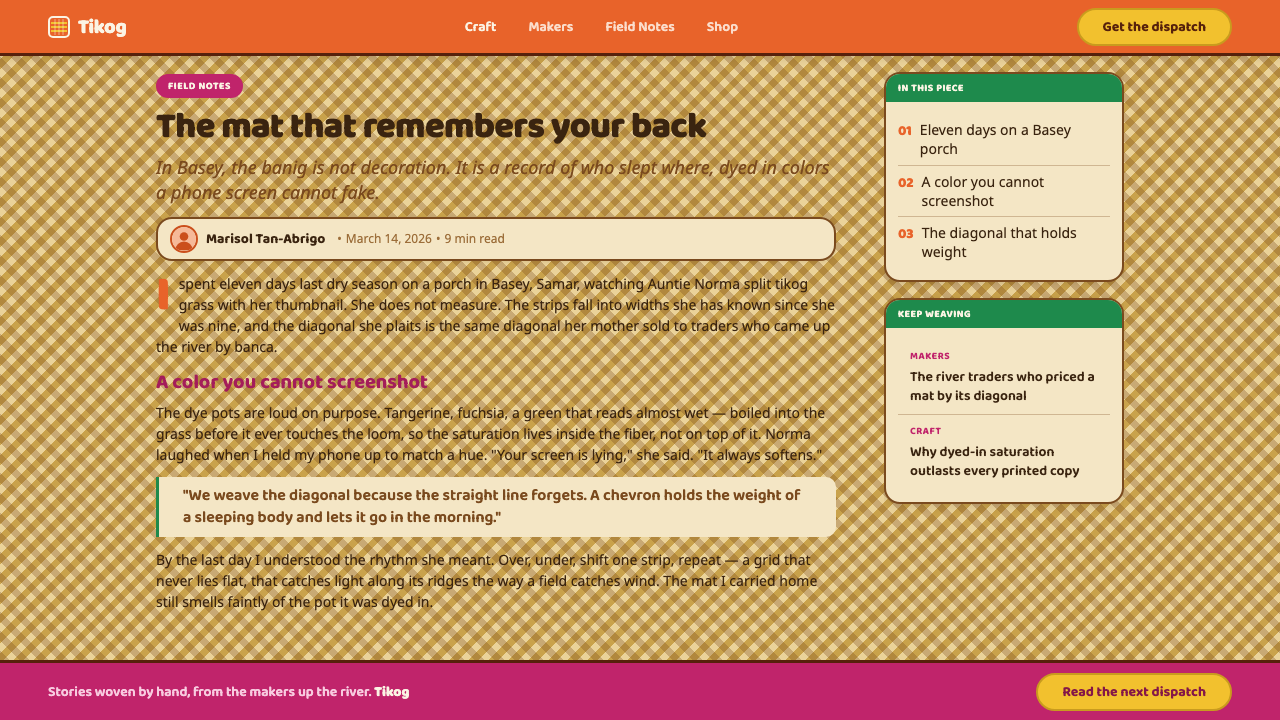
A convincing application shows strips taking turns above and below one another. The crossing is structural: a band briefly yields, then returns. Small shifts in overlap, interruption, and edge visibility create the impression of plaited material. Avoid perfectly uniform crossings, which make the pattern look mechanically printed instead of woven.
Friendly Geometry
Type and interface forms should be rounded, open, and generous. Geometric construction is welcome, but it should never become severe or industrial. Rounded letters, soft corners, and simple shapes support the folk-craft register, making the bright weave feel approachable rather than ornamental or overly formal.
Rhythm Before Ornament
The style works through repetition with variation. A sequence of strips, diamonds, and crossings should guide reading or organize content, not merely fill unused space. Pattern is most successful when it marks a section, frames an image, signals movement, or gives a data grouping a shared identity.
Who shaped Banig Pandan Mat?
The women weavers of Basey and Samar are the central named makers in this tradition. Their significance lies in the sustained, skilled transformation of dried tikog grass into mats whose color and geometry emerge through close interlacing. Any digital adaptation should acknowledge that the apparent pattern is rooted in labor, material knowledge, and repeated hand decisions.
The Sohoton tikog harvesting communities represent the beginning of the banig material chain. Their presence emphasizes that the straw-toned ground is not a styling convenience but a record of plant material. It is this natural base that lets dyed bands read as woven strips rather than detached graphic color.
Pandan and buri are identified as materials used elsewhere in Filipino mat-making. Their inclusion broadens the tradition beyond tikog alone and supports the name Banig Pandan Mat as a material-minded visual reference. The system should therefore celebrate plaiting as its core idea, while keeping its connection to Filipino plant-fiber craft visible.
How do you use Banig Pandan Mat today?
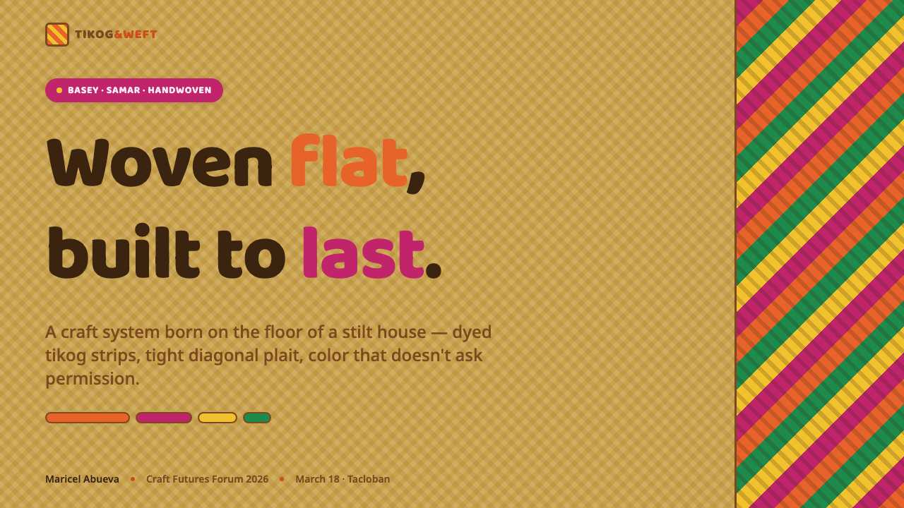
For presentation covers, use the straw ground as the full field and let a bold diagonal weave occupy one edge or corner. Place the title in rounded geometric type with ample open space around it, so the pattern feels like an active textile rather than a competing background. Content slides should simplify the weave into section markers, short bands, or small corner crossings that establish rhythm without interrupting reading.
Data slides can use the palette as a grouping device rather than a decorative flourish. Assign a dyed-strip color to a category and repeat it consistently through labels, chart elements, and small woven separators. A restrained diagonal grid can frame a summary or an annotation area, but the data itself must remain clearer than the textile reference. The natural straw field is especially useful for keeping bright data marks readable.
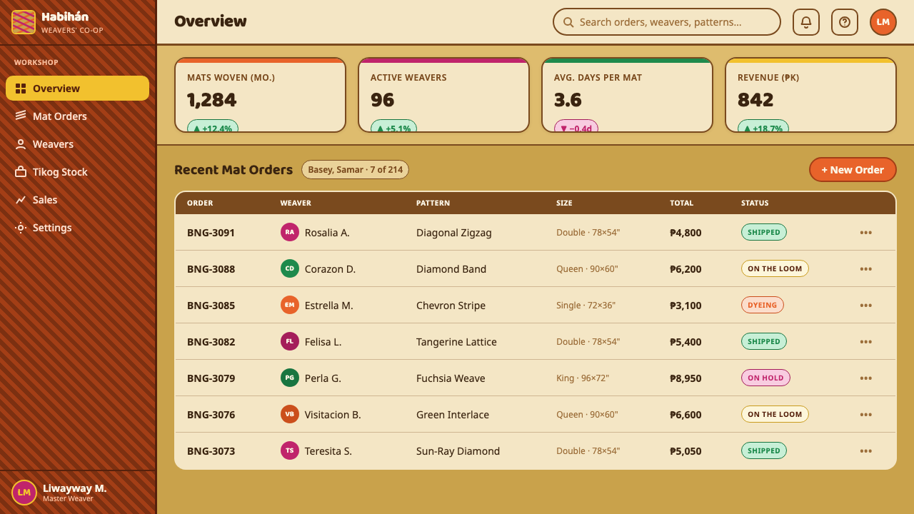
For web interfaces, this style is well suited to dashboards, planning tools, community spaces, and pricing pages that benefit from optimism and strong content grouping. Use the straw-toned background throughout, with rounded containers and concise color bands for navigation, alerts, tiers, or progress. A woven motif can distinguish major panels or states, but controls and body copy should remain calm enough for sustained use.
Editorial and marketing layouts can lean into the style's expressive side. Feature headers may open with a broad diagonal diamond field, while articles use small woven markers for pull quotes, captions, metadata, and section transitions. Campaign pages benefit from the contrast between the quiet natural ground and concentrated bursts of dyed color. Photography or illustration should be given clear space so the weave frames content rather than competes with it.
The common mistake is to treat banig as a generic tropical pattern and scatter every bright hue across a white page. That loses the craft logic immediately. Keep the straw ground visible, make crossings intelligible, and use color as interlaced strip material with a purpose. Another mistake is excessive uniformity: when every diamond and crossing is identical, the result becomes synthetic surface decoration instead of a lively interpretation of handwoven rhythm.
Banig Pandan Mat — FAQ
Is Banig Pandan Mat simply a tropical color palette?
No. Its color is inseparable from plaited construction. Tangerine, fuchsia, and green should read as dyed strips crossing a natural straw base, not as unrelated accents placed on a neutral interface. The diagonal diamond and the visible over-under relationship are what give the palette its specific craft identity.
Why should the background avoid white?
The natural buff-tan ground is a defining part of the reference. It recalls dried grass and gives high-chroma strips material contrast. White makes the bright colors feel detached and pushes the system toward generic digital decoration; the straw ground makes the same colors feel embedded in a woven object.
Can the weave be used as a full-page background?
It can, especially on a cover or promotional feature, but it needs a clear hierarchy. Reserve a quieter area of straw ground for the primary message, or enlarge the diamonds enough that text has stable resting space. For dense content, use the weave at section edges, in headers, or as a contained panel rather than behind every line.
How should typography relate to the pattern?
Choose rounded, friendly geometric letterforms and let spacing do much of the organizing work. Typography should offer a calm counterpoint to the active diagonal weave: direct headings, readable body text, and short labels work better than ornate display treatment. The goal is kinship with the craft's cheerful geometry, not imitation of the strips.
Where does this style work less well?
It is less effective when a product needs extreme visual restraint, a cool technical tone, or a nearly invisible interface. The strong color, tactile ground, and repeating diagonal motion naturally create presence. Use a quieter interpretation for utilitarian workflows, or reserve the full woven expression for entry points, campaigns, celebrations, and high-level content grouping.
Related design styles
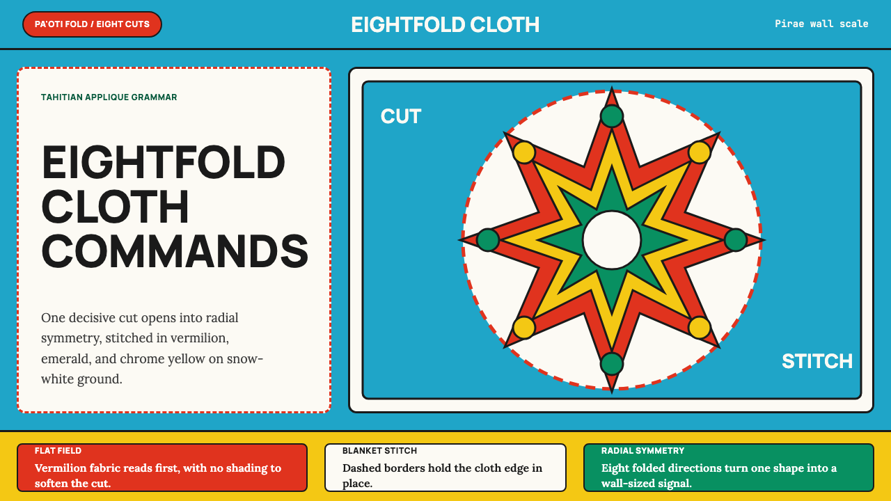 Tahitian Tifaifai (Appliqué Quilt)Flat fields command the room. Vermilion radial applique sits on Pacific cyan…
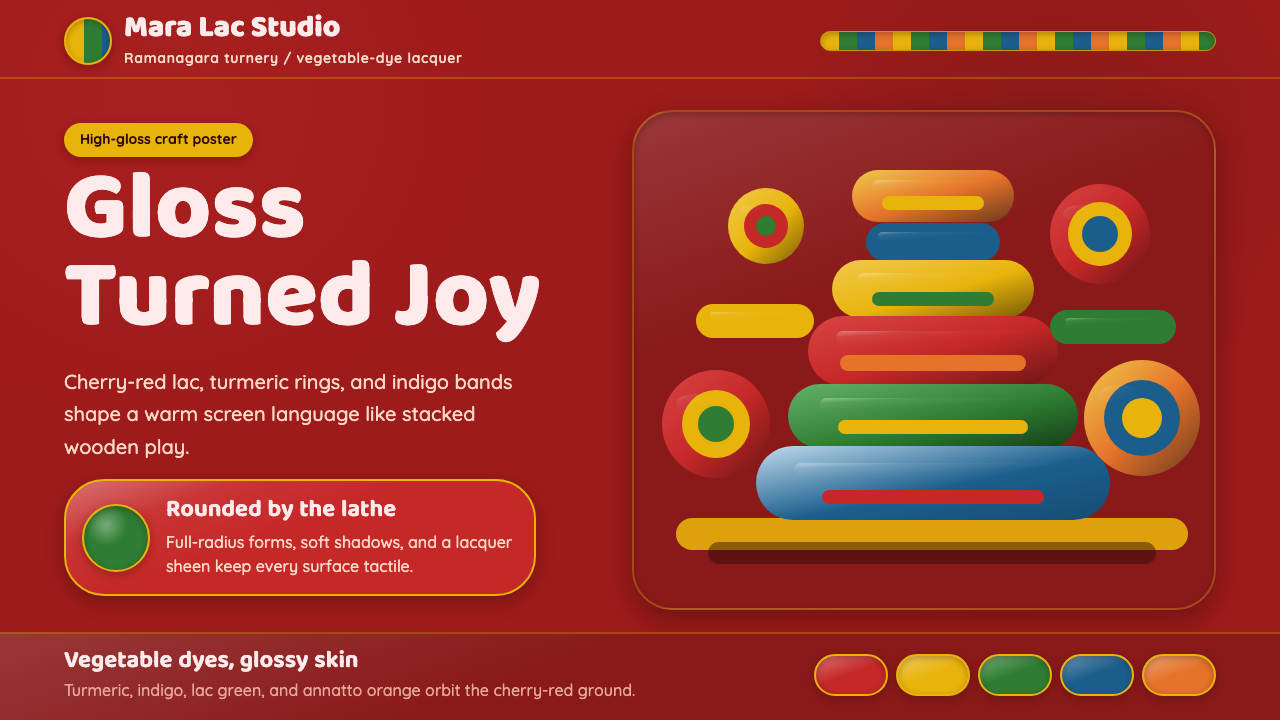 Channapatna Lacquered ToysGloss feels handmade. Lac-red ground and turmeric-indigo bands turn pixels in…
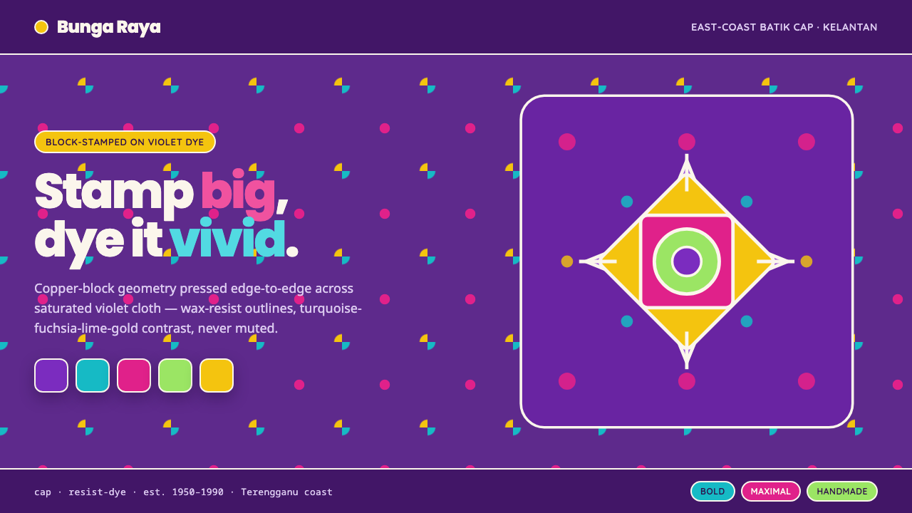 Kelantan Block BatikBright Malay batik, not Javanese brown. Oversized hibiscus stamped turquoise-…
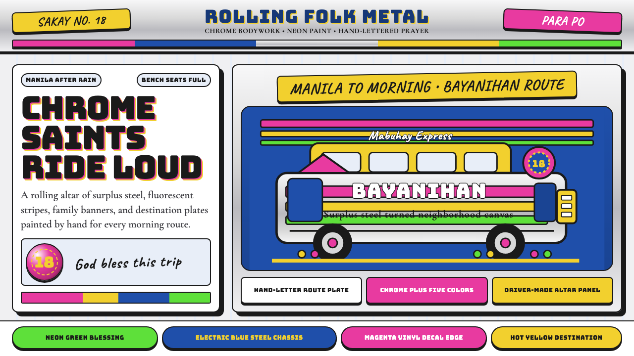 Filipino JeepneyLoud steel, made personal. Chrome gradients carry neon stripes and hand-lette…
 KFC Colonel (1952)Roadside appetite, turned up loud. Enamel red stripes and slab-serif shouts f…
 1950s Diner AquaRoadside optimism shouts. Aqua walls, cherry vinyl, chrome bands, and neon sc…