What is Kelantan Block Batik?
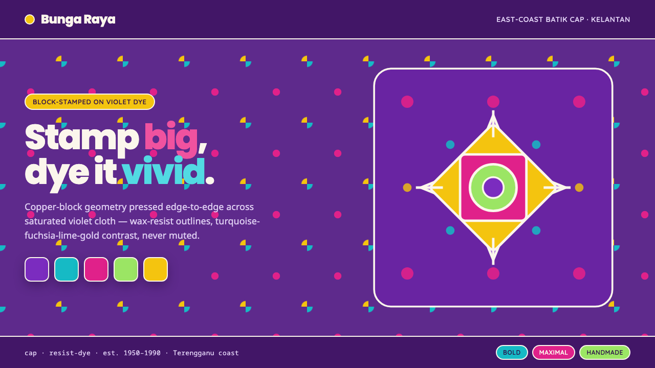
Kelantan Block Batik turns east-coast Malay craft into a high-contrast spectacle — saturated violet, oversized hibiscus, and bright resist lines that refuse to whisper.
Kelantan Block Batik in brief
Kelantan Block Batik is a modern Malaysian batik cap tradition associated with Kelantan and Terengganu on the east-coast peninsula. Its defining image is an oversized hibiscus bloom, stamped in copper across cloth dyed a saturated violet, then surrounded by near-white wax-resist outlines. Turquoise, fuchsia, lime, and gold create a vivid field against the dark ground.
The style is deliberately unlike the muted brown register commonly associated with Javanese tulis. Its character is maximalist, floral, and high-contrast: large blossoms dominate the composition, geometric repeats organize the surrounding space, and every resist line remains crisp enough to read as an active graphic mark rather than a soft naturalistic detail.
Translated into digital design, the tradition becomes a confident visual system built from deep violet grounds, rounded geometric type, brilliant color accents, and clean contour lines. The result should feel stamped, repeated, and materially decisive, with the energy of fabric transformed into an assertive interface, editorial page, or presentation.
Where does Kelantan Block Batik come from?
The source tradition belongs to the modern Malaysian batik cap period from 1950 to 1990, rooted in the east-coast peninsula regions of Kelantan and Terengganu. The name identifies a block-stamp approach to batik: repeated impressions made with a copper cap rather than a composition built entirely through individually drawn marks.
The copper block is central to the visual logic. A motif is designed for stamping, then repeated across cloth so that the pattern can move between oversized focal flowers and larger geometric structures. The process gives the style a balance between craft and system: each impression is materially made, but the overall surface depends on rhythm, recurrence, and controlled placement.
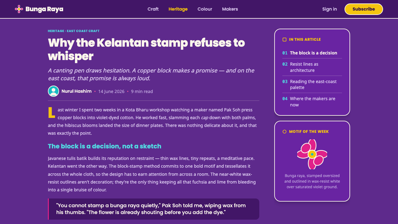
Kelantan dye-house artisans developed the tradition within a bright Malay visual register. The cloth is not treated as a quiet neutral field. Saturated violet establishes the ground, while turquoise, fuchsia, lime, and gold push forward as luminous accents. Wax resist preserves near-white lines around the stamped forms, making the contours legible even when the surrounding color is intense.
The resulting movement is best understood through three connected ideas: Malaysian batik cap, a bright Malay light-and-vibrant palette, and block-stamp resist-dye craft. Together they distinguish Kelantan Block Batik from softer floral patterning and from the restrained brown associations of Javanese tulis. Its identity comes from the interaction of stamping, dye, scale, and contrast.
What defines the Kelantan Block Batik look?
Violet Ground
A saturated violet field establishes the style before any motif appears. It is dark enough to give the composition weight, yet vivid enough to keep the surface energetic. In digital applications, violet should remain a true ground rather than a small decorative accent.
Vivid Palette
Turquoise, fuchsia, lime, and gold form the bright register against violet. These colors should feel concentrated and unapologetic, with clear separation between them. The palette gains its force from contrast, not from subtle blending or atmospheric gradation.
Oversized Hibiscus
The hibiscus, or bunga raya, is treated as a dominant graphic form rather than a small botanical ornament. Enlarged blooms can anchor a page, interrupt a field of text, or become the central image of a cover. Their scale should feel generous and almost theatrical.
Resist-Line Contours
Near-white resist lines outline each blossom and major form. They are crisp, visible, and structural, separating adjacent colors while preserving the stamped character of the motif. In a digital system, these lines can become borders, dividers, icon contours, or framing devices.
Block Repetition
Repeated stamping gives the surface its rhythm. Motifs should feel related without becoming mechanically identical: a large flower may recur beside geometric repeats, creating a pattern that is organized but never quiet. Repetition is the engine of the style, not background filler.
Rounded Geometry
Large geometric repeats provide a counterweight to the floral forms. Their edges should be confident but not sterile, supporting the rounded geometric type recommended for the digital translation. Geometry organizes the composition while the flowers supply its expressive force.
Dark Contrast
The style is dark-grounded but not subdued. Violet creates depth, while bright motifs and near-white outlines remain sharply separated from it. Avoid hazy overlays and weak contrast; the visual language depends on forms appearing stamped, placed, and immediately readable.
Who shaped Kelantan Block Batik?
These workshops represent the collective setting in which the modern Malaysian block-stamp tradition takes form. Their contribution is not a single signature style but a shared vocabulary of repeated copper impressions, oversized floral motifs, geometric repeats, and bright cloth-ground contrast across Kelantan and Terengganu.
The copper-block stampers are the makers who translate motifs into repeatable impressions. Their role explains why the style feels both handmade and systematic: the mark carries the physical certainty of a block, while the repeated arrangement creates a larger visual order across the cloth.
Kelantan dye-house artisans give the tradition its saturated chromatic identity. Their work is represented here through the relationship between violet cloth, vivid accent colors, and near-white wax-resist contours — a combination that makes the floral and geometric forms remain legible at high intensity.
How do you use Kelantan Block Batik today?
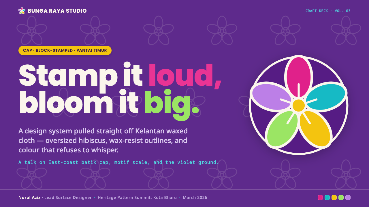
For presentation covers, use saturated violet as the dominant field and let one oversized hibiscus or geometric repeat enter from an edge or corner. Keep the title in rounded geometric type with strong contrast, then use turquoise, fuchsia, lime, or gold as a deliberate burst rather than a scattered collection of accents. The cover should feel like a large stamped textile fragment brought forward into the foreground.
For content and data slides, treat the resist line as an organizing device. Use crisp near-white contours to separate sections, frame charts, or connect labels, while bright colors distinguish categories and violet preserves continuity across the deck. Data graphics should remain bold and legible: large circles, petals, blocks, and repeated forms can carry information without turning the slide into a literal textile pattern.
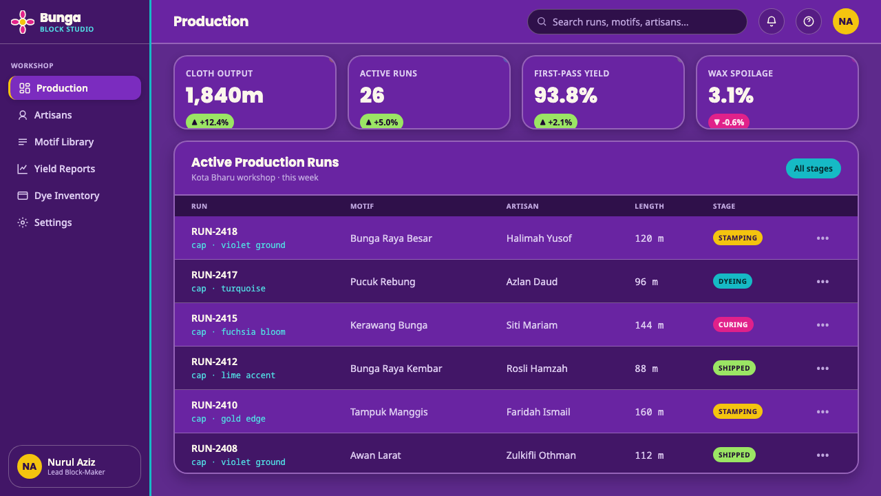
For web interfaces, the style suits dashboards and pricing pages that need a strong visual identity without becoming quiet or corporate. A deep violet shell can hold bright status states, tier accents, and geometric cards. Rounded type keeps the interface approachable, while resist-like outlines give panels and controls a firm edge. Use pattern selectively around navigation or empty states so the interface remains functional beneath the decorative energy.
For editorial and marketing work, Kelantan Block Batik supports bold campaigns, cultural storytelling, fashion features, and pages that need immediate visual presence. Pair a narrow text measure with a large floral image or cropped repeat, and let the violet ground unify separate sections. Marketing compositions can alternate between dense pattern fields and calmer violet space, using the near-white contour as a recurring signature across headlines, pull quotes, packaging, or promotional panels.
The common mistake is treating the style as a generic tropical floral theme. Random flowers, soft gradients, pale pastels, or a few decorative leaves do not recreate its identity. The system depends on the specific tension between copper-block repetition, oversized hibiscus, saturated violet, vivid accents, and crisp resist lines. If every element becomes equally loud, the composition loses hierarchy; if everything is softened, it loses the stamped character.
Kelantan Block Batik — FAQ
Is Kelantan Block Batik the same as Javanese batik?
They belong to related batik traditions but should not be treated as visually interchangeable. Kelantan Block Batik is defined here by Malaysian batik cap, copper-block repetition, saturated violet, and a bright Malay palette. Its high-contrast floral register differs from the muted browns associated with Javanese tulis.
What makes the style block batik rather than simply floral batik?
The defining clue is the repeated copper-block impression. Motifs are organized for stamping across the cloth, so the surface gains a rhythm of recurrence and the forms retain a firm, made edge. The hibiscus is therefore part of a repeat system, not an isolated illustration.
Can the style work on a light background?
It can, but the dark violet ground is the strongest expression of the source material. A light variation should preserve the essential contrast through vivid motifs and near-white resist-like contours. Without a clear dark field or an equally decisive separation between colors, the style can lose its saturated east-coast character.
Should every accent color appear in the same composition?
No. Turquoise, fuchsia, lime, and gold describe the available register, not a requirement to use everything at once. Choose a clear dominant relationship with violet, then add accents where they strengthen the flower, repeat, or information hierarchy. Restraint within a vivid palette keeps the composition readable.
What should be preserved when adapting it for digital products?
Preserve the relationship between dark violet ground, bright accents, oversized floral scale, rounded geometry, and crisp resist-line contours. The adaptation does not need to imitate cloth literally. It should carry over the source logic: stamped repetition, strong separation, confident color, and forms that remain immediately legible.
Related design styles
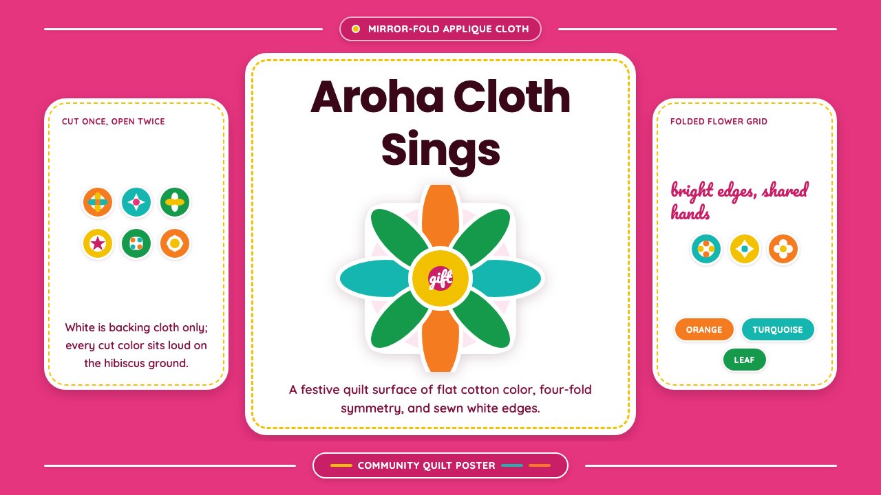 Cook Islands TivaevaeSaturated craft sings. Hibiscus pink carries mirror-fold florals in flat appl…
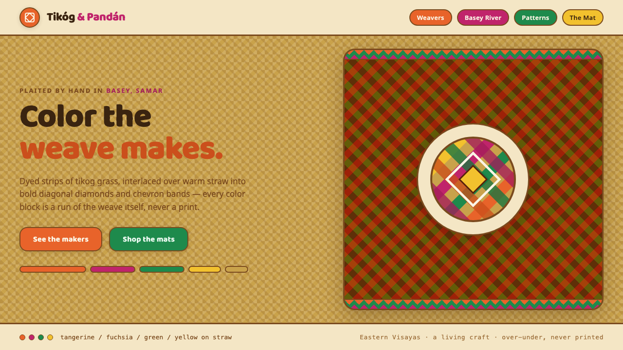 Banig Pandan MatHandwoven Filipino joy. Tangerine, fuchsia and green strips plaited into diag…
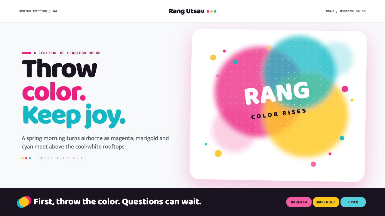 Holi Festival of ColorsColor refuses to sit still. Magenta, marigold and cyan powder bloom across co…
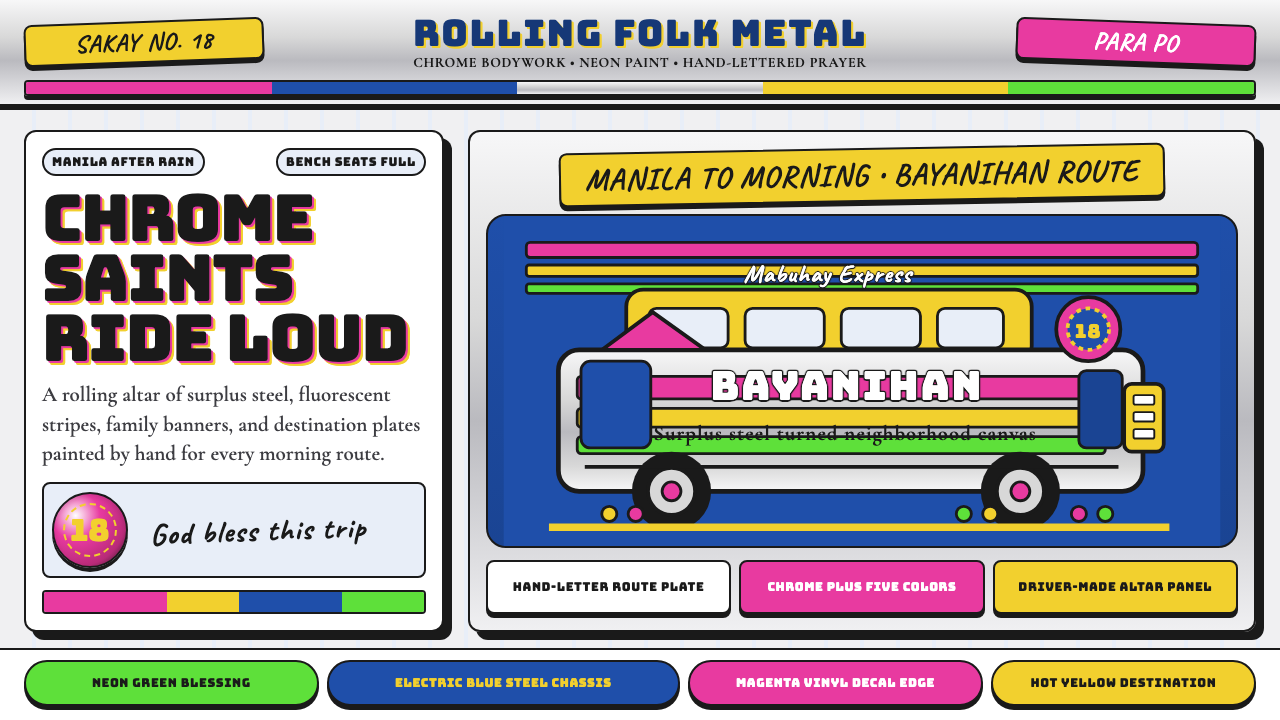 Filipino JeepneyLoud steel, made personal. Chrome gradients carry neon stripes and hand-lette…
 Bahamian Junkanoo CowbellNight refuses silence. Acid crepe stripes and block type collide like cowbell…
 Finnish Marimekko Unikko (1964)Scale becomes pattern. Poppy red, cobalt, mustard, and Inter tile flat silhou…