What is Cook Islands Tivaevae?
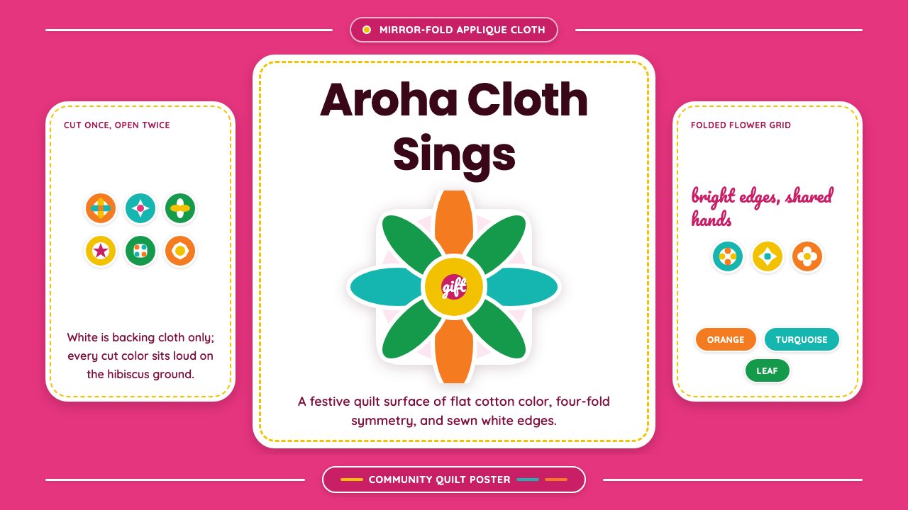
Tivaevae carries a Cook Islands sewing-circle tradition — radiant hibiscus pink, mirror-cut floral appliqué, kaleidoscopic symmetry — from the quilting frame onto the screen.
Cook Islands Tivaevae in brief
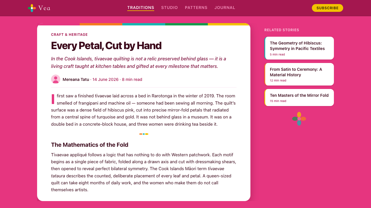
Tīvaevae are the appliqué quilts of the Cook Islands, hand-sewn by women's quilting groups whose tradition flourished across the mid-twentieth century, roughly 1950 to 1990. Each quilt is built the same way: a large sheet of fabric is folded — often into eighths, the way a child folds paper to cut a snowflake — and a single continuous floral motif is cut through every layer at once. Unfolded, the cut produces a radially symmetric flower or foliage shape, which is then appliquéd, edge turned under and hand-stitched, onto a contrasting backing cloth.
As a design system, this distills that craft into flat, screen-ready form: a saturated hibiscus-pink ground carries crisp, flat appliqué color blocks, arranged in kaleidoscopic symmetry that radiates outward from a central axis, set off by friendly, rounded lettering. White is not banished — it survives exactly where it exists in the real object, as the literal backing cloth glimpsed at the edges — but it never becomes the page itself.
The overall temperament is tropical, saturated, and unapologetically warm. Nothing here is muted or desaturated for restraint's sake; the visual logic is closer to a maximalist celebration than a minimalist system, because the source object was itself made to be given, displayed, and admired at close range.
Where does Cook Islands Tivaevae come from?
The tradition traces back to the arrival of Christian missionaries — chiefly the London Missionary Society, active in the Cook Islands from the early nineteenth century — who introduced European-style patchwork and quilting to island women alongside Western dress and worship. What happened next was not simple imitation. Cook Islands women took the introduced technique of sewing fabric pieces onto a backing cloth and remade it entirely in their own visual language, replacing geometric European patchwork blocks with bold, large-scale floral and foliage forms drawn from the plants around them: hibiscus, frangipani, ferns, breadfruit leaves.
Two related forms emerged from this reinvention. One is a mosaic patchwork built from many small pieces, prized as a test of collective patience and skill. The other — the form this system draws from most directly — uses the fold-and-cut method to produce a single large, radially symmetric motif, appliquéd whole onto a contrasting field. This mirror-fold technique, close in principle to cutting a paper snowflake, is what produces the kaleidoscopic symmetry radiating from a central axis that defines the look.
Tīvaevae has never been a solitary craft. It is made in women's groups — vainetini — who gather for communal sewing sessions that can run for days, working, teaching, and singing together as the quilt takes shape across many hands. Finished tīvaevae are given rather than sold: they mark weddings, funerals, milestone birthdays, and the ceremonial hair-cutting celebrations held for children across Polynesian culture, functioning as expressions of love, status, and reciprocity within the community. Some of the specifics of how the earliest quilting bees were organized survive mainly as family and oral history passed within island communities rather than as written record, and should be read with that in mind.
The 1950–1990 window in which this system is set marks the tradition's richest flowering, as wider access to vivid commercial cotton and synthetic fabric expanded the color range available to quilters beyond what earlier, more limited materials allowed. The Cook Islands did not develop this in isolation — related sibling traditions, including Hawaiian appliqué quilting and Tahitian tīfaifai, emerged from comparable missionary contact elsewhere in Polynesia, each community adapting the same introduced technique into a distinct local visual language.
What defines the Cook Islands Tivaevae look?
Color
The ground is a saturated hibiscus pink, never softened toward blush or pastel. Appliqué colors are chosen for maximum contrast against that ground and against each other — the palette behaves like the real vivid cottons and satins the quilts were cut from, not like a restrained, tonal design-system palette.
Composition and Symmetry
Layouts organize around a central axis with motifs radiating outward in mirrored repetition, echoing the fold-and-cut technique itself. This is not loose, scattered floral decoration; it is disciplined radial symmetry, the same way a single cut through folded fabric always produces a balanced, kaleidoscopic result.
Motif and Iconography
Floral and foliage forms — hibiscus, frangipani, fern fronds — are stylized into bold, simplified silhouettes rather than rendered naturalistically. Each motif reads instantly as a single recognizable shape, the way a cut-fabric flower must be legible as a whole the moment the folded cloth opens.
Appliqué Flatness
Every shape is flat, solid color with a crisp, clean edge — the visual signature of fabric turned under and hand-stitched to a backing, not painted or airbrushed. There are no gradients simulating fabric sheen or dimensional shading; the flatness is the point, echoing the physical construction of cut cloth laid on cloth.
Typography
Letterforms are rounded and friendly, avoiding anything sharp, condensed, or severe. The type should feel handmade-adjacent and warm — legible and contemporary, but never cold or clinical — so it sits comfortably beside the soft-edged, hand-cut floral forms rather than fighting them.
White as Backing, Not Ground
White appears only in the role it plays on the physical quilt: the backing cloth, visible as a thin margin or reveal at the edge of an appliquéd shape. It is never allowed to become the dominant page background, because doing so would erase the saturated ground that gives the whole system its identity.
Scale and Framing
A physical tīvaevae is built around one dominant motif filling almost the entire visible field, with smaller repeated elements playing a supporting role near the border. The system borrows that scale logic directly: one large, confident focal shape per composition, rather than many small motifs of similar size competing for attention across the page.
Who shaped Cook Islands Tivaevae?
The vainetini are the women's collectives at the center of tīvaevae-making. Quilts are produced communally within these groups rather than by individuals working alone, and the groups also function as the mechanism by which technique, motif knowledge, and the social meaning of the craft pass between generations.
Multi-day communal sewing sessions, in which a group of women gathers to work on a quilt together — sewing, teaching, and singing as they go — are the social setting in which tīvaevae are actually made. The finished quilt is a product of that shared, collective process, not of solitary studio work.
European missionary contact in the early nineteenth century is the historical channel through which patchwork and quilting techniques first reached the Cook Islands, alongside Christianity and Western dress. Island women transformed the introduced sewing technique into a wholly distinct visual tradition built from local floral motifs and radial cut-and-fold symmetry.
Within island communities, certain quilters are recognized as masters of the craft — women whose command of the fold-and-cut technique, color sense, and stitching produces the most admired work. This recognition is a living, community-conferred status rather than a formal institution, and it is the mechanism by which the craft's highest standards are set and maintained.
How do you use Cook Islands Tivaevae today?
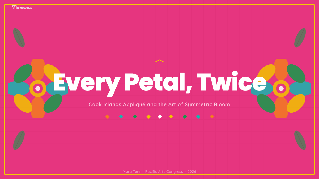
For presentation slides, a cover page works well built around a single large, centered mirror-symmetry floral motif on the saturated pink ground, with the title set beside or beneath it in the rounded typeface rather than overlapping the artwork. Content slides should treat white-backed panels as the equivalent of a quilt block — a calm field for text — with a small appliqué-style floral motif anchored to one corner rather than scattered across the slide.
Data on slides works best rendered as flat, solid-color shapes drawn from the appliqué palette — think of a bar or a proportion as one more cut-fabric shape laid onto the pink ground — rather than as conventional charts with gridlines and gradients, which would fight the flat, hand-cut visual logic.
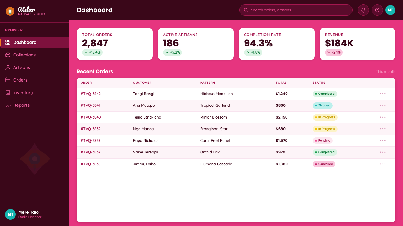
For web interfaces, this system suits hospitality, travel, gifting, wellness, and celebration-oriented consumer products particularly well, where warmth and craft authenticity are assets rather than distractions. On dashboards or pricing pages, it works best when the saturated pink is reserved for hero and marketing surfaces while working panels lighten toward the backing-cloth white, with the vivid appliqué colors used sparingly for badges, tier markers, and highlighted states rather than as a background.
In editorial and marketing contexts, full-bleed radial floral compositions make strong section dividers and hero art, and the style is a natural fit for content about gifting, weddings, travel, cultural heritage, or craft. It reads as celebratory rather than corporate, which is exactly the register it should be used for.
The most common mistake is softening the palette — pulling the hibiscus pink toward a muted blush or dusty rose in the name of restraint. That single change undoes the system: the saturated craft-sings quality depends on real chromatic intensity, and a desaturated version reads as generic tropical wallpaper rather than as tīvaevae. A second mistake is letting white creep in as a general page background rather than confining it to its proper role as the backing cloth's edge.
Cook Islands Tivaevae — FAQ
Is this just generic tropical floral pattern design?
No. Generic tropical florals are typically scattered, naturalistic, and repeated as an all-over print with no particular structural logic. Tīvaevae is defined by a specific construction method — a motif cut once through folded fabric, producing disciplined radial symmetry around a single central axis — and by a specific set of local motifs, colors, and a communal social practice behind it. The symmetry and the saturated pink ground are structural signatures, not decorative choices.
How does this relate to Hawaiian quilting?
They are sibling traditions rather than the same thing. Hawaiian appliqué quilting emerged from a comparable history of nineteenth-century missionary contact and also uses a fold-and-cut technique to produce a single large, radially symmetric motif. Each tradition developed its own distinct color sensibility, motif vocabulary, and cultural role within its own island community, so they should be treated as related but separate visual languages rather than interchangeable.
Can the background be white instead of pink?
Not without losing what makes this system recognizable. White has a specific, limited role — the backing cloth glimpsed at a motif's edge — and promoting it to a full page background collapses the design into a generic floral-on-white pattern. The saturated hibiscus-pink ground is the identity; if a lighter surface is genuinely needed for a specific panel, it should read as the backing-cloth white used sparingly, not as the dominant field.
Does this style work in dark mode?
It resists dark mode by design. The system is built on a light source object — a saturated but light-registering pink field carrying appliqué color — and inverting it to a dark ground removes the warmth and the specific hibiscus-pink identity that define it. If a dark surface is unavoidable, it is better handled as a small, contained panel within an otherwise light, pink-grounded layout rather than as a full inversion of the palette.
What should I keep in mind about cultural context when using this style?
This is a living craft tradition tied to a specific place and a specific social practice, made by named communities of women for gift-giving and communal celebration, not an abstract pattern invented for decoration. It suits contexts genuinely about gifting, heritage, travel, or celebration, and is worth pairing with real acknowledgment of where it comes from rather than a vague 'tropical' label. It is a poor fit for contexts that would flatten it into generic exotic wallpaper, and a better fit wherever warmth, generosity, and craft authenticity are the actual message being sent.
Related design styles
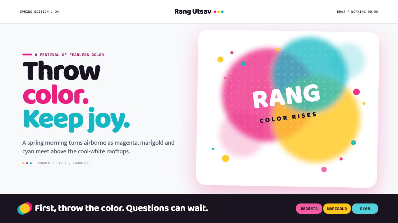 Holi Festival of ColorsColor refuses to sit still. Magenta, marigold and cyan powder bloom across co…
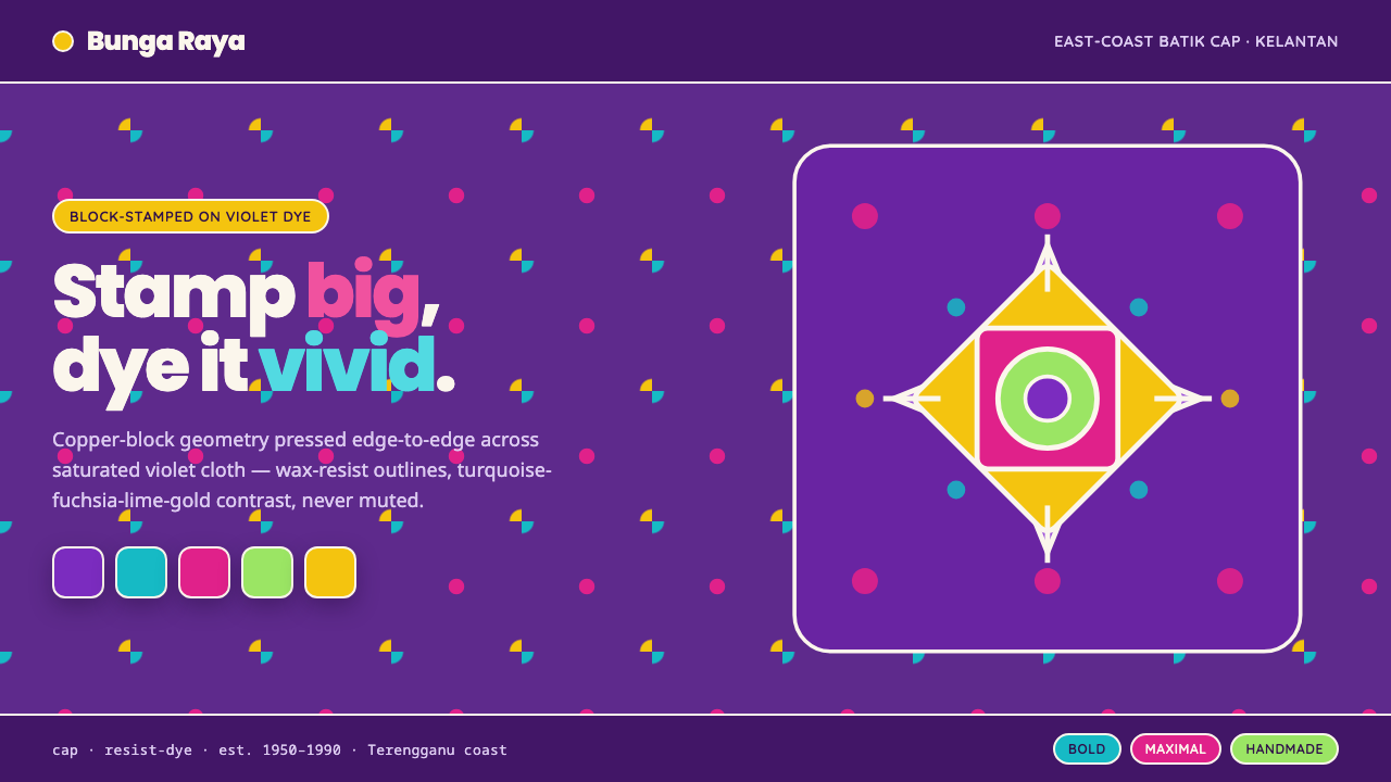 Kelantan Block BatikBright Malay batik, not Javanese brown. Oversized hibiscus stamped turquoise-…
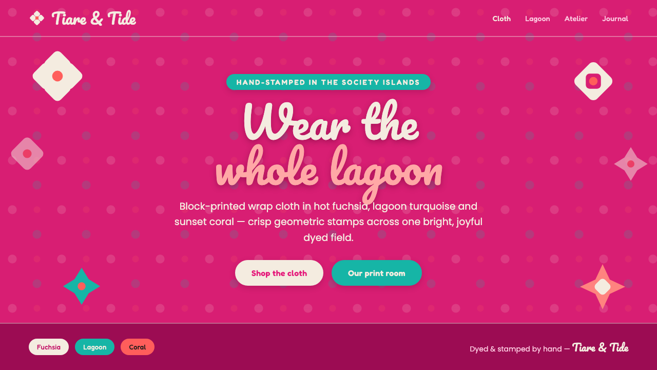 Tahitian Pareu PrintWear the whole lagoon. White hibiscus block-printed on hot-fuchsia cloth, wit…
 Filipino JeepneyLoud steel, made personal. Chrome gradients carry neon stripes and hand-lette…
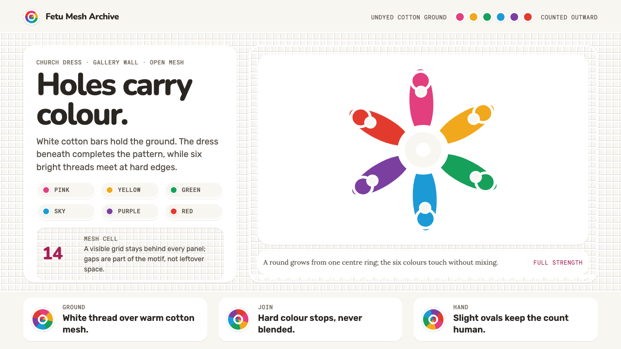 Tuvaluan KoloseHoles carry colour. White mesh meets six unmixed motif rounds at full strengt…
 Ga Fantasy CoffinMemory refuses to whisper. Marine enamel, fat sign type and hard black seams…