What is Holi Festival of Colors?
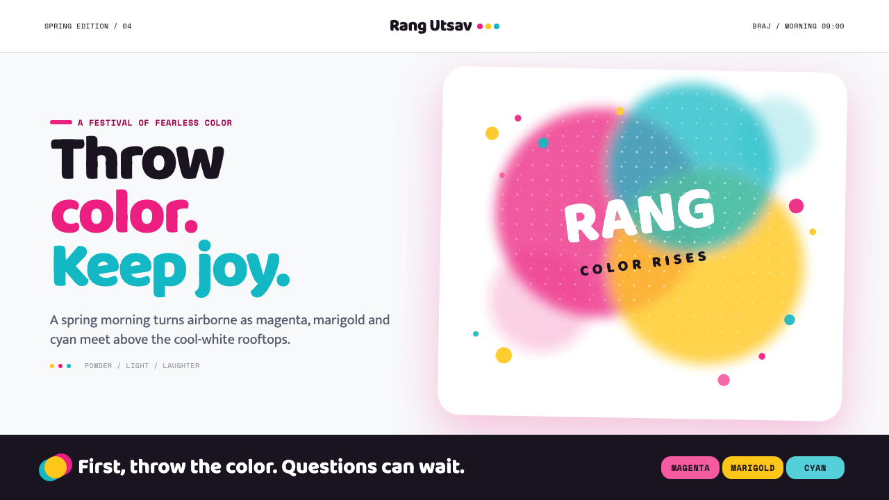
Holi turns color into motion — magenta, marigold and cyan powder suspended over cool white, as if a spring morning has been caught at the exact instant a handful of gulal leaves the hand.
Holi Festival of Colors in brief
Holi is an ancient Hindu spring festival associated with North India, especially the Braj region around Mathura, Vrindavan and Barsana, and with South Asian communities around the world. Its visual identity is not built from still color fields but from color in flight: dry pigment thrown upward, opened by the air, scattered across skin, clothing, walls and sky. The design system captures that suspended instant rather than attempting to reproduce an entire festival scene.
The dominant impression is exuberant but not chaotic. A cool-white ground gives the composition a clean morning atmosphere, while saturated magenta, marigold and cyan create the feeling of powder blooming through open air. These colors should appear as bursts, clouds, handprints, smears and soft-edged arcs rather than rigid blocks. The white space is not empty; it is the atmosphere through which the color travels.
Holi’s visual language depends on overlap. Powder thrown from different directions meets in translucent layers, producing temporary colors where one cloud crosses another. Edges remain soft, irregular and airborne. The result should feel tactile without becoming muddy, photographic without becoming literal, and celebratory without losing compositional control. The guiding mood is a whitewashed rooftop in Mathura during a spring morning: a hot-pink burst crossing the frame, marigold garlands nearby, and a turquoise handprint left on a doorway.
Where does Holi Festival of Colors come from?
Holi belongs to the long history of Hindu spring festivals and is documented from approximately the fourth century of the Common Era. Its strongest regional association is with North India’s Braj region, including Mathura, Vrindavan and Barsana. The festival’s modern visual recognition comes from the physical act of throwing gulal, but the deeper cultural image is one of communal transformation: ordinary surfaces, clothing and bodies become temporary carriers of color.
The visual canon developed through several overlapping traditions. Bhakti devotional art supplied an emotional and devotional vocabulary, while Krishna-lila iconography gave the festival a recurring mythic and performative frame. In Rajput and Pahari miniature painting of the seventeenth and eighteenth centuries, color, gesture, procession and social gathering became subjects that could be organized into highly concentrated scenes. These paintings provide a historical precedent for treating color as an active event rather than as a passive background.
The system also belongs to a later history of modern film and photography. Documentary color photography helped turn the airborne pigment cloud into a recognizable image of movement, crowd energy and fleeting transformation. Cinema expanded that image into spectacle, rhythm and emotional atmosphere. The contemporary design language therefore sits between miniature painting’s compressed composition and photography’s captured instant: it can be intimate like a handprint, expansive like a sky filled with powder, or cinematic like a burst crossing the frame.
The approved canon names Surdas, Nihal Chand, Nainsukh, Yash Chopra and Steve McCurry among its key figures. They represent a broad chain of association rather than a single school: devotional expression, Rajput and Pahari visual culture, Krishna-lila imagery, modern film and documentary color photography. Together, these references explain why the style can hold both historical richness and immediate visual impact without reducing Holi to a generic festival motif.
What defines the Holi Festival of Colors look?
Airborne Color
Color should appear to have been thrown, opened or caught in motion. Use clouds, arcs, bursts, powder trails and scattered particles instead of perfectly contained fills. The composition should suggest the gesture that produced the color, even when no hand or body is shown. A splash is more faithful than a stripe; a drifting bloom is more useful than a polished circle.
Saturated Festival Palette
Magenta, marigold and cyan are the signature colors, placed against a cool-white ground. Each hue should feel full of pigment and light rather than dusty or muted. The palette is festive because it is unapologetically intense, but the white field prevents that intensity from becoming visually heavy. Let one color lead a composition while the others answer it through accents or overlapping clouds.
Soft Edges
Nothing should look mechanically cut. Powder clouds dissolve at their perimeter, handprints lose definition toward the edges, and overlapping pigment creates translucent transitions. Softness does not mean blur everywhere; it means that the boundary belongs to the material. Keep important text and controls crisp, then let the surrounding color behave like powder in air.
Layered Translucency
The style gains its richness from color passing through color. A magenta cloud crossing cyan should not become a hard third block; it should read as a temporary stain, a veil or a mixed powder deposit. Layering gives the system depth without relying on realistic lighting. It also makes each composition feel unrepeatable, as though the air decided the final arrangement.
Cool-White Atmosphere
White functions as atmosphere, not merely as a neutral canvas. It recalls whitewashed walls, clear morning light and the visual pause before the next burst of powder. Keep the ground spacious enough for color to travel across it. When the white field disappears beneath decoration, the design loses the sensation of suspended pigment and becomes a conventional multicolor composition.
Gesture and Trace
Holi is a social action, so the system should preserve evidence of touch and throwing. Handprints, palm-like smears, curved trajectories and uneven deposits make the visual language feel lived rather than assembled. These marks can frame content, point toward an action or interrupt a quiet field. Their purpose is not random decoration; each trace should imply a human gesture.
Celebratory Restraint
The style is exuberant, but exuberance needs a quiet field to remain legible. Saturated color should be balanced by clear typography, generous breathing room and a deliberate focal point. Do not make every corner explode at once. The strongest compositions allow one burst to dominate, a second to support it, and the rest of the page to preserve the anticipation of movement.
Who shaped Holi Festival of Colors?
Surdas belongs to the devotional strand of the Holi visual canon. His inclusion connects the festival’s color and communal energy to Bhakti expression, where celebration is not merely spectacle but a vehicle for emotional and spiritual intensity.
Nihal Chand represents the Rajput miniature tradition within the approved canon. His association helps explain the system’s interest in compressed scenes, arranged gestures and color that carries narrative meaning rather than functioning as surface decoration.
Nainsukh anchors the Pahari side of the visual history. His place in the canon supports a reading of Holi imagery that values intimate observation, human presence and the expressive relationship between figures, landscape and color.
Yash Chopra represents the modern filmic continuation of Holi’s visual life. His inclusion points toward the festival as atmosphere and spectacle: color can carry rhythm, emotional scale and a sense of collective performance across a moving image.
Steve McCurry represents documentary color photography in the approved material. His association reinforces the system’s interest in the decisive instant: airborne powder, human gesture and saturated color can become an immediate record of a place and a shared event.
How do you use Holi Festival of Colors today?
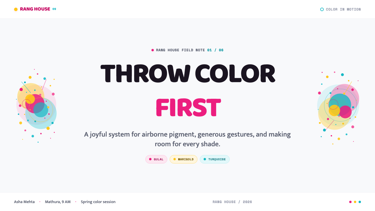
For presentation slides, use the Holi system as a sequence of controlled releases. A cover can begin with a large cool-white field interrupted by one airborne magenta burst, a marigold trace or a cyan handprint, leaving the title in a calm area rather than placing it inside the explosion. Content slides should keep the central reading surface clear, then use soft powder clouds as directional markers around headings or section transitions. Data slides can translate charts into pigment events: a rising series becomes an ascending arc of color, category differences become overlapping clouds, and a key figure receives a single saturated burst instead of a decorative badge.
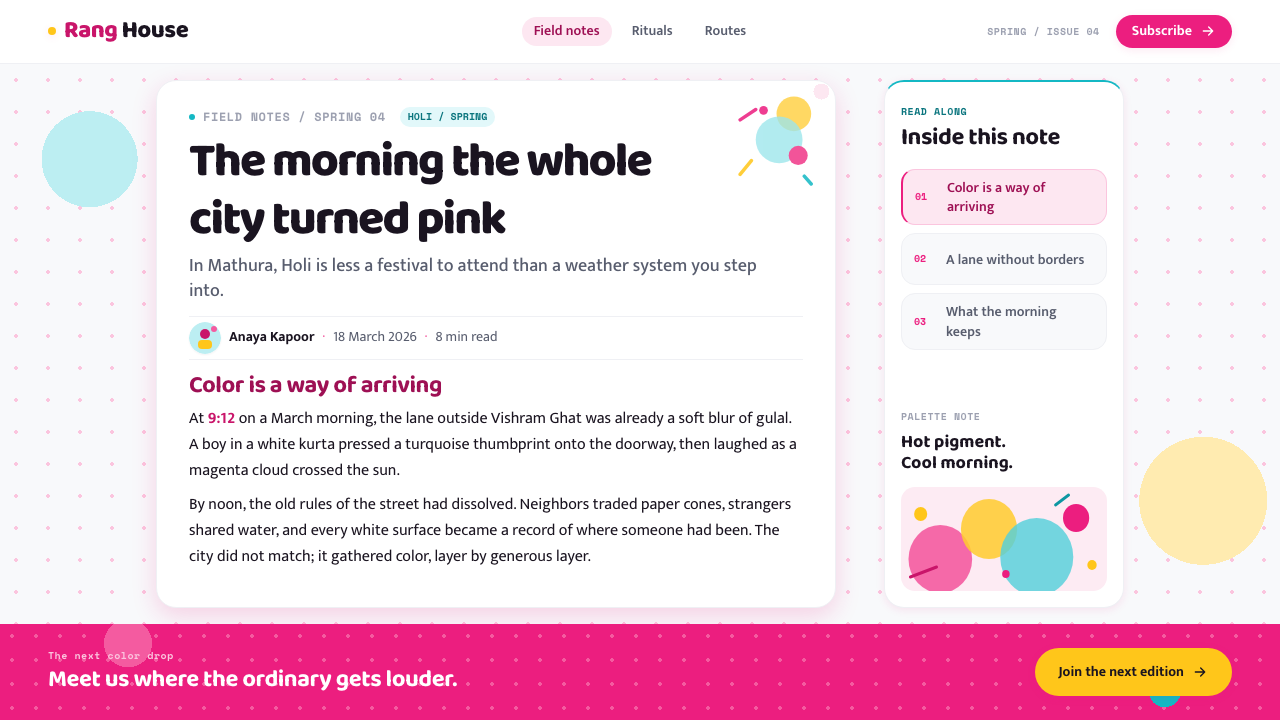
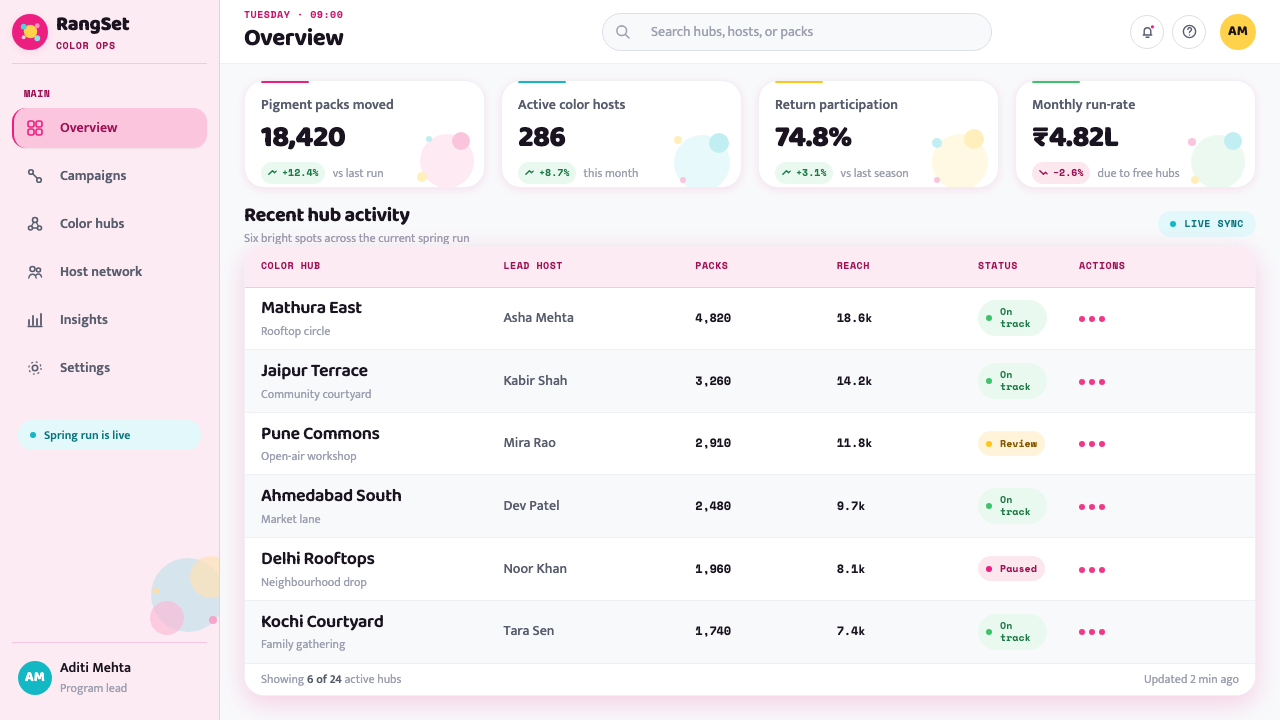
For web interfaces, the style suits dashboards, discovery tools and pricing pages that want to feel energetic without becoming dark or corporate. Keep the main interface grounded in cool white, with magenta, marigold and cyan reserved for active states, categories, progress, alerts or plan distinctions. Cards can remain clean and pale while powder traces create hierarchy around them. On a pricing page, one tier may receive a marigold cloud or cyan handprint as its focal marker, but the surrounding information should stay quiet enough for comparison. Use soft-edged color as atmosphere and interaction guidance, not as a substitute for labels.
For editorial and marketing work, Holi supports a strong contrast between calm reading space and sudden visual celebration. Long-form articles can begin with a white opening field, a short lead and a single powder bloom that establishes the mood before the text becomes denser. Section breaks can use a drifting color trail, a cropped handprint or a small cluster of overlapping pigment rather than a conventional ornament. Marketing pages can alternate spacious white sections with full-bleed color events, using the powder cloud to announce a launch, a campaign or a moment of shared participation.
For social, campaign and event materials, the system works best when the gesture remains visible. A poster should feel as though someone has just thrown color across it, not as though a stock rainbow was placed behind a headline. Use uneven deposits, partial marks and cropped edges to imply that the frame is only one fragment of a larger celebration. Photography, when included, should sit alongside the color rather than compete with it: the image can be treated as another captured surface touched by powder.
The most common mistake is turning Holi into an indiscriminate rainbow. The approved visual language is specific: magenta, marigold and cyan against cool white, with softness, overlap and airborne motion. Adding every bright color at equal strength removes hierarchy and weakens the cultural reference. A second mistake is making the powder too clean, geometric or opaque. If every burst has a perfect outline, the design loses the material behavior that makes it distinctive. Lead with one gesture, preserve white air around it, and let the other colors arrive as response.
Holi Festival of Colors — FAQ
Is Holi style simply a bright rainbow aesthetic?
No. Its identity is narrower and more material-specific. The central relationship is saturated magenta, marigold and cyan powder against a cool-white ground. What makes the system recognizable is not brightness alone but the behavior of the color: it is thrown, airborne, soft-edged, layered and partially translucent. A generic rainbow may be cheerful, but it does not carry the same sense of powder, gesture or captured festival movement.
Can the system work with a dark background?
It can be adapted, but the result will move away from the approved visual center. The source material defines the atmosphere through cool white, whitewashed surfaces and clear morning air. A dark ground may make the pigment feel more theatrical, but it removes the sense of a clean spring morning and can make the colors appear heavier than airborne. If a darker treatment is necessary, keep the powder soft and luminous while preserving generous open space around it.
How should imagery and photography be handled?
Treat imagery as another surface touched by the event. The approved history connects Holi to Rajput and Pahari miniature painting, Krishna-lila iconography, modern film and documentary color photography, so both intimate detail and larger spectacle can belong. Photography should support the sensation of place, gesture and shared activity. Avoid using images merely as colorful backgrounds; let the powder, hand, clothing, wall or sky retain a readable role in the composition.
How much color should appear in one composition?
Use enough color to imply celebration, but not so much that every gesture becomes equally loud. A strong composition usually has a leading burst, a supporting color and a quiet field that allows both to remain legible. Overlap should create temporary mixtures, not a uniform haze. The goal is to make the viewer feel that more color could enter the frame at any moment, while the current arrangement remains deliberate and readable.
Where does this style work best, and where can it struggle?
It works best for presentations, dashboards, pricing pages, editorial launches, cultural programming and campaigns that need warmth, movement and collective energy without a dark visual mood. It struggles when the product requires extreme neutrality, solemn restraint or a highly technical atmosphere in which soft color clouds may feel distracting. It can also fail when used as superficial decoration without acknowledging gesture and material behavior. The style is strongest when the product has something to announce, share or set in motion.
Related design styles
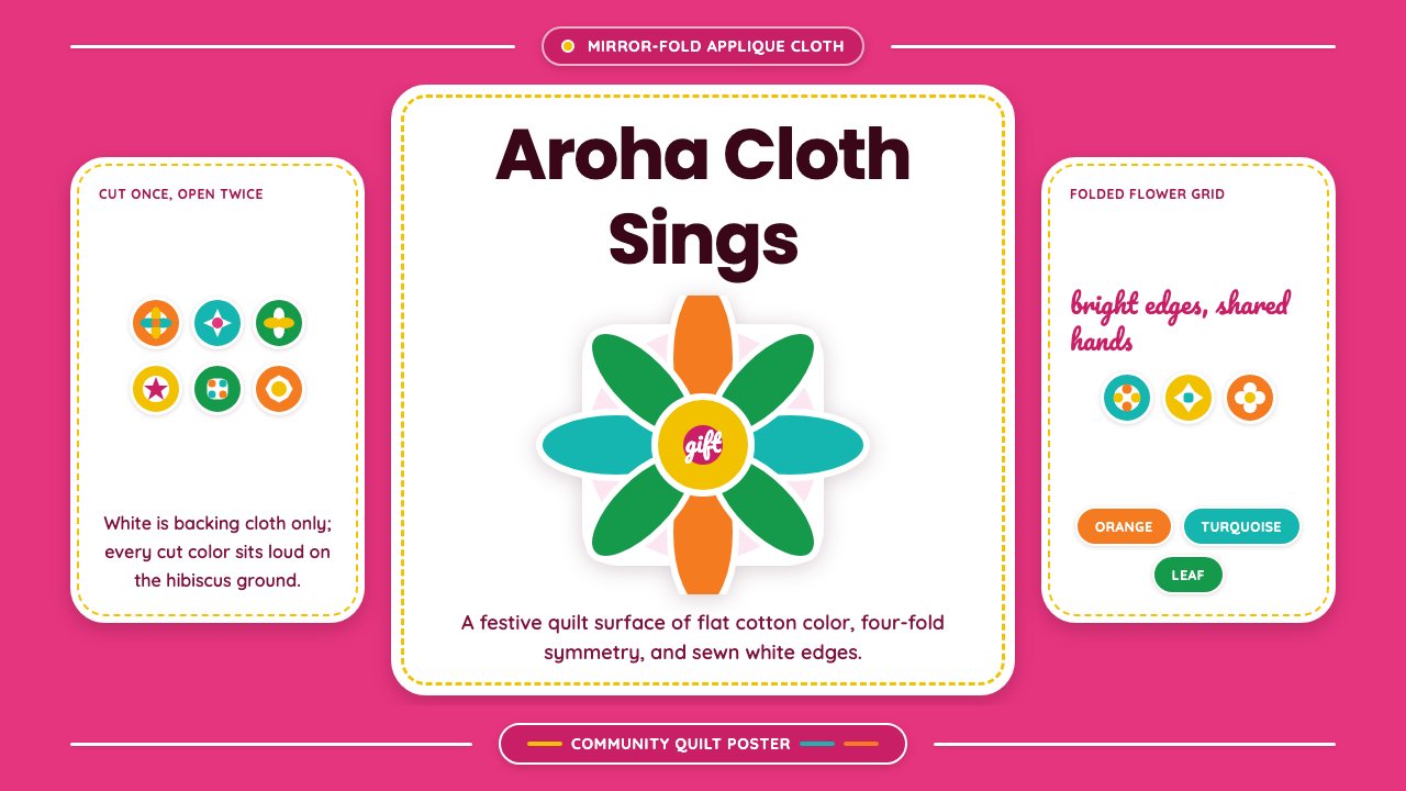 Cook Islands TivaevaeSaturated craft sings. Hibiscus pink carries mirror-fold florals in flat appl…
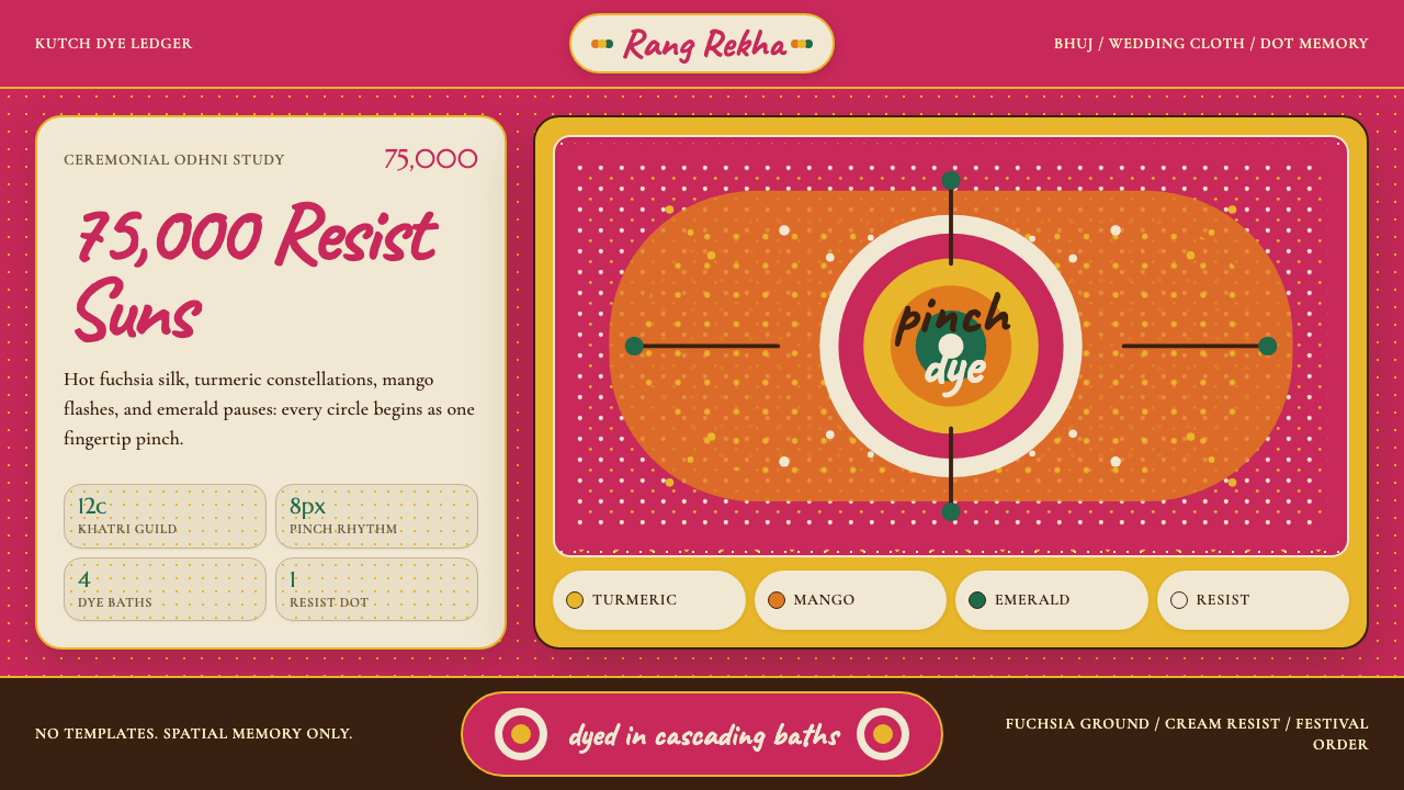 Gujarati Bandhani Tie-DyeFestival precision. Fuchsia cloth, turmeric dot constellations, Caveat letter…
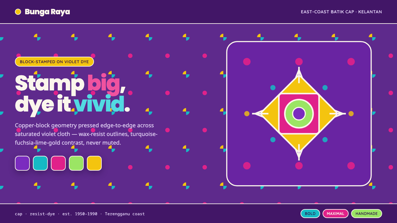 Kelantan Block BatikBright Malay batik, not Javanese brown. Oversized hibiscus stamped turquoise-…
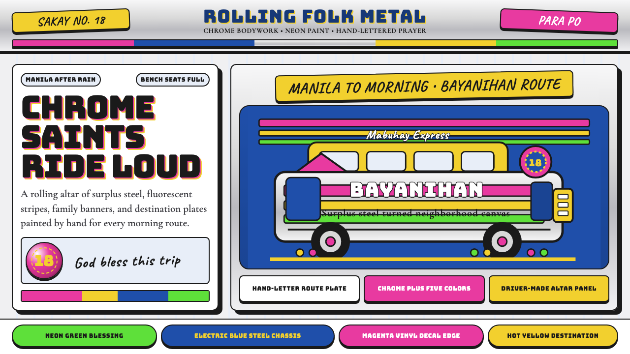 Filipino JeepneyLoud steel, made personal. Chrome gradients carry neon stripes and hand-lette…
 Moroccan Amazigh Berber RugAutobiography in wool. Cream ground, charcoal diamonds, saffron bands drift o…
 Mursi Omo Valley Lip Plate PaintRaw dignity, matte and proud. Kaolin dots and ochre rings sit on charcoal gro…