Design style guide设计风格指南
What is Gujarati Bandhani Tie-Dye?什么是 Gujarati Bandhani Tie-Dye?
Gujarati bandhani is the world's most precise tie-dye tradition — tens of thousands of hand-pinched dots on silk, dyed in cascading baths of festival color, producing a visual language as intricate as any printed textile.古吉拉特邦的万点扎染是世界上最精密的扎染传统——丝绸上数万个手捏微点,经层层节庆色浸染,编织出媲美任何印花织物的繁复视觉语言。
Gujarati Bandhani Tie-Dye in briefGujarati Bandhani Tie-Dye 速览
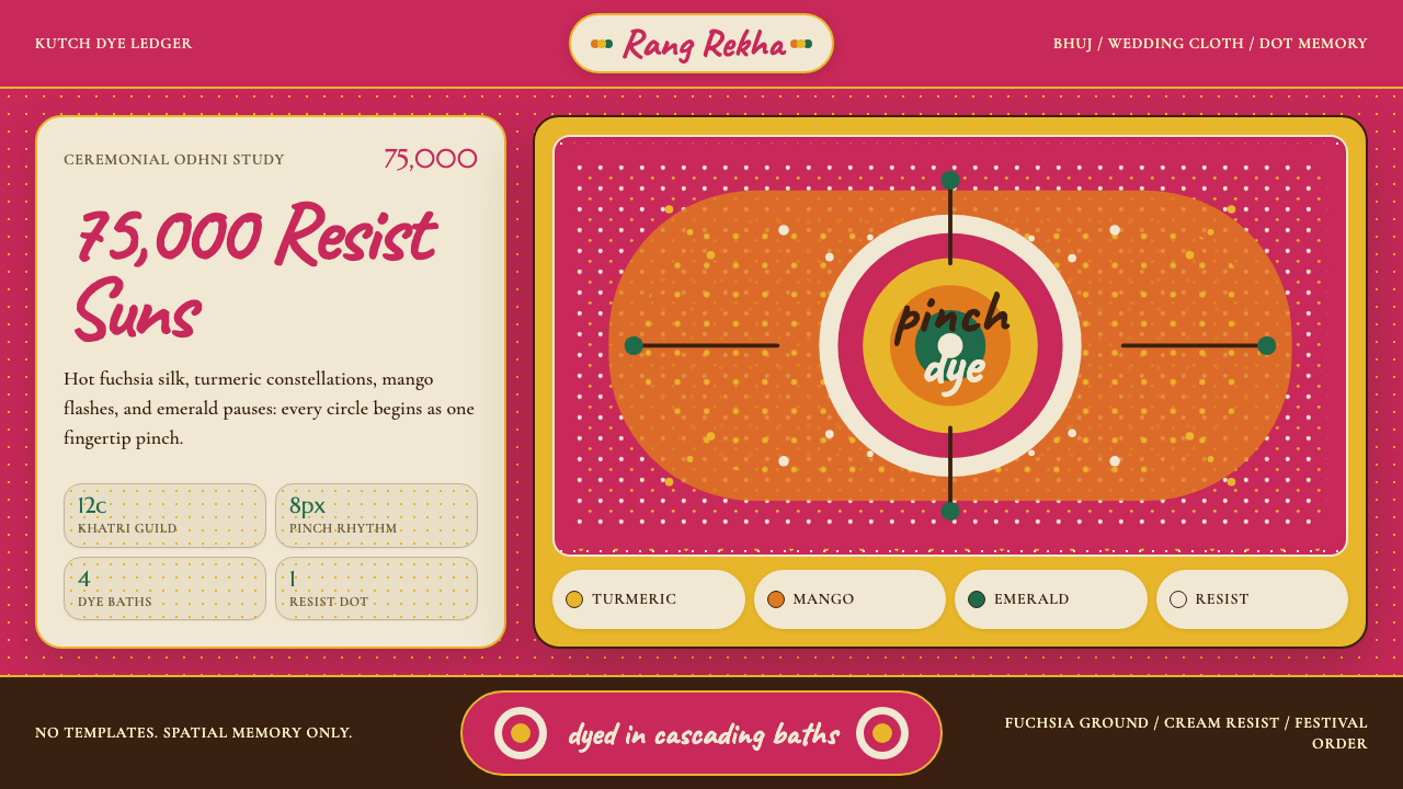
Gujarati bandhani (बंधनी) is a resist-dyeing technique in which fabric is pinched into tiny points, each bound tightly with thread before immersion in a dye bath. When the binding is removed after dyeing, each pinch-point reveals a small circle of undyed or earlier-dyed color — a resist dot. The cumulative effect of thousands of such dots forms geometrically precise constellations: grid arrays, diagonal waves, concentric rings, and the pea-sized circles of the classic chandrakala moon pattern. A single ceremonial odhni — a wedding veil — can carry more than seventy-five thousand individually hand-pinched points.古吉拉特邦的万点扎染(बंधनी)是一种防染技艺:将布料捏成细小的点,每个点在浸入染液前都用线紧紧扎束。染色完成、解开扎线后,每个捏点都会绽放出一个未染色或保留前一染色的圆形色环——即抗染点。数千个这样的点累积在一起,形成几何精确的图案:网格阵列、对角波浪、同心圆环,以及经典月亮纹(chandrakala)的豌豆大小圆圈。一条礼仪用的婚礼面纱(odhni)上,手捏点的数量可超过七万五千个。
The visual language of bandhani is built entirely from this fundamental unit: the dot. Everything else — stripes, borders, floral arrangements, animal motifs — is constructed from clusters and gradients of dots at varying densities. The palette is festival-saturated: fuchsia and magenta grounds dyed over turmeric yellow base layers, deep crimson reds, peacock greens, and cream reserves. Color depth is achieved not through pigment mixing but through sequential immersion, so adjacent areas can shift from one hue to another through the logic of subtraction — each dye bath adds color only where the resist thread has not been tied.万点扎染的视觉语言完全建立在这个最基本的单元——「点」上。其余一切——条纹、边框、花卉排列、动物纹样——都由不同密度的点簇与点渐变构成。色彩属于节庆饱和度:品红与洋红底色叠染在姜黄底层之上,配以深胭脂红、孔雀绿和奶油色留白。色彩深度不靠颜料调和,而靠逐层浸染实现——每次染浴只在未被扎线防染的区域上色,相邻区域之间的色彩过渡因此遵循「减法」逻辑。
As a design aesthetic, bandhani translates this dot-field logic into a bold, pattern-forward system. The characteristic warm fuchsia ground paired with turmeric yellow dot constellations functions as a kind of visual grammar: saturated ground, luminous resist marks, and accent hues drawn from the same ceremonial palette. Mango orange, emerald green, and ivory cream punctuate the composition, echoing the classic bandhani motifs — the peacock (mor), the mango paisley (keri), and the crescent moon (chand) — without requiring literal illustration.作为设计美学,万点扎染将这种点阵逻辑转化为大胆而图案主导的视觉系统。以灼热品红为底色、姜黄点阵如星座般铺展的组合构成了一套视觉语法:饱和的底色、发光的抗染印记,以及从同一节庆色盘中提炼的强调色。芒果橙、翡翠绿与象牙白点缀其中,呼应着经典的孔雀(mor)、芒果佩斯利(keri)与新月(chand)传统纹样,而无需借助字面图案。
See the Gujarati Bandhani Tie-Dye design system →查看 Gujarati Bandhani Tie-Dye 完整设计系统 →
Where does Gujarati Bandhani Tie-Dye come from?Gujarati Bandhani Tie-Dye 从何而来?
Bandhani's origins reach back at least to the fourth century. Ajanta cave paintings from that era depict dotted fabric in ceremonial contexts, suggesting that pinch-resist dyeing was already an established craft vocabulary in the subcontinent's textile culture long before any guild formalized it. The technique's name derives from the Sanskrit root bandha, meaning to bind or tie — a word that also underlies the term bandhana, evoking connection and bond.万点扎染的起源至少可追溯至公元四世纪。阿旃陀石窟壁画中已描绘出礼仪场合中的点状织物,说明捏点防染技艺在次大陆纺织文化中早已是成熟的工艺语汇,远早于任何行会将其系统化。这一技艺的名称源自梵文词根 bandha,意为「捆绑」或「系束」——这个词根也构成了 bandhana 一词,蕴含着连结与纽带的深意。
The Khatri community of artisans, primarily concentrated in the Kutch region of Gujarat and in cities such as Jamnagar, Bhuj, and Mandvi, became the guild most closely associated with bandhani from around the twelfth century onward. Khatri dyers developed the technique into a caste specialty, transmitting dyeing sequences, dot density charts, and color-bath orderings through family lineage. The traditional division of labor within Khatri households was precise: women performed the pinching and tying — a task demanding extraordinary manual dexterity — while men managed the dye vats and fixed the mordants that made colors fast on silk and cotton. A skilled artisan could tie several hundred dots per hour without any template, relying entirely on trained finger memory.卡特里(Khatri)工匠群体主要聚居于古吉拉特邦的卡奇地区,以及贾姆纳格尔、布吉、曼德维等城市,大约从十二世纪起成为与万点扎染关系最为紧密的行会。卡特里染匠将这门技艺发展为家族世袭的专门技能,将染色顺序、点密度图谱与染浴次序通过家族传承代代延续。传统卡特里家庭内部分工精确:女性负责捏点与扎线——这项工作需要极高的手部灵巧度——男性则管理染缸并固定使颜色在丝绸和棉布上牢固的媒染剂。一位熟练工匠无需任何模板即可每小时扎系数百个点,完全依赖训练有素的手指记忆。
Bandhani achieved its commercial and cultural peak during the eighteenth and nineteenth centuries, when the Saurashtra region's prosperous textile economy supplied wedding cloth across the subcontinent and into trade networks reaching the Gulf and East Africa. Specific cloth types became markers of social occasion: the gharchola, a red-and-gold grid pattern given to brides, was understood by sight as a wedding textile anywhere in Gujarat. Different regional centers developed distinct dot sizes, color combinations, and ground weaves: Jamnagar favored finer silk with smaller dots and cooler color ranges; Bhuj specialized in heavier, more saturated pieces intended for rural ceremonial use.万点扎染在十八、十九世纪达到其商业与文化的顶峰。彼时索拉什特拉地区繁荣的纺织经济向整个次大陆乃至延伸至波斯湾和东非的贸易网络供应婚礼织物。特定布料类型成为社会场合的标志符号:gharchola(一种红金网格图案婚礼礼物)在古吉拉特邦任何地方都能被一眼认出是婚礼织物。不同地区中心发展出各具特色的点尺寸、配色组合与底布编织:贾姆纳格尔偏爱点更细小、色调更冷静的精细丝绸;布吉则专长于更厚重、饱和度更高、专为农村礼仪场合设计的织品。
Eiluned Edwards, the textile scholar whose research helped document Kutchi material culture for international audiences, traced the survival of bandhani through the economic disruptions of the twentieth century — partition, synthetic dye competition, and the mechanization of Indian textiles. Yashodhara Agrawal's curatorial work at Indian craft institutions helped position bandhani alongside other Geographical Indication-protected textiles, eventually leading to the Kutch Bandhani receiving GI tag recognition, which now governs its provenance claims in trade contexts. Master craftsman Abdul Aziz Khatri became one of the most recognized living practitioners in the post-independence era, demonstrating the technique's continued vitality as both livelihood and cultural inheritance.纺织学者艾琳德·爱德华兹(Eiluned Edwards)的研究帮助将卡奇物质文化记录并推介至国际视野,她追溯了万点扎染在二十世纪经济动荡中的存续——分治、合成染料竞争与印度纺织业机械化的冲击。雅绍达拉·阿格拉瓦尔(Yashodhara Agrawal)在印度手工艺机构的策展工作,帮助将万点扎染与其他受地理标志保护的纺织品并列,最终使卡奇万点扎染获得地理标志(GI)认证,该认证现在规范着其在贸易语境中的产地声明。手工艺大师阿卜杜勒·阿齐兹·卡特里(Abdul Aziz Khatri)成为独立后时代最受认可的在世传承人之一,证明了这门技艺作为生计与文化遗产的持续活力。
What defines the Gujarati Bandhani Tie-Dye look?Gujarati Bandhani Tie-Dye 的视觉特征是什么?
Dot as the Fundamental Unit点:最基本的单元
Every element in bandhani — pattern, border, motif, field — originates from the single resist dot. In design terms, this means the aesthetic is radically modular: everything is built from repetition and variation of one primitive form. Dot density reads as tone (tightly packed dots read as near-solid; widely spaced dots read as transparent field), and dot arrangement encodes all representational content — no outline drawing is needed.万点扎染中的每一个元素——图案、边框、纹样、底面——都起源于单个抗染点。从设计角度而言,这意味着这种美学是彻底模块化的:一切都由一种原始形态的重复与变化构建而成。点的密度读作色调(密集排布的点接近纯色区域,宽松分布的点读作透明底面),点的排列编码出所有图形内容——无需任何轮廓线描绘。
Festival-Saturated Color节庆级饱和色彩
Bandhani's palette is unapologetically intense: hot fuchsia and deep magenta grounds, turmeric yellow dot fields, mango orange and peacock green accents, ivory and cream reserves. These are colors calibrated for visibility at distance in outdoor ceremony — the opposite of the subdued palette of contemporary digital minimalism. The saturation level is structural rather than decorative; it marks the cloth as festive and auspicious.万点扎染的色板毫不掩饰其浓烈:灼热的品红与深洋红底色、姜黄色点阵、芒果橙与孔雀绿强调色、象牙白与奶油色留白。这些色彩是为户外礼仪远距离可见度而校准的——与当代数字极简主义的低饱和色板截然相反。饱和度是结构性的而非装饰性的,它将布料标记为节庆与吉祥的象征。
Layered Dye Logic分层染色逻辑
Bandhani color relationships are the product of sequential dye baths rather than simultaneous mixing. A ground color set in the first bath persists wherever subsequent binding is applied; the second bath adds a new color only in unbound areas; the third bath does the same. This creates depth through transparency and subtraction — areas that appear one color may in fact be the result of multiple overlapping dye decisions. Designs using this system should allow for color relationships that feel layered and luminous rather than flat.万点扎染的色彩关系是分层染浴的产物,而非同时调色的结果。第一次染浴确立的底色在后续扎线区域持续保留;第二次染浴只在未被扎束的区域添加新色;第三次以此类推。这种方式通过透明与减法创造出深度——看似单一颜色的区域,实际上可能是多次重叠染色决定的结果。运用这套系统的设计,应追求色彩关系具有层次感与发光质感,而非平面感。
Geometric Motif Vocabulary几何纹样词汇
Classic bandhani motifs are geometric: the chand (crescent moon), the bundi (small dot field), the shikari (hunting scene rendered entirely in dot arrays), and the mor (peacock silhouette built from clustered dot fans). Even the paisley mango keri motif — organically curved — is constructed from rows of dots following a curved path. The entire repertoire is resolvable into geometric operations on the dot: rotation, scaling, mirroring, density variation.经典的万点扎染纹样是几何性的:新月(chand)、圆点底面(bundi)、全由点阵构成的狩猎场景(shikari),以及由簇状点扇形组成的孔雀剪影(mor)。即便是有机曲线的芒果佩斯利(keri)纹样,也是由沿弯曲路径排列的点行构成的。整个纹样库都可以还原为对点的几何操作:旋转、缩放、镜像、密度变化。
Textile Ground and Grain织物底色与纹理
Traditional bandhani is worked on silk or fine cotton, and the ground weave contributes its own visual texture to the finished piece — a very fine grained luminosity that no flat digital surface replicates exactly. In design applications, the equivalent is to treat the background as an active surface rather than an empty container: slight variation, grain, or warmth in the background field adds the visual softness that makes the dot constellations vibrate against the ground rather than sit inertly on it.传统万点扎染的底料是丝绸或细棉布,底布编织本身为成品贡献了独特的视觉质感——一种精细的、发光的粒感,任何数字平面都无法精确复制。在设计应用中,等效的做法是将背景视为活跃的表面而非空白的容器:背景底面中细微的变化、粒感或温度,能为作品增添一种柔和的视觉质感,使点阵星座在底色上「振动」而非呆板地叠放。
Symmetry and Repetition对称与重复
Bandhani compositions are typically organized around bilateral or four-fold symmetry, with a central field of dot density enclosed by progressively structured border bands. This creates a visual hierarchy from center outward — the central mass is the richest, most complex area; the borders are more regimented and linear. This inside-out hierarchy differs from Western grid layouts where hierarchy typically flows top-to-bottom.万点扎染的构图通常围绕双边或四重对称组织,以点密度的中心区域为核心,外围由逐渐规整的边框带环绕。这形成了一种由内向外的视觉层级——中心区域最丰富、最复杂;边框则更整齐、更线性。这种由内向外的层级关系不同于西方网格布局中通常从上往下流动的层级结构。
Auspicious Color Coding吉祥色彩编码
In the traditional context, bandhani colors carry specific social meaning: red grounds signal bridal occasion; yellow is associated with turmeric ceremony and new beginnings; green marks religious festivity. This color coding is not arbitrary — it is a literacy shared across the communities that use and recognize the cloth. Design systems drawing on bandhani inherit this sense of color as communication rather than decoration: each hue is expected to carry weight.在传统语境中,万点扎染的色彩承载着特定的社会含义:红色底色标志着新娘场合;黄色与姜黄仪式和新的开始相关;绿色标记宗教节庆。这套色彩编码并非随意——它是使用和识别这种织物的社区共同持有的一种「读写能力」。借鉴万点扎染的设计系统,继承了这种将色彩视为传达而非装饰的理念:每一个色调都被期待承载重量。
See the Gujarati Bandhani Tie-Dye design system →查看 Gujarati Bandhani Tie-Dye 完整设计系统 →
Who shaped Gujarati Bandhani Tie-Dye?谁塑造了 Gujarati Bandhani Tie-Dye?
One of the most celebrated living masters of Kutchi bandhani, Abdul Aziz Khatri has been recognized by the Indian government for his role in sustaining and transmitting the Khatri tie-dye tradition. His work demonstrates the highest register of the craft — pieces with exceptionally fine dot density, complex multi-bath color sequences, and the precise border grammar of Kutchi ceremonial cloth. He has been instrumental in training younger artisans and in engaging with documentation projects that have helped secure GI recognition for Kutch bandhani.阿卜杜勒·阿齐兹·卡特里是卡奇万点扎染最受推崇的在世大师之一,已获得印度政府对其在维护和传承卡特里扎染传统方面贡献的认可。他的作品展现了这门手艺的最高水准——点密度极为精细、染浴色彩序列复杂多变,以及卡奇礼仪布料精确的边框语法。他在培训年轻工匠以及参与帮助卡奇万点扎染获得地理标志认证的文献记录项目方面发挥了重要作用。
A British textile scholar specializing in the craft traditions of Kutch and Saurashtra, Eiluned Edwards conducted extensive fieldwork in Gujarat documenting the material culture, social organization, and aesthetic conventions of bandhani and related embroidery traditions. Her published research brought rigorous ethnographic attention to the Khatri guild's practices at a moment when those practices were under economic pressure, and her work has been foundational to subsequent curatorial and preservation efforts in both India and international textile institutions.艾琳德·爱德华兹是专注于卡奇和索拉什特拉手工艺传统的英国纺织学者,她在古吉拉特邦进行了广泛的田野调查,记录了万点扎染及相关刺绣传统的物质文化、社会组织与美学惯例。她发表的研究在卡特里行会实践面临经济压力的关键时刻,为其带来了严格的民族志关注,她的工作也成为此后印度及国际纺织机构策展与保护工作的基础性参考。
A curator and craft scholar whose institutional work helped position Kutchi bandhani within the broader framework of India's protected textile heritage. Agrawal's engagement with craft policy and exhibition practice raised the visibility of bandhani in contexts beyond regional markets, contributing to the Geographical Indication recognition process that now protects the designation 'Kutch Bandhani' in trade contexts and supports its authenticity claims against machine-made imitations.亚绍达拉·阿格拉瓦尔是一位策展人兼手工艺学者,其机构工作帮助将卡奇万点扎染定位于印度受保护纺织遗产的更广泛框架之中。阿格拉瓦尔在手工艺政策与展览实践方面的参与,提升了万点扎染在地区市场之外的知名度,为「卡奇万点扎染」在贸易语境中受到保护、以及对抗机器仿制品的真实性主张的地理标志认证程序做出了贡献。
The Khatri community's contribution to bandhani is not reducible to any single individual — it is a collective tradition spanning centuries and hundreds of family workshops across Kutch, Jamnagar, Bhuj, and Mandvi. The guild's anonymous collective achievement includes the development of the gharchola wedding cloth format, the standardization of dot-density conventions across different cloth grades, the chemical expertise needed to work natural dyes on both silk and cotton grounds, and the social grammar that made specific bandhani patterns readable as social markers across the subcontinent.卡特里社群对万点扎染的贡献不可归结为任何单一个体——它是一项跨越数百年、遍及卡奇、贾姆纳格尔、布吉和曼德维数百家家族工坊的集体传统。这一行会的匿名集体成就包括:gharchola 婚礼布料形式的发展、不同布料等级间点密度惯例的标准化、在丝绸与棉布底料上使用天然染料所需的化学专识,以及使特定万点扎染图案在整个次大陆范围内可被读解为社会标志的文化语法。
How do you use Gujarati Bandhani Tie-Dye today?今天怎么用 Gujarati Bandhani Tie-Dye?
Bandhani is a high-energy, ceremonially saturated aesthetic, and applying it well requires committing to its central logic: the dot as the atomic unit, the festival palette as a structural commitment, and ornamental density as a feature rather than a flaw. Half-measures — borrowing the fuchsia ground while using generic geometric shapes, or adding dot patterns as wallpaper behind otherwise conventional UI — tend to look costume-like rather than considered. The style rewards designers willing to rethink layout primitives in terms of dot fields, circular motifs, and layered color.万点扎染是一种高能量、充满礼仪感的美学,要用好它,需要投入其核心逻辑:点作为原子单元、节庆色板作为结构性承诺、装饰密度作为特性而非缺陷。半途而废的做法——借用品红底色却使用通用几何形,或将点状图案作为壁纸叠在本质上普通的 UI 后面——往往显得像是服装道具而非经过深思的设计。这种风格奖励那些愿意从点阵、圆形纹样和分层色彩角度重新思考版面基本元素的设计师。
For presentation slides, bandhani's cover page potential is exceptional. A richly saturated fuchsia ground with a turmeric dot constellation in one quadrant — leaving the opposing quadrant for title text in cream or white — creates immediate visual authority without resorting to photography. Content slides should lean into the dot-module logic: use circular badge elements for data callouts, let geometric motifs frame section openers, and maintain the festival palette as a consistent signal system (warm reds and oranges for priority information, cooler greens for supporting context). Data slides work well as dot matrices or bubble fields — chart elements become dots at varying density rather than conventional bars.对于演示文稿,万点扎染在封面页上的潜力是卓越的。以浓郁饱和的品红为底色,姜黄点阵星座铺满一个象限,将另一象限留给奶油色或白色标题文字——这样的设计在不借助摄影的情况下立刻建立起视觉权威感。内容页应充分发挥点模块逻辑:用圆形徽章元素作数据标注,让几何纹样框定小节开篇,保持节庆色板作为一致的信号系统(暖红和暖橙用于优先信息,较冷的绿色用于补充语境)。数据页适合做成点阵或气泡图——图表元素变成不同密度的点,而非常规柱状图。
For web interfaces and dashboards, bandhani suits contexts where warmth, cultural richness, and visual confidence are values — hospitality platforms, cultural organizations, lifestyle brands, artisan marketplaces, and any product aiming at South Asian audiences or at markets where festive visual culture is aspirational rather than foreign. The dot field translates naturally into a pattern layer behind hero sections or card grids; the festival palette generates a clear active-state hierarchy when applied to interactive elements. Pricing pages benefit from the style's traditional color-coding logic: use the warmest, most saturated hue for the recommended tier, cooler accents for alternatives.对于网页界面和仪表板,万点扎染适合那些将温度感、文化丰富性和视觉自信作为价值取向的场景——酒店住宿平台、文化机构、生活方式品牌、手工艺品市集,以及任何面向南亚受众或将节庆视觉文化视为向往而非异域风情的市场的产品。点阵图案天然适合作为英雄区块或卡片网格的图案背景层;节庆色板应用于交互元素时,能生成清晰的激活状态层级。定价页面适合运用这种风格的传统色彩编码逻辑:将最温暖、最饱和的色调用于推荐套餐,较冷的强调色用于备选方案。
For editorial and marketing work, bandhani provides one of the strongest available tools for cultural specificity and visual warmth. A feature spread using a fuchsia-to-ivory gradient dot field as a background wash — with type set in clean, generous weight against it — reads as distinctive and culturally grounded. Marketing pages using the full festival palette for hero blocks, with the dot motif appearing as a textural element in section dividers and pull quotes, achieve the celebratory register the style is built for. The style is especially effective for announcement contexts — product launches, seasonal campaigns, and cultural events — where the ceremonial weight of the source tradition translates directly into visual impact.对于编辑与营销内容,万点扎染提供了文化特异性与视觉温度最强有力的工具之一。以品红到象牙色渐变的点阵图案作为背景底色铺展的专题版面,配以简洁、有分量字重的文字——读来既独特又有文化根基。使用完整节庆色板打造英雄区块的营销页面,将点纹样作为质感元素置于分节线和引用段中,能实现这种风格天生具备的庆典格调。该风格在公告语境中尤为有效——产品发布、季节性营销活动和文化活动——原始传统的礼仪分量直接转化为视觉冲击力。
A common mistake is treating bandhani as a color palette with dots added — importing the fuchsia and orange while leaving the compositional logic entirely generic. The result looks like a mood board rather than a coherent system. Equally, trying to desaturate or 'calm down' the palette to make it feel more 'professional' typically destroys the style's energy without replacing it with any alternative logic. If the context genuinely requires a muted palette, bandhani is probably not the right choice. The style also suffers when dot patterns are applied at too small a scale — the dots need visual weight to function as a structural element rather than noise.一个常见错误是将万点扎染当作「加了点点的色板」——移植品红和橙色,但将构图逻辑完全留在通用范式中。结果看起来像情绪板而非连贯的系统。同样,试图降低饱和度或「平息」色板以显得更「专业」,通常会在摧毁风格能量的同时不能以任何替代逻辑补充。如果场景确实需要低饱和色板,万点扎染大概不是合适的选择。当点状图案缩放过小时,这种风格也会受损——圆点需要足够的视觉分量,才能作为结构性元素发挥作用,而非成为噪音。
See the Gujarati Bandhani Tie-Dye design system →查看 Gujarati Bandhani Tie-Dye 完整设计系统 →
Gujarati Bandhani Tie-Dye — FAQGujarati Bandhani Tie-Dye · 常见问题
Is bandhani the same as tie-dye in the Western sense?万点扎染和西方意义上的扎染是同一回事吗?
They share the same basic resist principle — binding fabric before dyeing to preserve color in the bound areas — but bandhani is far more technically precise and compositionally systematic than Western tie-dye. Western tie-dye, popularized in the 1960s counterculture, typically uses large random folds and rubber bands, producing unpredictable, fluid patterns. Bandhani uses individual finger-pinches at planned positions across a grid, producing exactly placed dot constellations that can be replicated across hundreds of pieces. The tools, scale of precision, pattern vocabulary, and cultural context are entirely different.两者共享同样的防染基本原理——在染色前扎束布料以保留扎束区域的色彩——但万点扎染在技术精度和构图系统性上远超西方扎染。西方扎染因1960年代反文化运动而普及,通常使用大块随机折叠和橡皮筋,产生不可预测的流动图案。万点扎染则使用手指在网格中按计划位置逐点捏取,生成位置精确的点阵星座,可在数百件作品中复现。两者的工具、精度规模、图案词汇和文化语境都完全不同。
Can bandhani work in dark-mode or dark-background interfaces?万点扎染风格能用于深色模式或深色背景界面吗?
Yes, but the inversion requires rethinking the color hierarchy. Traditional bandhani is a light-resists-on-dark-ground system — the dot is lighter than the ground it appears on, because it resisted the darkening dye. A dark interface can maintain this logic by using a deep indigo, near-black, or saturated eggplant as the ground, with turmeric yellow or pale gold dot fields reading against it. The warm accent hues — mango orange, peacock green — tend to hold their vibrancy on dark grounds well. What does not survive is the hot fuchsia used as a ground on dark: it reads as garish rather than festive. Treat dark mode as the deep-dye-bath stage rather than a simple inversion.可以,但反转需要重新思考色彩层级。传统万点扎染本质上是「浅色点在深色底上」的系统——圆点比其所在的底色浅,因为它抗拒了加深色调的染液。深色界面可以保留这一逻辑:以深靛蓝、近黑色或饱和茄紫作底,用姜黄或浅金色点阵与之对比。暖色强调色——芒果橙、孔雀绿——在深色底上通常能很好地保持鲜活感。无法移植的是将灼热品红用作深色界面的底色:它读起来是俗艳而非节庆感。将深色模式理解为「深染浴阶段」,而非简单的色彩反转。
How does bandhani differ from other Indian textile aesthetics, such as ikat or block print?万点扎染与其他印度纺织美学(如依卡或木版印花)有何不同?
Ikat achieves its pattern by resist-dyeing the yarn before weaving, which produces characteristically feathered or blurred edges at pattern boundaries — the woven structure itself creates the visual softness. Block print applies pigment or dye through carved wooden stamps, giving it hard edges and the ability to render complex multi-color florals and geometric fill patterns. Bandhani's marks are always circles — the pinched dot — and its pattern edges are always crisp at the individual dot level even when the overall composition reads as a soft field. The fundamental mark of each technique is different: ikat is a line or area; block print is a stamped form; bandhani is always a circle.依卡(ikat)通过在织造前对纱线进行防染来实现图案,这在图案边界处产生了特有的羽化或模糊边缘——织物结构本身创造了视觉柔和感。木版印花通过雕刻木块印章将颜料或染料施涂于布料,赋予其硬朗边缘以及描绘复杂多色花卉和几何填充图案的能力。万点扎染的印记永远是圆形——即捏点——即使整体构图读起来像一片柔和的底面,每个点层面上的图案边缘也始终清晰。每种技艺的基本印记不同:依卡是线或面;木版印花是印章形;万点扎染永远是圆。
What types of products or contexts are a poor fit for the bandhani aesthetic?哪些类型的产品或场景不适合万点扎染美学?
The style struggles in contexts where clinical neutrality, minimalist restraint, or high-information-density readability are primary requirements. Enterprise software, medical interfaces, financial analytics dashboards, and platforms positioning themselves as austere or precision-first will conflict with the aesthetic's fundamental warmth and visual density. The dot-field structure also competes with data visualizations — overlaying a dot pattern on a chart creates visual interference. Additionally, the style's festive register makes it a poor choice for somber or serious-toned communications: legal services, crisis communications, or any context where celebratory visual energy would read as tone-deaf.这种风格在临床中性感、极简克制或高信息密度可读性为首要需求的场景中表现欠佳。企业级软件、医疗界面、金融分析仪表板,以及将自身定位为严肃或精准优先的平台,都会与这种美学根本性的温度感和视觉密度产生冲突。点阵结构也会与数据可视化产生竞争——在图表上叠加点状图案会造成视觉干扰。此外,该风格的节庆格调使它不适合庄重或严肃基调的传播:法律服务、危机传播,或任何庆典视觉能量会显得不合时宜的场景。
Is it appropriate to use bandhani-inspired design without cultural connection to Gujarat or India?在没有与古吉拉特邦或印度文化关联的情况下,使用受万点扎染启发的设计是否恰当?
This question doesn't have a single universal answer, but a few principles help frame it. Attribution and transparency matter: if a product is explicitly drawing on bandhani as a named tradition, naming it and providing context is more respectful than passing it off as generic pattern. Depth matters over surface: applying the festival palette as a color theft while ignoring the dot logic, the compositional grammar, and the cultural significance of specific motifs tends to produce work that reads as superficial appropriation. And purpose matters: using the aesthetic to serve a South Asian cultural context, celebrate the tradition itself, or create a design system genuinely rooted in the style's logic is different from using it as exotic decoration for an unrelated product.这个问题没有单一的普适答案,但有几个原则有助于框定思考。归因与透明度很重要:如果产品明确借鉴万点扎染作为一种被命名的传统,点名并提供语境比将其作为通用图案呈现更为尊重。深度比表面更重要:借用节庆色板而忽视点阵逻辑、构图语法和特定纹样的文化意义,往往会产生显得肤浅挪用的作品。目的也很重要:将这种美学用于服务南亚文化语境、颂扬这一传统本身,或创建真正根植于这种风格逻辑的设计系统,与将其作为异域装饰用于不相关产品,是性质不同的事情。
Related design styles相关设计风格
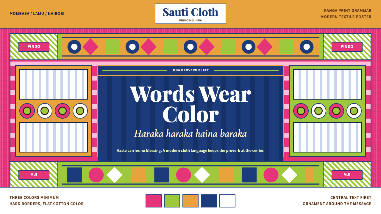 Kenyan Kanga PrintText speaks first. Hot pink ground, lime pindo border, indigo italic proverb…文字先发声:热粉底、青柠边框、靛蓝斜体谚语板。
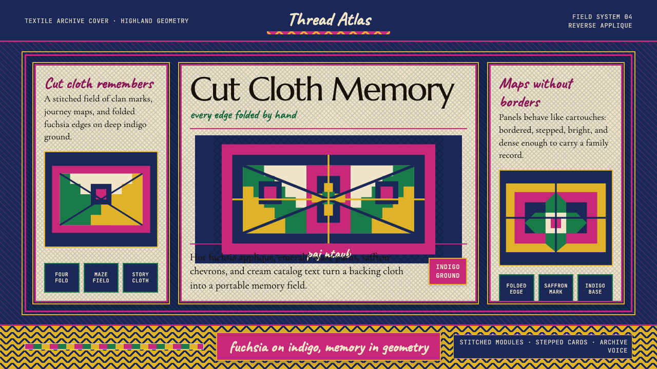 Hmong Paj Ntaub (Flower Cloth)Memory is geometric. Fuchsia applique on indigo forms stepped maze panels.记忆是几何的:靛蓝底上桃红贴花,组成阶梯迷宫面板。
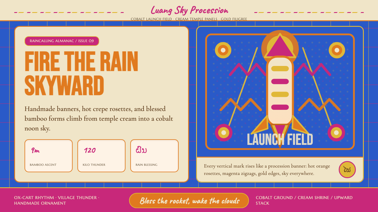 Lao Luang Pho (Bun Bang Fai Rocket)Festival thunder rises. Cobalt sky, Caveat banners, orange rosettes, and gold…节庆雷声向上:钴蓝天空、Caveat 横幅、热橙花环与金边层层升起。
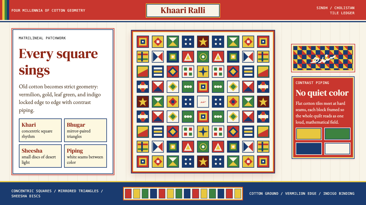 Sindhi Ralli QuiltSings in squares. Vermilion, gold, green, and indigo lock into piped tile rhy…方块在合唱:朱砂、金黄、叶绿与靛蓝,被白色镶边锁成拼布节奏。
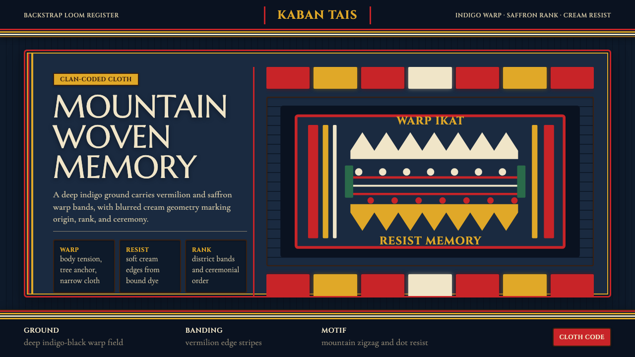 Timorese Tais (Backstrap Loom)Identity woven in darkness. Indigo ground, vermilion bands, saffron stripes,…暗色中织出身份。靛蓝黑底、朱砂与藏红花条纹、米白晕边。
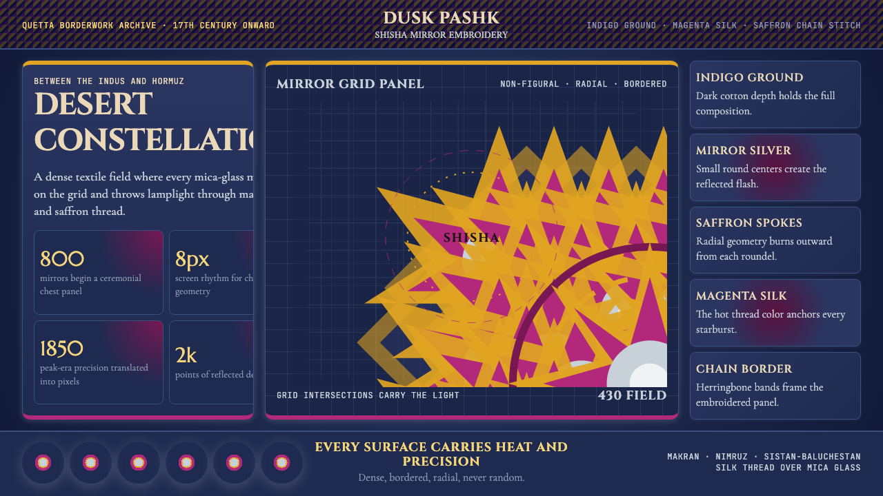 Balochi Mirror Embroidery (Shisha)Desert light made dense. Indigo grids flash with magenta, saffron, and mirror…沙漠光被织密:靛蓝网格闪出品红、藏红花与镜银星芒。