What is Lao Luang Pho (Bun Bang Fai Rocket)?
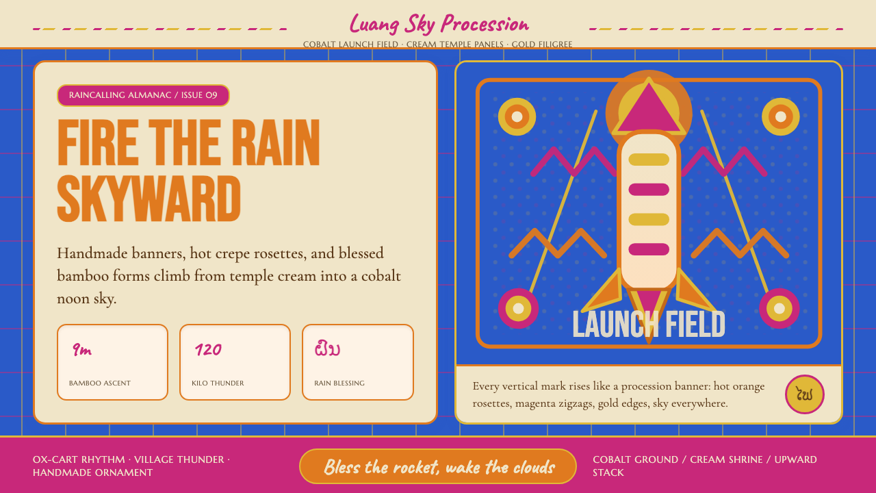
Bun Bang Fai transforms bamboo, crepe paper, and collective faith into nine meters of rain-summoning thunder aimed straight at the sky.
Lao Luang Pho (Bun Bang Fai Rocket) in brief
The Lao Luang Pho Rocket Festival — known in Lao and Isaan Thai as Bun Bang Fai — is the most visually explosive Buddhist-animist celebration in the Mekong basin. Every dry-season end, communities across Laos and northeastern Thailand build enormous bamboo rockets decorated with naga serpents, golden filigree, and cascades of crepe-paper rosettes, then parade them through the streets before launching them skyward to call the monsoon rains. The spectacle is simultaneously a Buddhist merit-making ceremony, a pre-Buddhist rain ritual, and an unapologetically raucous village carnival.
Visually, Bun Bang Fai occupies its own unmistakable register. The dominant ground is a clear, saturated cobalt — the color of the sky the rockets are sent to pierce. Against this blue, hot orange crepe-paper blossoms and magenta naga banners assert themselves in full saturation, without apology. Gold ornamental filigree traces the rockets' flanks, while cream and warm white recall the whitewash of temple walls. Nothing is restrained. Everything reaches upward, literally and compositionally.
As a design language, this style captures the festival's layered meanings: the animist impulse to bargain with rain spirits, the Theravada Buddhist framing that turns the rockets into merit offerings, and the purely communal joy of building something enormous together and watching it fly. The visual vocabulary — cobalt sky, hot orange, magenta, gold, cream — carries the weight of centuries of living tradition.
Where does Lao Luang Pho (Bun Bang Fai Rocket) come from?
The roots of Bun Bang Fai predate Buddhism in mainland Southeast Asia. Animist rain rituals involving noise, procession, and symbolic sky-reaching objects were common across the Mekong basin long before Theravada Buddhism arrived from Sri Lanka in the thirteenth and fourteenth centuries. Scholars including Charles Keyes have documented how the festival represents a particularly complete example of Buddhist-animist syncretism: the animist desire to compel the rain spirits through spectacle and offering was absorbed into a Buddhist merit-making framework rather than replaced by it.
Under the Lao kingdom of Lan Xang in the sixteenth century, the festival acquired its current formal structure. The Lan Xang court patronized Theravada Buddhism extensively, and the great rocket festivals at Vientiane and Luang Prabang took on royal dimensions — a pattern that gave the festival its other name, Bun Bang Fai Luang (the Great Rocket Festival). Temples became the organizational centers, rocket-building became a communal merit activity, and the procession through town became an occasion for theatrical performance and collective humor.
The French colonial period (1893–1953) documented the festival extensively, and it is partly through French ethnographic records that the nineteenth-century festival form is well understood today. Scholars such as Mayuri Ngaosrivathana have analyzed how the festival's visual grammar — the naga serpent motifs, the specific color combinations, the hierarchical decoration of the rockets according to the prestige of their builders — encodes a complete cosmological worldview in material form.
Robert Lingat's comparative work on legal and religious custom in mainland Southeast Asia helped situate the festival within the broader framework of Mekong-basin culture, where similar rain-rocket traditions appear across Laos, northeastern Thailand (Isaan), and parts of Myanmar. The Yasothon Rocket Festival in Isaan Thailand is today the largest single event in this tradition, drawing hundreds of thousands of visitors each May, though local community versions throughout Laos and Isaan remain the living core of the practice.
What defines the Lao Luang Pho (Bun Bang Fai Rocket) look?
Color: Cobalt Sky and Festival Heat
The palette is anchored by a deep, saturated cobalt blue that evokes both the tropical sky and the charged moment before the launch. Against this ground, hot orange and magenta assert themselves at full intensity — these are the colors of crepe-paper rosettes, flower garlands, and naga banners, and they read as pure, joyful heat. Gold ornamental detailing provides a third tier of warmth and prestige, while cream and warm white surfaces recall whitewashed temple walls and the natural tone of bamboo. The system uses all its colors simultaneously and at high energy, because a festival does not hold back.
Typography: Hand-lettered Warmth and Classical Dignity
Festival banners in Bun Bang Fai tradition are lettered by hand — exuberant, slightly irregular, full of warmth and forward energy. This quality gives the typographic register of this style its primary character: display type should feel like it was written in one confident, celebratory motion, with visible stroke personality rather than mechanical regularity. Alongside this banner warmth sits the stately heritage of classical Lao script, which brings a dignified counterweight — upright, measured, rooted in centuries of manuscript culture. The two registers in combination produce type that is simultaneously festive and serious.
Vertical Momentum
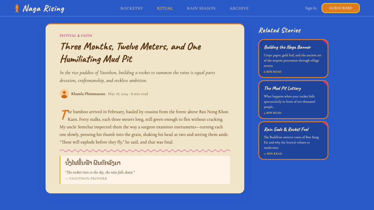
The entire compositional logic of this style reaches upward. Rockets are vertical objects; the act of launching is an upward motion; the prayer itself is directed at the sky. This vertical momentum shapes every layout decision. Elements stack and ascend rather than spread horizontally. Tall proportions are preferred over wide ones. Diagonal energy, when it appears, tilts upward rather than down. The composition enacts the same aspiration the festival expresses: a collective reaching toward something above.
Ornamental Layering
The rockets themselves are built up in layers — bamboo core, lacquer finish, wrapped naga serpent forms, applied crepe rosettes, gold filigree overlay, painted banners. This additive, layered approach to decoration is part of the visual DNA of the style. Unlike minimalist systems that subtract until only the essential remains, this style adds. Each layer of decoration is a form of devotion, a unit of effort, a demonstration of communal investment. Interfaces and layouts built in this register should feel generous and abundant rather than sparse.
Naga Serpent as Structural Motif
The naga — the mythological water serpent of mainland Southeast Asian cosmology — is the single most important figurative element in Bun Bang Fai visual culture. Nagas are the lords of the waters; sending a rocket decorated with naga imagery is a direct address to the rain spirits. As a design motif, the naga provides sinuous, flowing line energy that contrasts with the bold, flat geometry of the color fields. Serpentine curves, undulating borders, and scale-like patterns all draw on this tradition. The motif should feel mythological rather than merely decorative.
Gold as Sacred Emphasis
Gold in Lao Buddhist visual culture is not mere luxury — it is the color of the sacred. Temple spires, Buddha images, and manuscript illuminations all use gold to mark what is highest and most reverenced. In the rocket festival context, gold filigree identifies the apex of the rockets and the borders of important banners. As a design accent, gold should be used with similar intentionality: it marks what is most important, most honored, or most aspired to. It should appear rarely enough to retain its weight.
Communal Joy and Participatory Energy
Bun Bang Fai is not a spectator event — it is a collective act. Rockets are built by communities over months; the parade involves the entire village; the humor and bawdiness of the procession are scripted participatory rituals. This quality of collective, participatory energy should inform the emotional register of designs in this style. The feeling is not the polish of a luxury brand or the authority of an institution but the warmth and abundance of a large group of people building something together. Layouts can afford to be generous, slightly imperfect, and openly celebratory.
Who shaped Lao Luang Pho (Bun Bang Fai Rocket)?
Robert Lingat was a French legal historian whose comparative work on law and religious custom in mainland Southeast Asia provided one of the earliest scholarly frameworks for understanding how animist ritual practices were absorbed into and transformed by Theravada Buddhist institutional life. His research helps situate Bun Bang Fai within the broader history of how the Mekong basin negotiated the relationship between older spirit-placation traditions and the incoming Buddhist sangha.
Charles Keyes is an American anthropologist whose decades of fieldwork in Isaan Thailand and Laos produced foundational studies of Lao-Isaan identity, Theravada Buddhism, and the intersection of ethnic and religious practice in the Mekong basin. His documentation of how communities in Isaan experienced and navigated national borders — and how the Bun Bang Fai tradition functioned as a cross-border cultural continuum — remains essential for understanding the festival's living social role.
Mayuri Ngaosrivathana is a Lao scholar whose work on the cultural and religious dimensions of Bun Bang Fai has analyzed the festival's visual grammar with particular care — including the symbolic significance of the naga serpent decorations, the hierarchical coding of rocket ornamentation according to the social status of the builders, and the way the festival's theatrical elements encode cosmological meaning in performance. Her scholarship is among the most direct engagements with the festival as a coherent visual and symbolic system.
In every community that celebrates Bun Bang Fai, there are master craftspeople — typically older men with deep knowledge of bamboo preparation, lacquering, and structural engineering — whose skill determines whether a rocket will fly straight and reach its intended altitude. Their names are not recorded in scholarly literature, but their knowledge is transmitted through apprenticeship, and the visual sophistication of the rockets they produce represents centuries of accumulated material intelligence. The style owes its highest expressions to their craft.
How do you use Lao Luang Pho (Bun Bang Fai Rocket) today?
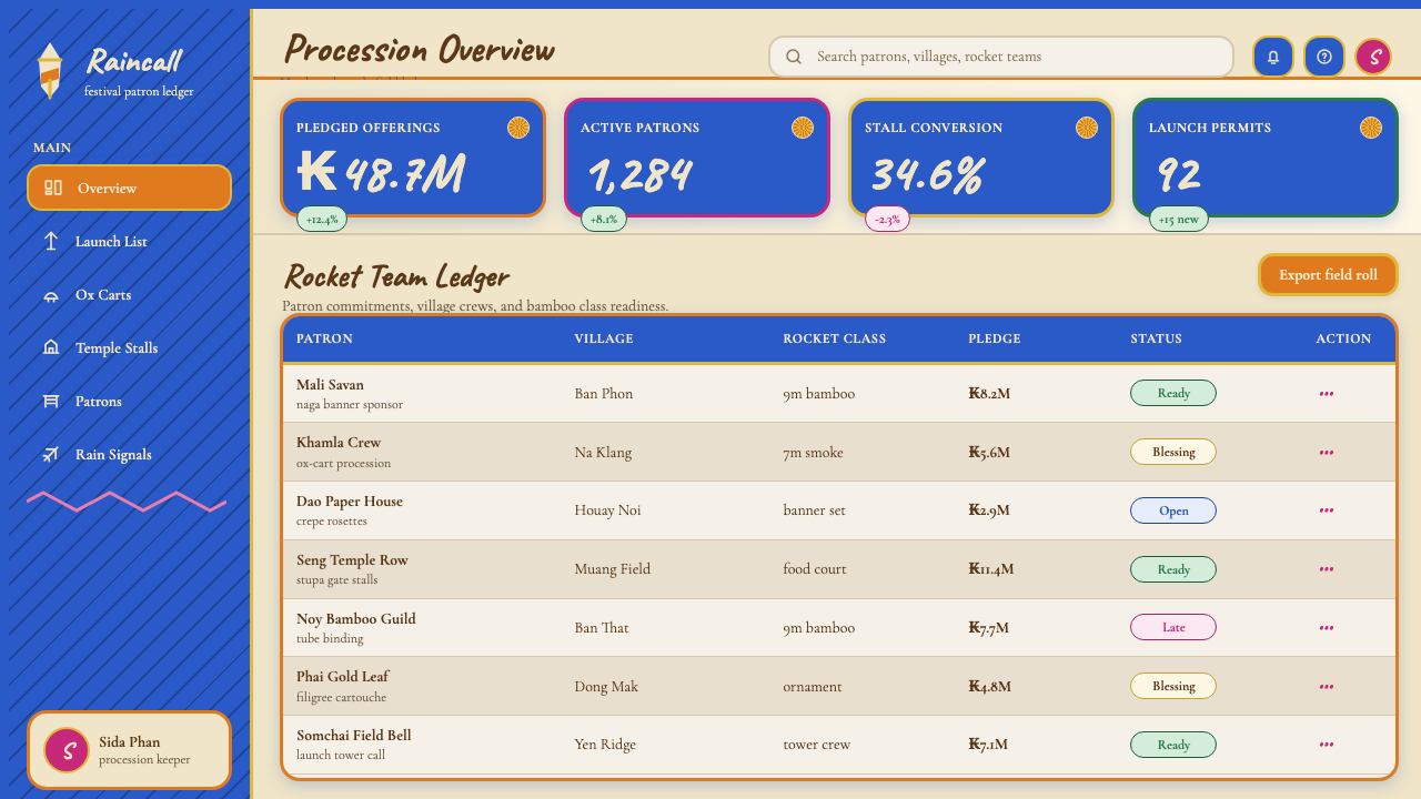
Bun Bang Fai is a style for contexts that demand warmth, festivity, and communal energy — the opposite of institutional coolness. Understanding when to deploy it means recognizing the emotional register it naturally inhabits: celebration, collective pride, cultural richness, and a sense of something being launched toward an aspired outcome. It is not suited to products whose primary value propositions are precision, austerity, or analytical authority. It is exceptionally well suited to cultural events, community platforms, products tied to Southeast Asian heritage, and any context where the goal is to make users feel welcomed into something abundant and generous.
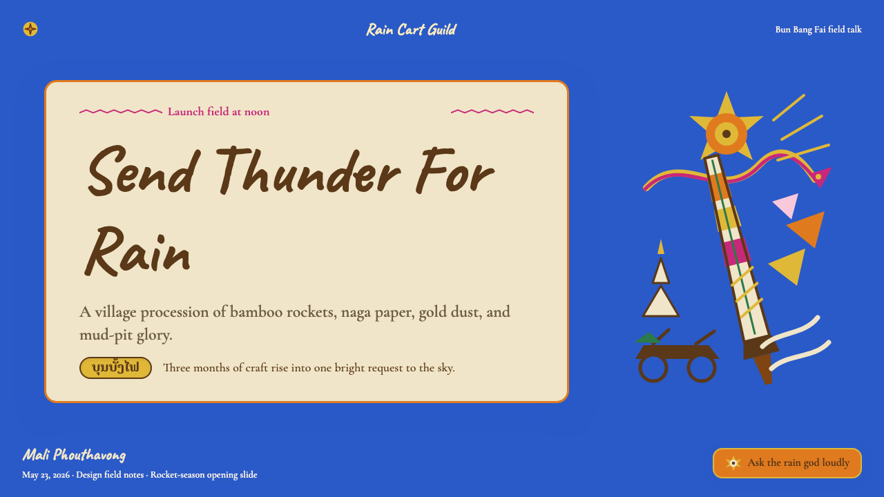
For presentation slides, this style works best when the content itself has energy and forward momentum. A cover in this register might use cobalt as the full-bleed background, with a large typographic title in cream or warm white, a gold ornamental border element framing the composition, and a hot orange accent used for a single high-emphasis word or subtitle. Content slides should maintain the vertical orientation where possible — tall image blocks, stacked text and data elements — with magenta or orange used to highlight the single most important figure or claim on each slide. Data slides can be treated boldly: charts built in cobalt and orange read as festival banners of information, with each data series carrying the associative warmth of the color palette.
For web interfaces, this style is most effective on pages where cultural richness and festive energy are the product — event websites, cultural institution landing pages, community platforms, and heritage tourism interfaces. The approach: use cobalt as the primary background for hero and feature sections, cream or warm white for content-dense reading areas, and reserve the full hot-orange and magenta for interactive elements, category labels, and calls to action. Navigation can incorporate naga-inspired sinuous line motifs as decorative borders without overwhelming the functional clarity. Gold accents should mark only the highest tier of interaction — the primary call to action, the featured item, the most honored content.
For editorial and marketing work, the style supports content that celebrates rather than argues. A Bun Bang Fai-inflected editorial layout uses wide, generous margins with orange or gold decorative borders, large typographic pull-quotes that lean into the hand-lettered warmth of the display register, and section breaks marked by naga-serpent curve ornaments rather than plain horizontal rules. Marketing pages built in this style work well for announcements, launches, and festival-adjacent campaigns — anything where the core emotional message is collective excitement and forward momentum.
A common mistake when applying this style is flattening it into a generic tropical or festive pastiche by using the colors without the compositional logic. The specific quality of Bun Bang Fai visual culture is not just the palette but the vertical orientation, the layered abundance, the sacred weight of the gold accent, and the dynamic tension between the cobalt ground and the hot foreground colors. Designs that sample the colors but lay them out in standard horizontal grids will feel like generic festival branding rather than a genuine engagement with the tradition. The style demands its own compositional commitments.
Lao Luang Pho (Bun Bang Fai Rocket) — FAQ
Is this style only appropriate for Southeast Asian brands or culturally Lao contexts?
Not exclusively, but cultural specificity demands honest engagement. The style draws on a living tradition with deep spiritual and communal meaning, so applications that adopt its visual vocabulary without any acknowledgment of that context risk superficiality. That said, the design principles — vertical momentum, layered abundance, the interplay of a saturated ground color with hot foreground accents, the sacred use of gold as emphasis — are translatable to many contexts: cultural festivals, community celebrations, platforms that want to communicate warmth and collective energy, or any launch-oriented product where the metaphor of something being sent skyward resonates. The style works best when the emotional register of the application aligns with the festive, aspiring character of the source.
How do I use the cobalt blue without it feeling overwhelming or aggressive?
The key is treating cobalt as a sky — a ground from which other elements emerge — rather than as a feature color. In the festival, the blue is the context that the rockets fly against, not the rockets themselves. Applied to layouts, this means cobalt works best as a large-area background in sections where other elements are given room to breathe against it: a single large typographic statement, a generous amount of negative space, and two or three carefully placed accent colors. If cobalt is used in small quantities — as a secondary color rather than the dominant ground — it loses its sky-like expansiveness and reads simply as a corporate mid-blue. Commit to it as a field, not a detail.
The style seems very saturated and energetic — can it be quieted for contexts that need more restraint?
Yes, and the tradition itself offers the answer. Temple walls and manuscript pages in Lao Buddhist culture are quieter than the rockets — they use the same gold and cream and blue, but at lower intensity, with more white space, and with the gold used as fine ornamental detail rather than broad field color. A quieted version of this style reduces the cobalt to an accent or border element, expands the cream and warm white as the primary ground, and uses the hot orange and magenta sparingly for single emphasis points. The naga serpent motifs remain but become delicate line drawings rather than bold fills. This produces a style that reads as cultural and warm without the full festival intensity.
How does this style handle photography and illustration?
Photography in this register works best when it is treated as a festival document rather than a polished commercial image — candid energy, warm light, saturated color, human presence at scale. Images of collective activity (crowds, parade formations, collaborative construction) align better with the style's communal character than isolated product shots or controlled studio imagery. When illustration is used, the most coherent approach draws on the visual lexicon of the tradition itself: naga serpent forms, crepe-paper rosette patterns, bamboo structural geometry, and the bold graphic quality of hand-painted festival banners. Digital illustration should feel drawn rather than rendered — expressive line, flat color fields, and a sense of material physicality.
What is the single most important principle for someone applying this style for the first time?
Commit to the vertical. Every other quality of the style — the layered decoration, the festive color energy, the ornamental abundance — can be approximated by working carefully with the palette and motifs. But the vertical orientation, the upward compositional reach that mirrors the rockets themselves, is the structural principle that distinguishes authentic engagement with this tradition from a generic tropical color exercise. Layouts that spread horizontally, that anchor weight at the center, or that treat all four edges of the composition as equivalent will never quite achieve the aspiring, launching quality that makes this style distinct. Design as if you are building something that needs to fly.
Related design styles
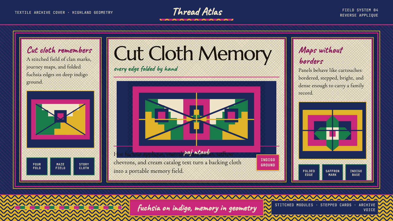 Hmong Paj Ntaub (Flower Cloth)Memory is geometric. Fuchsia applique on indigo forms stepped maze panels.
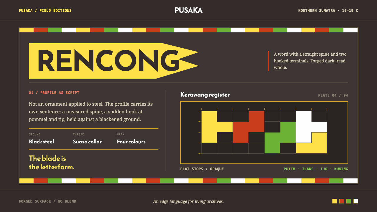 Acehnese Rencong MotifA blade that reads as a word. Flat kerawang red, white, green and yellow lock…
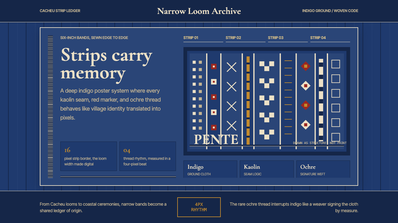 Bissau-Guinean Pano de PenteIndigo remembers. Narrow bands and kaolin seams turn weave grammar into pixel…
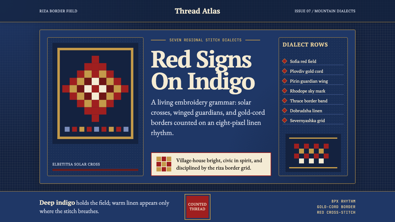 Bulgarian Shevitsa Folk EmbroideryVillage-bright code. Deep indigo carries shevitsa red crosses and gold-cord b…
 Dayak Borneo Tattoo (Iban)A living journey ledger. Soot lines, ochre panels, and rust rosettes feel han…
 Gorodets Folk Panel PaintingFolk color moves at a gallop. Blue forms, red roses and white dots spark on i…