What is Chhau Purulia Mask?
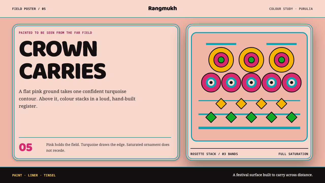
A Purulia chhau mask is built up in layers, not carved: a flat pink face drawn in broad turquoise line, crowned with a dense stack of foil, feathers and flowers, and made to be read from the far side of a night field.
Chhau Purulia Mask in brief
Chhau Purulia Mask is a loud, joyful design system modelled on the masks of Purulia chhau, a dance of West Bengal in eastern India. It rests on a simple division of labour: pink is the ground, turquoise is the ink. The face is a flat pink field, every feature is drawn onto it in a broad turquoise line of even weight, and above the brow rises a crown of dense, saturated ornament. Nothing is restrained, and nothing needs to be, because the object was made to be seen from a long way off.
The mask is built rather than carved. A maker lays clay over a cane mould, then adds papier-mâché, ash and strips of cloth, and finishes with lacquered paint. The face that results is flat and smooth, which is what lets colour do all the work. The crown is a different kind of construction, an assembly of tinsel, foil, feathers and flowers made of shola pith, heavy enough to reach five kilograms. Together, the flat face and the crowded crown are the whole composition.
That split is the style's core rule. The flat pink face is the calm centre and the crown is the excess. Translating it for screens means keeping one large, simple, flat area, a line drawn at one steady weight across it, and then allowing a dense, bright stacked accumulation above or around it. It is a style of full colour and full commitment, and it rewards designers who are willing to be bold.
Where does Chhau Purulia Mask come from?
The masks come from Charida village in the Baghmundi block of Purulia district, West Bengal, India. The record places the style in the period 1900 to 1950, when the masked, martial form of chhau consolidated in Purulia, and the workshops in Charida are still producing masks today. A family tradition sits at the centre: the Sutradhar mask-making families of Charida have made masks there for a hundred years and more, and they supply the whole chhau dance region.
Chhau itself is a dance tradition with three recorded branches, named for the places they come from: Purulia, Seraikella and Mayurbhanj. The Purulia branch is the one this design system draws on, and its masks are its most visible objects. The craft traditions that feed it are Charida mask-making and shola-pith craft, the working of a pale, light plant pith into flowers and ornament. In 2010 UNESCO inscribed chhau dance, which brought international attention to the tradition.
The colours are a code, not a decoration. Pink is reserved for the human-like heroes, among them Lakshman, Kartik and Arjuna, and for most of the goddesses. Blue is held for Krishna, and green for Rama. Demons are given dark colours. A viewer standing far from the performers can therefore read a character's nature from the colour of the face before a single gesture is made. That function, legibility at a distance, shapes everything about the look: broad flat areas, strong hues and bold, even lines.
The design system translates that function into a method. The base is a flat pink field. The line is the turquoise that draws eyes, brows, nostril wings and lips in a broad, steady stroke. Above everything sits a crown-like stack of dense ornament in full colour, leaving no margin. The result is meant to read from the back of a night field, and so, on a screen, from across a room. It is a designer's reading of the craft, built on the workshops' own logic of base colour, line and crown, and it credits the makers of Charida for that logic.
What defines the Chhau Purulia Mask look?
Built Up, Not Carved
The mask is an additive object: clay over a cane mould, then papier-mâché, ash and strips of cloth, then lacquered paint. Nothing is removed from a block. That additive logic carries into the design: surfaces are laid down in layers, shapes are smooth and continuous, and detail is added on top rather than cut in. There are no engraved or recessed effects, only things applied, stacked and painted.
Pink as Ground
The face is a flat pink, applied as an even field without shading or modelling. Pink is the colour reserved for the human-like heroes and most of the goddesses, so it carries a sense of the human and the approachable. In the design system it is the default surface: large, flat and uninterrupted, the field on which all the other decisions are made.
Turquoise as Ink
Every feature, eyes, brows, nostril wings and lips, is drawn in a broad turquoise line of even weight. The line never swells or tapers; it has the steadiness of a signwriter's stroke. Turquoise is the ink of the system, the colour that draws and the colour that holds the pink in shape. Lines, outlines, icons and rules should all share this single weight and hue.
Colour as Casting
Colour assigns role. Pink for the human-like heroes and most goddesses, blue for Krishna, green for Rama and dark tones for demons. Nothing about the palette is arbitrary, since each hue tells the viewer who is on stage. In an interface this becomes a semantic system: decide what each colour means, apply it consistently, and let people learn the code at a glance.
The Crown
Above the brow sits a crown of tinsel, foil, feathers and shola-pith flowers, tied to a halo of wire and weighing as much as five kilograms. Rosette-like round forms stack in tiers, each glittering with metallic and saturated colour. In the design system the crown is the single place where density is welcome: layered, ornate, overflowing, and set against the calm of the flat face below it.
Saturation Without Reserve
Colours are used at full strength. There is no muting, no pastel timidity and no neutral buffer to calm things down. The result is a high-energy, high-chroma image where each hue competes only with the sheer scale of the pink ground. The discipline is not restraint but structure: because the base, the line and the crown each have a clear role, the strength of the colour stays readable instead of chaotic.
Built to Carry Across Distance
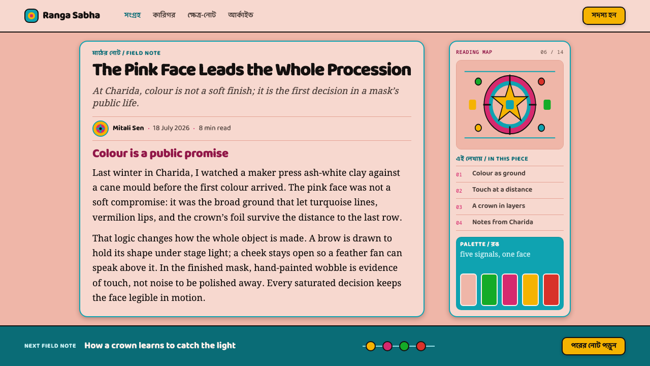
The whole object is designed for legibility at a distance, to be seen from the back of a night field. Large flat shapes, strong hues, thick lines and a glossy lacquered finish all serve that purpose. The lesson for screens is scale: use big areas, heavy strokes and strong contrast between ground and line, so the design stays clear from across a room and on a small phone alike.
Who shaped Chhau Purulia Mask?
The Sutradhar families of Charida village are the makers at the centre of this tradition, and they have worked there for a hundred years and more, supplying the whole chhau dance region. Their workshops are still producing. The design system is built on their logic of base colour, line and crown, and the right way to use it is to credit them for it.
UNESCO inscribed chhau dance in 2010. The inscription covers the dance tradition and its three branches, Purulia, Seraikella and Mayurbhanj, and it is the reason the form is recognised internationally today. For designers it is a reminder that the masks belong to a living performance practice, not only to an object style.
These are the human-like heroes named in the tradition whose masks take the pink face, the colour the system uses as its default ground. They are characters, not historical people, and they show how the colour code works: a hero's face is the plain, flat, approachable field on which the turquoise line is drawn.
Krishna is given blue and Rama green, the two colours reserved for them in the code. They show that the system's palette is not a free choice. Each strong hue belongs to a specific role, so a designer borrowing the style should likewise decide what its blue and green mean and keep them for those meanings.
How do you use Chhau Purulia Mask today?
Chhau Purulia Mask is a style for work that wants to be seen, remembered and enjoyed. It suits energetic, expressive subjects and gives a layout a clear three-part structure to build on: a flat pink base, a turquoise line and a dense crown of ornament. The key is to keep those three roles distinct and then commit to them fully.
On presentation slides, a cover can be a large flat pink field with a title drawn in the single turquoise line and a dense stack of colourful shapes rising above one edge like a crown. Content slides should keep the pink ground flat and use turquoise rules, arrows and outlines at one consistent weight. Data slides suit bold, high-chroma bars and segments, with each hue assigned a clear meaning, and with the legend treated as part of the code rather than an afterthought.
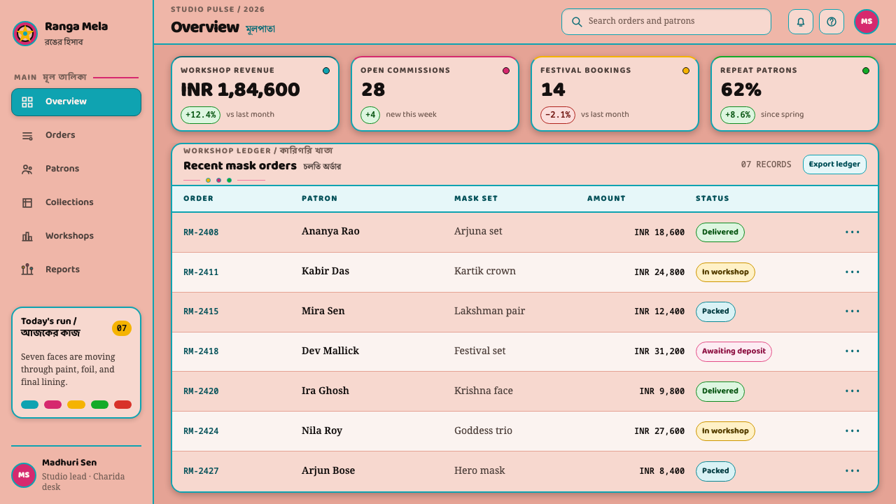
For web interfaces the style fits entertainment, culture, events, food, creative tools and playful consumer products. Make the default surface a flat pink, draw borders, icons and dividers in the turquoise line at one steady weight, and reserve the crown treatment for hero sections or banners, where layered, saturated decoration sits above the calm field. Semantic colours such as success, warning and role badges can follow the casting idea: each strong hue gets one job. Dense data dashboards are harder, so keep their tables calm and put the ornament in headers.
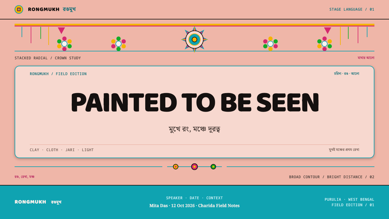
In editorial and marketing work, the style gives campaign pages and posters a distinctive, high-energy look. A page can open with a big flat colour field and a single bold line, then end with a crowded, glittering cluster of detail as a sign-off. Photography works best when it is cropped boldly and treated as one more flat area, ideally in sympathetic hues. Festival, performance, craft and community subjects are natural territory, and the style is excellent for anything that must be recognised from a distance.
The common mistake is to calm the style down. Grey neutrals, pastel versions of the colours and hairline strokes all remove the thing that makes it work, which is distance legibility. Another is to blur the split: using turquoise as a big fill, or letting the crown's density spread across the whole page, destroys the contrast between calm face and busy crown. A third is to treat the mask as a caricature. It is the product of a living craft, so use its logic of base, line and crown, and credit the makers of Charida.
Chhau Purulia Mask — FAQ
What is a Purulia chhau mask made of?
It is built up in layers rather than carved: clay over a cane mould, then papier-mâché, ash and strips of cloth, and finally lacquered paint. The crown above it is assembled from tinsel, foil, feathers and flowers made of shola pith, and can weigh as much as five kilograms. The Sutradhar families of Charida village have been making them for a hundred years and more.
Why is the face pink and the line turquoise?
Pink is the colour reserved for the human-like heroes, such as Lakshman, Kartik and Arjuna, and for most of the goddesses. Krishna is blue, Rama is green, and demons are dark. The features are then drawn on the pink in a broad, even turquoise line. That division, pink for ground and turquoise for ink, is the heart of the design system and the reason it reads clearly from far away.
Is full saturation appropriate for serious or professional work?
It depends on the subject. The style is built for visibility and celebration, so it suits cultural, creative, event and consumer work better than quiet, formal communication. If you want to use it in a more serious setting, keep its structure, a flat base, one line and a limited crown, but assign colours strictly by meaning and keep the busiest ornament in headers or banners rather than in data areas.
What is shola pith?
Shola pith is a pale, light plant pith worked by hand into flowers and ornaments. In the chhau mask it is one of the materials of the crown, alongside tinsel, foil and feathers. Shola-pith craft is a recognised tradition in its own right, and in the design system it stands for light, flower-like decorative forms that can be stacked high without looking heavy.
How do I use the crown idea without making the interface cluttered?
Confine it. The crown works because it sits above a large, calm, flat face. Use the dense, layered ornament in one place, such as a hero banner, a header or a celebration state, and keep the surfaces below it plain pink with a single turquoise line. If the crown appears everywhere, it stops being a crown and becomes noise.
Related design styles
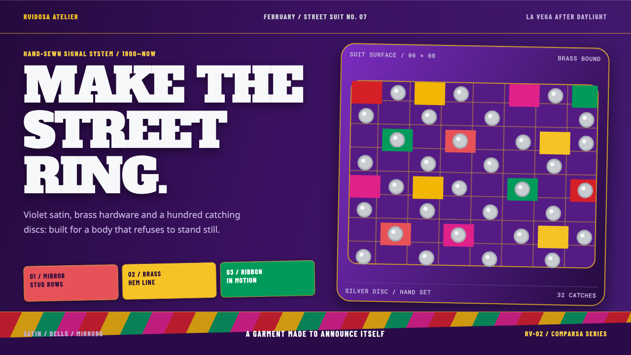 Diablo Cojuelo CostumeBuilt to be seen moving. Violet satin, brass edges, and mirror-disc grids mak…
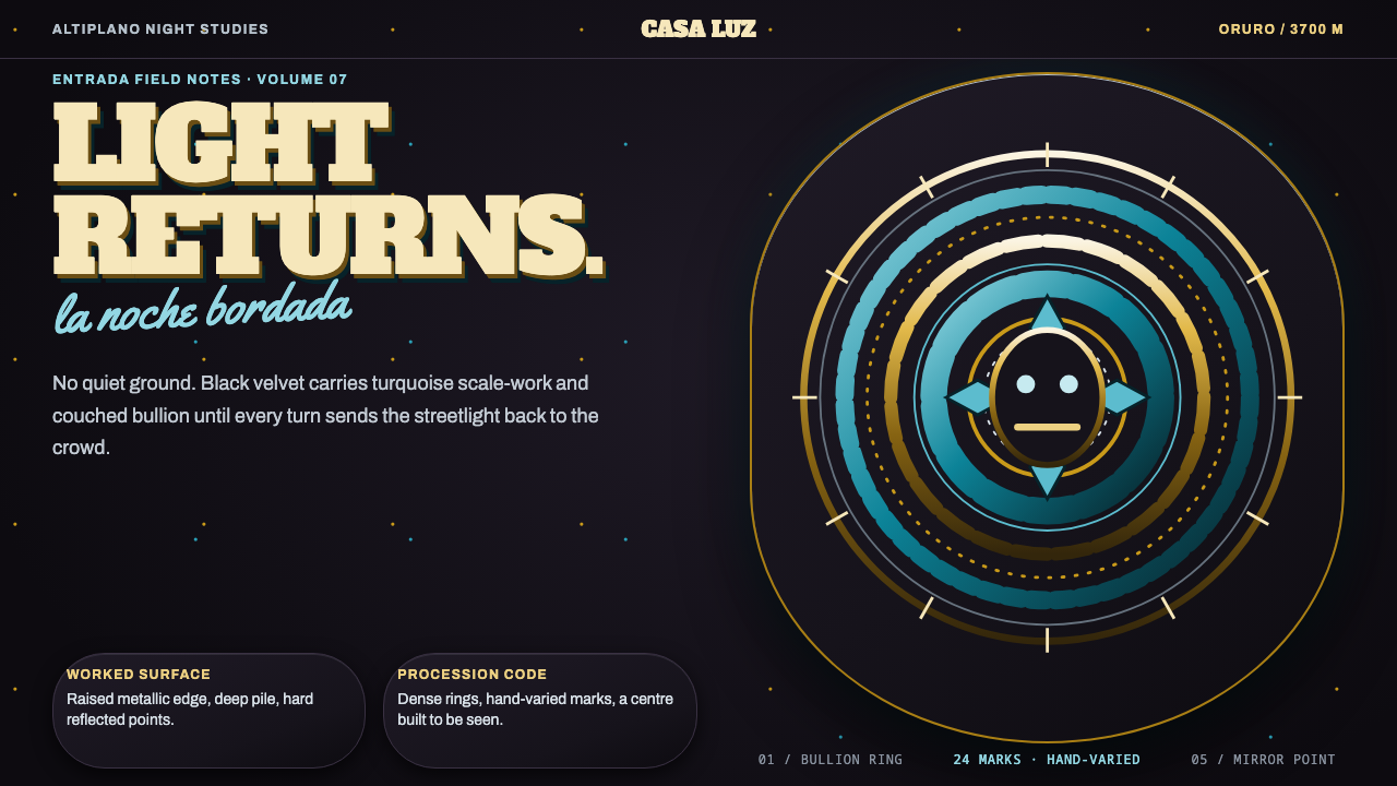 Diablada de OruroDensity throws light back. Turquoise scale-work and bullion rings electrify b…
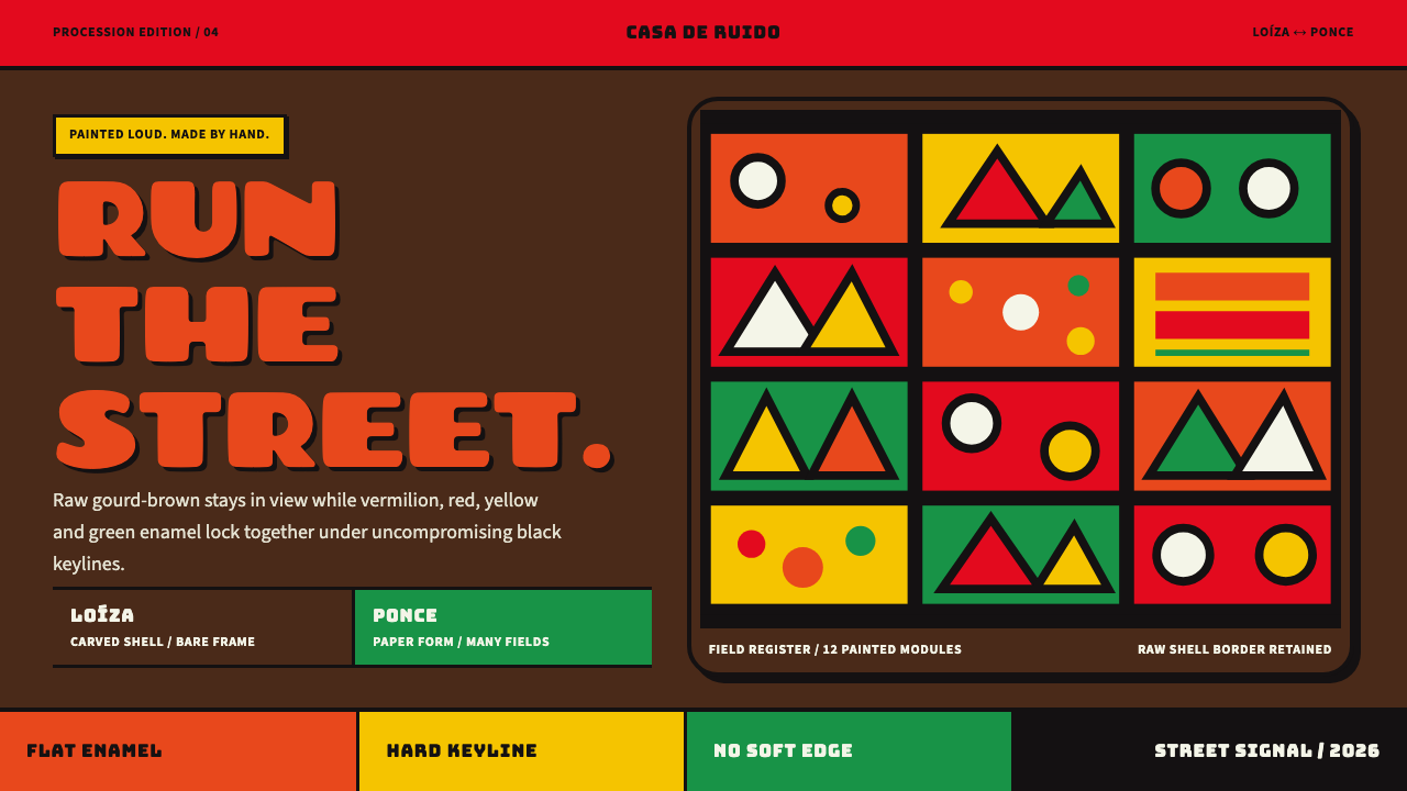 Vejigante MaskCarnival paint refuses polish. Flat red, yellow and green enamel meet in hard…
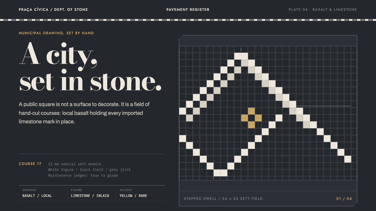 Calçada PortuguesaA city drawn in stone. Stepped limestone courses cut across a basalt grid.
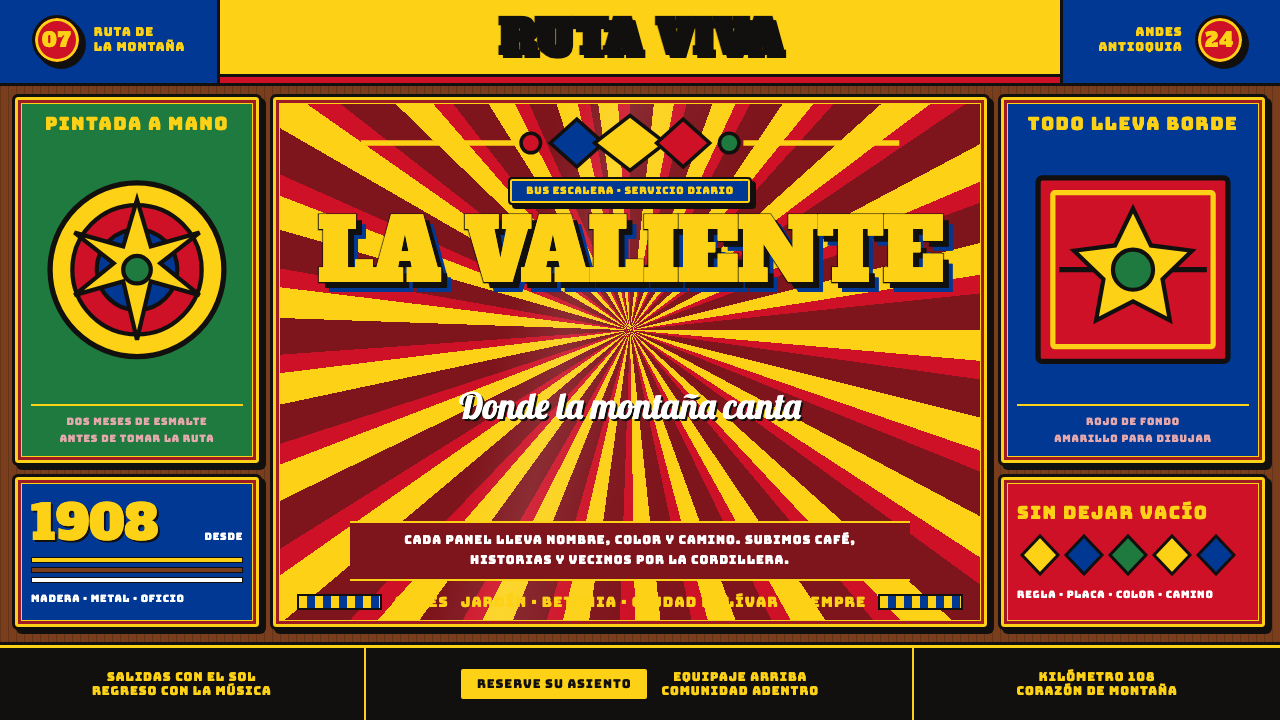 Colombian Chiva BusNothing is left unpainted. Flag-yellow rules, slab lettering and black keylin…
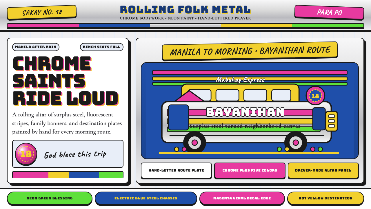 Filipino JeepneyLoud steel, made personal. Chrome gradients carry neon stripes and hand-lette…