What is Ga Fantasy Coffin?
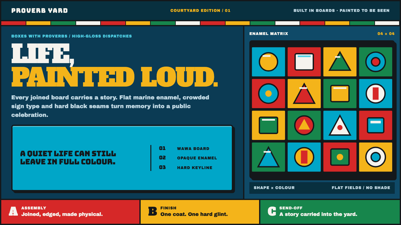
Ga Fantasy Coffin takes the vocabulary of Ghana's figurative coffin workshops — flat marine-enamel color, a heavy black outline around every shape, and one hard highlight — and builds a screen language meant to be read from across a courtyard, not up close.
Ga Fantasy Coffin in brief
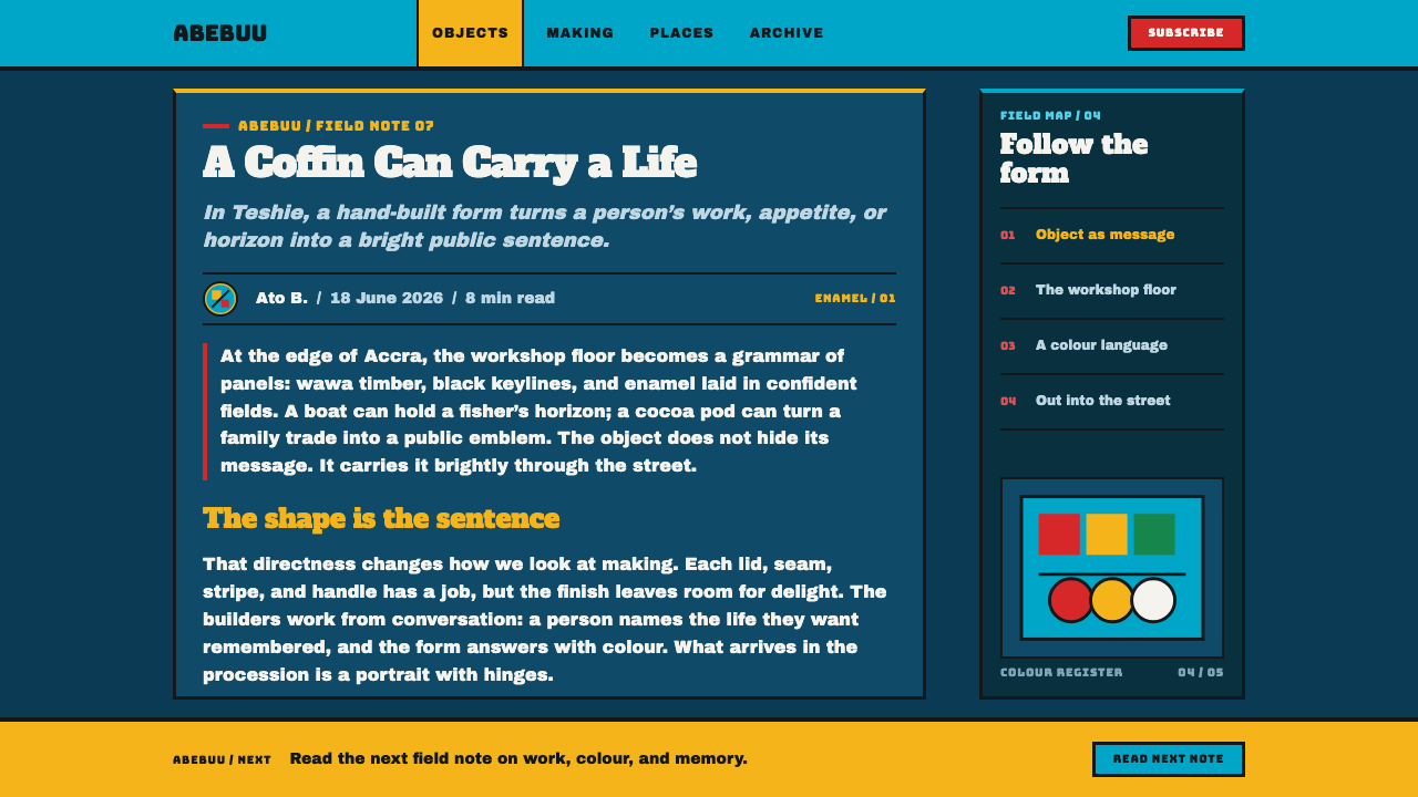
Ga Fantasy Coffin is built from abebuu adekai — literally 'boxes with proverbs' — the custom figurative coffins made since the 1950s by the Kane Kwei workshop in Teshie, Ghana. Each coffin is carved and pieced into the shape of the life it carries: a boat for someone who fished, a cocoa pod for someone who farmed, an aeroplane for a woman who loved watching them land. The coffin is not meant to whisper. Among the Ga people, a funeral is a public, celebratory send-off, and the coffin is designed to be seen — in the workshop yard, in the procession, by an entire neighborhood.
The construction process shapes the visual system as much as the symbolism does. The coffins are pieced together from wawa timber the way a carpenter builds furniture, then handed off to sign painters — often the same artists who paint movie posters — to finish in industrial marine enamel. That finishing process is why the look is so specific: color goes on as flat, opaque fields with no shading or gradient, every seam between shapes is sealed with a heavy black outline, and a single hard, bright sliver stands in for a highlight rather than any soft rendering of light.
This system paints screens exactly the way those sign painters paint wood. The ground reads as deep sea-blue, the way a courtyard scene would, and color arrives in the same enamel-bright register — turquoise, sign red, yellow, green — laid down in whole blocks. Typography follows the same sign-painter's hand: letters are fat, crowded together, and unapologetically loud, because the entire visual language was built to survive being seen from a distance in bright outdoor light, not examined on a screen held six inches from the face.
Where does Ga Fantasy Coffin come from?
The tradition traces to the workshop Seth Kane Kwei founded in Teshie, in Ghana's Greater Accra region, around 1951. Kane Kwei is credited with the founding idea behind abebuu adekai: that a coffin could — and should — take the shape of the life it was built for, rather than the generic rectangular box used elsewhere. A fisherman's coffin could be a boat or a fish; a cocoa farmer's could be a cocoa pod; a woman who liked watching aeroplanes land could be carried in one shaped like a plane.
This idea sits inside a specific cultural framework: among the Ga people, funerals are not muted, private affairs. They are festive public events, and the coffin is a centerpiece meant to be displayed and admired before burial — in the workshop courtyard and in the procession through the streets. That public function is inseparable from the visual style; a coffin meant to be glanced at quietly would not need flat, high-contrast enamel color and a heavy black outline, but a coffin meant to hold a crowd's attention in the open air does.
The workshop's method reflects a division of labor between two trades. The coffin's form is built like furniture — pieced together from wawa timber by carpenters — and only afterward handed to sign painters for its finish. Those painters typically worked across other commercial trades as well, including painting movie posters, and they brought that same fast, bold, flat-color, hard-outline technique to funerary work. The result is a visual system born from combining furniture construction with commercial sign-painting, rather than from fine-art sculpture traditions.
The workshop has continued across multiple generations, from Seth Kane Kwei's founding around 1951 through carvers including Paa Joe and Ben Kwei, into current output led by figures such as Eric Adjetey Anang in the 2020s. That continuity across decades — the same figurative logic and the same enamel-and-outline finish carried forward by successive workshop generations — is part of why the style reads as an established tradition of Ga funerary art and West African sign painting rather than a single artist's invention.
What defines the Ga Fantasy Coffin look?
Flat Enamel Color
Color is applied as whole, opaque fields with no shading, no gradient, and no attempt to simulate volume through tonal variation. Each shape — a hull, a fin, a letterform — is a single flat color, the way industrial marine enamel goes onto wood.
Heavy Black Outline
Every shape is sealed by a thick, continuous black line where it meets its neighbor. The outline does the structural work that shading would do in a softer style — it is what separates one color field from the next and gives every form its edge.
Single Hard Highlight
Where light is suggested at all, it appears as one hard, bright sliver rather than a soft gradient or ambient glow. This is a sign painter's shorthand for shine, not a rendering of a real light source, and it is used sparingly — once per form, not scattered across a surface.
Sign-Painter Typography
Lettering is fat, tightly set, and loud, descended from the same hand that painted movie posters and shop signs. It is built to be legible from a distance in bright outdoor light, not to be refined at close reading range.
Form as Biography
The shape of the whole object is symbolic of the life it represents — a boat, a cocoa pod, an aeroplane. Applied to a product, this principle argues that a shape or icon should say something specific and literal about its content, not serve as generic decoration.
Structure Before Finish
The underlying form is built first, like furniture, from a separate material logic than the enamel finish applied on top. This maps to a design discipline where the structural layer — layout, hierarchy, shape — is resolved before the color and surface treatment are applied, and the two are never allowed to blur into each other.
Built for Public Distance
Every choice — the flatness, the loud color, the heavy outline — is calibrated for visibility across a courtyard or along a procession route in bright daylight, not for the intimate, close-up viewing distance most screen design assumes.

Who shaped Ga Fantasy Coffin?
Kane Kwei founded the workshop in Teshie around 1951 and is credited with originating the idea that a coffin should take the literal shape of the life it was built to carry, establishing the figurative form that defines abebuu adekai to this day.
Paa Joe trained and carved within the Kane Kwei workshop tradition, helping carry the figurative coffin practice forward as one of its recognized carvers across the following decades.
Ben Kwei represents a later generation of the Kane Kwei family workshop, continuing production of figurative coffins under the tradition Seth Kane Kwei established.
Anang leads the workshop's most recent generation, keeping the abebuu adekai tradition in active production into the 2020s and carrying its furniture-then-enamel construction method forward.
How do you use Ga Fantasy Coffin today?
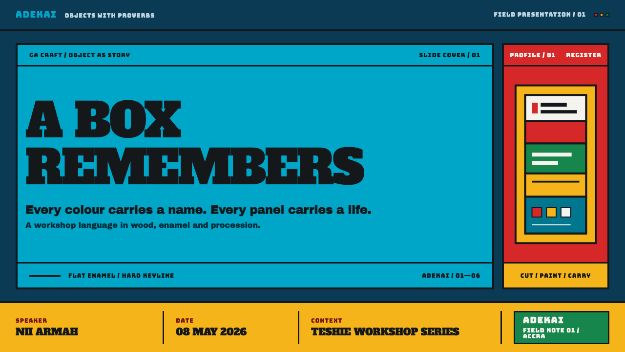
On presentation slides, the style works best as a bold, high-visibility statement rather than a subtle backdrop. A cover slide can use a single large symbolic shape — filled with one flat enamel color and sealed in a heavy outline — positioned the way a coffin would sit in a courtyard, with the title set in fat, sign-painter type. Content slides should keep color blocking flat and confident: one enamel field per section, separated by heavy rules rather than soft dividers, and data should appear as bold flat-color bars or icons rather than shaded charts.
For web interfaces, this system suits products that want to feel bold, celebratory, and unmistakably present — brand pages, cultural platforms, or anything positioning itself against quiet, minimal competitors. Keep backgrounds deep sea-blue or similarly saturated and dark, use flat enamel-bright colors for primary actions, and outline interactive elements with a heavy, continuous line rather than a soft border or shadow. Icons should be literal and specific — form as biography — rather than abstract glyphs.
In editorial and marketing contexts, the sign-painter's typography is the strongest transferable asset: headlines set fat, tight, and loud communicate confidence and read well at a distance, which suits hero banners and pull quotes meant to stop a scroll. Section dividers can use a heavy black rule in place of a thin line, echoing the outline that seals every coffin's color fields.
Marketing pages benefit from leaning into the style's core proposition — that form itself should say what something is. A product feature can be represented by a literal, symbolic shape rather than a generic icon, following the same logic that gives a fisherman a boat-shaped coffin rather than an ordinary box.
The most common mistake is softening the outline or adding gradients to the enamel color fields in the name of subtlety. Both moves erase the entire visual argument, which depends on hard edges and flat, opaque color to survive being seen from a distance — softening it produces something that reads as neither this style nor anything else, just a diluted version of a much bolder original.
Ga Fantasy Coffin — FAQ
Is it appropriate to use funerary coffin art as a commercial or digital design style?
The workshops themselves have always operated as a visible, public craft — the coffins are commissioned, displayed, and celebrated openly rather than treated as private or somber objects, and the tradition has been recognized internationally as a form of contemporary sculpture. Applying its visual vocabulary respectfully to design work follows the same logic that already governs how the originals are made and shown: as bold, public, celebratory craft.
What does 'abebuu adekai' actually mean?
It translates roughly to 'boxes with proverbs' — the idea that a coffin's shape should carry meaning about the life inside it, rather than being a generic container. That principle of a form literally representing its content is the conceptual core the whole design system is built around.
Does this style need a dark, saturated background to work?
Effectively yes. The deep sea-blue ground read is central to the look, echoing the courtyard and workshop settings the coffins are traditionally displayed in, and it provides the contrast the flat enamel colors and heavy black outlines need to stay legible and bold.
How is this different from other bold, flat-color design styles?
The defining difference is the heavy black outline sealing every color field and the single hard highlight standing in for light — both descended specifically from marine-enamel sign painting on wood, not from a general graphic-design trend toward flatness. The typography and the 'form as biography' principle, where shape itself carries specific meaning, are equally distinctive.
What is the biggest mistake when applying this style digitally?
Trying to make it subtle. This is a style built for maximum visibility in bright outdoor light and a crowd of onlookers; softening the outlines, muting the colors, or adding gradients for a more 'refined' digital feel removes exactly the qualities that make it recognizable and effective.
Related design styles
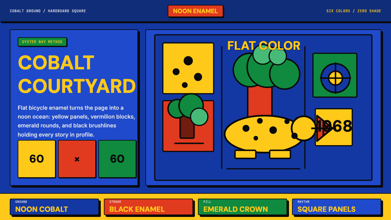 Tanzanian Tingatinga on Cobalt Canvas (1968)Cobalt sings flat. Yellow, vermilion and emerald panels snap under black enam…
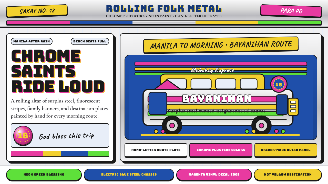 Filipino JeepneyLoud steel, made personal. Chrome gradients carry neon stripes and hand-lette…
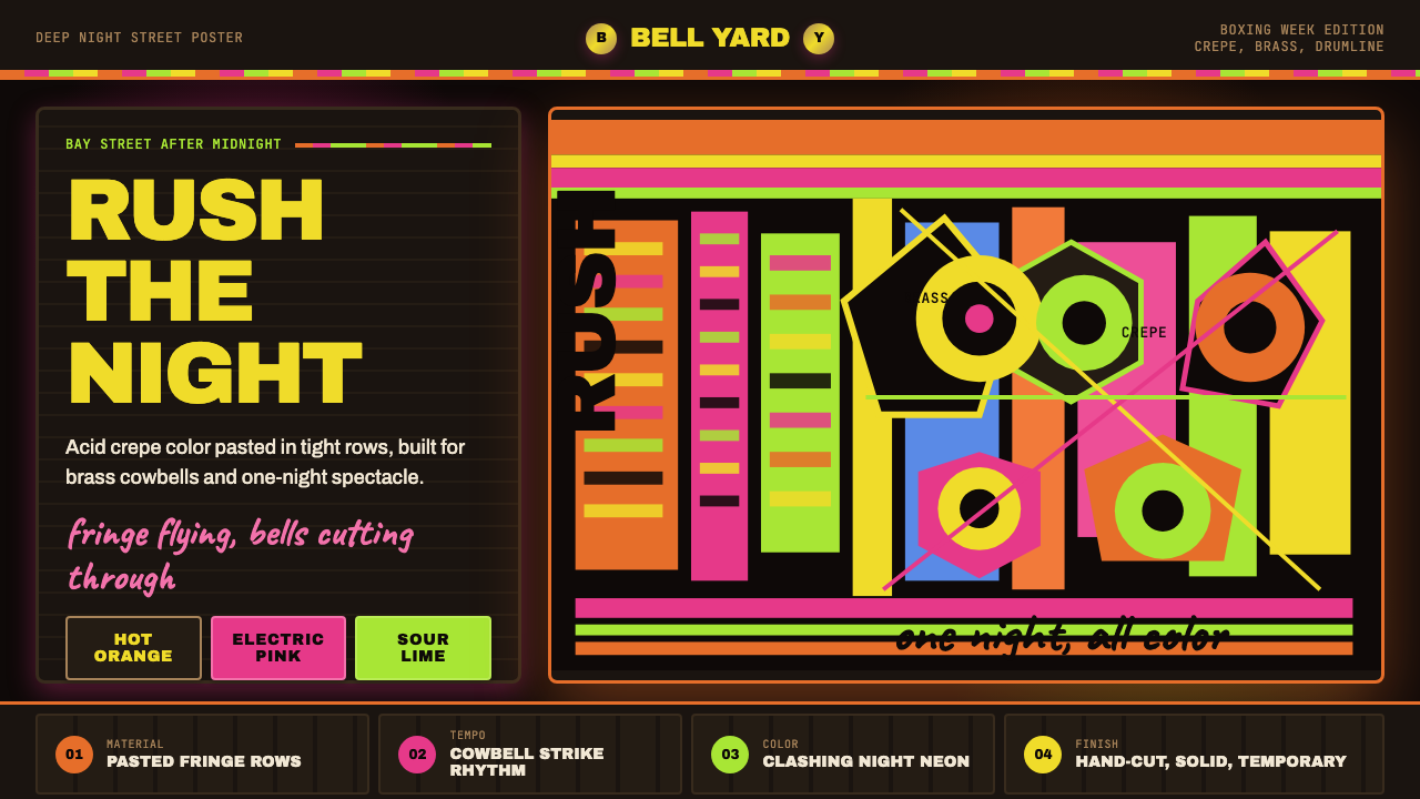 Bahamian Junkanoo CowbellNight refuses silence. Acid crepe stripes and block type collide like cowbell…
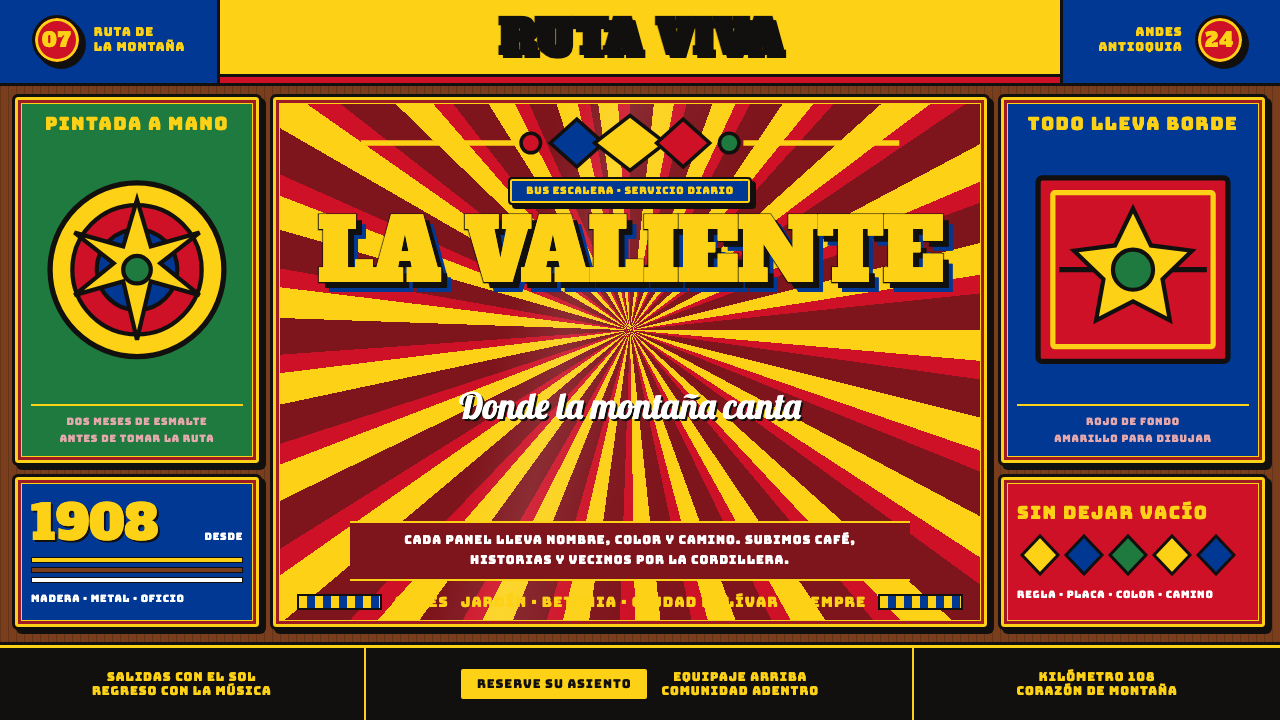 Colombian Chiva BusNothing is left unpainted. Flag-yellow rules, slab lettering and black keylin…
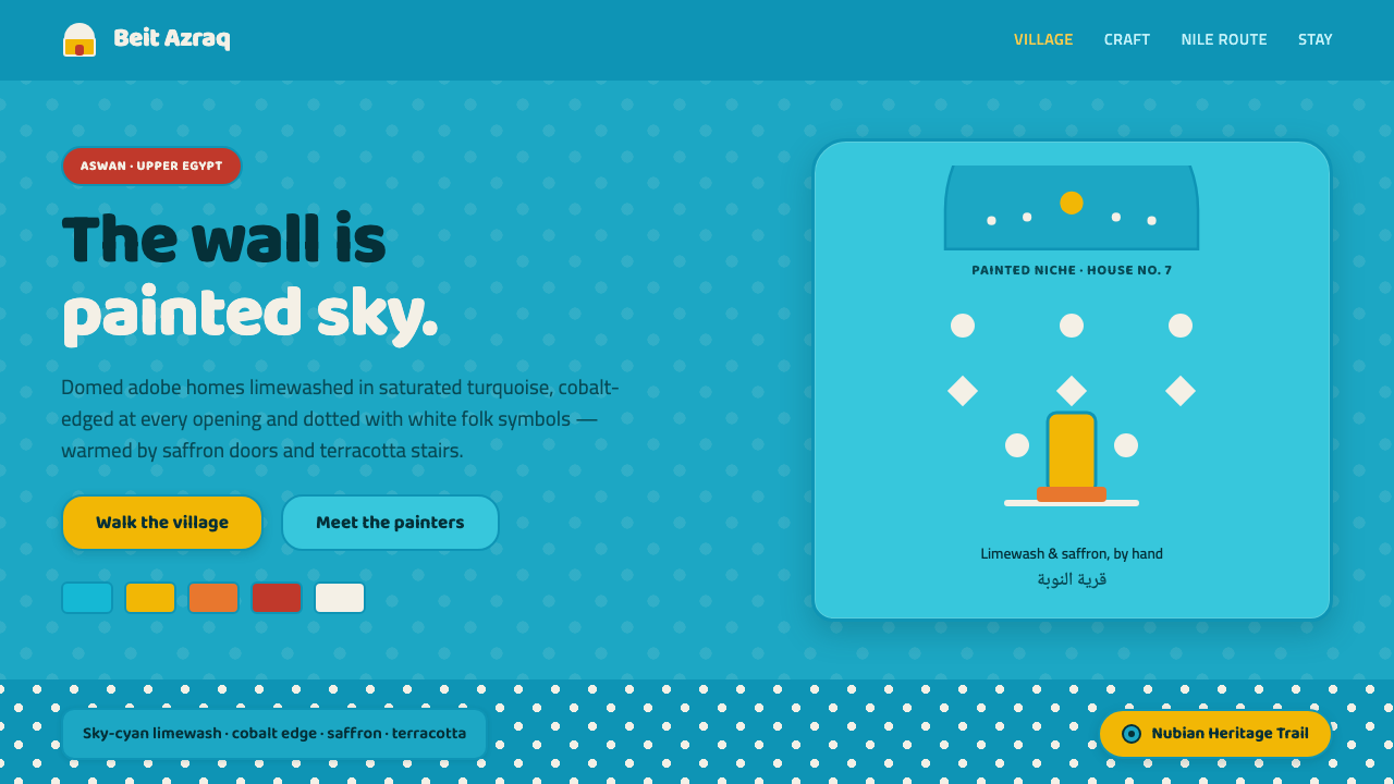 Nubian House BlueThe wall is the page. Sky-cyan limewash, cobalt-edged niches, white folk dots…
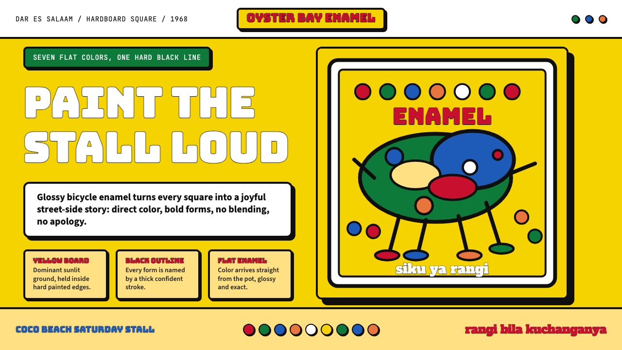 Tingatinga PaintingJoy refuses blending. Enamel yellow, Bungee strokes, and black-outlined flat…