What is Tahitian Pareu Print?
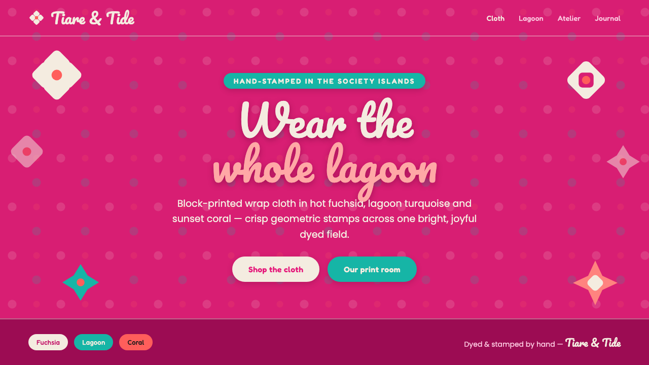
Tahitian pāreu brings the whole lagoon to the surface—hot fuchsia, crisp white flowers, turquoise water, and coral light in one joyful cloth.
Tahitian Pareu Print in brief
Tahitian pāreu is the hand-stamped cotton wrap cloth of French Polynesia, especially associated with Tahiti and the Society Islands. Its visual language is immediate and generous: bold floral silhouettes spread across a saturated field, with hibiscus, tiare, and frangipani appearing as crisp white forms against lagoon turquoise or sunset hues.
This design system translates the mid-century pāreu tradition into a digital setting without sanding away its energy. Hot fuchsia becomes the dominant ground, white floral cutouts provide the strongest contrast, and turquoise and coral act as vivid accents. The result is flat, high-chroma, and celebratory. It does not depend on muted neutrals, soft gradients, or quiet restraint; its character comes from color arriving at full volume.
Pāreu print is decorative, but never timid. The flowers are not delicate botanical studies. They are simplified, enlarged, and stamped with enough clarity to survive across a whole cloth. In digital applications, that same logic favors broad color fields, recognizable silhouettes, confident repetition, and interfaces that feel open to sunlight, water, and movement.
Where does Tahitian Pareu Print come from?
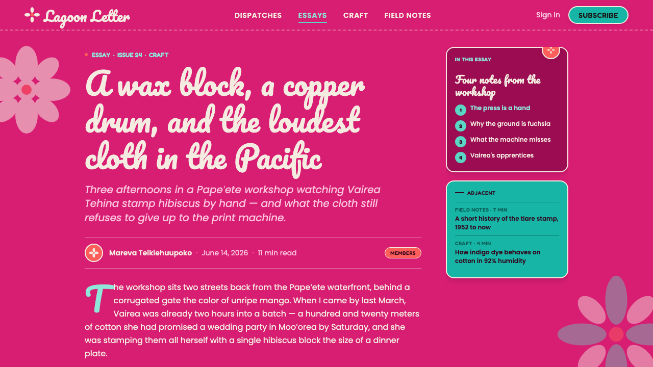
The pāreu belongs to the textile culture of French Polynesia, with Tahiti and the Society Islands named as its central region. It is a cotton wrap cloth made through hand stamping, and its identity is inseparable from the act of covering a large surface with repeated, emphatic motifs rather than treating decoration as a small border or isolated emblem.
The pre-approved tradition spans 1950–1990 and is described as mid-century block-printed pāreu. Its place within Polynesian pāreu or pareo fabric design connects the cloth to a broader language of tropical block-print florals and Pacific textile craft. The design is therefore neither an invented resort pattern nor a generic tropical theme: it is a screen translation of a specific cloth tradition rooted in French Polynesia.
The printers and cloth makers are the essential makers of the system. Tahitian pāreu printers establish the directness of the hand-stamped floral image, while Society Islands cloth makers carry the pattern language through cotton, color, and repeated surface. Their work gives the style its combination of tactile origin and graphic clarity.
In digital form, the historical reference is distilled rather than copied literally. The cloth becomes a visual system built from a hot-fuchsia ground, white floral cutouts, turquoise, and coral. The aim is to preserve the original sense of abundance: the interface should feel patterned, colorful, and alive, while remaining clear enough for text, controls, and information.
What defines the Tahitian Pareu Print look?
Hot-Fuchsia Ground
Fuchsia is the emotional and visual anchor of the system. It should read as saturated, warm, and unapologetically tropical rather than dusty or burgundy. Large areas of this color create the sensation of cloth dyed for sunlight, giving the interface an immediate identity before any floral detail appears.
White Floral Cutouts
Hibiscus, tiare, and frangipani appear as bold white silhouettes. The white is crisp and decisive, not creamy or softened. Floral forms should be recognizable through their outer contour and internal openings, allowing them to function as pattern, illustration, and strong contrast against the saturated ground.
Lagoon and Coral Accents
Turquoise and coral introduce the water and sunset sides of the palette. They should punctuate the dominant fuchsia and white rather than compete with every surface. Turquoise feels open and aquatic; coral feels warm and sunlit. Together they keep the system from becoming a single-note floral print.
Flat, Stamped Form
The visual language is flat and graphic, recalling a hand stamp pressed onto cloth. Floral shapes should not be modeled with realistic shading or atmospheric depth. Slight irregularity may suggest the human origin of the print, but the overall silhouette remains legible, solid, and confidently placed.
Abundant Repetition
Pattern is created through recurrence across a broad field. Repetition should feel generous rather than mechanical: motifs can vary in orientation, scale, or spacing while retaining the same floral vocabulary. The surface should suggest a whole cloth, not a single decorative sticker placed on an otherwise empty page.
High-Chroma Joy
The mood is joyful, bright, and openly celebratory. Colors should remain vivid and clean, with no drift toward muted earth tones or grayish softness. This intensity is not visual noise when hierarchy is clear; it is the style's emotional promise, turning ordinary surfaces into something closer to a sunlit textile.
Who shaped Tahitian Pareu Print?
Tahitian pāreu printers represent the hand-stamped origin of the visual language. Their contribution is the direct, high-contrast floral silhouette: a motif that can cover cloth decisively while preserving the immediacy of a human-made impression.
Society Islands cloth makers represent the material and regional continuity of the tradition. Through cotton, saturated dye, and repeated floral arrangement, they turn individual stamped forms into a complete wrap cloth whose identity is carried by the entire surface.
The mid-century pāreu tradition is the central design reference for this system. Spanning 1950–1990, it supplies the combination of tropical block-print florals, saturated fields, and Pacific textile craft that the digital interpretation preserves.
How do you use Tahitian Pareu Print today?
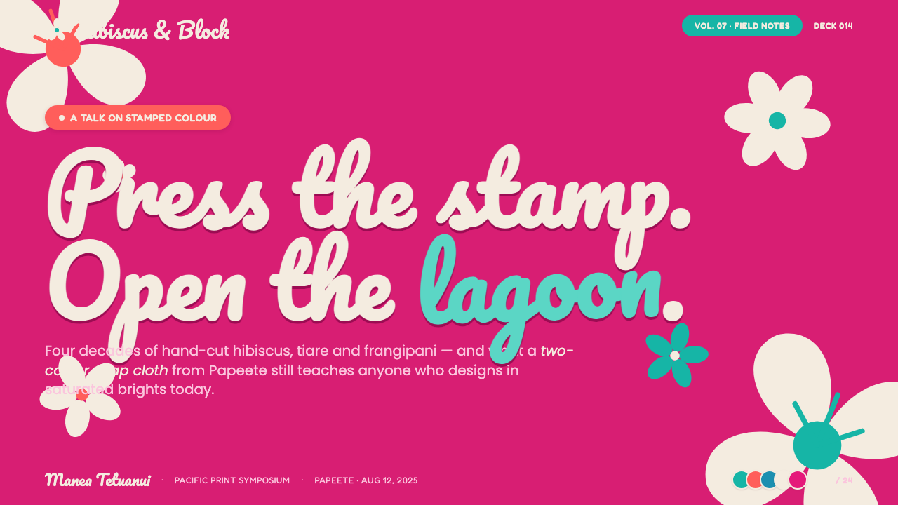
For presentation slides, use the fuchsia ground most decisively on the cover, where it can establish the visual world before the subject matter begins. A large white floral silhouette can act as the main compositional anchor, with the title set in a clean, highly legible contrast. Content slides should let white carry reading areas while fuchsia, turquoise, and coral mark sections or moments of emphasis. Data slides benefit from flat, solid forms: charts can feel like stamped pattern pieces, but the strongest accent should remain reserved for the most important comparison or conclusion.
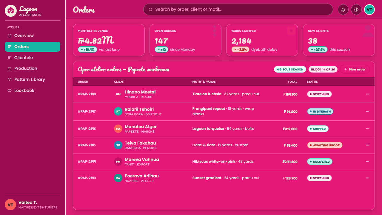
For web interfaces, the style suits dashboards, pricing pages, and other products that want to feel energetic rather than clinical. Keep the information surface clear and allow the saturated ground to appear in navigation, headers, featured states, or broad panels. White floral forms can become background motifs behind cards, while turquoise and coral distinguish categories, statuses, or calls to action. Controls should remain crisp and easy to scan; the decorative vocabulary should support orientation instead of obscuring labels or values.
For editorial and marketing work, pāreu print offers a strong surface language for campaigns, landing pages, announcements, and seasonal storytelling. A full-bleed fuchsia field can carry a white floral silhouette and a short headline, while supporting sections alternate between white reading space and saturated color blocks. Marketing imagery should feel sunny and immediate, but the pattern must be edited enough that the message remains the first thing the reader sees.
A common mistake is treating the style as permission to scatter every tropical color across every element. The system works because fuchsia and white establish the main relationship, while turquoise and coral provide controlled variation. Another mistake is replacing stamped flatness with realistic petals, soft shadows, muted backgrounds, or cream-colored surfaces. Those choices weaken the material reference. Keep the flowers bold, the colors vivid, and the pattern abundant but organized.
Tahitian Pareu Print — FAQ
Is Tahitian pāreu print the same as a generic tropical style?
No. A generic tropical style may borrow palms, leaves, or sunset colors without a specific material or regional reference. Tahitian pāreu print is tied to the hand-stamped cotton wrap cloth of French Polynesia, particularly Tahiti and the Society Islands. Its identity comes from the combination of crisp floral silhouettes, saturated dyed fields, repeated surface coverage, and the visual memory of Pacific textile craft.
Can this style work without a fuchsia background?
It can, but fuchsia is the clearest digital expression of the approved system and should remain the leading ground whenever possible. White floral forms need a saturated field to achieve their characteristic contrast. Turquoise or coral can become the dominant background for a variation, but the result should still preserve crisp white flowers, high chroma, flat treatment, and a distinctly joyful Pacific textile mood.
Should the floral motifs look perfectly regular?
Not necessarily. The source is hand-stamped cloth, so a small amount of variation can reinforce the sense of human making. Motifs may shift in orientation, spacing, or scale, as long as the overall field remains legible and abundant. Perfectly mechanical repetition can feel sterile; uncontrolled variation can damage hierarchy. The desired balance is organized richness with a visible trace of the stamp.
Why avoid cream, muted colors, and soft shading?
Because they contradict the defining qualities of this interpretation. The approved system calls for saturated lagoon and sunset color, crisp white floral cutouts, and a flat, joyful surface. Cream softens the contrast that makes the white flowers read as stamped forms; muted colors remove the tropical intensity; soft shading changes a graphic textile language into a more realistic and atmospheric one.
Where does this style work best, and where can it struggle?
It works best where warmth, celebration, and strong visual identity are valuable: presentation covers, campaign pages, lifestyle dashboards, pricing experiences, and editorial features with a clear point of view. It can struggle when a product requires severe neutrality, subdued attention, or dense technical reading across every surface. In those contexts, use the floral and saturated vocabulary selectively, keeping the information layer calm enough for the product's practical demands.
Related design styles
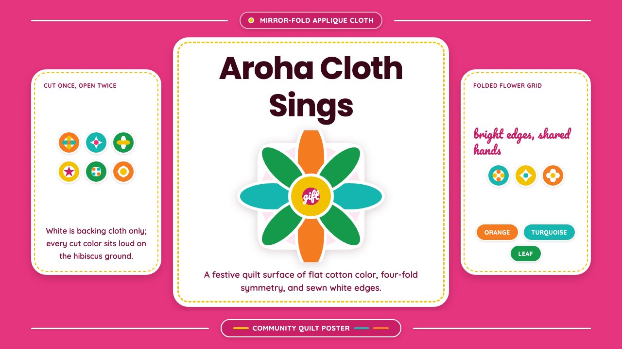 Cook Islands TivaevaeSaturated craft sings. Hibiscus pink carries mirror-fold florals in flat appl…
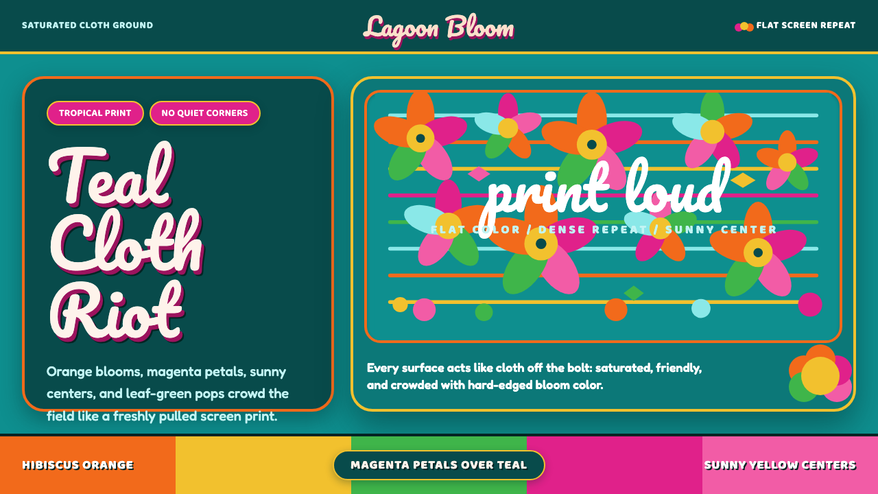 Fiji Bula Floral ShirtLoud cloth, zero quiet corners. Teal ground carries orange blooms and magenta…
 1950s Diner AquaRoadside optimism shouts. Aqua walls, cherry vinyl, chrome bands, and neon sc…
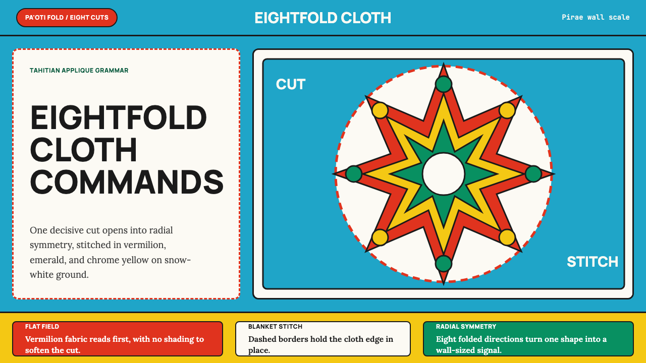 Tahitian Tifaifai (Appliqué Quilt)Flat fields command the room. Vermilion radial applique sits on Pacific cyan…
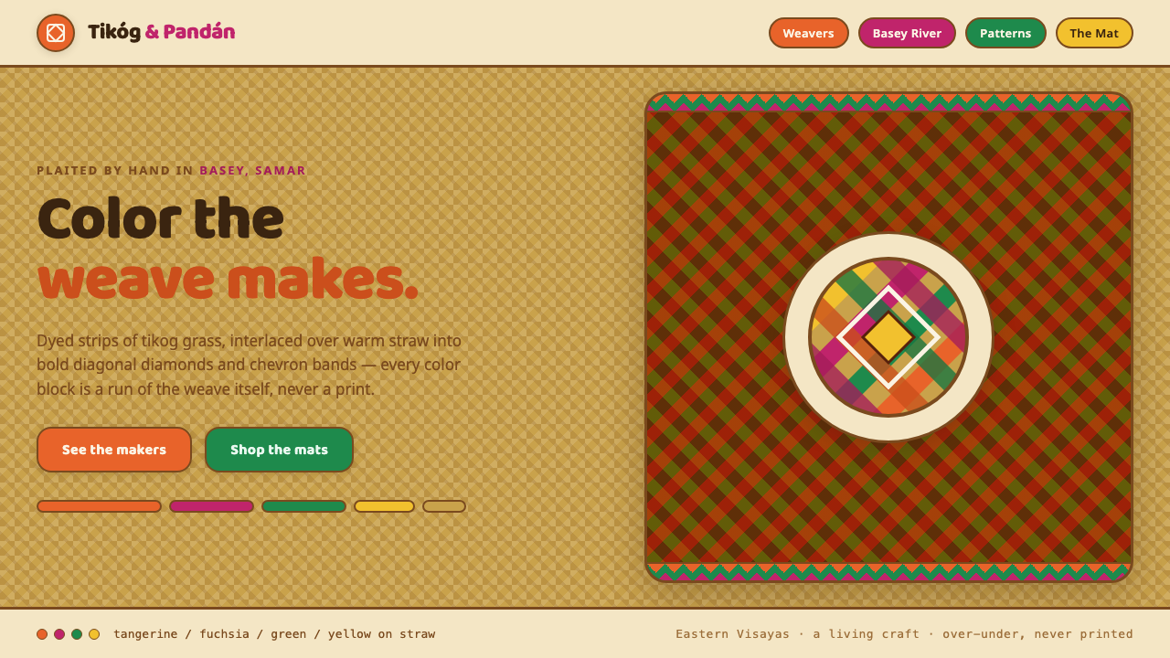 Banig Pandan MatHandwoven Filipino joy. Tangerine, fuchsia and green strips plaited into diag…
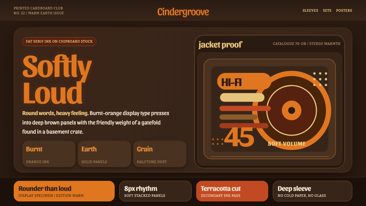 Cooper Black DisplayShouts softly. Burnt-orange Cooper type sinks into deep chipboard brown with…