Design style guide设计风格指南
What is Finnish Marimekko Unikko (1964)?什么是 Finnish Marimekko Unikko (1964)?
A Finnish designer defied her founder's ban on flowers and created the world's most recognized Nordic textile pattern — a flat, saturated poppy so large it turns any surface into pure color.一位芬兰设计师无视创始人的花卉禁令,创作出全球辨识度最高的北欧纺织图案——一朵扁平、饱和的罂粟花,大到足以让任何表面化为纯粹的色彩。
Finnish Marimekko Unikko (1964) in briefFinnish Marimekko Unikko (1964) 速览
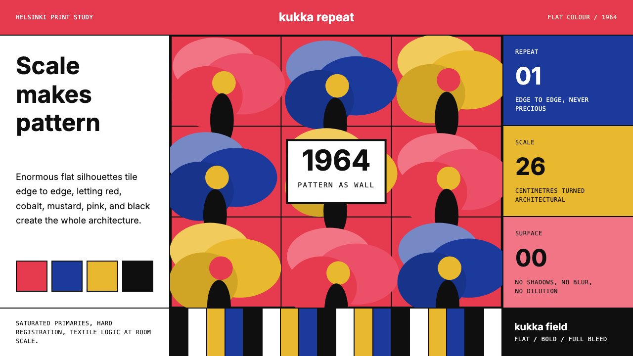
Finnish Marimekko Unikko (1964) is a textile-rooted design language built around a single radical premise: that a flat, boldly coloured floral silhouette, repeated at near-architectural scale, needs nothing else to communicate visual authority. No gradient, no shadow, no ornament beyond the outline of the flower itself. The result is a graphic vocabulary that feels simultaneously ancient — flowers have been decorative motifs for millennia — and completely modern in its flatness and scale.芬兰 Marimekko Unikko(1964年)是一套根植于纺织传统的设计语言,建立在一个激进的前提之上:一朵平涂的、色彩鲜明的花卉剪影,以接近建筑的尺度重复铺展,不需要任何其他元素便能传递视觉力量。没有渐变,没有投影,没有轮廓线以外的装饰。这套视觉词汇既古老——花卉作为装饰母题已有数千年历史——又因其平面性与尺度感而完全现代。
The visual system rests on a palette of intense, saturated primaries: poppy red, cobalt blue, mustard yellow, and hot pink, each laid down as a solid field of unmodulated colour. These hues do not blend, shadow, or fade into one another. They meet at crisp boundaries, and the contrast between them — positive shape against negative ground — provides all the depth the composition needs. Depth here is structural, produced by the scale relationship between figure and field, not by the illusion of three-dimensional light.这套视觉系统建立在一组高饱和原色上:罂粟红、钴蓝、芥末黄与亮粉,每一种都以均匀、无调制的实色平铺。这些色调不相融合、不投影、不渐变。它们在清晰的边界相遇,色块之间的对比——正形与负底——提供了构图所需的全部深度。这里的深度是结构性的,由图形与底面之间的尺度关系产生,而非三维光照的幻觉。
What distinguishes Unikko from decorative floral pattern in the conventional sense is the role of scale. The petals, stems, and stamens of the Unikko poppy are enlarged to a size that makes them architectural elements rather than surface embellishment. Seen up close, a single petal fills an entire panel. Seen at distance, the repeat creates a rhythm as regular and deliberate as a modernist grid. This is pattern as structure, not pattern as decoration.将 Unikko 与传统装饰花卉图案区别开来的,正是尺度所扮演的角色。Unikko 罂粟的花瓣、茎秆与雄蕊被放大到令其成为建筑元素而非表面点缀的程度。近观时,单片花瓣填满整个幅面;远观时,重复图案制造出一种如现代主义网格般规律而刻意的节奏。这是作为结构的图案,而非作为装饰的图案。
See the Finnish Marimekko Unikko (1964) design system →查看 Finnish Marimekko Unikko (1964) 完整设计系统 →
Where does Finnish Marimekko Unikko (1964) come from?Finnish Marimekko Unikko (1964) 从何而来?
Marimekko was founded in Helsinki in 1951 by Armi Ratia and her husband Viljo Ratia. Armi's original mission was straightforward but radical for its time: to produce printed textiles of genuine artistic quality that could be worn and used in everyday Finnish life. The company's name — a compound of the Finnish word for Mary and the word for a simple girl's dress — signalled its intent to ground high design in the domestic and the wearable.Marimekko 由 Armi Ratia 与丈夫 Viljo Ratia 于 1951 年在赫尔辛基创立。Armi 最初的使命直白而激进:生产真正具有艺术品质、可被日常穿用的印花织物。公司名称融合了芬兰语中「玛丽」与「简单女童裙」两个词,暗示了它的志向:将高水准设计扎根于日常与可穿性之中。
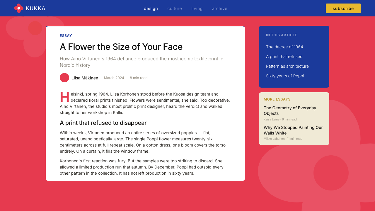
By 1964, Marimekko had already established an international reputation through its bold graphic textiles, and Armi Ratia had developed strong views about the direction of the brand. One of those views was a personal distaste for floral motifs, which she considered sentimental and commercially predictable. She declared that Marimekko would no longer produce floral prints. It was into this atmosphere of prohibition that Maija Isola introduced Unikko.到 1964 年,Marimekko 已凭借其大胆的图形织物在国际上建立起声誉,Armi Ratia 也对品牌方向形成了强烈的个人判断。其中之一是她对花卉母题的反感——她认为花卉图案多愁善感、商业上过于保守。她宣布 Marimekko 将不再生产花卉印花。正是在这种禁令氛围下,Maija Isola 带来了 Unikko。
Maija Isola had joined Marimekko in 1949, two years before the company's official founding, and would go on to design over five hundred prints for the brand. When Ratia issued her anti-floral directive, Isola responded not with compliance but with the Unikko poppy: an enormous, flat, aggressively saturated floral pattern that was the opposite of everything sentimental or conventional about floral design. Whether the print was a direct act of defiance or simply a response to an open creative challenge is a matter of historical debate, but the outcome was unambiguous. Ratia recognized the print's power, reversed her position, and approved it for production.Maija Isola 于 1949 年加入 Marimekko,彼时公司甚至尚未正式成立;此后她为品牌设计了逾五百款印花。当 Ratia 发布反花卉指令时,Isola 没有服从,而是拿出了 Unikko 罂粟图案:一朵巨大、平涂、高饱和的花卉图案,与花卉设计中一切多愁善感或陈规俗套的东西截然相反。这究竟是直接的抗命还是对一个开放创意挑战的回应,历史上尚有争议,但结果无可辩驳——Ratia 认可了图案的力量,推翻了自己的立场,批准投入生产。
The timing placed Unikko within a broader moment in Finnish and Nordic design history. Post-war Scandinavia was working through a productive tension between craft tradition and modernist abstraction. Finnish designers, in particular, were developing an approach — visible also in Alvar Aalto's furniture and Tapio Wirkkala's glassware — that combined modernist formal rigour with a deep responsiveness to natural form. Unikko represents a specific resolution of that tension: nature rendered flat, scale rendered architectural, decoration rendered structural. The pattern became one of the most copied and recognized textile prints of the twentieth century, entering the permanent collections of museums worldwide and remaining in continuous production since 1964.Unikko 的诞生时间,将其置于芬兰乃至整个北欧设计史的一个更广阔的时刻之中。战后斯堪的纳维亚正在经历手工艺传统与现代主义抽象之间富有成效的张力。芬兰设计师尤其发展出一种方式——在阿尔瓦·阿尔托的家具与塔皮奥·维尔卡拉的玻璃器皿中同样可见——将现代主义的形式严谨与对自然形态的深度回应相结合。Unikko 代表了这种张力的一种特定解法:自然被渲染成平面,尺度被渲染成建筑,装饰被渲染成结构。这一图案成为二十世纪被复制和辨识度最高的纺织品印花之一,进入世界各地博物馆的永久馆藏,并自 1964 年起持续生产至今。
What defines the Finnish Marimekko Unikko (1964) look?Finnish Marimekko Unikko (1964) 的视觉特征是什么?
Flat Colour Fields平涂色域
Every shape in the Unikko vocabulary — petal, stamen, stem, leaf — is filled with a single unmodulated colour. There are no highlights to suggest reflected light, no gradients to imply curvature, no shadows to anchor forms to a surface. The flatness is absolute and intentional. This commitment to flat colour removes all illusionism and makes each shape a graphic decision rather than a representation of nature.Unikko 词汇中的每一个形态——花瓣、雄蕊、茎秆、叶片——都以单一、均匀的色彩填充,没有暗示反射光的高光,没有暗示弧度的渐变,没有将形态锚定于某一表面的投影。平面性是绝对的、刻意的。对平涂的坚持去除了一切幻觉,使每个形状成为一个图形决策,而非自然的再现。
Architectural Scale建筑尺度
The Unikko poppy was designed at a scale that was, for 1964, startling: individual petals large enough to dominate an entire panel of fabric. This enlargement is not decorative exaggeration — it is the core concept. Scale transforms a floral motif into a structural pattern. At Unikko's intended size, the viewer does not see a flower decorated with repetition; they see a repeat rhythm of bold shapes whose floral origin is almost secondary to their graphic force.Unikko 罂粟在设计时采用了对 1964 年而言颇为惊人的尺度:单片花瓣大到足以占据整块面料的幅面。这种放大不是装饰性的夸张,而是核心概念本身。尺度将花卉母题转化为结构性图案。在 Unikko 预设的尺寸下,观者看到的不是一朵以重复为装饰的花,而是一组以粗犷形态构成的节奏——其花卉起源几乎成为视觉力量的附属。
Saturated Primary Palette饱和原色色板
The canonical Unikko colours — poppy red, cobalt blue, mustard yellow, hot pink — are deployed at full saturation with no desaturation or tinting to ease the eye. Colour contrast does the work that shadow and dimension do in other design systems: it separates foreground from background and gives each element its visual weight. The palette changes across colourways — Unikko has been produced in dozens of combinations — but the saturation principle holds regardless of the specific hues chosen.Unikko 的标准配色——罂粟红、钴蓝、芥末黄、亮粉——以全饱和度铺陈,没有降饱和或加白来柔化视觉。色彩对比承担了其他设计系统中投影与立体感所承担的工作:将前景与背景分离,赋予每个元素其视觉重量。配色会随不同色调版本而变化——Unikko 已出现在数十种组合中——但无论具体色调如何,高饱和的原则始终不变。
Organic Silhouette with Graphic Precision有机剪影与图形精确性
Unikko's petals and forms are recognisably floral — loose, rounded, slightly irregular in the way natural things are — but they are drawn with graphic decisiveness. The outlines are not botanical illustrations; they are simplified shapes that retain just enough of a flower's character to read as flowers while functioning as pure graphic blocks. This balance between the organic and the geometric is the aesthetic tension that gives the pattern its lasting appeal.Unikko 的花瓣与形态可辨识为花卉——松散、圆润、带有自然事物特有的轻微不规则——但以图形的决断性绘制而成。这些轮廓不是植物学插图,而是简化的形态,保留了花朵的足够特征以被辨认为花卉,同时作为纯图形色块发挥功能。有机性与几何性之间的这种平衡,正是赋予该图案持久魅力的美学张力。
Pattern as Structure图案即结构
The repeat in Unikko is not a surface treatment laid over a neutral ground — the pattern itself is the composition. There is no separate grid, no typographic framework, no neutral zone of rest. The flowers tile edge to edge, and the rhythm of their repetition creates the visual order that a grid would provide in a conventional layout system. This makes Unikko particularly powerful as a full-bleed element: when used at scale, it establishes spatial authority without requiring any supporting structure.Unikko 中的重复不是覆盖在中性底面上的表面处理——图案本身就是构图。没有独立的网格,没有文字框架,没有中性的休止区域。花朵首尾相接地铺展,其重复的节奏提供了传统版面系统中网格所提供的视觉秩序。这使 Unikko 作为满版元素时尤为强大:当以足够的尺度使用时,它无需任何支撑结构便能确立空间权威。
Colourway Flexibility配色方案的灵活性
One of Unikko's most significant design achievements is its adaptability across radically different colour treatments. The same silhouette reads as joyful in red and pink on white, as sober and elegant in black on cream, as bold and contemporary in monochrome, and as warm and nostalgic in ochre and terracotta. Because the pattern's power comes from shape and scale rather than from any specific hue, it can absorb almost any palette without losing coherence. This flexibility has sustained its commercial relevance across six decades.Unikko 最重要的设计成就之一,是其在截然不同的配色处理中的适应性。相同的剪影在白底红粉中读来欢快,在奶油底黑色中读来端庄典雅,在单色调中读来大胆当代,在赭黄与赤陶色中读来温暖怀旧。因为图案的力量来自形态与尺度而非任何特定色相,它几乎可以承纳任何色板而不失连贯性。这种灵活性使其商业生命力延续了六十年。
Nordic Modernist Restraint北欧现代主义的克制
Despite its visual intensity, the Unikko system is deeply restrained in the number of decisions it makes. The entire language is essentially one motif, one scale principle, and one flat-colour rule. There are no secondary patterns, no secondary motifs, no textural variation within shapes. This economy of means — achieving maximum visual impact with minimum graphic vocabulary — is characteristic of Nordic modernism and distinguishes Unikko from decorative maximalism that superficially resembles it.尽管视觉强度极高,Unikko 系统在所做决策的数量上却极为克制。整套语言本质上只有一个母题、一个尺度原则和一条平涂规则。没有辅助图案,没有辅助母题,形态内部没有质感变化。以最少的图形词汇实现最大视觉冲击——这种手段上的节俭,是北欧现代主义的特征,也将 Unikko 与表面上与之相似的装饰性极繁主义区别开来。
See the Finnish Marimekko Unikko (1964) design system →查看 Finnish Marimekko Unikko (1964) 完整设计系统 →
Who shaped Finnish Marimekko Unikko (1964)?谁塑造了 Finnish Marimekko Unikko (1964)?
Isola joined Marimekko's creative team before the company officially launched and remained a central designer there for decades, producing over five hundred prints. Her work ranged from geometric abstractions to large-scale nature-derived forms, but Unikko became her most enduring contribution. The poppy's combination of organic warmth and graphic boldness defines the particular territory Isola carved out — neither purely abstract nor purely botanical, but something that uses natural reference as a launching point for a fully independent graphic language.Isola 在 Marimekko 正式成立之前便加入了其创意团队,此后数十年间始终是核心设计师,创作了逾五百款印花。她的作品涵盖几何抽象与大尺度自然形态,但 Unikko 成为她最持久的贡献。罂粟花有机温度与图形大胆性的结合,定义了 Isola 开辟的那片特殊领域——既非纯抽象,亦非纯植物学,而是以自然参照为起点,建立起一套完全独立的图形语言。
Ratia co-founded Marimekko and served as its creative and commercial driving force for decades. Her instinct for bold visual identity — and her willingness to reverse a public position when confronted with work of genuine quality — shaped the company's culture of creative risk. Her initial ban on florals, and the subsequent approval of Unikko, illustrates the productive tension she maintained between directorial authority and openness to surprise. Ratia also understood that textiles were not just commercial products but cultural statements, and she positioned Marimekko accordingly on the international design stage.Ratia 共同创立了 Marimekko,数十年间始终是公司创意与商业的核心驱动力。她对大胆视觉识别的直觉——以及当面对真正高质量作品时敢于推翻公开立场的意愿——塑造了公司的创意冒险文化。她最初对花卉的禁令,以及随后对 Unikko 的批准,展示了她在指挥权威与对惊喜的开放性之间所保持的富有成效的张力。Ratia 也深知织物不仅是商业产品,更是文化表达,她据此将 Marimekko 定位于国际设计舞台之上。
Rimala was among the core designers who expanded Marimekko's vocabulary beyond the signature large-scale prints. Her contribution was particularly important in translating the brand's graphic textile identity into wearable, practical garments — demonstrating that the boldness of patterns like Unikko could function in clothes designed for everyday movement and use. Her work reinforced the founding principle that Marimekko was not a luxury brand but a democratic design proposition: bold beauty accessible to ordinary life.Rimala 是将 Marimekko 视觉词汇拓展至标志性大尺度印花之外的核心设计师之一。她的贡献在于将品牌的图形织物身份转化为可穿、实用的服装,证明了 Unikko 等图案的大胆性可以在为日常活动与使用而设计的衣物中发挥作用。她的工作强化了 Marimekko 的创立原则:这不是一个奢侈品牌,而是一个民主的设计主张——让日常生活触及大胆之美。
Eskolin-Nurmesniemi was a defining early designer at Marimekko whose geometric abstract prints established much of the visual language the brand was known for before Unikko. Her work leaned toward pure geometry and structural simplicity, providing a counterpoint to Isola's more nature-derived forms. The coexistence of these two approaches — abstract geometric and organic botanical — within a single brand's output demonstrates the breadth of the Nordic modernist project that Marimekko represented.Eskolin-Nurmesniemi 是 Marimekko 早期最具定义性的设计师,她的几何抽象印花建立了 Unikko 问世之前品牌为人所知的大量视觉语言。她的作品倾向于纯几何与结构性简约,与 Isola 更多取材自自然的形态形成对应。这两种方式——抽象几何与有机植物学——在同一个品牌产品中的共存,展示了 Marimekko 所代表的北欧现代主义计划的广度。
How do you use Finnish Marimekko Unikko (1964) today?今天怎么用 Finnish Marimekko Unikko (1964)?
Unikko is among the most legible historical textile patterns to translate into digital and presentation contexts, because its logic — flat colour, architectural scale, no illusionism — is already native to screen. Applying it well, however, requires understanding what the system is actually doing and resisting the temptation to decorate or soften it.Unikko 是最易转译到数字与演示场景的历史性纺织图案之一,因为其逻辑——平涂色彩、建筑尺度、零幻觉——本就与屏幕媒介天然契合。然而,良好地应用它需要理解这套系统实际在做什么,并抵制对其进行装饰或柔化的冲动。
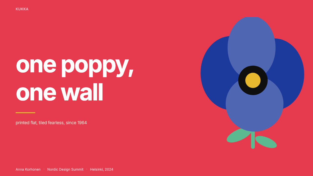
For presentation slides, Unikko works with particular power as a full-bleed cover or section-divider element. A single colourway of the pattern — cropped closely enough that individual petals fill the frame — creates an immediate visual statement without any accompanying type treatment. For content slides, the principles of the system apply even without the literal pattern: use a restricted palette of two saturated hues, keep all shapes flat and unshaded, and let scale contrast between large and small elements provide the hierarchy. Data slides take on a bold, poster-like quality when bars and areas are filled with the Unikko palette — solid colour blocks, no gradients, hard edges between segments.在演示文稿中,Unikko 作为满版封面或章节分隔元素时效力尤为突出。一种配色版本的图案——裁切得足够紧密以使单片花瓣填满画面——无需任何文字处理便能制造即时的视觉声明。对于内容页,即使不直接使用字面图案,系统的原则依然适用:使用两种饱和色的限定色板,保持所有形态平涂无阴影,让大小元素之间的尺度对比提供层级关系。当柱状图与面积区域以 Unikko 色板填充时,数据页呈现出大胆的海报品质——实色色块、无渐变、段落之间的硬边界。
For web interfaces, Unikko is most appropriate in contexts that can carry its visual intensity: editorial feature pages, hero sections, marketing landing pages, or any surface where the goal is immediate visual authority rather than quiet utility. As a UI system for dashboards or dense information displays, the full pattern can overwhelm — here it is better to extract the palette and apply the flatness principle to component design, using solid fills and crisp edges in place of soft shadows and neutral greys. A pricing page can use a single large petal silhouette as a background element behind a feature tier, creating differentiation through pattern rather than through colour alone.对于网页界面,Unikko 最适合能承载其视觉强度的场景:编辑专题页、英雄区、营销落地页,或任何目标是即时视觉权威而非低调实用性的表面。作为仪表板或密集信息展示的 UI 系统,完整图案可能产生压迫感——此时更好的做法是提取色板并将平面性原则应用于组件设计,以实色填充与清晰边缘替代柔和阴影与中性灰。定价页可以将单片大花瓣剪影作为某一功能层级背后的背景元素,通过图案而非单纯的颜色实现差异化。
For editorial and marketing work, the style's poster heritage is its greatest asset. A full-page spread anchored by a large Unikko colourway in a single bold hue, with typography reversed out in white or black, produces a result that reads at distance before the copy is legible. Campaign imagery benefits from the pattern's ability to function as both background and subject: the flowers are identifiable but abstract enough to carry any messaging without competing with it. For printed materials — packaging, campaign posters, tote bags — the flat-colour silhouette reproduces cleanly in any print process, including single-colour and two-colour runs.对于编辑与营销内容,这种风格的海报传统是其最大资产。以单一粗犷色调的大幅 Unikko 配色锚定整版跨页,文字以白色或黑色反白,产生的效果在正文可读之前便已在远处发挥作用。活动形象受益于图案作为背景与主体双重功能的能力:花朵可辨认,却又抽象到足以承载任何信息而不与之竞争。对于印刷材料——包装、活动海报、帆布袋——平涂剪影在任何印刷工艺中都能清晰再现,包括单色与双色印刷。
A common mistake when working with this system is reducing the scale. Unikko at small scale loses its architectural authority and becomes merely decorative — the point is that the flower is large enough to be read as structure, not ornament. Similarly, adding drop shadows, inner glows, or any simulation of three-dimensional light breaks the foundational rule of the system. The flatness is not a limitation; it is the source of the pattern's graphic strength. A second common error is using the pattern at full saturation across every surface of a layout, which produces visual noise rather than visual authority. Unikko works best when it occupies one clearly defined zone — a hero, a background panel, a section break — with clean, neutral space elsewhere for content to breathe.使用这套系统时最常见的错误是缩小尺度。Unikko 在小尺度下失去建筑权威感,沦为单纯的装饰——关键在于花朵必须大到足以被读作结构而非点缀。同样,添加投影、内发光或任何三维光照的模拟,都会打破系统的基础规则——平面性不是局限,而是图案图形力量的来源。第二个常见错误是在版面的每一个表面都以全饱和度使用图案,这产生的是视觉噪音而非视觉权威。Unikko 在占据一个清晰界定的区域时效果最佳——一个英雄区、一个背景面板、一个段落分隔——其余地方留以干净的中性空间,让内容得以呼吸。
See the Finnish Marimekko Unikko (1964) design system →查看 Finnish Marimekko Unikko (1964) 完整设计系统 →
Finnish Marimekko Unikko (1964) — FAQFinnish Marimekko Unikko (1964) · 常见问题
Is Unikko a modernist pattern or a decorative one?Unikko 是现代主义图案还是装饰性图案?
Both, and the tension between the two descriptions is exactly what makes it interesting. Unikko uses a floral motif — one of the oldest decorative traditions in human making — but applies to it a set of formal decisions that are entirely modernist: flat colour, large scale, no illusionism, no representational detail beyond the minimum necessary for recognition. The result is a pattern that looks decorative at first glance but operates structurally. This duality is also why it has proved so durable: it satisfies the human appetite for natural reference while delivering the graphic clarity that modernist visual culture demands.两者皆是,而这两种描述之间的张力恰恰是其魅力所在。Unikko 使用花卉母题——人类制作传统中最古老的装饰元素之一——却对其施加了一套完全现代主义的形式决策:平涂色彩、大尺度、零幻觉、除识别所需最低限度外无具象细节。结果是一个乍看装饰性却以结构性方式运作的图案。这种双重性也是它经久不衰的原因:它满足了人类对自然参照的本能渴望,同时传递出现代主义视觉文化所要求的图形清晰性。
Why does Unikko work so well in so many different colour combinations?为什么 Unikko 在如此多种不同的配色组合中都表现出色?
Because the pattern's visual power comes from shape and scale, not from any specific hue. The large flat silhouettes create strong figure-ground contrast regardless of which colours fill them, as long as the relationship between foreground and background has sufficient contrast. A black Unikko on a white ground, a white Unikko on a navy ground, or a red Unikko on a cream ground all work by the same principle. This colour-independence is unusual in historically significant patterns, which are often inseparable from their original colourway. Unikko's abstract graphic logic gives it an adaptability that has allowed it to remain visually current across six decades of shifting colour trends.因为图案的视觉力量来自形态与尺度,而非任何特定色相。只要前景与背景之间的关系具有足够的对比度,巨大的平涂剪影便能产生强烈的图底对比,无论填充哪种颜色。白底黑色 Unikko、深蓝底白色 Unikko、奶油底红色 Unikko,都遵循同一原则发挥作用。这种色彩独立性在历史上重要的图案中并不常见——大多数图案都与其原始配色方案密不可分。Unikko 的抽象图形逻辑赋予了它跨越六十年色彩潮流更迭依然保持视觉当代性的适应能力。
How should Unikko be used alongside type?Unikko 与文字排版应如何搭配使用?
The pattern's visual intensity means that type must be handled with care. The most reliable approach is to keep type in a neutral zone — white, cream, or black — and let the pattern occupy a separate, clearly defined region. Reversing white type out of a dark-coloured petal area works, but requires that the petal be large enough and flat enough in colour to provide consistent legibility across the full line length. Setting type directly over the pattern without a solid ground almost always fails: the irregular pattern edges create inconsistent contrast that makes extended reading difficult. For editorial contexts, a wide clear margin or a solid colour panel alongside the patterned area is more reliable than attempting to overlay the two.图案的视觉强度意味着文字必须被谨慎处理。最可靠的方式是将文字置于中性区域——白色、奶油色或黑色——让图案占据一个独立、清晰界定的区域。将白色文字反白于深色花瓣区域是可行的,但要求花瓣足够大且颜色足够均匀,以在整行长度内提供一致的可读性。直接将文字叠加于图案之上而不设置实色底面,几乎总是失败的:图案的不规则边缘制造出不一致的对比度,使持续阅读变得困难。对于编辑场景,在图案区域旁设置宽阔的空白边距或实色色块面板,比尝试将两者叠加更为可靠。
Is Marimekko Unikko appropriate for digital product UI, or is it primarily a surface/brand element?Marimekko Unikko 适合用于数字产品 UI,还是主要作为表面/品牌元素使用?
Primarily a surface and brand element, and understanding this distinction matters for application quality. The pattern is visually dominant — when present, it organizes the entire visual field around itself, which is valuable for brand-establishing contexts but disruptive in dense functional UI where multiple elements need to coexist at equal weight. In product UI, the better approach is to derive from the system rather than apply it literally: use the flat-colour principle for component fills, extract one or two hues from the palette for interactive states, and use scale contrast as the primary organizational device. The literal Unikko motif works best at defined moments — a welcome screen, an empty state illustration, a marketing overlay — where its visual authority is useful rather than competing with functional hierarchy.主要作为表面与品牌元素,理解这一区别对应用质量至关重要。图案在视觉上具有主导性——一旦出现,它便将整个视觉场域组织于自身周围,这在建立品牌感的场景中很有价值,但在需要多个元素以同等权重共存的密集功能性 UI 中则会造成干扰。在产品 UI 中,更好的做法是从系统中衍生而非字面应用:将平涂原则用于组件填充,从色板中提取一两种色相用于交互状态,以尺度对比作为主要组织手段。Unikko 字面母题最适合出现在界定明确的时刻——欢迎屏、空状态插图、营销覆盖层——此时其视觉权威是有用的,而非与功能层级竞争。
What is the difference between using Unikko and simply using a bold floral pattern?使用 Unikko 与单纯使用一个大胆的花卉图案有何区别?
The difference lies in the formal commitments that define the system: flat colour with no shading, architectural scale that makes the motif structural rather than decorative, and a palette at full saturation rather than softened tones. Many bold floral patterns retain elements that Unikko deliberately strips away — shading, multiple scales of detail, softened edges, naturalistic colour relationships. Applying a generic bold floral in the Unikko register requires making those same formal commitments: every petal must be a flat colour field, the scale must be large enough that the repeat reads as rhythm rather than texture, and the colour relationships must be high-contrast rather than harmonious. Without those commitments, the result looks like a floral pattern inspired by Marimekko rather than a genuine application of the design logic Unikko represents.区别在于定义该系统的形式承诺:无阴影的平涂色彩、使母题成为结构性而非装饰性的建筑尺度,以及全饱和而非柔化色调的色板。许多大胆的花卉图案保留了 Unikko 刻意剥除的元素——阴影、多尺度细节、柔化边缘、自然主义的色彩关系。在 Unikko 的语境中应用一个通用大胆花卉图案,需要做出同样的形式承诺:每片花瓣必须是平涂色域,尺度必须足够大以使重复读作节奏而非质感,色彩关系必须是高对比而非和谐协调的。缺少这些承诺,结果看起来像是一个受 Marimekko 启发的花卉图案,而非 Unikko 所代表的设计逻辑的真正应用。
Related design styles相关设计风格
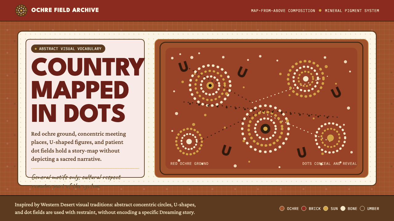 Aboriginal Dot PaintingAncient story-map energy. Red ochre, bone dots, concentric circles, and U-mar…古老故事地图感:红赭底、骨白点、同心圆与 U 形构成大地。
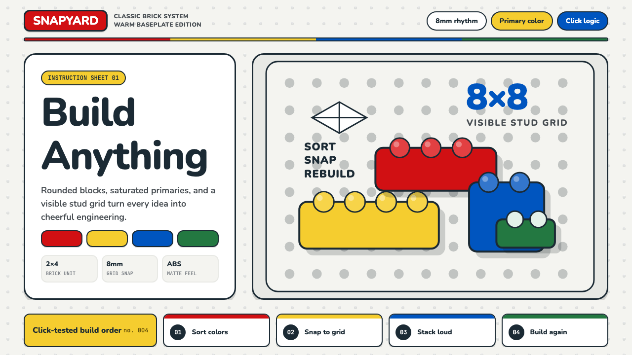 LEGO ClassicCheerful engineering. Primary bricks snap across a warm gray stud grid.快乐工程学:原色砖块咔哒扣入暖灰凸点网格。
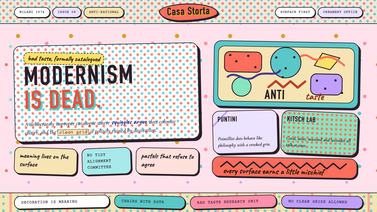 Studio Alchimia Anti-DesignModernism gets heckled. Coral, mint and mustard collide in dotted collage blo…现代主义被起哄:珊瑚、薄荷与芥末色在圆点拼贴中相撞。
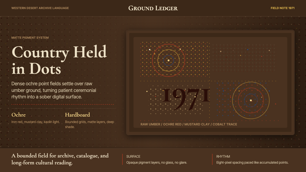 Aboriginal Dot Painting (Papunya 1971)Ochre memory, held steady. Raw umber ground, Cormorant type, disciplined dot-…赭石记忆沉稳留存:生赭黑地、Cormorant 字体与克制点阵。
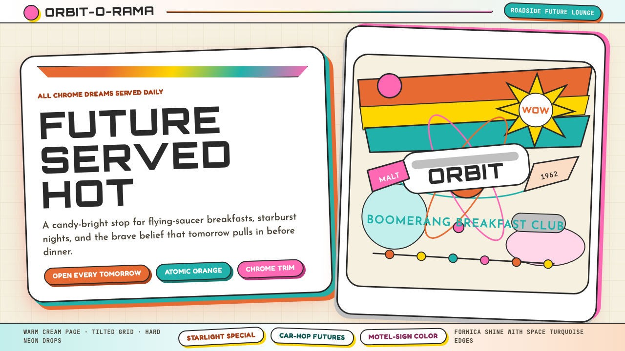 Googie / Space Age (1960s)Tomorrow pulls in grinning. Atomic orange, space turquoise, tilted signs and…明天笑着驶来:原子橙、太空青、倾斜招牌与星爆。
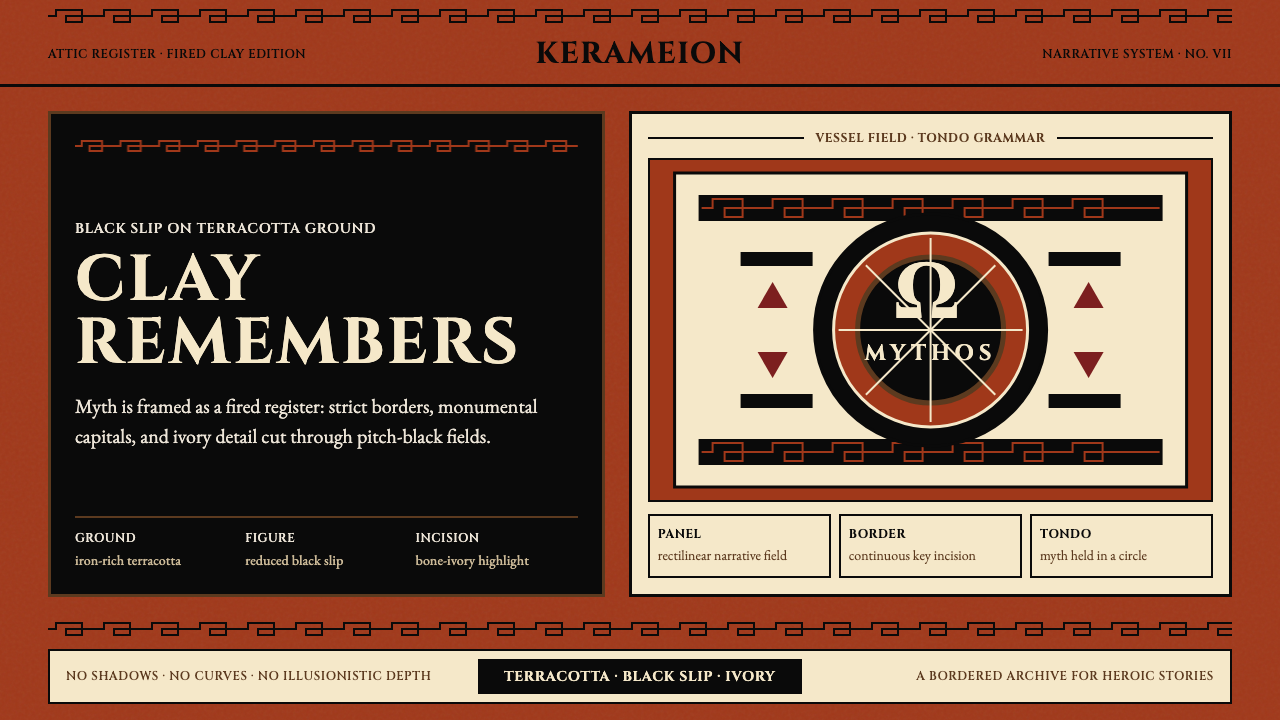 Greek Antiquity (Attic Vase)Myth becomes architecture. Terracotta, black slip, and Greek-key borders fram…神话化为建筑:赤陶、黑釉与希腊回纹框住叙事。