What is LEGO Classic?什么是 LEGO Classic?
LEGO Classic is the visual language of cheerful engineering — primary bricks snapped onto a warm gray stud grid that has taught generations to believe anything can be built.乐高经典是「快乐工程学」的视觉语言——原色砖块咔哒扣入暖灰凸点网格,几十年来告诉每一代人:什么都能搭。
LEGO Classic in briefLEGO Classic 速览
LEGO Classic is the visual identity system that has defined the LEGO brand since the toy's maturation in the 1970s: bold primary red, yellow, and blue set against a medium-gray stud grid and bright white backgrounds, rendered in the flat, matte, toybox-bright aesthetic of injection-molded plastic. Every element in the system — the brick silhouette, the instruction-manual line art, the logo's cheerful lettered form — communicates the same message: construction is joyful, systematic, and completely within reach.乐高经典是自1970年代品牌成熟以来定义乐高的视觉识别系统:鲜亮的红、黄、蓝三原色落于中灰凸点网格与亮白背景之上,以注塑塑料特有的哑光、鲜亮、玩具箱质感呈现。系统中的每一个元素——砖块轮廓、说明书式线描图、商标那充满活力的字体形态——都传达同一条信息:搭建是快乐的,是有系统的,也是完全可以实现的。
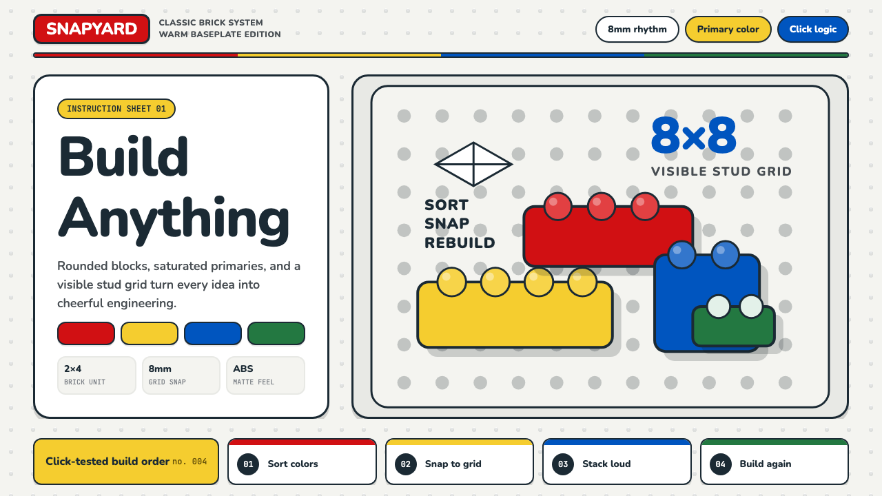
The design language is governed by what might be called cheerful precision. The stud grid — the regular pattern of raised cylindrical pins that covers every LEGO baseplate — functions as a visual module system, the underlying order that makes infinite combination possible. Above this grid sit saturated primary colors, deliberately chosen for maximum distinguishability and the boldest possible emotional impact. Rounded corners on every brick soften what could be a harsh geometric system into something approachable, tactile, and friendly. Nothing is accidental: the roundness, the primary palette, the gray base, the chunky proportion — each is a considered design decision.这套设计语言由一种可称为「快乐的精确性」所统领。凸点网格——覆盖每块乐高底板的圆柱形凸起阵列——作为视觉模块系统运作,是使无限组合成为可能的底层秩序。在这个网格之上,是饱和度拉满的三原色,它们的选择旨在实现最强的可区分性与最大的情感冲击力。每块砖的圆角将原本可能显得硬朗的几何体系柔化为触手可及、充满手感、令人亲近的形态。没有任何一处是偶然的:圆润感、原色组合、灰色底板、厚实的比例——每一项都是经过审慎权衡的设计决定。
What makes LEGO Classic distinctive among toy aesthetics is its dual nature as both an object system and a communication system. The bricks themselves are the product, but the visual language extends through catalogs, instruction booklets, packaging, and advertising into a coherent world. The instruction manual — with its clean isometric line art, numbered steps, and arrow indicators — is itself a minor design classic, a piece of information design that has successfully communicated complex assembly sequences to children who cannot yet read, across dozens of languages and six decades.乐高经典之所以在玩具美学中独树一帜,在于它同时作为物件系统与传播系统的双重本质。砖块本身是产品,但这套视觉语言通过产品目录、说明书、包装与广告延伸成一个连贯的世界。说明书——以其简洁的等轴测线描图、编号步骤与箭头指示——本身就是一件小小的设计经典,一份成功地向还不识字的儿童传达复杂组装步骤的信息设计作品,横跨数十种语言与六十余年。
Where does LEGO Classic come from?LEGO Classic 从何而来?
The LEGO story begins in a carpenter's workshop in Billund, Denmark. Ole Kirk Christiansen had been making wooden toys since 1932, and his company's name — LEGO — was coined in 1934 from the Danish phrase leg godt, meaning 'play well.' In 1949, following the introduction of an injection-molding machine, the company produced its first plastic interlocking bricks, though these early bricks lacked the precise clutch power — the satisfying grip between stacked pieces — that would come to define the system. The breakthrough came in 1958, when Godtfred Kirk Christiansen, Ole's son, patented the modern stud-and-tube coupling system that remains the foundation of every LEGO element made today. That single mechanical innovation transformed a toy into a system.乐高的故事始于丹麦比隆的一间木匠工坊。奥勒·柯克·克里斯蒂安森自1932年起便在制作木质玩具,他的公司名称——LEGO——于1934年由丹麦短语leg godt(意为「好好玩」)创造而来。1949年,公司引入注塑机后生产了第一批塑料互锁砖块,但这些早期砖块还缺乏后来定义整个系统的精确咬合力——那种叠放砖块时令人上瘾的紧实握持感。突破发生在1958年:奥勒之子戈特弗雷德·柯克·克里斯蒂安森为现代凸柱与管式连接系统申请了专利,这一系统至今仍是每一块乐高零件的基础。这项单一的机械创新将一件玩具变成了一套系统。
The visual identity of LEGO Classic as it is recognizable today solidified across the 1960s and 1970s. The primary color palette — red, yellow, blue, black, and white, later expanded to include green and gray — was not chosen arbitrarily but reflects both practical manufacturing constraints and a considered theory of play. Primary colors are maximally distinct from one another, making sorting and selecting easier for young builders. They are also culturally neutral across most of the markets LEGO served, avoiding the cultural specificity of secondary or tertiary color choices. The medium-gray baseplate, introduced to anchor construction, became an iconic visual signature — the calm foundation beneath vibrant primary color activity.乐高经典今日可辨认的视觉识别在1960至70年代逐步成形。原色调色板——红、黄、蓝、黑与白,后来扩展加入绿色与灰色——并非随意选择,而是反映了实际制造约束与经过审慎考量的游戏理论。三原色彼此间辨识度最高,使年幼搭建者在分拣与选取时更为轻松。它们在乐高所服务的大多数市场中也具有文化中立性,避免了间色或复色选择所带来的文化特殊性。为锚定建造而引入的中灰底板,成为一个标志性视觉印记——鲜明原色活动之下那片平静的基础。
The LEGO logo itself has passed through several iterations, arriving at its current form in 1998. The bold oval badge with thick white lettering on a red field — high contrast, rounded, instantly legible — distills the brand's visual principles into a single mark. Earlier versions of the logo were more ornate; each successive revision stripped away complexity in favor of the toybox-bright directness that characterizes the mature system. The instruction manual's visual language evolved in parallel: early booklets used photographic assembly guides before the company standardized the iconic isometric line-art format, which proved superior for clarity across print scales and translation contexts.乐高商标本身经历了数次演变,于1998年定格为当前形态。红底白字的粗椭圆徽章——高对比度、圆润、即刻可辨——将品牌的视觉原则凝聚于一个标志之中。早期版本的商标更为繁复,每一次修订都在剥除复杂性,走向成熟系统所特有的玩具箱式直接感。说明书的视觉语言也在同步演进:早期小册子使用照片式组装指南,后来公司将标志性的等轴测线描图格式标准化,这种格式被证明在各种印刷尺寸与多语言环境下均具有优越的清晰度。
The design movements that influenced LEGO Classic are perhaps less obvious than for more consciously avant-garde aesthetics. Scandinavian toy design — with its emphasis on durability, play value, and clear visual communication — is the nearest tradition, and LEGO sits comfortably alongside Brio and other northern European toy brands in their shared commitment to simple, direct form. More broadly, the system reflects the postwar European interest in modular systems and kit construction as both educational philosophy and design methodology: the idea that complex objects can be decomposed into a limited set of interchangeable units, and that this decomposition is itself a form of knowledge. The LEGO brick is, in this reading, a physical instantiation of systems thinking.影响乐高经典的设计传统或许不如更具先锋意识的美学那般显眼。斯堪的纳维亚玩具设计——以其对耐用性、游戏价值与清晰视觉传达的重视——是最近近的传统,乐高与宾度等北欧玩具品牌并肩而立,共同秉持对简洁、直接形态的承诺。更宏观地看,这套系统折射出战后欧洲对模块化系统与套件搭建的兴趣,无论是作为教育哲学还是设计方法论:复杂的对象可以被分解为一组有限的可互换单元,而这种分解本身就是一种知识形态。在这层意义上,乐高砖块是系统性思维的实体化。
What defines the LEGO Classic look?LEGO Classic 的视觉特征是什么?
Primary Color Palette原色调色板
The LEGO Classic palette centers on the three primary colors — red, yellow, and blue — alongside black and white, with green and medium gray serving as supporting constants. Each color is used at full, unmodified saturation: no pastels, no muted tones, no gradients. The primaries are chosen for maximum mutual contrast and universal legibility, ensuring that a mix of bricks reads as a coherent visual field rather than visual noise. Gray functions as the neutral ground — the baseplate, the background — against which the primaries sing.乐高经典的调色板以红、黄、蓝三原色为核心,辅以黑色与白色,绿色与中灰色作为恒定的支撑色。每种颜色均以完整的、未经修改的饱和度使用:无粉彩,无哑色,无渐变。原色的选择旨在实现最大的相互对比度与普遍可读性,确保一堆混合砖块呈现为一个连贯的视觉场,而非视觉噪音。灰色作为中性底色——底板、背景——在其衬托下,原色方能鲜明歌唱。
Stud Grid Structure凸点网格结构
The stud grid is the invisible order beneath every LEGO composition. The regular array of raised cylindrical pins defines a modular unit that governs all proportional relationships in the system: width, length, and height are all integer multiples of this single base unit. In visual terms, this creates a system that is simultaneously rigid (nothing can sit outside the grid) and infinitely variable (any combination of units is valid). The stud grid is LEGO's equivalent of a typographic baseline grid — the structure that makes freedom possible.凸点网格是每一件乐高作品之下的隐形秩序。圆柱形凸起的规则阵列定义了一个模块单元,统领系统中所有的比例关系:宽度、长度与高度均是这个基本单元的整数倍。在视觉上,这创造了一个既刚性(没有任何东西可以落在网格之外)又无限可变(任何单元组合都合法)的系统。凸点网格是乐高等价于排版基线网格的存在——那个使自由成为可能的结构。
Rounded Matte Forms圆润哑光形态
Every LEGO brick is a rectangle with consistently rounded corners and a matte plastic surface finish. The rounding is not decorative — it serves structural and safety functions — but its visual effect is to transform what could be a harsh, angular geometric system into something warm, approachable, and tactile. The matte finish absorbs light rather than reflecting it, giving every color a flat, poster-like quality that reads well both in hand and at any photographic scale. The absence of gloss is part of the aesthetic: LEGO does not simulate glass, metal, or high polish.每块乐高砖均为具有一致圆角的长方体,表面为哑光塑料质感。圆角并非装饰——它服务于结构与安全功能——但其视觉效果是将一个原本可能显得硬朗、棱角分明的几何体系转化为温暖、亲近、富有手感的形态。哑光表面吸收光线而非反射,赋予每种颜色一种平面、海报式的品质,无论是手持还是在各种摄影尺寸下都清晰可辨。无光泽本身就是美学的一部分:乐高不模拟玻璃、金属或高抛光质感。
Instruction-Manual Line Art说明书线描图
The LEGO instruction manual represents one of the great achievements of information design: a purely visual, language-independent assembly system that communicates complex three-dimensional construction sequences without a single word of text. The isometric line-art style — clean outlines, minimal shading, consistent orientation — is instantly recognizable and has remained essentially stable for decades. Arrow indicators show movement and attachment; numbering provides sequence; close-up insets highlight small or difficult elements. The style is diagrammatic in the best sense: it makes the invisible visible and the complex simple.乐高说明书代表了信息设计领域的伟大成就之一:一套纯视觉的、与语言无关的组装系统,无需一个文字便能传达复杂的三维搭建步骤。等轴测线描图风格——清晰轮廓、极简阴影、一致的取景方向——即刻可辨,数十年来保持基本稳定。箭头指示器显示运动与连接;编号提供步骤顺序;局部放大图突出细小或复杂的元素。这种风格是最好意义上的图解式:它使不可见的变得可见,使复杂的变得简单。
Bold Logomark and Typography粗犷标志与排印
The LEGO wordmark — thick white lettering inside a bold red oval badge — is among the most legible brand marks in the world. Its characteristics are directness and weight: high contrast between figure and ground, rounded letterforms that echo the brick's own rounded corners, and a scale that reads at both thumbnail and billboard size. The typographic sensibility extends through all official LEGO communications: headlines are always bold and large, body text is minimal and functional, and there is no place for decorative type or delicate letterforms anywhere in the system.乐高文字标志——粗椭圆红底徽章中的厚白字——是世界上辨识度最高的品牌标志之一。其特征是直接与厚重:图形与底色之间的高对比度,呼应砖块自身圆角的圆润字形,以及在缩略图与广告牌尺寸下均能清晰辨读的体量。这种排印感性贯穿所有官方乐高传播:标题始终粗重而大号,正文最简化而功能性,系统中任何地方都没有装饰性字体或纤细字形的立足之地。
Systematic Modularity系统性模块化
At the deepest level, LEGO Classic communicates the aesthetic of the kit — the idea that a finite set of standardized parts can produce infinite variety. This modularity shows up visually in the stud grid, proportionally in the brick sizing system, and conceptually in the instruction manual's step-by-step decomposition. The aesthetic implication is that complexity is always reducible to simple, combinable units, and that this reduction is not a limitation but a liberation. LEGO's visual language makes systems feel friendly rather than constraining.在最深层,乐高经典传达了套件的美学——有限的标准化零件组合可以产生无限多样性的理念。这种模块化在凸点网格中以视觉方式呈现,在砖块尺寸系统中以比例方式呈现,在说明书的逐步分解中以概念方式呈现。其美学含义是:复杂性始终可以还原为简单的、可组合的单元,而这种还原不是限制,而是解放。乐高的视觉语言使系统感觉友善而非束缚。
Cheerful Confidence快乐的自信感
If Bauhaus is principled austerity and Memphis is ironic exuberance, LEGO Classic is cheerful confidence — a visual register that says nothing is impossible if you have the right pieces. This tonal quality is achieved through the combination of fully saturated colors with rounded forms and the explicit visual promise of combinatorial freedom. Nothing in the system is tentative, subtle, or restrained. The saturation is all the way up, the forms are all the way clear, and the overall message is uncomplicated: building is good, building is fun, and you are capable of building.如果包豪斯是有原则的克制,孟菲斯是反讽的张扬,那么乐高经典就是快乐的自信——一种视觉基调,宣告只要有对的零件,没有什么是不可能的。这种基调品质通过将全饱和色彩与圆润形态相结合,以及对组合自由的明确视觉承诺来实现。系统中没有任何东西是试探性的、微妙的或克制的。饱和度拉到最大,形态清晰到极致,整体信息毫不复杂:搭建是好的,搭建是有趣的,你有能力去搭建。

Who shaped LEGO Classic?谁塑造了 LEGO Classic?
Ole Kirk Christiansen founded the LEGO company in Billund, Denmark in 1932, initially as a manufacturer of wooden toys. It was his decision in 1949 to invest in plastic injection molding — a technology still regarded with skepticism by much of the toy industry — that set the company on its transformative path. He coined the name LEGO, established the foundational commitment to quality that became the brand's most durable principle, and built a company culture in Billund that would outlast his own tenure. Ole Kirk died in 1958, the same year his son Godtfred patented the modern brick coupling system.奥勒·柯克·克里斯蒂安森于1932年在丹麦比隆创立了乐高公司,最初作为木质玩具制造商。1949年,他决定投资塑料注塑成型技术——这项技术在当时仍被玩具业大多数人以怀疑态度看待——正是这一决定将公司引上了变革之路。他创造了乐高这个名字,确立了对质量的根本承诺(这一承诺成为品牌最持久的原则),并在比隆建立了一种延续至今的公司文化。奥勒·柯克于1958年辞世,同年他的儿子戈特弗雷德获得了现代砖块连接系统的专利。
Godtfred Kirk Christiansen, Ole's son, was responsible for the decisive technical and conceptual breakthrough that made LEGO what it is. In 1955 he articulated the concept of the 'LEGO System in Play' — the idea that a consistent set of compatible bricks could form an open-ended system rather than a collection of individual sets. In 1958 he patented the stud-and-tube coupling mechanism that gave LEGO bricks their precise, reliable clutch power. Together, these contributions transformed a toy product line into a design system, establishing the modular logic that still governs every LEGO element produced today.奥勒之子戈特弗雷德·柯克·克里斯蒂安森是决定性技术与概念突破的缔造者,正是他使乐高成为今日的样子。1955年,他阐明了「乐高游戏系统」的概念——一套兼容砖块可以构成一个开放系统,而非一系列独立套装的理念。1958年,他为凸柱与管式连接机构申请专利,赋予乐高砖块精确、可靠的咬合力。这两项贡献共同将一条玩具产品线转化为一套设计系统,确立了至今仍统领每块乐高零件的模块化逻辑。
Jørgen Vig Knudstorp joined LEGO in 2001 and became CEO in 2004, inheriting a company in severe financial crisis. His turnaround strategy — which included refocusing on the core brick system, expanding licensed themes, launching LEGO Digital Designer, and eventually building the LEGO Ideas platform — not only rescued the company but transformed it into one of the world's most valuable toy brands. Under his leadership, LEGO refined and consistently applied its visual identity across an enormously expanded product range, demonstrating that the Classic visual system could scale from a simple brick set to global franchise without losing its essential character.约恩·维格·努德斯托普于2001年加入乐高,并于2004年成为CEO,接手了一家陷入严重财务危机的公司。他的复兴策略——包括重新聚焦核心砖块系统、扩展授权主题、推出乐高数字设计师,并最终建立乐高Ideas平台——不仅挽救了公司,更将其打造为全球最具价值的玩具品牌之一。在他的领导下,乐高在大幅扩张的产品线上精炼并一贯应用其视觉识别,证明了经典视觉系统可以从一套简单砖块组合扩展至全球特许经营,而不失其本质特征。
Unlike most design systems covered in Curio, LEGO Classic is not the work of a single named designer but the accumulated output of the Billund design team over several decades. The team is responsible for maintaining the visual consistency of the system across thousands of sets, instruction manuals, packaging designs, and brand expressions — a task of considerable complexity given the breadth of LEGO's licensed and original themes. The anonymous, collaborative character of LEGO's design authorship is itself consistent with the system's values: the work is about the system and what it enables, not about individual creative signature.与Curio收录的大多数设计系统不同,乐高经典并非某位有名有姓的设计师的个人作品,而是比隆设计团队数十年来的累积产出。该团队负责在数千套产品、说明书、包装设计与品牌表达中维持系统的视觉一致性——考虑到乐高授权与原创主题的广度,这是一项相当复杂的任务。乐高设计作者身份的匿名性与集体性,本身就与系统的价值观保持一致:这份工作关乎系统本身及其所赋能的可能性,而非个人创作签名。
How do you use LEGO Classic today?今天怎么用 LEGO Classic?
LEGO Classic translates into contemporary design work more naturally than its toy origins might suggest, because its core principles — bold primary color, systematic modularity, clear hierarchy, and matte-flat surface treatment — are structurally sound visual thinking rather than mere stylistic decoration. Applying it well means understanding the underlying logic: the grid comes first, color carries meaning, and nothing should exist on the page without a functional reason. The cheerful confidence of the system should feel earned, not pasted on.乐高经典转化为当代设计实践,比其玩具起源所暗示的更为自然——因为它的核心原则——大胆的原色、系统性的模块化、清晰的层级与哑光平面的表面处理——是在结构上扎实的视觉思维,而非单纯的风格装饰。正确应用它意味着理解其底层逻辑:网格优先,色彩承载意义,页面上的每一个元素都应有功能性存在的理由。系统那种快乐的自信感应当是挣来的,而非贴上去的。
For presentation slides, LEGO Classic is especially effective on cover and section-break pages. A cover built on this system uses a single dominant primary color as the background field — deep red or bright yellow — with the title set in heavy, rounded letterforms in white or black for maximum contrast. Section slides benefit from the stud-grid logic: organize content in a visible grid of blocks or cards, use color to differentiate categories, and keep backgrounds either bright white or the primary accent color. Data slides should embrace the diagrammatic clarity of instruction-manual illustration: bar and column charts with flat, fully saturated primary fills, no drop shadows, no gradient overlays, and axis labels kept to the minimum necessary for comprehension.在演示文稿中,乐高经典在封面与章节分隔页上尤为出色。基于这套系统的封面以单一主色作为背景底色——深红或亮黄——标题以白色或黑色的粗圆字形呈现,实现最大对比度。章节页受益于凸点网格逻辑:将内容组织在可见的方块或卡片网格中,用颜色区分类别,背景保持亮白或主色调。数据页应当拥抱说明书插图的图解式清晰感:柱状图与条形图使用平面、全饱和度的原色填充,无投影,无渐变叠加,坐标轴标签精简至理解所需的最低限度。
For web interfaces, LEGO Classic works best on dashboards, product landing pages, and marketing microsites where bold visual hierarchy is the primary communication goal. The approach: build on a strict visible grid, use primary colors only for interactive elements and categorical differentiation, and keep the base background clean and near-white. Card components should have clear, consistent borders and flat fills rather than soft shadows; hover and active states can introduce a primary color highlight. The typography should be heavy and direct — large headings, minimal body copy, clear calls to action. Pricing pages benefit particularly from this system, since color differentiation between tiers maps naturally onto the primary palette.在网页界面中,乐高经典最适合仪表板、产品着陆页与营销微站,即大胆的视觉层级是首要传播目标的场景。方法如下:建立在严格的可见网格之上,原色仅用于交互元素与类别区分,基础背景保持干净的近白色。卡片组件应当有清晰、一致的边框与平面填充,而非柔和阴影;悬停与激活状态可以引入原色高亮。排印应当厚重而直接——大标题、最简正文、清晰的行动召唤。定价页面尤其适合这套系统,因为各层级之间的色彩区分自然地映射到原色调色板上。
For editorial and marketing material, LEGO Classic lends itself to a poster-bold approach that works well for both print and digital contexts. Editorial layouts should define a consistent grid with generous gutters, use a single primary color as a repeating accent throughout, and treat photographs either as flat silhouettes or cropped tightly into primary-color geometric frames. Marketing campaigns can draw on the instruction-manual convention of numbered steps and arrow indicators — both are immediately legible, culturally neutral, and carry the system's characteristic sense of ordered possibility. Packaging and social card designs work especially well at high contrast: a primary color field, white text, and a simple geometric or brick-inspired motif.对于编辑与营销物料,乐高经典造就了一种海报式的大胆感,无论在印刷还是数字语境中都表现出色。编辑版面应当定义有宽裕分栏间距的一致网格,全程以单一原色作为重复出现的强调色,将照片处理为平面剪影或紧凑裁入原色几何框架。营销活动可以借鉴说明书中编号步骤与箭头指示符的惯例——两者均即刻可辨、文化中立,并携带系统特有的有序可能感。包装与社交卡片设计在高对比度下尤为出色:原色底色、白色文字与简洁的几何或砖块灵感图案。
A common mistake when applying LEGO Classic is confusing its cheerful brightness for permission to be visually chaotic. Authentic LEGO design is not busy — it is bold. The stud grid imposes strict order; the primary colors are used with discipline, never all three simultaneously at full saturation across the same composition. A second frequent error is over-relying on the brick shape as literal decoration — stamping brick outlines across backgrounds or UI elements reads as costume rather than system. The visual language is about the logic of the grid and the confidence of primary color, not about branding with the physical artifact. Reserve brick imagery for deliberate product references or hero moments, and let the color and grid carry the day elsewhere.应用乐高经典时最常见的错误,是将其快乐的明亮感误解为视觉混乱的许可。真实的乐高设计不是繁忙的——它是大胆的。凸点网格施加严格的秩序;原色使用有节制,从不在同一构图中同时以全饱和度呈现三种颜色。第二个常见错误是过度依赖砖块形状作为字面装饰——在背景或界面元素上大量印制砖块轮廓,读来像是服装造型而非系统应用。这套视觉语言关乎网格的逻辑与原色的自信,而非以实物为品牌元素。将砖块图像保留用于蓄意的产品参照或视觉焦点时刻,其他地方让色彩与网格说话。
LEGO Classic — FAQLEGO Classic · 常见问题
Is LEGO Classic a legitimate design system or just a toy aesthetic?乐高经典是正统的设计系统,还是只是玩具美学?
It is a fully coherent design system, and in some respects a more rigorously systematic one than many acknowledged design traditions. The stud grid provides a modular unit system equivalent to a typographic baseline grid. The primary color palette is applied with genuine discipline — each color has a functional role. The instruction-manual visual language is a sophisticated piece of information design that has proven universally legible across cultures and age groups. The fact that the system was developed for a toy does not diminish its structural integrity; if anything, the requirement to communicate clearly to young children without the aid of language imposed a useful design constraint that produced exceptional visual clarity.这是一套完全连贯的设计系统,在某些方面甚至比许多公认的设计传统更为严格系统化。凸点网格提供了一套等价于排版基线网格的模块单元系统。原色调色板以真正的节制来应用——每种颜色都有功能性角色。说明书的视觉语言是一件精密的信息设计作品,被证明可以跨越文化与年龄层实现普遍可读。这套系统为玩具而生的事实并不削弱其结构完整性;恰恰相反,在无文字辅助的情况下向幼儿清晰传达信息的要求,施加了一种有益的设计约束,产出了非凡的视觉清晰度。
How does LEGO Classic differ from other bold primary-color systems like Bauhaus or Mondrian?乐高经典与包豪斯或蒙德里安等其他大胆原色系统有何不同?
All three share the primary color vocabulary, but their underlying logic and emotional register are quite different. Bauhaus is principled and austere — primary colors carry symbolic weight derived from theory, used sparingly and with deliberate purpose. Mondrian is compositional and contemplative — primary colors define fields in a static, balanced structure. LEGO Classic is systematic and joyful — primary colors are used at full saturation across modular units, and the emotional message is not symbolic or compositional but operational: here are the pieces, now build. Bauhaus restrains; Mondrian balances; LEGO enables.三者共享原色词汇,但其底层逻辑与情感基调截然不同。包豪斯是有原则而克制的——原色承载源自理论的象征重量,使用节制而目的明确。蒙德里安是构图性而沉思性的——原色在静态平衡结构中定义色域。乐高经典是系统性而快乐的——原色以全饱和度铺满模块化单元,情感信息不是象征性或构图性的,而是操作性的:这里是零件,现在去搭建。包豪斯节制,蒙德里安平衡,乐高赋能。
Can LEGO Classic work for professional or corporate contexts, or is it inherently playful?乐高经典能用于专业或企业场景,还是本质上只适合趣味场合?
The style can work in professional contexts, but it requires deliberate calibration. Its natural fit is with products or services that want to communicate approachability, systematic clarity, and confident simplicity — onboarding experiences, educational platforms, collaborative tools, developer documentation, and consumer-facing applications where the goal is to make a complex process feel manageable. It struggles in contexts that require signaling premium status, sophistication, or gravitas — financial services, luxury goods, legal or medical contexts. The cheerful confidence that makes the system effective for its natural use cases becomes a liability when the user needs to feel that the service handles serious matters with appropriate weight.这种风格可以在专业场景中使用,但需要刻意校准。它的天然契合点是那些希望传达亲近感、系统性清晰度与自信简洁的产品或服务——新用户引导体验、教育平台、协作工具、开发者文档,以及目标是让复杂流程感觉可掌控的面向消费者应用。它在需要传递高端地位、精致感或庄重感的场景中力不从心——金融服务、奢侈品、法律或医疗场景。使系统在其天然用例中有效的那种快乐自信感,当用户需要感受到服务以适当分量处理严肃事务时,便成了一种负累。
What is the biggest visual mistake designers make when referencing LEGO Classic?设计师在引用乐高经典时最常犯的视觉错误是什么?
The most common error is literalism — using the brick shape as decoration rather than internalizing the system's logic. Designers tile brick outlines across backgrounds, add stud-pattern textures to cards, or use the circular stud as a bullet point, and the result feels like costume rather than design language. LEGO Classic's actual power is in its grid discipline, its color confidence, and its instructional clarity — none of which require a single brick silhouette to be visible. A second common error is breaking the color discipline by introducing the entire primary palette at full saturation simultaneously, which produces visual cacophony rather than the coherent boldness that characterizes the genuine system.最常见的错误是字面化——将砖块形状用作装饰,而非内化系统的逻辑。设计师在背景上平铺砖块轮廓,在卡片上添加凸点纹理,或将圆形凸点用作项目符号,结果感觉像是服装造型而非设计语言。乐高经典真正的力量在于其网格纪律、色彩自信与说明书式的清晰度——这些都不需要一个砖块轮廓的出现。第二个常见错误是同时将整套原色调色板以全饱和度引入,打破色彩纪律,结果产生的是视觉嘈杂,而非真实系统所特有的连贯大胆感。
How should LEGO Classic handle illustration and imagery?乐高经典应当如何处理插图与图像?
The native illustration mode for LEGO Classic is the instruction-manual style: clean isometric line art, flat fills, directional arrows, numbered steps. This style works well for process diagrams, onboarding flows, assembly sequences, and any context where the goal is to make a sequence of steps legible without ambiguity. For photography, the LEGO Classic approach treats images as flat graphic elements — tightly cropped, placed within primary-color frames, or converted to high-contrast treatments that reduce photographic depth. Soft, atmospheric, or ambient photography conflicts with the system's matte flatness. The question to ask of any image used in a LEGO Classic context is: does it look like it belongs in a catalog or instruction booklet, or does it introduce a competing visual logic?乐高经典的原生插图模式是说明书风格:简洁的等轴测线描图、平面填充、方向箭头、编号步骤。这种风格适用于流程图、新用户引导流程、组装步骤,以及任何目标是毫无歧义地呈现步骤序列的场景。对于摄影图像,乐高经典将其作为平面图形元素处理——紧密裁剪、置于原色框架内,或转化为高对比度处理以减少摄影深度感。柔和的、氛围性的或环境感强的摄影与系统的哑光平面性相冲突。对于在乐高经典场景中使用的任何图像,应当追问:它看起来是否属于产品目录或说明书,还是引入了一套竞争性的视觉逻辑?
Related design styles相关设计风格
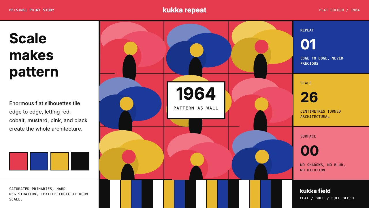 Finnish Marimekko Unikko (1964)Scale becomes pattern. Poppy red, cobalt, mustard, and Inter tile flat silhou…尺度化为图案。罂粟红、钴蓝、芥末黄与Inter平铺扁平剪影。
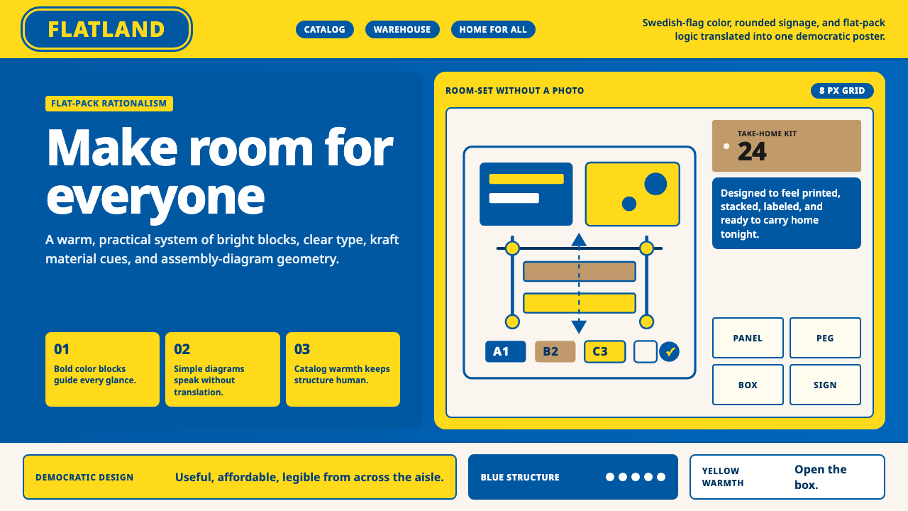 IKEADemocratic warmth in a box. Swedish blue-yellow blocks, Noto Sans, and assemb…盒中民主温暖:瑞典蓝黄块面、Noto Sans 与组装几何。
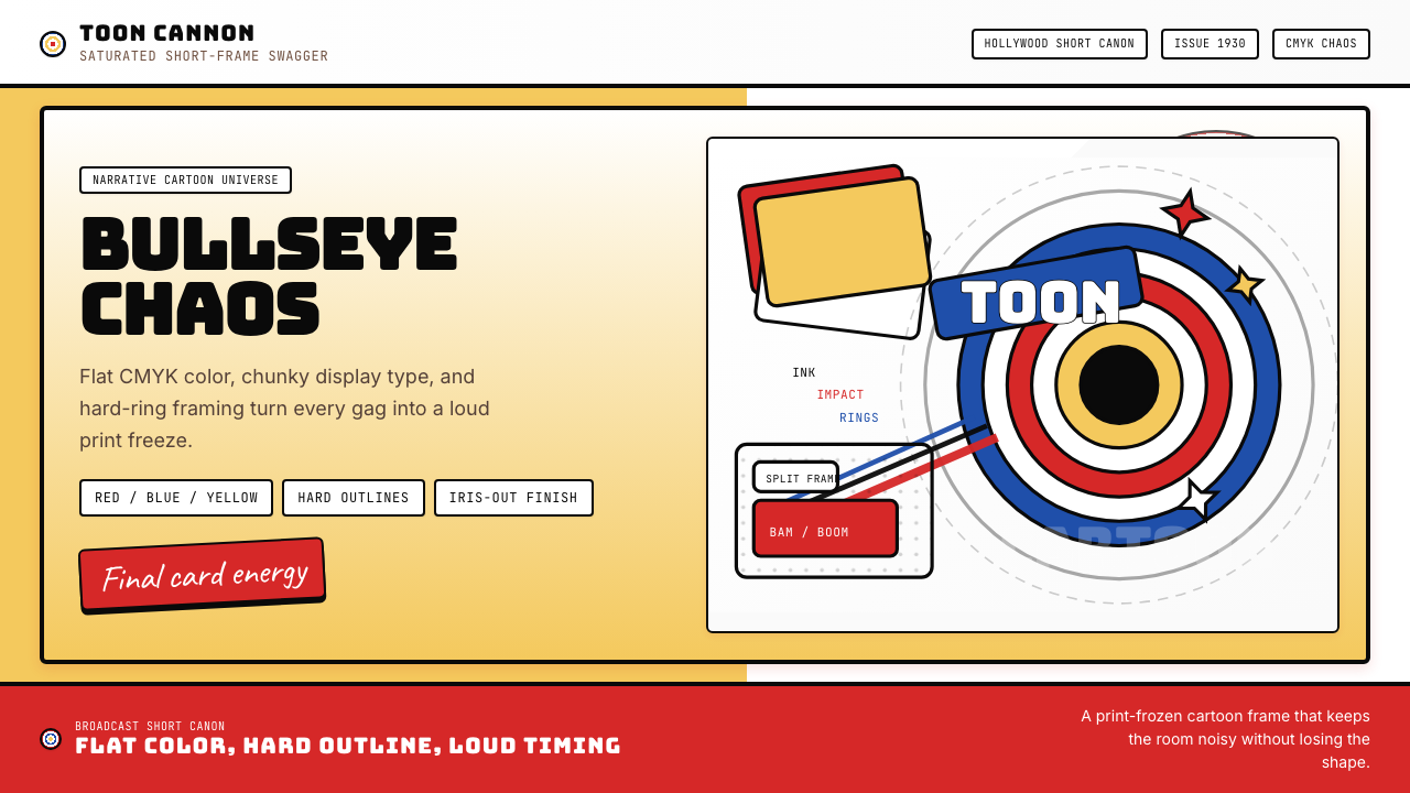 Looney Tunes (Warner Bros.)Pure cartoon chaos. Bull's-eye rings, Bungee type, and red-blue-yellow blocks.纯卡通混乱。牛眼环、粗壮标题字与红蓝黄块面。
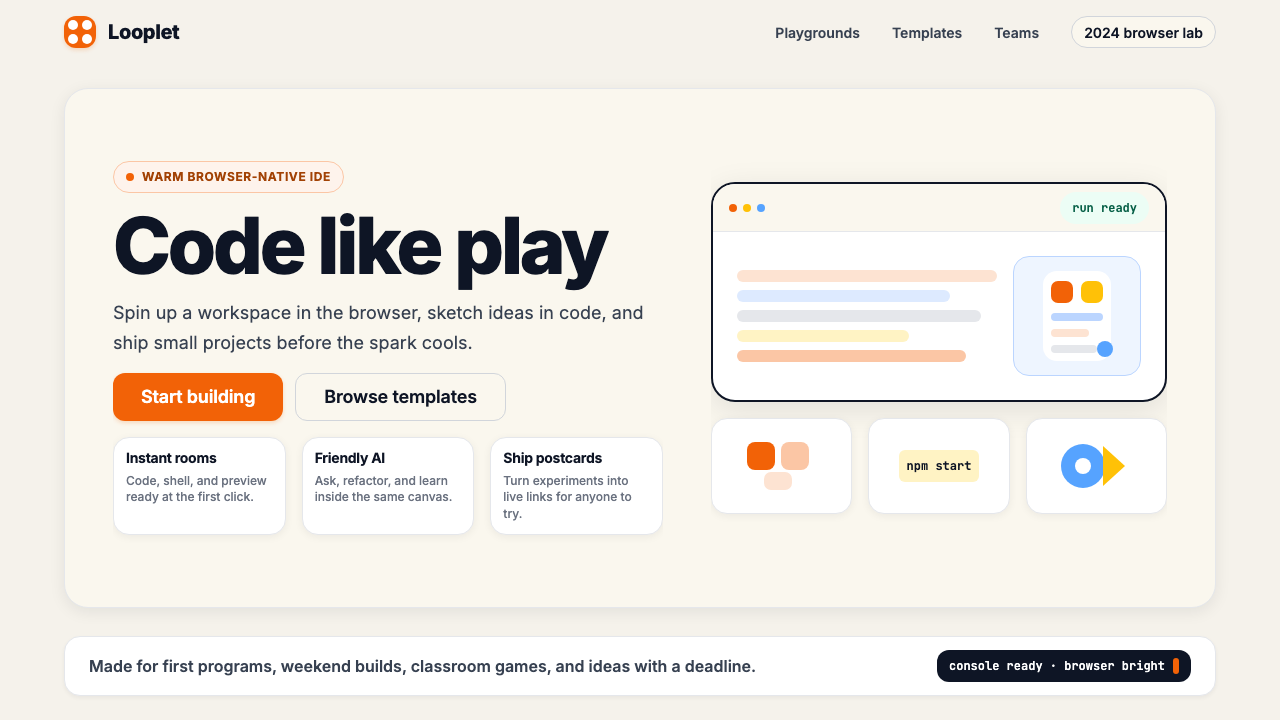 Replit 2024Coding feels warm. Coral buttons, cream panels, rounded code tiles make build…编程变得温暖:珊瑚按钮、奶油面板与圆角代码块让构建更好玩。
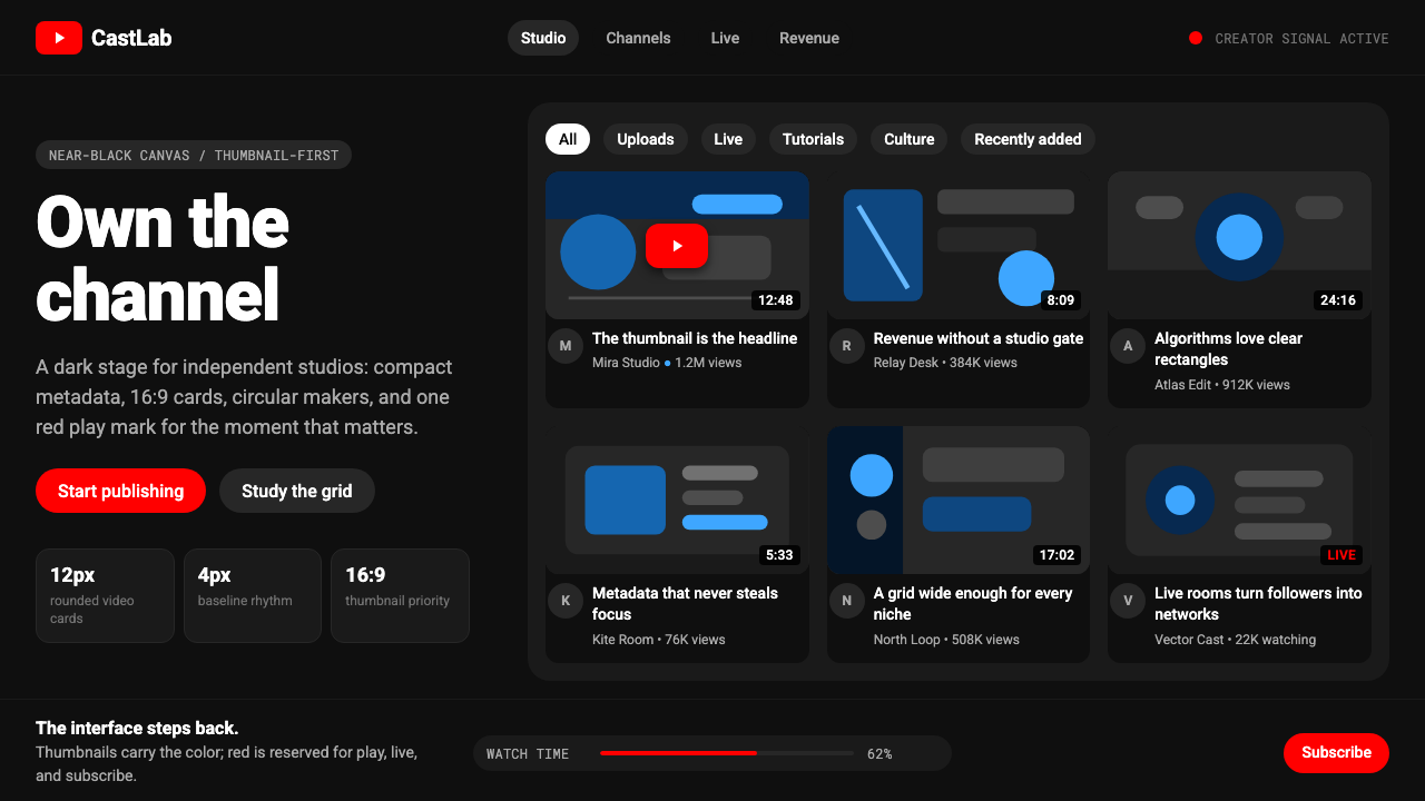 YouTube Creator EconomyThe UI disappears. Near-black Roboto grids let thumbnails shout; red only mea…界面退后:近黑Roboto网格让缩略图发声,红色只为播放。
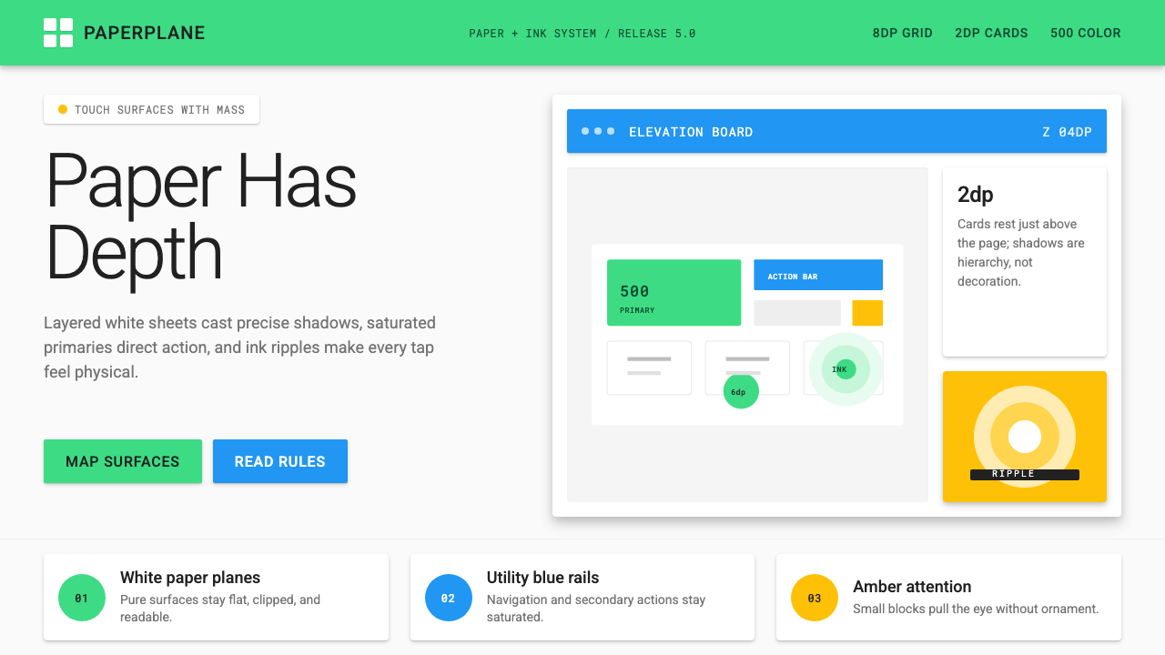 Android Lollipop (Material 1.0)Paper becomes physical. Roboto, green FABs and sharp shadows give white cards…纸张拥有物理感:Roboto、鲜绿浮动按钮与硬阴影让白卡片产生深度。