About LEGO Classic
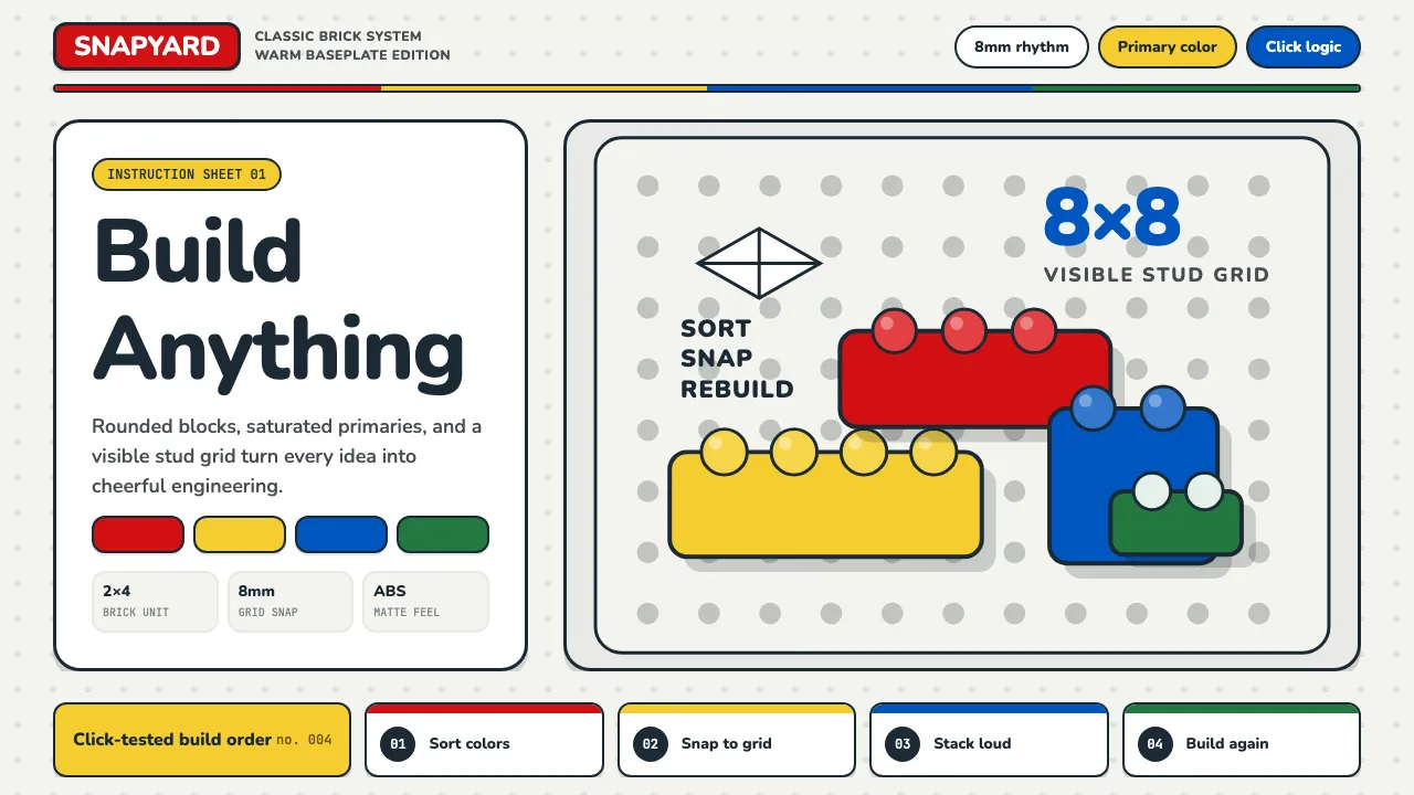
LEGO is primary colors snapped together — the most intuitive visual language of construction ever created. Red, yellow, blue, and green sit on a medium-gray baseplate beside the rounded stud grid and instruction-manual line art. The brand says "build anything" and means it.
The design language is cheerful engineering: a precise 8mm stud grid, bold saturated primaries, chunky rounded forms, and the satisfying click of things fitting together. Nothing is elegant, nothing is moody — everything is toybox bright, matte plastic, and snap-together confident.
- Origin
- Billund, Denmark
- Era
- 1949 first plastic bricks; current logo since 1998; visual identity mature 1970s–present
- Key figures
- Ole Kirk Christiansen · Godtfred Kirk Christiansen · Jørgen Vig Knudstorp
- Movements
- Scandinavian toy design · construction play · instruction-based visual communication
LEGO Classic design spec
Colors
Typography
The other 11 sections — buttons, cards, spacing, motion, techniques and more — open once you unlock. Download the DESIGN.md or send it to your AI in one click. Unlock once, yours forever.
Sign up nowStyles similar to LEGO Classic
Also inspired by brands & products, with a close feel.
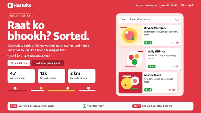 Zomato India DeliveryOwns the midnight scroll. Saturated red, Mukta Hinglish, white cards and gold ratings.
 Rappi DeliveryOrdering, made joyful. A hot red-orange wash floods the page; white pill cards, bouncy green CTAs.
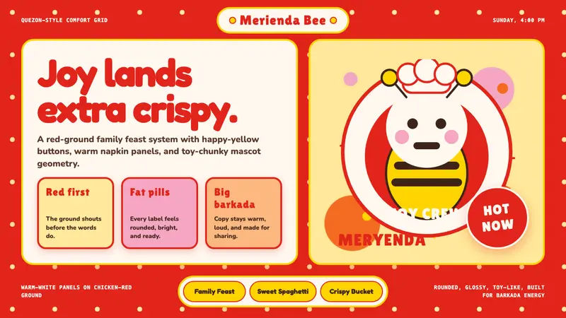 Philippines Jollibee Bee MascotJoy shouts first. Red ground, Fredoka curves, yellow pills, chunky grid.
 Taobao (淘宝)Every pixel sells. Orange on cream, dense price grids and gold coins shout abundance.