招牌配方
Brick-shadow button
Flat offset shadow beneath a solid-fill button so pressing it feels like pushing a real brick — the shadow shortens on `:active` as if the brick sinks onto the baseplate.
.brick-button {
display: inline-flex;
align-items: center;
justify-content: center;
height: 48px;
padding: 0 24px;
background: #D11013;
color: #fff;
font-family: 'Nunito', sans-serif;
font-weight: 800;
font-size: 1rem;
border: none;
border-radius: 12px;
box-shadow: 0 4px 0 #7A0A0D;
transition: transform 120ms cubic-bezier(0.34, 1.56, 0.64, 1),
box-shadow 120ms ease-out,
background 120ms ease-out;
cursor: pointer;
}
.brick-button:hover {
background: #E24042;
box-shadow: 0 6px 0 #7A0A0D;
transform: translateY(-2px);
}
.brick-button:active {
box-shadow: 0 1px 0 #7A0A0D;
transform: translateY(3px);
}
Stud-grid baseplate background
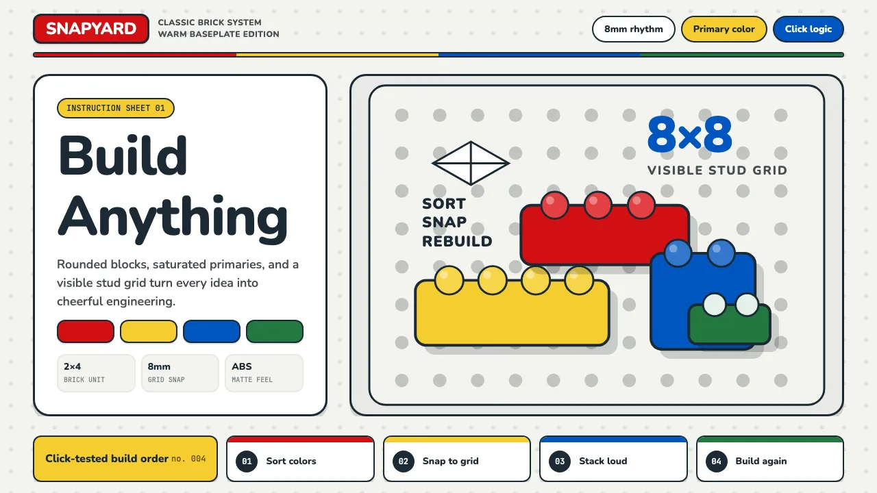
Recreates the iconic LEGO baseplate with a radial-gradient stud repeated on an 8mm-ish grid. Use as a page or hero background behind content cards.
.stud-baseplate {
background-color: #F4F4F0;
background-image:
radial-gradient(circle at center,
rgba(27, 42, 52, 0.10) 0 3px,
transparent 3.5px),
radial-gradient(circle at center,
rgba(255, 255, 255, 0.8) 0 1.5px,
transparent 2px);
background-size: 32px 32px, 32px 32px;
background-position: 0 0, 0 -1px;
}
Primary-color block header
Four solid color blocks stacked edge-to-edge with zero gap — the LEGO-Movie opening sequence, reduced to a CSS header. Drop over any section break or category divider.
.lego-stripe {
display: grid;
grid-template-columns: 1fr 1fr 1fr 1fr;
height: 8px;
width: 100%;
border-radius: 4px;
overflow: hidden;
}
.lego-stripe > span:nth-child(1) { background: #D11013; }
.lego-stripe > span:nth-child(2) { background: #F5CD2F; }
.lego-stripe > span:nth-child(3) { background: #0055BF; }
.lego-stripe > span:nth-child(4) { background: #237841; }