What is IKEA?什么是 IKEA?
IKEA's blue-and-yellow identity is furniture democracy made visible — a Scandinavian system that turned flat-pack rationalism into one of the most recognized design languages on earth.宜家的蓝黄视觉识别是家具民主的可见形态——一套将平板包装理性主义演变为全球最易辨认设计语言之一的北欧系统。
IKEA in briefIKEA 速览
IKEA's visual identity is one of the most studied examples of a retail brand that functions simultaneously as a design system. The two-color palette drawn from the Swedish flag, combined with bold rectangular layouts, generous lifestyle photography, and wordless assembly diagrams, creates a visual language that communicates warmth, accessibility, and practical order without relying on craft or luxury signals.宜家的视觉识别是零售品牌同时作为设计系统运作的最具研究价值的案例之一。从瑞典国旗提取的双色色板,结合大胆的矩形版式、大幅生活场景摄影以及无文字的组装说明图,构建了一套无需依赖工艺感或奢侈信号便能传递温暖、亲切与实用秩序的视觉语言。
The system is built on a fundamental tension: it is mass-market and populist in its values, yet disciplined and consistent in its visual execution. Where luxury brands use scarcity and restraint to signal exclusivity, IKEA uses saturation and scale to signal abundance and availability. The result is a design language that feels simultaneously democratic and confident — never apologetic about its reach, never pretending to be something smaller or rarer than it is.这套系统建立在一个根本性的张力之上:其价值观是大众市场式的、平民主义的,然而其视觉执行却是严格且一致的。奢侈品牌用稀缺与克制来传递独特性,宜家则用饱和度与规模来传递丰裕与可及性。结果是一种视觉语言——既民主又自信,从不为自身的广泛覆盖道歉,也从不伪装成某种更小众或更稀有的东西。
Visually, the IKEA language is organized around color blocks, photographic panels, and typographic hierarchy rather than illustration or ornament. Every surface is legible at a distance. The rounded-rectangle brand enclosure — the yellow logotype on a deep blue field — functions as a geographic anchor, instantly orienting a viewer within any store, catalog page, or digital interface.在视觉层面,宜家语言围绕色块、摄影图版和字体层级组织,而非依赖插图或装饰。每一个界面都可在远处被清晰识读。圆角矩形品牌框定——深蓝色底上的黄色字标——充当地理锚点,在任何门店、目录页或数字界面中都能立刻为观者提供方位感。
Where does IKEA come from?IKEA 从何而来?
IKEA was founded in 1943 by Ingvar Kamprad in Älmhult, a small town in Småland, southern Sweden. Kamprad was seventeen years old. The name is an acronym: I and K are his initials, E stands for Elmtaryd (his family farm), and A for Agunnaryd (his home village). The company initially sold small household goods — pens, picture frames, watches — by mail order. Furniture entered the catalog in 1948, and by 1955 IKEA had begun designing its own pieces, responding to a price war with local competitors that had led suppliers to boycott the company.宜家由英格瓦·坎普拉德于1943年在瑞典南部斯莫兰省的小镇阿姆霍特创立,当时他年仅十七岁。品牌名称是一个首字母缩写:I和K是他名字的缩写,E代表艾姆特利(他家的农场),A代表阿古纳里德(他的家乡村庄)。公司最初通过邮购销售小型家居用品——钢笔、相框、手表。家具于1948年进入目录,至1955年宜家已开始自主设计家具,起因是与当地竞争对手的价格战导致供应商联合抵制。
The flat-pack format, which became the organizational logic for both the physical product and the visual identity, was developed in the late 1950s. The story most often cited involves a designer named Gillis Lundgren removing the legs of a table to fit it into a car — the insight that a knocked-down object is cheaper to ship, store, and sell than an assembled one reshaped the entire enterprise. Flat-pack demanded a new kind of communication: instructions that could work across languages, diagrams legible to any buyer in any country. The wordless assembly manual — a figure navigating bolts and boards with only numbered steps and line drawings — became one of IKEA's most distinctive and globally consistent design outputs.平板包装格式——后来成为实体产品与视觉识别系统共同的组织逻辑——于1950年代末期发展成型。最常被引用的故事是:一位名叫吉利斯·伦德格伦的设计师为了将桌子装进汽车而拆下桌腿——这个发现,即拆卸状态的物品比组装状态更便于运输、存储和销售,彻底重塑了整个企业。平板包装要求一种新的传达方式:能够跨语言使用的说明书,任何国家的买家都能看懂的图表。无文字组装手册——一个人物仅凭编号步骤和线条图解螺栓与板材——成为宜家最具辨识度、在全球最为一致的设计输出之一。
The blue-and-yellow visual identity consolidated around the 1970s and 1980s, tracking closely with IKEA's expansion beyond Sweden into Germany, Switzerland, and eventually the rest of Europe and North America. The Swedish-flag palette was both pragmatic and strategic: it communicated a specific national origin at a moment when Swedish design carried strong positive associations — clean, functional, modern, democratic — while also being simple enough to reproduce at any scale, in any medium, with complete consistency.蓝黄视觉识别于1970至1980年代前后趋于稳定,这与宜家从瑞典向德国、瑞士以及后来欧洲其他地区和北美扩张的时间线紧密吻合。瑞典国旗色板既是务实的,也是战略性的:它在瑞典设计拥有强烈正面联想——简洁、功能性、现代、民主——的时代传达了一个明确的国家来源,同时也足够简单,能够在任何规模、任何媒介中以完整的一致性再现。
Stockholm Design Lab, which has worked with IKEA on various identity projects, represents the more refined, typographically rigorous end of the brand's visual evolution. But the core identity — the bicolor palette, the rounded-rectangle enclosure, the commitment to accessibility over refinement — has remained essentially stable across eight decades, maintained through hundreds of markets and billions of catalogs. It is one of the longest-sustained brand identity systems in global retail history.曾在多个识别项目上与宜家合作的斯德哥尔摩设计实验室,代表了品牌视觉演进中更精致、排版更严谨的一端。但核心识别——双色色板、圆角矩形框定、可及性优于精致感的承诺——在八十年间本质上保持稳定,贯穿数百个市场与数十亿份目录。这是全球零售史上持续时间最长的品牌识别系统之一。
What defines the IKEA look?IKEA 的视觉特征是什么?
Bicolor Palette双色色板
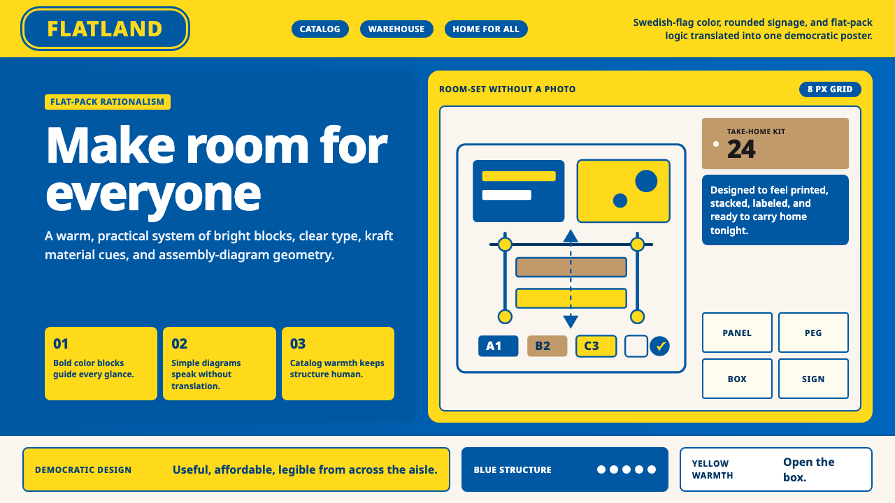
The palette is anchored by two colors drawn from the Swedish national flag: a deep, saturated blue and a warm, vivid yellow. These are not pastel approximations or corporate softened variants — they are used at full intensity, creating maximum contrast and visibility at any scale. Supporting tones include the warm kraft-brown of cardboard and the near-white of catalog backgrounds, but these are ambient rather than defining. The bicolor system is so consistent that either color alone, in this specific saturation and temperature, suffices to evoke the brand.色板以两种源自瑞典国旗的颜色为锚:深邃而饱和的蓝色,以及温暖而鲜艳的黄色。这并非柔和的近似色或经过企业软化的变体——它们以全强度使用,在任何尺度下都能形成最大对比度与可见性。支撑色调包括纸板箱的暖牛皮纸棕色与目录背景的近白色,但这些是环境性的,而非定义性的。这套双色系统如此稳定,以至于任意一种颜色单独出现时,以这种特定饱和度和色温,便足以唤起品牌联想。
Rounded-Rectangle Brand Enclosure圆角矩形品牌框定
The signature visual container is a deeply rounded rectangle — sometimes described as a stadium or pill-adjacent form — filled with the brand's deep blue, inside which the yellow wordmark sits horizontally centered. This enclosure functions simultaneously as a logo, a wayfinding marker, and a system anchor. Its rounded corners soften what would otherwise be a harsh industrial shape, contributing to the sense of approachability that distinguishes the IKEA system from colder Scandinavian-adjacent aesthetics. The form has remained stable for decades.标志性的视觉容器是一个深度圆角矩形——有时被描述为体育场形或近似胶囊形——以品牌深蓝填充,内部水平居中置放黄色字标。这个框定形式同时作为徽标、导向标记与系统锚点使用。其圆角使原本可能显得粗粝工业感的形态变得柔和,有助于形成那种亲切感——这正是宜家系统区别于更冷峻的北欧邻近美学的核心所在。该形态已稳定沿用数十年。
Photography Scale and Warmth摄影尺度与温暖感
Photography in the IKEA system is used at generous scale — filling entire catalog spreads, dominating web banners, commanding store displays. Unlike fashion or luxury photography, the subjects are almost always rooms and objects in use, shown from eye level, with evidence of habitation: a half-read book on a side table, morning light entering through an open window, a family meal in progress. The photographs are styled with warm, diffuse lighting and a naturalistic color grading that reads as lived-in rather than aspirational. This photographic warmth is the primary emotional differentiator in the system.宜家系统中的摄影被大尺度使用——铺满整个目录对开页,主导网页横幅,统领店面陈设。与时装或奢侈品摄影不同,拍摄对象几乎总是正在被使用的房间与物品,以视平线高度拍摄,带有居住痕迹:茶几上半读完的书,从开着的窗户透入的晨光,正在进行中的家庭餐食。这些照片以温暖、漫射的光线和自然主义色调处理,传递出的是「被住过的」感觉,而非「令人向往的」感觉。这种摄影温暖感是整个系统中首要的情感差异化因子。
Wordless Diagram Language无文字图解语言
The assembly manual represents a distinct and highly refined sub-system within the IKEA visual language. Instructions are delivered entirely through line drawings of a human figure — always calm, always gently expressive — performing numbered steps with hardware and panels. The absence of text makes the instructions function across any language, in any market, without translation. The visual grammar is consistent across thousands of products and decades of updates: isometric views alternate with detail callouts, hardware is shown actual-size in relation to the components, and mistakes are shown crossed out in red alongside the correct approach.组装手册代表了宜家视觉语言中一套独特而高度精炼的子系统。说明完全通过线条画的人物形象传递——总是平静的,总是带着温和表情——按编号步骤操作五金件与板材。文字的缺席使说明书在任何语言、任何市场都无需翻译即可使用。这套视觉语法在数千种产品和数十年的更新中保持一致:等距视图与细节标注交替出现,五金件按与组件的实际比例展示,错误做法以红色叉号标出,正确方法并排呈现。
Democratic Typography民主字体排印
IKEA's type system favors clean, highly legible sans-serif letterforms with generous spacing and open counters — letterforms that function across a wide range of contexts, from large signage to small catalog captions, without feeling cramped or precious. The typographic hierarchy is simple and direct: a large, bold headline establishes the primary message; a secondary level handles product names and prices; a tertiary level carries descriptions and specifications. There is no calligraphic or display type in the system. The goal is maximum readability at minimum effort — a democratic rather than connoisseur-oriented typographic approach.宜家的字体系统偏好简洁、高度可读的无衬线字形,字距宽松,字腔开放——这些字形能在从大型标牌到小型目录说明文字的宽泛语境中使用,而不会显得局促或精英化。字体层级简单直接:大而粗的标题确立主要信息,次级层级处理产品名称与价格,三级层级承载描述与规格。系统中没有书法体或展示型字体。目标是以最小努力实现最大可读性——一种面向民主而非鉴赏家的排印取向。
Flat Color Blocks平面色块
Beyond the bicolor core, IKEA layouts use flat, unmodulated color fields as structural dividers and background panels. These blocks carry no gradient, texture, or shadow — they function as visual punctuation, separating zones of content and creating breathing room between image and text. In store signage and catalog chapter openers, a full yellow or blue panel serves the same organizing function that a ruled line might serve in a typographically restrained system: it marks a boundary and announces a transition. The flatness is not minimalism — it is a production principle that has proven durable across print, physical, and digital contexts.在双色核心之外,宜家版式使用平面、无渐变的纯色域作为结构性分隔线和背景图版。这些色块不带渐变、纹理或投影——它们作为视觉标点使用,分隔内容区域,在图像与文字之间创造呼吸空间。在店面标牌和目录章节首页,全版黄色或蓝色图版承担着与排版克制系统中的分割线相同的组织功能:标记边界,宣告过渡。这种平面感不是极简主义——它是一种在印刷、实体与数字语境中都证明了其耐久性的生产原则。
Accessibility as Aesthetic可及性作为美学
Every element of the IKEA visual system encodes the same core value: this is for everyone. High-contrast color combinations, oversized type, clear wayfinding graphics, and the universally legible assembly diagram language are not accessibility accommodations added after the fact — they are the aesthetic itself. The system was designed for a shopper navigating a 300,000-square-foot store alone, for a first-time furniture buyer reading a flat-pack manual in a second language, for a family choosing a kitchen configuration online. Universality is not a constraint on the design; it is its ambition.宜家视觉系统的每一个元素都编码了同一个核心价值:这是为所有人准备的。高对比度的色彩组合、超大号文字、清晰的导向图形,以及普遍可读的组装图解语言——这些并非事后添加的无障碍设计补丁,它们本身就是这套美学。这套系统是为独自穿越三十万平方英尺卖场的购物者设计的,为用第二语言阅读平板包装手册的初次家具买家设计的,为在网上选择厨房配置方案的家庭设计的。普遍性不是对设计的约束;它是这套设计的抱负。
Who shaped IKEA?谁塑造了 IKEA?
Kamprad founded IKEA in 1943 at the age of seventeen and remained its guiding force until his death in 2018, shaping both its commercial strategy and its visual and cultural identity. His insistence on democratic pricing — captured in the concept of designing furniture that any person, regardless of income, could afford — became the brand's foundational principle and the implicit logic behind every visual decision the system makes. His frugality was legendary and genuinely influential: he believed that waste in any form, including unnecessary visual complexity, was a moral failure. The design system's commitment to flat color, legible type, and wordless communication reflects his conviction that good design should cost the same to produce as bad design.坎普拉德于1943年以十七岁之龄创立宜家,并在2018年去世前始终是公司的精神核心,塑造了其商业战略与视觉文化身份。他对民主定价的坚持——即设计任何人,无论收入高低,都能负担的家具——成为品牌的基础原则,也是这套系统中每一个视觉决策背后的隐性逻辑。他的节俭精神是传奇性的,也是真正有影响力的:他相信任何形式的浪费——包括不必要的视觉复杂性——都是一种道德失败。设计系统对平面色彩、可读字体和无文字传达的坚持,正是他这一信念的体现:好设计的生产成本应与坏设计相同。
Lundgren was the IKEA designer credited with the insight that led to the flat-pack format — the realization, reportedly made while trying to fit a table into a car, that removing legs and shipping components knocked-down could transform the economics of furniture retail. This was not merely a logistical innovation; it was a design constraint that reshaped the entire visual system. Flat-pack required assembly diagrams, which required a wordless pictorial language, which required a visual grammar consistent enough to function across every culture where IKEA operated. Lundgren's practical problem-solving sits at the origin of what became one of the most influential design communication systems in retail history.伦德格伦是宜家设计师,被认为是平板包装格式背后灵感的发现者——据说在试图将一张桌子装进汽车时,他意识到拆去桌腿、以零件状态运输可以从根本上改变家具零售的经济逻辑。这不仅仅是一项物流创新;它是一种设计约束,重塑了整个视觉系统。平板包装需要组装图解,组装图解需要无文字的图示语言,而图示语言需要足够一致的视觉语法,才能在宜家运营的每一种文化中有效运作。伦德格伦的实用问题解决方式,位于后来成为零售史上最具影响力的设计传达系统之一的起点。
Stockholm Design Lab, founded in 1998, has collaborated with IKEA on identity and communication projects that represent the more typographically refined evolution of the brand's visual language. The studio's broader body of work — including projects for SAS, Absolut, and other Scandinavian institutions — demonstrates a consistent interest in the intersection of simplicity, clarity, and cultural identity that aligns naturally with the IKEA system's underlying values. Their involvement represents IKEA's periodic effort to subject its vast, often chaotic real-world visual output to a more principled and systematic design logic.斯德哥尔摩设计实验室创立于1998年,曾与宜家在识别与传达项目上合作,代表了品牌视觉语言中排版更为精致的演进方向。该工作室更广泛的作品——包括为北欧航空、绝对伏特加及其他北欧机构的项目——展现了对简洁、清晰与文化身份交汇点的持续关注,这与宜家系统的基础价值观自然契合。他们的参与代表了宜家周期性地将其庞大且往往混乱的现实视觉输出纳入更有原则、更系统性设计逻辑的努力。
Dahlvig served as IKEA's Group CEO from 1999 to 2009, a period that encompassed the brand's most aggressive international expansion and the maturation of its visual identity into a globally standardized system. Under his leadership, the challenge was not invention but consistency — maintaining the coherence of a bicolor, typographically direct, photography-led identity across dozens of new markets, each with different printing norms, retail environments, and cultural contexts. The visual discipline that characterizes the mature IKEA system was consolidated substantially during this decade of expansion.道尔维格于1999至2009年间担任宜家集团首席执行官,这一时期涵盖了品牌最积极的国际扩张与视觉识别成熟为全球标准化系统的过程。在他的领导下,挑战不在于创新,而在于一致性——在数十个新市场中维持这套双色、排版直接、以摄影为主导的识别系统的连贯性,每个市场都有不同的印刷规范、零售环境与文化语境。成熟宜家系统所特有的视觉纪律,在这十年的扩张期间得到了实质性的巩固。
How do you use IKEA today?今天怎么用 IKEA?
The IKEA visual language is among the most recognizable retail design systems ever built, which creates both opportunity and risk when borrowing from it. Applying it well requires understanding its underlying logic: warmth through scale and photography, not decoration; clarity through contrast and restraint, not minimalism; accessibility through system consistency, not simplification of individual elements. The goal is never to produce an IKEA look-alike but to deploy its structural principles — bold color blocking, generous imagery, direct typographic hierarchy — in service of a different product or message.宜家视觉语言是有史以来最具辨识度的零售设计系统之一,这在借鉴时既带来机遇,也带来风险。好的应用需要理解其底层逻辑:通过尺度和摄影而非装饰传递温暖;通过对比和克制而非极简主义实现清晰;通过系统一致性而非对单个元素的简化实现可及性。目标从来不是制造宜家的外表仿品,而是将其结构原则——大胆色块、丰盛的图像、直接的字体层级——部署于服务不同产品或信息的场合。
For presentation slides, the IKEA approach yields strong results on both cover and content pages. A cover built on this system uses a deep blue or vivid yellow field occupying a substantial portion of the slide, with the title in high-contrast reversed type and a cropped lifestyle photograph showing the product or service in actual use. Content slides are organized on a clear grid with one dominant visual — photograph or diagram — supported by a concise text hierarchy. Data slides benefit from the system's flat color logic: bar charts and segmented graphics use the bicolor palette as their encoding scheme, avoiding decorative gradients in favor of solid, distinct fields that read clearly at projection scale.对于演示文稿,宜家风格在封面页和内容页上都能产生强劲效果。基于这套系统构建的封面,以深蓝或鲜黄色域占据幻灯片的相当面积,标题以高对比度反白字体呈现,配以裁切处理的生活场景摄影,展示产品或服务的实际使用状态。内容页在清晰网格上组织,以一个主视觉——摄影或图解——为主体,辅以简洁的文字层级。数据页受益于这套系统的平面色彩逻辑:柱状图和分段图形使用双色色板作为编码方案,避免装饰性渐变,转而采用在投影尺度下清晰可读的实心、明确的色域。
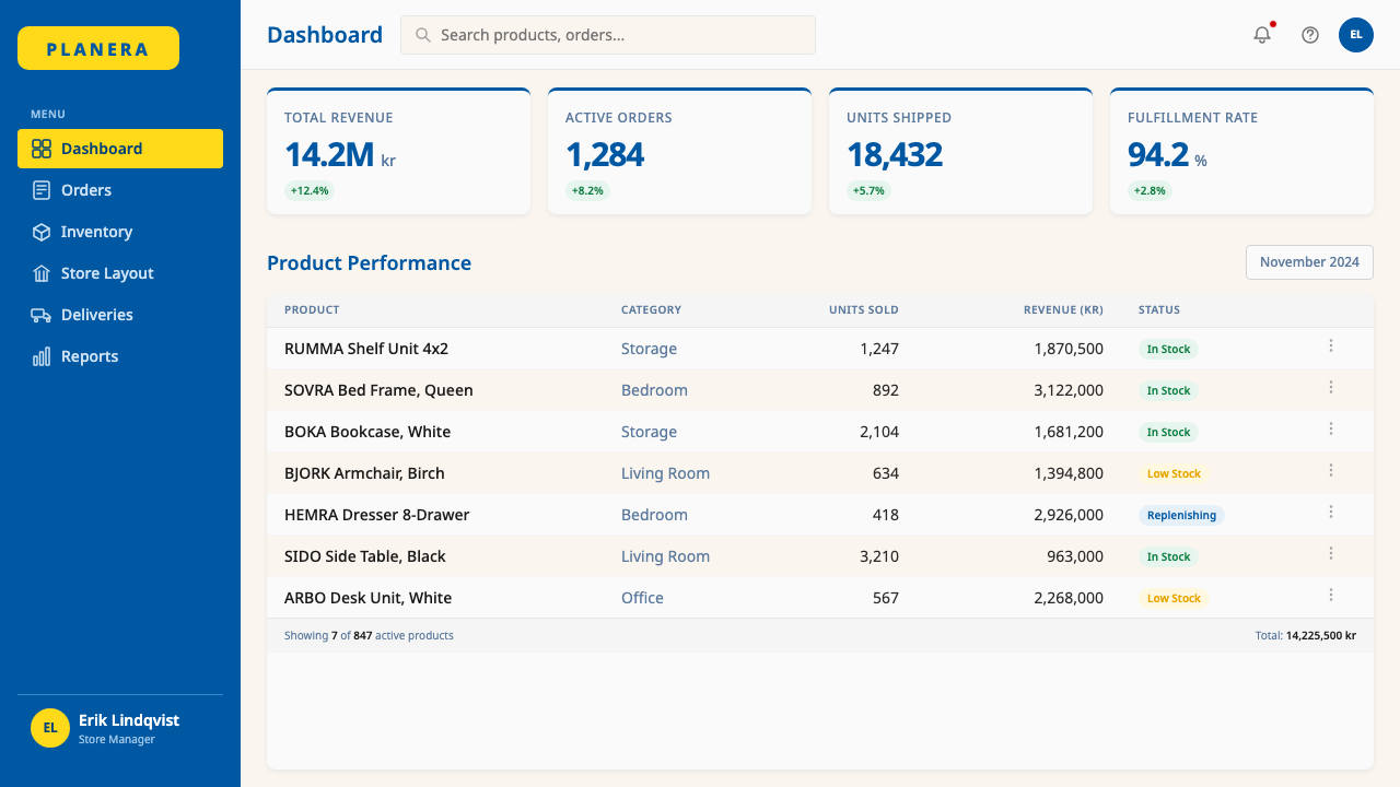
For web interfaces, dashboards, and pricing pages, the IKEA system offers a strong model for achieving hierarchy without visual noise. The approach: a near-white background with deep blue and vivid yellow reserved for interactive elements, active states, and tier differentiation. Navigation should rely on clear typographic labels rather than icon-heavy menus. Pricing and feature comparison tables work well with alternating color-field rows — blue fields for one tier, yellow accents for a highlighted tier — keeping all type in a single clean sans-serif family. Card components should use flat backgrounds and clearly legible type at comfortable sizes rather than soft shadows and micro-type.对于网页界面、仪表板和定价页面,宜家系统为在无视觉噪音的情况下实现层级提供了强有力的模型。方法如下:近白色背景,深蓝和鲜黄保留给交互元素、激活状态和层级差异。导航应依赖清晰的字体标签,而非图标密集的菜单。定价与功能对比表格适合使用交替色域行——蓝色域用于某一层级,黄色强调用于高亮层级——所有文字保持单一简洁无衬线字体家族。卡片组件应使用平面背景和足够字号的清晰可读字体,而非柔和阴影和微型字体。
For editorial and marketing applications, the system's photographic scale and color boldness make it well-suited to materials where immediate visual impact is required. A marketing page or editorial layout built on IKEA principles alternates between full-bleed lifestyle photography and bold color-field sections that carry headlines and calls to action. The yellow field, used as a full-width band, creates natural pause points and reading rhythm. Product-focused editorial benefits from the system's approach to combining object photography with supporting text: generous white space around the photograph, type set in a single weight hierarchy to the side or below.对于编辑和营销应用,这套系统的摄影尺度和色彩大胆感使其非常适合需要即时视觉冲击力的材料。基于宜家原则构建的营销页面或编辑版式,在满版生活场景摄影与承载标题和行动号召的大胆色域区块之间交替。黄色域作为全宽色带使用,创造自然的阅读停顿点和节奏感。以产品为中心的编辑内容受益于这套系统将实物摄影与支撑文字结合的方式:摄影周围宽阔的留白,文字以单一字重层级排列于侧边或下方。
A common mistake when applying this design language is treating the blue-yellow combination as simply a color choice rather than a system decision. The bicolor palette works because it is deployed with discipline — one color dominates a given surface, the other provides accent, and the combination never appears simultaneously at equal weight on a single composition. Another frequent error is substituting warm, welcoming photography with abstract or illustrative imagery, which immediately loses the warmth that is the system's primary emotional differentiator. The photographic warmth is not incidental to the IKEA aesthetic — it is the mechanism by which the system's strict color and typographic discipline is balanced against human relatability.应用这种设计语言时最常见的错误,是将蓝黄组合仅视为一种色彩选择,而非一个系统决策。双色色板之所以有效,是因为它以纪律部署——某一色彩在给定界面上主导,另一色彩提供强调,两种组合在单一构图中从不以同等分量同时出现。另一个常见错误是以抽象或插画式图像取代温暖友好的摄影,这会立刻失去该系统的首要情感差异化因子。摄影温暖感对于宜家美学而言不是附带的——它是这套系统的严格色彩和排版纪律与人类亲切感得以平衡的机制。
IKEA — FAQIKEA · 常见问题
Is IKEA's visual language the same as Scandinavian design?宜家的视觉语言等同于北欧设计吗?
IKEA's identity shares values with Scandinavian design — functionality, simplicity, restraint — but its visual execution is more saturated, more populist, and more commercially assertive than the Scandinavian design tradition at its most refined. Classic Scandinavian design, as represented by brands like Muuto or Hay, typically uses a muted, nature-derived palette and lets material quality carry aesthetic weight. IKEA uses the Swedish flag's full-intensity blue and yellow, large-scale photography, and bold typographic hierarchy to communicate at retail scale. Think of classic Scandinavian design as the quiet room and IKEA as the same room with the lights fully on and the furniture labeled.宜家的识别与北欧设计共享价值观——功能性、简洁、克制——但其视觉执行比北欧设计传统在最精致端的呈现更为饱和、更为平民主义、更具商业主张性。以Muuto或Hay等品牌为代表的经典北欧设计,通常使用来源于自然的低饱和色板,让材质品质承载美学分量。宜家则使用瑞典国旗的全强度蓝与黄、大尺度摄影和大胆的字体层级,以零售规模进行传达。可以这样理解:经典北欧设计是那个安静的房间,宜家是同一个房间,灯光全开,家具都贴着标签。
Can the IKEA visual language work for digital products, or is it too retail-specific?宜家视觉语言能用于数字产品吗,还是说它太局限于零售场景?
The underlying principles transfer well to digital contexts, but several specific elements require adaptation. The bicolor palette — a deep blue for structure and navigation, a warm yellow for highlights and calls to action — works effectively in interface design, and the system's commitment to high contrast and legible type scale translates directly to accessibility best practice in digital products. The challenge is photography: the IKEA system's warmth depends heavily on lifestyle photography at generous scale, which may not suit all digital product contexts. For a productivity tool or analytics dashboard, the color and typographic logic transfers; the photographic warmth should be replaced by clear data visualization and well-structured empty states.其底层原则能很好地迁移至数字语境,但若干具体元素需要适配。双色色板——深蓝用于结构与导航,暖黄用于高亮与行动号召——在界面设计中表现有效,而这套系统对高对比度和可读字号的坚持,直接对应数字产品无障碍设计的最佳实践。挑战在于摄影:宜家系统的温暖感很大程度上依赖于大尺度生活场景摄影,这可能不适合所有数字产品语境。对于生产力工具或数据分析仪表板,色彩和字体排印逻辑可以迁移;摄影温暖感应被清晰的数据可视化和结构良好的空状态所替代。
How does IKEA's design language handle diversity and cultural variation across markets?宜家的设计语言如何在不同市场中处理多样性与文化差异?
The most durable element of the IKEA system across cultures is precisely what requires no cultural translation: the wordless assembly diagram. The bicolor palette and the rounded-rectangle lockup are also remarkably culture-neutral — blue and yellow carry no strong negative associations in most markets, and the enclosure form reads as a container rather than a culturally specific symbol. Where variation occurs, it is primarily in photography: IKEA's catalog and marketing imagery has progressively evolved to show a wider range of family configurations, home sizes, and interior styles reflecting the diversity of each market. The system's visual grammar stays constant; the people and spaces depicted within it change.宜家系统在跨文化场景中最为持久的元素,恰恰是那个不需要任何文化翻译的部分:无文字组装图解。双色色板和圆角矩形框定在文化上也是出奇地中性——蓝色和黄色在大多数市场中不带强烈负面联想,而这种容器形态被读解为一个通用包裹,而非一个特定文化符号。当差异发生时,主要体现在摄影层面:宜家的目录和营销图像逐渐演进,展示更多样的家庭形态、居住面积和室内风格,以反映各市场的多样性。系统的视觉语法保持不变;其中描绘的人与空间在变化。
Why does the IKEA identity feel warm when it uses such a bold, high-contrast palette?宜家的识别系统使用如此大胆、高对比度的色板,为何仍然让人感觉温暖?
The warmth comes not from the color palette itself but from the photographic content and the rounded geometry that frames the logotype. The bicolor palette is assertive and high-contrast, which in isolation could read as cold or industrial. But it operates alongside large-format photography of domestic spaces filled with natural light, human activity, and familiar objects — and that photography carries the emotional temperature of the system. The rounded-rectangle enclosure adds a secondary warmth signal: rounded forms are perceptually associated with safety and approachability in a way that sharp-cornered rectangles are not. The bold palette provides visibility and recognition; the photography and rounded geometry provide warmth. Together they prevent the system from tipping into either cold corporate minimalism or chaotic retail noise.温暖感来自的不是色板本身,而是摄影内容和框定字标的圆角几何形态。双色色板是强势而高对比度的,单独看可能给人冷漠或工业感的印象。但它与充满自然光、人的活动与熟悉物品的大幅室内摄影并行运作——而正是那些摄影承载了整套系统的情感温度。圆角矩形框定提供了次级温暖信号:圆润形态在感知上与安全感和亲切感相关联,这是锐角矩形所不具备的。大胆色板提供可见度与识别度;摄影和圆角几何提供温暖感。两者共同作用,防止系统倾向冷漠企业极简主义或混乱零售噪音中的任何一端。
Does applying this style require actual IKEA products or Swedish references?应用这种风格是否需要实际的宜家产品或瑞典元素?
No. The visual language transfers independently of any specific product or cultural reference. What makes the system work is the structural relationship between its elements: the bicolor palette used with discipline, lifestyle photography at generous scale, a clean typographic hierarchy, the wordless diagram aesthetic for instructional content, and flat color fields as spatial organizers. These principles can be applied to any product category — software, financial services, education, food — without reference to furniture or Sweden. The risk to avoid is literal quotation: copying the rounded-rectangle lockup or using the exact bicolor combination creates brand confusion rather than aesthetic transfer. Extract the principles; do not reproduce the symbol.不需要。这套视觉语言的迁移独立于任何具体产品或文化参照。使这套系统有效运作的,是其各元素之间的结构关系:以纪律使用的双色色板,以丰盛尺度使用的生活场景摄影,简洁的字体层级,用于说明性内容的无文字图解美学,以及作为空间组织者的平面色域。这些原则可以应用于任何产品类别——软件、金融服务、教育、食品——无需参照家具或瑞典。需要避免的风险是字面引用:复制圆角矩形框定或使用完全相同的双色组合,会造成品牌混淆而非美学迁移。提取原则;不要复制符号。
Related design styles相关设计风格
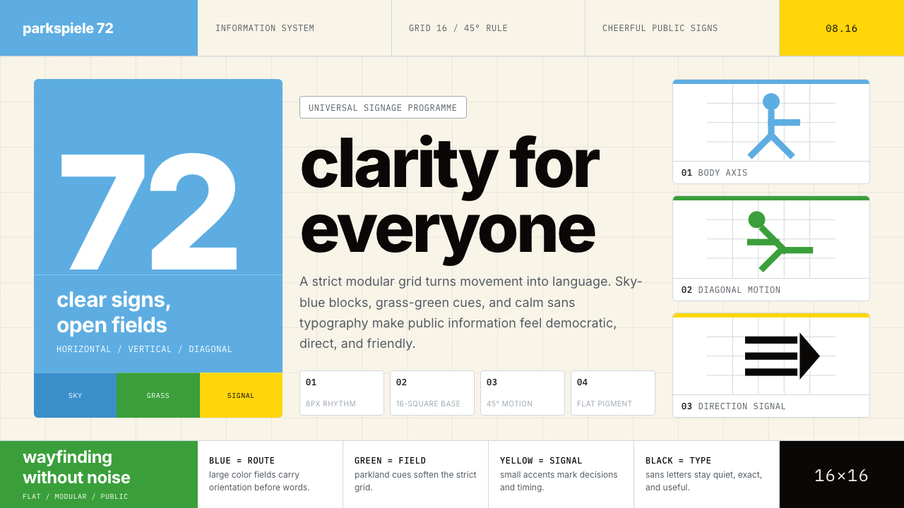 Otl Aicher Munich OlympicsFriendly rigor. Sky-blue grids and straight-line pictograms make public infor…友好的严谨:天蓝网格与直线图标,让公共信息普世清晰。
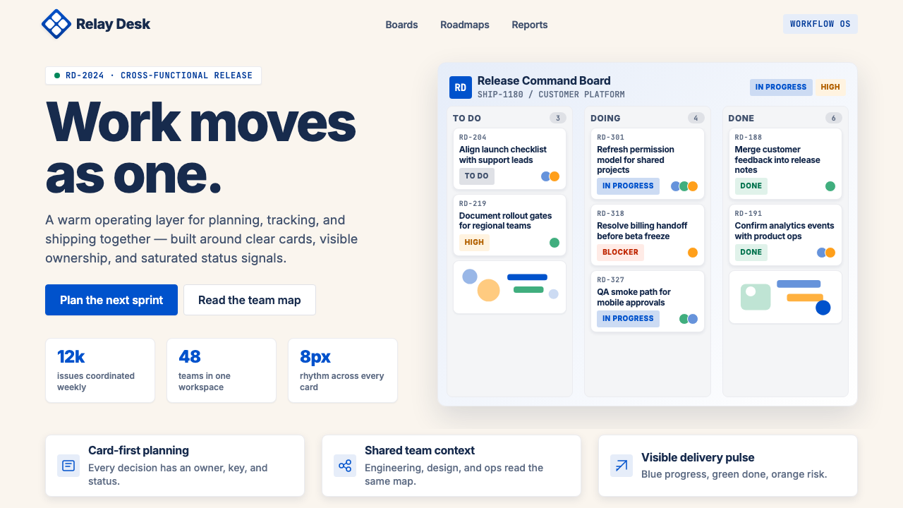 Atlassian Jira BlueWarm enterprise teamwork. Saturated blue cards on cream make status feel huma…温暖的企业协作:奶油底上的饱和蓝卡片,让状态更有人味。
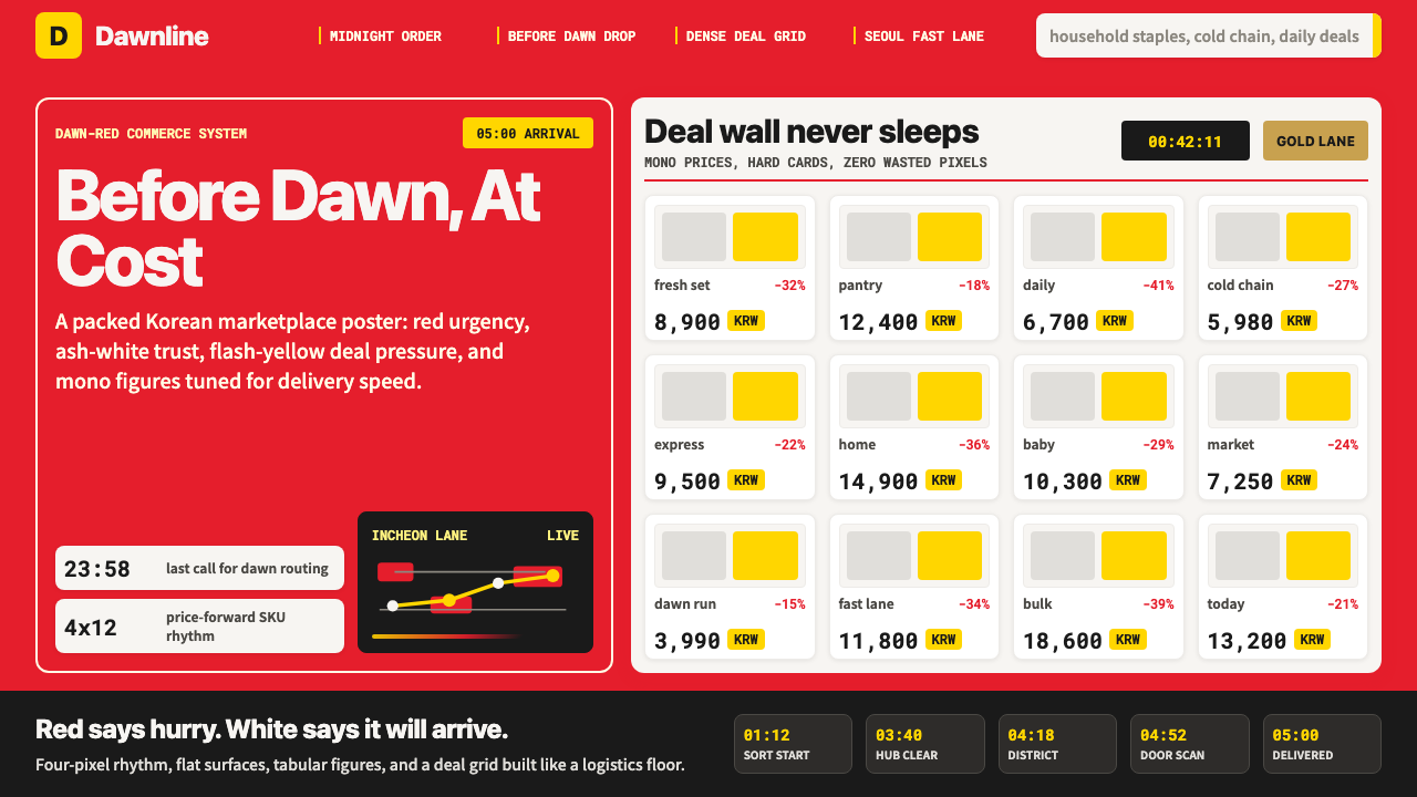 Coupang Rocket DeliveryUrgency made trustworthy. Rocket red, flash yellow, mono prices and packed gr…可信的紧迫感。火箭红、闪黄价格与密集网格推进速度。
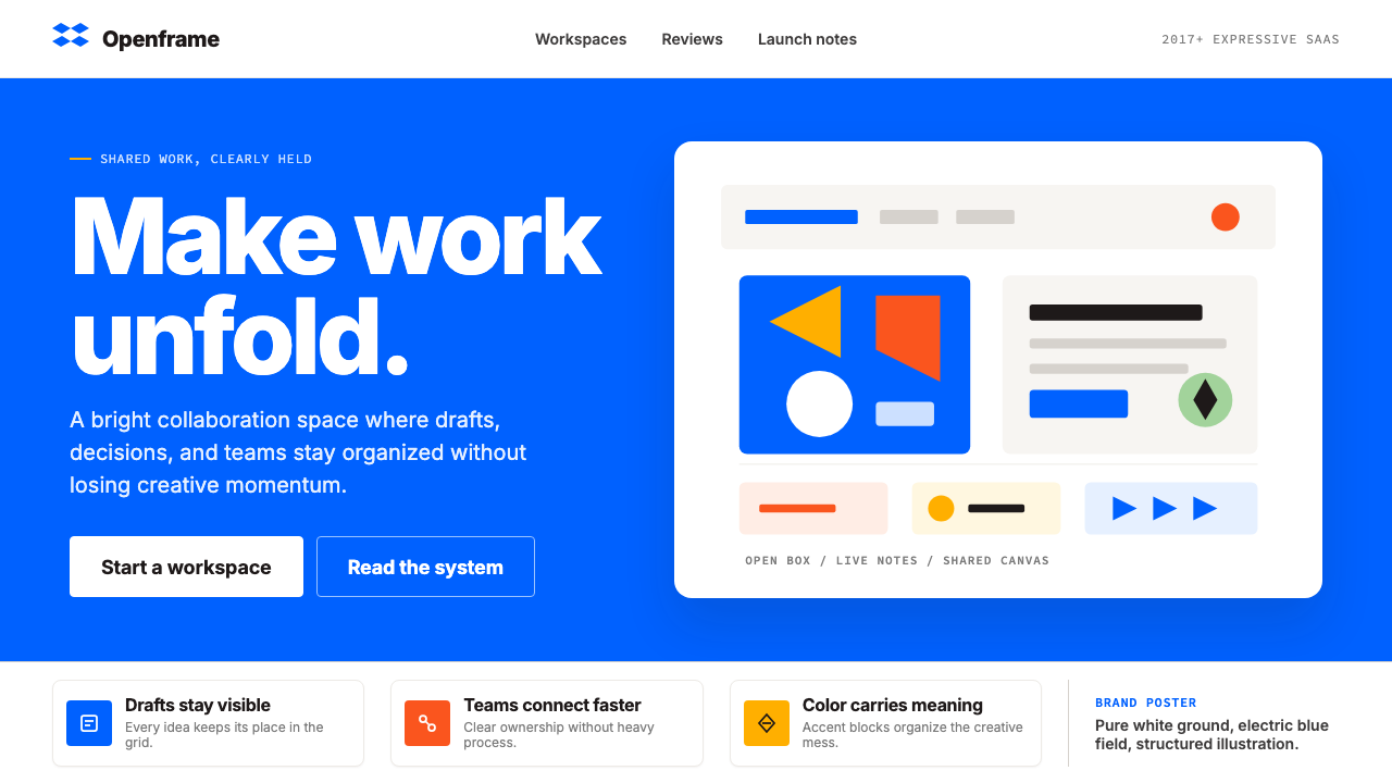 Dropbox ModernFriendly SaaS gets loud. Electric blue and Sharp Sans drive a structured geom…友好 SaaS 变响亮:电蓝与 Sharp Sans 推动几何网格。
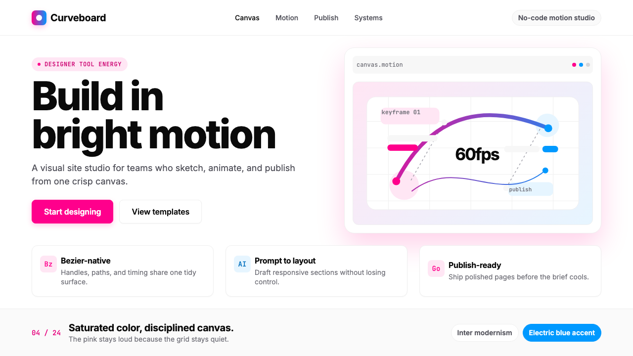 Framer Motion PinkDesigner-tool pink stays sharp. Inter whitespace frames electric blue Bezier…设计工具粉很锋利:Inter 留白托起电光蓝贝塞尔曲线。
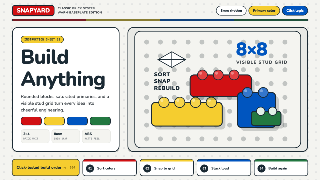 LEGO ClassicCheerful engineering. Primary bricks snap across a warm gray stud grid.快乐工程学:原色砖块咔哒扣入暖灰凸点网格。