What is Persian Teahouse Chaikhaneh?
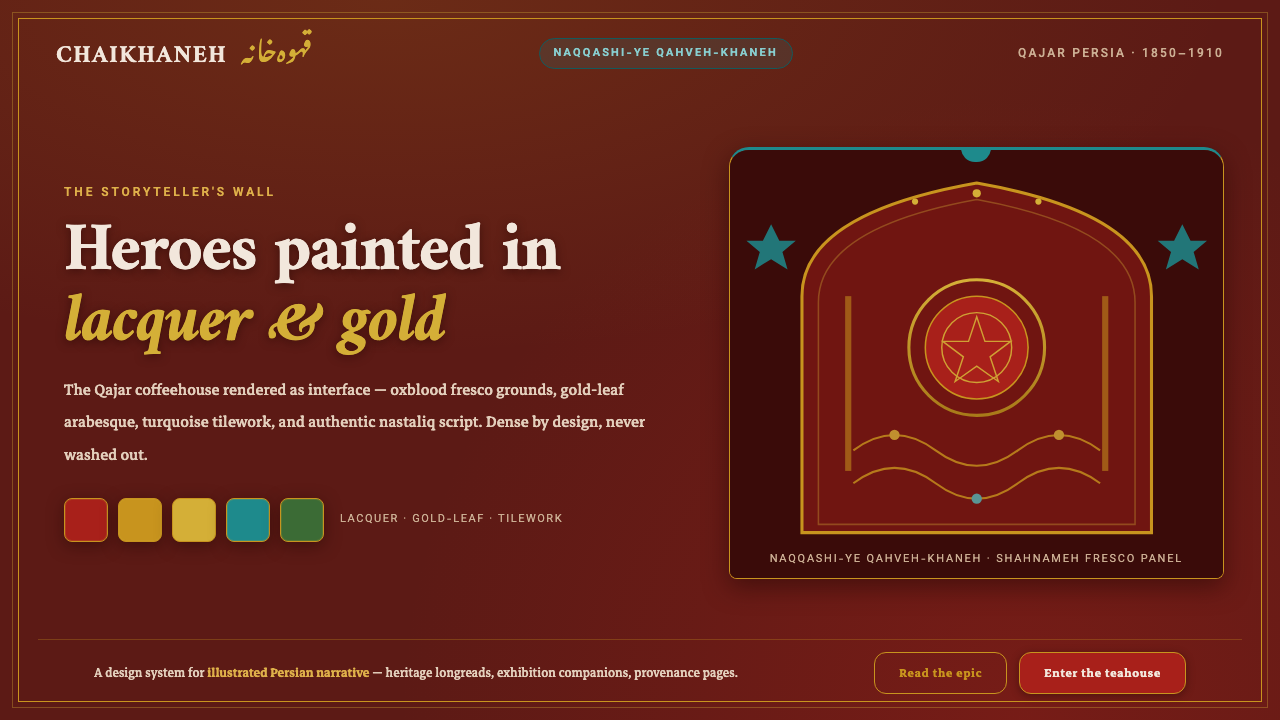
Persian Teahouse Chaikhaneh turns the Qajar coffeehouse into a dense digital chamber of epic heroes, lacquer-red drama, gold ornament, and warm storytelling.
Persian Teahouse Chaikhaneh in brief
Persian Teahouse Chaikhaneh draws from the qahveh-khaneh, the Persian coffeehouse and teahouse of the Qajar era. These rooms were not neutral social backdrops. They were theaters of painted epic, where walls carried naqqashi-ye qahveh-khaneh: expansive narrative paintings populated by Shahnameh heroes, rendered with emphatic gesture, saturated color, and ceremonial force.
The style translates that storyteller’s room into an interface language. Deep oxblood and earthen grounds establish a nocturnal, fresco-like field; lacquer-red heroic accents push the foreground forward; gold-leaf arabesques provide ritual richness; turquoise tilework and samovar brass add flashes of crafted material culture. The result is intentionally immersive rather than restrained.
Its defining principle is density with hierarchy. Figures, ornament, script, borders, and decorative motifs may all coexist, but none should feel casually scattered. Every surface should read as part of one narrated environment: a place where image, inscription, and ornament work together to make the user feel they have entered a chamber prepared for a tale.
Where does Persian Teahouse Chaikhaneh come from?
The visual source is the Persian qahveh-khaneh of the Qajar dynasty, which lasted from 1789 to 1925. In the coffeehouses of Tehran, Isfahan, and Shiraz, painted narrative became part of the room itself. Rather than treating the wall as empty architecture, the coffeehouse tradition made it an active storytelling surface.
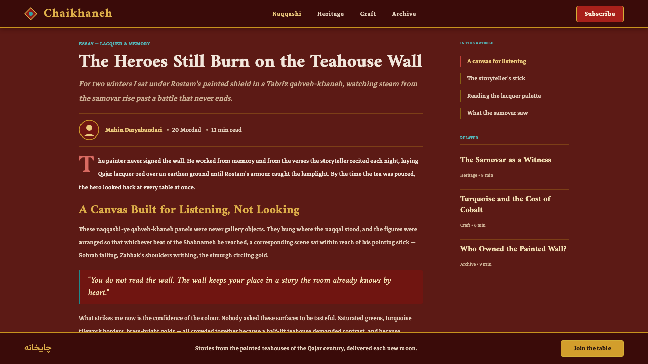
At the center of this source material is naqqashi-ye qahveh-khaneh, or coffeehouse painting. Its peak is placed around 1850 to 1910. The movement’s visual identity is inseparable from sprawling Shahnameh narrative frescoes: heroes in lacquer-red armour, forceful scenes, and an unapologetically saturated palette set against deep earthen-ochre grounds.
The style also inherits the Qajar relationship between narration and crafted surface. Lacquer, tilework, gold ornament, and calligraphic presence do not function as detachable decoration. They make the surrounding field feel ceremonial, inhabited, and materially rich, so that the painted epic appears to extend beyond a single image into the entire room.
For contemporary use, Chaikhaneh should therefore be understood less as a historical costume than as a compositional attitude. It preserves the coffeehouse’s conviction that visual abundance can carry a story. A dark ground is not empty space waiting to be simplified; it is the wall from which heroes, script, brass, turquoise, and arabesque emerge.
What defines the Persian Teahouse Chaikhaneh look?
Epic Ground
The background is deep, warm, and materially suggestive: oxblood lacquer, dark fresco walls, and earthen ochre rather than cool neutral gray. It should feel like a painted chamber after dusk, capable of carrying layers of ornament and narrative without becoming visually vacant.
Lacquer-Red Heroism
Lacquer red is the style’s dramatic advance signal. It belongs to the Shahnameh hero and should mark decisive focal points: an emblem, a major title, a featured action, or the visual center of a narrative panel. It is vivid because it carries consequence, not because it fills space.
Gold Arabesque
Gold ornament acts as a luminous connective tissue. Arabesque should frame, bind, and circulate around content, turning divisions and borders into living decorative lines. It works best as an intricate presence against dark grounds, never as an isolated luxury accent without structural purpose.
Turquoise and Brass
Turquoise tilework and samovar brass provide crafted counterpoints to red and gold. Turquoise opens a cool jewel-like interval within the warmth; brass adds the quieter glow of an object handled in a tea room. Both should appear as deliberate material notes, not broad generic decoration.
Nastaliq Presence
Authentic nastaliq script gives the system its sense of cadence and cultural gravity. It should be treated as a visual voice, especially for titles, invocations, or short narrative moments. Dense ornamental writing must remain legible enough to feel intentional, not reduced to an anonymous texture.
Narrative Density
Figures and arabesques are welcome across the surface because the coffeehouse wall was built for epic accumulation. Yet density requires staging: a hero, inscription, or central ornament must lead the eye before secondary motifs unfold. Maximalism here is orchestrated storytelling, never indiscriminate clutter.
Who shaped Persian Teahouse Chaikhaneh?
Hossein Qollar Aqasi is named among the key figures connected to the coffeehouse-painting source of this style. In a Chaikhaneh context, his name anchors the tradition in the painters who made epic narrative central to the Qajar coffeehouse interior.
Mohammad Modabber is identified as a key figure of the same visual lineage. His inclusion emphasizes that Chaikhaneh is rooted in a painting tradition, not merely a palette of red, gold, and turquoise applied to a dark interface.
Abbas Boloukifar appears among the key figures associated with this coffeehouse-painting world. He represents the human continuity behind a style whose surfaces are full of figures, episodes, and painted narrative intensity.
The Qollar Aqasi school painters are included as a collective figure because the coffeehouse tradition is larger than a single author. Their presence supports the style’s communal atmosphere: a visual world shaped for public storytelling, shared looking, and repeated epic recall.
How do you use Persian Teahouse Chaikhaneh today?
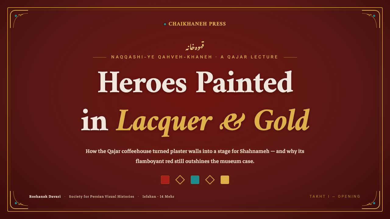
For presentation covers, build a single dramatic field rather than a clean corporate banner. Let a dark oxblood or earthen ground carry one lacquer-red focal form, a gold arabesque border or flourish, and a short title with a strong calligraphic presence. On content slides, keep the richness at the perimeter while the central reading area remains ordered. For data slides, treat charts as part of a framed manuscript panel: hierarchy should come from clear contrast, not from adding ornament to every mark.
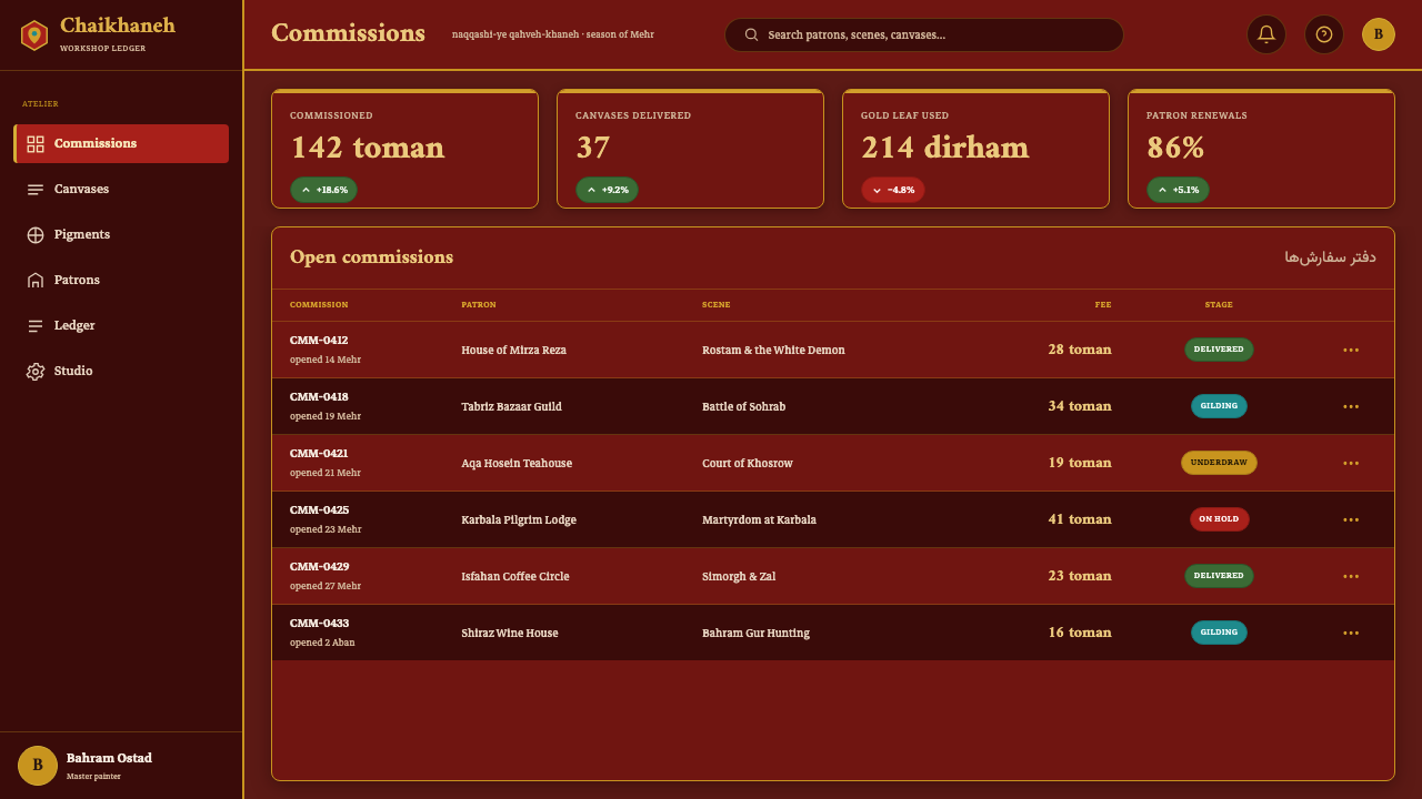
For web interfaces, Chaikhaneh is strongest in dashboards, member spaces, editorial products, and pricing experiences that benefit from ceremony and immersion. Use a deep narrative ground to unify navigation, panels, and featured states. Gold can distinguish navigation or premium emphasis, turquoise can identify selected or supporting information, and lacquer red can reserve urgency for genuinely important actions.
For editorial and marketing work, this style is particularly effective when content has a story to tell: launches, collections, cultural programming, hospitality, food and tea experiences, or richly authored brand worlds. Use framed modules, narrative illustration, ornamental transitions, and short calligraphic moments to make the page feel sequential rather than merely decorative.
The common mistake is to interpret maximalism as permission for equal emphasis everywhere. If every card, title, border, figure, and accent competes at the same intensity, the epic disappears into noise. Start with one narrative hero, one dominant ground, and a clear route through the page; then let gold, turquoise, imagery, and script enrich that route.
Another common mistake is cooling the system down with generic gray surfaces or washing it out with pale minimalism. Its neutrals should remain warm, earthen, or golden in character. The style depends on contrast between dark fresco depth and illuminated crafted detail; remove that tension, and the result becomes decorative without becoming Chaikhaneh.
Persian Teahouse Chaikhaneh — FAQ
Is Persian Teahouse Chaikhaneh simply a dark maximalist style?
No. Darkness and abundance are necessary mood conditions, but the style is specifically grounded in the Qajar coffeehouse and naqqashi-ye qahveh-khaneh tradition. Its density should feel narrative and crafted: Shahnameh heroism, fresco-like grounds, gold arabesque, turquoise tilework, brass, and nastaliq all belong to one storyteller’s room.
How should imagery be handled?
Treat imagery as painted narrative rather than neutral content photography. A featured figure should feel ceremonial and central, with ornamental framing or a fresco-like field supporting it. Secondary figures and motifs can accumulate around the image, but the composition needs a clear protagonist so the eye can enter the story.
Can the style work for information-heavy dashboards?
Yes, provided ornament is assigned to structure rather than allowed to invade every reading surface. Keep key metrics, controls, and dense data legible in calm interior panels, then use the dark ground, gold framing, and jewel-like accents to establish hierarchy across the wider environment.
Where does Chaikhaneh struggle?
It struggles where immediate neutrality, extreme compactness, or deliberately invisible branding is the primary value. A quick utilitarian form, a subdued system setting, or a context that cannot support narrative attention may not have enough room for the style’s ceremonial density. Its strength is atmosphere with purpose.
What is the fastest way to make the style feel inauthentic?
Using red, gold, and turquoise as detached luxury signals while removing the warm fresco ground, narrative focus, and calligraphic rhythm. The result may look ornate, but it loses the coffeehouse logic. Chaikhaneh needs a sense that the room is holding a story, not merely displaying expensive decoration.
Related design styles
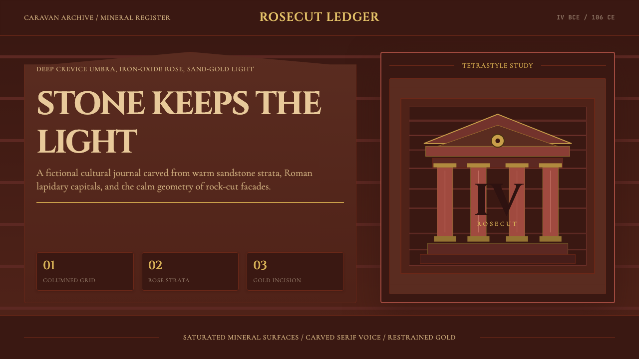 Jordanian Petra Rose NabataeanGeology feels monumental. Crevice umbra, rose strata, and Cinzel capitals car…
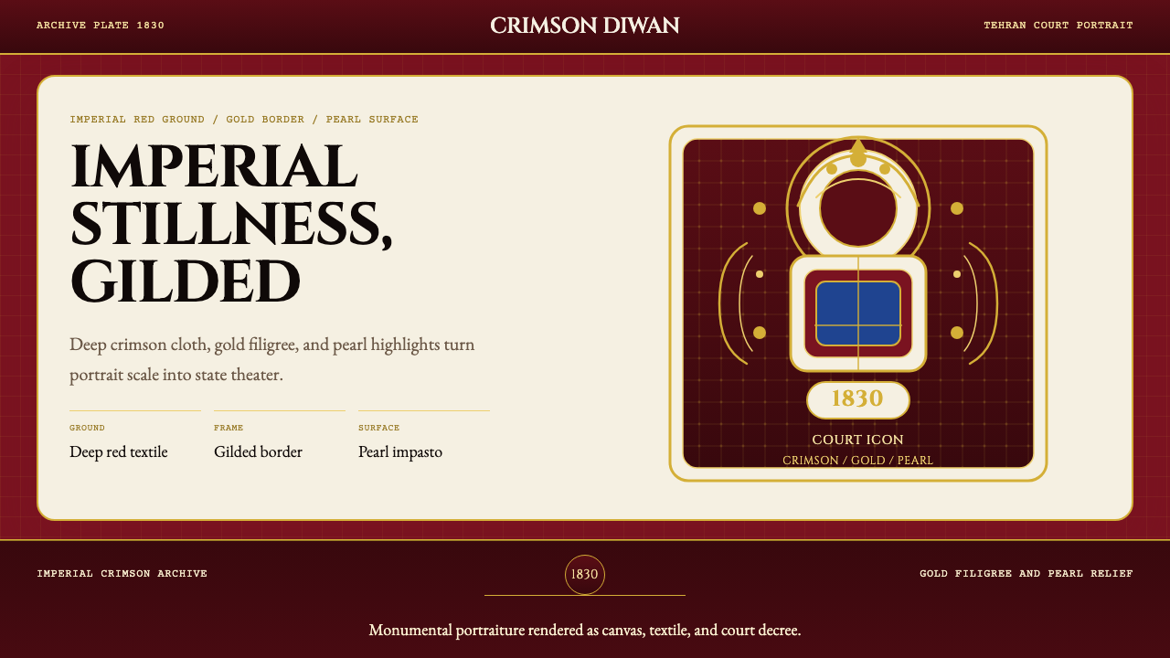 Persian Qajar Portrait (1830)Imperial stillness, gilded. Deep crimson, gold filigree, and pearl accents st…
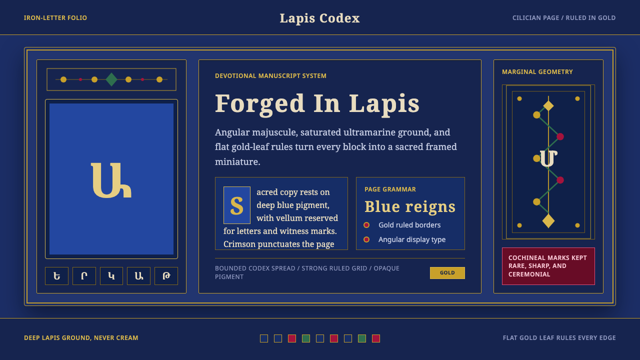 Armenian ErkatʿagirDevotional lapis reigns. Gold rules and angular serif glyphs frame a sacred g…
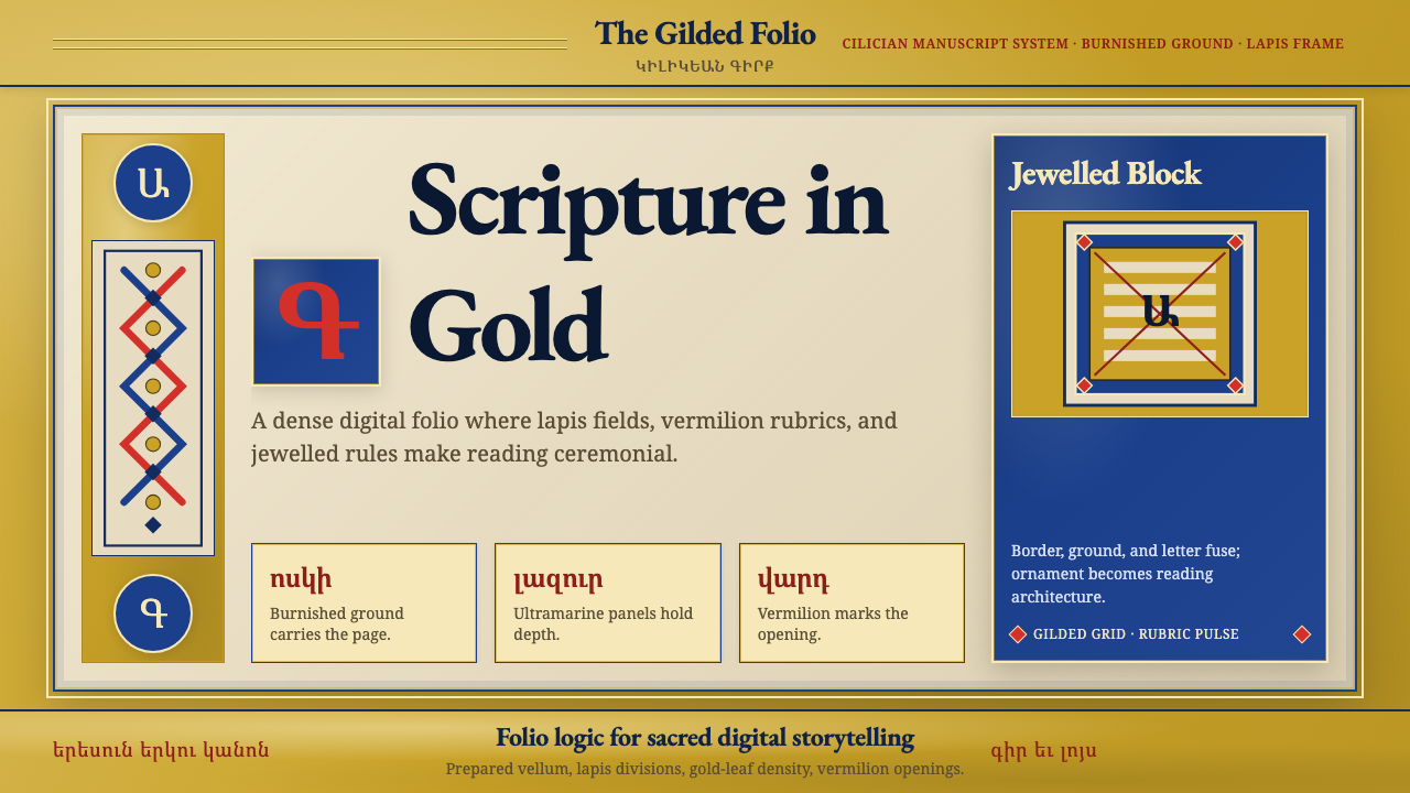 Armenian Illuminated ManuscriptGilded maximalism. Burnished gold, lapis frames, and vermilion initials build…
 Bhutanese Dzong (Fortress Red)Monumental red holds the page. Cobalt frames and gold bands lock the fortress…
 Egyptian FaienceGlaze carries the afterlife. Deep teal grooves, copper-turquoise rims, rare c…