What is Pastel Grunge?
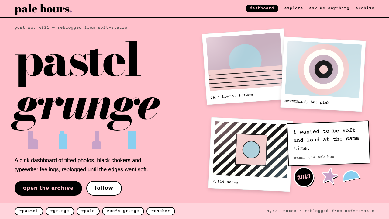
Pastel grunge is sweet with a scratch: flat candy-pink fields, tilted Polaroid frames and black type, the look of a Tumblr dashboard in 2013.
Pastel Grunge in brief
Pastel grunge is a visual style that collided two opposite moods. One was the soft sweetness of pink, lilac and baby-blue; the other was the worn, slouchy attitude of 1990s grunge. It is what Tumblr looked like in 2013: Nirvana smiley tees, chokers and ripped tights worn under dyed pastel hair, shot with washed-out Polaroid-style filters and reblogged onto pink blog themes.
The design system built from it keeps that collision intact. Flat pastel fields carry the page, black does the grunge work in type and outline, and every image sits in a tilted white Polaroid frame with a typewriter caption, a note count and a row of tags. Star prints, holographic sheen, tiny aliens and moons appear as stickers rather than backgrounds.
The mood is a little sad and a little sweet, and it suits content that wants intimacy more than polish. Lowercase headlines in a high-contrast serif sit beside typewriter captions, so the page feels like a scrapbook assembled at night by someone with strong taste and no fixed rules.

Where does Pastel Grunge come from?
The style belongs to roughly 2012 to 2014 and peaked in 2013, a year when fashion terms around it were prominent in Tumblr's own year-in-review. Its home was North America on Tumblr, the blogging platform founded in New York in 2007 by David Karp. Tumblr's reblog mechanism, in which a post could be passed along with a single click, suited a look that spread by images rather than by words.
The root of the sensibility is the 1990s grunge revival. Grunge itself came out of the Pacific Northwest scene of the late 1980s and early 1990s, with Nirvana as its most recognised name: thrift-store flannel, torn clothes, distorted guitars and a deliberate refusal of polish. Teenagers in the 2010s rediscovered it through photographs and music, and recast it in a softer palette.
That recast form is often called soft grunge or pastel goth. It kept the dark garments and boots but added hair dyed in sorbet colours, glitter, galaxy prints and kawaii accessories. The movements named in the source material, 1990s grunge revival, soft grunge and pastel goth, and Tumblr reblog culture, describe a loop: images were made to be reblogged, and reblogging itself shaped how they looked, with filters, haze and soft edges accumulating through repeated sharing.
The reference figures listed for the style include Nirvana, David Karp, Lisa Orth and Grant Alden. For designers, the useful point is not any single biography but the cultural mechanism: a nostalgic rock aesthetic from the 1990s, filtered through a new platform and a new colour sensibility, produced something recognisable as its own style. By the middle of the decade the look had faded as platforms and fashions shifted, which gives it the specific charm of an era that is clearly over.
What defines the Pastel Grunge look?
Color
Large flat fields of candy pink carry the page, supported by lilac, baby blue and pale mint. These are solid colours with no gradient blends, which keeps the look graphic and slightly cheap-printed in a charming way. Black is the counterweight: it does the outlining, the lettering and the occasional heavy block. White appears mostly inside photo frames. The result is high-contrast sweetness rather than muted pastel.
Typography
Headlines are set in a high-contrast Bodoni-style serif, in black and often in lowercase, which gives a fashion-magazine edge to a casual blog setting. Captions and metadata use typewriter-style type, as if typed onto the photo strip. The pairing of elegant didone titles with rough typewriter lines is the typographic version of sweet with a scratch.
Tilted Polaroid Frames
Every picture sits inside a white instant-photo frame with a wide bottom border, rotated by a small, irregular angle so the page feels hand-placed. Frames overlap slightly and cast only a faint, flat shadow. The tilt is the style's primary compositional device: it replaces a rigid grid with something that looks like photos dropped on a bedroom wall.
Blog Furniture
Under or beside each image sit the habits of a blog post: a caption in typewriter type, a note count, a reblog arrow and a row of hashtag-style tags such as pastel, grunge or pale. These details are not decoration added afterwards; they are part of what makes the layout recognisable. Removing them leaves only pink and photographs, which could be any soft aesthetic.
Stickers and Motifs
Star prints, holographic sheen, little aliens and moons appear as stickers placed on top of the page, not as full backgrounds. They are small, flat and slightly misaligned, like decals on a laptop lid. Used as accents they add personality; used as wallpaper they would bury the content and the frames.
Washed-Out Photography
Images carry the look of cheap instant film and early phone filters: lifted blacks, low contrast, hazy edges and a faint colour cast. The haze is part of the appeal and works as a unifying layer, so photographs of very different subjects can share one page. High-definition, saturated stock imagery will fight the system.

Who shaped Pastel Grunge?
The Seattle-associated band whose smiley-face shirt became an emblem of the pastel grunge wardrobe. Its presence ties the soft Tumblr look back to the 1990s grunge it is reviving.
Founder of Tumblr in New York in 2007. The platform's reblog mechanism and customisable themes created the conditions for this look to spread so quickly.
Listed among the reference figures for this style in its source material. She is named as part of the cultural background rather than as a single designer of the look.
Another reference figure named in the style's source material, listed alongside the musicians and platform founders that define its cultural field.
How do you use Pastel Grunge today?
Pastel grunge works for content that wants personality over polish: youth fashion, indie music, zines, photography portfolios, personal blogs, merch pages and creative communities. It fits brands that can laugh at themselves and hold a sweet voice and a rough one at once. It is a poor fit for financial, medical or formal institutional work.
For presentation slides, a cover can be a flat pink field with a lowercase black serif title and one tilted photo frame in the corner. Content slides should treat each image as a Polaroid with a typewriter caption underneath, and arrange two or three at slightly different angles. Data slides need restraint: keep charts flat, use black linework on pastel fields, and put the key number in the large serif.
For web interfaces, the style suits social feeds, photo galleries, community pages and playlist-style products. Use a pink or lilac background, black text, frames with a thin flat shadow and a tag row under each item. Pricing pages can be handled as sticker-like cards with black outlines and a tilted highlight on the recommended plan, but keep the layout readable, because the tilt should never reduce clarity.
For editorial and marketing work, it is strongest in lookbooks, event posters, music release pages and nostalgic retrospectives. Write in short lowercase phrases, pair photographs with a typed caption, and keep ornamentation limited to a few stickers. Avoid long paragraphs of body text in the Bodoni display face; set them in a plain readable alternative.
A common mistake is to drift into pure pastel, losing the black and the scratch, so that the page becomes generic cute. The grunge is what keeps it from being sugary. Another mistake is to tilt everything, including text blocks and buttons; in the original, only the photos and a few stickers rotate, while type and controls stay straight and usable.

Pastel Grunge — FAQ
What is pastel grunge?
It is an aesthetic that mixed soft pastel colours with 1990s grunge attitude, most visible on Tumblr around 2013. The design system built from it uses flat candy-pink fields, tilted white photo frames, black Bodoni-style headlines and typewriter captions.
When was the style at its peak?
It ran from about 2012 to 2014 and peaked in 2013. After that the platforms and fashions it depended on shifted and the look faded.
Why does Tumblr matter to this style?
Tumblr, founded in New York in 2007 by David Karp, offered one-click reblogging and customisable blog themes. That let image-led aesthetics spread fast, and the repeated sharing itself added the washed-out filtered look.
Which typefaces suit pastel grunge?
A high-contrast Bodoni-style serif for lowercase headlines, and a typewriter-style face for captions and metadata. The contrast between elegant and rough is central to the look.
How do I stop it looking too sugary?
Keep black in the type and outlines, keep the photographs hazy rather than bright, and use stickers sparingly. The scratch of grunge is what balances the sweetness of the pastels.
Related design styles
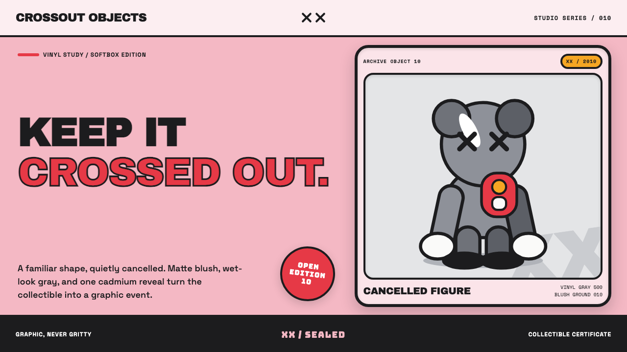 KAWS Companion (2010)Playful, with its eyes crossed out. Blush fields frame glossy gray vinyl and…
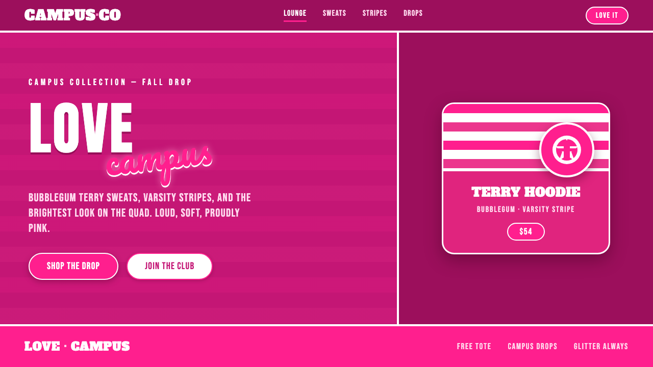 Victoria's Secret PINK 2004Proudly, relentlessly pink. Bubblegum magenta, varsity caps under cursive scr…
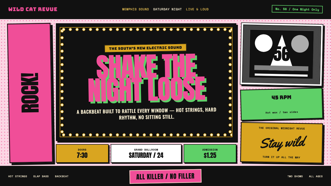 Elvis Presley (1956)Rock learned to shout. Bubblegum pink, acid green and jailhouse type land wit…
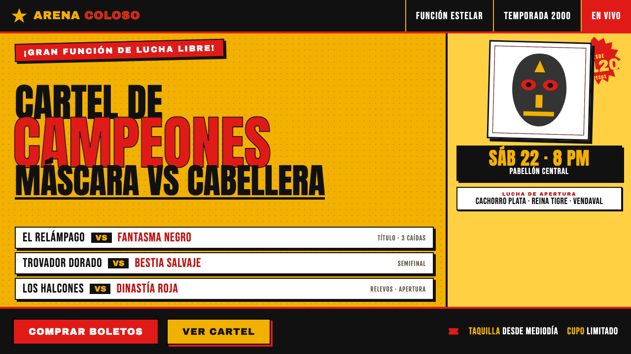 Lucha Libre Fight CartelTwo inks, maximum volume. Blood red on chrome-yellow, fat condensed type, sta…
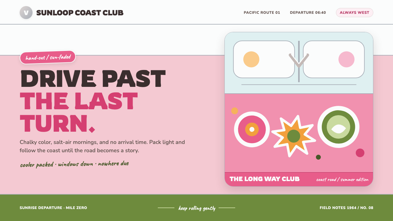 VW Bus Flower-Power (1964)Road-trip optimism in chalky pastels. Rounded type rides pink, white, and chr…
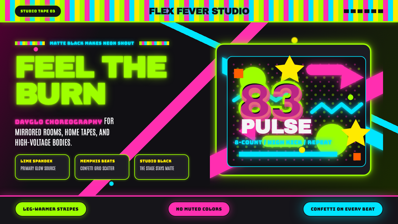 80s Aerobics Fluoro SpandexNeon refuses restraint. Lime spandex, pink-cyan confetti, and black-stage typ…