What is Parviz Tanavoli Heech?
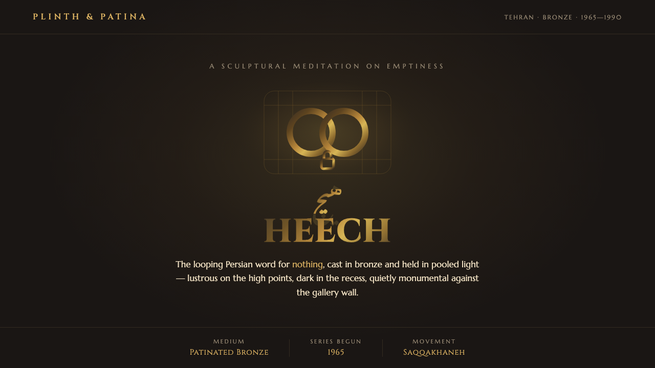
Nothing, made monumental: a looping bronze word rises from near-black shadow, carrying the stillness and gravity of a solitary gallery object.
Parviz Tanavoli Heech in brief
Parviz Tanavoli’s Heech design language begins with a single Persian word: Heech, meaning nothing. Since 1965, Tanavoli has cast its looping calligraphic form in bronze. The resulting object is neither merely lettering nor conventional sculpture. It is a word made physical, continuous in contour, dense in presence, and powerful precisely because its subject is absence.
The visual system extracts the conditions that make the object feel monumental: warm gold-brown metal, deep umber recesses, a nearly black surrounding field, and light that catches only selected ridges. The form reads as cast rather than drawn. Its curves seem to have weight, its dark interior spaces seem excavated, and its highlights imply touch, age, and polished metal without becoming ornate.
Recurring cage and lock motifs extend this vocabulary. Derived from shrine-like street grilles, they introduce enclosure, ritual, and quiet protection into the system. Together, the looping word-form and the barred motif create an aesthetic that is sculptural and neo-traditional: rooted in Persian calligraphic presence, yet reduced to a restrained modern composition.
Where does Parviz Tanavoli Heech come from?
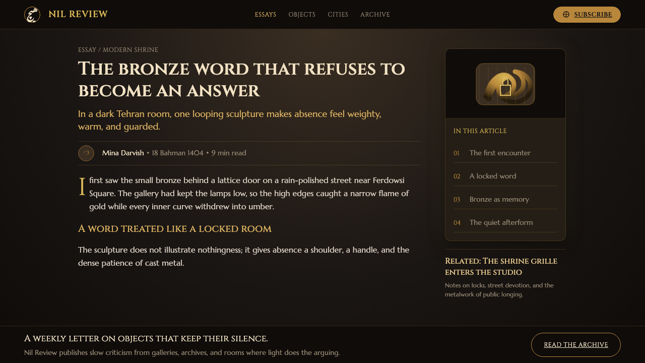
This language belongs to the context of Iranian modern sculpture and the Saqqakhaneh movement in Tehran. Tanavoli is identified as Iran’s foremost modern sculptor and as a founder of Saqqakhaneh, a setting in which neo-traditionalism could treat inherited visual forms as active material for modern art rather than as decoration to be copied.
The Heech series began in 1965 and continued within an era spanning 1950 to 1990. Its key move was direct and consequential: take a Persian word associated with nothingness and cast it in bronze. Calligraphy therefore becomes volume. Meaning becomes contour, cavity, mass, and changing reflection; language is encountered through the body before it is read through the eye.
Bronze is essential to the effect. The high points are lustrous while the recesses remain dark, so the material creates its own hierarchy under raked light. Gold-brown patina gives the surface warmth, but the surrounding darkness prevents that warmth from becoming luxurious or decorative. The object feels discovered in shadow rather than displayed for easy consumption.
The design system should preserve that tension. It is not an attempt to reproduce a gallery sculpture as a flat illustration. It translates the sculpture’s conditions—solitary illumination, calligraphic continuity, metal-like relief, and shrine-grid recurrence—into a visual language for contemporary communication while keeping the original atmosphere restrained and quietly monumental.
What defines the Parviz Tanavoli Heech look?
Near-Black Ground
The field should feel like a gallery falling away beyond the spotlight: almost black, but warmer and more earthen than an empty digital void. It gives bronze-gold forms a place to emerge from and makes empty space part of the composition. Darkness is not a backdrop; it is the condition that grants the object gravity.
Bronze Patina
Use a warm gold-brown metallic impression with selective brightness on raised curves and deep umber in protected recesses. The surface should suggest patina and handling, not mirror polish. Variation belongs to form: brightness follows the imagined relief of the cast object rather than spreading evenly across the page.
Calligraphic Volume
The looping Persian word-form is treated as a solid body. Its turns should feel continuous, rounded, and heavy enough to have been poured into a mold. Preserve the distinction between illuminated outer ridges and shadowed inner bends; this contrast lets the word remain legible as sculpture even when it is not read linguistically.
Raked Light
Light arrives from the side rather than flooding the object. It grazes edges, isolates a few high points, and leaves most depth unresolved. This creates an intimate theatricality: the viewer is invited to inspect the form slowly, while the shadows keep part of its structure withheld.
Cage and Lock Motifs
Cage-like grids and lock-like signs recall shrine structures without becoming busy pattern. They work best as repeated, contained emblems: framing a word-form, interrupting an expanse of darkness, or establishing a secondary rhythm beside the main sculptural gesture. Their value is symbolic enclosure and ritual density, not ornament.
Quiet Monumentality
Scale is felt through isolation and contrast, not through visual noise. A single bronze form can carry a large field because the composition gives it room, darkness, and concentrated light. The result should feel ceremonial but never loud: an object of contemplation rather than a spectacle demanding instant reaction.

Who shaped Parviz Tanavoli Heech?
Tanavoli is Iran’s foremost modern sculptor and a founder of the Saqqakhaneh movement. His Heech series provides the design system’s central form: a looping Persian word cast in bronze, where language, sculpture, and patinated light become inseparable.
Begun in 1965, the Heech series establishes the decisive conceptual contrast of the style: nothingness given weight, permanence, and monumental presence. Its repeated word-form offers a disciplined visual anchor rather than a broad decorative vocabulary.
As a founder of Saqqakhaneh, Tanavoli situates the work within Iranian modern sculpture and neo-traditionalism. The cage-and-lock shrine motifs in this system should therefore carry cultural and sculptural resonance, never be reduced to generic ornamental geometry.
How do you use Parviz Tanavoli Heech today?
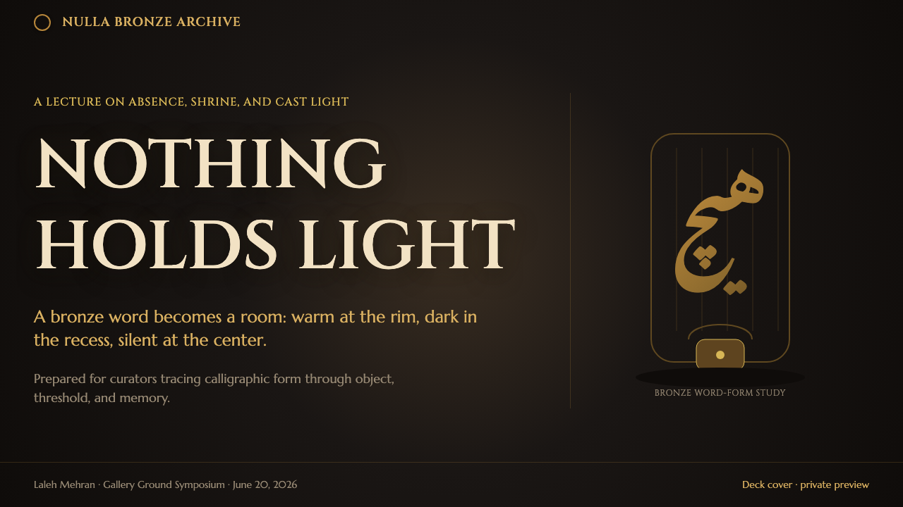
For presentation covers, let one calligraphic bronze form occupy a deliberate portion of a near-black field. A short title may sit apart from it, as though installed on the gallery wall rather than attached to the sculpture. The cover succeeds when light, void, and form establish the subject before explanatory copy begins.
Content slides should behave like a sequence of illuminated exhibits. Keep the main reading area calm and dark; use a bronze ridge, a contained cage motif, or a brief line of display type to mark transitions. Text needs generous visual breathing room so that the sculptural language remains an atmosphere rather than a texture behind every sentence.
Data slides benefit from the style when information is treated as carved hierarchy. Use warm metallic emphasis for the most consequential value or path, retain subdued marks for supporting information, and allow dark negative space to separate categories. Avoid decorative metallic effects on every chart element; the sense of relief is most useful when it identifies significance.
For dashboards and pricing interfaces, apply the system selectively to moments of focus: a landing state, a premium overview, an important summary, or a decisive call to action. Functional controls and dense tables should remain clear and restrained, while bronze-lit forms can establish section identity and ceremony. A pricing page can use darkness and a single elevated offer to create seriousness without turning comparison into theatre.
For editorial and marketing work, the style is strongest when it frames an idea of value, reflection, culture, or permanence. Pair an expansive dark field with carefully spaced copy and one recurring shrine-grid sign. The common mistake is to turn the palette into generic luxury branding: excessive gold, glossy imitation metal, busy Arabic- or Persian-looking decoration, and dramatic effects everywhere erase the Heech system’s particular force. Its power comes from one word-form, selective light, and the confidence to leave most of the field quiet.
Parviz Tanavoli Heech — FAQ
What does Heech mean in this design system?
Heech means nothing. In Tanavoli’s series, that word is cast in bronze, producing the central paradox of the aesthetic: an idea of absence becomes a physically weighty, enduring object. Designs should preserve this contrast between semantic emptiness and sculptural presence.
Is this simply a dark luxury style?
No. The bronze and darkness may initially suggest luxury, but the system is grounded in a specific sculptural work, Iranian modern sculpture, Saqqakhaneh, and neo-traditionalism. Its metal should feel patinated and contemplative, not polished for display. Its darkness creates concentration and monumentality rather than exclusivity.
How should the cage and lock motifs be used?
Use them as spare structural emblems, not as an all-over pattern. They can frame a feature, establish a secondary rhythm, or briefly evoke the shrine-grid reference beside a Heech-inspired form. Repetition should remain measured so that the motif retains its sense of enclosure and ritual.
Can the system use bright backgrounds?
It can, but the canonical atmosphere comes from warm bronze-gold rising against a near-black gallery ground. A brighter field weakens the feeling of raked spotlight and concealed depth. If light ground is necessary, retain strong shadowed recesses and treat the bronze form as a solitary object rather than a decorative logo.
What is the most important restraint when applying Heech?
Do not make every surface metallic, illuminated, or symbolic. The system depends on contrast: one concentrated form against a broad void, a few highlights against deep recesses, and occasional cage or lock references beside silence. When every element performs, nothing can feel monumental.
Related design styles
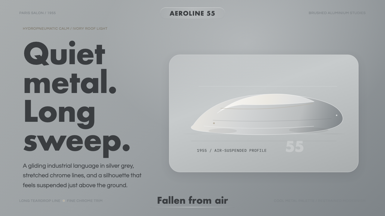 Citroën DSSilence made aerodynamic. Silver-grey ground, chrome hairlines, one long glid…
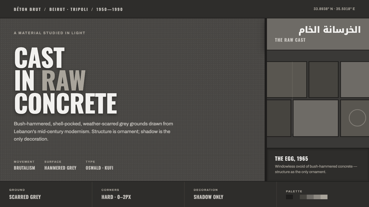 Beirut Brutalist GrayStructure is the only ornament. Scarred bush-hammered grey, monumental Oswald…
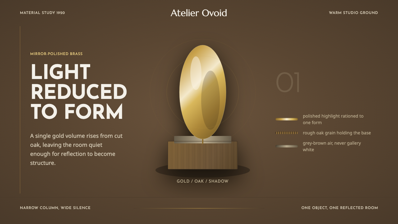 Brâncuși SculptureLight is rationed. Brass ovoids glow against oak-brown space and geometric ty…
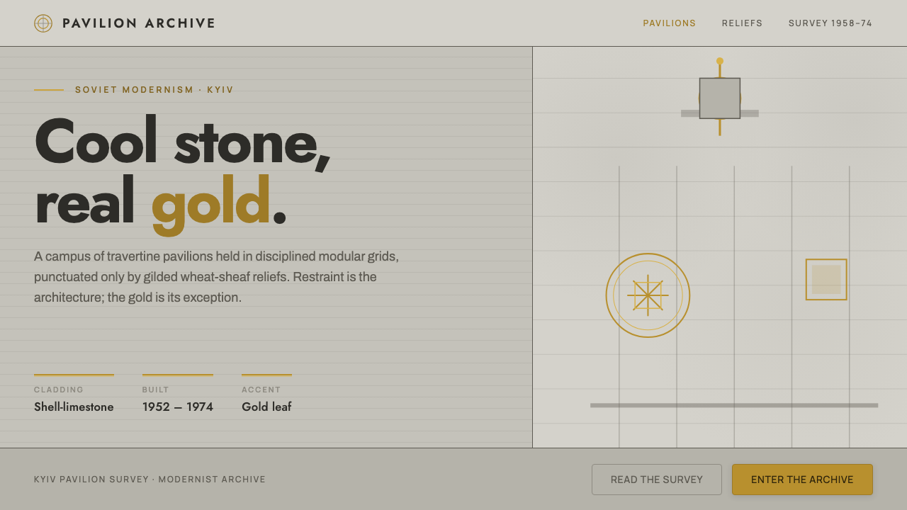 Kyiv VDNH Soviet ModernismRestraint made monumental. Cool travertine grey, geometric Jost type, wheat-s…
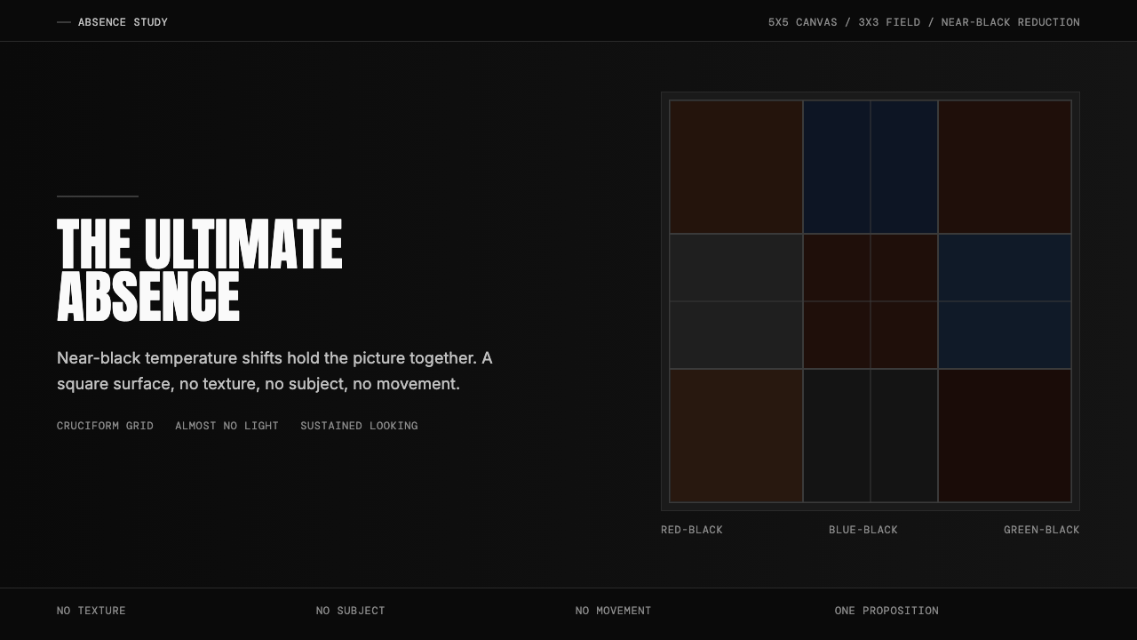 Ad Reinhardt Black Painting (1953)Austere absence. Near-black grid shifts reveal structure on sustained looking.
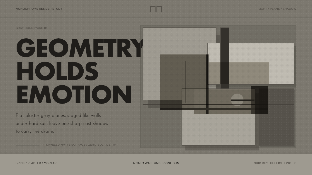 Barragán Render in GrayEmotion made grayscale. Plaster-gray planes and hard shadows carry the geomet…