What is Pan-Arab Illustrated Magazine?
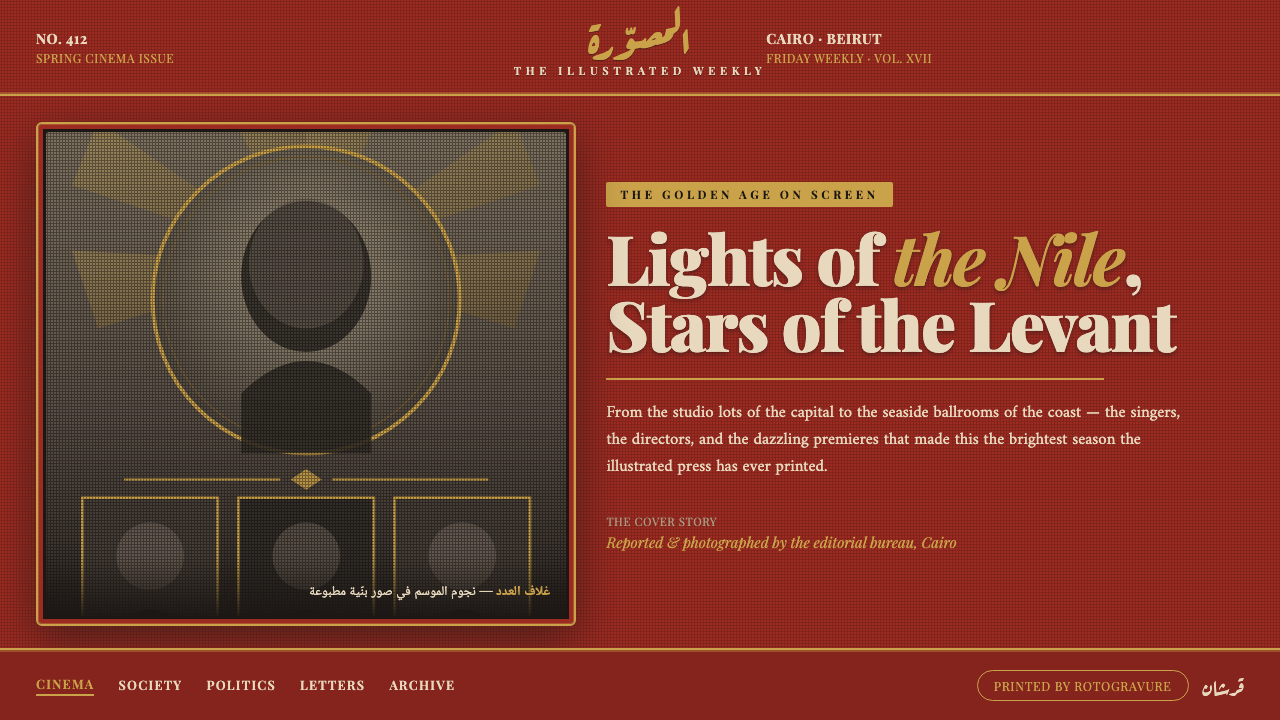
Pan-Arab Illustrated Magazine brings the glamour of 1940s Cairo and Beirut press culture to the screen: brick-red drama, sepia photographic grain, and a masthead that arrives like an announcement.
Pan-Arab Illustrated Magazine in brief
Pan-Arab Illustrated Magazine is a photo-led editorial style derived from the illustrated weeklies that shaped a glamorous, widely circulating Arab press aesthetic in 1940s Cairo and Beirut. Its defining impression is ceremonial rather than quiet: a saturated terracotta or brick-red field establishes the atmosphere, sepia halftone portraits provide visual evidence and human presence, and an ornate Ruq'ah-inspired Arabic logotype gives the page an unmistakable editorial authority.
The style does not treat photography as neutral documentation. A portrait, news image, or cultural scene becomes part of a montage, softened by the grain and tonal compression associated with mid-century rotogravure printing. Sepia and deep brown unify images that may otherwise compete, allowing the page to feel printed, collected, and edited rather than assembled from unrelated digital assets.
Around those images sits an Art Deco framework: ruled borders, ornamental corners, and restrained gold-toned accents that turn a page into a cover-like composition. The result is lavish without becoming chaotic. The red ground supplies heat, the photographic material supplies history, the calligraphic masthead supplies voice, and the frame supplies ceremony.
Where does Pan-Arab Illustrated Magazine come from?
The style belongs to the Pan-Arab illustrated journalism associated with Cairo and Beirut in the 1940s. Its immediate reference points are Al-Musawwar, published by Dar al-Hilal, and Akher Saa, associated with the Amin brothers. These titles established a photo-driven weekly-magazine language in which the cover and the editorial page could carry the same sense of public presence.
Al-Musawwar was founded in 1924–25, placing it before the decade most strongly associated with this visual mood. By the 1940s, the illustrated press format had a mature vocabulary: photographs were not merely inserted beside text, but were organized as the page’s principal attraction. The printed image, its visible halftone structure, and its relationship to headline lettering became inseparable.
Akher Saa was relaunched in 1944. Alongside Al-Musawwar, it anchors the style in a period when editorial identity was expressed through immediately legible cover drama: rich colored fields, photographic montage, and prominent title treatment. The source material identifies the Amin brothers and the editors of both publications as key figures because the look was not only a matter of illustration or photography; it was an editorial system shaped by publication-making.
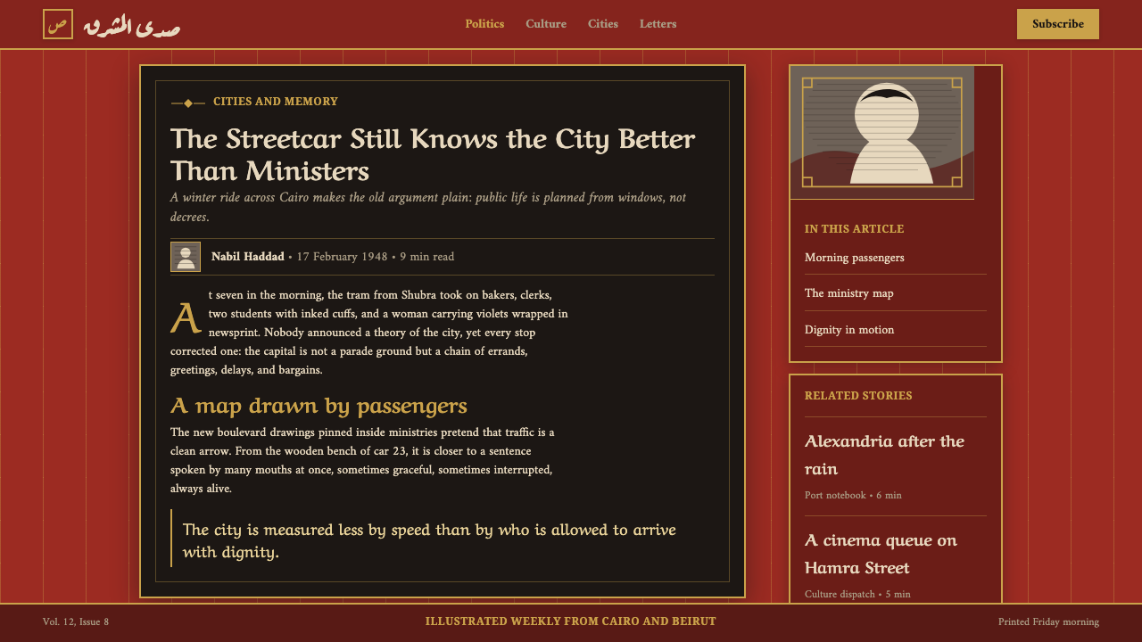
Art Deco cover design provided the framing language. Its influence appears in ruled geometry, ornamental corners, and gold-like accents that make information feel presented rather than merely placed. Ruq'ah calligraphic logotypes supplied a contrasting force: where Deco framing brings order and polish, the Arabic masthead brings movement, density, and cultural specificity. The contemporary system translates those ingredients into a dark, digitally usable visual language without discarding their print-era character.
What defines the Pan-Arab Illustrated Magazine look?
Brick-Red Ground
The background should feel saturated, warm, and substantial, closer to terracotta paper or a painted cover field than a neutral interface canvas. It gives photographs immediate contrast and makes the page feel authored before any content is read. The ground is an active editorial surface, not empty space waiting to be filled.
Sepia Halftone Montage
Photography is softened into sepia or deep-brown tonal families, with grain and halftone texture treated as part of the image rather than a defect to erase. Crops may be assertive and montage can create visual density, but the treatment should keep all imagery in one printed world. Clean, glossy full-color photography breaks the illusion.
Ruq'ah Masthead
The masthead is a lockup, not a disposable label. Ruq'ah calligraphic character gives it a compact, expressive presence that can hold a page together above a busy image field. It should read as the publication’s voice: confident, ornamental in its own stroke rhythm, and strong enough to remain recognizable against visual texture.
Deco Rule Frames
Ruled frames and corner ornaments introduce measured ceremony. They should define a cover field, contain a portrait, or signal the importance of a story, rather than surround every object indiscriminately. The best frames feel printed into the composition: precise but not sterile, decorative but still accountable to editorial hierarchy.
Gold-Touched Accents
Gold-like detailing functions as a highlight, not a blanket finish. Used on a rule, a corner device, a subtitle, or a small emblem, it catches the eye against the dark red field and reinforces the magazine’s glamour. When spread too broadly, it changes from editorial luxury into generic ornament.
Printed Softness
The system benefits from softened edges, restrained contrast, and a slight sense that ink has met paper. This is not an invitation to make content vague. Text and hierarchy must remain clear, while images carry the gentle grain and tonal blending associated with rotogravure. The visual mood is archival, not degraded.
Who shaped Pan-Arab Illustrated Magazine?
Dar al-Hilal is identified in the source material as the publisher of Al-Musawwar and as a key institutional figure in this visual tradition. Its role matters because the style is inseparable from magazine production: a recurring title, an editorial rhythm, and a recognizable relationship between masthead, photography, and cover treatment.
The Amin brothers are named in connection with Akher Saa, whose 1944 relaunch is part of the style’s approved historical frame. Their inclusion emphasizes the magazine’s editorial authorship. The look was carried by publication identity and selection as much as by individual images or decorative devices.
The editors of Al-Musawwar represent the decisions that turn a photograph-led publication into a coherent visual world. In this style, editorial judgment is visible on the page: image prominence, title treatment, montage, and framing all communicate what deserves attention before the body text begins.
The editors of Akher Saa are key figures because the relaunch-era magazine aesthetic depends on editorial orchestration. The bold field, portrait treatment, and ornamental frame are most convincing when they behave as a publication system rather than a set of separately applied visual effects.
How do you use Pan-Arab Illustrated Magazine today?
For presentation covers, use the style as an act of arrival. Let a brick-red field establish the stage, give one sepia portrait or montage a commanding position, and place the title as a true masthead rather than ordinary interface text. A fine Deco frame can make the slide feel published. Resist filling every available area; the cover needs enough quiet around its strongest image to preserve grandeur.
For content slides, organize information as editorial spreads. A calligraphic section title can introduce a topic, while a smaller image, rule, or ornamental corner gives the content a magazine rhythm. Data slides work best when charts are treated with the same tonal discipline as photography: dark, warm, and clearly separated, with gold-like accents reserved for the point that requires attention rather than applied to every series.
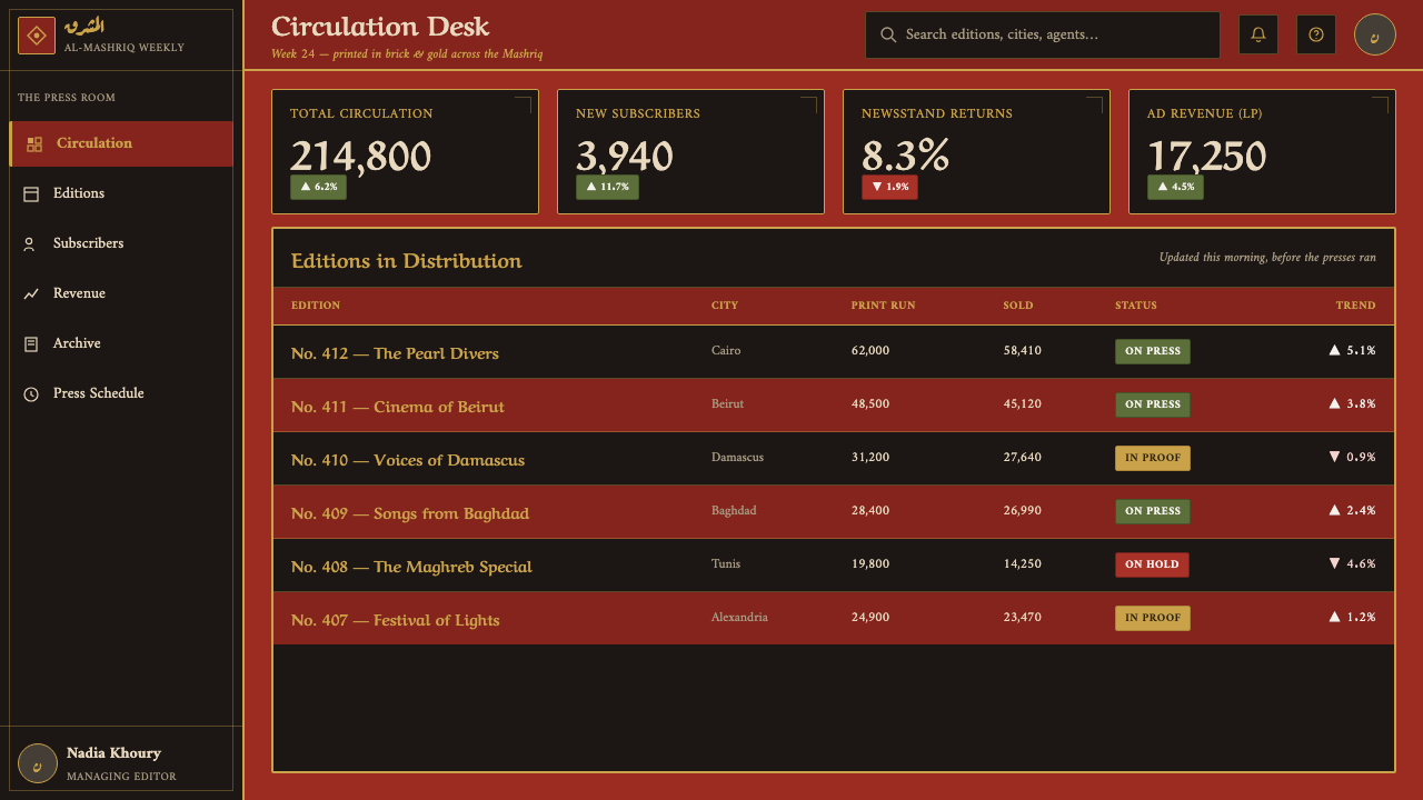
For web interfaces, the style is most persuasive in editorial hubs, archives, cultural programming, publishing products, and feature-rich landing pages. A dashboard can borrow its hierarchy through framed content modules, sepia image previews, and a distinctive masthead area, but operational controls should remain immediately readable. On pricing or membership pages, use the decorative language to frame value and identity, while keeping comparisons and actions visually calm.
For editorial and marketing work, treat each page as an issue cover or a cultivated spread. Feature stories can open with a large halftone image, an assertive Arabic or display lockup, and a frame that establishes occasion. Campaign pages can use recurring corner ornaments and consistent warm image treatment to connect unrelated messages without forcing every block into the same composition.
The common mistake is to reduce the style to red backgrounds plus random gold decoration. Its glamour comes from the relationship between editorial selection, photographic printing texture, calligraphic identity, and Art Deco structure. Avoid shiny generic gradients, unfiltered full-color image libraries, excessive ornament, and interchangeable headline type. If the masthead, image treatment, and framing do not appear to belong to one publication, the result becomes costume rather than editorial design.

Pan-Arab Illustrated Magazine — FAQ
Is this style only suitable for Arabic-language content?
No, but Arabic calligraphic identity is central to its historical character. Non-Arabic content can use the editorial logic of the system—warm red fields, sepia photographic montage, and Deco framing—without pretending that an unrelated wordmark is Ruq'ah. When Arabic is present, give the masthead enough prominence to function as a real visual anchor rather than a decorative afterthought.
How should photography be prepared for the style?
Prioritize images that remain expressive after being reduced into a sepia, halftone-like tonal world. Strong portraits, clear silhouettes, and scenes with readable light and shadow tend to work well. Treat grain as a deliberate print character, crop with editorial confidence, and make images relate to the surrounding red field and frame. The goal is not nostalgic damage; it is visual coherence.
Can the Deco ornament become the main attraction?
Usually it should not. The ornamental frame is most effective when it elevates a masthead, portrait, feature title, or important piece of information. If it competes with photography and copy at every moment, the editorial hierarchy disappears. Use ornament to signal occasion and containment, then let the image and the publication voice carry the page.
Does the dark presentation make the style difficult to use for data or product UI?
It can, if atmosphere is allowed to outrun legibility. The dark red field and printed texture are ideal for identity and framing, but charts, controls, and comparisons need stable contrast and simple grouping. Use the magazine language around the information and at major hierarchy points; do not turn every operational element into a textured artifact.
What separates an authentic application from a retro pastiche?
Authenticity comes from systems thinking. A convincing application makes the brick-red ground, sepia image treatment, Ruq'ah-inspired masthead, and Deco frame cooperate as one editorial identity. A pastiche borrows isolated signals—gold lines, old-looking photos, ornamental corners—without giving them a role in hierarchy or storytelling. The question is not whether the page looks old; it is whether it looks edited.
Related design styles
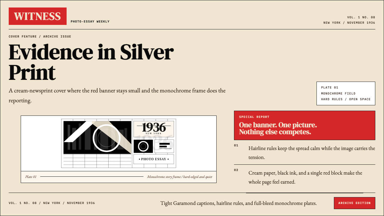 LIFE Magazine (Red-Banner)Photojournalism stripped bare. One red banner, cream newsprint, stark black p…
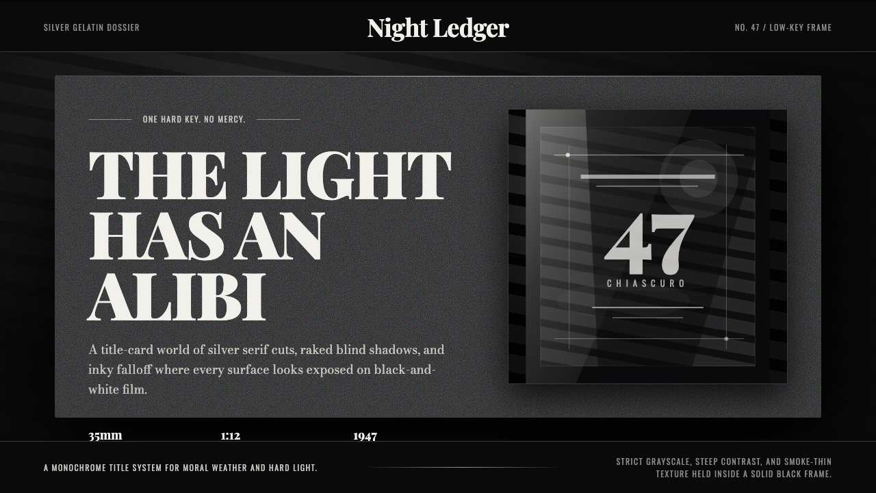 Film Noir ChiaroscuroLight is the crime. Silver serif cards, blind stripes, and grain carve drama…
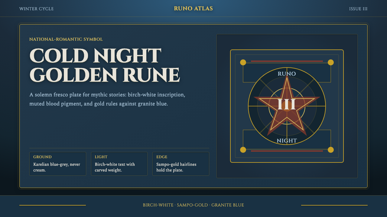 Finnish Kalevala EpicEpic weight in cold night. Birch-white Cinzel, Sampo-gold rules, blue-grey fr…
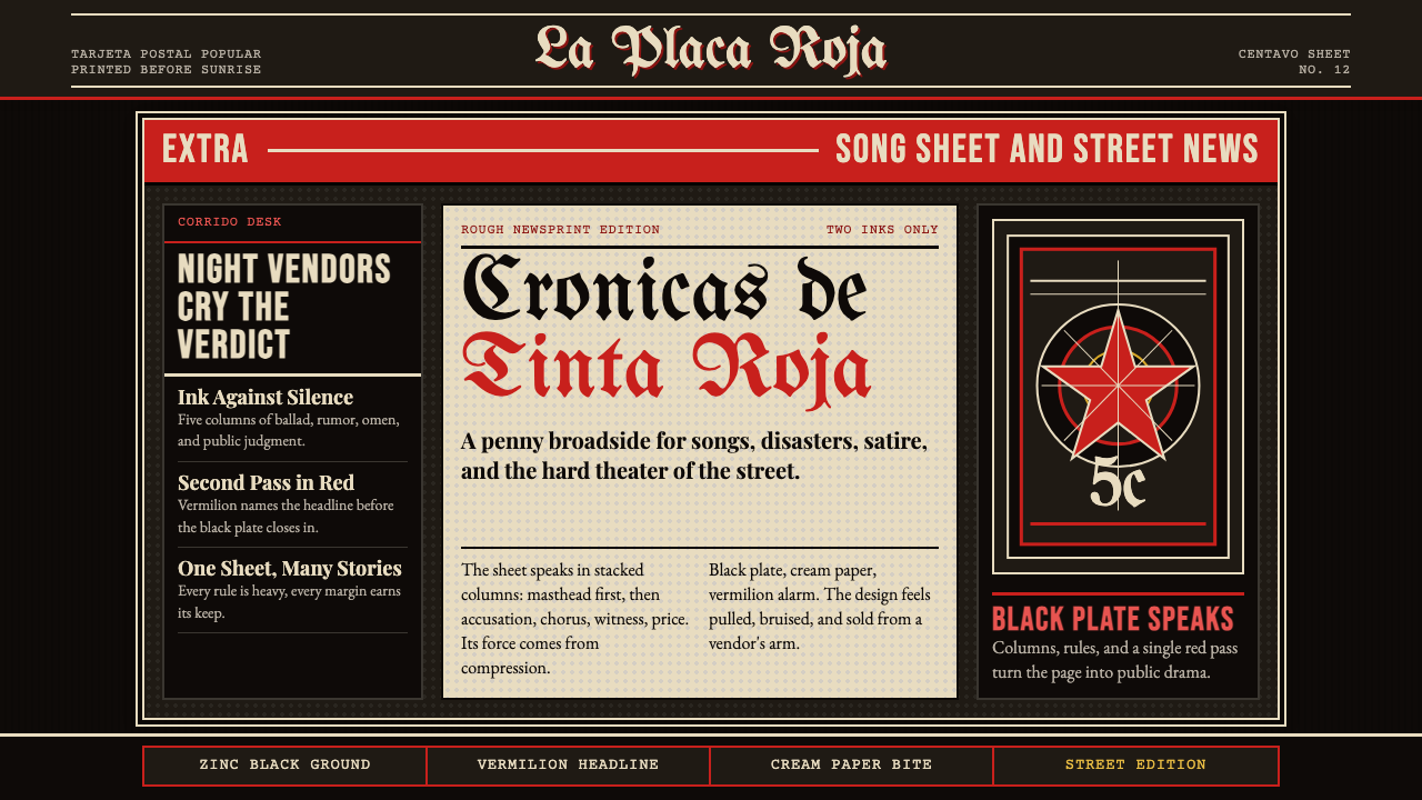 Mexican Tarjeta Postal (Posada Engraving 1900)Tabloid drama in two inks. Fraktur mastheads, vermilion rules, and cream news…
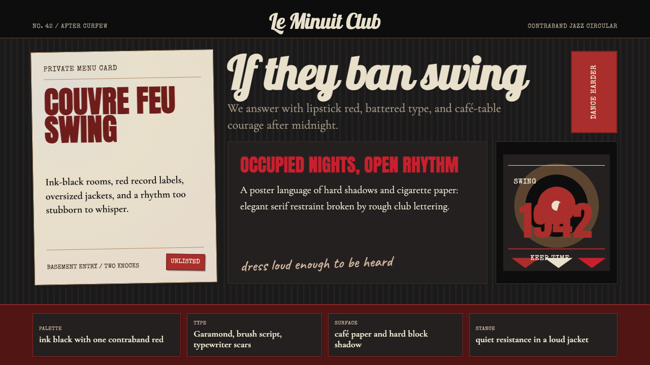 Parisian Zazou (1942)Defiance swings in the dark. Ink black, record-sleeve red, and battered typew…
 Tintin (Hergé Ligne Claire)Adventure reads at a glance. Flat spot colors and uniform black contours map…