What is Gyeongseong Modern Girl?
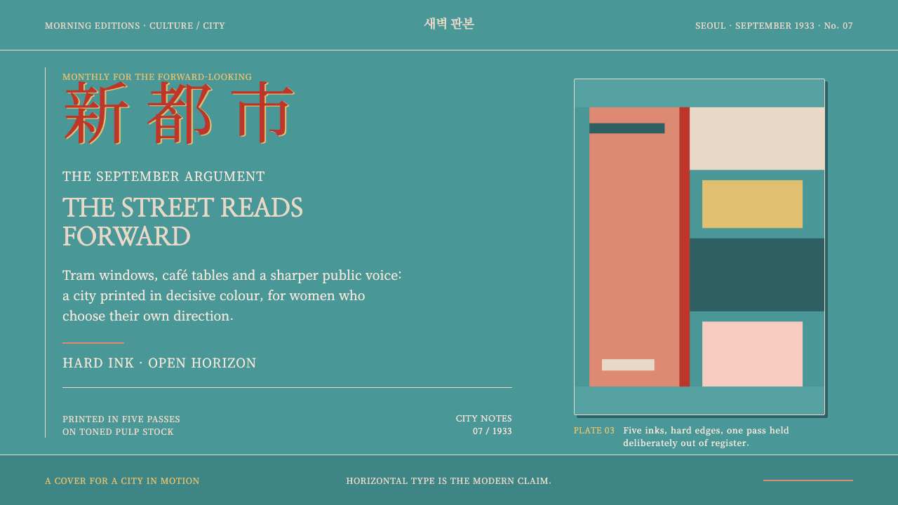
Gyeongseong Modern Girl prints modernity in hard ink: a teal field, a coral figure cut as one solid shape, and a brushed vermilion title that runs left to right across the page.
Gyeongseong Modern Girl in brief
Gyeongseong Modern Girl is a design style drawn from the covers of Sinyŏsŏng ('New Woman'), a women's magazine published by the Kaebyŏksa press in 1930s Gyeongseong, the colonial-era name of present-day Seoul. It is a flat-ink look: three to five spot colours printed on cheap toned pulp paper, with no halftones and no gradients. A teal field bleeds to the trim, a coral figure is cut as a single solid shape, and a brushed vermilion masthead crosses the top.
Its hardness is deliberate. Colour planes are laid down as solid areas with crisp ink edges, plates sit very slightly out of register as they did on the press, and type is set in Myeongjo serifs. There is no soft light and no drop shadow. The look is graphic rather than photographic and bold rather than refined: modernity as something printed with conviction on cheap paper.
The style also carries an argument about direction. The masthead is horizontal, written left to right, at a time when vertical setting was the habit of the old world. In 1930s Gyeongseong, a magazine that read across the page rather than down it announced itself as modern, urban and addressed to women who worked, rode the tram and cut their hair short.

Where does Gyeongseong Modern Girl come from?
Sinyŏsŏng was one of the women's magazines of 1920s–1930s Gyeongseong and among the most prominent of them, giving 'the new woman' — educated, urban, working and fashion-conscious — an image. It was published by Kaebyŏksa, and its peak years, as the source material has it, fell between 1931 and 1934. The city it described was itself changing. Cafés, trams, permanent waves and Western-style dresses were all becoming visible in the same streets, and magazine covers were where those things first became an image.
Making the covers was a matter of constraint. The magazine was printed on cheap toned pulp using three to five flat spot inks. No halftone screens were used, so there are no photographic tones, only areas of solid colour; the teal field runs to the trim, and figures are cut as unbroken shapes. Two traditions supplied the technique: Korean modernist illustration, and Japanese-colonial commercial lithography, the printing trade that the colonial period had established. Korean illustrators worked inside that commercial system and shaped a local modernism within it.
Three names are tied to the tradition. An Sŏk-ju (안석주) is associated with Korean modernist illustration, the line of work that produced the period's magazine pictures. Pang Chŏng-hwan (방정환) is connected with the editorial circles around Kaebyŏksa and is better known for his work in children's literature. Na Hye-sŏk (나혜석) was a painter and writer whose career is bound up with the debates about the new woman that the magazine carried. Together they sketch the world that the covers came from: illustration, editing and a public argument about women's lives.
The horizontal title is the key to reading the style. In the visual culture of the time vertical setting was the old habit and horizontal setting belonged to the new, so a masthead brushed in vermilion and running left to right put that argument on every cover. The covers' subjects, such as cafés, trams, permed hair and Western dresses, said the same thing in imagery. The design system keeps the press conditions rather than the nostalgia: hard ink edges, slight mis-registration, Myeongjo type, no soft light and no drop shadow.
What defines the Gyeongseong Modern Girl look?
A teal field to the trim
A single large field of teal floods the page and runs right off the edge, so the cover has no margin and no frame. It is a flat plane of ink, not a gradient or a photograph, and it sets the cool, urban key against which the warmer colours work. The effect is of a printed sheet, bold and immediate, rather than of a picture framed in white.
Coral spot-colour planes
The modern girl herself is cut from coral as one solid shape, with no inner modelling or shading. Her bobbed hair, dress and silhouette are read as planes of colour rather than drawn detail. A few such planes, laid side by side with sharp edges, do the work that tone and line would do in a photograph or an engraving.
Brushed vermilion masthead
The title is written with a brush in vermilion and runs horizontally, left to right. It is the hottest and most personal element on the page: the visible stroke of a hand against the flat, mechanical colour fields. The brush gives the masthead energy, and the horizontal direction gives it its meaning.
Hard ink edges and slight mis-registration
Where one ink meets another the edge is crisp, and the plates sit very slightly off register, leaving a hairline gap or overlap as they did on the press. This is not a defect to be corrected but a record of the printing conditions. Used lightly, it gives the page the feel of a thing printed on a real press, not drawn on a screen.
Myeongjo serif type
Type is set in Myeongjo serifs throughout, in titles and in text. The serif gives the page a printed, editorial authority that sits against the loud colour. There is no sans-serif in the system, no soft glow and no outline effect; letters are plain, dark and sharp so that colour does the shouting.
Flat spot inks, no tone
Three to five flat spot inks do all the work. There are no halftone screens, no gradients and no photographic tonality, so every area is a single colour. This limit is the source of the style's confidence: with so few inks, each must be decisive, and the composition must be built from shape and contrast alone.
Toned paper, no soft light
The ground is the warm, slightly yellowed tone of cheap pulp paper, not bright white, and the inks sit on it as flat layers. There is no glow, no drop shadow and no bloom. Depth, where it exists, comes from overlap and from contrast between planes, never from simulated light.

Who shaped Gyeongseong Modern Girl?
An Sŏk-ju is associated with Korean modernist illustration, the practice behind the period's magazine pictures. His name stands for the cover-art side of the tradition: flat colour, cut-out figures and a poster-like directness, produced inside a commercial printing system.
Pang Chŏng-hwan is connected with the editorial circles around Kaebyŏksa and is better known for his work in children's literature. His place in the list stands for the editorial side of the magazine culture, in which writers, editors and illustrators made a new kind of publication together.
Na Hye-sŏk was a painter and writer whose career is bound up with the debates about the new woman that Sinyŏsŏng carried. She stands for the subject of the covers and the content behind them: a woman with work, opinions and a public voice, not merely a fashionable image.
How do you use Gyeongseong Modern Girl today?
The Gyeongseong Modern Girl style suits subjects that want a confident, urban, graphic voice: culture, fashion, city life, festivals, publishing and anything that wants to look like a page printed with conviction. It is bold without being digital-glossy, and its flatness makes it easy to apply consistently.
For presentation slides, a cover can be a full-bleed teal field with a single coral solid figure and a vermilion title running horizontally across it. Content slides work as flat colour planes, each section a different ink, with all text in a serif face. Data slides can use the limited palette as a rule: a coral and a vermilion plane on the teal, or paper-toned panels for denser tables, with no gradients, no gridlines in light tones and no shadows.
For web interfaces, the style fits editorial products, cultural organisations, event and ticketing pages, fashion and lifestyle sites and campaign pages. Use large flat colour blocks as section backgrounds, hard-edged cards without borders or shadows, and serif headings. On a pricing page, three plans can be three colour planes. Keep body text on a plain paper-toned plate for readability, and keep the vermilion for the masthead and the single most important action.
For editorial and marketing work, the style is made for magazine covers, festival posters, book jackets, album art and print campaigns. Crop figures as solid cut-outs, run the title horizontally in a brushed vermilion, and let the colour bleed to the trim. A very light mis-registration between two inks can add the feel of a real press, as long as it never harms legibility.
The most common mistake is to soften it. Gradients, drop shadows, glows and photographic blends all contradict a style defined by flat ink and hard edges. A second mistake is to push the mis-registration so far that it becomes a distortion effect, losing legibility; it should stay hairline-slight. A third is to switch to a sans-serif, which removes the printed authority of the Myeongjo type. Finally, avoid treating it as a retro filter; the style works best when it speaks about the present with the confidence of its source.

Gyeongseong Modern Girl — FAQ
What was Sinyŏsŏng?
Sinyŏsŏng ('New Woman') was a women's magazine published by Kaebyŏksa in Gyeongseong, the colonial-era name of Seoul, in the 1920s and 1930s, with its peak between 1931 and 1934. It was printed on cheap toned pulp in three to five flat spot inks, and its covers gave the urban, working 'new woman' of the time a bold graphic image.
Why is the title set horizontally?
In that period vertical setting was the habit of the old world, and horizontal setting belonged to the new. A masthead written left to right announced a magazine that was modern, urban and aimed at women who worked, rode the tram and cut their hair short. In the design system the horizontal vermilion title is therefore a meaning, not just a layout choice.
Why does the style imitate slight printing misalignment?
Because the original covers were printed in flat spot inks, one plate after another, and the plates never sat in perfect register. The slight gap or overlap where two inks meet is a trace of the press, not a mistake. The system keeps it as a hairline-light effect to preserve the feel of the printing conditions, while never letting it harm legibility.
What does 'spot colour' mean in this style?
A spot colour is a single, pre-mixed ink printed as a flat area, as opposed to a tone built up from halftone dots. Here three to five such inks do all the work, which is why the teal, coral and vermilion appear as solid planes with no gradients or photographic tonality. In digital design, treat each as one flat fill with a hard edge.
Is the style only for Korean-themed projects?
No. It comes from a specific moment in Gyeongseong, but its principles, flat spot colour, hard ink edges, a serif voice and a brushed horizontal masthead, apply to any project about urban modernity, culture or publishing. If your content is Korean, the Myeongjo type makes it especially natural. Whatever the subject, credit the source and keep the confidence of the original.
Related design styles
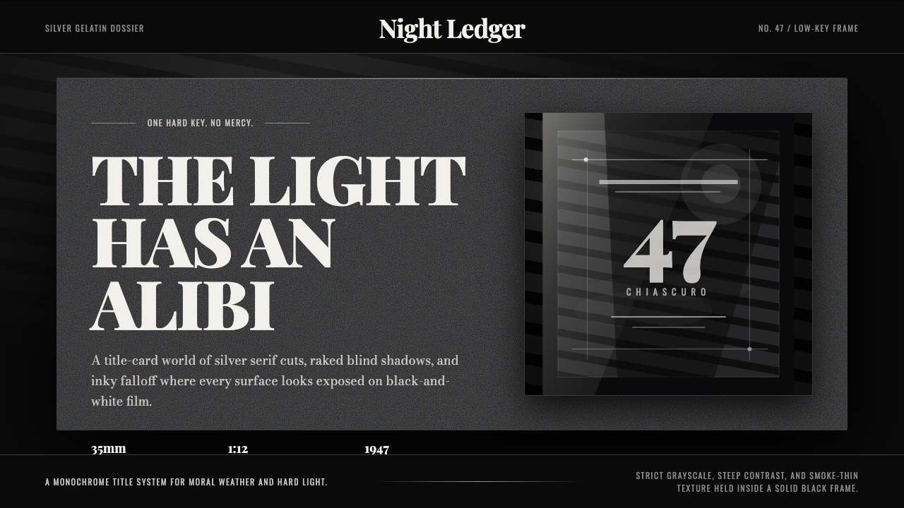 Film Noir ChiaroscuroLight is the crime. Silver serif cards, blind stripes, and grain carve drama…
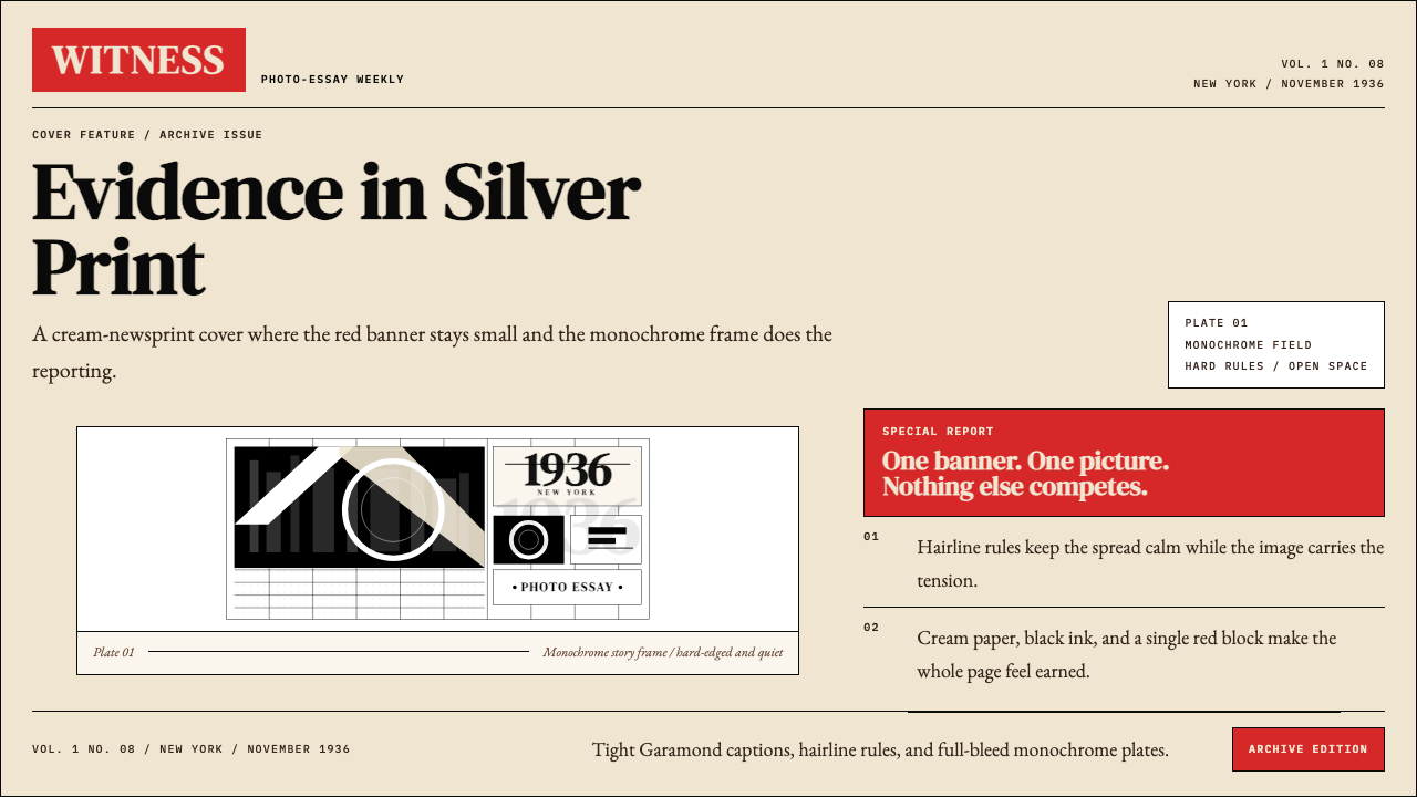 LIFE Magazine (Red-Banner)Photojournalism stripped bare. One red banner, cream newsprint, stark black p…
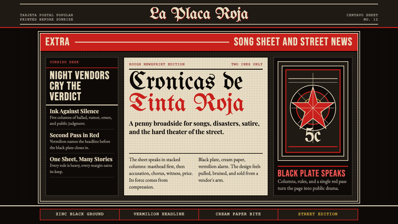 Mexican Tarjeta Postal (Posada Engraving 1900)Tabloid drama in two inks. Fraktur mastheads, vermilion rules, and cream news…
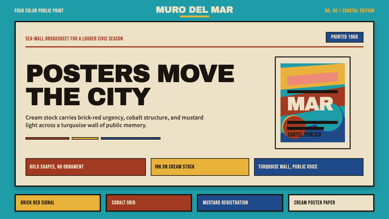 Cuban Malecón 1960 PosterPublic voice in flat ink. Turquoise wall, cream stock, brick red and cobalt b…
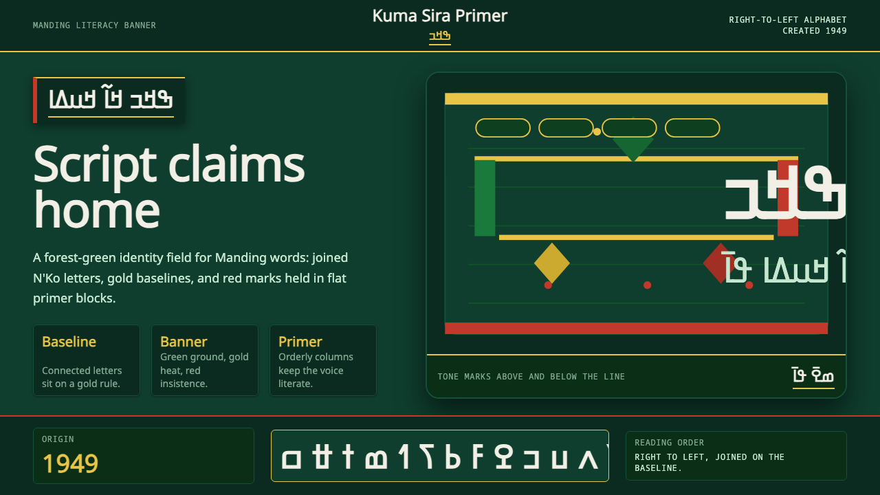 N'Ko ScriptIdentity writes itself. Forest green and gold baselines anchor joined N'Ko le…
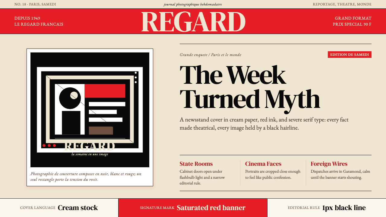 Paris MatchThe cover shouts in one red slab. Cream paper, serif headlines, and black rul…