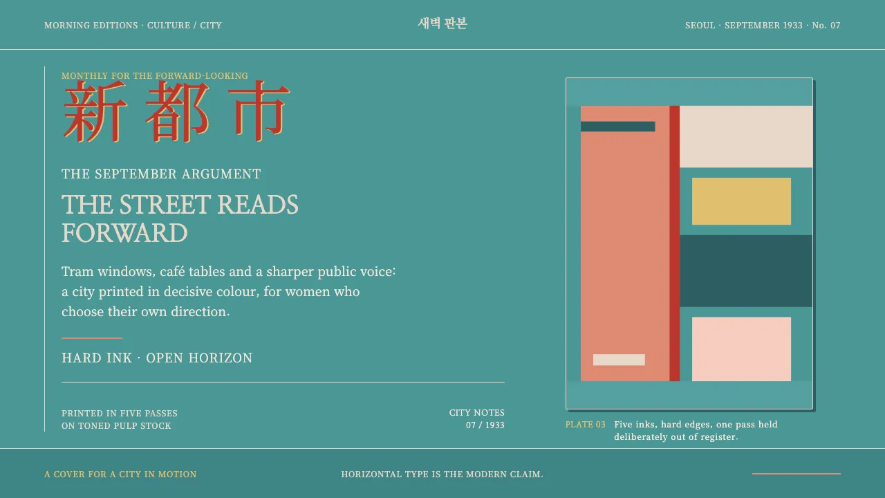
About Gyeongseong Modern Girl
Kaebyŏksa printed *Sinyŏsŏng* on cheap toned pulp in three to five flat spot inks. No halftones, no gradients — a teal field bleeding to the trim, a coral figure cut as one solid shape, and a brushed vermilion masthead running horizontally, left to right.
That horizontal title was the argument. A magazine that read across the page instead of down it was announcing itself as modern, urban and for women who worked, rode the tram and cut their hair short. This system keeps the press conditions: hard ink edges, one-or-two-pixel mis-registration, and type set in Myeongjo serifs.
- Origin
- Gyeongseong (Keijō / present-day Seoul), colonial Korea
- Era
- 1920s–1930s, peak 1931–1934
- Key figures
- An Sŏk-ju (안석주) · Pang Chŏng-hwan (방정환) · Na Hye-sŏk (나혜석)
- Movements
- Sinyŏsŏng (new woman) press · Korean modernist illustration · Japanese-colonial commercial lithography
Gyeongseong Modern Girl design spec
Colors
Typography
The other 11 sections — buttons, cards, spacing, motion, techniques and more — open once you unlock. Download the DESIGN.md or send it to your AI in one click. Unlock once, yours forever.
Sign up nowStyles similar to Gyeongseong Modern Girl
Also inspired by print & type, with a close feel.
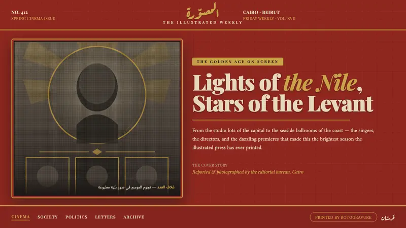 Pan-Arab Illustrated MagazineMid-century Arab press glamour. Brick-red fields, sepia halftone montage, gold Deco frames.
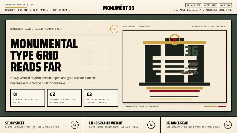 Olympic Poster Berlin (1936)Monumental and legible. Green-gray, cream, and gold turn type into architecture.
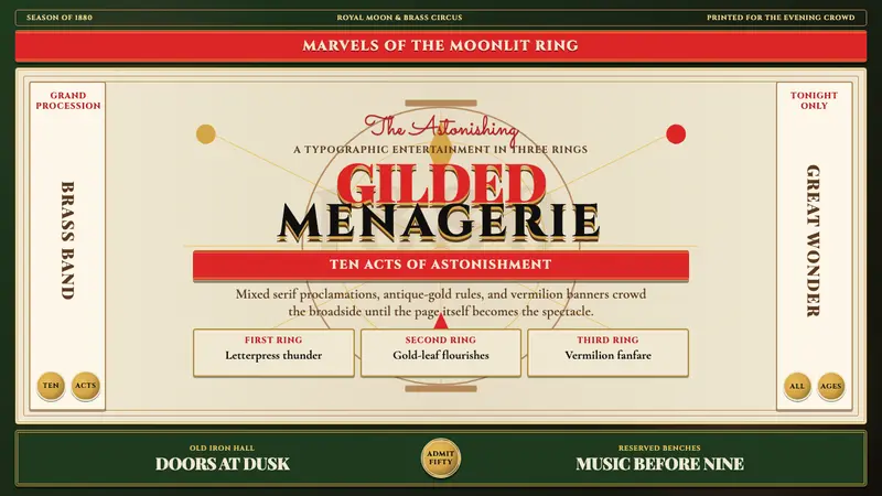 Victorian Circus Poster (1880)Spectacle leaves no inch quiet. Forest green, antique gold borders, mixed serifs, vermilion sash.
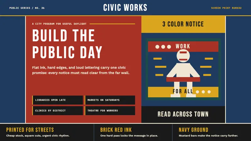 WPA Poster (Federal Art Project, 1936)Civic urgency in ink. Navy, brick red, mustard bands and Bebas Neue shout across the platform.