What is İznik Carnation Panel?
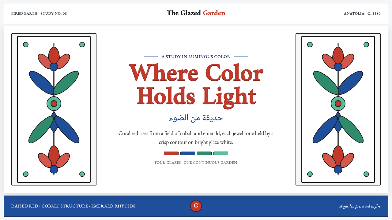
İznik Carnation Panel holds light in color: raised coral red, cobalt ornament, and a glaze-white ground made to gleam rather than recede.
İznik Carnation Panel in brief
İznik Carnation Panel draws on fritware wall tiles fired at İznik around 1580, during the high period of Ottoman İznik production. Its visual language is floral but never soft or casual: coral carnations and swirling saz leaves spread across a luminous tin-white glaze, each motif held in place by crisp black outlines. The result is an ornamental system with unusual discipline. Flowers appear alive with movement, yet every curve is contained, every color has a distinct role, and the white field remains an active source of light.
The palette is the mature İznik four: sealing-wax bole red, Kashan cobalt, emerald, and copper turquoise. These colors do not dissolve into one another or create atmospheric haze. They sit clearly on the glaze-white surface, with black contouring acting as a fine structural frame. Coral red is especially important because it is raised: it catches light physically as well as visually, making the panel feel less like a flat printed pattern and more like a glazed surface with material presence.
The style belongs to Ottoman ceramic tilework and to the quatre-fleurs and saz floral tradition. In a contemporary design system, it is best understood not as a loose floral wallpaper but as a controlled relationship among ground, contour, motif, and saturated color. Its character depends on keeping the field bright, letting ornament breathe, and preserving the tension between lush vegetal motion and precise enclosure.
Where does İznik Carnation Panel come from?
The reference point for this style is İznik, ancient Nicaea in Anatolia, Ottoman Turkey. Around 1580, local fritware wall tiles carried a highly resolved decorative language: a luminous tin-white glaze supporting floral ornament rather than merely serving as empty background. The place matters because the panel is inseparable from ceramic surface. Its brightness is not the blank brightness of paper; it is glaze-white, reflective, faintly warm, and designed to make surrounding color appear more vivid.
Kara Memi is named as the court designer associated with the coral carnations and swirling saz leaves that define the panel’s motif world. The language is built from an encounter between recognizable flowers and deliberately energized foliage. Carnations provide rounded, petaled focal forms, while saz leaves introduce length, curl, and directional force. Together they prevent the composition from becoming either a static botanical study or an undifferentiated field of decoration.
The mature palette gives the period its special visual authority. Sealing-wax bole red, Kashan cobalt, emerald, and copper turquoise form a compact color system, while black outlines make the colors legible as separate, intentional areas. This is not color used as soft atmosphere. It is color used as ornament, emphasis, rhythm, and edge. The raised coral red is particularly expressive because it holds light differently from the surrounding glazed surface.
The panel also reflects collective making. Alongside Kara Memi, the source names İznik kiln masters and imperial nakkaşhane cartoonists. Their presence points to a system in which motif design, drawing, firing, glaze, and finished tile surface had to agree. The visual result is therefore neither solely painterly nor solely architectural. It is a ceramic language whose floral abundance is made convincing through coordination, contour, and controlled material finish.
What defines the İznik Carnation Panel look?
Glaze-white Ground
The ground should read as luminous tin-white glaze with only the faintest warmth. It is neither cream nor an indifferent pure white. Its job is to hold reflected light, separate the ornament cleanly, and give the raised coral red a surface against which it can appear to gleam.
Mature İznik Color
Sealing-wax bole red, Kashan cobalt, emerald, and copper turquoise make up a deliberately limited but rich palette. Each hue should remain distinct and substantial. The system gains force from contrast among clearly bounded colors, not from blended transitions or an expanded rainbow of decorative accents.
Raised Coral Red
Coral red is the panel’s most tactile color. It should feel raised, dense, and responsive to light, as if the ornament has a slight physical relief above the white glaze. Used well, it gathers attention without flattening the cobalt, green, or turquoise into supporting noise.
Crisp Black Contours
Black outlines pin every color and curve into place. They are not decorative sketch marks or casual ink texture; they are the graphic structure that prevents the floral field from losing definition. The contour makes petals, leaves, and colored compartments feel intentional, legible, and rhythmically connected.
Carnation and Saz Motion
Carnations establish rounded floral moments; swirling saz leaves carry the eye through the composition. The relationship should feel directional rather than evenly scattered. Long leaf curves create movement across the field, while blossoms offer pauses, turns, and concentrated points of color.
Ornament with Discipline
The surface may be visually abundant, but abundance is never an excuse for clutter. Motifs need room around them, contours need to stay clear, and the bright ground must remain visible. The panel works when floral richness feels composed and ceramic, not when every open area is filled for its own sake.
Who shaped İznik Carnation Panel?
Kara Memi is the court designer associated in the source material with the coral carnations and swirling saz leaves of the panel. His role identifies the motif system as a designed ornamental language rather than an incidental floral arrangement. The carnations and leaves together establish the panel’s central balance of bloom, motion, contour, and color.
The İznik kiln masters represent the ceramic knowledge behind the panel’s finished surface. The style depends on more than drawing: fritware, luminous glaze, raised coral red, and the separation of cobalt, emerald, turquoise, and black contour all have to arrive as a coherent fired result. Their contribution is material precision made visible.
The imperial nakkaşhane cartoonists are named as contributors to the ornamental system. Their presence emphasizes the importance of planned motifs and controlled contour. In this panel tradition, floral life is not opposed to order: the apparent freedom of leaves and blossoms is carried by an underlying drawn discipline.
How do you use İznik Carnation Panel today?
For presentation covers, use the panel’s logic to create a single luminous field rather than a busy decorative border. Let a glaze-white background occupy most of the composition, place one carnation or a cropped saz-leaf movement near an edge, and allow the title to sit in a calm zone of open ground. A coral-red floral detail can establish the focal point, while cobalt or turquoise can support secondary information. The cover should feel like a fragment of ceramic ornament with room for a modern message, not a reproduction crowded by text.
For presentation content and data slides, translate the system into hierarchy. Keep content on a bright, faintly warm white field; use crisp dark lines to organize sections, tables, or chart axes; and reserve the mature İznik colors for categories with clear meaning. A data graphic can borrow the panel’s principle of separated color areas: cobalt, emerald, turquoise, and coral red should remain discrete, labeled, and outlined where needed. Avoid soft color fades, translucent decorative layers, or dense floral backgrounds behind information, because they weaken the clarity that black contour and glaze-white ground provide.
For web interfaces, this language suits dashboards, collections, product stories, and pricing pages that need warmth without losing structure. Build navigation and controls around a bright field, decisive outlines, and clearly isolated color signals. A coral-red state can carry high attention, cobalt can anchor navigation or informational structure, while emerald and turquoise can differentiate related content without turning the interface into a multicolor surface. Floral motifs work best as framed accents, section markers, or generous background fragments rather than as constant wallpaper behind every interaction.
For editorial and marketing layouts, the style is especially effective when an article or campaign needs to communicate craft, continuity, or material richness. Use a large ornamental flourish to introduce a section, then return to open white space for reading. Cropped carnations can become visual punctuation; saz leaves can guide the eye along a margin or between content blocks. Keep the black contour visible enough to preserve the source language, and let the contrast between empty glaze-white space and concentrated ornament give the layout its cadence.
The common mistake is to treat İznik Carnation Panel as a generic floral pattern and scatter red, blue, green, and turquoise equally across every surface. That loses the hierarchy of the original system. The style depends on a bright glaze-white ground, contours that remain crisp, coral red that can stand forward, and motifs that move through space rather than fill it indiscriminately. Another mistake is making the white ground creamy or starkly generic: its barely warm glazed character is what allows the colors to feel illuminated rather than merely saturated.
İznik Carnation Panel — FAQ
Is İznik Carnation Panel simply a floral pattern?
No. Flowers are its visible subject, but the style is organized through a specific ceramic system: luminous tin-white glaze, mature İznik color, raised coral red, black contour, and the directional relationship between carnations and saz leaves. Removing those relationships leaves floral decoration, but not the panel’s particular visual language.
Why is the white ground so important?
The ground is the source of the panel’s luminosity. It is intentionally glaze-white and only faintly warm, so it separates the ornament, reflects light, and allows coral red to appear raised and gleaming. A cream ground changes the character; an empty generic white ground loses the ceramic specificity.
What role do black outlines play?
Black outlines are the system’s structural discipline. They pin the color areas and floral curves into place, keeping the decorative field legible. Without them, cobalt, red, emerald, and turquoise can blur into a softer visual mass; with them, every petal and leaf retains its deliberate shape.
Can the palette be expanded for a contemporary application?
It can be adapted, but expansion should not obscure the mature İznik four that defines the reference. The visual coherence comes from the conversation among bole red, cobalt, emerald, turquoise, black contour, and glaze-white ground. If additional color is needed, it should remain subordinate to that relationship rather than competing with it.
Related design styles
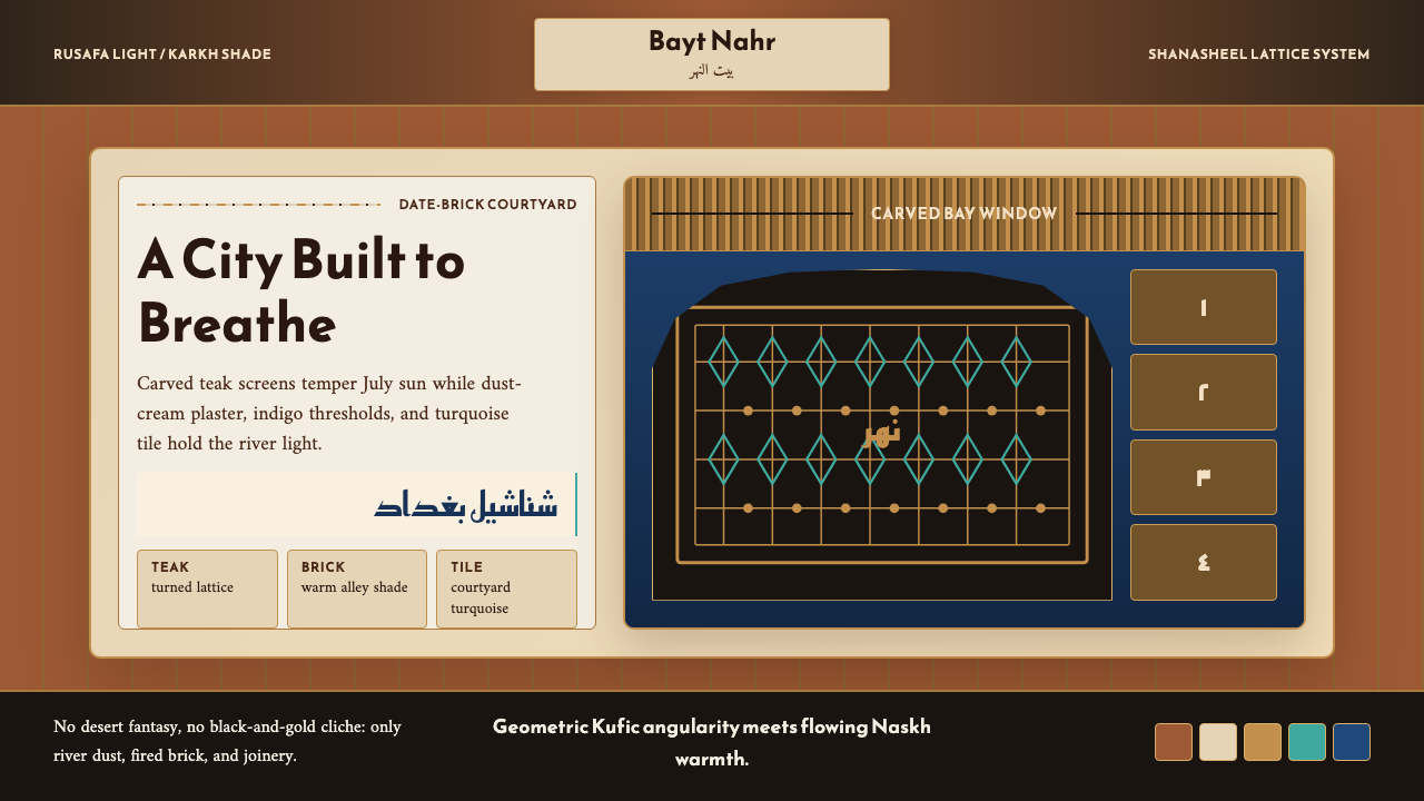 Iraqi Baghdad Shanasheel HouseBreathes through ornament. Date-brick ground, teak lattice, and turquoise til…
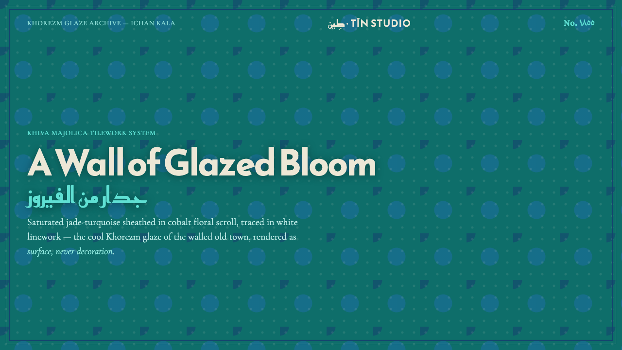 Khiva Ichan-Kala MajolicaJade becomes architecture. Cobalt bands and white tracery lock the surface in…
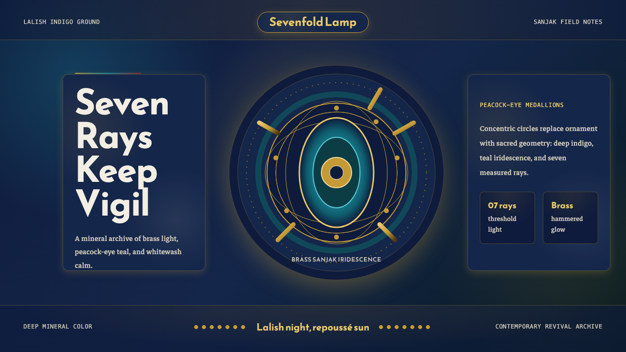 Kurdish Yazidi Peacock & SunSacred geometry glows. Lalish indigo holds brass rays and teal peacock-eye me…
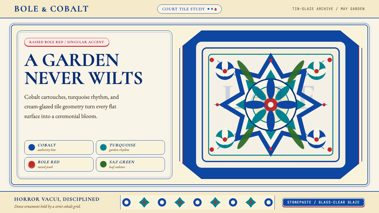 Turkish İznik CeramicBlooms with discipline. Cobalt grid and cream glaze hold turquoise motifs wit…
 Aztec CodexSacred records stay severe. Ochre amatl ground, Cinzel capitals, black cartou…
 Babylonian Ishtar GateMonumental by procession. Lapis brick, gold registers, and carved capitals ho…