What is Khiva Ichan-Kala Majolica?
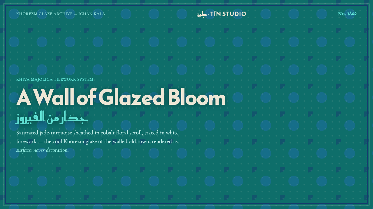
Jade becomes architecture: cobalt borders and white tracery lock a saturated turquoise surface into a cool, glassy ornamental world.
Khiva Ichan-Kala Majolica in brief
Khiva Ichan-Kala Majolica is the glazed architectural language of Khiva’s walled Ichan Kala in Central Asia, rooted in the mid-nineteenth-century Khanate of Khiva. Its reference points are the squat unfinished Kalta Minor minaret, begun in 1855, and the courtyards of the Tash-Khauli palace, where saturated jade-turquoise tile turns walls into continuous fields of color.
The style is cooler and greener than the warmer ceramics associated with Bukhara. Its surface is built from a limited but intense relationship: jade-turquoise as the ground, deep cobalt as the enclosing band and structural counterpoint, and white as delicate tracery within the tilework. The result is not a painted illustration placed on architecture; it is architecture understood as a glazed, repeating surface.
Floral mosaic fields and geometric framing work together. Cobalt establishes direction and containment, while white linework threads through the jade like a drawn pattern inside glass. Under desert light, the surface appears glossy, saturated, and almost luminous. In digital form, the system preserves that hierarchy: jade carries the field, cobalt makes the edges legible, and white remains a line or inset motif rather than becoming a competing background.
Where does Khiva Ichan-Kala Majolica come from?
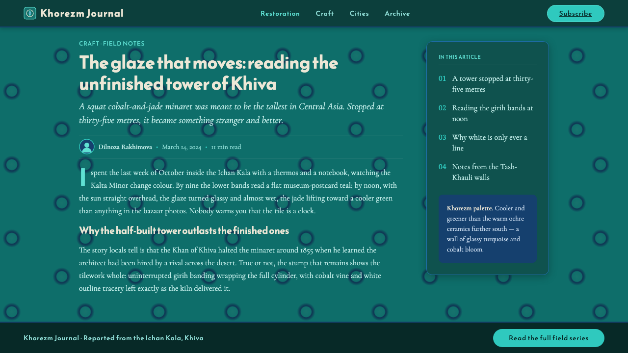
The style belongs to the pre-1900 visual culture of the Khanate of Khiva, in Khorezm, Uzbekistan. Its identity is architectural rather than merely decorative: glazed majolica covers substantial surfaces, so color, border, and pattern operate at the scale of walls and courtyards. The visual language is therefore read as an environment, not as an isolated ornament.
Ichan Kala provides the defining setting. Within the walled city, jade-turquoise tile creates a strong continuity between vertical architecture and patterned surface. The courtyards of Tash-Khauli show how this language can make enclosure feel richly articulated without abandoning the clarity of a repeated system. Floral fields, cobalt framing, and white linework remain visibly related across the built environment.
Kalta Minor gives the style its most distinctive vertical reference. Begun in 1855 and left unfinished, the squat minaret embodies the tension between massive architectural presence and intricate surface treatment. Its importance to the system lies in the way a large, simple form can carry a dense ceramic vocabulary without losing its identity as architecture.
The craft lineage is identified with the Khorezm tile masters of Ichan Kala and with a broader Islamic floral-geometric mosaic tradition. It also belongs to a majolica white-and-blue lineage, although the Khorezm expression shifts the emphasis toward a greener, cooler turquoise field. The result is a regional language that feels saturated and ornamental while remaining governed by borders, repetition, and disciplined contrast.
What defines the Khiva Ichan-Kala Majolica look?
Jade-Turquoise Ground
Jade-turquoise is the dominant field and the emotional temperature of the system. It should feel saturated, cool, and glazed rather than dusty or pastel. The ground carries the largest uninterrupted areas, allowing the surface to read as architecture first. Its green cast distinguishes Khorezm majolica from warmer ceramic traditions and gives the style its unmistakable identity.
Cobalt Bands
Deep cobalt is the enclosing force. It outlines fields, marks thresholds, and gives the repeating surface a firm architectural rhythm. Cobalt should feel structural rather than atmospheric: a band, rule, frame, or dark floral countershape. Its depth keeps jade from becoming visually loose and turns pattern into a legible system of containment.
White Tracery
White is used as line, incision, and fine internal articulation. It traces flowers, separates small units, and catches the imagined shine of the glaze. It must not become the main ground, because its role is to illuminate the jade and cobalt relationship from within. The effect is delicate but not faint: white is a precise instrument of contrast.
Floral Mosaic
Floral motifs appear as tiled fields rather than freehand botanical illustrations. Their power comes from scrolling repetition, interlocking fragments, and the tension between organic petals and geometric enclosure. A successful interpretation keeps the flowers dense enough to suggest a continuous wall while preserving the visible logic of units, borders, and recurring paths.
Glazed Light
The surface should suggest glassy light without relying on soft atmospheric effects. Saturation, hard contrast, and carefully bounded highlights create the impression of fired glaze under desert sun. Depth comes from layering fields and tracery, not from realistic modeling. The object should feel polished and luminous, yet still composed from decisive flat shapes.
Architectural Rhythm
The system moves from large architectural fields to smaller ornamental units through repeated framing. Borders establish cadence, floral centers provide density, and white tracery keeps the eye moving across the surface. Composition should feel continuous and enclosed rather than scattered. Even when adapted to a compact interface, the design should retain the memory of a wall or courtyard.

Who shaped Khiva Ichan-Kala Majolica?
Muhammad Amin Khan anchors the human history of this visual language in the Khanate of Khiva. His name belongs beside the architectural world of Ichan Kala and the unfinished Kalta Minor, begun in 1855. In this system, that association matters because the tile language is inseparable from the monumental surfaces and courtyards through which Khiva is recognized.
The Khorezm tile masters of Ichan Kala represent the craft intelligence behind the surface: the joining of jade-turquoise fields, cobalt borders, white tracery, and floral-geometric repetition. Their place in the system is not that of anonymous ornament makers, but of practitioners who turn a limited material vocabulary into a coherent architectural environment.
Kalta Minor is the defining architectural reference of the style: squat, unfinished, and begun in 1855. Its presence clarifies the central idea of Khiva Ichan-Kala Majolica. A large architectural body can become a field of saturated jade-turquoise without losing its mass, while cobalt and white patterning make that mass readable as an ordered surface.
How do you use Khiva Ichan-Kala Majolica today?
For presentation covers, let jade-turquoise occupy the field and use a strong cobalt band to establish the first architectural edge. A title can sit within that enclosure in clear, high-contrast lettering, while a compact floral or geometric fragment introduces the majolica reference. The cover should feel like entering a tiled courtyard: saturated, framed, and immediately spatial.
Content slides should use the same hierarchy at a calmer density. Cobalt can organize section boundaries and visual anchors; white can clarify diagrams, labels, or fine rules; jade should remain the continuous ground. Data slides benefit from repeated units and bounded forms, allowing bars, cells, or comparison fields to read as fragments of a larger tiled wall rather than as unrelated graphic objects.
For web dashboards and pricing pages, the style works when the interface behaves like architecture. Use jade for the main field, cobalt for navigation bands, active outlines, and strong divisions, and white for text or internal tracery where contrast is needed. Cards should feel enclosed and substantial, with clear borders and repeated modules. Avoid making every element ornamental; the system depends on a stable field in which only selected structures receive intense pattern.
Editorial and marketing layouts can use the style’s wall-like continuity to create memorable sections. A feature story may begin with a broad jade field, a cobalt frame, and a dense floral motif that is cropped at the edge, suggesting that the pattern continues beyond the page. Campaign panels can alternate between large architectural color fields and close views of tracery, keeping the same cool, saturated Khorezm temperature throughout.
The common mistake is treating the palette as three equally loud colors or using white as a full background. That reverses the system’s logic. Jade should carry the surface, cobalt should contain and structure it, and white should appear as line, floral detail, or precise contrast. Another mistake is adding soft, atmospheric depth that makes the tile feel like a rendered material; the stronger interpretation preserves bounded shapes, repeating units, and the impression of glazed light.
Khiva Ichan-Kala Majolica — FAQ
What is Khiva Ichan-Kala Majolica?
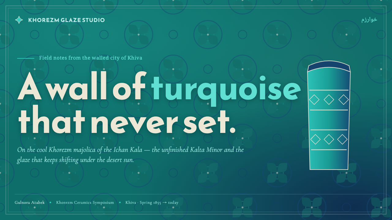
It is a design language derived from the glazed majolica surfaces of Khiva’s walled Ichan Kala in Khorezm, Uzbekistan. Its defining relationship is jade-turquoise ground, deep cobalt framing, and white floral-geometric tracery. The visual reference is architectural, especially the unfinished Kalta Minor begun in 1855 and the courtyards of Tash-Khauli palace.
How does it differ from Bukhara ceramic style?
The source material distinguishes Khorezm majolica as cooler and greener than Bukhara’s warmer ceramics. That difference should remain visible in digital use. The jade-turquoise ground needs to feel dominant and cool, while cobalt supplies depth and white provides internal articulation. Replacing the green cast with warmer earth tones weakens the regional identity.
Can white be used as the main background?
Not if the goal is to preserve the system’s defining hierarchy. White is specified as tracery and linework, never as the ground. It can appear in text, fine rules, floral insets, or small areas of contrast, but jade-turquoise should remain the principal field. This keeps the surface connected to glazed tile rather than turning it into a generic blue-and-white pattern.
How should the glazed quality be represented digitally?
Suggest it through saturation, bounded contrast, and carefully placed linework rather than realistic material simulation. Cobalt borders can create firm depth, white tracery can imply reflected light, and repeated floral units can make the field feel fired and assembled. The surface should remain composed and graphic, with its luminosity coming from the relationship of colors and edges.
What is the biggest mistake when applying this style?
The biggest mistake is distributing jade, cobalt, and white as competing equal areas. The system is hierarchical: jade is the field, cobalt is the frame and structural counterpoint, and white is the fine line. Overusing floral detail creates visual noise, while using white as ground destroys the tiled atmosphere. Preserve enclosure, repetition, and cool saturation before adding more ornament.
Related design styles
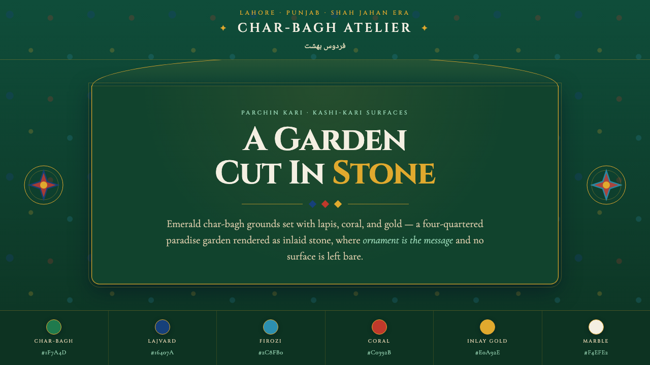 Shalimar Mughal Pietra DuraA paradise garden cut in stone. Emerald char-bagh ground inlaid with lapis, c…
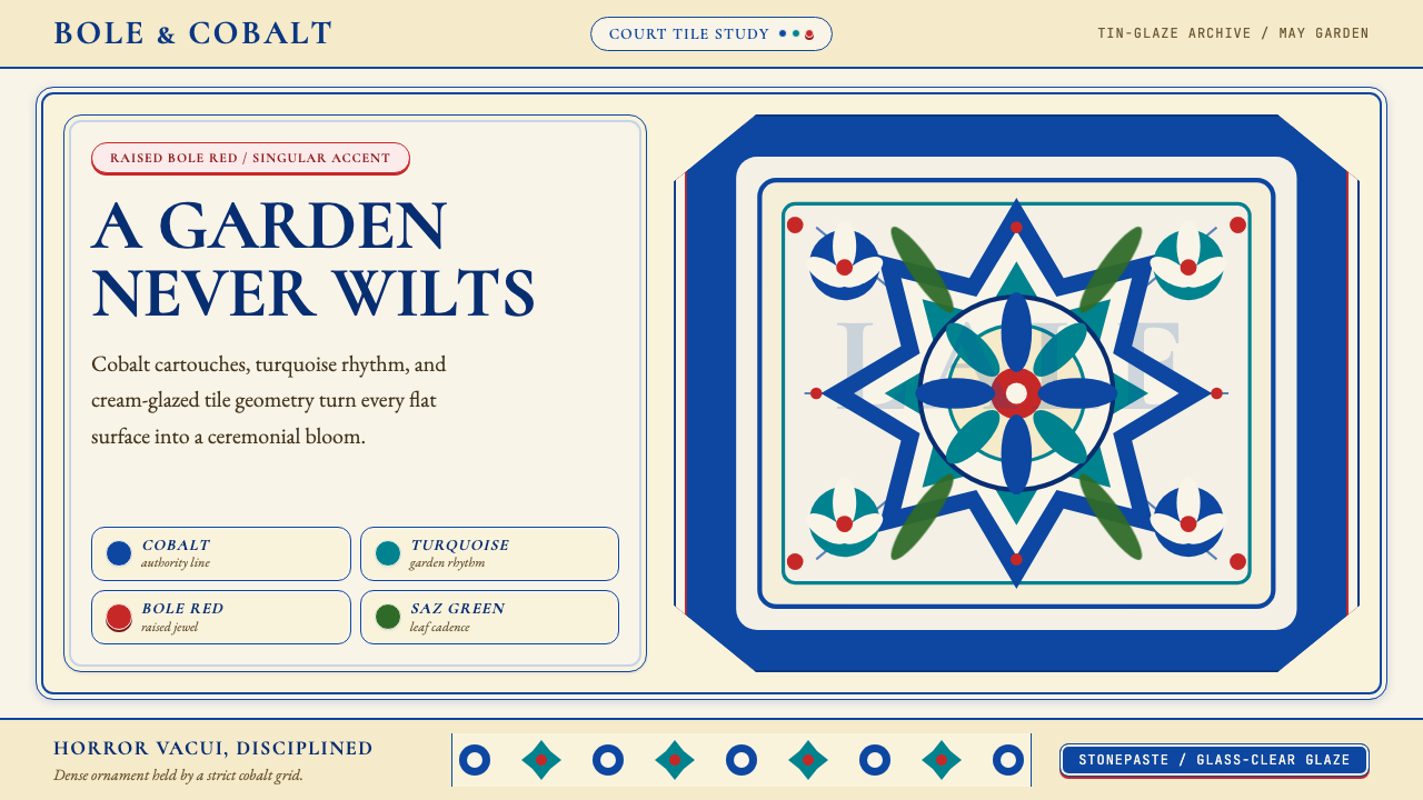 Turkish İznik CeramicBlooms with discipline. Cobalt grid and cream glaze hold turquoise motifs wit…
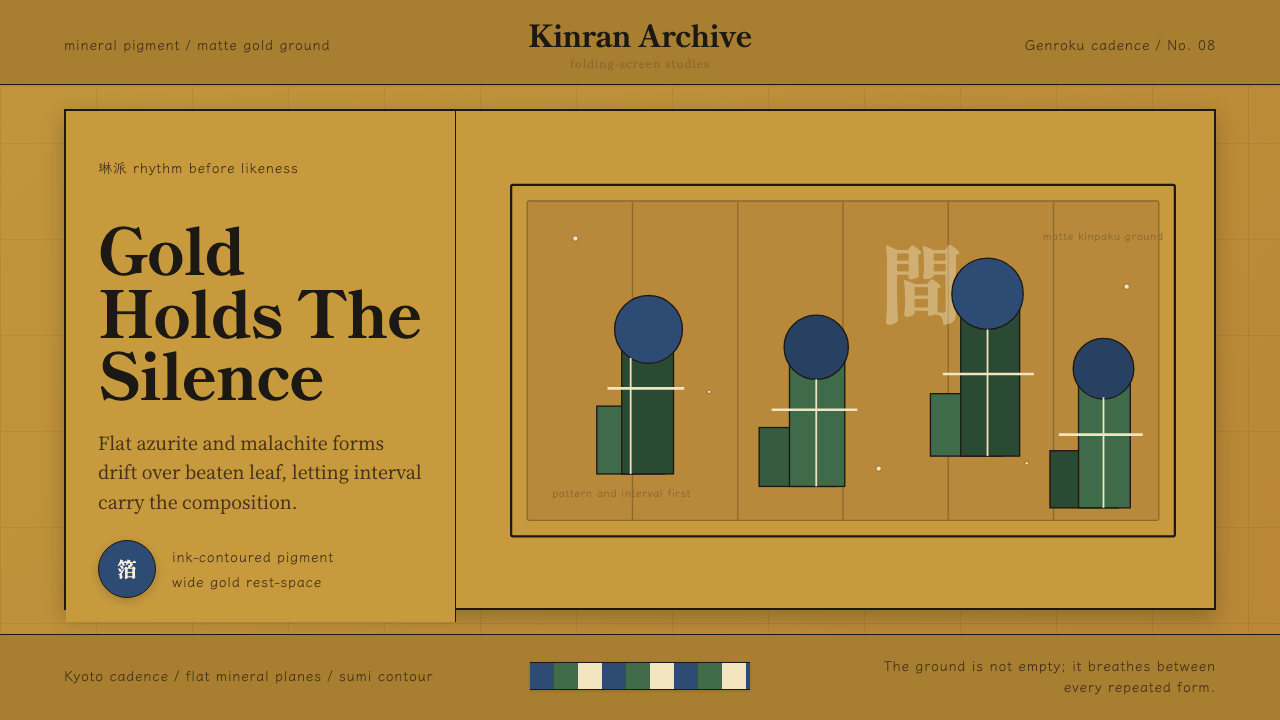 Edo Rinpa (Kōrin)Matte gold breathes. Azurite and malachite repeats float across inked screen…
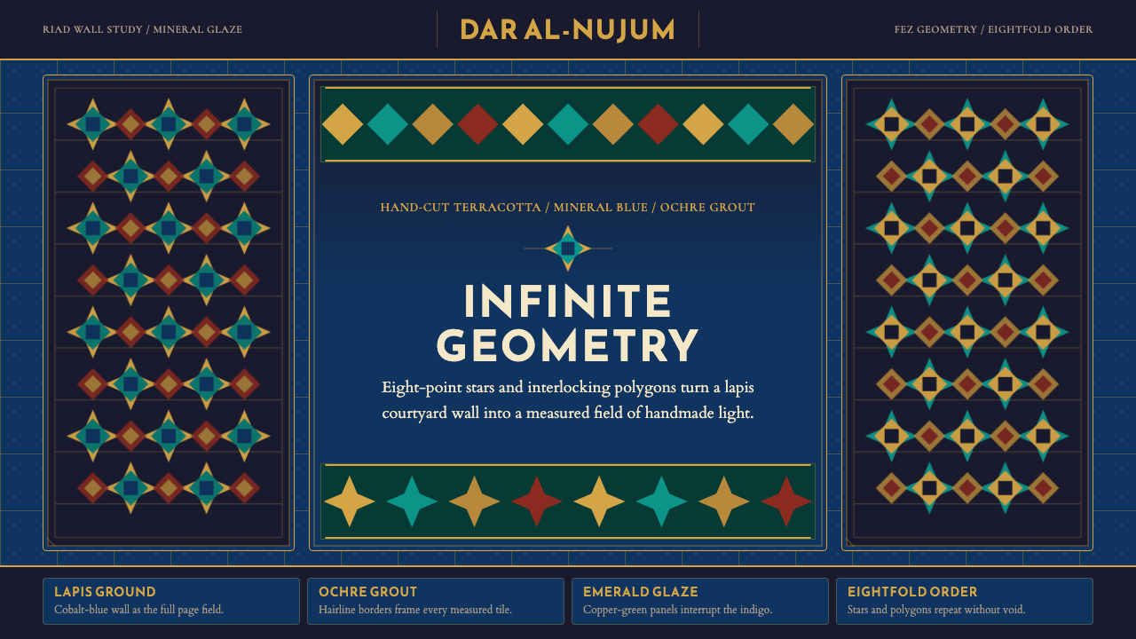 Moroccan Zellige TileLuxurious geometry without void. Lapis ground, ochre borders, and eight-point…
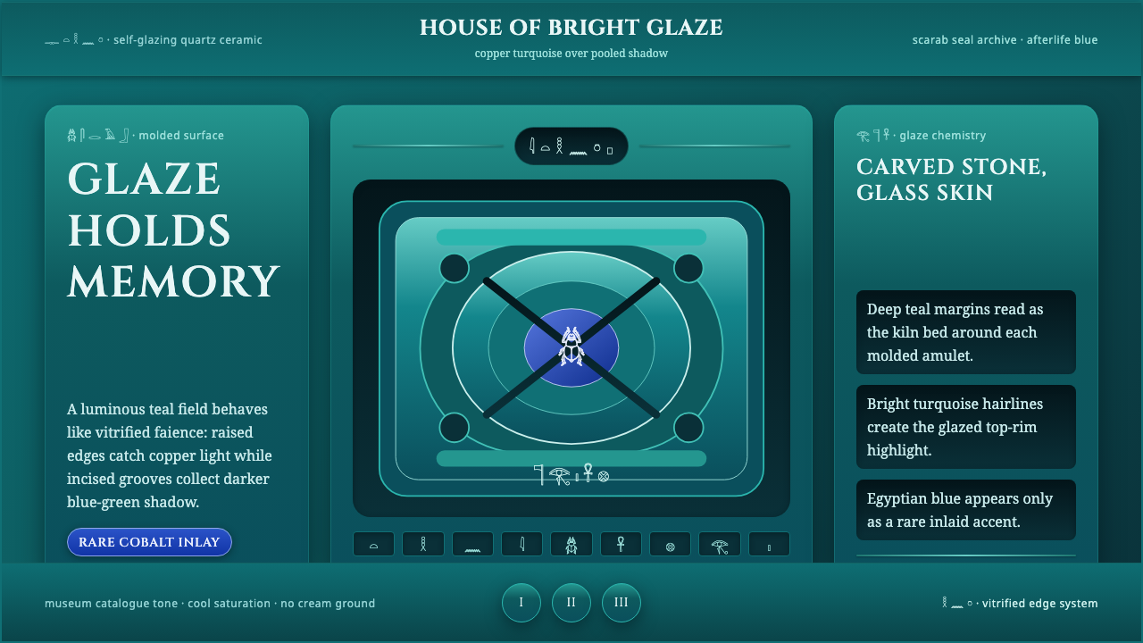 Egyptian FaienceGlaze carries the afterlife. Deep teal grooves, copper-turquoise rims, rare c…
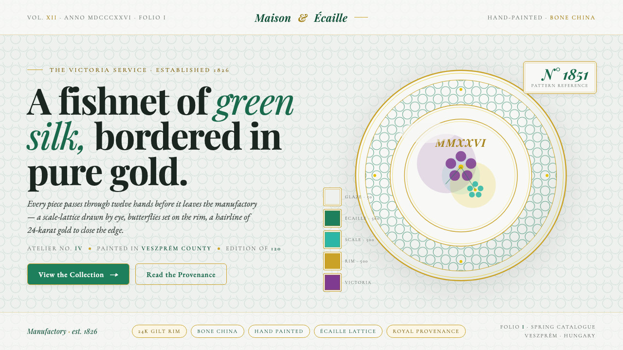 Herend PorcelainRoyal porcelain, drawn by hand. Cool glaze, écaille fishnet, gilt rim, Playfa…