What is Herend Porcelain?
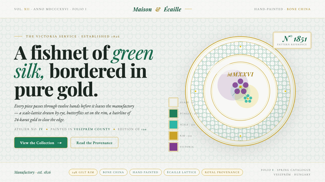
Herend turns royal porcelain into a visual language of cool glaze, hand-painted botanicals, fishnet-green lattice, gilt edges, and poised italic serifs.
Herend Porcelain in brief
Herend Porcelain is the visual language of a Hungarian hand-painted bone-china house founded in 1826. Its signature is the Victoria pattern, ordered by Queen Victoria in 1851: butterflies and floral sprays move through an écaille, or fishnet, scale lattice. On the object, cool translucent glaze, careful handwork, and gilt rims turn decoration into provenance. The design system carries that same logic to the screen, where every detail should feel painted, placed, and finished rather than mechanically repeated.
The mood is regal without becoming heavy. A cool porcelain ground provides the quiet field; fishnet green supplies the recognizable pattern; gold appears as a restrained edge; and refined high-contrast serifs give language the poise of fine china. The composition depends on breathing room. Ornament is precious because it is surrounded by calm, not because it is crowded across every surface.
Herend is best understood as a system of relationships rather than a floral theme. Botanical motifs need the lattice to feel distinctive, the lattice needs open space to remain legible, and gilt needs restraint to retain its sense of finish. The result is delicate, formal, and tactile in suggestion: a digital surface that recalls porcelain sheen, hand-painted craft, and royal provenance without imitating an actual plate.
Where does Herend Porcelain come from?
Herend was founded in 1826 in Herend, Hungary, within the tradition of nineteenth-century European fine porcelain. Its identity is inseparable from the fact that the pieces are hand-painted bone china. That human scale of production matters to the design language: the surface is not merely polished, and the decoration is not merely printed. The visual impression comes from the meeting of a cool porcelain body, translucent glaze, botanical imagery, and an evident sense of finish.
The decisive historical reference is the Victoria pattern, ordered by Queen Victoria in 1851. Its structure brings together butterflies, floral sprays, and an écaille fishnet lattice. These parts do not behave as unrelated ornaments. The lattice establishes a repeating field, while the butterflies and flowers interrupt that field with irregular, living forms. The tension between order and hand-painted variation is the pattern’s central character.
Herend’s visual lineage joins several strands named in its provenance: nineteenth-century European fine porcelain, Victorian decorative arts, and chinoiserie botanical painting. The result is neither purely European restraint nor purely botanical exuberance. It is a controlled decorative language in which foreign-looking natural forms, formal tableware, and royal association are held together by disciplined composition and careful edging.
The digital translation preserves those signals while changing their medium. A screen cannot reproduce the physical body of bone china, but it can establish a cool porcelain-glaze ground, use fishnet green as a recurring structural motif, and let gilt edging clarify boundaries. High-contrast serif typography and Playfair italics complete the translation. The aim is not historical reenactment; it is to carry forward the feeling of hand-painted luxury, quiet ceremony, and crafted completion.
What defines the Herend Porcelain look?
Porcelain Color
Color begins with a cool porcelain ground rather than a warm cream or theatrical jewel tone. Fishnet green is the signature accent, carrying the pattern’s identity without overwhelming the field. Gold should read as a fine finishing note, while deep text tones provide contrast. The palette feels expensive because it is restrained and material-led, not because it relies on loud saturation.
Glaze and Sheen
The surface should suggest cool, translucent porcelain glaze: smooth, quiet, and lightly luminous. Texture is implied through calm tonal shifts and generous open space, not through busy effects. The screen treatment should feel polished but never glossy in a commercial, plastic sense. Its refinement comes from softness of atmosphere and precision of edges.
Écaille Lattice
The écaille lattice is the defining structural motif. It resembles a fishnet of small scales, creating rhythm behind the hand-painted elements. Used well, it behaves like a delicate architectural field: visible enough to establish identity, quiet enough to let text and botanicals remain clear. It works best as a framing, lining, or selective background device rather than a universal fill.
Botanical Painting
Butterflies and floral sprays are treated as composed specimens, not generic nature imagery. Their charm lies in the contrast between organic movement and the ordered lattice beneath them. Botanical elements should appear selectively, with enough surrounding calm to preserve their rarity. They can carry the emotional center of a cover or invitation, while smaller accents support navigation and section identity.
Serif Typography
Refined high-contrast serifs provide the typographic voice, with Playfair italics especially suited to titles, quotations, and ceremonial labels. Italic forms introduce grace and movement without becoming informal. Body copy should remain composed and readable, allowing the display face to carry the sense of occasion. Typography is elegant because hierarchy comes from contrast and placement, not from decorative type variety.
Gilt Edging and Space
Gilt rims and gilt-edged borders act as finishing lines, not heavy containers. They clarify the perimeter of a card, panel, invitation, or title block and give the composition the feeling of a carefully completed object. Space around those lines is essential. Without it, gold becomes flashy and the lattice becomes busy; with it, both read as signs of craft and ceremony.
Who shaped Herend Porcelain?
Mór Fischer is named in the approved provenance as one of Herend’s key figures. The available material does not assign him a specific biography or production role, so his importance here is handled through the broader idea of human authorship: Herend is not anonymous ornament, but a house whose identity is carried by named people and hand-painted work.
Queen Victoria is the historical patron attached directly to the Victoria pattern. Her order in 1851 gives the motif its royal provenance and explains why butterflies, floral sprays, and the écaille lattice carry more than decorative charm. They belong to a named pattern with a clear ceremonial association.
The Victoria pattern is the central visual figure of Herend’s identity in this source. Its power comes from a balanced opposition: a repeating fishnet structure holds together butterflies and floral sprays that feel individually placed. The pattern therefore gives the design system both a recognizable signature and a model for combining order with hand-painted irregularity.
The hand-painting tradition represents the unnamed artisans behind every piece. It is the reason the system should preserve variation, breathing room, and a sense of deliberate placement. Digital repetition can borrow the lattice, palette, and gilt line, but it should still feel guided by a human eye rather than assembled from interchangeable decoration.
How do you use Herend Porcelain today?
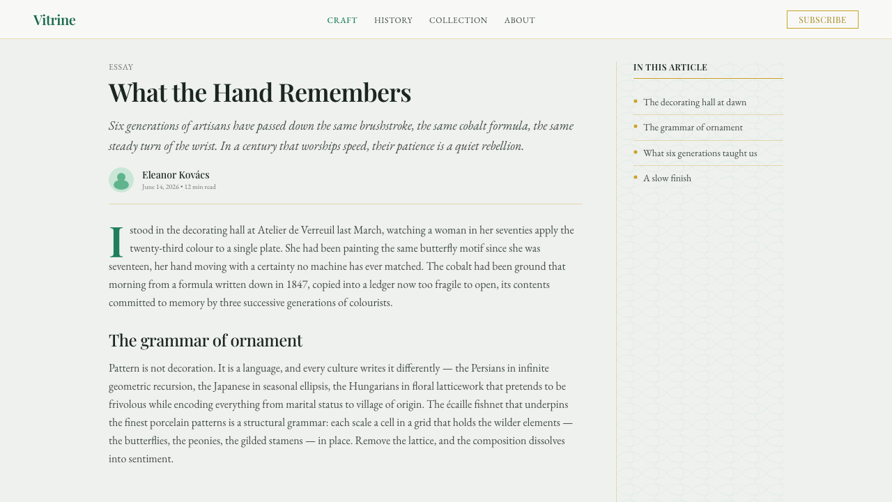
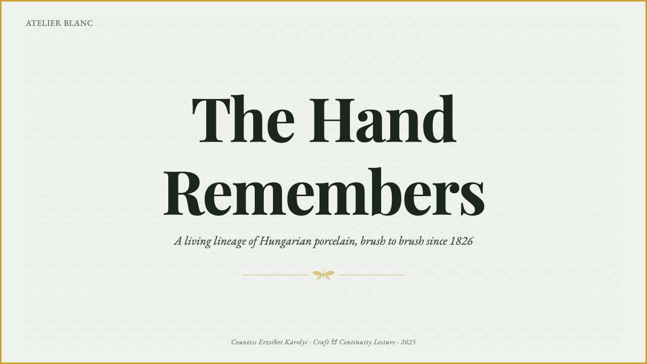
For presentation slides, begin with a cover that feels like an invitation or a porcelain lid: a cool ground, a composed Playfair italic title, a restrained gilt edge, and a selective botanical or fishnet-green detail. Content slides should keep the same calm field, using the lattice to establish section identity rather than as wallpaper. Data slides benefit from the system’s formal clarity: charts, labels, and callouts can be separated by fine gilt rules and restrained green accents, while the main information remains easy to read.
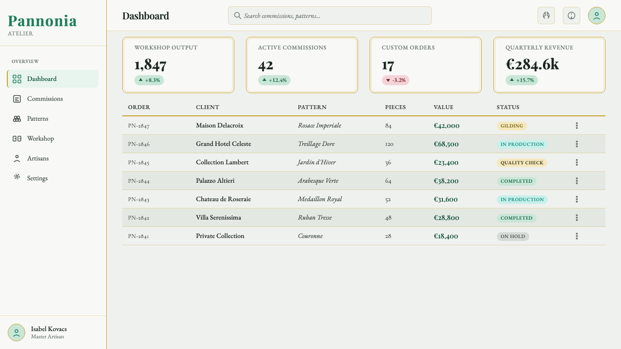
For web interfaces, Herend suits dashboards and pricing pages that need to feel curated, premium, and ceremonial rather than technical or aggressive. Use the porcelain ground as the dominant environment, reserve fishnet green for navigation, selected states, or tier distinction, and let gold clarify important boundaries or featured offers. Cards should feel like arranged objects with generous space around them. Typography should carry most of the hierarchy, with floral imagery and lattice used selectively.
For editorial and marketing work, the system supports invitations, hospitality materials, luxury product stories, cultural announcements, and brand pages that depend on provenance. A narrow text measure, elegant serif headings, and generous margins create the feeling of a printed keepsake. Marketing sections can alternate quiet porcelain fields with more concentrated botanical compositions, but each change should preserve the same cool atmosphere. Gold is strongest when it marks a title edge, frame, or final detail.
The common mistake is treating Herend as a generic luxury floral style by placing flowers, green pattern, and gold on every available surface. That removes the very restraint that makes the system distinctive. Another failure is making the lattice perfectly dominant or the typography overly ornate. Herend works when the hand-painted motif, the cool ground, the gilt finish, and the serif voice are given separate roles and enough space to remain legible.
Herend Porcelain — FAQ
Is Herend Porcelain simply a floral luxury style?
No. Flowers are only one part of the system. Its identity depends on the relationship between cool porcelain glaze, hand-painted butterflies and floral sprays, the écaille fishnet lattice, restrained gilt edging, and refined serif typography. Remove the lattice or the quiet ground and the result becomes generic. Remove the hand-painted irregularity and it loses the sense of craft. Herend is a coordinated language of surface, pattern, provenance, and space.
What does écaille mean in the Victoria pattern?
Écaille is the fishnet or scale lattice that appears beneath and around the butterflies and floral sprays. It provides a repeating structure that makes the hand-painted motifs feel composed rather than scattered. In a digital application, it should be treated as a selective field or framing device. Its purpose is to establish identity and rhythm, not to compete with every word or image.
How prominently should gold appear?
Gold should appear as a finishing material, echoing the gilt rims of the porcelain. It is most effective on borders, rules, selected labels, or a featured edge, where it gives the composition a sense of completion. If gold becomes a broad field or constant background, it loses its delicacy and can make the interface feel showy. The cool porcelain ground and fishnet green should carry the larger visual structure.
Can this style work on a dark background?
It can be adapted, but a dark background works against the system’s clearest foundation: the cool porcelain-glaze ground. Herend is strongest when the surface feels light, translucent, and quietly reflective. A dark version should therefore be treated as an intentional variation, with fishnet green and gold used carefully so the result does not become theatrical. If the goal is recognizably Herend, the pale porcelain field is the safer starting point.
Why are Playfair italics useful here?
Playfair italics introduce the refined, ceremonial tone associated with fine china and royal provenance. Their movement also complements the organic gestures of butterflies and floral sprays. They work best for titles, invitations, quotations, and short labels where elegance matters. Longer informational text should remain calm and readable, allowing the italic display voice to retain its special status instead of turning every line into an ornament.
Related design styles
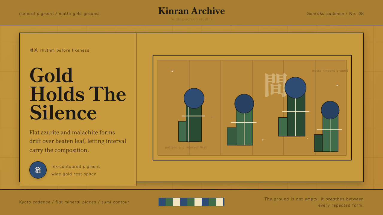 Edo Rinpa (Kōrin)Matte gold breathes. Azurite and malachite repeats float across inked screen…
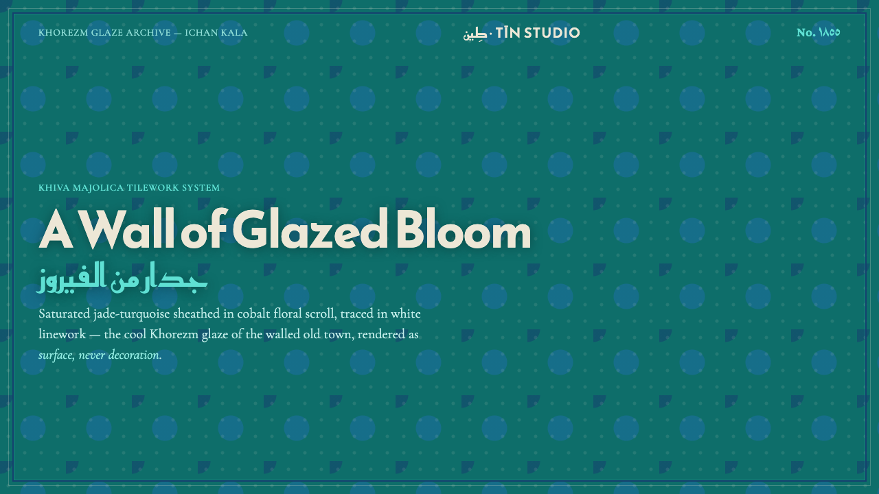 Khiva Ichan-Kala MajolicaJade becomes architecture. Cobalt bands and white tracery lock the surface in…
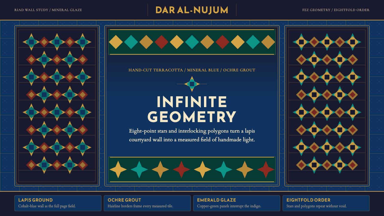 Moroccan Zellige TileLuxurious geometry without void. Lapis ground, ochre borders, and eight-point…
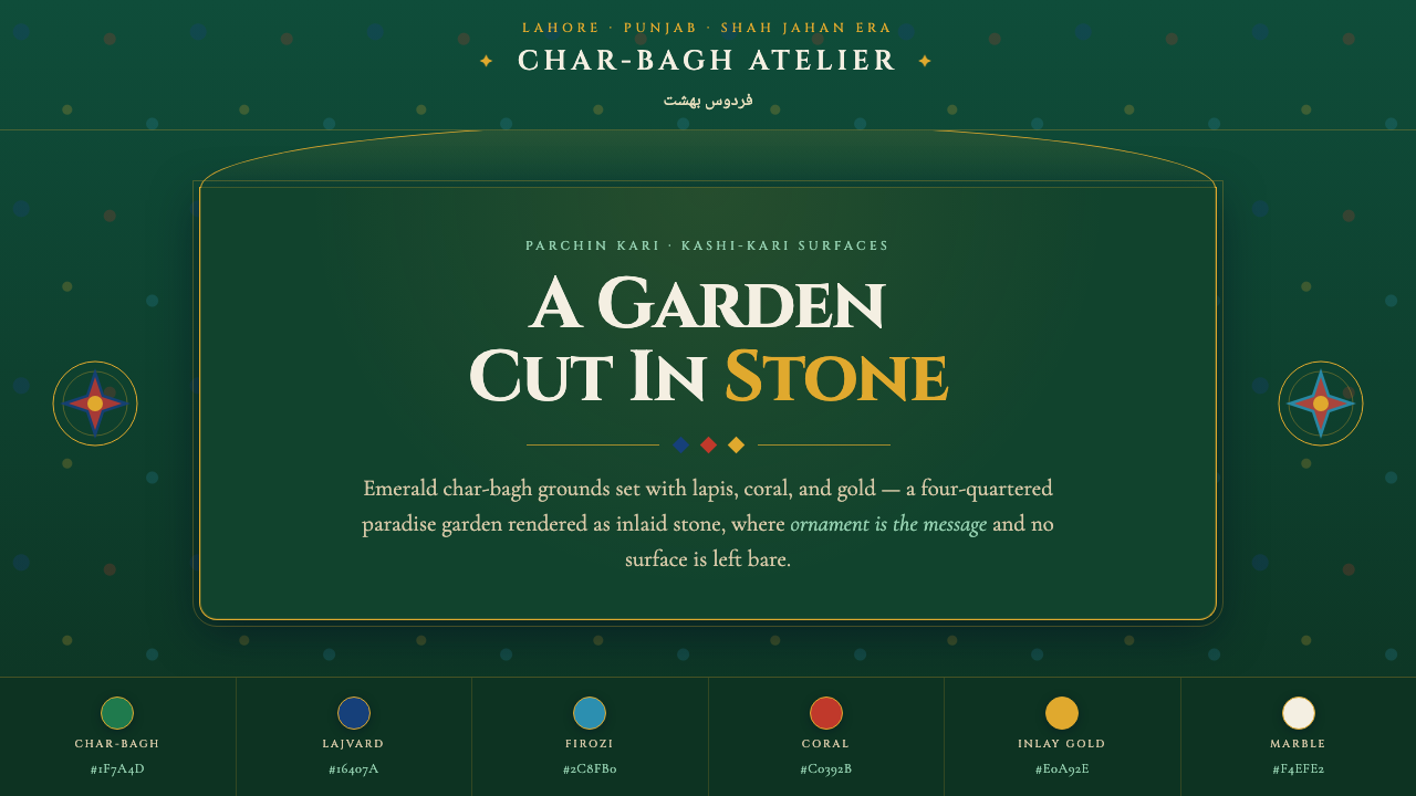 Shalimar Mughal Pietra DuraA paradise garden cut in stone. Emerald char-bagh ground inlaid with lapis, c…
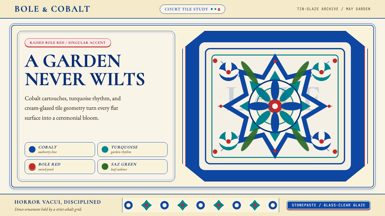 Turkish İznik CeramicBlooms with discipline. Cobalt grid and cream glaze hold turquoise motifs wit…
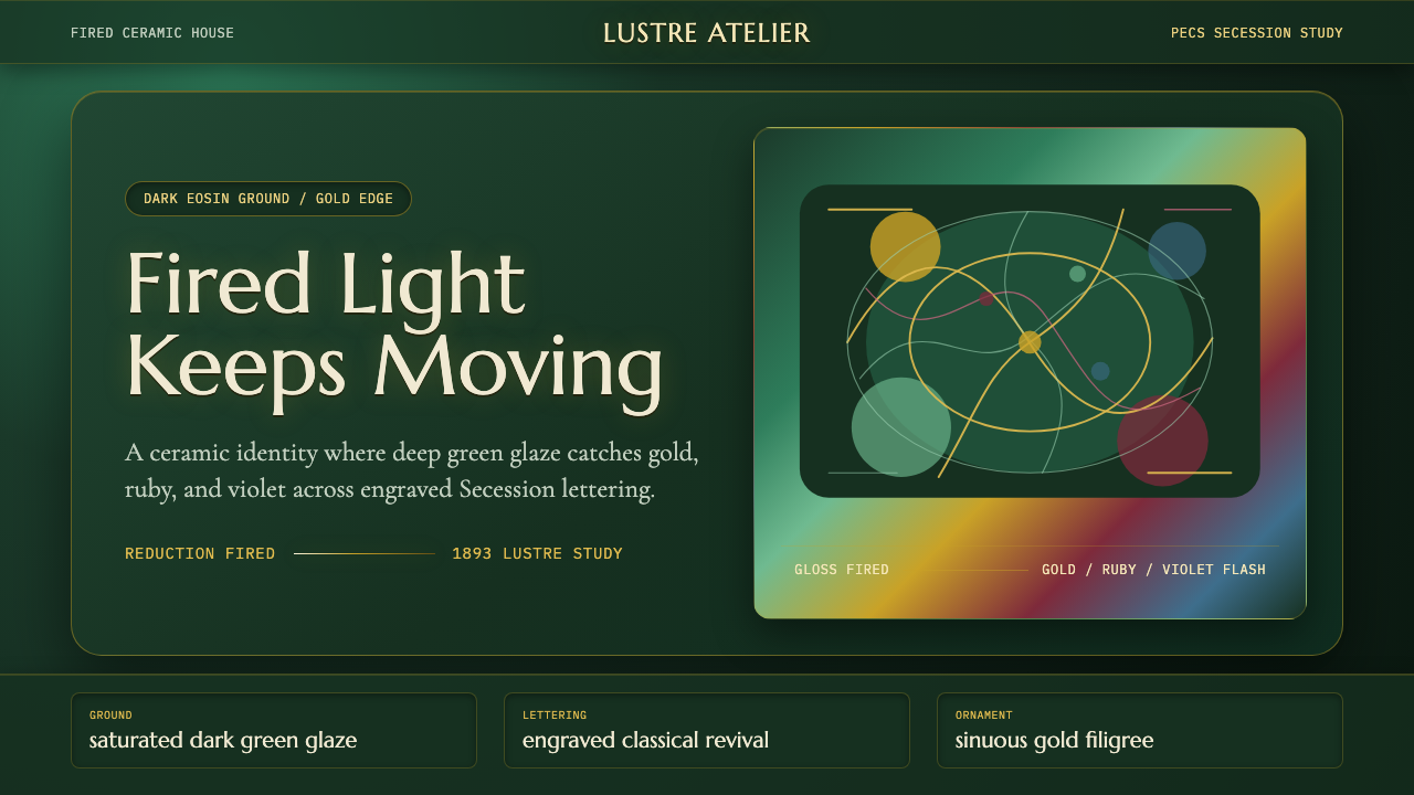 Zsolnay Eosin CeramicsGlaze becomes theater. Dark eosin green flashes gold, ruby, and violet throug…