What is Ottoman Hamam Interior?
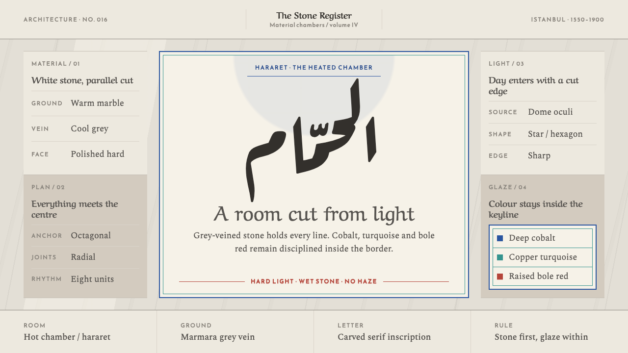
The Ottoman hamam interior is bright, hard stone rather than soft steam: grey-veined marble, cut shafts of light and tile colour that always sits inside a border.
Ottoman Hamam Interior in brief
The Ottoman Hamam Interior style takes the classical Turkish bath as its model and takes it literally. The hararet, the hot room at the heart of the bath, is not a dim, softly lit spa. It is a bright, hard stone chamber. Floor, walls and the octagonal göbek taşı, the central 'belly stone', are all cut from white marble of Marmara and Afyon, with grey veins running in parallel bands through every surface.
Light is the second material. It enters only through small star- and hexagon-shaped glass openings punched into the dome, which the Turks call fil gözü, 'elephant's eyes'. They drop cut-edged shafts of light onto wet stone rather than diffusing it into haze. The style translates that room into a graphic system: a warm marble ground, grey vein as the working colour, and sharp-edged shapes in place of glow.
Colour arrives the way tile arrives. İznik cobalt, copper turquoise and a raised Armenian-bole red appear in bordered, panelled fields and are never scattered across a surface. Display type belongs to Arabic calligraphy, while Latin text sits in sharp serifs, like an inscription cut into a foundation plaque. The overall impression is of dignity, brightness and exactness, closer to a monument than to a wellness brand.
Where does Ottoman Hamam Interior come from?
The hamam descends from the bathing culture of the Roman and Byzantine world, a lineage that the source lists beside classical Ottoman architecture and İznik ceramics. The Ottomans inherited the idea of a sequence of rooms of increasing heat, organised around water, steam and heated stone, and reinterpreted it as a civic and religious institution in which washing was bound up with ritual cleanliness and community life. The hot room of that sequence is the one this style takes as its subject.
The classical form was codified in the hamams of Mimar Sinan, the chief architect of the Ottoman court, built between the 1550s and the 1580s. Sinan's baths organise a changing hall, a warm room and the hot room under domes and vaults, and they treat the hot room as the architectural climax: a domed, centrally planned space whose heated central platform, the göbek taşı, sits beneath a pierced roof. The style the source describes spans the sixteenth to nineteenth centuries, but it draws its proportions from this codified Sinan-era form.
Patronage shaped the building type. Hürrem Sultan and Barbaros Hayreddin Pasha appear among the key figures in the source, and their names point to the way the empire's elite commissioned baths and related buildings as public works, often paired for men and women and often tied to mosques and charitable foundations. The twin baths associated with Hürrem Sultan beside Hagia Sophia in Istanbul are the best-known example of that pattern.
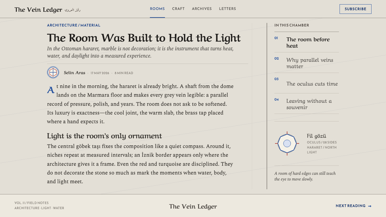
The colour language comes from İznik ceramics, the tile tradition associated with the Ottoman court in the sixteenth century. İznik tile is known for crisp cobalt and turquoise and for a thick, raised red, which the source calls Armenian bole. Tiles were laid in panels framed by borders, which is the rule this style follows: colour arrives in organised fields, never as sprinkled accents. Calligraphy in Arabic script, run as an architectural inscription band, supplies the other half of the visual voice.
What defines the Ottoman Hamam Interior look?
Warm marble ground
The base is warm, pale marble, not stark white and not cool grey, and it covers floor, wall and central platform alike. It is a continuous mineral surface that does the bulk of the visual work, giving the system a bright but never clinical field to sit on.
Grey vein as the working colour
The parallel grey veins running through the stone are the system's real working colour. They supply texture, rhythm and a sense of material without any decoration. Patterns should read as stone cut in bands, with direction and parallelism, not as random clouds or swirls.
Hard, cut light
Light is sharp. The star and hexagon openings in the dome produce shafts with clear edges, landing as bright geometric patches on wet stone. In graphic terms this means hard-edged highlights, crisp shapes and strong contrast rather than glow, haze or soft diffusion.
Tile colour in borders and panels
İznik cobalt, copper turquoise and a raised Armenian-bole red appear as they would on tile: inside borders, framed panels and bands. Colour has a place and an edge. It never drifts across a surface as a casual accent, and each hue is given its own field.
Arabic calligraphy as the display voice
Headlines belong to Arabic calligraphic forms, treated as architectural inscription: large, rhythmic and set in a band or panel, the way a ceremonial line sits above a doorway. The calligraphy is a monument's voice, not a decorative flourish.
Sharp serifs for Latin text
Latin text uses a sharp-cut serif face, like lettering engraved on a foundation stone or a plaque. Letters are crisp, with clear contrast between thick and thin and no soft rounding, so that text feels carved rather than printed.
Octagon, hexagon and star
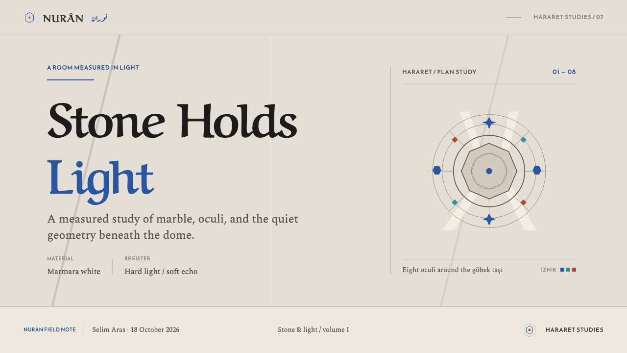
The octagonal göbek taşı and the star and hexagon openings in the dome supply the geometric vocabulary. Octagons, hexagons and star forms frame content, and layouts organise symmetrically around a central focus, just as the room is organised around its stone.
Who shaped Ottoman Hamam Interior?
Chief architect of the Ottoman court in the sixteenth century, Sinan is the figure under whom the classical hamam was codified. His baths of the 1550s to 1580s fix the sequence of changing, warm and hot rooms and give the hot room its monumental domed form, which is the spatial logic this style translates into layouts and screens.
A sixteenth-century Ottoman grand admiral and statesman, Barbaros Hayreddin Pasha appears in the source as a representative of the elite patron class around Sinan's generation, the people who commissioned public buildings and endowed them for the common good. His presence reminds us that the hamam was an institution of public life, not a private indulgence.
Consort of Süleyman the Magnificent, Hürrem Sultan is associated with the twin baths beside Hagia Sophia in Istanbul, a paired plan with separate sections for men and women. The building exemplifies the symmetrical, hard-lit hararet that this style describes, and her patronage places the form at the centre of the imperial city.
How do you use Ottoman Hamam Interior today?
Ottoman Hamam Interior suits subjects that value dignity, craft and tradition without slipping into pastiche. Because the system is so literal, marble, light, tile and inscription, it works best when each of those four elements is present and none is exaggerated.
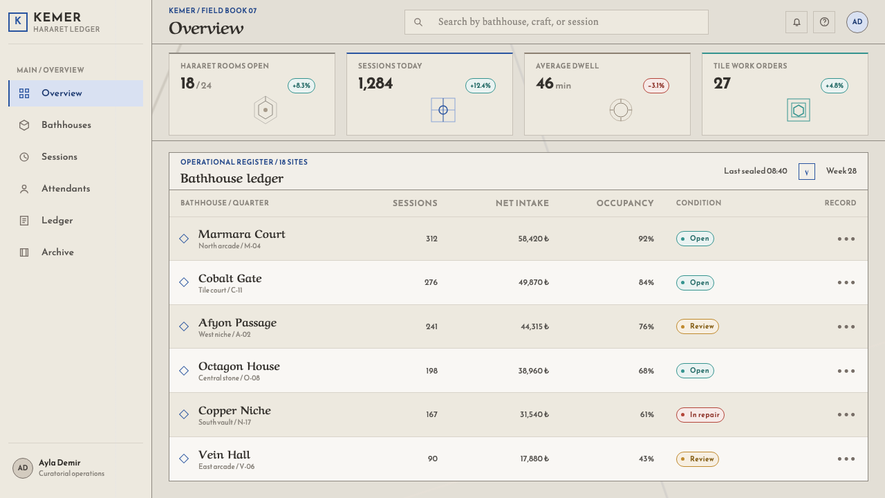
For slides, a cover can be a marble field with a bordered tile-colour panel holding the title in a sharp serif, or Arabic calligraphy as a display line when the content genuinely calls for it. Content slides are best built as symmetrical, framed layouts: a central focus, a bordered panel for each key point and grey vein lines as dividers. Data slides should use cobalt, turquoise and red as discrete bordered fields, with chart series sitting in panels rather than scattered over the page.
For web interfaces the style fits hospitality, heritage, cultural institutions, wellness with a serious tone and premium craft products. Use a warm marble ground, thin grey vein lines as separators, hard-edged cards with framed borders and sharp serif headings. Colour belongs in banner bands, badges and bordered feature panels, and buttons can use cobalt as the single primary action colour. Avoid soft shadows and glow; where elevation is needed, make it a crisp edge.
For editorial and marketing work the style supports cultural features, travel and architecture writing, museum and exhibition identities and brand stories rooted in craft. A page can use a calligraphic masthead, a column in sharp serif set like an engraved plaque and framed image panels like tile fields. Photography should be bright and hard-lit, with stone, water and pattern shown in sharp detail.
The common mistake is to treat 'hamam' as 'spa': pastel, steamy, dim and candle-lit, with soft gradients and rounded cards. This system is the opposite. Another is to scatter the İznik colours as accents across a page or to turn Arabic calligraphy into decorative wallpaper, which breaks the rule that colour is panelled and inscription has a place. Also take care with the Arabic itself: use real, correct text set by someone who can read it, never a decorative imitation of the script.
Ottoman Hamam Interior — FAQ
Is this the same as soft 'Turkish spa' styling?
No. Spa styling is dim, steamy and soft. This system is built from the opposite image: a bright, hard stone room lit by cut-edged shafts of light. Surfaces are marble with parallel grey veins, shapes have sharp edges, and nothing glows. If your design needs candlelight, pastel gradients or rounded softness, this is the wrong system.
What is the göbek taşı and why does it matter to the design?
The göbek taşı, literally the 'belly stone', is the large heated marble platform at the centre of the hot room, octagonal in form. It is the room's focal point, and bathers arrange themselves around it. In design terms it justifies centred, symmetrical compositions and octagonal framing, with one clear focus and everything else organised around it.
How should the İznik colours be used?
Treat them as tile. Cobalt, copper turquoise and Armenian-bole red belong in borders, framed panels and bands, each in its own field with a clear edge. They should not be sprinkled as general accents or mixed into gradients. The marble ground and grey veins carry the page; the tile colours arrive in organised patches on top of it.
Does it work with Latin-only content?
Yes. Latin text is set in sharp serifs, like an engraved plaque, and works well on its own inside bordered panels. Arabic calligraphy is the display voice when it is relevant to the content, but it is optional. If you do not have genuine Arabic text, do not fake it with pseudo-script; use a sharp serif headline in a framed band instead.
Can it be made in a dark version?
The source is a bright marble room, so a light base is the faithful default. A dark version is a departure, and it only works if it keeps the idea of hard light on stone: pale, sharp-edged shafts and marble veins against a deep ground, with tile colour still confined to bordered panels. Without that, it drifts toward exactly the dim, soft spa mood the style avoids.
Related design styles
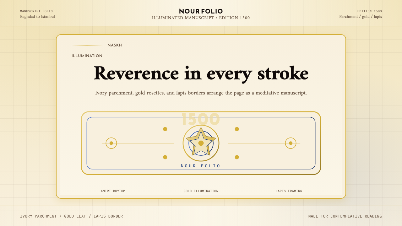 Naskh Quranic (1500)Reverence in every stroke. Ivory parchment, gold rosettes, and lapis framing.
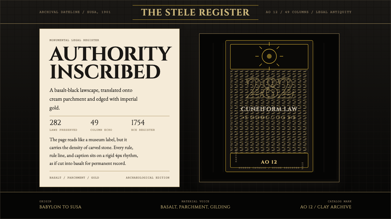 Babylonian Hammurabi SteleAuthority carved in stone. Basalt-black grids, parchment panels, and imperial…
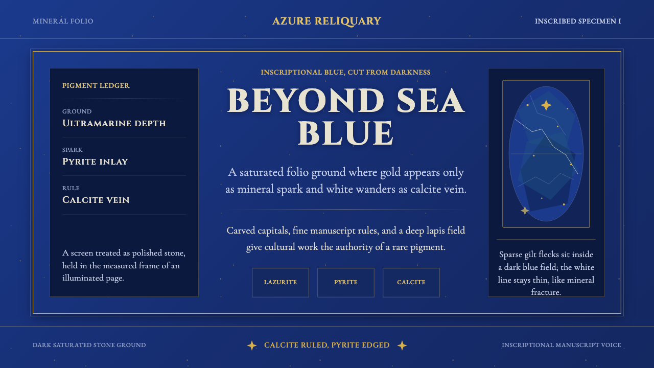 Badakhshan Lapis LazuliStone as manuscript. Ultramarine field, pyrite flecks, calcite veins, carved…
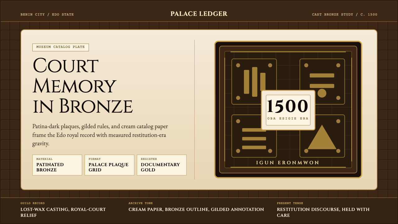 Benin Bronze (Edo, 1500)Royal memory, cast in bronze. Cream plaques and gilded lines carry museum gra…
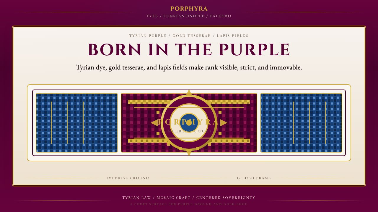 Byzantine Tyrian Purple (Imperial Court)Imperial rank made visible. Tyrian purple, gold tesserae, and centered symmet…
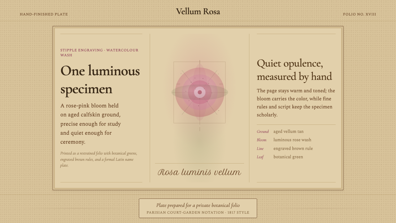 Redouté BotanicalScholarly opulence. Rose wash on aged vellum, framed by engraved brown rules.