What is Ottoman Ebru Marbling?
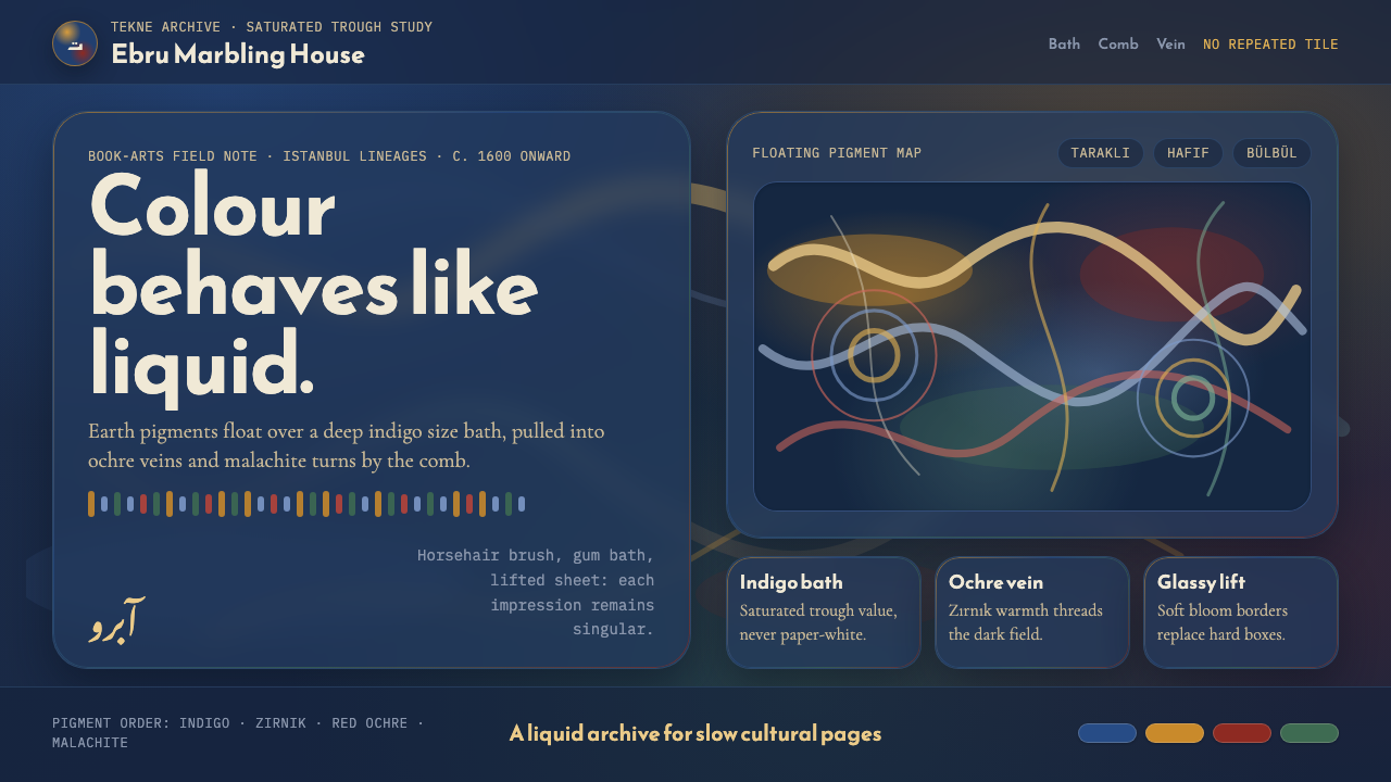
Ottoman Ebru Marbling makes color behave like water: saturated, veined, and impossible to repeat.
Ottoman Ebru Marbling in brief
Ebru is the Ottoman craft of marbling: earth pigments are floated on a gum-tragacanth bath, guided into veins and blooms with horsehair brushes and combs, then transferred to paper by laying a sheet across the prepared surface. The essential image is not a print built from repeatable units. It is a single moment in a liquid field, captured before the colors can move again.
This interpretation reads ebru at the saturated depth of the tekne, or marbling bath, rather than at the paler value of the finished paper sheet. A deep indigo-slate field carries yellow zırnık veins, red ochre currents, and malachite green passages. The palette is dense but not mechanically controlled: colors meet, divide, drift, and retain the visual memory of the gestures that shaped them.
The style belongs to Ottoman ebru marbling and to the wider world of Islamic book arts, particularly calligraphic and hilye border decoration. Its visual authority comes from a productive tension: the work is highly disciplined in process, yet the final composition refuses the rigid grid, mirrored symmetry, and repeated motif expected of many decorative systems.
Where does Ottoman Ebru Marbling come from?
The source tradition is Ottoman Turkey, centered in Istanbul and connected to the Middle East. By around 1600, ebru was present within Ottoman court culture and dervish traditions, where knowledge was sustained through master lineages rather than detached from practice as a purely visual style. Its continuity matters: this is a living craft, not simply a historical surface treatment.
Its procedure explains its appearance. Pigment is first made buoyant on the thickened bath. Horsehair brushes introduce color without flattening it into a uniform coating; combs draw through the surface and turn floating deposits into veins, feathered passages, nests, and flower-like forms. A paper sheet receives the image only after the composition has been shaped on water. The transfer preserves both intentional guidance and the unpredictable behavior of liquid material.
The Ottoman vocabulary includes taraklı comb patterns, hafif feathered effects, bülbül yuvası or nightingale-nest forms, and floral motifs associated with tulips and carnations. These names describe recognizable modes of movement rather than a fixed template library. Each sheet remains singular because the bath, pigment, tool, and gesture never meet in precisely the same way twice.
Ebru also developed in collaboration with hattat practitioners, joining marbled surfaces to the world of calligraphy and hilye decoration. The colored field could frame, surround, or heighten written work without competing with its legibility. UNESCO recognition identifies the craft as a continuing cultural practice, and workshops in Istanbul through the 2020s keep its material vocabulary active rather than merely archival.
What defines the Ottoman Ebru Marbling look?
The Saturated Bath
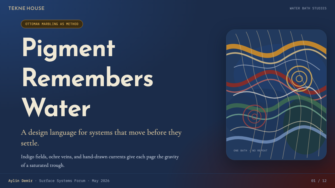
The defining ground is a deep indigo-slate bath rather than a pale paper field. This makes the style feel submerged, nocturnal, and materially dense. The darkness is not empty background; it is the liquid body in which every other color remains suspended. Lighter veins should appear to emerge from within it, not sit crisply on top of it like printed stripes.
Veins and Currents
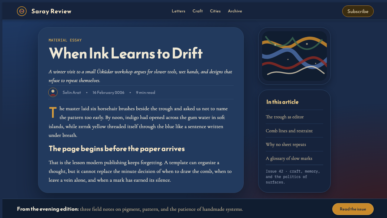
Indigo, zırnık yellow, red ochre, and malachite green move as currents rather than as isolated fills. Their boundaries bend, branch, narrow, and expand with the logic of pigment on water. A useful composition preserves unevenness: some passages gather into dense knots, while others open into quieter pools. The result should feel guided, never diagrammed.
Glassy Bloom Edges
Bloom edges are soft, translucent in feeling, and continuously negotiated by neighboring colors. They do not resemble a hard vector contour or a blurred digital halo. Instead, they suggest the thin surface tension of a bath: color holds its territory for a moment, then yields to the pressure of another color. That tension gives the marbling its glassy, living edge.
No Repeating Tile
Ebru rejects the visual expectation of a tiled decorative pattern. Motifs may recur as families of motion, but no unit should line up, mirror itself, or return at regular intervals. The eye should be able to travel through the field without finding a seam. Repetition can be suggested by rhythm, never delivered as a cloned motif.
Comb, Brush, and Gesture
The visual marks should imply tools moving through a fluid surface. Fine drawn channels recall comb teeth; broader swells suggest a brush introducing or redirecting pigment. This is not painterly expression in the usual sense. The gesture is indirect, mediated by the bath, which gives every line a slight delay, drift, and resistance.
Floral Emergence
Tulip and carnation forms can emerge from the marbled field, but they should feel discovered in the motion rather than pasted onto it. Taraklı, hafif, and bülbül yuvası provide a more faithful structural reference than generic floral decoration. Flowers remain part of the liquid system: their stems, petals, and surrounding currents share the same drifting origin.

Who shaped Ottoman Ebru Marbling?
Ottoman ebru masters carried the practical knowledge of preparing the bath, floating pigment, and directing it with brushes and combs. Their role is central because the craft depends on embodied judgment: the visual result cannot be separated from how the liquid surface is handled.
Dervish-lodge lineages form one of the traditions through which ebru was sustained. They locate the craft within an Ottoman cultural world where disciplined making, transmission, and contemplative attention were connected rather than treated as separate concerns.
Hattat–ebru collaborators joined calligraphy to marbling in Islamic book arts and hilye border decoration. Their work demonstrates that ebru can supply atmosphere, framing, and material depth while written language retains the visual priority needed for reading.
How do you use Ottoman Ebru Marbling today?
For presentation covers, use the marbled field as an immersive visual ground rather than as a decorative border. Let a single calm title block sit over a quieter region of the bath, while denser veins collect toward an edge or corner. On content slides, treat marbling more sparingly: use cropped fragments to separate sections or frame a quotation, leaving the main reading area stable and calm. Data slides benefit from the same restraint; charts should remain lucid, with marbling used as contextual atmosphere rather than as a competing information layer.
For web interfaces, the style is strongest in editorial dashboards, collection pages, and premium pricing or membership experiences that need material richness without conventional ornament. Keep navigation and controls legible against relatively quiet portions of the field. Use the marbling to establish depth, category atmosphere, or transitions between major areas, not as a continuously animated-looking texture behind dense controls. A controlled dark field and a clear reading surface can coexist without making the interface feel tiled.
For editorial and marketing work, ebru suits covers, event identities, cultural programming, book-oriented pages, and campaigns that benefit from a sense of lineage and singularity. Crop the artwork generously so that individual veins have room to travel. Pair it with a measured typographic system whose letters do not imitate the marbling. The contrast between controlled text and liquid color is more persuasive than forcing every element into ornamental movement.
The common mistake is to treat Ottoman ebru as a generic swirl background or an interchangeable dark watercolor effect. That removes the craft's specific logic: floating pigment, comb-guided paths, glassy bloom edges, and nonrepeating motion. Avoid perfect symmetry, looped patterns, overly crisp contour lines, and decorative flowers detached from the surrounding currents. The design should feel like a moment taken from a bath, not a wallpaper generated from a motif.
Ottoman Ebru Marbling — FAQ
Is Ottoman Ebru Marbling simply a watercolor style?
No. Watercolor describes a broad family of pigment effects on paper, while ebru begins before paper is involved: pigment floats on a prepared gum-tragacanth bath and is shaped on the liquid surface. Its characteristic veins, comb channels, and bloom edges come from that floating process. The paper records the composition after it exists in the bath.
Why should the palette be read as dark and saturated?
This interpretation deliberately takes its visual cue from the tekne rather than from the pale printed sheet. The deep indigo-slate bath gives yellow, ochre, and green veins a submerged intensity and makes color appear to move through a liquid body. A pale interpretation can still reference marbling, but it does not express the saturated trough-value premise of this system.
Can an ebru-inspired layout use a grid?
Yes, especially for text, navigation, and data. The grid should organize information rather than force the marbling itself into repeated compartments. Let the interface or page structure remain stable while the marbled field crosses, enters, or recedes around it. The important distinction is between a readable framework and a tiled imitation of liquid motion.
How should floral motifs be handled?
Use tulip and carnation forms as emergent results of the marbling process, not as separate stickers placed on a swirling background. The most convincing floral passages retain visible kinship with nearby veins and feathered currents. Taraklı, hafif, and bülbül yuvası are useful references because they preserve the craft's own vocabulary of movement.
Related design styles
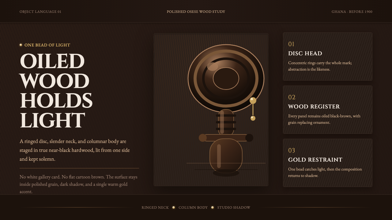 Akuaba Akan Fertility DollDarkness becomes sculpture. Near-black wood, ringed geometry, and one gold be…
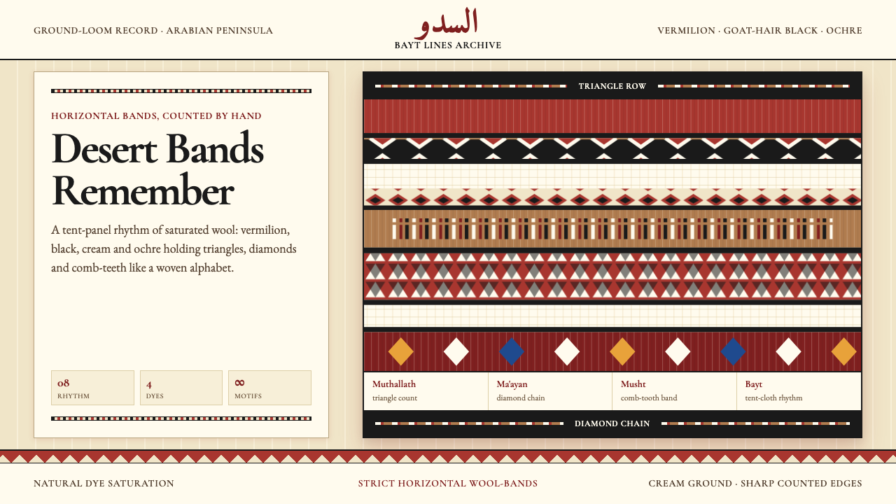 Bedouin Desert Textile (Sadu)Woven memory, not ornament. Vermilion-black bands count triangles and diamond…
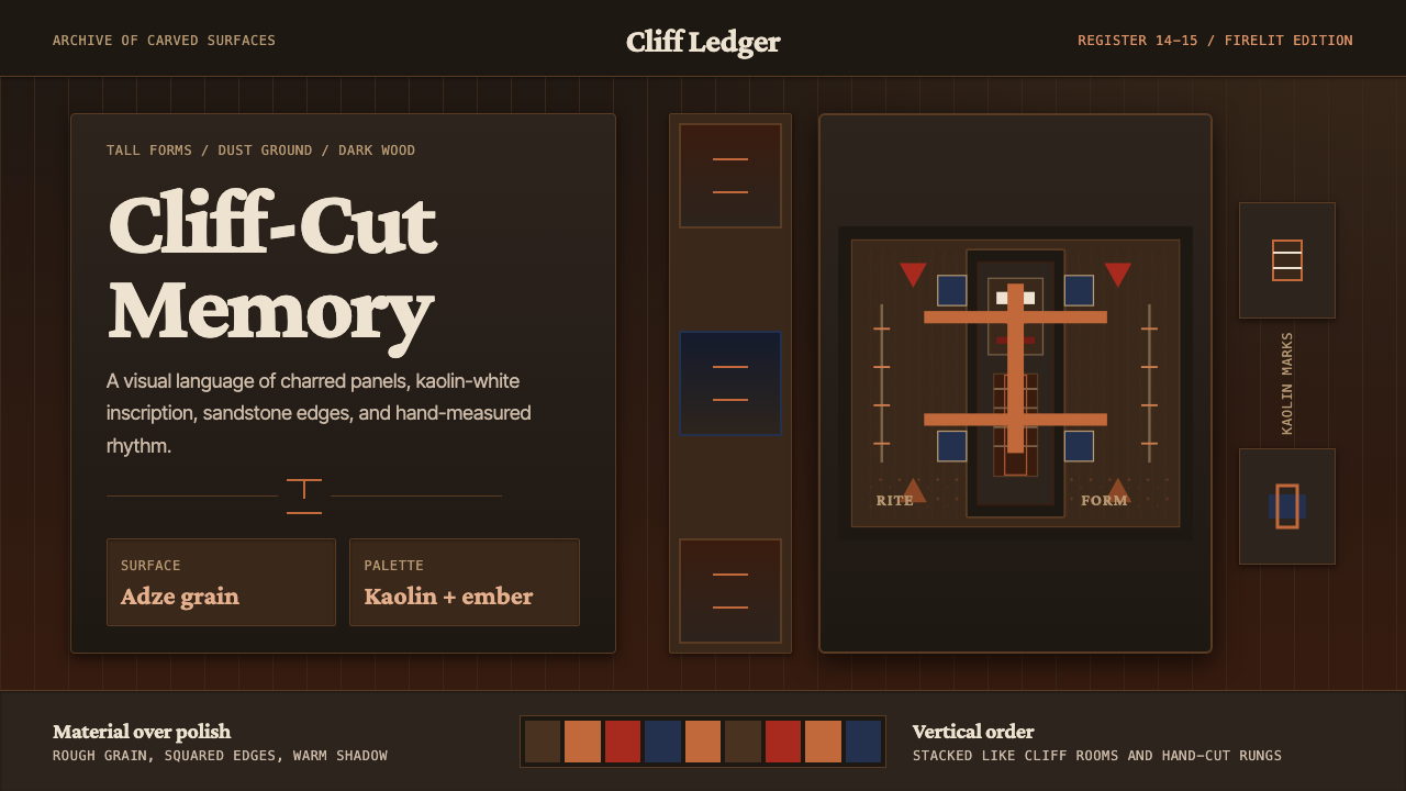 Dogon Bandiagara Cliff MaskHand-hewn gravity. Charred wood, kaolin type, and sandstone geometry stack li…
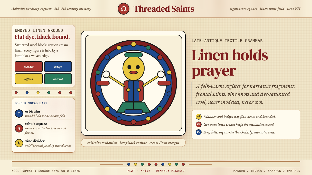 Egyptian Coptic TextileWarmth woven flat. Madder, indigo and saffron medallions sit on linen cream.
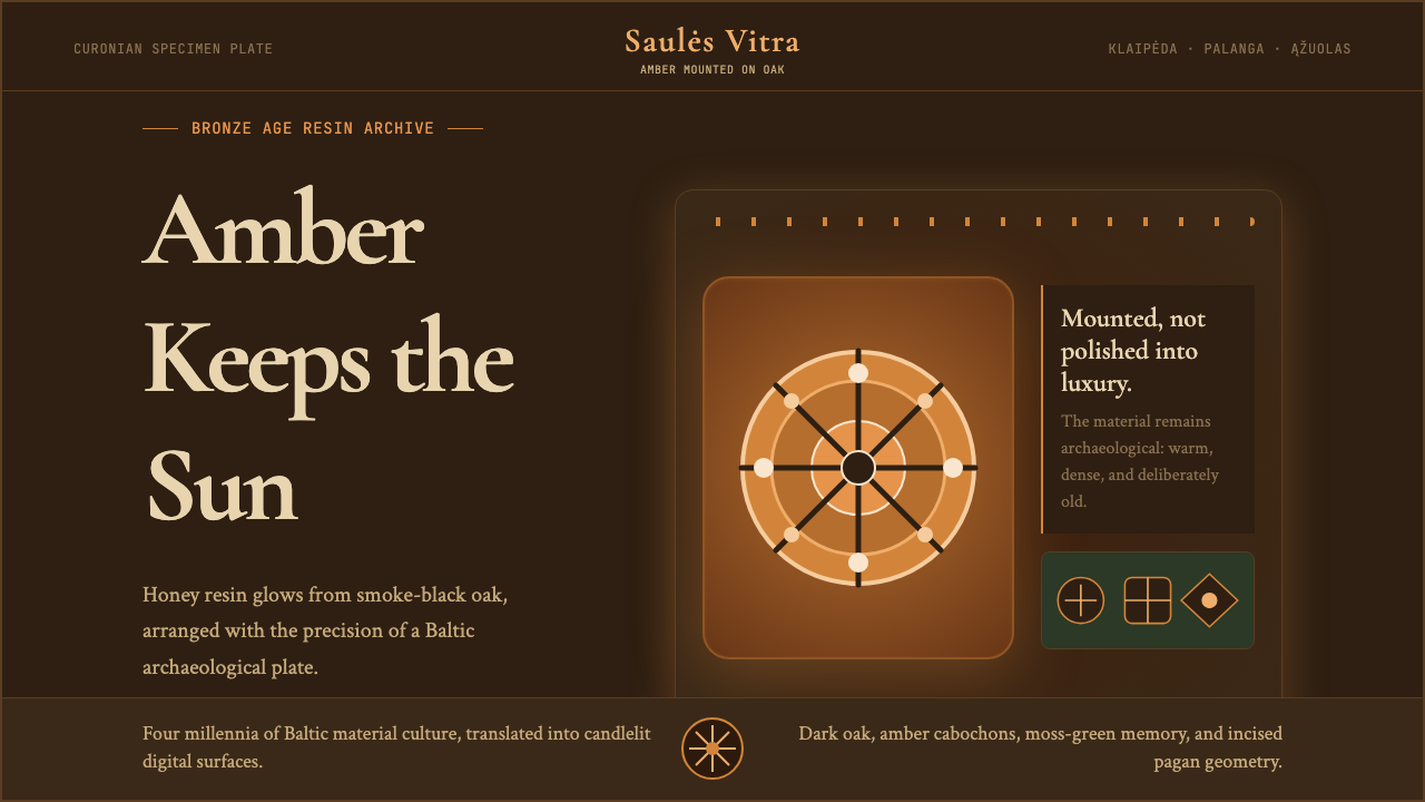 Lithuanian Amber (Baltic Pagan)Ancient amber glows. Honey resin on smoked oak, framed by saulė geometry.
 Rapa Nui Rongorongo GlyphThe unread glows. Pale-gold incisions alternate across scorched rosewood rows.