What is Humanist NGO Report?
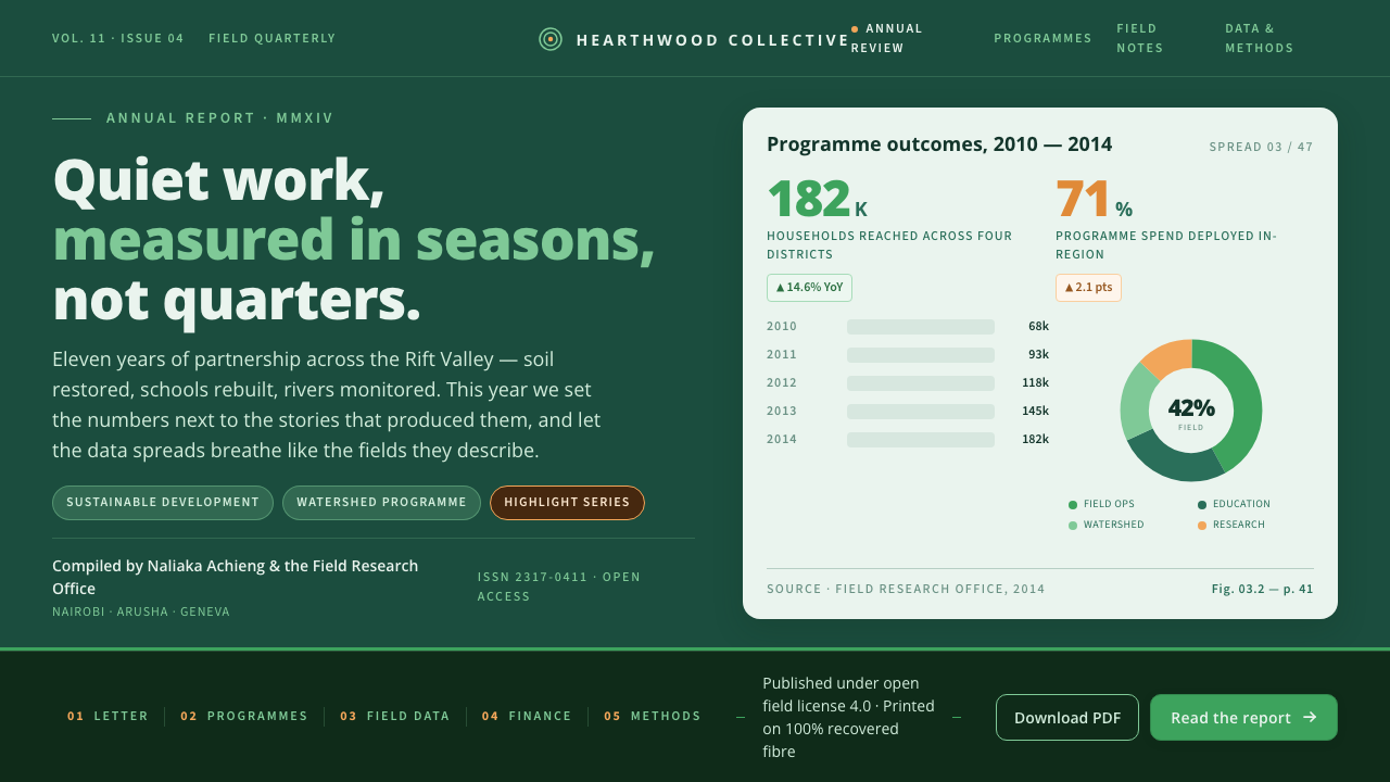
Humanist NGO Report makes development data feel legible, grounded, and humane: a field-green public face, warm chart signals, and generous room for readers to think.
Humanist NGO Report in brief
Humanist NGO Report distills the friendly visual language associated with sustainable-development annual reports from the 2010s, particularly the publications of UN agencies and global nonprofits. It is a reporting style designed for subjects that can otherwise feel remote or overwhelming: development indicators, environmental progress, program reach, and institutional accountability. Rather than making data look technical for its own sake, it makes data approachable enough to invite attention.
Its public-facing expression begins with a saturated deep field-green cover. The color suggests landscape, continuity, stewardship, and seriousness without adopting the hard severity of a conventional corporate report. Warm orange appears primarily in charts and emphasis points, where it acts as a human, energetic counterweight to the green field. A lighter leaf-green extends the environmental identity and helps interior pages move from the gravity of the cover toward a more open reading experience.
The system is anchored by Open Sans, Steve Matteson’s upright humanist sans-serif for Google, released in 2011. Large, readable headings, clean bar and donut charts, and substantial whitespace give figures a calm pace. Chart-led interior spreads shift onto an airy pale green-white ground, making comparison easier while preserving a visual connection to the environmental and development context established at the front of the report.
Where does Humanist NGO Report come from?
The style belongs to the reporting culture that gathered around global development and sustainability communication in the 2010s. In the Africa and global development reporting context, institutions needed documents that could speak to partners, funders, public audiences, and communities without treating any one of them as a specialist. The visual problem was therefore not simply to display evidence, but to make evidence readable, credible, and emotionally proportionate.
Open Sans supplied an especially useful typographic foundation. Released in 2011 and designed by Steve Matteson for Google, it is an upright humanist sans-serif whose tone avoids both ornamental personality and mechanical coldness. In this report idiom, that balance matters: text must carry institutional information clearly, while still feeling open enough for readers moving between narrative explanation, chart labels, summaries, and calls for collective attention.
The visual idiom developed through the overlap of humanist sans-serif typography, NGO and UN data reporting, and information design. Its field-green, orange, and leaf-green relationships make environmental and development subject matter visible before a reader reaches the first metric. Its pale interior grounds then create a distinct working surface for data, where charts can do explanatory work without competing against the cover’s stronger symbolic atmosphere.
What defines the Humanist NGO Report look?
Field-Green Authority
A saturated deep field-green carries the strongest visual weight, especially on covers and opening statements. It establishes seriousness through association with land, ecology, and long-term stewardship rather than through institutional stiffness. The effect is public-minded and grounded: a report that asks to be trusted without appearing distant.
Warm Data Accent
Warm orange is reserved for chart accents, focal values, and moments that need momentum. Against green, it prevents development reporting from becoming visually solemn or monotonous. The accent should clarify a comparison, a change, or a point of attention; when it is spread indiscriminately across a page, it loses its explanatory force.
Leaf-Green Continuity
A lighter leaf-green broadens the palette without breaking the environmental identity. It can support secondary information, quiet separations, and transitions between the dark public face and the light analytical interior. Its role is connective rather than dominant, giving the report a sense of growth and continuity across sections.
Humanist Readability
Open Sans gives the system an upright, accessible voice. Its humanist construction softens the administrative character that dense reporting can acquire, while remaining clear enough for headings, explanatory text, labels, and numerical context. Typography is not ornamental here; it is the mechanism that lets institutional language remain hospitable.
Breathing Room
Generous whitespace is a functional part of the reporting method. It separates claims from evidence, gives charts visual boundaries, and lets large headings establish a reader’s orientation before detail arrives. The emptiness is not luxury; it is a refusal to make information compete with itself.
Airy Chart Spreads
Interior chart spreads move to a pale green-white ground, where bars and donuts can be read as clear shapes rather than decoration layered over a dark field. The contrast between cover and interior creates a useful rhythm: the cover declares purpose, while the pale spread invites examination. Charts feel calm, clean, and answerable.
Who shaped Humanist NGO Report?
Steve Matteson designed Open Sans for Google, and its 2011 release supplies the typographic basis for this visual idiom. The typeface’s upright humanist character is central to the style’s promise that institutional information can remain direct, readable, and welcoming.
Open Sans functions as more than a font choice in this system. It connects headings, explanatory copy, labels, and data context into one consistently approachable voice, allowing the color and chart system to carry emphasis without forcing typography into theatrical display.
Information design provides the operational logic of the report: charts are explanatory devices, whitespace creates order, and visual emphasis is assigned where interpretation needs help. It keeps the environmental palette from becoming branding alone by making every major visual decision answer to reading.
How do you use Humanist NGO Report today?
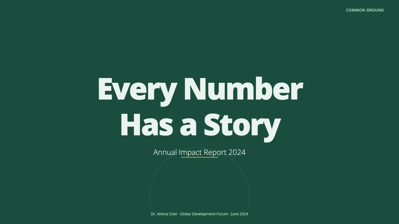
For presentation covers, Humanist NGO Report works best when the deep field-green establishes a confident public face and the title has generous room around it. Use the warm orange as a single signal for a key finding, program theme, or data marker, rather than turning the cover into a collection of competing accents. Content slides should remain open and typographic, with headings leading readers toward short explanations and clearly separated evidence.
Data slides are the style’s natural strength. Move charts onto the airy pale green-white ground and make bar and donut forms clean enough to compare at a glance. Let orange indicate the most relevant movement or priority, while green maintains the report’s broader identity. Supporting labels should sit close to the evidence they explain, and space should make it obvious which elements belong together.
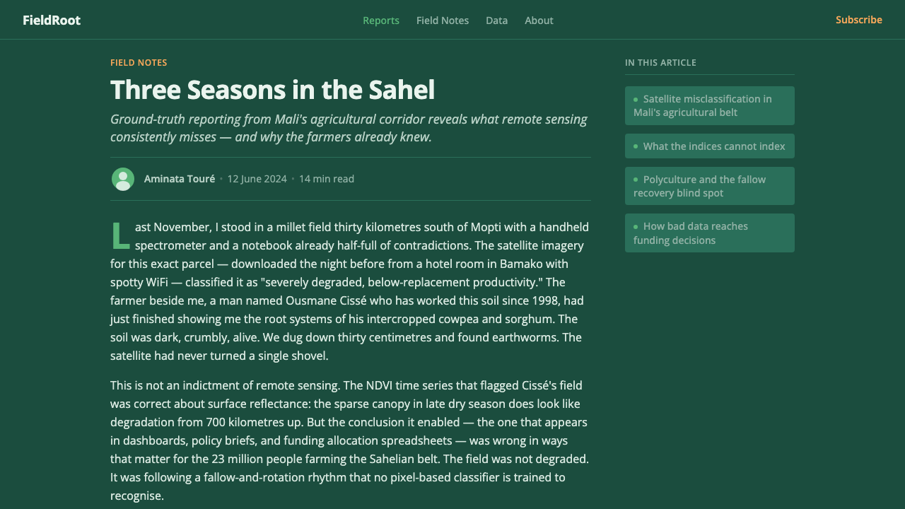
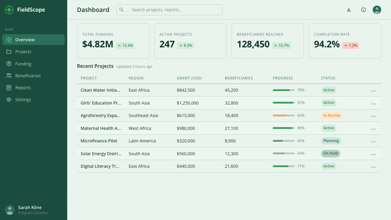
For web interfaces, this language suits public dashboards, impact reports, and pricing or support pages where trust depends on scannability. A deep-green opening area can frame purpose and navigation, while lighter analytical surfaces hold charts, summaries, and filters. Open Sans keeps dense interface language approachable. Use the orange sparingly for active attention, important states, or a focused action rather than as general decoration.
In editorial and marketing work, the style is effective for annual-report landing pages, campaign summaries, and program stories that need both institutional credibility and human warmth. Let a strong green field introduce the subject, then alternate it with pale, chart-friendly sections where claims can be substantiated. The common mistake is to mistake the palette for the whole style: adding green and orange to crowded layouts does not create clarity. The style depends on readable type, breathing room, and charts that explain rather than merely decorate.
Humanist NGO Report — FAQ
Is Humanist NGO Report only appropriate for environmental organizations?
No. Its green identity makes it especially natural for sustainability and development topics, but its underlying method is broader: accessible typography, calm analytical surfaces, and chart accents with a clear purpose. It can serve any public-interest report that needs to make evidence approachable, provided the environmental associations of the palette fit the subject.
Why use a pale interior after a deep-green cover?
The contrast assigns different jobs to different parts of the report. Deep field-green introduces purpose, identity, and seriousness; the pale green-white interior creates an analytical field where charts and labels can be examined without visual pressure. The change is not a break in the system but a deliberate shift from declaration to reading.
Can the warm orange be used throughout every chart?
It can appear consistently, but it should not carry every value. Its strength comes from selective emphasis: a relevant change, a key comparison, or the point that merits attention. If every bar, segment, and label receives the same warm accent, readers lose the visual cue that tells them where interpretation matters most.
What makes the style humanist rather than merely corporate?
Its humanist quality comes from treating readability as a form of respect. Open Sans is clear without sounding rigid, whitespace gives complex material time to be understood, and charts are allowed to explain rather than perform. The result can still be institutionally credible, but it addresses readers as people who need orientation, not as audiences to be impressed.
Related design styles
 Shake Shack (Green-Chartreuse)Friendly premium, never loud. Chartreuse on warm cream with tight modernist t…
 Jasper Morrison Super NormalRefuses spectacle. Matte greige ground, plain Helvetica, gentle 20px radii —…
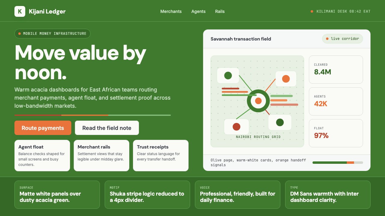 Nairobi Silicon SavannahWarm fintech confidence. Acacia green, orange shuka bands, and matte SaaS car…
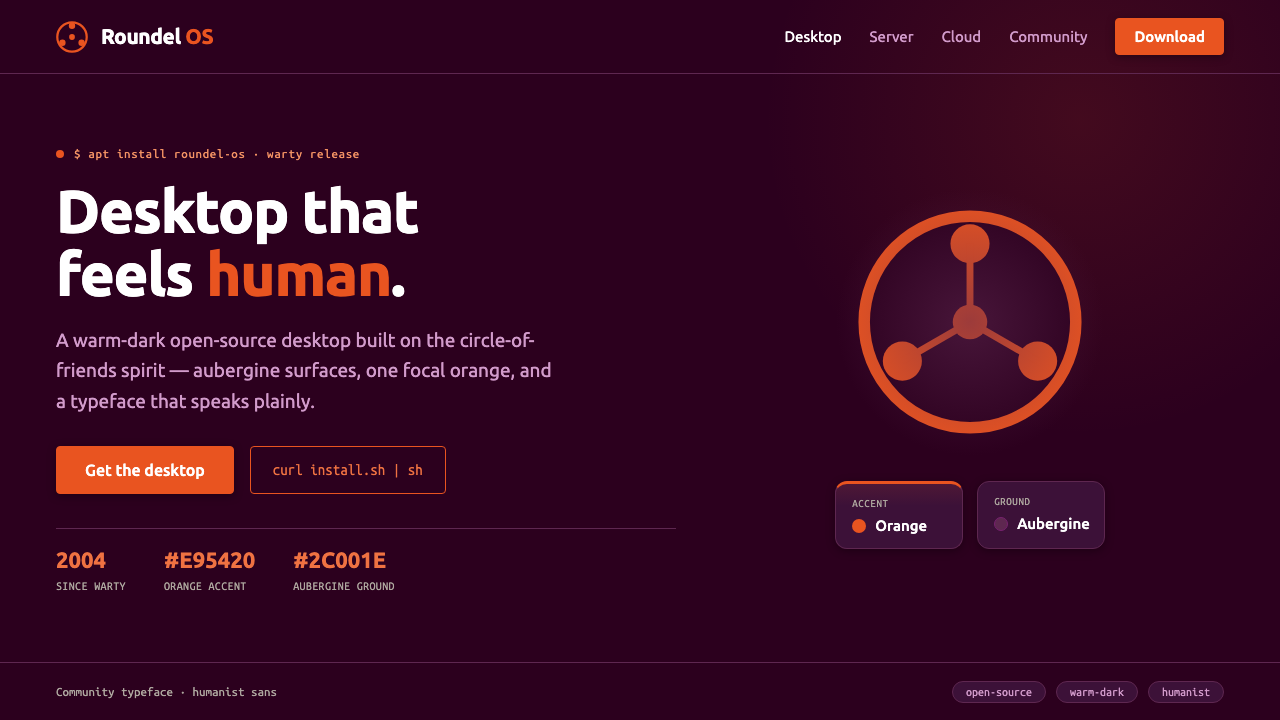 Ubuntu Linux BrandLinux that feels human. Aubergine ground, one focal orange circle-of-friends,…
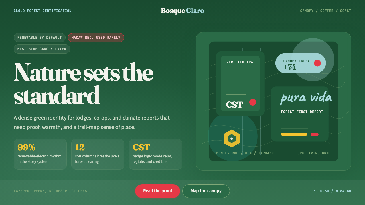 Costa Rica Pura Vida EcoAlive without greenwash. Cloud-forest green, Fraunces serif, and scarlet acce…
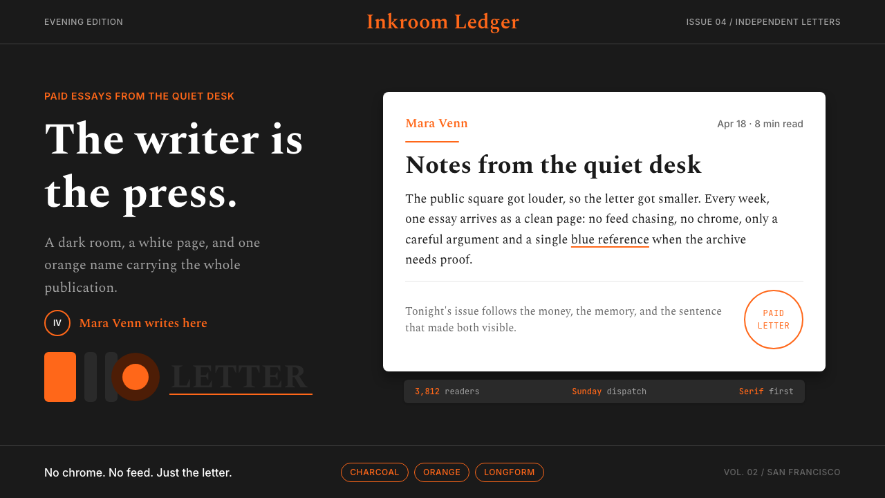 Substack Orange NewsletterLit page, dark room. Orange serif bylines ignite white cards on charcoal.