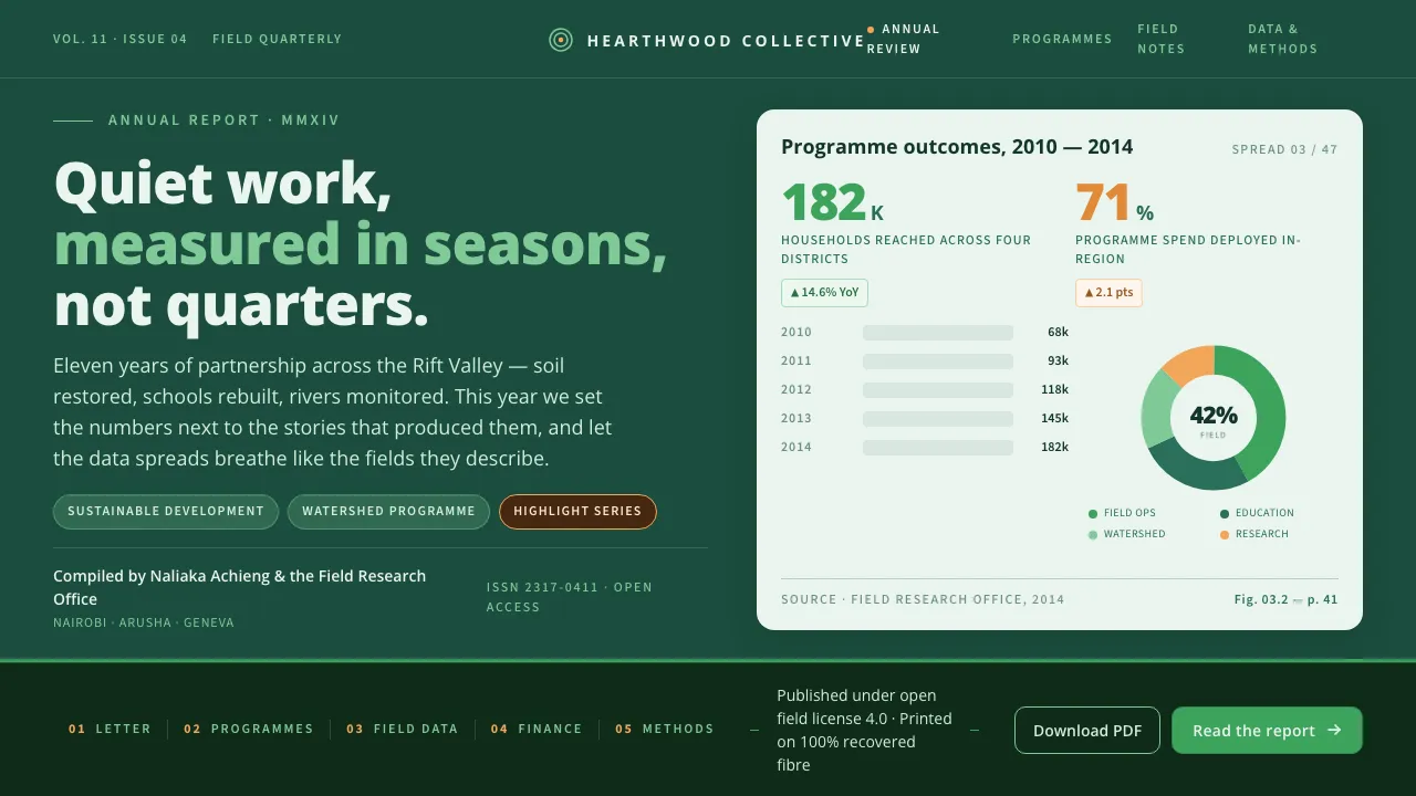
About Humanist NGO Report
Humanist NGO Report distills the friendly visual language of 2010s sustainable-development annual reports — the kind published by UN agencies and global nonprofits. A saturated deep field-green covers the page; warm orange chart accents and a light leaf-green carry the development-and-environment identity.
The system is built on Open Sans, the upright humanist sans Steve Matteson designed for Google in 2011. Generous whitespace, clean bar-and-donut charts, and large readable headings give data room to breathe, while interior chart spreads switch to an airy pale green-white ground.
- Origin
- Africa / global development reporting context
- Era
- 2011 (Open Sans released); visual idiom ~2012–2018 NGO/UN reporting
- Key figures
- Steve Matteson
- Movements
- Humanist sans-serif · NGO/UN data reporting · Information design
Humanist NGO Report design spec
Colors
Typography
The other 11 sections — buttons, cards, spacing, motion, techniques and more — open once you unlock. Download the DESIGN.md or send it to your AI in one click. Unlock once, yours forever.
Sign up nowStyles similar to Humanist NGO Report
Also inspired by print & type, with a close feel.
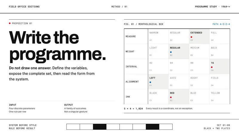 Karl Gerstner ProgrammesDesign becomes a programme. Black hairlines and a strict matrix turn parameters into form.
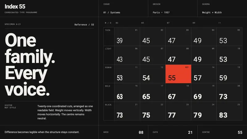 Univers Frutiger Numbered GridDifference becomes a system. Numbered grey type locks to a dark grid, with one red centre.
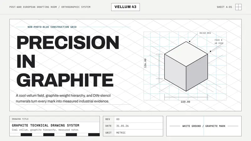 Graphite Technical DrawingDrafting-room precision. Non-photo-blue grid and graphite DIN lettering do the work.
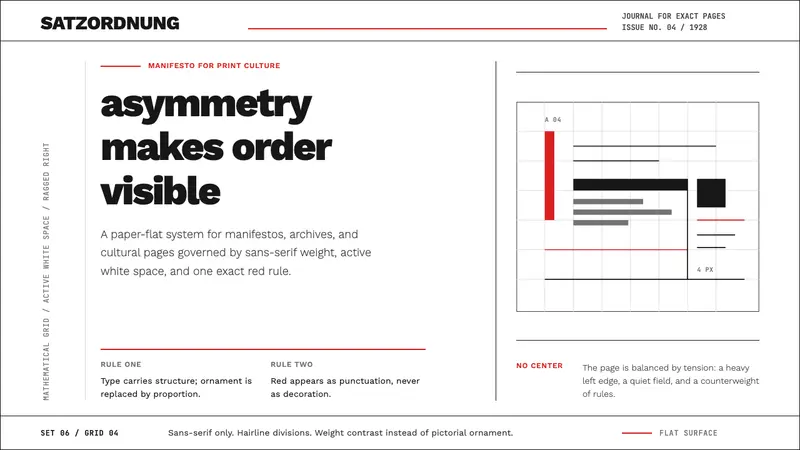 New Typography (Tschichold 1928)Tschichold's 1928 doctrine in CSS. Asymmetric grid, hairline rules, red-and-black as only ornament.