What is Ubuntu Linux Brand?
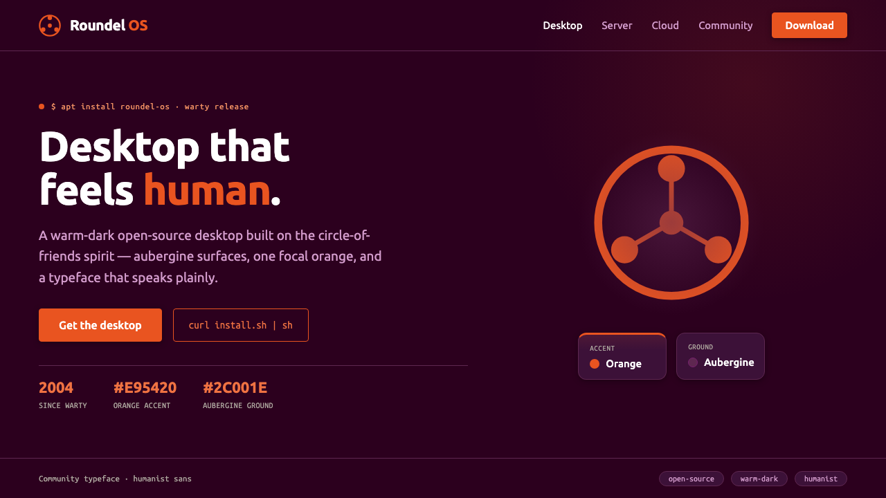
Ubuntu made Linux feel human — a deep aubergine world, one warm orange circle of friends, and typography that speaks with open-source confidence rather than technical distance.
Ubuntu Linux Brand in brief
Ubuntu is the most recognizable face of desktop Linux, launched by Canonical in 2004. Its identity is built around a deep Canonical aubergine ground, a warm Ubuntu Orange circle-of-friends mark, and a rounded humanist typeface. The result is a dark, welcoming system that feels technical without becoming cold.
The brand’s central idea is community. The circle-of-friends symbol depicts three figures joining hands in a roundel, turning an abstract open-source principle into a simple human gesture. It gives Ubuntu a visual center that is memorable at a glance and emotionally legible even to people unfamiliar with Linux.
Ubuntu’s character depends on restraint. Aubergine carries the environment, orange supplies the focal moment, and typography provides the voice. There is little need for decorative imagery or competing accents: the identity works because one dark field, one communal symbol, and one distinctive type style repeat with confidence.

Where does Ubuntu Linux Brand come from?
Ubuntu emerged in 2004 as Canonical’s contribution to open-source desktop Linux. From its beginning, the project needed to communicate more than software capability. It had to make Linux approachable to people who might associate open-source systems with specialist knowledge, command lines, or institutional technology. The brand therefore framed technical freedom through a warmer and more social visual language.
The identity’s regional story is global and internet-based, with Canonical’s South African and UK roots. That combination matters less as a literal national motif than as a sign of Ubuntu’s intended reach: the brand is not built around a local craft tradition or a single physical place, but around a worldwide digital community connected through shared software.
The circle-of-friends mark gives that community a recognizable emblem. Three figures join hands inside a circular arrangement, creating a symbol that is both human and diagrammatic. It avoids the coldness of an abstract technical icon while remaining simple enough to work as a compact sign across the operating system, promotional material, and digital interfaces.
In 2010, Dalton Maag designed the Ubuntu typeface, which became the system’s default voice. Its humanist construction is rounded, open, friendly, and still professional. A later brand refresh in 2014 established the orange used in the current identity, preserving the relationship between the deep aubergine ground and the single warm accent while giving Ubuntu a more settled and recognizable visual presence.
What defines the Ubuntu Linux Brand look?
Aubergine Ground
Deep aubergine is not a background added after the fact; it is the atmosphere of the identity. It creates a warm-dark field in which the orange mark and light typography can carry unusual clarity. The color feels more human than pure black and more distinctive than a neutral navy or grey.
Single Orange Focus
Ubuntu Orange is used as a decisive focal accent rather than a broad decorative palette. Its warmth draws attention to the circle-of-friends mark and can guide emphasis elsewhere without competing with the aubergine field. The effect is energetic but controlled.
Circle of Friends
The mark is a roundel formed by three linked human figures. Its circular structure suggests continuity and belonging, while the joined hands make the idea of community immediately visible. It is symbolic without becoming complicated, and personal without becoming informal.
Humanist Typography
The Ubuntu typeface gives the system a voice that is rounded, open, and approachable. Its forms soften technical language without making it childish, allowing headings, interface labels, and longer passages to feel part of the same welcoming environment. Typography is therefore a central brand asset, not a neutral carrier.
Warm-Dark Contrast
Ubuntu builds contrast through temperature as much as lightness. The deep ground establishes seriousness and depth; the orange mark introduces warmth; the humanist typeface prevents the darkness from becoming forbidding. This balance makes the identity feel capable, contemporary, and socially open.
Open Digital Atmosphere
The system feels native to the internet rather than to a physical luxury object or a nostalgic print tradition. Its visual language is clean, repeatable, and suited to software surfaces, while the communal symbol keeps it from feeling purely functional. The identity presents open source as a lived social environment.
Who shaped Ubuntu Linux Brand?
Mark Shuttleworth is listed among Ubuntu’s key figures and is associated with the project’s early identity as it launched through Canonical in 2004. His place in the story represents the ambition to make open-source desktop Linux feel accessible, global, and recognizably human.
Dalton Maag designed the Ubuntu typeface in 2010. The typeface became the system’s default voice and gave the brand its rounded, open, friendly, and professional humanist character.
Canonical launched Ubuntu in 2004 and shaped the identity around a global open-source desktop Linux project. Its contribution is visible in the consistent relationship between aubergine, orange, the circle-of-friends mark, and Ubuntu typography.
How do you use Ubuntu Linux Brand today?
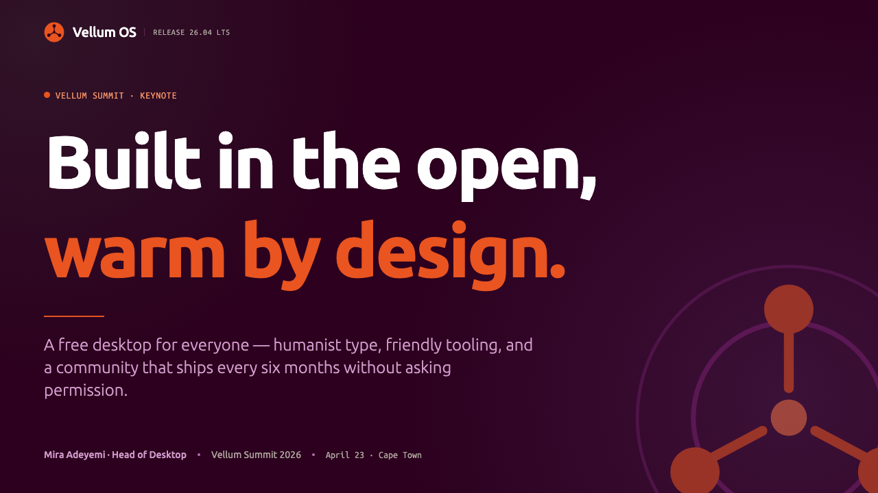
For presentation slides, Ubuntu works best when the cover treats aubergine as a full atmospheric field and gives the orange circle-of-friends mark a clear focal position. Content slides should keep the same dark environment, using the humanist typeface to establish hierarchy through scale, spacing, and weight rather than decorative rules. Data slides benefit from the same discipline: let the information remain primary, and use orange as the meaningful highlight rather than turning every chart element into an accent.
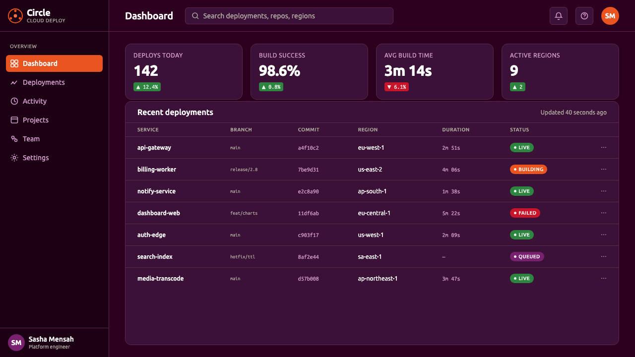
For web interfaces, the identity suits dashboards, developer tools, software documentation, and pricing pages that need to feel capable without becoming intimidating. Aubergine can hold navigation and major surfaces, light type can carry dense information, and orange can identify action, selection, or the most important state. Rounded typography and restrained use of the community mark help technical products retain a sense of welcome.
For editorial and marketing work, Ubuntu supports a strong contrast between serious dark fields and warm moments of orange. Feature pages can open with a large aubergine composition, a concise humanist headline, and the circle-of-friends symbol used as a social anchor. Campaigns, launch announcements, and community stories should emphasize participation and connection, allowing the identity’s warmth to emerge through language and image selection rather than through an accumulation of decorative effects.
A common mistake is to treat Ubuntu as a generic dark theme with orange buttons. That approach loses the relationship among atmosphere, symbol, and voice. Another failure is to scatter orange across every surface or replace the humanist typeface with an unrelated technical face. The system is strongest when aubergine remains the environment, orange remains selective, the circle-of-friends mark remains meaningful, and typography carries the welcoming tone consistently.
Ubuntu Linux Brand — FAQ
What makes the Ubuntu brand recognizable?
Recognition comes from the combination rather than from one isolated asset: deep aubergine as the ground, a warm orange focal accent, the circle-of-friends mark, and rounded humanist typography. Together they form a warm-dark identity that is both technical and communal.
Why does Ubuntu use a dark aubergine ground instead of pure black?
Aubergine provides darkness and seriousness without the absolute severity of black. Its warmer, more distinctive character gives the interface emotional room, allowing the brand to feel capable and contemporary while remaining open and approachable.
What does the circle-of-friends mark mean?
It represents three people joining hands in a circular arrangement, symbolizing community and connection. The mark turns the social ideal of open source into a simple human image that can be understood quickly and remembered easily.
Why is the Ubuntu typeface important to the identity?
The typeface is the brand’s spoken voice in visual form. Designed by Dalton Maag in 2010, it made the system feel rounded, open, friendly, and professional. Without it, the colors and symbol could remain recognizable but would lose much of the identity’s human tone.
Can the Ubuntu identity work on a light background?
It can, but the dark aubergine ground is the strongest expression of the system’s established character. On a light field, aubergine should remain present as a major structural element, while orange should stay selective. If both the dark ground and orange become incidental, the identity will drift toward a generic software palette.
Related design styles
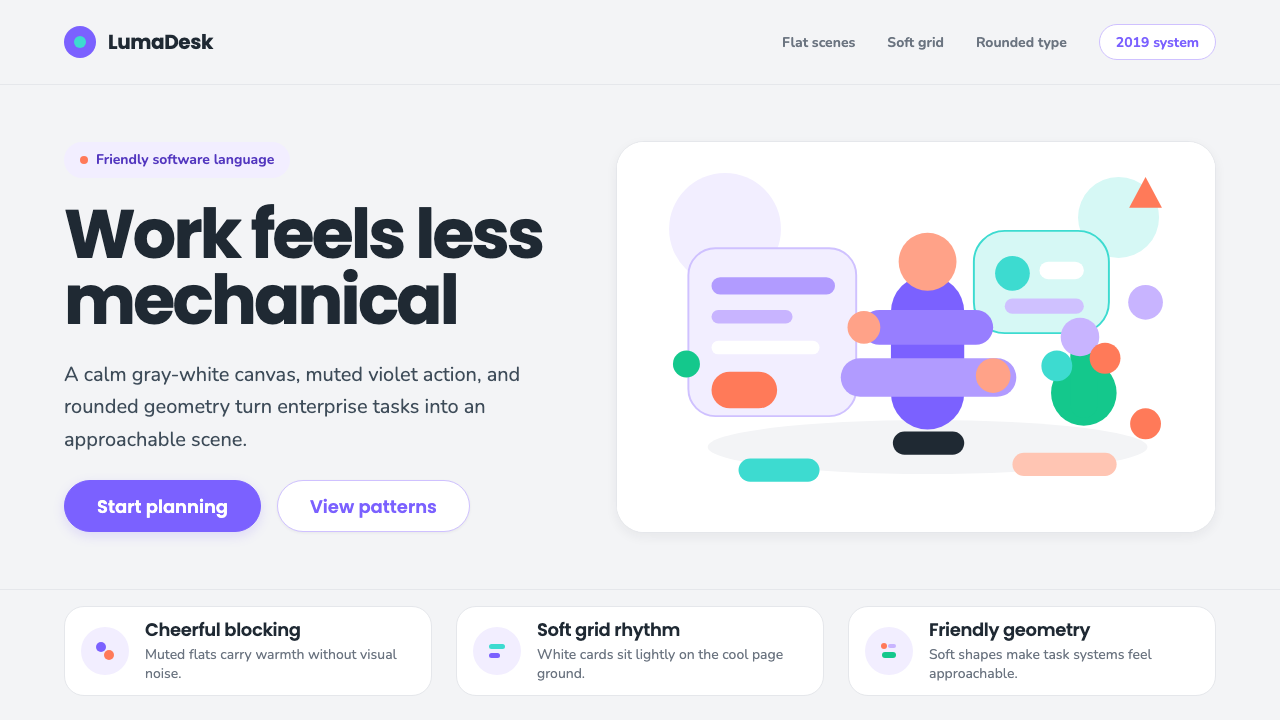 Corporate Memphis (Alegria)Friendly by design. Violet flats and rubber-hose geometry soften the SaaS gri…
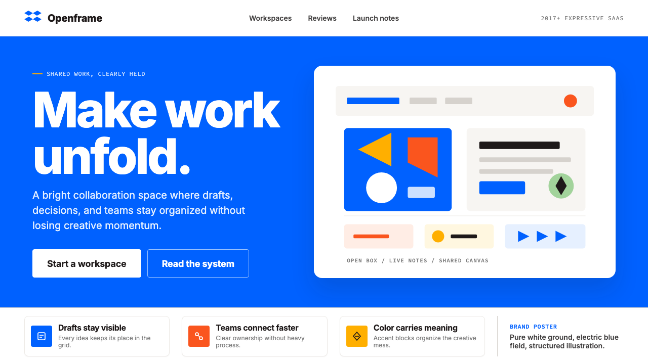 Dropbox ModernFriendly SaaS gets loud. Electric blue and Sharp Sans drive a structured geom…
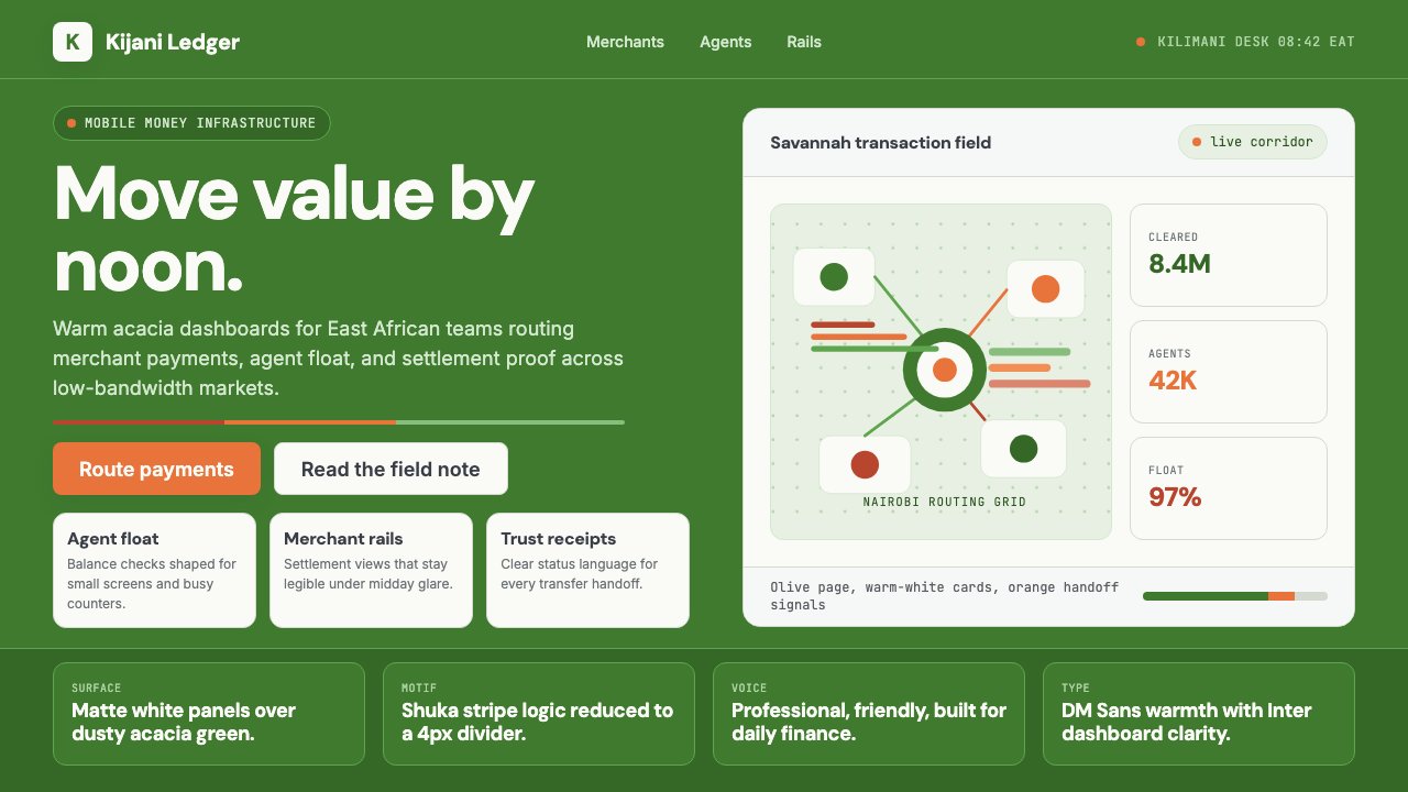 Nairobi Silicon SavannahWarm fintech confidence. Acacia green, orange shuka bands, and matte SaaS car…
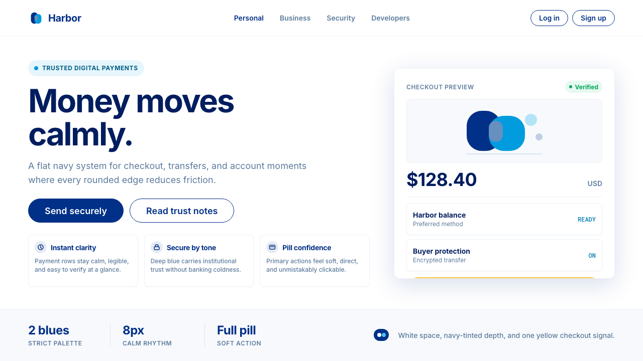 PayPalTrust without coldness. Deep navy, sky cyan, white cards, and pill checkout c…
 Shake Shack (Green-Chartreuse)Friendly premium, never loud. Chartreuse on warm cream with tight modernist t…
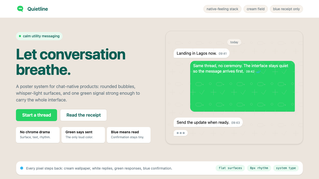 WhatsAppConversation is the interface. Cream wallpaper, green bubbles, and tiny blue…