About Ubuntu Linux Brand
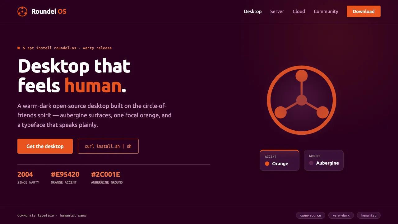
Ubuntu is the most recognizable face of desktop Linux, launched by Canonical in 2004. Its brand pairs a deep "Canonical aubergine" ground with the warm Ubuntu Orange circle-of-friends mark — three figures joining hands in a roundel of community.
The 2010 Ubuntu typeface from Dalton Maag gave the system a humanist voice: rounded, open, friendly yet professional. Together they form a warm-dark identity that is unmistakably open-source and unmistakably Ubuntu.
- Origin
- Global / internet (Canonical Ltd., South Africa / UK roots)
- Era
- 2004 launch (Ubuntu 4.10 Warty Warthog); Ubuntu typeface default since 10.10 (2010); current orange #E95420 since 2014 refresh
- Key figures
- Mark Shuttleworth · Dalton Maag
- Movements
- Open-source desktop Linux · Humanist brand typography · Warm dark UI identity
Ubuntu Linux Brand design spec
Colors
Background
Surface
Primary
Secondary
Accent
Text
Typography
UbuntuHeadings
Ubuntu MonoMono
Unlock for 1 credit
The other 11 sections — buttons, cards, spacing, motion, techniques and more — open once you unlock. Download the DESIGN.md or send it to your AI in one click. Unlock once, yours forever.
Sign up nowHave an account? Sign in
Styles similar to Ubuntu Linux Brand
Also inspired by brands & products, with a close feel.
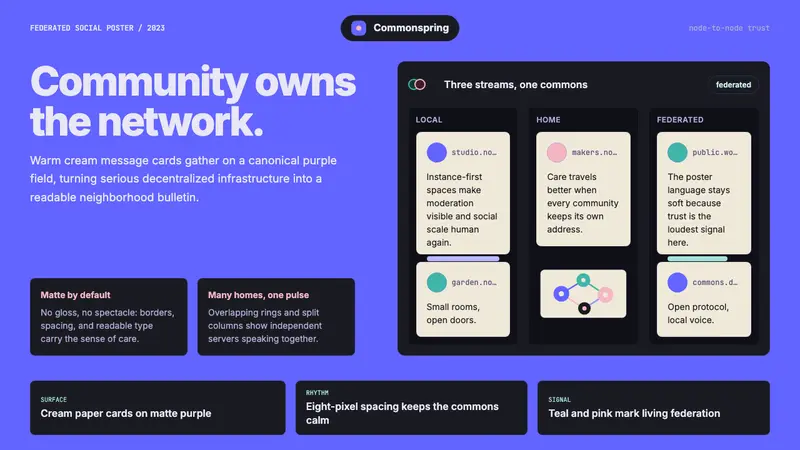 Mastodon FediverseDecentralized warmth. Purple fields and cream toot-cards make federation feel human.
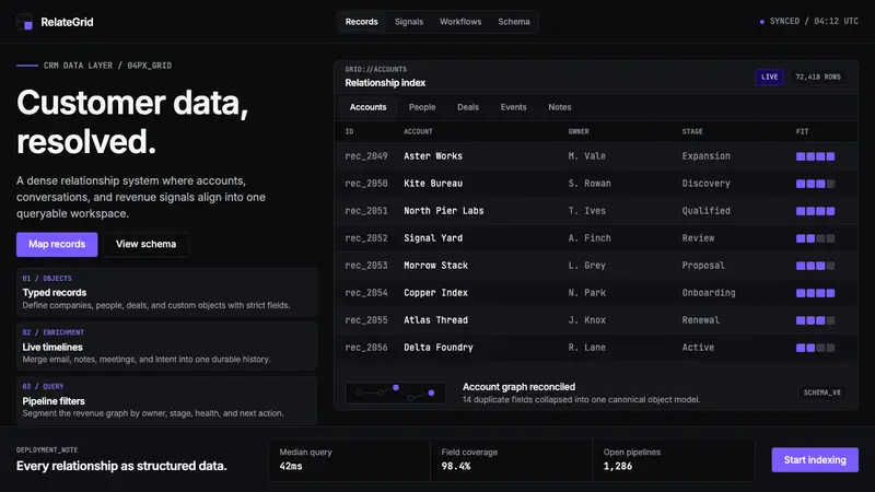 Attio CRMCRM stripped to its data layer. Single-pixel borders, monospaced IDs, violet as the only accent.
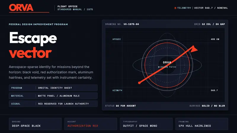 NASA Worm Logo (1975)Engineering reaches orbit. Black void, worm red, mono telemetry, and aluminum hairlines.
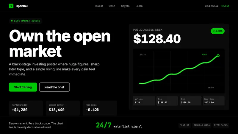 Robinhood 2023Markets feel immediate. Pure black, Inter numbers, and one neon-green line do the work.