What is Bruder Klaus Field Chapel?
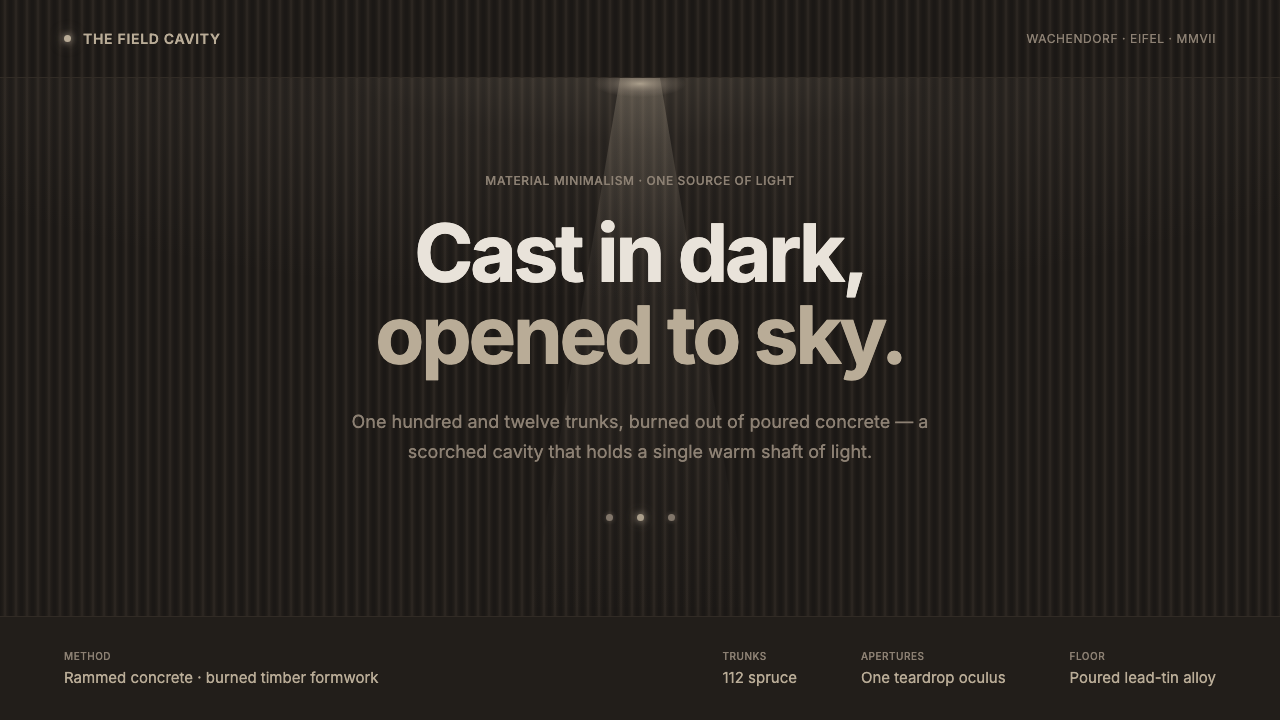
Bruder Klaus Field Chapel turns concrete, timber, fire, and daylight into a single dark ritual space — severe in appearance, but intensely human in atmosphere.
Bruder Klaus Field Chapel in brief
The Bruder Klaus Field Chapel is a small concrete chapel near Wachendorf in Germany’s Eifel region, designed by Peter Zumthor and completed in 2007. Its visual identity does not begin with a conventional architectural style applied to a surface. It begins with an interior condition: a tall, enclosed cavity whose walls are charcoal-black, vertically ribbed, and visibly marked by the process that made them. The chapel is dark not as a theatrical effect, but as evidence of material transformation.
The interior was formed around a clustered structure of 112 tree trunks. Concrete was rammed around that temporary timber core, then the wood was burned out, leaving behind a sooty void and the preserved impression of every trunk. What remains is neither smooth concrete nor rustic wood. It is a fused material memory: rough, dark, tactile, and spatially compressed. The chapel’s atmosphere comes from this direct record of construction rather than from applied imagery, symbolic decoration, or ornamental detail.
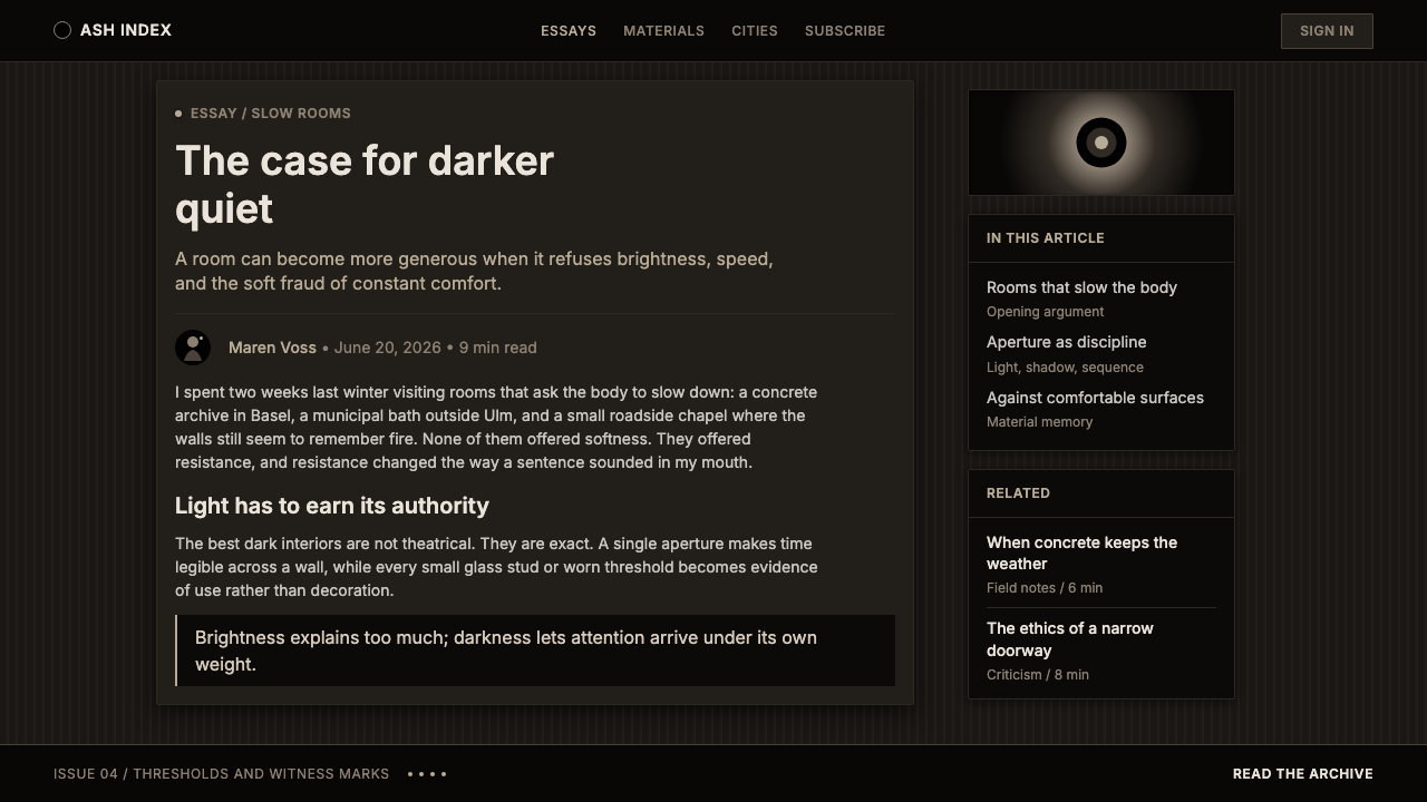
As a design language, Bruder Klaus Field Chapel translates into near-black fields, warm soot-brown striation, restrained modern grotesque typography, isolated points of glowing glass, and one concentrated shaft of warm light. The system is austere, but it is not sterile. Darkness has grain; concrete has depth; light is scarce enough to become meaningful. Every visual decision should feel as if it has been excavated from a quiet interior rather than added for visual stimulation.
Where does Bruder Klaus Field Chapel come from?
The chapel belongs to an enduring contemporary architectural reference point rather than to a historical decorative movement. Completed in 2007 near Wachendorf, it is rooted in Western Europe while remaining unusually resistant to regional cliché. Its identity is carried by construction, enclosure, weathered darkness, and daylight. This makes it especially relevant to contemporary design systems seeking material gravity without relying on nostalgia, luxury signals, or fashionable visual excess.
Peter Zumthor’s role is central because the chapel’s effect cannot be separated from its making. The defining gesture was to stack 112 tree trunks as an interior formwork, cast rammed concrete around them, and burn the timber away. The resulting cavity holds the negative trace of the trees. Its walls read as built matter and as aftermath at once: concrete carries the solidity, while soot and striation preserve the temporary organic structure that disappeared.
The chapel is dedicated to Niklaus von Flüe, known as Brother Klaus. Within the approved visual material, this association matters primarily through restraint and contemplation rather than through illustrative religious symbolism. The space does not depend on figurative iconography to establish seriousness. It directs attention inward, toward darkness, texture, vertical enclosure, and the open oculus above. Spiritual force is created by the visitor’s bodily relation to material and light.
This places the chapel in the territory of atmospheric architecture, phenomenological architecture, and material-driven minimalism. These terms describe an approach in which a space is understood through sensation: how light enters, how surfaces absorb it, how an interior feels enclosed, and how a material records time and process. The chapel’s influence comes from showing that minimalism need not be smooth, pale, or technologically neutral. It can be blackened, irregular, hand-made in feeling, and still radically reduced.
What defines the Bruder Klaus Field Chapel look?
Charcoal Materiality
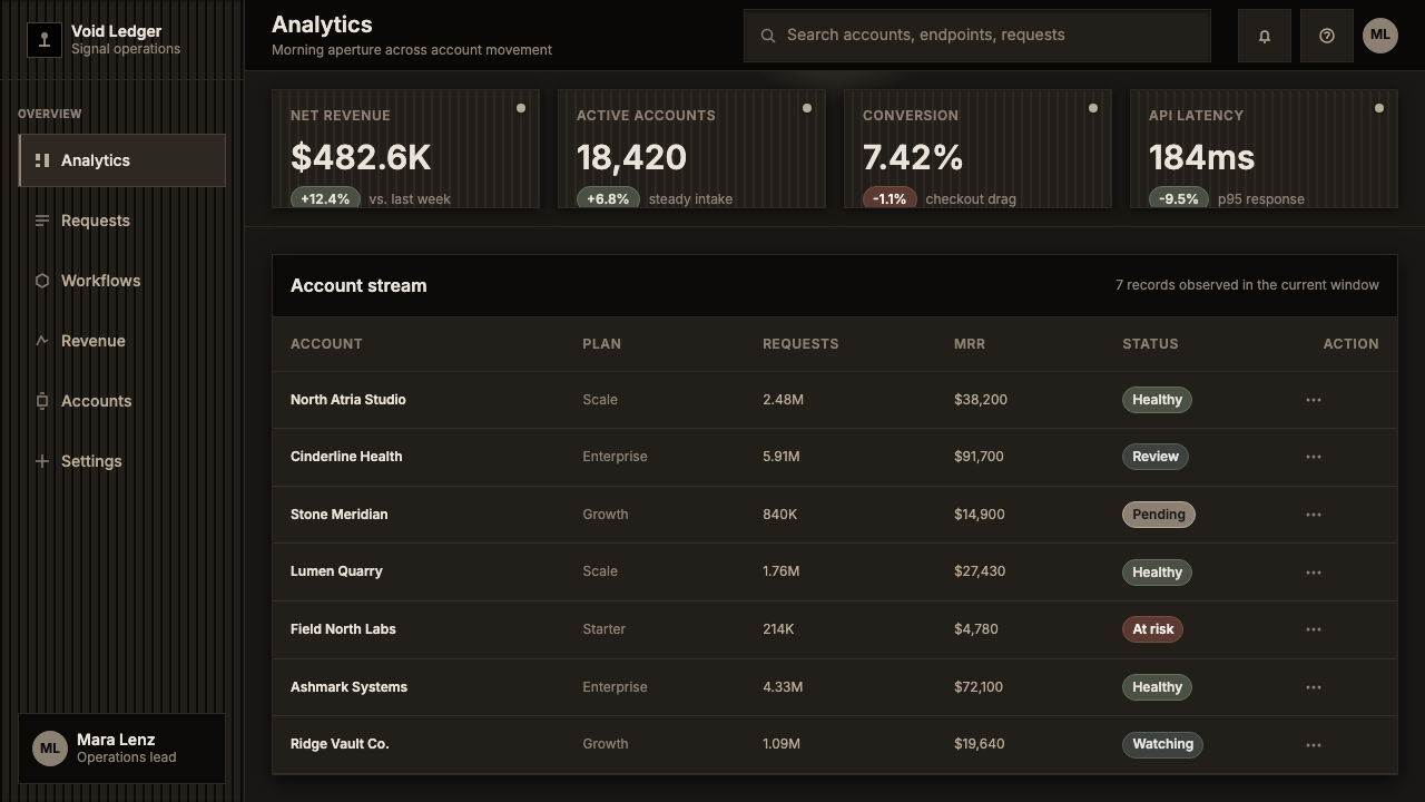
The dominant field is near-black, but it should never read as a featureless digital void. It carries the density of scorched concrete and settled soot: matte, absorbent, and slightly uneven in perception. Warm brown undertones appear within ribbing and recesses, giving the darkness an organic memory. Use blackness as a material condition, not as a generic dramatic backdrop.
Ribbed Vertical Trace
The chapel’s most distinctive texture is vertical and structural. The burned-out trunks left an irregular rhythm of channels, seams, and dark ridges. In visual work, this suggests restrained vertical repetition rather than decorative patterning: narrow tonal variation, shadowed grooves, and forms that imply compression or enclosure. The rhythm should feel discovered in the surface, never printed on top of it.
Single Oculus Light
Light is not distributed evenly across the composition. It arrives as one concentrated opening: a warm vertical shaft that makes darkness legible by contrast. This is a discipline of scarcity. A single illuminated focal area can organize an entire page, screen, or slide more effectively than multiple competing highlights. Light should imply direction, height, and silence rather than spectacle.
Glass Points in Darkness
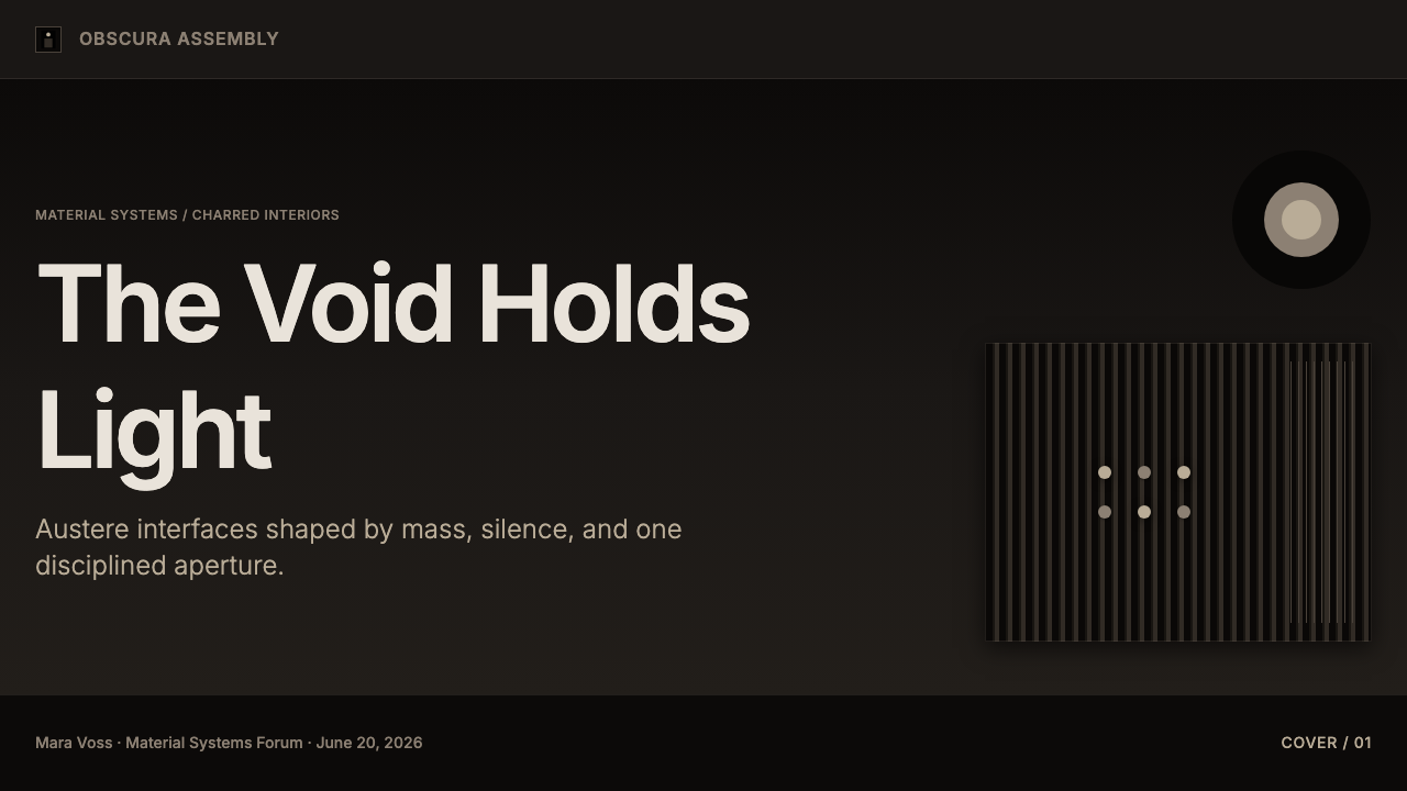
Hand-blown glass studs introduce small points of glow against the dark enclosure. Their value is not decoration in the conventional sense; they give scale and intimacy to an otherwise monolithic field. When adapted digitally, use sparse luminous markers, restrained highlights, or isolated circular details. They should read as embedded material events, not as interface glitter or an ornamental constellation.
Austere Typography
Typography should be an austere modern grotesque sans, chosen for calm clarity rather than personality display. Large titles can carry architectural presence when surrounded by darkness and generous emptiness; supporting text should remain direct, quiet, and highly legible. Avoid expressive display faces, ornamental serifs, handwritten gestures, or theatrical distortion. The type should behave like an inscription cut into a wall.
No Added Ornament
The system permits visual richness only when it comes from concrete, soot, ribbing, glass, and light. Decorative borders, polished metallic effects, busy iconography, illustrative flourishes, and arbitrary gradients interrupt its logic because they deny the chapel’s economy of means. If an element does not intensify enclosure, material presence, orientation, or contemplation, it should be removed.
Who shaped Bruder Klaus Field Chapel?
Peter Zumthor designed the Bruder Klaus Field Chapel. The work’s importance lies in its inseparability from process: the stacked tree-trunk formwork, rammed concrete, burned-out timber, ribbed cavity, and open oculus are not separate aesthetic choices but parts of one constructional idea. For designers, Zumthor’s contribution is a model of material coherence, in which atmosphere emerges from how something is made.
Niklaus von Flüe, known as Brother Klaus, gives the chapel its name and dedication. In this design reference, his presence is not communicated through portraiture or narrative imagery. Instead, the chapel creates a contemplative setting through enclosure, darkness, silence, and the upward opening of light. The association demonstrates how a spiritual subject can be approached through atmosphere rather than illustration.
The 112 tree trunks are not a named author, but they are an essential co-author of the chapel’s visual identity. Stacked as formwork and later burned away, they created the irregular vertical relief that gives the interior its unmistakable character. Their absence becomes visible as texture. This is the chapel’s most useful lesson for visual design: process can leave a trace that is richer than any surface treatment added afterward.
How do you use Bruder Klaus Field Chapel today?
For presentation covers, use the chapel language to create concentration rather than immediate disclosure. Let a near-black field dominate, introduce a restrained ribbed vertical texture, and place a large, quiet title in an area that feels cut through by warmth. One narrow shaft, haloed opening, or isolated glass-like point can carry the focal role. Do not crowd the cover with secondary messages. The effect depends on the feeling that the viewer is approaching an interior, not scanning a promotional banner.
Content slides should treat darkness as a container for thought. Use a clear modern sans-serif hierarchy, with short headings and carefully grouped body copy. Keep text blocks intentionally limited so that the page retains its enclosed silence. A warm rule, vertical seam, or small glowing marker can distinguish sections, but repeated card treatments and decorative separators will make the composition feel like a software template rather than a material space. For data slides, allow charts to emerge from the dark field with muted structural marks and a single warm emphasis for the value that matters most.
In web interfaces, this language suits dashboards, reports, premium editorial tools, and pricing contexts where seriousness, focus, and perceived material depth are desired. The interface should remain operationally clear: navigation, labels, controls, and status states must be easy to locate. Use the dark atmospheric layer to frame information, not to obscure it. Panels can feel inset into a charcoal enclosure, while a warm illuminated area guides the user toward a primary action, selected plan, or important state.
For editorial and marketing work, the style is strongest when the subject already involves craft, architecture, process, landscape, reflection, or durable materials. Long-form pages can pair generous dark margins with narrow reading columns, using small warm points for notes, quotations, or transitions. Marketing sequences can move from darkness into a single illuminated feature, then return to a dense material field. Photography, if used, should feel restrained and architectural: cropped for texture, shadow, surface, or aperture rather than for lifestyle exuberance.
The common mistake is to reduce Bruder Klaus Field Chapel to black backgrounds plus an orange glow. That loses the architecture’s essential tension between rough material and disciplined restraint. The dark field needs grain, the warm accent needs scarcity, and the layout needs an unmistakable sense of enclosure. Avoid turning soot into a grunge effect, glass points into decoration, or the oculus into a generic spotlight. The style succeeds when every trace appears necessary to the space.
Bruder Klaus Field Chapel — FAQ
Is this style simply dark minimalism?
No. Dark minimalism can be smooth, glossy, technological, or anonymous. The Bruder Klaus Field Chapel reference depends on material evidence: soot, ribbed concrete, the trace of burned timber, hand-blown glass, and a single open source of daylight. Its reduction is physical rather than merely visual. A successful application should make darkness feel inhabited by process.
How should warm light be used in this design system?
Use it as orientation and revelation, not as ambient decoration. The chapel’s oculus makes a small amount of light feel consequential because the surrounding field remains dark. In a layout, reserve warmth for a title, selected state, central metric, or primary call to action. When warmth appears everywhere, it stops behaving like light and becomes a palette choice.
Can the ribbed wall texture be used as a repeating background pattern?
It can, but only with great restraint. The original ribbing is the consequence of the burned-out tree trunks, not a decorative motif. A repeated treatment should remain low-key, irregular in feeling, and subordinate to information. If the texture becomes crisp, symmetrical, or constantly visible, it shifts from material trace to branding wallpaper and loses its connection to the chapel.
What kind of imagery belongs with this visual language?
Choose imagery that can carry material or spatial attention: concrete surfaces, timber traces, apertures, shadow, landscape, weather, hands, or close architectural fragments. Crop for density and texture rather than for narrative activity. Bright lifestyle photography, busy collages, and highly polished product renderings usually conflict with the chapel’s inward, low-noise atmosphere.
Where does this style work poorly?
It is a poor fit when a product needs exuberance, immediate friendliness, dense utility controls, or broad visual accessibility through constant contrast and color coding. Children’s products, playful social experiences, celebratory retail campaigns, and interfaces requiring many simultaneous alerts may find the system too severe. Its strength is concentrated attention, not universal cheerfulness.
Related design styles
 Sunshine (2007)Ship with no key light. Solar gold blooms to white from near-black void — squ…
 Glacial Teal LagoonQuiet feels elemental. Basalt darks and milky silica blue drift in a low-cont…
 Oslo Opera House SnøhettaArchitecture becomes public ground. Cool marble planes meet fjord blue and on…
 Parametricism (Zaha Hadid)Architecture as one unbroken surface. A liquid-white swoop floats on glossy b…
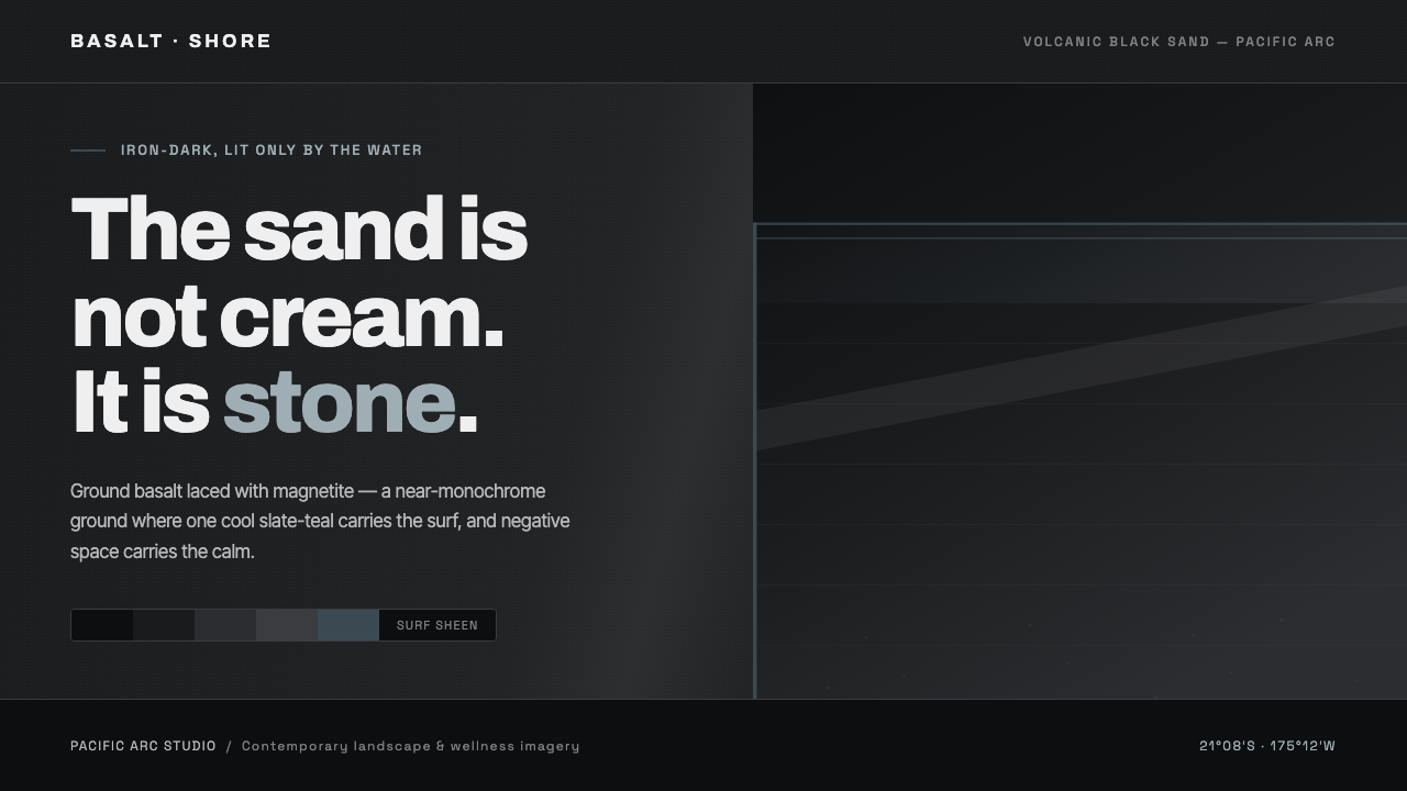 Tongan Black SandThe sand is stone, not cream. Iron-dark basalt grays with one cool slate-teal…
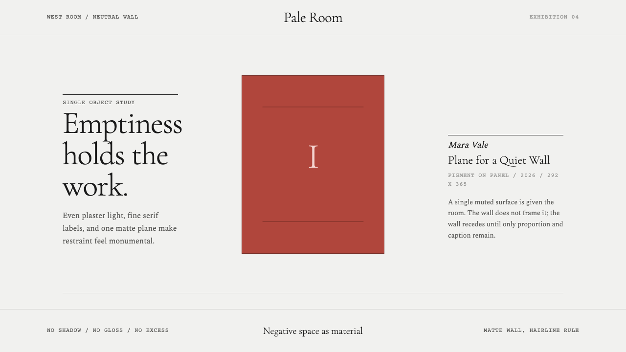 White Cube GalleryEmptiness is the medium. Cormorant labels and one terracotta plane hold the w…