What is Oslo Opera House Snøhetta?
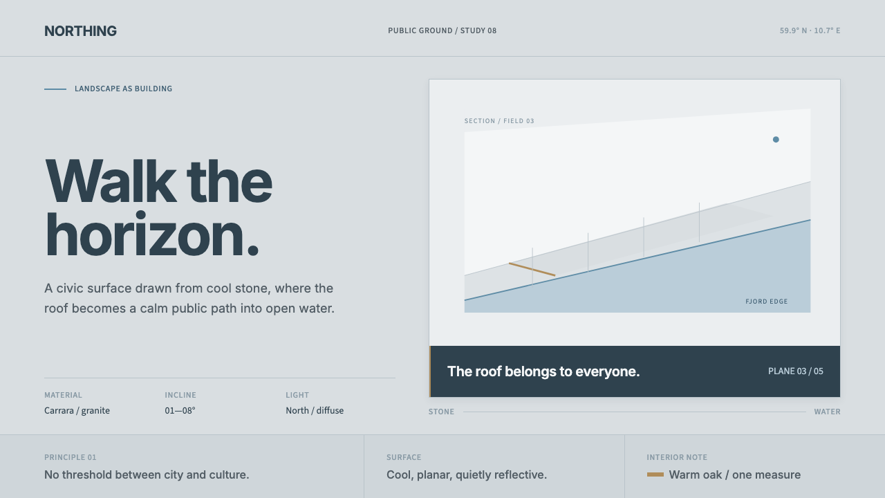
Oslo Opera House turns a civic building into a piece of public landscape: a pale stone slope descending toward fjord water, sharpened by cold light and warmed only from within.
Oslo Opera House Snøhetta in brief
Oslo Opera House, designed by Snøhetta for the Norwegian National Opera and Ballet, is a defining work of Nordic contemporary architecture completed in 2008 in Bjørvika, Oslo. Its central visual proposition is unusually direct: architecture becomes public ground. Instead of presenting a sealed cultural institution with a ceremonious front, the building extends a broad, walkable roof of white Carrara marble and granite toward the Oslofjord. The roof reads less as a cap placed on a building than as a geological plane emerging from the city and entering water.
The style is governed by cool stone brilliance, long diagonal movement, and restraint. Pale marble surfaces hold the composition together; granite gives the exterior a related but more grounded material presence. The building does not depend on applied ornament, picturesque detail, or theatrical façade effects to announce its status. Its drama comes from the scale and inclination of its planes, the sharpness of their joints, and the way a visitor’s route becomes part of the architecture’s image.
As a visual language, the Oslo Opera House translates landscape into a system of design decisions. The dominant field is pale and quietly blue-toned, like marble seen in northern fjord light. Glacier cyan appears as a controlled accent rather than a decorative field. A warm oak note, borrowed from the auditorium interior, provides a single human counterpoint to the surrounding cold stone. Crisp Scandinavian grotesque typography, calm negative space, flat planes, and hard seams complete a language in which clarity is more expressive than embellishment.
Where does Oslo Opera House Snøhetta come from?
The project belongs to Bjørvika, Oslo, at the edge of the Oslofjord, and its setting is inseparable from its form. Water is not a distant backdrop framed by a façade; it is the spatial horizon toward which the building moves. Snøhetta answered that condition with a roofscape that can be walked, turning the transition between city and fjord into a public route. This is the project’s essential civic gesture: access is built into the composition rather than added as an amenity.
Completed in 2008, the opera house sits within the period identified as Nordic contemporary architecture. Its expression draws strength from qualities often associated with that context: lucid structure, material directness, light-sensitive surfaces, and an aversion to needless visual noise. Yet the project is not simply a pale minimalist object. Its pale field, diagonal ascent, and physical invitation to climb give it a strong presence without requiring monumentality in the conventional sense.
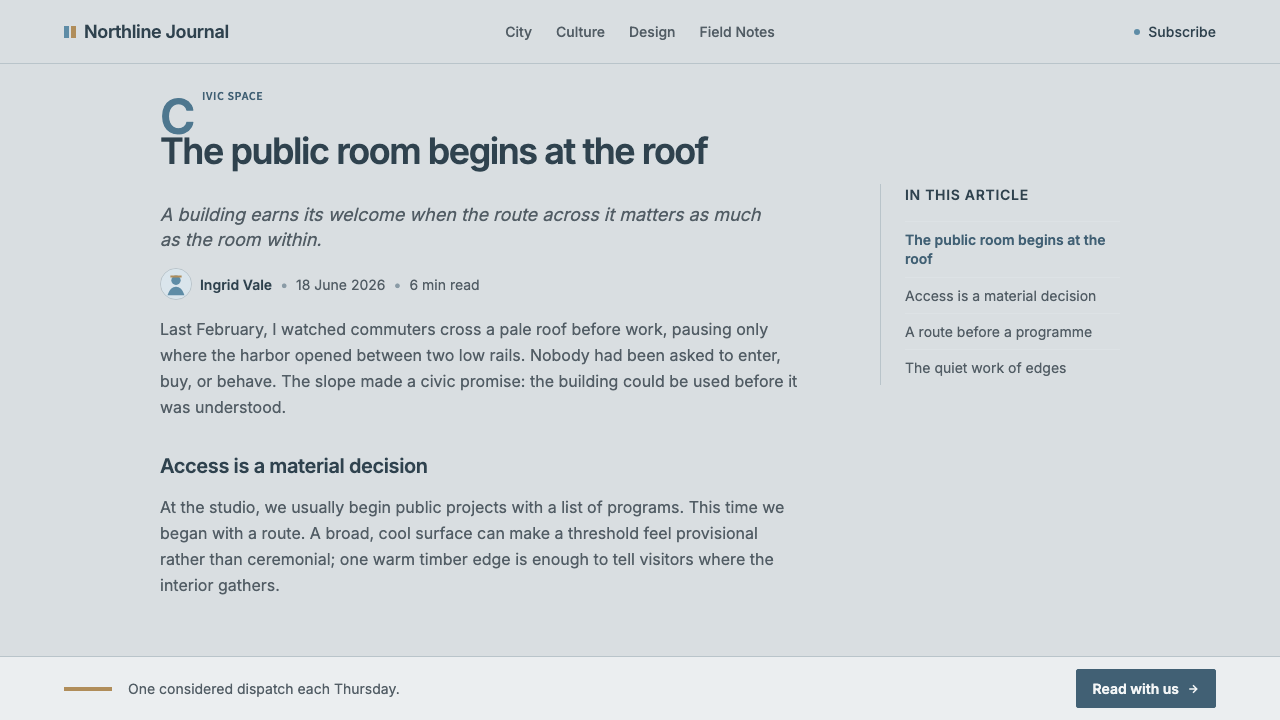
The work is also defined by the idea of landscape-as-building civic design. This phrase is useful because it describes more than a roof treatment. The building asks visitors to occupy its exterior as terrain: to move across it, pause on it, and read the city and fjord from it. The visual system therefore begins with circulation and public use. Long ramps and inclined planes are not secondary graphic motifs; they are the formal evidence of the building’s social role.
Snøhetta and the Norwegian National Opera and Ballet are the key figures named for the project. Together, designer and cultural institution establish its dual identity: an opera house must support performance, while its exterior must also participate in the life of the waterfront. The warm oak reference from the auditorium is especially important to this balance. It prevents the cool marble exterior from becoming emotionally remote, allowing interior cultural intensity and exterior civic calm to belong to one coherent whole.
What defines the Oslo Opera House Snøhetta look?
Walkable Topography
The defining gesture is the roof treated as public terrain. Broad, inclined surfaces invite movement rather than merely receiving the eye. In a design system derived from the building, diagonal fields should feel traversable and directional, never like arbitrary slashes. The sense of ascent is calm and continuous, with each plane leading naturally toward another view, another pause, or a more open horizon.
Pale Stone Field
White Carrara marble and granite establish a pale, mineral ground. The effect is not sterile white but cool, light-catching stone with a faint fjord-blue cast. Surfaces should appear expansive and unforced, with tonal variation coming from material character and light rather than visual texture. Large pale fields need generous empty space around them so that they retain the stillness of an open waterfront plane.
Fjord Blue and Glacier Cyan
The cool palette is atmospheric rather than decorative. A faint fjord-blue undertone gives the marble field depth without turning it into a colored backdrop. Glacier cyan is reserved for moments requiring orientation, emphasis, or a sense of reflected northern light. Its power depends on scarcity: it should read as a glint on cold stone, not as an energetic brand color competing with the architecture.
Warm Oak Counterpoint
One warm oak note, borrowed from the auditorium interior, prevents the system from becoming uniformly glacial. This color should be used with the discipline of an interior reveal: a focal detail, a humanizing surface, or a moment of cultural intimacy. It works best against pale stone and cool blue, where its warmth feels earned rather than merely contrasting.
Sharp Joints
The architecture’s edges are decisions. Planes meet with crisp joints rather than dissolving into softness, and the graphic equivalent is similarly exact: clear borders, precise alignment, and an avoidance of decorative haze. The goal is not aggression. Sharpness makes the quiet composition legible, allowing each material field and directional change to retain its identity.
Scandinavian Grotesque
Typography is crisp, restrained, and structurally clear. A Scandinavian grotesque approach favors unadorned letterforms, generous breathing room, and hierarchy created through placement and scale rather than typographic flourish. Text should sit on the page like architecture on the roofscape: composed with confidence, given room to stand, and never crowded by unnecessary labels, badges, or ornamental framing.

Who shaped Oslo Opera House Snøhetta?
Snøhetta is the design practice identified with Oslo Opera House. Its contribution is visible in the project’s decisive fusion of architecture, route, and landscape: the roof becomes publicly occupiable ground, and the fjord is treated as an active spatial condition rather than scenery. The resulting style offers a powerful model for design work that wants to feel civic, calm, and materially grounded.
The Norwegian National Opera and Ballet is the cultural institution named as the project’s client and key figure. Its presence explains why the building must hold two scales at once: the concentrated atmosphere of performance inside and the broad availability of a public waterfront outside. The warm oak reference from the auditorium is the visual bridge between those conditions.
The Oslofjord is not a designer in the conventional sense, but it is an indispensable formal presence in the project. The building’s pale stone planes, cool blue cast, and downward movement all take their meaning from the waterline. Treating a site condition as a visual protagonist is central to the landscape-as-building idea represented here.
How do you use Oslo Opera House Snøhetta today?
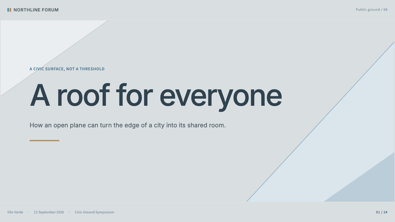
For presentation covers, use the style to establish a calm civic scale before introducing information. Begin with a broad pale field, then place one diagonal plane or directional line so that the page feels like it opens toward a horizon. Set the title in a crisp sans-serif treatment with ample empty space. A restrained glacier-cyan cue can mark the subject, while a single oak-toned detail can give the cover a point of welcome. On content slides, preserve the same sense of circulation: let headings, body copy, and supporting notes occupy clear terraces rather than competing blocks.
Data slides benefit when charts are treated as part of the terrain. Keep the main analytical field pale and uncluttered, use cool blue distinctions to organize comparable values, and reserve glacier cyan for the most important signal. An oak accent can identify a human, cultural, or decisive point, but should remain exceptional. Avoid dense panels, floating decoration, and visual effects that mimic glossy depth; the desired result is a legible landscape of information in which the reader can see where to begin and where to move next.
For web interfaces, this language is especially effective in dashboards, cultural platforms, public-service tools, and pricing pages that need to communicate trust through calm structure. Build the interface around broad surfaces, strong alignment, and directional grouping. Pale stone-like backgrounds can hold the system together, while cool blue states guide attention without making every control shout. Forms, cards, and navigation should have firm boundaries and quiet spacing. Use the warm oak note sparingly for moments that deserve reassurance, such as a selected plan, a meaningful confirmation, or a featured cultural offer.
For editorial and marketing work, think in terms of a waterfront sequence rather than a collage. A long feature page can move from pale, open introductory areas into more concentrated sections, then release again into white space. Photography or illustration should be treated as a plane within the composition, with crisp cropping and generous margins rather than ornamental layering. Marketing copy benefits from the style’s confidence: one clear proposition, a strong directional composition, and a limited number of visual events can feel more persuasive than repeated calls for attention.
The common mistake is to reduce Oslo Opera House to white marble, blue accents, and diagonal shapes. That produces a surface imitation while missing the project’s governing idea: public movement across a landscape. Do not fill every area with sloping fragments, cool colors, or severe type. The diagonal must have a reason, the empty space must create room to pause, and the oak warmth must feel like an interior human presence. When every element supports orientation, access, and material calm, the style becomes architectural rather than merely Nordic-looking.
Oslo Opera House Snøhetta — FAQ
Is this style simply Nordic minimalism?
Nordic restraint is part of it, but the Oslo Opera House language is more specific than a generic minimal approach. Its essential feature is not merely reducing visual elements; it is turning a cultural building into accessible terrain. Pale surfaces, quiet typography, and limited color work because they support movement, public access, and the relationship between city, roof, and fjord. A spare layout without that directional and civic logic may look related, but it will not carry the same character.
How should the warm oak accent be used?
Use it as a rare interior counterpoint, not as a second dominant palette. The source material connects it to the auditorium, so it works best where a design needs to introduce human warmth, cultural focus, or a sense of arrival. Against pale stone and cool blue, even a small oak-toned area can feel substantial. If it appears repeatedly across every card, button, and heading, it loses the quiet contrast that makes it meaningful.
Can this language work for dense information?
Yes, provided density is organized rather than concealed. The building’s long planes suggest a useful model: establish a clear direction, group related material on stable fields, and leave enough open area for transitions between topics. In a dashboard or report, pale backgrounds and crisp boundaries can hold substantial information without visual congestion. The mistake is to interpret calmness as emptiness; the real requirement is that every cluster has a readable place within the larger route.
Why avoid gradients and decorative softness?
The source language is built from flat planar surfaces, sharp joints, quiet light, and material clarity. Gradients and diffuse decorative effects can make a composition feel atmospheric in a way that competes with those principles, replacing stone-like precision with generic digital polish. This does not mean every transition must be harsh. It means lightness should come from space, pale fields, and careful contrast, while depth should be expressed through overlap, direction, and material relationship.
Where does this style work best?
It is strongest where public access, cultural confidence, environmental context, and clear orientation are central values. Cultural institutions, civic services, architecture and urbanism platforms, analytical products, and premium editorial experiences can all benefit from its calm authority. It is less natural for work that depends on exuberance, dense ornament, nostalgic comfort, or constant promotional urgency. The deciding question is whether the product should feel like a composed public place rather than a decorated surface.
Related design styles
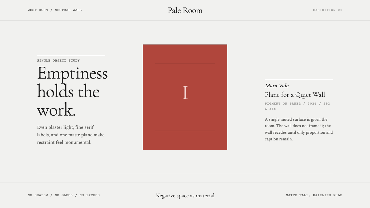 White Cube GalleryEmptiness is the medium. Cormorant labels and one terracotta plane hold the w…
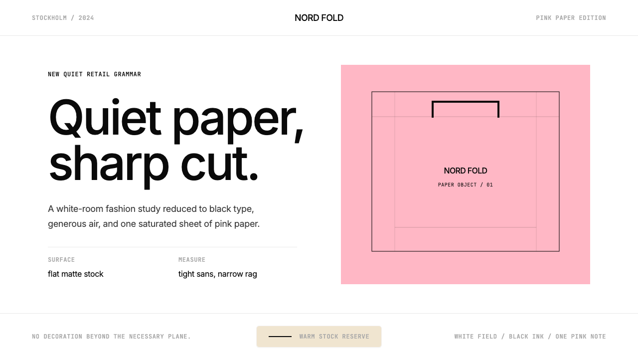 Acne Studios Pink-PaperQuiet luxury in one pink plane. Inter type floats on white with a bag-like re…
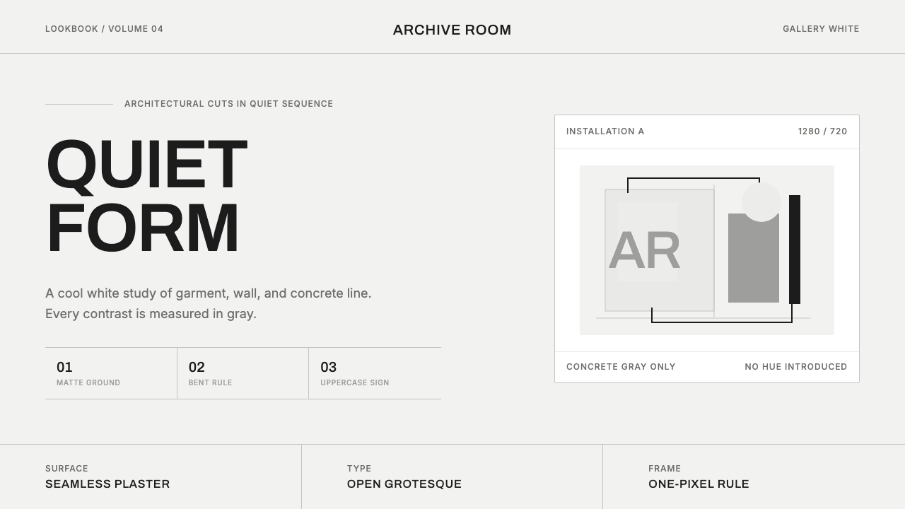 COS Gallery MinimalSilence has structure. Cool gallery white, Archivo uppercase, and concrete-gr…
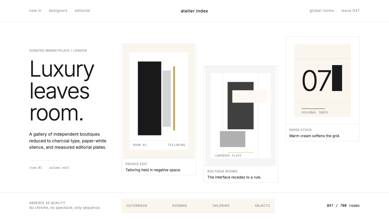 FarfetchLuxury as absence. Charcoal type, white canvas, and hairline editorial plates.
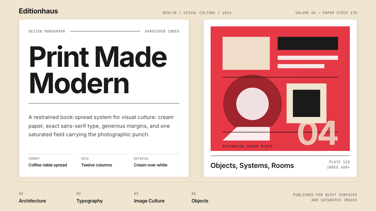 Gestalten Design BookCoffee-table calm. Cream paper, tight sans, one saturated block, and a strict…
 Glacial Teal LagoonQuiet feels elemental. Basalt darks and milky silica blue drift in a low-cont…