What is Nutrition Facts Label?
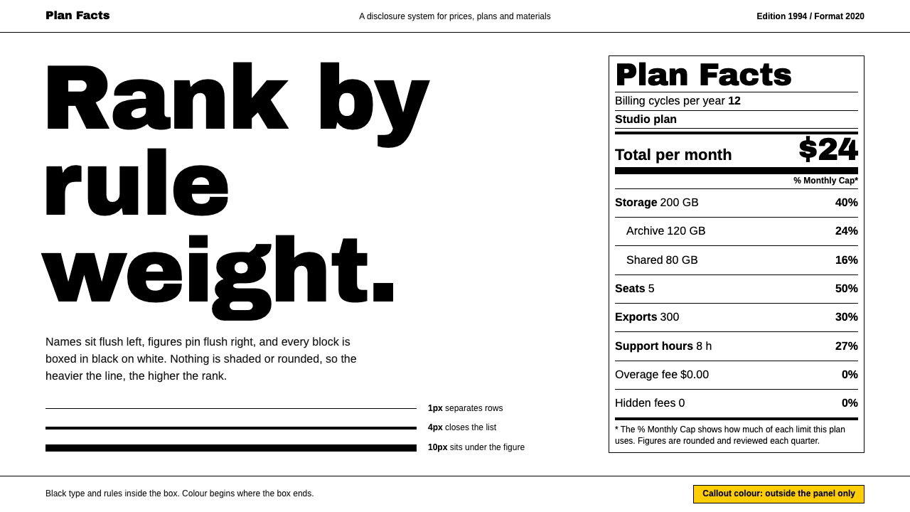
The Nutrition Facts panel is a law that happens to be beautiful: a white box, black Helvetica-style type, and a hierarchy built entirely out of how heavy each line is.
Nutrition Facts Label in brief
The Nutrition Facts Label is the most-printed piece of information design in America. It sits on the back or side of nearly every packaged food sold in the country: a black-and-white box, set in a Helvetica-style grotesque, with a heavy rule under the line that says Calories and a column of percentage figures running down the right-hand edge. Most shoppers have read it thousands of times and never once thought of it as a designed object, which is precisely the mark of a successful piece of information design.
As a visual style, the label is best understood as a grammar rather than a look. Hierarchy is carried by the weight of horizontal rules, not by colour, shadow or size alone. Numbers are aligned flush right so that the eye can run down a column and compare quantities without reading. Every block of information is boxed, and the box is the only decoration the system allows. There are no rounded corners, no charts, no illustrations and no gradients; the page asks to be read, measured and compared, in that order.
Curio's version of the style takes that grammar out of the supermarket and treats it as a general design language for products that need to be trusted. It keeps the discipline of the original — rule weight as hierarchy, tabular figures, boxed grids — and reserves colour for the single place where the regulation stops. That makes it a natural fit for anything that has to present dense, comparable facts calmly: ingredient lists, specification sheets, pricing breakdowns, safety information and the kind of dashboards where a number matters more than a mood.

Where does Nutrition Facts Label come from?
The story begins with a legislative decision. In 1990 the United States passed the Nutrition Labeling and Education Act, which obliged the Food and Drug Administration to standardise how nutrition information appears on food packaging. Until then, labels were voluntary, inconsistent and often misleading: each manufacturer chose its own format, its own serving sizes and its own selection of facts. The law's premise was that a shopper standing in an aisle should be able to compare two boxes of cereal in a few seconds, and that comparison is only possible if both boxes speak the same visual language.
In 1992 the agency commissioned a Washington, D.C. designer, Burkey Belser, to work out what that language should be. Belser worked on it pro bono for the Food and Drug Administration and went through roughly thirty-five versions before the panel settled into the form we recognise. The brief was unusually severe for a design project. The label had to be legible at a glance on a crowded shelf, readable in a very small space, producible by any printer on any substrate, and neutral enough that no manufacturer could use it to flatter its own product. David Kessler, then leading the agency, is the other name consistently attached to the project as the regulator who drove it through.
Mandatory use began in 1994, and the panel's appearance was effectively written into regulation. That is why the style feels different from most design movements: it was not a taste, a school or a trend, but a set of rules that happened to be well made. The choice of a Swiss neo-grotesque typeface, the heavy rule under the calorie count, the thin rules that separate each nutrient, the right-hand column of daily-value percentages — each of these is a decision that was tested against the needs of ordinary readers rather than the preferences of a studio.
The format has since been revised rather than replaced. A new version was published in 2016, with compliance required from 2020, adjusting emphasis on calories and serving sizes to reflect how people actually eat. Even in that revision the underlying structure survived intact, which says something about how well the original grammar was built. It belongs to a lineage of regulated information design and standardised comparison labels, sitting alongside other public-interest documents that use typography and rules, not decoration, to make complicated facts usable by everyone.
What defines the Nutrition Facts Label look?
Rule weight as hierarchy
The defining move of the style is that importance is expressed by the thickness of a line. A very heavy bar closes off the header, a thick rule sits under the calorie line, medium rules separate major groups and hairlines divide ordinary rows. A reader who has never seen the layout before can still tell what matters most, because the heaviest marks always sit next to the most consequential facts. Colour and shadow are never asked to do this job.
Typography
Type is a plain Swiss-style neo-grotesque in black on white, in the manner of Helvetica. Only a few sizes are used, and the contrast between them is made with weight: a bold face for the title, the calorie figure and the nutrient names that matter, a regular face for subordinate lines. Line spacing is tight but never cramped, so a dense table still reads as a column of separate facts rather than a block of text. There is no decorative or display face anywhere.
Tabular figures and right alignment
Numbers are set in tabular figures and aligned flush right, so digits stack neatly and a column can be compared by eye. Units follow the quantity at a lighter weight, and percentages occupy their own column at the right edge. This is the part of the style that makes it feel trustworthy: the layout behaves like a ledger, and the reader senses that nothing has been rounded off for effect.
Boxed grids
Every block of information lives in a rectangle. The whole panel is a box, and inside it the content is partitioned into stacked bands, each with its own rules. Boxes are sharp-cornered and abut one another without gaps or soft shadows. The effect is of a form to be filled in or checked, which is exactly the reading the style wants to encourage: the viewer is auditing, not browsing.
Colour held outside the box
Inside the panel there is only black on white. Colour appears, if at all, outside the box, where the regulation stops and the surrounding page begins. In Curio's interpretation, that outside space borrows a single warm yellow from another label by the same designer, the energy-guide tag, so the palette is a strict two-tone system with one signal accent. The restraint is the point: when the content itself is monochrome, any colour at all becomes a deliberate announcement.
No ornament, no softness
Corners are square, edges are crisp and nothing is rounded, blurred or faded. There are no icons doing decorative work and no pictorial charts. Where a graphic device is needed, it is a rule or a box. This severity gives the style an almost bureaucratic calm, a sense that the document is on the reader's side and has nothing to sell.
Generous reading rhythm inside a tight frame
Although the panel is dense, it is not chaotic. Rows repeat at a steady rhythm, indents are used to show that one nutrient belongs to another, and the same few spacing relationships recur from top to bottom. That regularity lets the reader find a given nutrient by position alone, the way one finds a line in a familiar form. It is the source of the style's speed.

Who shaped Nutrition Facts Label?
Belser is the Washington, D.C. designer who drew the panel. Starting in 1992 he worked pro bono for the Food and Drug Administration, taking the design through about thirty-five versions before it was finalised for mandatory use in 1994. His other best-known label, the energy-guide tag, is the source of the single yellow accent that Curio borrows for this system.
Kessler is named in the project's history as the regulator associated with commissioning and carrying the label through. His role illustrates something unusual about this style: it exists because a public agency decided that comparison between products should be easy, and then insisted on a design that could deliver it.
The agency commissioned the design in 1992 and enforced the resulting format from 1994. It later published the revised version in 2016, with compliance required from 2020. As the owner of the standard, it is the reason the panel looks the same on every package, regardless of manufacturer.
Passed in 1990, this law is the starting point of the whole story. It made standardised nutrition information a legal requirement and so turned a design problem — how to present dense facts clearly — into a public project with a deadline and a mandate.
How do you use Nutrition Facts Label today?
In slides, the style works best on content and data pages. A cover can be as simple as a single boxed title block with a heavy rule beneath it, in black on white, with the deck's subtitle set small and flush left. Content slides should be organised as stacked bands: each band opens with a bold label, followed by a lighter line of detail, with a rule between bands. Data slides are where the style shines, because tabular figures aligned to the right turn a plain list of quantities into something that can be compared at a glance. Resist the temptation to add charts; a well-ruled table is the native form of this style.
On the web, the system suits interfaces that handle facts rather than feelings. Dashboards can adopt the boxed grid as their basic unit, with each metric in its own rectangle and the figure aligned right. Pricing pages work well as a panel in which plan names are heavy, features are listed as thin-ruled rows, and the price sits in the right-hand column like a daily-value percentage. Settings screens, order summaries and compliance or specification pages all inherit the calm of the original. Buttons should be plain rectangles with a strong outline, and links should be underlined text, not coloured pills.
In editorial and marketing work, the label is an attractive device for anything that wants to look honest: comparison pages, ingredient or materials disclosures, annual-report summaries, a product facts sheet at the back of a brochure. A magazine spread can borrow the panel as a sidebar, setting a few key numbers in the boxed format against otherwise free-flowing text. Because colour lives outside the box, the one warm accent can be used to draw attention to the panel itself without disturbing its internal discipline, for example as a band behind or around it.
The grammar also travels into print and packaging. A one-page fact sheet, a menu with nutritional or allergen information, or a returns-and-warranty card can all adopt heavy and thin rules with stacked bands. The style rewards restraint in paper stock and ink as much as in layout: black on white, no tints, minimal varnish. It is among the cheapest styles to produce well, because its entire value lies in alignment and rule weight, not in finishing.
The most common mistake is to treat the style as a skin and ignore its grammar. Teams copy the white box and the black type, then add rounded corners, soft shadows, coloured category chips or decorative icons, and the result reads as a diluted corporate template rather than a regulated label. A second mistake is to use rule weight inconsistently, so that heavy lines appear where nothing important follows them; once the reader learns that thickness does not mean importance, the whole hierarchy collapses. Finally, avoid centring numbers or mixing proportional and tabular figures, which destroys the ledger effect that makes the style credible.

Nutrition Facts Label — FAQ
Who designed the Nutrition Facts label?
The panel was designed by Burkey Belser, a Washington, D.C. designer. He worked pro bono for the Food and Drug Administration from 1992, going through about thirty-five versions. The agency made the format mandatory in 1994 under the framework set by the 1990 Nutrition Labeling and Education Act, and a revised format was published in 2016 with compliance required from 2020.
Why is the label's hierarchy built from lines instead of colour?
Because the label has to work everywhere: on any printer, on any kind of packaging, in one colour or several, and for readers with different vision. Rule weight survives all of those conditions, and it communicates importance without relying on a palette that could be misread or lost in printing. It also keeps the design neutral, so no manufacturer can use colour to make its numbers look friendlier than a competitor's.
Is this the same as Swiss International Style?
They are close relatives but not the same. The label draws on Swiss neo-grotesque typography and shares its love of grids and flush alignment, but it is a regulated information format rather than a movement with a manifesto. Swiss style leaves room for photography, scale contrast and expressive layout; the Nutrition Facts system is far more constrained, with weight of rule rather than composition doing the expressive work.
Why is there a yellow accent if the panel itself is black and white?
In Curio's interpretation, colour appears only where the regulation stops, outside the box. The single yellow is borrowed from another label by the same designer, the energy-guide tag, which is a deliberate nod to his wider body of work. Keeping it outside the panel means the inside stays strictly monochrome, and the accent works as a signal rather than as decoration.
What kinds of products suit this style best?
Anything whose value depends on being believed: finance and billing tools, specification and comparison pages, health or ingredient information, compliance dashboards, documentation and reports. It is less suited to brands that sell on mood or delight, because the system deliberately offers no softness, illustration or atmosphere to work with.
Related design styles
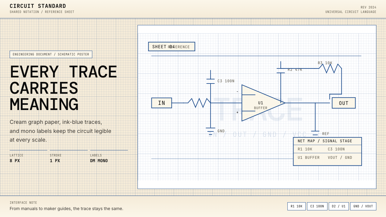 Electrical Schematic WiringAustere and exact. Cream graph paper, ink-blue traces, and mono labels make e…
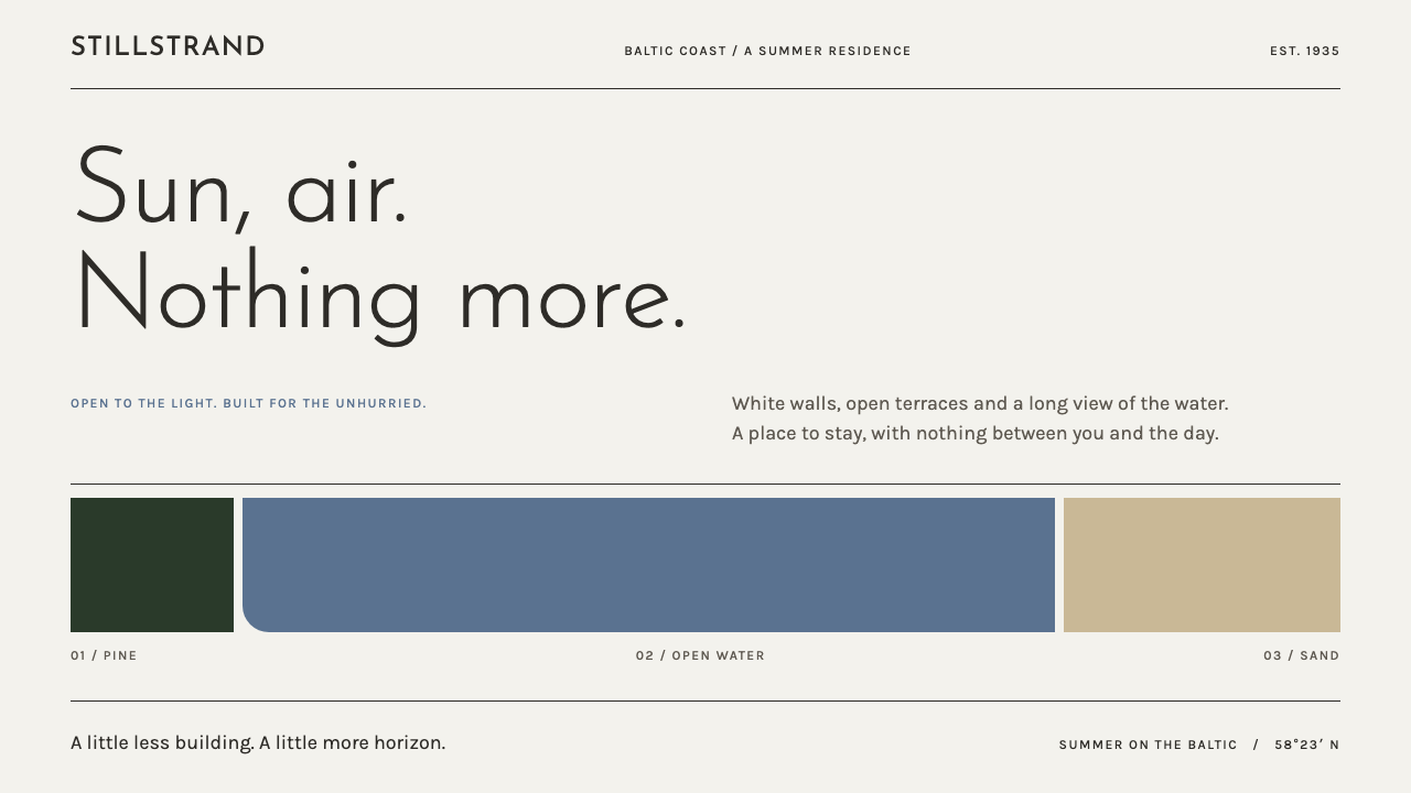 Pärnu Resort FunctionalismNothing ornamental. Light geometric type and Baltic-blue bands stretch across…
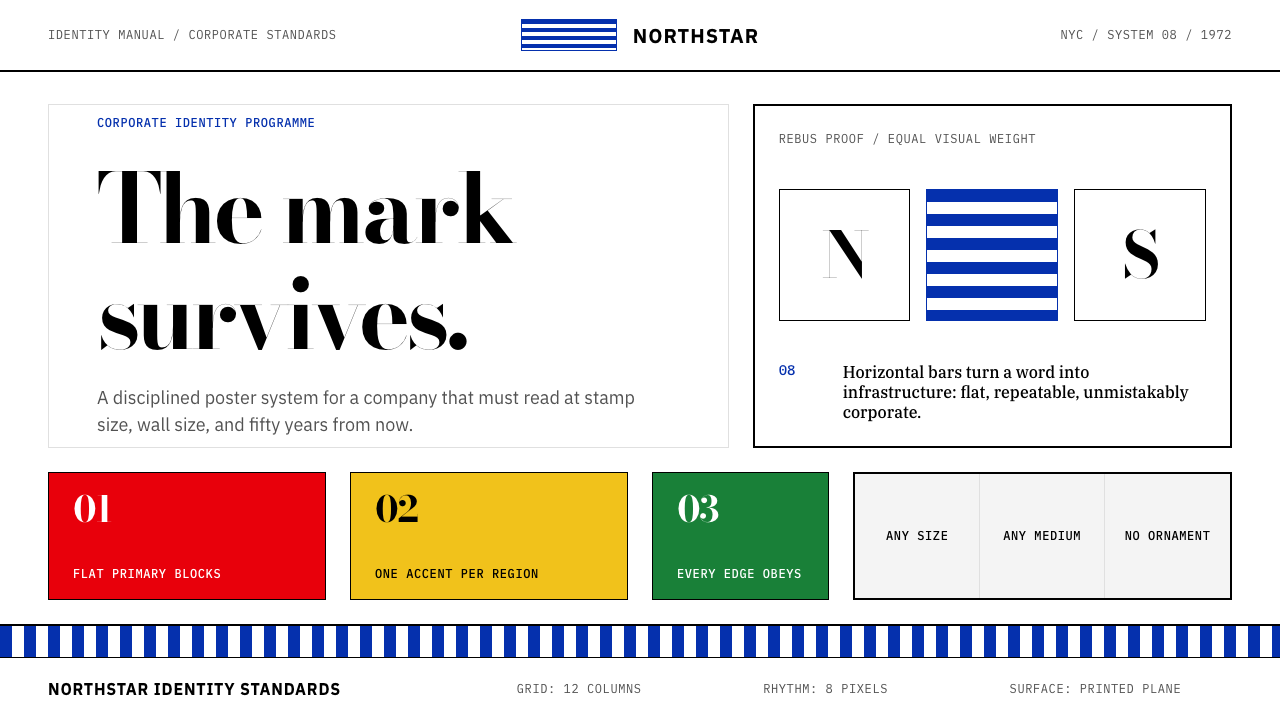 Paul Rand / IBM Corporate IdentityCorporate modernism stays exact. Blue 8-bar stripes, high-contrast serif, har…
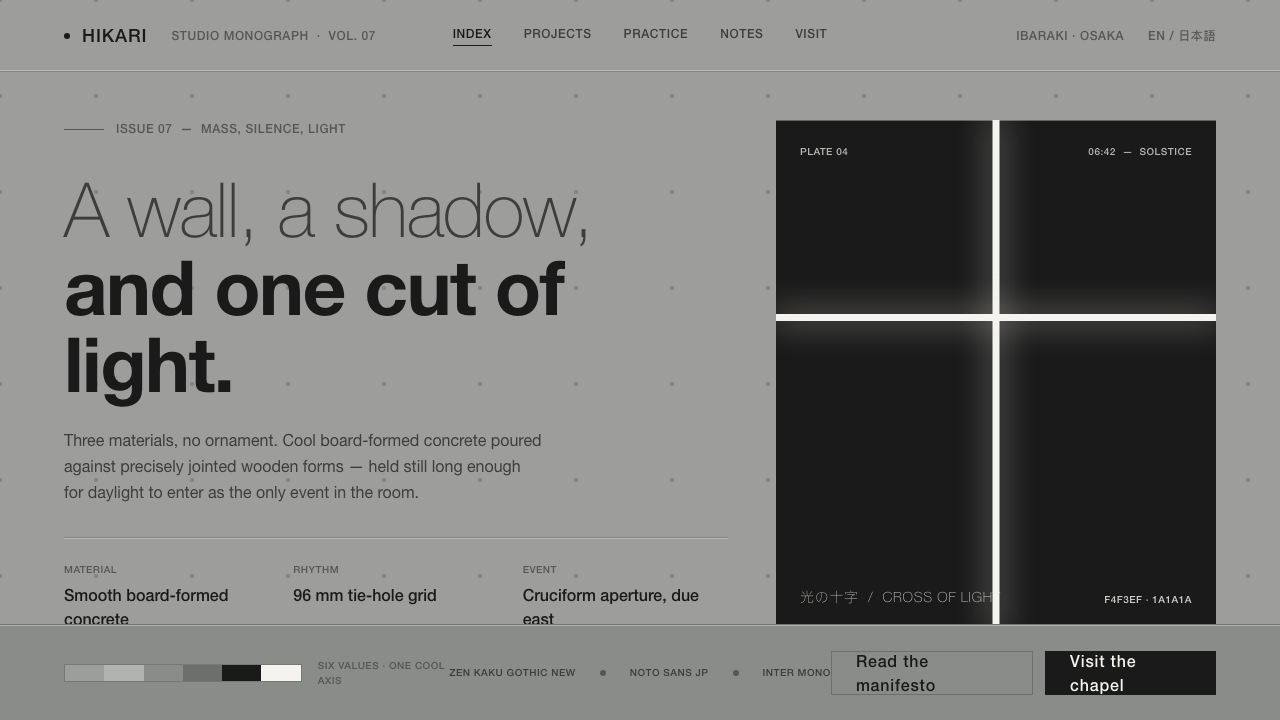 Tadao Ando ConcreteSilence as material. Cool board-formed grey, tie-hole grid, one sliver of lig…
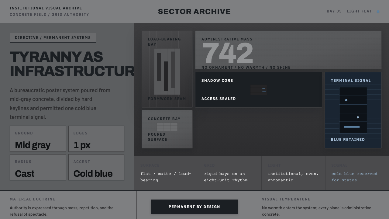 Andor Imperial GrayOppression made ordinary. Mid-gray concrete slabs, hard keylines, one cold bl…
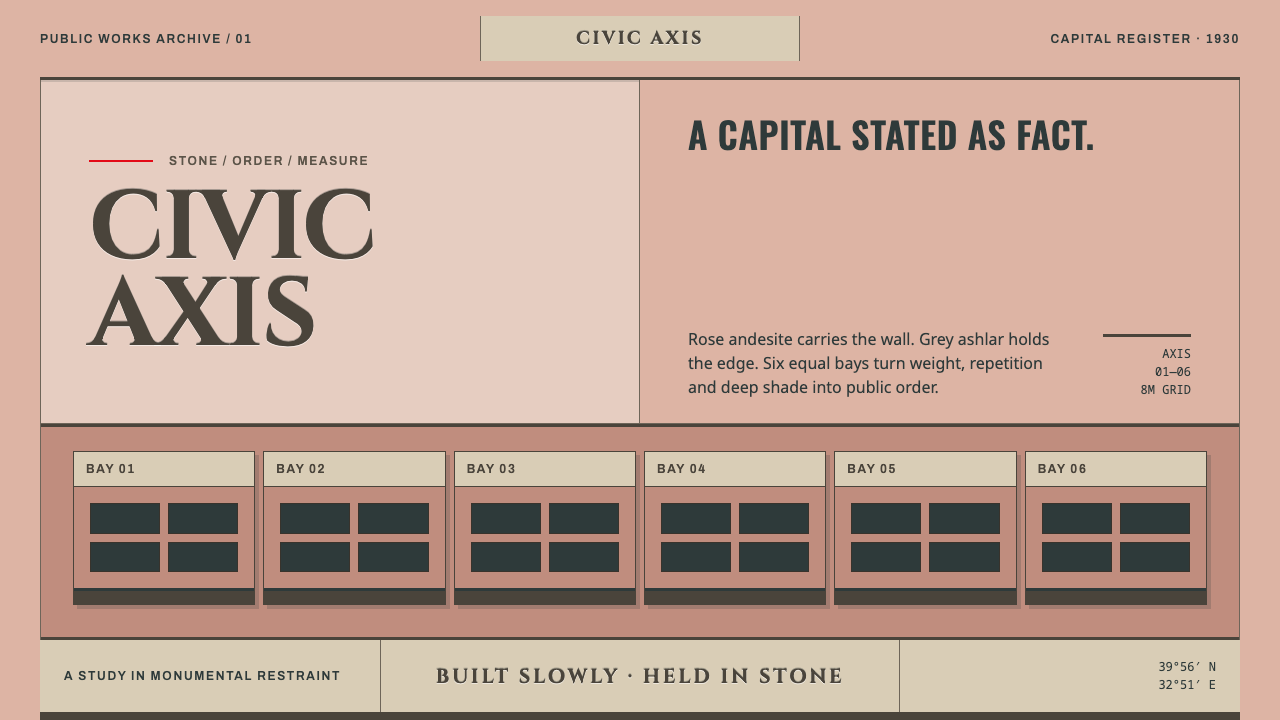 Ankara Republican ArchitectureAuthority moves slowly. Rose andesite, grey ashlar and six equal bays enforce…