What is Nsibidi Script Cross River?
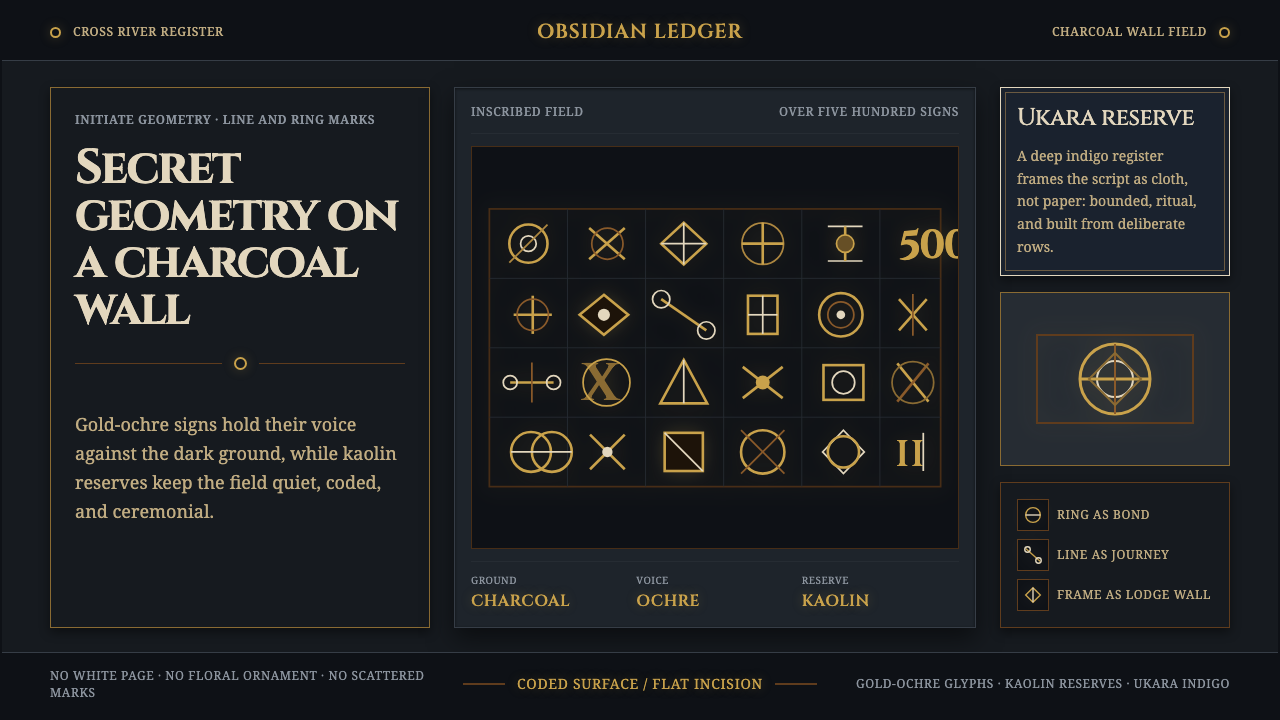
Nsibidi turns secrecy into a visual language of rings, paths, and marks glowing from a dark Cross River ground.
Nsibidi Script Cross River in brief
Nsibidi is an ideographic writing tradition from the Cross River region of southeastern Nigeria and southwestern Cameroon in West Africa. Its vocabulary contains more than five hundred ideograms and pictograms, formed through straight strokes, rings, enclosed spaces, and compact marks. Rather than behaving like an alphabet, its signs communicate through image, association, and learned cultural meaning. A ring may hold the force of a knot; a line may imply movement; a mark may carry the presence of the leopard.
The script was created and guarded by members of the Ekpe leopard society. Its visual life extended beyond a single writing surface: symbols were cut into split palm stems, painted on calabashes and bronze, and dyed in white onto deep indigo ukara cloth worn by initiates. That movement between incision, pigment, metal, and cloth is essential to its character. Nsibidi is not merely a collection of signs; it is a system shaped by materials, ritual boundaries, and the distinction between what can be seen and what can be understood.
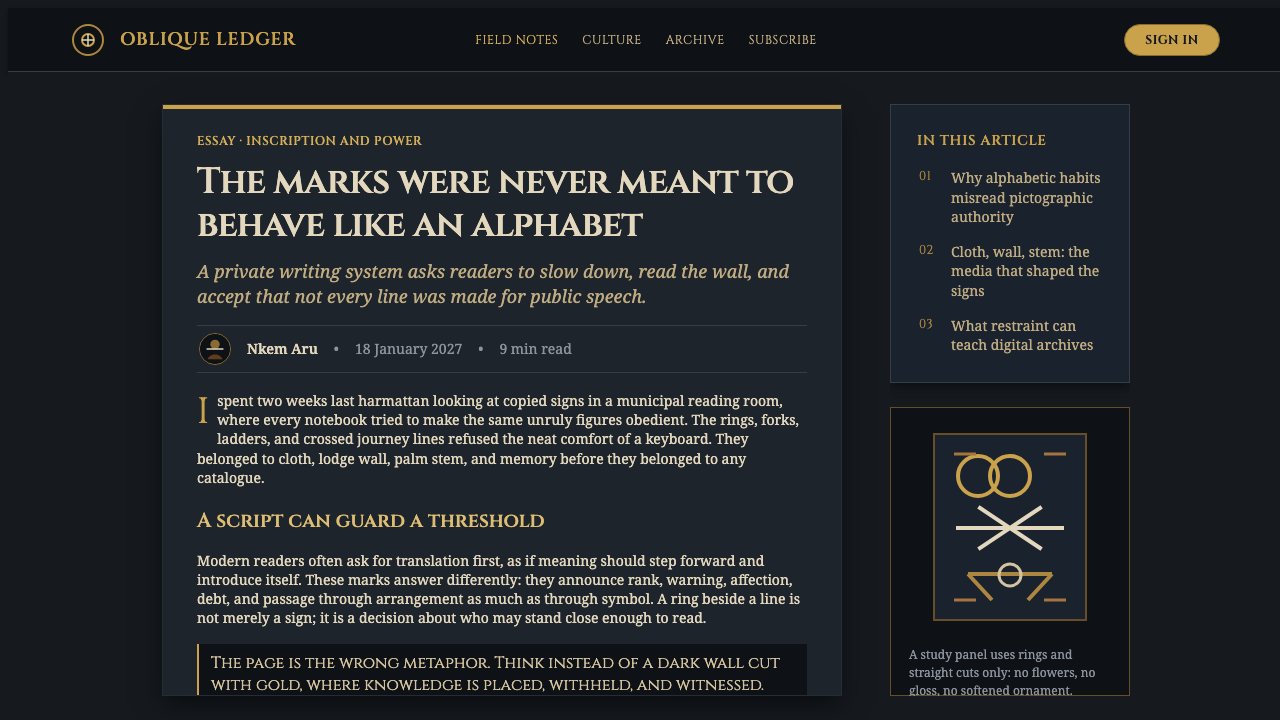
A contemporary Nsibidi-inspired design system should preserve this atmosphere of protected knowledge rather than flatten it into decorative pattern. Its field is dark, like a lodge wall rather than a blank page. Gold-ochre glyphs emerge with measured brightness, while kaolin-cream reserves create pauses of exposure and deep ukara indigo carries the cloth tradition into the composition. The result should feel coded, tactile, and ceremonial: signs do not fill space casually, but appear as if placed with purpose.
Where does Nsibidi Script Cross River come from?
Nsibidi belongs to the Cross River region, spanning southeastern Nigeria and southwestern Cameroon. Its roots reach back centuries before the twentieth century, while documented use extends through 1909. This long continuity matters because the script did not arise as an isolated graphic invention. It developed within regional social worlds, carried through practices of marking, making, wearing, and reading signs across different objects and surfaces.
The Ekpe society is central to the tradition. Its initiates created and safeguarded a visual vocabulary associated with the leopard society, including love-knot rings, journey lines, and leopard marks. Secrecy was not an incidental mood added after the fact; it was part of the system’s social condition. A sign could be visible while its fuller meaning remained available only to those with the knowledge to interpret it. That distinction gives Nsibidi its unusual visual tension: open marks, guarded sense.
The tradition also involved Efik, Ejagham, and Igbo scribes. Their presence situates Nsibidi within a wider Cross River network rather than reducing it to a single maker or a single medium. The script’s forms traveled through practical acts of inscription and display: palm stems accepted cuts, calabashes and bronze received painted marks, and ukara cloth carried white motifs against indigo. Each material altered the appearance of the signs without dissolving their identity.
For a design reader, the historical lesson is that Nsibidi should be understood as ideographic writing with cultural limits, not as a generic African motif bank. Its ring-line language is compelling because it joins form and meaning, concealment and declaration, surface and ritual use. Any contemporary interpretation should retain that restraint: it may evoke the atmosphere and formal logic of the source material, but should not claim secret readings or invent symbolic definitions for individual glyphs.
What defines the Nsibidi Script Cross River look?
Dark Ground
The ground is always dark: black moving toward charcoal, with the spatial feeling of a lodge wall rather than a neutral page. Darkness is not an empty background but the condition that makes the glyphs legible. It gives ochre, cream, and indigo the feeling of emergence, as though marks have been revealed from within a protected interior.
Ring and Line Glyphs
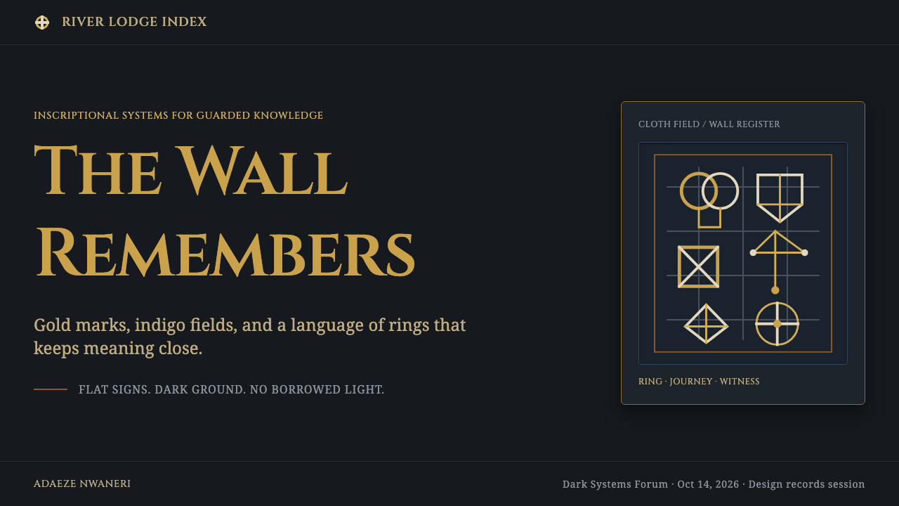
Rings and straight lines form the primary visual vocabulary. Love-knot rings suggest connection and enclosure; journey lines imply passage and direction; leopard marks introduce a compact, emblematic presence. The forms should remain decisive and sparse, with enough surrounding dark space for each sign to retain its separate force.
Ochre and Kaolin
Gold-ochre provides the warm glow of the system, while kaolin-cream functions as reserve, contrast, and quiet disclosure. These tones should feel mineral rather than cosmetic. Ochre is most effective when it highlights a few consequential glyphs; cream should clarify structure or interrupt darkness, not soften the composition into a conventional light layout.
Ukara Indigo
Deep ukara indigo carries the cloth tradition into the palette. It is not simply a cool accent: it is the visual register that connects graphic signs to white-dyed motifs on initiates’ cloth. Against charcoal, indigo can sit almost quietly; against kaolin reserve, it gains the density and depth of dyed fabric without requiring literal textile imitation.
Reserved Meaning
Nsibidi’s strongest compositional principle is restraint. Not every sign needs to be explained, repeated, or enlarged. The tradition’s secrecy suggests a layout in which visual information is rationed: one emblematic mark may carry more authority than an all-over pattern, and an unexplained gap may be more faithful than an invented caption.
Material Trace
The system should imply the trace of incision, paint, bronze, and dyed cloth without turning into literal texture effects. A glyph may feel cut, painted, or resist-dyed through its edge quality and placement. The key is material memory: marks should look as though they belong to a surface with history, not as though they have been applied as detached digital ornament.

Who shaped Nsibidi Script Cross River?
Ekpe society initiates created and safeguarded the Nsibidi visual tradition associated with the leopard society. Their role is central to understanding why secrecy belongs to the script’s structure rather than serving as a superficial aesthetic. The signs were visible across selected objects and cloth, but access to their fuller significance was culturally bounded.
Efik scribes are among the key figures associated with Nsibidi in the Cross River region. Their inclusion places the script within a regional practice of writing and interpretation. For designers, this is a reminder that the tradition is not reducible to one isolated object or one contemporary visual treatment.
Ejagham scribes form another named group connected to the Nsibidi tradition. Their place in the source material reinforces the script’s Cross River context and its life across communities. A responsible visual interpretation should therefore avoid presenting Nsibidi as a placeless decorative code detached from its regional setting.
Igbo scribes are also identified among the people associated with Nsibidi. Together with Ekpe initiates, Efik scribes, and Ejagham scribes, they show that the tradition involved distinct custodians and readers. This plurality should encourage careful attribution and discourage claims that a contemporary graphic treatment can stand in for the whole knowledge system.
How do you use Nsibidi Script Cross River today?
For presentation covers, use the dark lodge-wall field as the first act of communication. Place one or a small number of ring-line glyphs with generous surrounding space, then introduce the title as a secondary, clearly separated layer. Ochre can establish the focal signal, kaolin can provide a restrained countermark, and indigo can hold a quiet region of depth. The cover should feel like an encounter with a sign, not an inventory of motifs.
Content slides benefit from an editorial rhythm of dark fields and reserved light areas. Let a single journey-like line organize reading direction, and use glyphs as section anchors rather than bullets or decorative dividers. On data slides, retain the same discipline: charts and labels should live within calm, legible structures, while a ring, path, or leopard-inspired mark signals the conceptual threshold of a section. The visual language should frame information without assigning invented meanings to historical symbols.
For web interfaces, this approach suits dashboards, archives, cultural research spaces, and controlled-access experiences where a sense of depth and attention is useful. A charcoal field can establish the environment, while ochre identifies consequential actions and kaolin carries essential reading content. Navigation should remain plain and easy to understand; glyph-like elements work best as wayfinding accents, status emblems, or section markers, never as replacement text where accessibility requires direct language.
For editorial and marketing work, Nsibidi-derived atmosphere is especially effective when the subject calls for care, provenance, or layered discovery. Use wide dark margins, compact sign clusters, and deliberate moments of cream reserve to create pacing. Campaign pages can alternate between indigo-bearing fields and charcoal passages, with ochre reserved for the central proposition or invitation. Images and copy should leave room for silence instead of competing with the glyph system at every turn.
The common mistake is to treat Nsibidi as an all-purpose pattern and repeat ring marks across every available surface. That converts a protected ideographic tradition into wallpaper and erases the force of reserve. Another mistake is inventing translations for symbols or using them as shorthand for generic mystery. Work from the supplied, public formal vocabulary only: rings, lines, leopard associations, dark ground, ochre glow, kaolin reserve, and ukara indigo. Let the design acknowledge cultural specificity through restraint and attribution.
Nsibidi Script Cross River — FAQ
Is Nsibidi an alphabet?
No. Nsibidi is described here as an ideographic script made of more than five hundred ideograms and pictograms. Its signs are built from forms such as straight lines and rings, and they communicate through learned visual meanings rather than through an alphabetic sequence. A design treatment should therefore avoid presenting the glyphs as interchangeable letters or using them to spell invented words.
Why is the background kept dark?
The dark ground comes directly from the design system’s intended setting: a lodge wall, not a page. Black and charcoal make ochre glyphs and kaolin reserves feel revealed rather than merely printed, while deep indigo recalls the register of ukara cloth. A light-ground adaptation may retain isolated colors, but it loses the enclosure, concealment, and slow emergence that define this interpretation.
Can I assign meanings to individual Nsibidi symbols in a design?
No. The public source identifies broad examples such as love-knot rings, journey lines, and leopard marks, but it does not authorize invented translations or secret readings for individual glyphs. Use the available forms as culturally situated visual references, and keep explanatory copy focused on the documented tradition rather than claiming knowledge the design does not possess.
How should ukara cloth influence a digital layout?
Ukara cloth provides a material and chromatic register rather than a mandate to imitate fabric literally. Bring its influence through deep indigo fields, kaolin-like contrast, and the disciplined placement of light motifs against darkness. The goal is to remember that white symbols were dyed onto indigo cloth worn by initiates, while keeping digital content readable and avoiding simulated textile effects that overwhelm the signs.
What is the safest contemporary use of this style?
Use it as a restrained atmosphere for contexts that can acknowledge its Cross River origin: archival storytelling, cultural education, research presentation, or carefully attributed editorial work. Keep the public visual cues clear — dark ground, ring-line forms, ochre, kaolin, and ukara indigo — while avoiding claims to hidden meanings, ritual authority, or unrestricted ownership of the script. The strongest result is specific about origin and modest about what design can know.
Related design styles
 Togolese Vodun Fa DivinationSacred clutter speaks. Shrine-black layers, chalk marks, and palm-oil red bui…
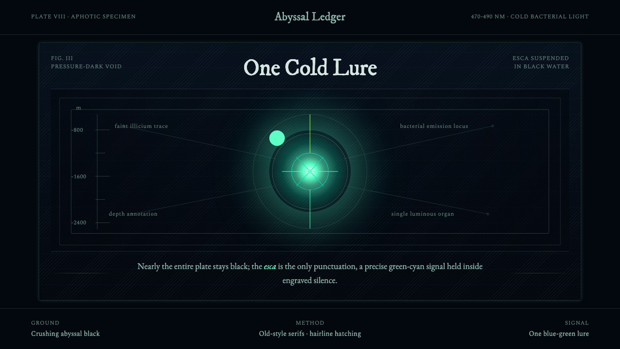 Anglerfish Lure BioluminescenceLight is scarce. Old serifs and hairline rules frame one cold green-cyan lure.
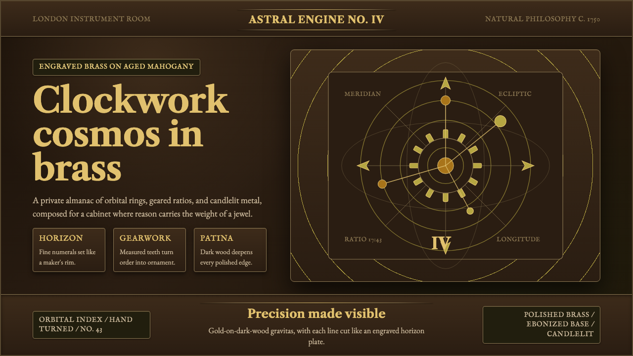 Brass OrreryTurns reason into gold. Brass rings and Caslon type glow over near-black maho…
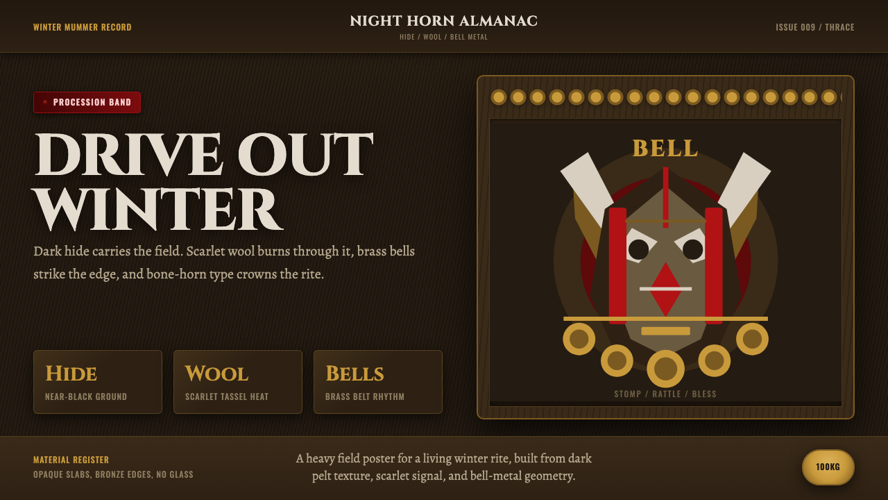 Bulgarian Kukeri MummersRitual darkness hits first. Scarlet wool, brass bells, and bone type stomp ac…
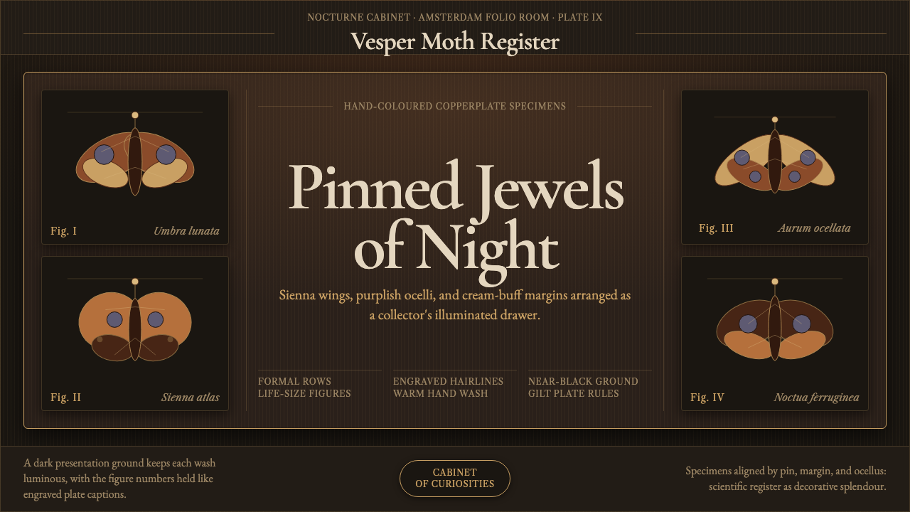 Cramer Exotic MothsJewel-like precision. Sienna specimens glow in formal rows on a near-black pl…
 Ecuadorian Otavalo Cochineal LoomHandwoven gravity. Cochineal and cobalt stripes tense against charcoal, cut b…