What is Togolese Vodun Fa Divination?
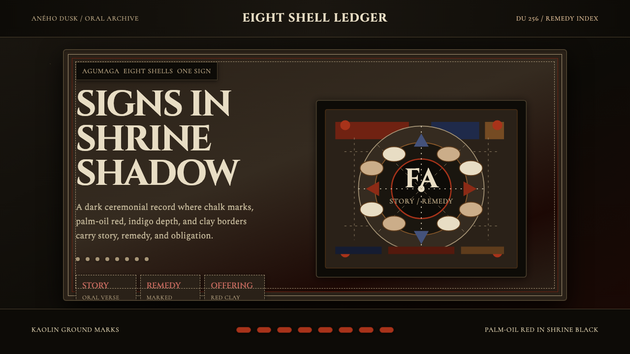
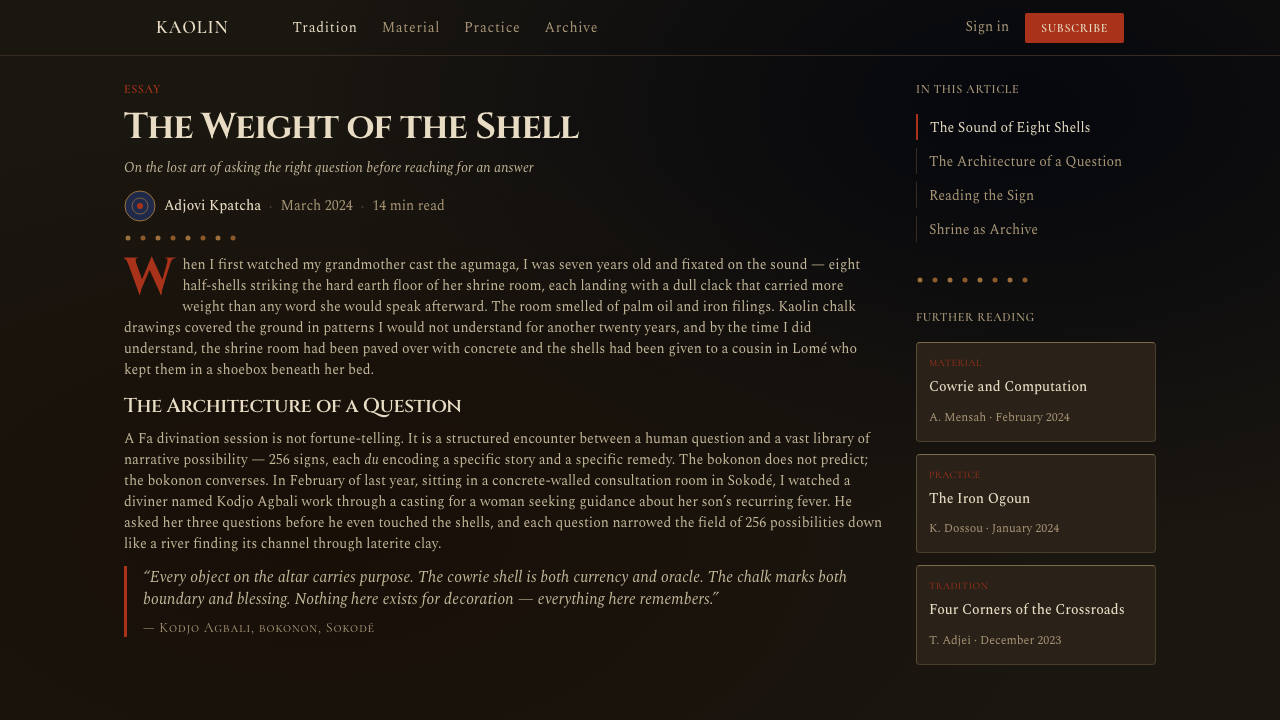
Fa divination transforms sacred ritual weight into a design language of shrine-black depth, chalk-white marks, and palm-oil red — where every element carries both function and history.
Togolese Vodun Fa Divination in brief
Togolese Vodun Fa Divination is a design system rooted in the geomantic oracle tradition of the Ewe, Mina, and Fon peoples of West Africa. At its ritual core, a trained diviner known as a bokonon casts an eight-element chain of palm nuts or shells and reads one of 256 possible signs — called odu — each associated with a set of stories, warnings, and remedies. The visual world that surrounds this practice is dense, layered, and deliberately weighted: clay altars daubed with palm oil, iron spikes representing the deity Ogun, kaolin ground-drawings etched in white, faded scarlet cloth draped over offerings, and cowrie shells arranged in patterns that accumulate meaning through accumulation rather than simplification.
As a design aesthetic, Vodun Fa Divination refuses minimalism on principle. The richness of shrine space is not disorder — it is organized density. Each object is present because it has earned its place through ritual significance, and the composition as a whole communicates authority, age, and spiritual weight. Translated into screen or print, this aesthetic operates through deep shadow grounds, chalk-like marks that suggest hand-drawn inscription rather than mechanical precision, and a palette anchored in three symbolic poles: the black of night and the unseen, the white of kaolin and ancestral communication, and the red of palm oil, sacrifice, and vital force.
The system is fundamentally dark — not in mood, but in ground. The darkness is generative rather than voids, and elements emerge from it the way objects emerge from shadow in a candlelit shrine. This is the opposite of modernist white-ground design: instead of removing everything that does not serve clarity, this language adds layers until the composition reaches the density it requires. The challenge for the designer is knowing when that threshold has been reached — when sacred clutter becomes meaningful, and when it tips into chaos.
Where does Togolese Vodun Fa Divination come from?
The Fa divination system is part of the wider Ifa tradition that originated among the Yoruba people of what is now southwestern Nigeria, likely taking its distinctive form sometime in the first millennium CE. As Yoruba religious and commercial networks expanded westward, Ifa practices were adapted by neighboring peoples, most significantly by the Fon kingdom of Dahomey (centered on present-day Abomey, Benin) and by the Ewe and Mina communities of what is now southern Togo and Ghana. In this westward diffusion, the system was renamed Fa and incorporated into local Vodun cosmology — a religious framework that understands the universe as governed by a hierarchy of divine forces called vodu, each with their own visual emblems, colors, materials, and temperaments.
The visual culture of Fa divination developed in parallel with the religious practice itself across the coastal and inland communities of Togo, Benin, and southwest Nigeria. In the royal court of Dahomey, where Vodun was a state religion, divination aesthetics informed monumental art: the bronze reliefs of the royal palaces at Abomey depicted vodu symbols, and the court maintained specialist metalworkers who produced iron staffs and sculptural assemblages charged with spiritual significance. In village-level practice, the visual language was more intimate but no less intentional — domestic shrines were maintained as accumulations of objects given to specific deities over generations, and the patina of age and repeated ritual anointing was itself an aesthetic value. The oldest shrines were the most visually complex.
The Atlantic slave trade — which devastated the Fon, Ewe, and Yoruba homelands between the seventeenth and nineteenth centuries — paradoxically spread Vodun visual culture across the diaspora. In Haiti, Cuba, Brazil, and New Orleans, Vodun practices survived and hybridized with Catholic iconography, producing syncretic traditions (Haitian Vodou, Cuban Lucumí, Brazilian Candomblé) that share visual DNA with the Togolese originals: the same altar density, the same stratified use of black, white, and red, the same logic of accumulation. The twentieth-century documentation of these traditions by scholars including Pierre Verger and Suzanne Preston Blier made the visual systems legible to international audiences and eventually to designers working outside the tradition.
Contemporary Togolese artists and designers have engaged actively with this visual inheritance since the country's independence in 1960. Lomé's artistic scene, which emerged in the 1970s and 1980s, drew on Vodun shrine aesthetics as a counterpoint to both European modernist influence and the flattening abstractions of official state culture. In the broader global context, the design language of Fa divination has attracted renewed interest in the 2010s and 2020s as practitioners seek non-Western visual systems that carry genuine conceptual depth rather than merely surface pattern — systems whose logic of accumulation, layering, and symbolic color use offers an alternative to both Bauhaus reduction and corporate digital minimalism.
What defines the Togolese Vodun Fa Divination look?
Ground and Dark Field
The foundational ground is deep and dark — evoking the visual weight of a shrine at night, where objects emerge from shadow rather than sit upon a lit surface. This dark field is not empty: it carries implied depth, as if layers of use and anointing have accumulated beneath the surface. Elements placed on this ground gain gravity and presence that they would not have on a white or neutral field. The darkness is chromatic rather than merely achromatic — it shifts subtly toward deep brown or warm black, reflecting the palette of clay, oil, and iron.
Chalk-White Inscription
White elements in this system read as inscriptions rather than as highlights or whitespace. Derived from the kaolin ground-drawings (vévé-like patterns traced in chalk or white clay before ceremonies), white marks carry the quality of something written by hand with urgency and intention. Lines are irregular, gestural, and dense where they cluster. Against the dark ground, this white is luminous and slightly warm — not the clean white of modernist design but the dusty, mineral white of ritual drawing material. Text, symbols, and graphic marks share this quality: they appear drawn rather than printed.
Palm-Oil Red as Signal
The third pole of the palette is a deep, slightly muted red — the color of palm oil used to anoint shrines and sacred objects, and by association with blood, sacrifice, and vital force. This red is not the bright primary red of modernist color theory but something older and more organic: slightly orange at the edge of the spectrum, deepened by age and ritual use. As a design element, this red functions as an urgent signal — the element in a composition that demands attention and indicates consequence. It appears sparingly, which is what gives it power; when it dominates, the balance tips from sacred weight to alarm.
Layered Accumulation
Where minimalist design subtracts, this system adds. Visual complexity is achieved through layering — textures overlapping, marks built up through repetition, earlier elements visible beneath newer ones like votive objects accumulated on an altar over generations. This layering is not random: it follows a logic of addition where each new layer relates to what is beneath it. The result is a surface that rewards close reading because the density is structured. In practice, this means that empty space is used deliberately and rarely — every region of a composition carries material, and density itself becomes a quality signal rather than a problem to solve.
Symbolic Geometry of the Odu
The 256 odu signs of Fa divination are rendered as configurations of binary marks — paired or single notches arranged in four columns, creating a visual system that is simultaneously mathematical and symbolic. This mark-pattern logic, when translated into design, produces a preference for binary arrangements, repeated unit forms, and systematic variation within a strict formal grammar. Graphic elements tend to recur at regular intervals with subtle differences, like the marks of a divination chain read across multiple throws. The geometry is archaic and pre-mechanical — it does not feel computed but rather counted, the result of hands and materials rather than pixels and vectors.
Iron and Material Weight
Iron is the material of Ogun, the deity of metalwork, roads, and war, and iron objects — spikes, chains, tools — appear in shrine assemblages as bearers of force and protection. In design terms, this translates to a visual heaviness: strokes are thick rather than hairline, borders where they appear are substantial rather than decorative, and there is a preference for elements that appear to have mass and density rather than to float. The aesthetic resists any sense of lightness or delicacy and favors forms that seem forged rather than drawn.
Patina and Ritual Time
Shrine objects gain power through use, and the marks of that use — the darkening of oil-anointed wood, the fading of cloth, the worn edge of a divination board — are not imperfections to be corrected but evidence of accumulated spiritual attention. In design, this principle manifests as a deliberate embrace of visual age: surfaces that appear textured and worn rather than fresh and smooth, colors that carry depth and variation rather than uniform flatness, marks that suggest multiple passes rather than a single clean stroke. The aesthetic is opposed to the gleaming newness of consumer product design; it values density that has been earned over time.
Who shaped Togolese Vodun Fa Divination?
A Yoruba scholar, poet, and former senator who devoted his life to documenting and preserving the Ifa oral corpus — the literary foundation that Fa divination shares with its Yoruba ancestor tradition. Abimbola's translations and analyses of the odu made the philosophical and aesthetic dimensions of the divination system legible to scholars across disciplines, and his advocacy was instrumental in securing UNESCO's recognition of Ifa divination as an Intangible Cultural Heritage in 2005. His work established that the visual and material culture of shrine practice is inseparable from the oral literature it accompanies.
A French photographer and ethnobotanist who arrived in West Africa in the 1940s and eventually became initiated into Ifa practice as a babalawo (divination priest). Verger's photographs — dense, close, attentive to the material surfaces of shrine objects and ritual practice — created the first sustained visual record of Vodun aesthetics accessible to outside audiences. His work demonstrated that the visual logic of the tradition had its own coherence and demanded documentation on its own terms rather than as anthropological curiosity.
A Togolese artist and cultural practitioner based in Lomé who has worked extensively to translate the visual vocabulary of Vodun shrine practice into contemporary art and design contexts. Sanvee's work exemplifies the challenge of transposition: maintaining the density and symbolic weight of traditional aesthetics while making the work legible and meaningful to audiences who did not grow up within the practice. His engagement with material accumulation, dark fields, and iron-like heaviness in contemporary formats shows how the design system can be activated without being emptied of its conceptual content.
An art historian at Harvard whose research on Fon royal art and the visual culture of Dahomey produced foundational scholarship on the relationship between power, aesthetics, and religious practice in the Vodun world. Her book on the royal arts of Dahomey analyzed how shrine aesthetics and court art shared a visual grammar built on accumulation, symbolic color, and material weight. This scholarship gave designers outside the tradition intellectual tools for understanding why the visual system works the way it does — not as decoration but as a structured language for communicating about the invisible world.
How do you use Togolese Vodun Fa Divination today?
Applying Vodun Fa Divination aesthetics requires a fundamental shift in compositional logic: instead of starting from a clean white ground and adding elements until the layout feels complete, you start from darkness and bring elements forward into visibility. This reversal changes how every design decision lands. The dark ground is not a stylistic preference — it is the base condition from which everything else derives meaning. Any lightening of that ground, any move toward neutral gray or cream, immediately reduces the visual system's characteristic gravity.
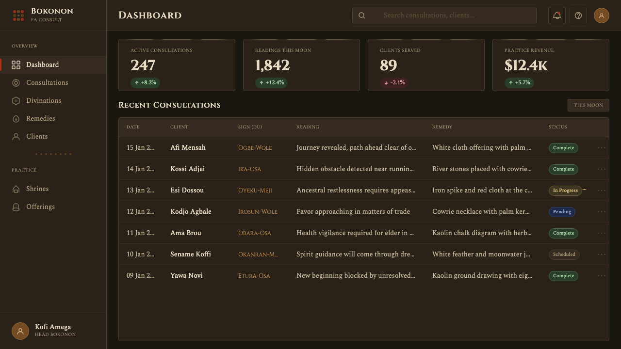
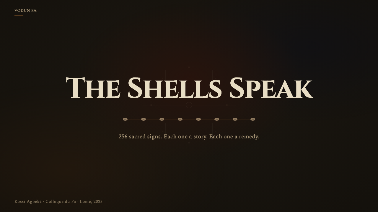
For presentation slides, this style works most powerfully on cover pages and section breaks where tonal weight and symbolic presence matter more than information density. A cover built on this system uses the deep dark field to full bleed, allows one or two chalk-white mark elements to establish the ritual inscription quality, and reserves the palm-oil red for the single most important visual signal — a title word, a date, a name. Content slides within a Vodun Fa-derived deck should be treated more sparingly: dark grounds with generous space around text elements, and white marks used only to draw the eye toward key points. Data slides can use the symbolic color system to differentiate categories — one data series in white, one in red — with the dark ground reducing visual noise to zero.
For web interfaces, this aesthetic is best suited to landing pages, portfolio presentations, and cultural or heritage contexts where the dark ground's weight and authority serve the content. Dashboard applications are more challenging: the density logic that makes shrine aesthetics powerful can impede functional clarity at scale. If adapting to a dashboard context, the most effective approach is to treat the dark ground as the primary state and use white marks to indicate active, selected, or alert states — using the system's inherent contrast hierarchy for information architecture rather than fighting it. Navigation and structural elements should remain in the black-white axis; the red appears only for critical alerts or primary calls to action.
In editorial and marketing contexts, the style creates strong visual impact for cultural brands, music and performance work, heritage institutions, and any project where the association with deep historical roots and spiritual authority serves the brand positioning. A full-spread editorial page built on this system — dark field, dense overlapping elements, chalk-white headline, red accent on the key phrase — reads as both ancient and contemporary, a quality that is difficult to achieve with other historical systems. Marketing materials benefit from the poster-like boldness: unlike Bauhaus, which works through geometric clarity, this system works through accumulated weight, and the emotional register is reverence and attention rather than rationality and efficiency.
A common mistake when applying this aesthetic is treating the dark ground as a trendy dark mode and lightening everything else accordingly. Dark mode design optimizes for readability in low-light environments; Vodun Fa aesthetics uses darkness as a conceptual ground, not a screen accommodation. If the white elements are too clean and the overall composition feels like a standard dark-mode UI with a red accent, the system has been stripped of its character. The other frequent error is deploying the density principle without the underlying logic — adding textures, marks, and overlapping elements randomly in the hope that accumulation will create ritual weight. Sacred clutter is earned through symbolic purpose; decorative clutter is empty. Every mark should be there because it is doing something.
Togolese Vodun Fa Divination — FAQ
Is this aesthetic appropriate to use outside of its originating cultural context?
This is the central ethical question for any designer working with Vodun Fa aesthetics. The tradition is living and practiced — it is not historical in the way that, say, Art Nouveau is historical. The most honest approach is to engage with the visual system as a visual system while being transparent about its origins and without claiming spiritual authority or authenticity that belongs to initiated practitioners. Appropriating specific sacred symbols (odu configurations, vodu emblems) for decorative purposes without understanding their meaning is different from working within the aesthetic logic — the dark ground, accumulation, and symbolic color — in a way that acknowledges its source. Collaboration with artists and designers from within the tradition is the strongest response to this concern.
How does this system differ from other African visual traditions?
Africa encompasses an enormous range of visual traditions, and it would be a mistake to treat Vodun Fa aesthetics as representative of African design broadly. What distinguishes this particular system is its specific logic of accumulation in dark fields, its tripartite palette anchored in black, white, and a deep organic red, and its emphasis on inscription-like mark-making derived from geomantic divination practice. Other West African traditions — Kente weaving, Adinkra symbol systems, Nok sculptural aesthetics, Tuareg geometric ornamentation — operate according to entirely different visual grammars. Even within Vodun practice, the visual cultures of Haitian Vodou and Brazilian Candomblé, while sharing roots, have developed distinct aesthetics shaped by their respective diasporic contexts.
Can this aesthetic be applied effectively in a light-background context?
With difficulty. The dark ground is not a preference within this system — it is the system's primary condition. Inverting to a white ground fundamentally changes the character of every other element: chalk marks become merely thin lines, the palm-oil red loses its luminosity against darkness and instead reads as a standard accent color, and the logic of emergence from shadow is completely lost. A light-ground version of this palette risks looking like a heavily stylized world-music brand rather than a genuine engagement with the aesthetic. If the context genuinely requires a light background, it is worth asking whether this particular system is the right choice at all, rather than adapting it so extensively that its character disappears.
What makes Vodun Fa different from general 'dark and mysterious' aesthetic trends?
The surface resemblance to gothic, dark-academia, or moody editorial aesthetics is real but superficial. What distinguishes Vodun Fa as a design system is the specificity of its symbolic logic: the dark ground is a theological condition (the unseen world from which divination draws), the white marks are a specific inscription practice (geomantic ground-drawing), and the red is tied to specific material and ritual significance (palm oil, blood, vital force). Dark aesthetics in general use darkness as mood or atmosphere; Vodun Fa uses darkness as ground from which meaning is structured. The accumulation principle also differs: gothic darkness tends to use decorative density for menace or romance, while shrine accumulation is functional — each object is there because it was given for a specific purpose. This purposeful density is what the design system is reaching for, and it requires genuine compositional discipline rather than the addition of moody textures.
How should text and typography be handled in this system?
Text in this system should evoke inscription rather than printing. This means type choices that carry a degree of manual or archaic quality — letterforms with visible construction, slight irregularity, or the sense that they were made rather than generated. Against the dark ground, text is most powerful in the chalk-white register: the natural treatment is light text on dark background, with generous leading and spacing that let each character breathe within the density of the overall composition. The palm-oil red should be reserved for the most critical text elements — a single word, a name, a number — rather than used for running text. Avoid type that reads as purely digital or screen-optimized; the system's material character is at odds with the frictionless surfaces of contemporary interface typography.
Related design styles
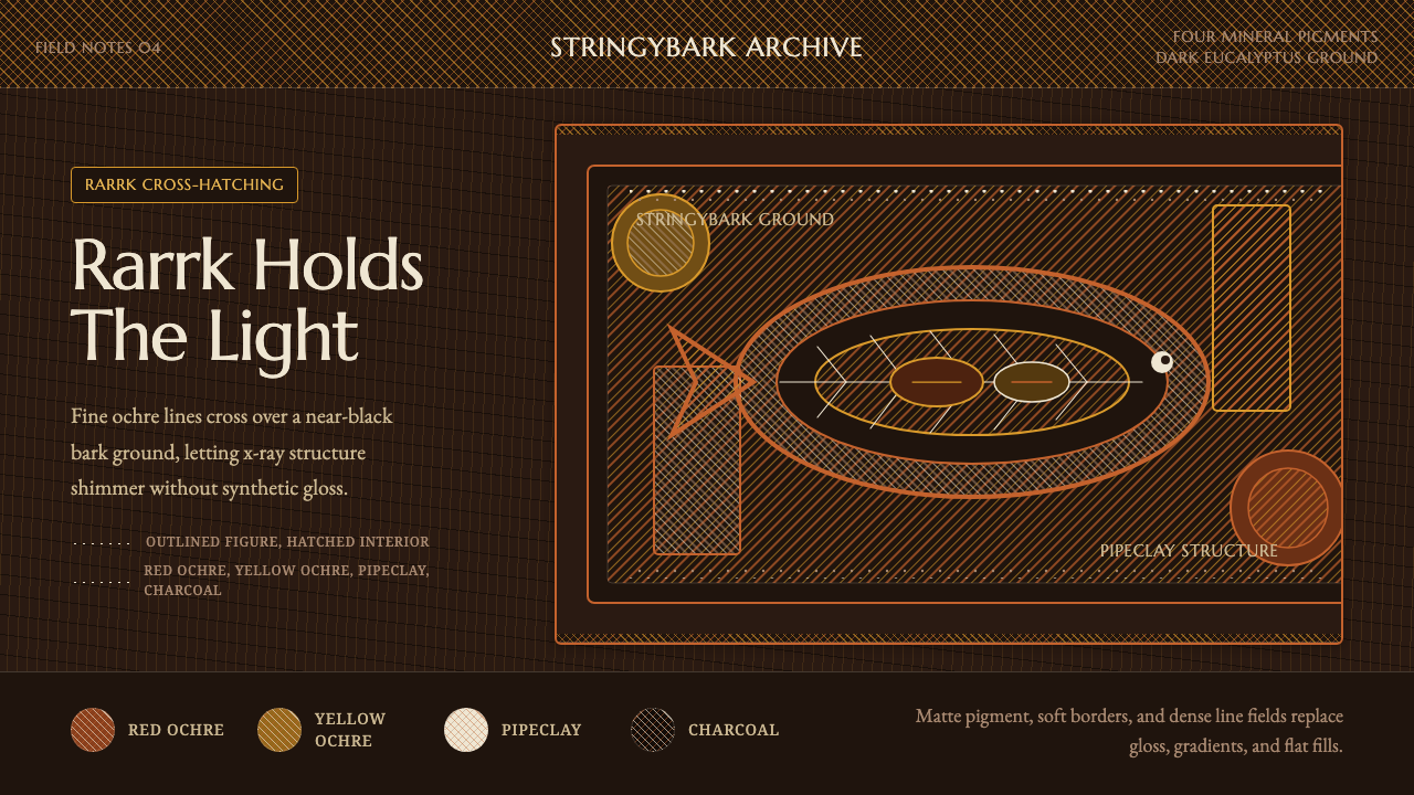 Arnhem X-Ray Bark PaintingShimmers without gloss. Ochre rarrk lines vibrate on dark stringybark.
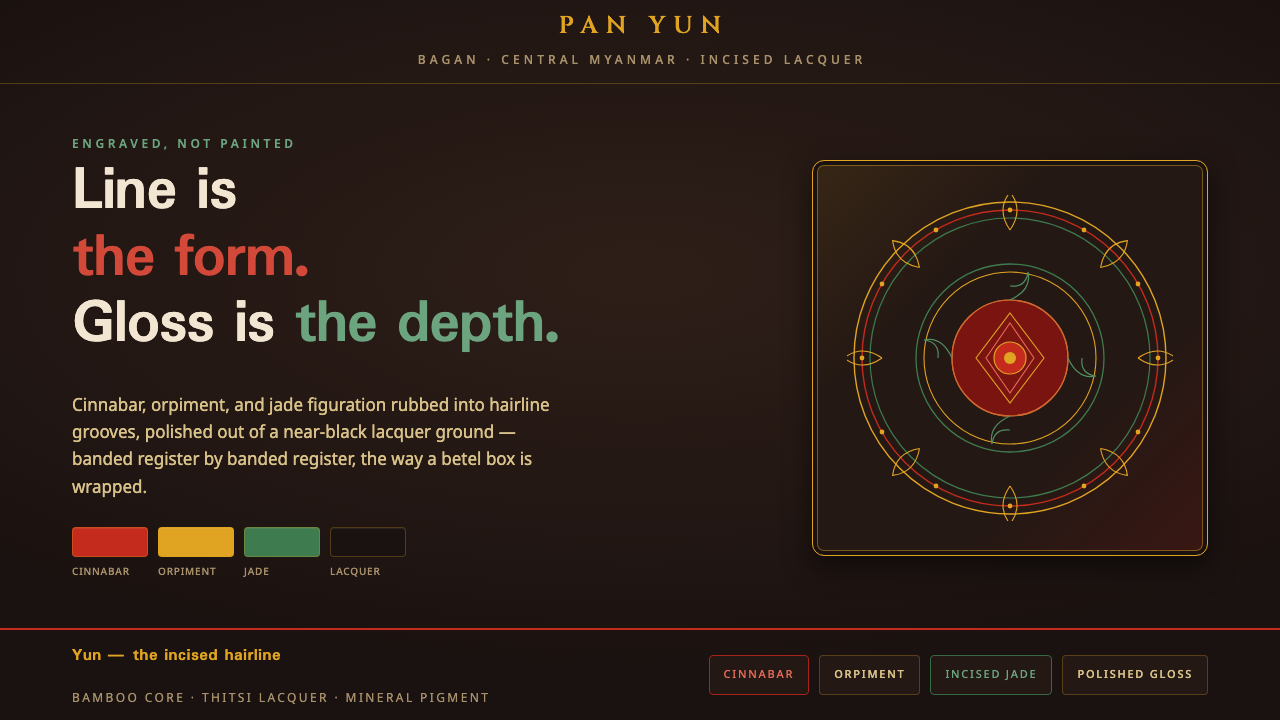 Bagan Yun LacquerwareEngraved, not painted. Cinnabar, orpiment and jade hairlines polished from ne…
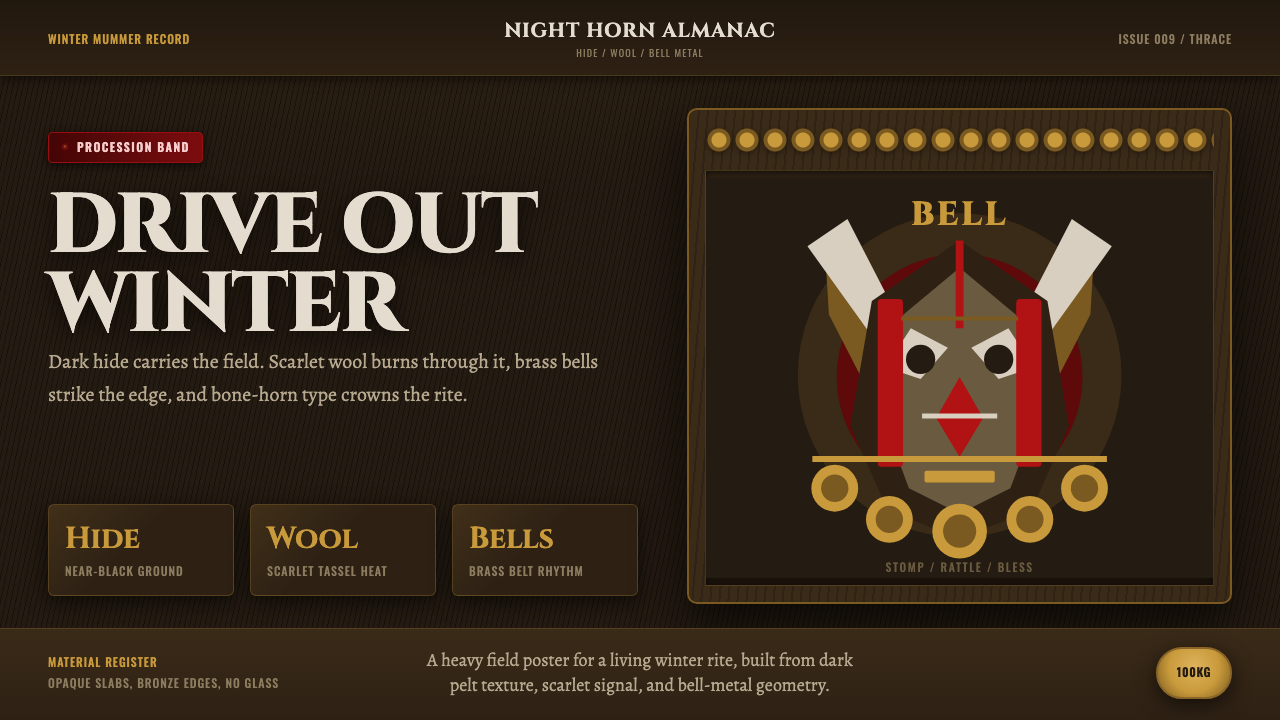 Bulgarian Kukeri MummersRitual darkness hits first. Scarlet wool, brass bells, and bone type stomp ac…
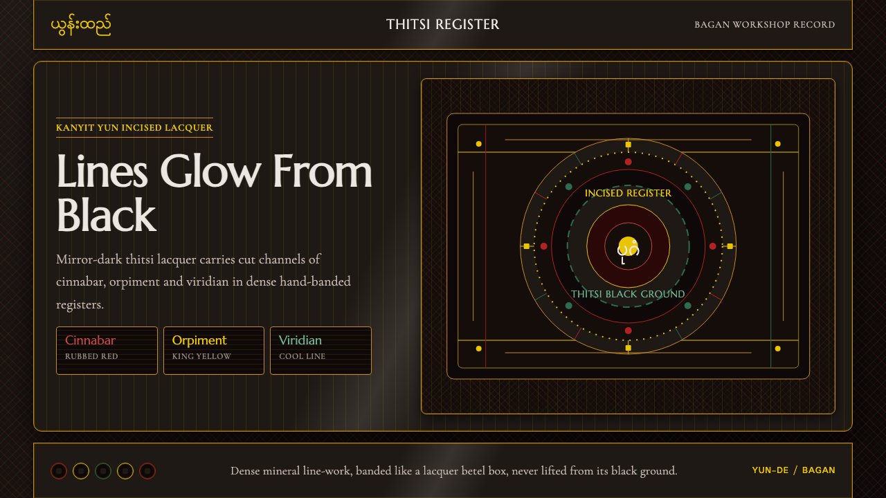 Burmese Yun LacquerwareLacquer glows in cut lines. Cinnabar, orpiment and viridian band a mirror-bla…
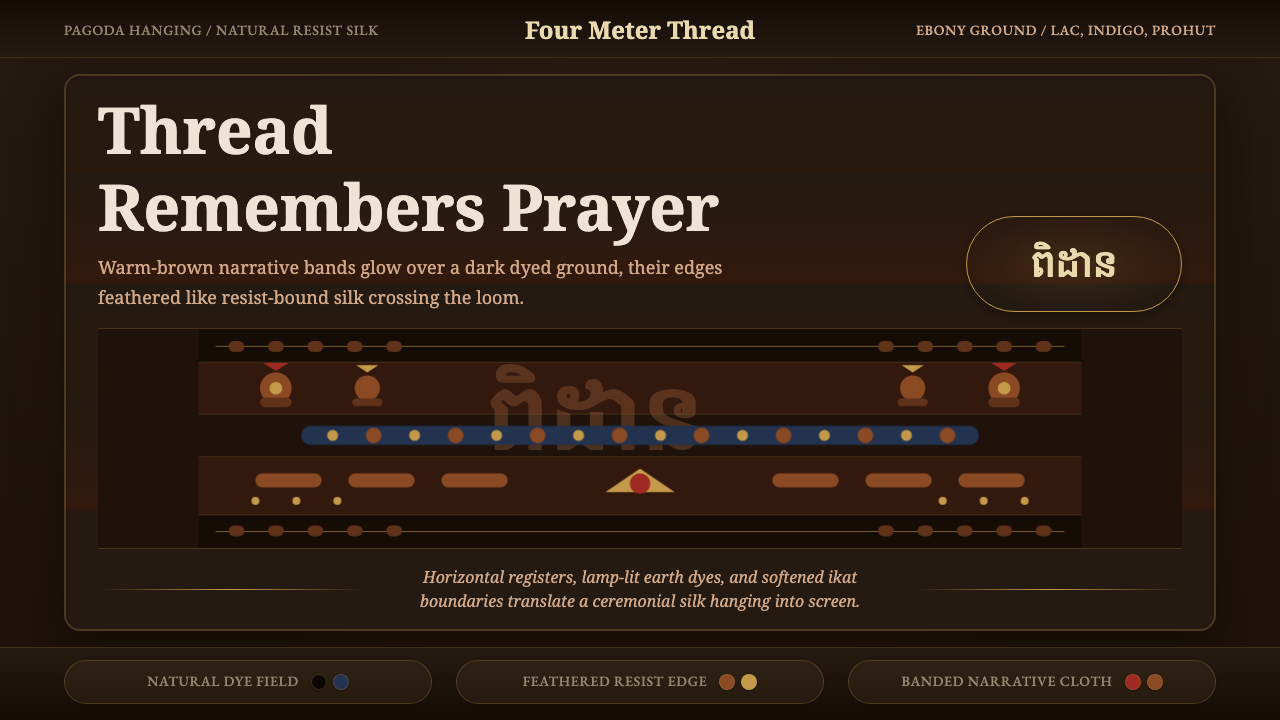 Cambodian Pidan IkatSacred cloth glows. Ebony-indigo bands carry warm-brown ikat figures with fea…
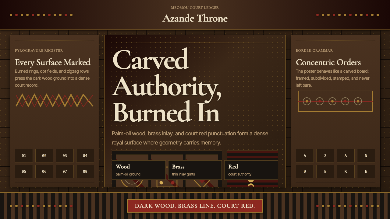 Central African Azande ThroneDense court gravity. Dark wood grids, brass dots, and court red cover every s…