What is Norse Runic Stave?
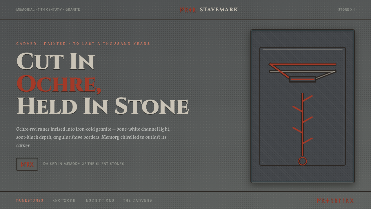
Norse Runic Stave treats the surface as carved memory: ochre-red futhark marks cut into iron-cold granite, with serpent knots holding the composition together.
Norse Runic Stave in brief
Norse Runic Stave is a dark visual system derived from Viking-age runestones and the galdrastafir stave tradition. Its central image is not a printed page or a polished interface, but a granite face bearing incised futhark runes: marks made by removal, then made legible again with pigment. The style therefore feels archaeological without becoming dusty. It is severe, tactile, ceremonial, and built around the conviction that inscription carries weight.
The surviving stones are often perceived as bare gray objects, softened by weather and flecked with lichen. Yet paint-residue evidence shows that their carved channels once held strong color. Norse Runic Stave rebuilds that lost contrast rather than imitating a neutral museum display. Ochre-red marks appear to sit within cuts in iron-gray stone; bone white and soot black serve as restrained supporting tones. The result should feel like a painted carving, never like red typography placed casually on a dark background.
Interlaced serpent knotwork gives the system its movement. Runes establish reading, memorial intent, and symbolic force; the serpent line binds edges, corners, and fields into a continuous enclosure. This is not an ornamental border added after the fact. It is a structural rhythm that makes the composition feel carved from one surface. The aesthetic gains its authority from tension between hard stone, warm pigment, narrow incisions, and lines that seem able to continue beyond the visible frame.
Where does Norse Runic Stave come from?
The visual source of Norse Runic Stave lies in Viking-age runestones in the Norse runestone heartlands of Eastern Europe and Scandinavia. These stones combine a durable mineral surface with language cut directly into it. Their futhark inscriptions turn writing into an event on the material itself: the marks do not float over a field, but occupy grooves, edges, turns, and enclosed spaces. This relationship between text and stone is the foundation of the style.
Rune-carvers shaped the visual language through incision. Their work required a composition that could survive the resistance of granite while remaining legible across a stone face. The resulting logic favors clear strokes, decisive cuts, compact arrangements, and contrast that remains readable against dark material. The people memorialised on the stones are equally important to the system's emotional register. A rune inscription is not merely texture or fantasy atmosphere; it implies remembrance, patronage, lineage, and the effort to make a name endure.
Mammen and Urnes interlace knotwork provide the style's characteristic sense of enclosure and flow. Serpent-like bands bend around text, meet themselves, and organize a surface without relying on modern boxes or soft separations. Their function in a contemporary interpretation is not to reproduce every historical detail, but to preserve the feeling of a continuous carved line whose turns govern the page. A knot can frame an inscription, interrupt a large field of stone, or guide attention toward a title without losing its identity as a living, interwoven form.
The galdrastafir magical stave tradition adds another dimension: the mark as a concentrated sign rather than ordinary prose. Within Norse Runic Stave, this supports compositions that feel charged, diagrammatic, and deliberate. A central symbol may act as a seal, while surrounding runes operate as a ring, a caption, or a field of carved evidence. The system should hold both origins at once: memorial stone and magical stave, durable inscription and active sign.
What defines the Norse Runic Stave look?
Stone Ground
The background should read as iron-cold granite rather than generic charcoal, black glass, or a smooth luxury surface. It carries mineral density, weathering, and a faint sense of unevenness, but should not become decorative texture. The stone is a field for carving: broad, dark, quiet, and capable of making each incision feel consequential.
Pigment in the Cut
Ochre-red is the dominant accent because it suggests pigment pressed into carved channels. It should appear dense, matte, and materially embedded, not luminous or candy-bright. Bone white may clarify selected marks, while soot black can deepen recesses or support secondary inscription. The palette is strongest when red behaves as evidence of a carving being remembered, not as a universal highlight.
Runic Inscription
Futhark runes function as carved signs with directional strokes and deliberate spacing. They work best in short, concentrated passages, rings, labels, or emphatic clusters rather than as a substitute for every line of readable copy. When ordinary text is necessary, it should preserve the same gravity: firm, spare, and clearly separated from the runic layer.
Serpent Interlace
Interlaced serpent knotwork organizes the composition through continuity. Lines bend, cross, return, and hold an area without becoming a decorative flourish. Use it where a modern frame would feel too clean: around a title field, at a page boundary, through a divider, or as a route between related content. The line should feel incised and disciplined, never soft or ornamental for its own sake.
Incised Depth
Depth comes from the illusion of a channel cut into stone, not from glossy dimensional effects. A mark can appear recessed by means of dark inner edges, restrained contrast, and a sense that pigment occupies a hollow. This keeps every rune connected to the material. The surface should feel worked by tools, not rendered as a floating digital badge.
Ceremonial Restraint
The style gains force from scarcity. Large fields of granite, limited pigment, and isolated inscriptions create the feeling that a mark has been placed for a reason. Avoid filling every open area with runes, knotwork, or texture. Silence is part of the visual language: an unmarked stone field gives the carved material room to carry memory.
Who shaped Norse Runic Stave?
The rune-carvers are the essential makers behind this visual language. Their incised work establishes the system's central relationship between sign, tool, pigment, and granite. In a contemporary application, their legacy is expressed through marks that feel cut into a resistant surface rather than simply placed upon it.
The patrons memorialised on runestones give the style its human purpose. Their presence prevents the system from becoming an abstract collection of ancient-looking symbols. Inscription implies that someone was named, remembered, or made present through stone and color; this is why the aesthetic carries gravity even when used in a modern editorial or product context.
The galdrastafir stave tradition contributes the idea of the concentrated magical sign. It informs compositions in which a single symbol can command a field, while surrounding marks create ritual framing and visual charge. Its value is not decorative mysticism, but the discipline of treating a sign as an intentional object.
Mammen and Urnes interlace knotwork supply the system's living line. Their serpent-like continuity transforms borders, dividers, and empty margins into interconnected territory. Used with restraint, the interlace gives a layout historical character without obscuring the inscription that remains the primary event.
How do you use Norse Runic Stave today?
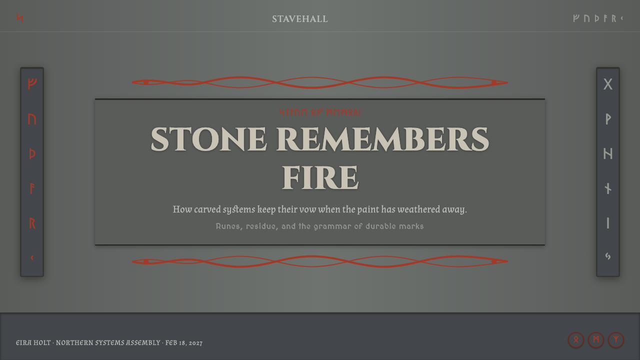
For presentation covers, Norse Runic Stave works best when the title is treated as an inscription on a broad granite field. Give one concentrated title area visual priority, introduce ochre-red as pigment within the carved logic, and let a serpent interlace enter from an edge or wrap a selected zone. Avoid turning the cover into a themed illustration. The strongest cover is sparse enough that the surface, the cut, and the memorial weight of the mark remain visible.
On content slides, organize information as a sequence of carved fields rather than a stack of soft cards. A title can sit in a recessed band, a short rune cluster can distinguish a section, and a fine interlace can divide related ideas. Keep ordinary copy direct and highly legible; runes are accents, not a replacement for communication. For data slides, use dark stone planes and ochre-red emphasis to identify the most important comparison, while bone white and soot black establish supporting structure. Charts should feel incised and categorical, not glossy or ornamental.
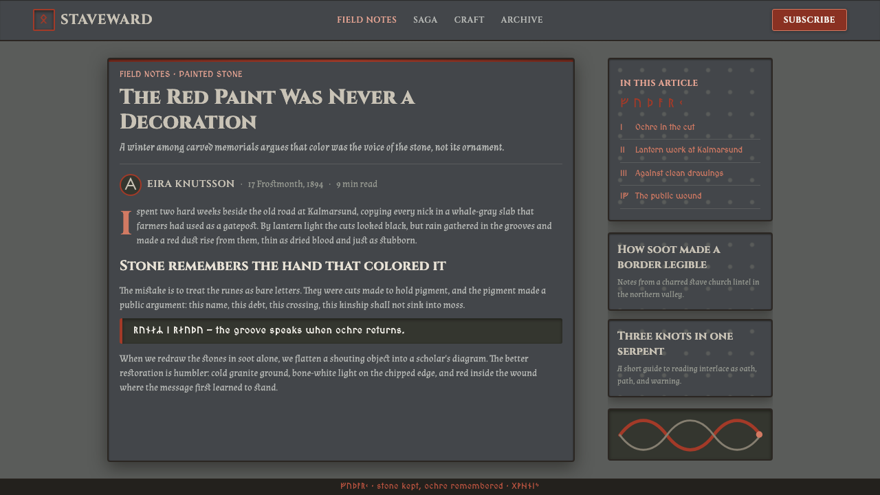
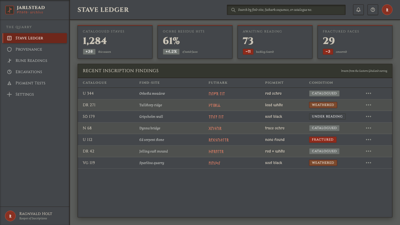
For web interfaces, the system is particularly suitable for dashboards, archive-like tools, discovery platforms, and pricing pages that need authority, permanence, or a sense of collected knowledge. Establish a stable granite ground, let navigation read as inscription rather than lightweight utility text, and reserve red for active states, meaningful status, or decisive calls to action. Interlace can guide a transition between major regions, but it should never compete with controls, tables, forms, or essential reading paths.
For editorial and marketing work, Norse Runic Stave is effective when the subject benefits from narrative gravity: cultural collections, craft, music, fantasy worlds, heritage experiences, or product launches framed as an unveiling. Use the stone field to create pause around a headline, then introduce a carved emblem or knotwork route as a visual thread across sections. Photography or imagery should be handled as an object inserted into the stone world, with disciplined cropping and strong contrast, rather than as a bright window that dissolves the atmosphere.
The common mistake is to confuse the style with a general dark fantasy look. Excessive glowing effects, crowded pseudo-runes, decorative weapons, frosted panels, or random animal motifs weaken its material logic. Another mistake is treating red as a loud accent for every interface element. The system succeeds when pigment remains precious, the granite remains quiet, and each rune or interlaced line appears to have been deliberately cut for a particular purpose.
Norse Runic Stave — FAQ
Is Norse Runic Stave simply a dark fantasy style?
No. It can support fantasy subject matter, but its defining logic is material and inscriptive: granite, carved channels, futhark marks, pigment residue, and serpent interlace. A generic dark fantasy treatment often relies on spectacle and accumulation. Norse Runic Stave relies on restraint, carved evidence, and the sense that marks endure because they were made with intention.
Why is ochre-red so important to the system?
The surviving artifacts may appear gray today, but paint-residue tests confirm that carved channels once held color. Ochre-red restores the crucial contrast between the granite face and the inscription. It should therefore read as material pigment placed within a cut, not as a fashionable red accent applied evenly across a modern layout.
Can runes replace readable interface text?
They should not. Futhark runes are most effective as inscriptions, labels, sectional signals, or concentrated symbolic elements. Navigation, form labels, data, instructions, and critical actions still need clear ordinary language. The style becomes more convincing when the runic layer adds ceremonial and historical force without obstructing the actual task of reading.
How should serpent knotwork be used in modern layouts?
Use it as an organizing line, not wallpaper. It can establish a boundary, carry the eye from one related section to another, encircle a title, or create a deliberate interruption in an otherwise quiet stone field. If it appears everywhere, it loses its structural role and reduces the runic inscription to visual noise.
Related design styles
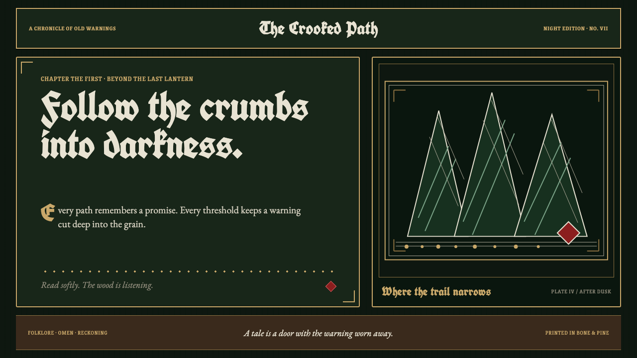 Grimm Fairy Tales (Black Forest Woodcut)The dark wood closes in. Bone-white cuts and aged-gold frames score a pine-bl…
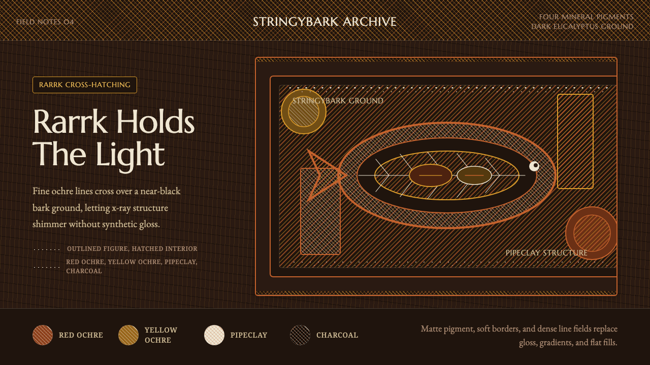 Arnhem X-Ray Bark PaintingShimmers without gloss. Ochre rarrk lines vibrate on dark stringybark.
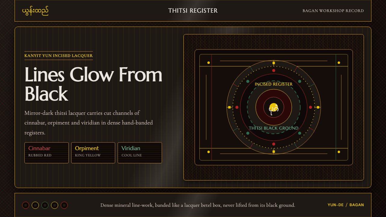 Burmese Yun LacquerwareLacquer glows in cut lines. Cinnabar, orpiment and viridian band a mirror-bla…
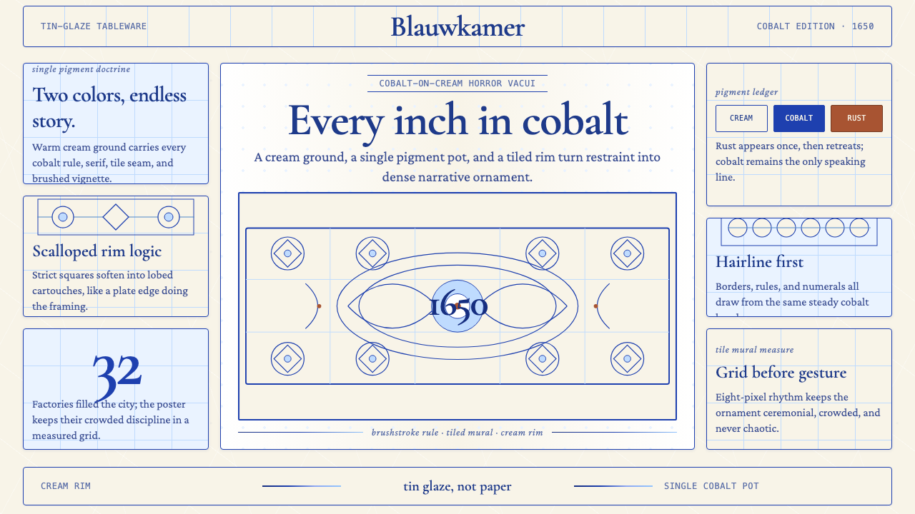 Delft Blue PotteryRestrained, yet every inch speaks. Cobalt hairlines crowd a cream tile grid.
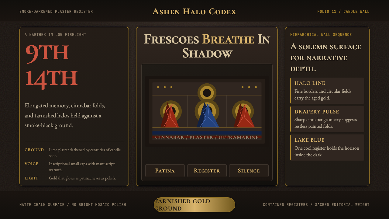 Macedonian Ohrid Fresco (Byzantine)Sacred darkness breathes. Tarnished gold rings, cinnabar folds, and plaster g…
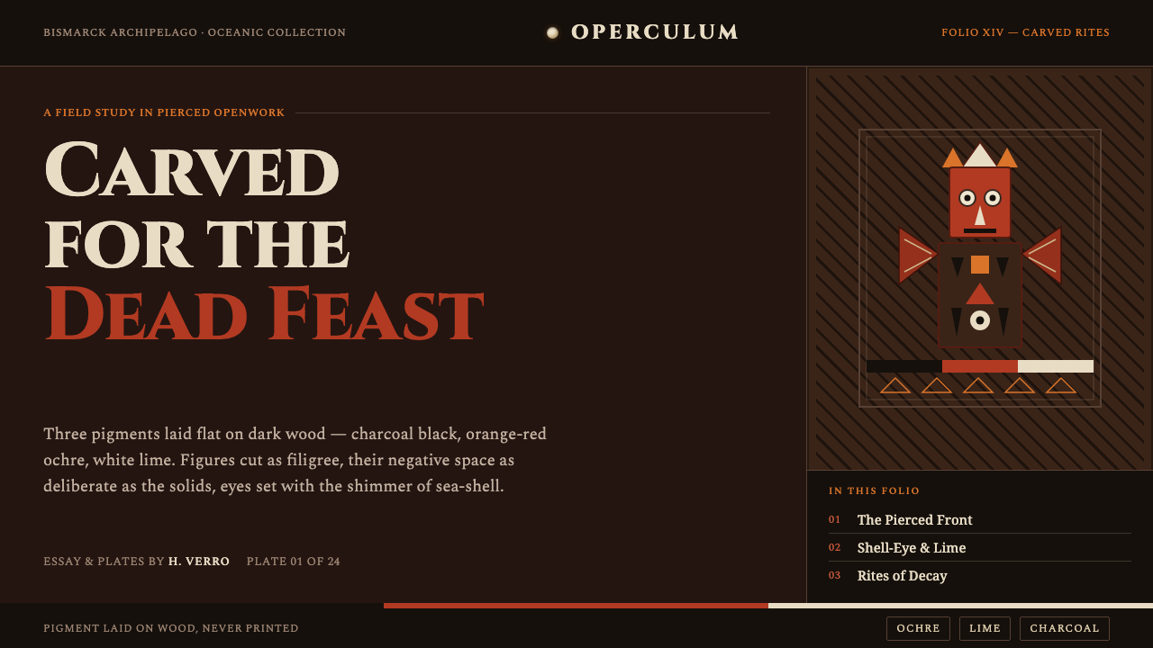 Malagan CarvingCarved for the dead feast. Ochre, lime and charcoal pierced into dark wood, e…