What is Grimm Fairy Tales (Black Forest Woodcut)?
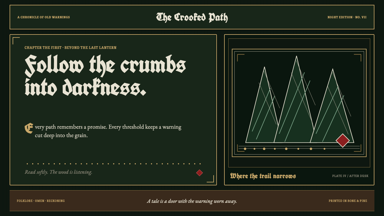
Grimm Fairy Tales turns the page into a dark wood: knife-bright ink, old-gold borders, and one crimson warning waiting beneath the trees.
Grimm Fairy Tales (Black Forest Woodcut) in brief
Grimm Fairy Tales, in its Black Forest Woodcut interpretation, draws on the 1812 Kinder- und Hausmärchen as though every page were printed from a hand-carved block. Dense black hatching presses into pine-dark grounds. Bone-white marks cut through the darkness with the blunt certainty of a blade. Aged-gold rules enclose panels like carved cartouches rather than polished frames.
The style is folkloric, ominous, and deliberately flat. Its world is made from ink, incision, and silhouette: trees can seem watchful, doors can carry warnings, and borders become part of the storytelling rather than neutral containers. Oak leaves, pinecones, spinning wheels, and wolf-tooth motifs turn the margin into a living threshold between the reader and the forest.
This is not a nostalgic fairytale style built from softness. It relies on compression, contrast, and restraint. No element glows or dissolves into atmosphere. The rare dried-blood crimson is held back for narrative consequence: a pricked finger, a poisoned apple, or another irreversible turn in the path.
See the Grimm Fairy Tales (Black Forest Woodcut) design system
Where does Grimm Fairy Tales (Black Forest Woodcut) come from?
The visual premise begins with the Kinder- und Hausmärchen, whose first through seventh editions span 1812 to 1857. The Black Forest Woodcut treatment does not attempt to make that material modern by smoothing it out. Instead, it treats the tale collection as a physical book-object: dark paper, carved marks, enclosed scenes, and an invitation that feels inseparable from a threat.
Its regional atmosphere belongs to Hesse and the German states, including Kassel, the Black Forest, and the Rhineland. These places establish an imagined geography of woods, roads, cottages, doors, and thresholds. In this style, the forest is not background scenery. It is the dominant field into which type, illustration, ornament, and navigation must enter cautiously.
German Romanticism supplies the emotional weather: darkness, wonder, warning, and the sense that familiar places contain something older than the traveler. The folklore revival supplies the recurring signs and story-bearing objects. Biedermeier book illustration contributes the intimacy of the printed page, where an image can be close, enclosed, domestic, and quietly unsettling at once.
The woodcut revival, reaching its peak from the 1840s through the 1880s, gives the treatment its surface logic. Hatching is not merely texture; it is pressure and direction. White is not empty space; it is ink preserved from the dark field. Gold does not function as luxury alone; it recalls the carved framing device that keeps each scene contained, even when its forest seems ready to escape.
What defines the Grimm Fairy Tales (Black Forest Woodcut) look?
Pine-Black Ground
The page begins in darkness rather than on an empty light field. Pine-black grounds make every pale mark feel excavated, as though light has been cut out of the wood instead of laid gently on top. Large dark areas should remain calm and unbroken enough to let hatching, type, and ornament carry the pressure.
Bone-White Cuts
Bone-white functions as an incision. It is used for sharp type, carved illustration, hatch marks, and small moments of legibility within the dark field. These marks should feel decisive and hard-edged, never misty, luminous, or airbrushed. Their strength comes from the contrast between a narrow cut and the darkness pressing around it.
Hatching and Grain
Dense hatching gives flat ink its movement. Lines can gather into a canopy, a shadowed face, a rough road, or the side of a carved object, but they should retain a hand-cut rhythm rather than becoming a neutral digital texture. Grain suggests that the image was made through resistance: a tool meeting a stubborn surface.
Aged-Gold Framing
Aged gold is reserved for rules, panel edges, cartouches, and small structural ornaments. It should read as weathered ceremonial material, not as a glossy premium finish. The frame has narrative force: it marks a threshold, isolates a scene, and makes the reader feel that an old warning has been physically carved around the content.
Folk Border Language
Oak leaves, pinecones, spinning wheels, and wolf-tooth patterns belong at the edge, where they can creep, repeat, and guide. Ornament is permitted because it is not idle decoration: each motif thickens the folktale world and reinforces the border as a dangerous threshold. Repetition should feel grown, carved, or stitched into the page.
Crimson Consequence
The single dried-blood crimson is an event, not a decorative accent. It belongs to danger, injury, poison, or a decisive act. Because it appears rarely, it interrupts the black, white, and gold system with immediate narrative authority. If crimson is spread across ordinary controls and background details, the style loses its capacity to warn.
See the Grimm Fairy Tales (Black Forest Woodcut) design system
Who shaped Grimm Fairy Tales (Black Forest Woodcut)?
Jacob Grimm is named among the key figures connected to the source tradition. In this visual interpretation, his name anchors the literary inheritance behind the dark forest, breadcrumb path, and warning-filled folktale atmosphere.
Wilhelm Grimm is likewise named among the key figures of the material. The style treats the tale collection as an intimate but unsettling book world, where domestic objects and dangerous narrative turns occupy the same carved page.
Ludwig Emil Grimm appears in the source list of key figures. His inclusion reinforces the article’s emphasis on illustrated-book presence: the page is not a neutral carrier of text, but a framed visual object shaped by mark, edge, and enclosure.
Ludwig Richter is included among the key figures associated with this setting. Within the style system, that association supports the Biedermeier book-illustration current: close scenes, contained panels, and an image world that feels printed for sustained reading rather than fleeting display.
Moritz von Schwind is the final named key figure in the source material. His presence places the treatment within the wider field of German Romanticism, folklore revival, and illustrated storytelling rather than reducing it to a generic dark fantasy surface.
How do you use Grimm Fairy Tales (Black Forest Woodcut) today?
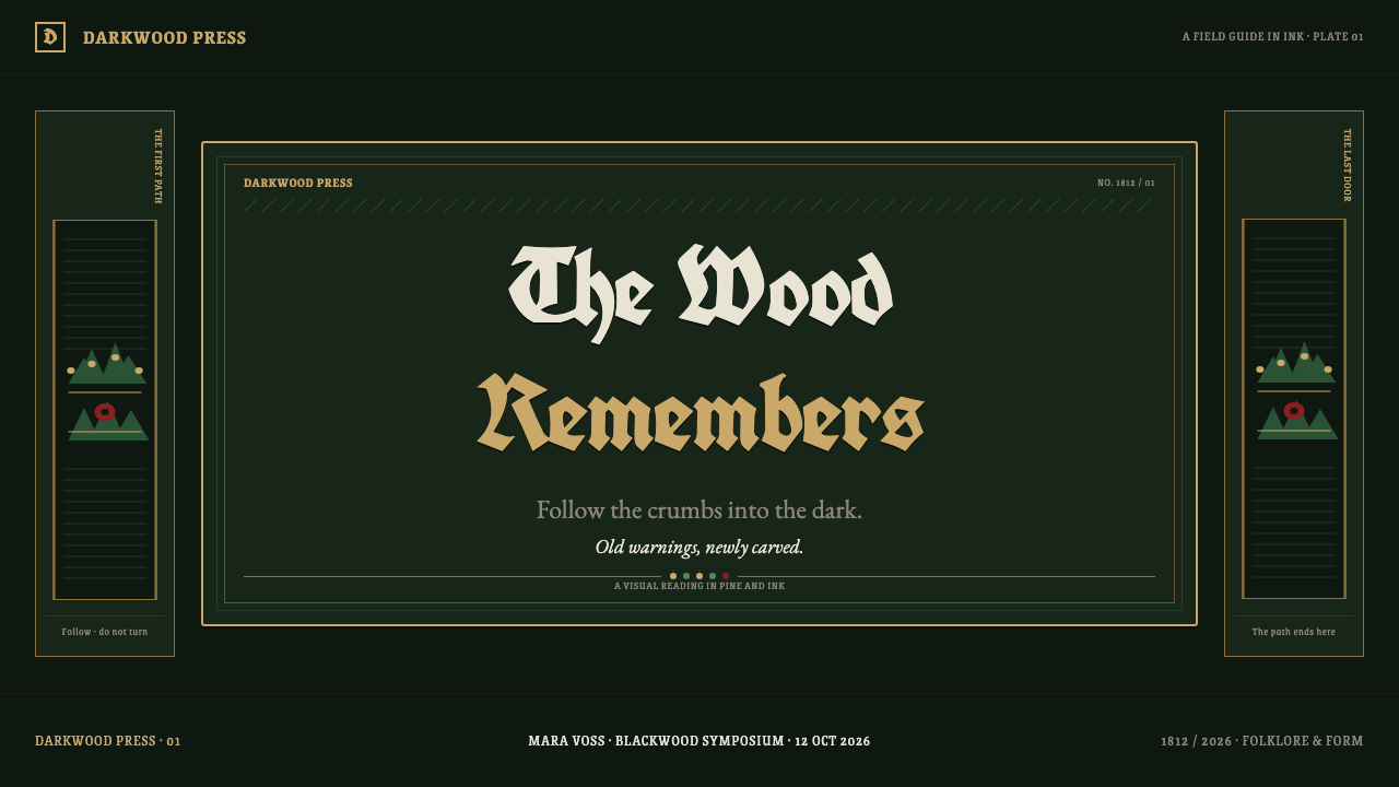
For presentation covers, let the dark field establish the mood before information arrives. A carved title, a single enclosed illustration, and an aged-gold frame can make the opening feel like a forbidden page from a storybook. Content slides should preserve generous dark breathing room, with bone-white text and restrained hatch-built dividers. On data slides, treat charts as engraved diagrams: pale marks emerge from darkness while crimson identifies only the risk, anomaly, or decisive point.
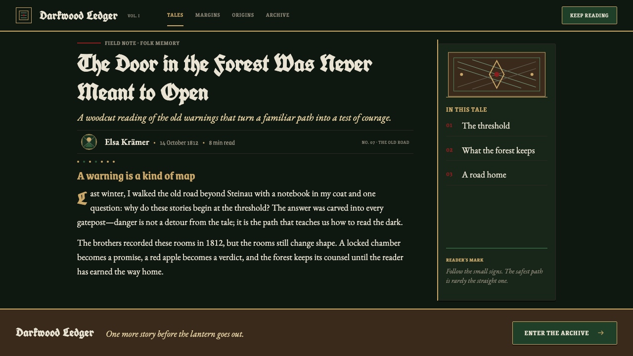
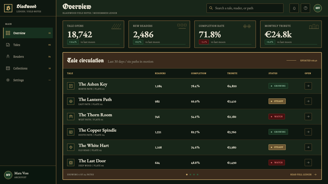
For web interfaces, the style works best when a product genuinely benefits from mystery, lore, or careful progression. Reading experiences, archives, narrative tools, themed collections, and atmospheric dashboards can use breadcrumb trails as meaningful wayfinding. Panels should feel carved into the page rather than floating above it. Navigation should remain legible and direct even when it is framed by folk ornament; the forest may be dense, but the user should never be lost by accident.
For editorial and marketing work, use the style to turn sections into chapters and calls to action into thresholds. A gold rule can introduce a new passage, a woodcut vignette can punctuate a quote, and a narrow crimson mark can signal urgency without shouting. Campaign pages gain force when the story unfolds as a path through framed scenes instead of a sequence of interchangeable promotional blocks.
The visual language is especially useful when imagery must carry implication rather than explanation. A spinning wheel, a door, a pinecone, or a wolf-tooth edge can suggest a tale without illustrating every event. This makes it suitable for launches, seasonal collections, literary programming, and long-form editorial pieces where anticipation matters as much as immediate conversion.
The most common mistake is to confuse darkness with clutter. Filling every surface with hatching, gold ornament, crimson accents, and decorative folklore destroys the hierarchy that makes the style tense. Keep the deepest black spacious, let white cuts do the reading work, use gold to frame rather than flood, and reserve crimson for consequences that truly deserve it.
See the Grimm Fairy Tales (Black Forest Woodcut) design system
Grimm Fairy Tales (Black Forest Woodcut) — FAQ
Is this style simply dark fantasy?
No. Dark fantasy can borrow its mood, but Grimm Fairy Tales Black Forest Woodcut is more specific in its construction. It is rooted in the Kinder- und Hausmärchen, German Romanticism, folklore revival, Biedermeier book illustration, and woodcut logic. Its darkness comes from carved contrast, narrative warning, and printed-page enclosure, not from generic gloom or spectacle.
Why is crimson used so sparingly?
Crimson carries consequence. Against pine-black, bone-white, and aged gold, it has the force of an interruption: blood, poison, injury, or a dangerous decision. Using it rarely makes it legible as story information. If it becomes a routine decorative color, the page may remain attractive, but it no longer feels like it is warning the reader.
Can the style use photography?
It can, provided the photograph submits to the woodcut world rather than competing with it. Crop for silhouette, contrast, texture, or a single ominous object. Treat the image as a hard-edged printed panel that can be framed, hatched over, or reduced to a carved-looking field. Avoid soft cinematic lighting and glossy realism, which break the ink-on-paper premise.
Does the ornamental border make the interface less usable?
Not if the border has a disciplined role. Folk motifs should mark section boundaries, frame a contained reading area, or support wayfinding such as a breadcrumb path. They should not invade labels, obscure controls, or imitate interaction states. The strongest implementations make ornament clarify the threshold between scenes while keeping actual navigation unmistakable.
Where does this style struggle?
It struggles when a product needs to feel light, frictionless, cheerful, or broadly neutral. Dense dark grounds and warning-oriented symbolism can make ordinary tasks feel heavier than they are. It is also a poor fit when frequent status colors are essential, because crimson must remain exceptional. Use it where atmosphere and narrative consequence serve the content, not as a decorative costume for unrelated software.
Related design styles
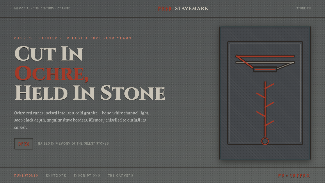 Norse Runic StaveCarved memory, painted to last. Ochre-red futhark runes incised into iron-col…
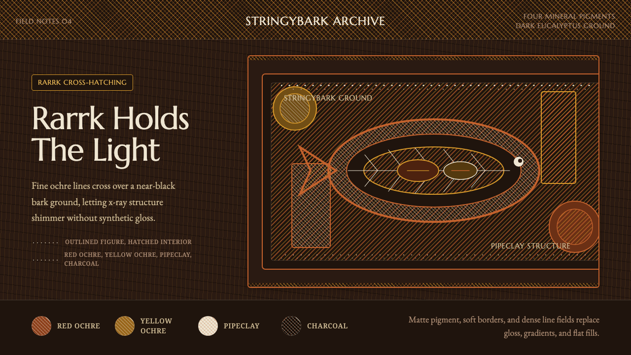 Arnhem X-Ray Bark PaintingShimmers without gloss. Ochre rarrk lines vibrate on dark stringybark.
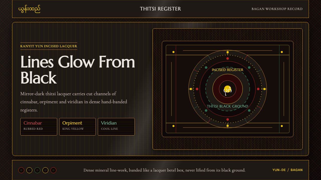 Burmese Yun LacquerwareLacquer glows in cut lines. Cinnabar, orpiment and viridian band a mirror-bla…
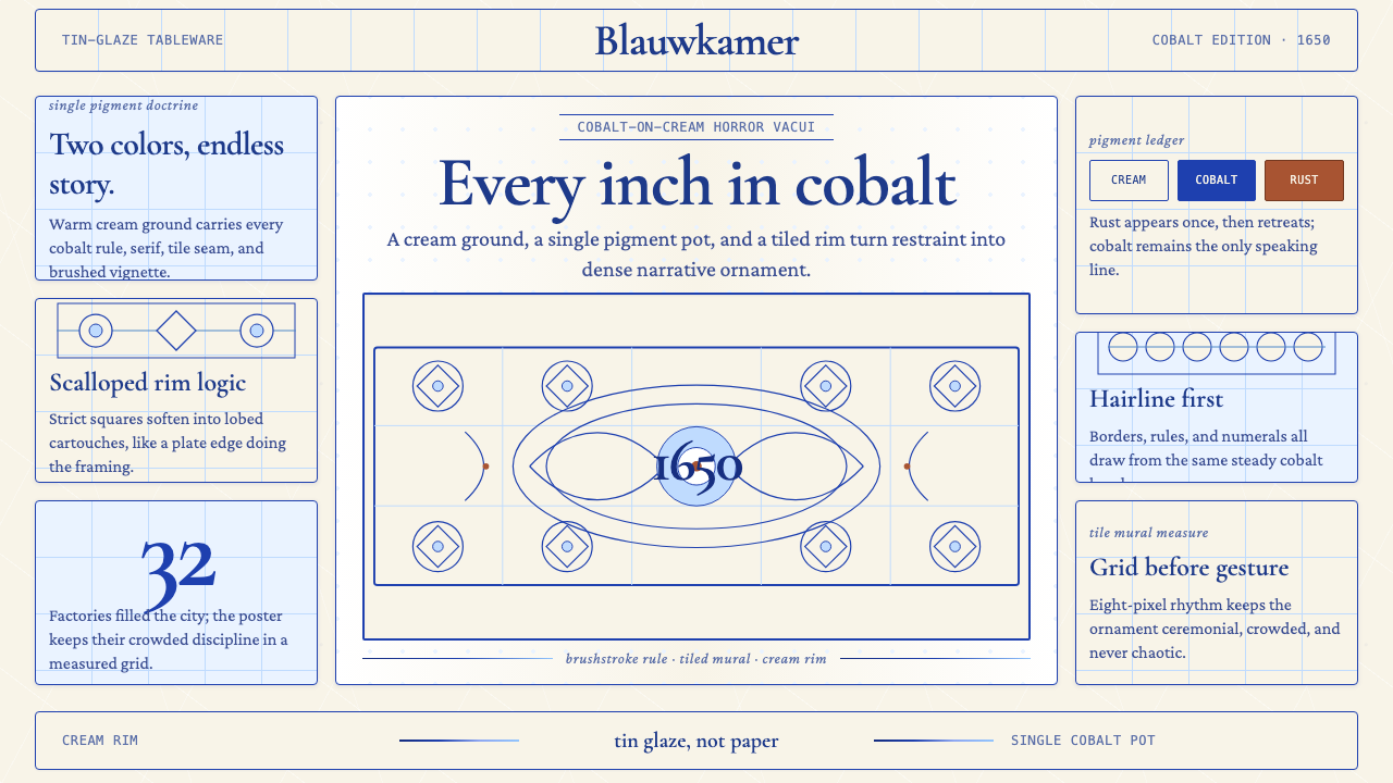 Delft Blue PotteryRestrained, yet every inch speaks. Cobalt hairlines crowd a cream tile grid.
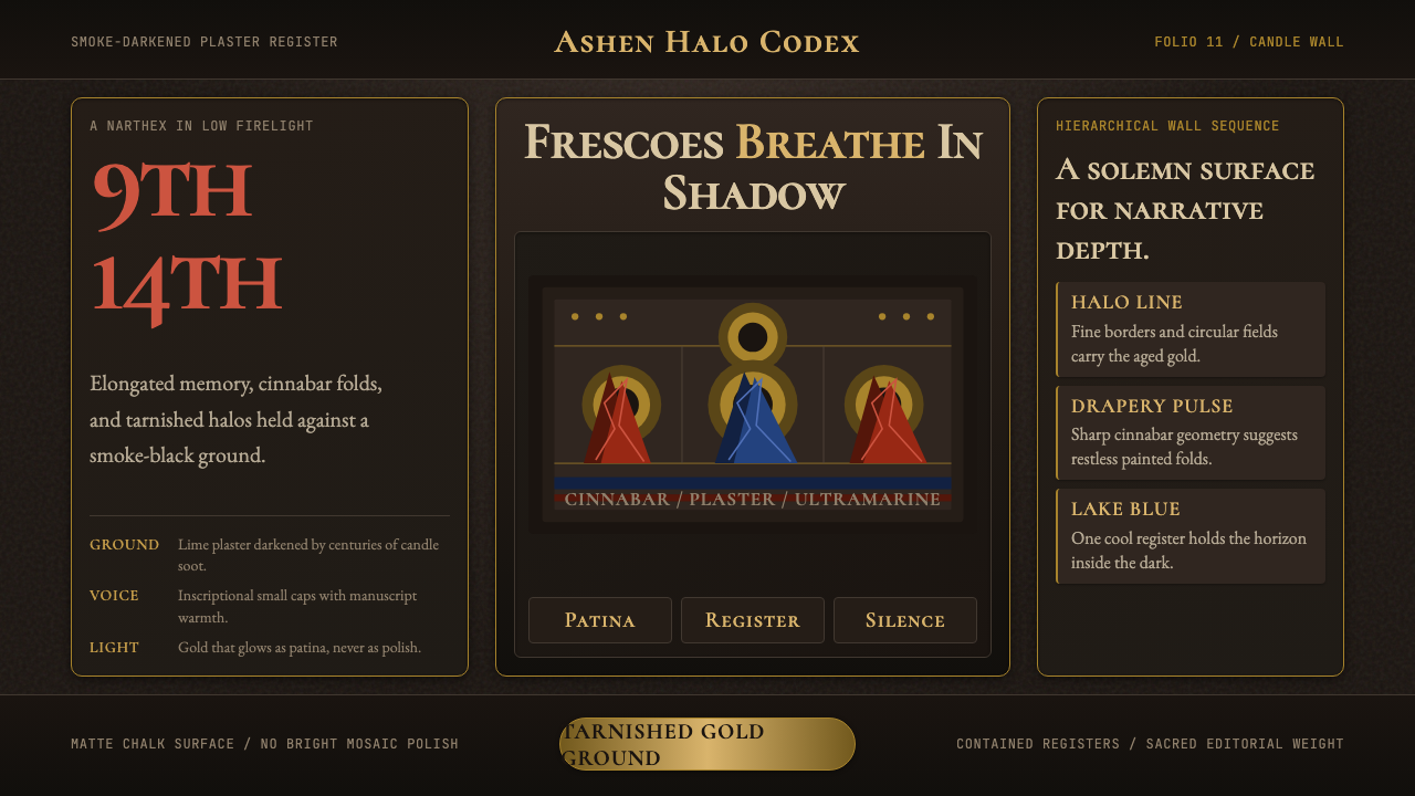 Macedonian Ohrid Fresco (Byzantine)Sacred darkness breathes. Tarnished gold rings, cinnabar folds, and plaster g…
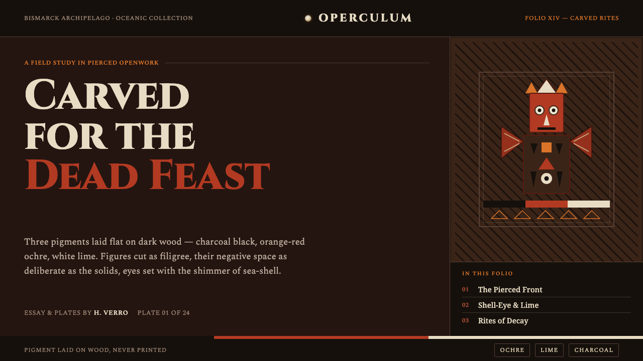 Malagan CarvingCarved for the dead feast. Ochre, lime and charcoal pierced into dark wood, e…