What is Nordic Noir Titles?
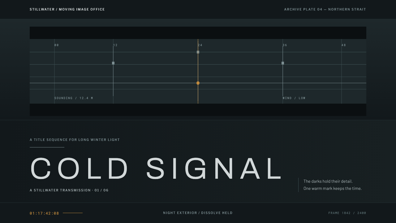
Nordic Noir Titles has no artefact behind it, only a broadcast colour grade: a cold blue-green night over the Øresund, with small, widely spaced capitals held low in the frame.
Nordic Noir Titles in brief
Nordic Noir Titles is a design style built from a way of treating images rather than from an object. It takes the look of the main titles that grew up around Scandinavian crime drama — a night exterior of a strait, a bridge span, a harbour edge, graded until the shadows lose their saturation and the whole frame settles into a cold blue-green — and turns that look into a complete interface system. Where most historical styles start with a chair, a poster or a building, this one starts with the colourist's curve.
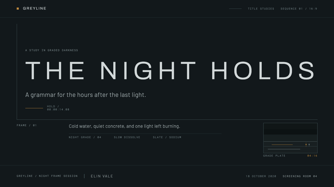
Over that graded plate, thin sans-serif capitals fade up. They are small, widely tracked, set low in the frame and flush left, with a great deal of empty sky above them. They hold for a beat and then dissolve. Everything else in the system — rules, plates, buttons — is a hairline drawn on the same graded dark. Nothing is filled, nothing glows, and nothing competes with the image.
The mood is deliberate: bleak naturalism, withheld emotion and a sense of institutional cold. Black is not ink-black but a broadcast black with a trace of cyan, and the only warmth in the picture is a single sodium-lamp yellow, the one warm light source a night exterior like this would plausibly contain.
Where does Nordic Noir Titles come from?
Nordic noir is the name given to a wave of crime fiction and television from Denmark, Sweden and Norway that gathered pace in the 1990s and reached an international audience in the decades that followed. Its storytelling is slow, procedural and socially minded, set among flat water, concrete and low winter light. The visual style that accompanied it was just as consistent: muted colour, patient takes, wide frames with plenty of empty space, and an unwillingness to glamorize. This system's reference window runs from 1990 to 2020.
The anchor point is the main title sequence of Bron/Broen, the Danish-Swedish series known in English as The Bridge, first broadcast in 2011. Its setting is the Øresund strait between Copenhagen and Malmö, crossed by a road-and-rail bridge that links the two countries, and the look of its titles belongs to that world of bridge, harbour and night water. A title sequence of this kind does not tell a story. It sets a temperature, and it asks the viewer to adjust to it before the first scene begins.
Behind the look lies the broader craft of broadcast colour grading. In television finishing, a colourist shapes contrast, saturation and tint across a whole programme, and the choices made — how far to pull saturation out of the shadows, how far to push the midtones toward blue or green — define a series' emotional register more than any single set or costume. The Nordic noir grade is distinctive because it is restrained: it does not heighten colour, it withdraws it. Wide shots of northern landscape in flat winter light already supply the raw material, and the grade confirms it.
The names in this system's reference set — Andreas Öhman, Jonathan Sjöberg, Erin Sarofsky and Norman Nisbet — belong to the wider world of title design, where small teams combine photography, typography and motion into a minute or less of mood. The discipline has its own constraint: type must sit on a moving, textured image without competing with it. That constraint helped shape the thin, tracked, low-set capitals that now stand for the genre.
What defines the Nordic Noir Titles look?
The Grade
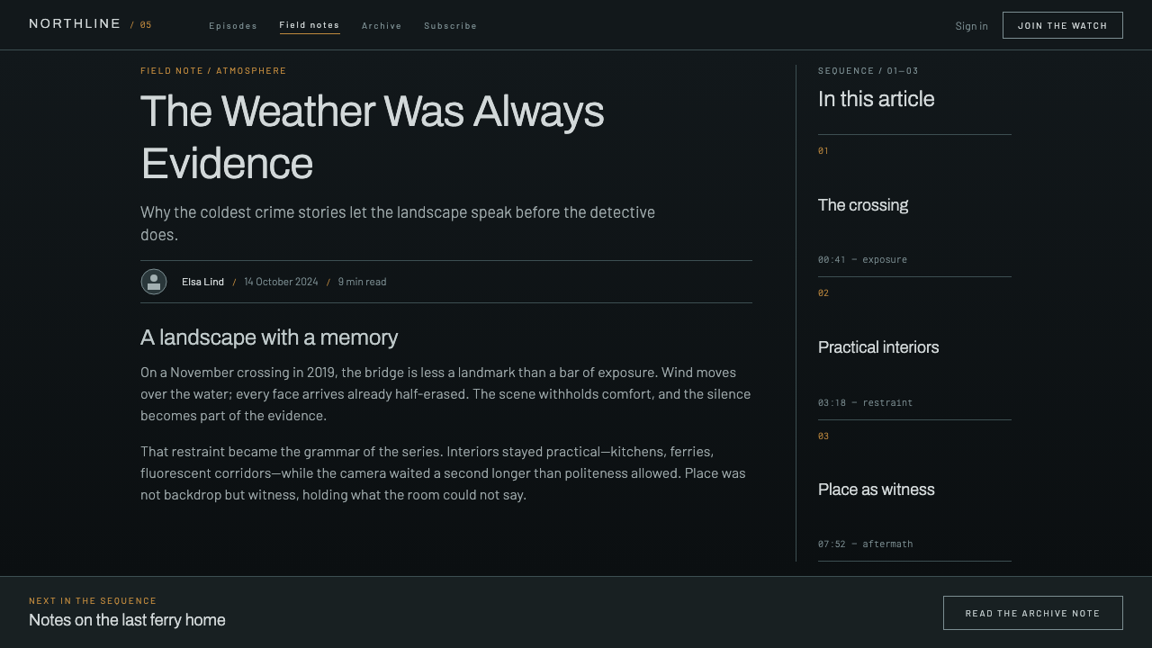
The defining element is a colour treatment rather than a colour palette. Everything sits in a narrow range of cold blue-green: shadows pulled toward grey-teal, midtones desaturated, highlights slightly cool. The effect is of a world seen through frost or fog. In an interface, the grade means that every surface — page, panel, card — belongs to one tonal family, and differences of hue are subtle rather than loud.
Broadcast Black
Black here is not pure ink but the deep, slightly cyan dark of a broadcast monitor, lifted just enough to keep detail in the shadows. Backgrounds are never a flat void; they carry a faint temperature. This gives dark surfaces a quiet depth without gradients or glows, and it is why large dark areas in this style feel cold rather than empty.
Tracked Capitals
Type is thin sans-serif, set in capitals, small, and widely letter-spaced. The letterforms are light so they do not weigh on the image, and the generous spacing makes short strings — a title, a label, a credit — read like an inscription. This treatment suits headings, labels and navigation. It is not meant for paragraphs.
Low and Flush Left
Placement is part of the style. Text sits low in the frame and aligns to the left edge, leaving a large field of empty sky above. The composition reads as weight at the bottom and air at the top, which produces a feeling of waiting. It is the layout equivalent of a held breath.
Fade Up, Hold, Dissolve
Motion has a single vocabulary: elements appear by fading in, stay long enough to be read, and leave by dissolving. There are no slides, springs or bounces. Transitions behave like cuts in an edit rather than animations, and the pace is slow enough to be a deliberate tone, not a delay.
Hairlines and Letterbox Plates
Structure comes from hairline rules and wide, letterbox-shaped plates in the graded dark. Panels are drawn, not filled; borders are thin and quiet; buttons are outlined, not solid. The result is an interface that feels like a title card, where the image remains the main surface and the controls are marks laid on top of it.
One Warm Point
The cold field is broken by a single warm accent: the yellow of a sodium streetlamp, the only plausible warm light in a night exterior like this. It is used sparingly, for the one thing that must be seen — a primary action, an active state, a key figure. The restraint is what gives it value.
Who shaped Nordic Noir Titles?
Öhman is one of the title-design names this system's reference set associates with the Nordic noir look. The relevant lesson is how a main title can be assembled from very little — a graded landscape plate, a few lines of sparse type, slow and patient pacing — and still establish the tone of a whole series before the first scene.
Sjöberg appears in the same reference set, alongside the Bron/Broen titles and the broadcast title tradition around them. His inclusion underlines that this is a collaborative, craft-based kind of design, in which photographers, editors, colourists and typographers share authorship of one short sequence.
Sarofsky is an American title designer and creative director whose work shows how a restrained approach to type and image travels beyond the Nordic region, into mainstream film and television. She is included here as evidence that the style is a transferable craft vocabulary rather than a purely regional one.
Nisbet completes the reference set as a further title-design practitioner. The set as a whole is more useful than any single biography: it shows a shared group of conventions — graded imagery, light type, slow dissolves — carried across several hands and several countries.
How do you use Nordic Noir Titles today?
Nordic Noir Titles works best where a design wants atmosphere, authority and quiet tension, and where the content can tolerate darkness. It is a style of mood, which means it rewards restraint: the fewer things that move, glow or shout, the more convincing it becomes.
On presentation slides, the cover is the strongest use. Use a full-bleed graded image — a night landscape, a harbour, a bridge, an empty road — with the title set small, in widely spaced capitals, low and flush left. Content slides should stay dark and sparse: a hairline rule, a short heading, a few lines of text, plenty of empty field above. For data slides, draw charts as thin lines on the dark ground, let the cool tones carry most series, and use the single warm point to mark the number the audience must remember.
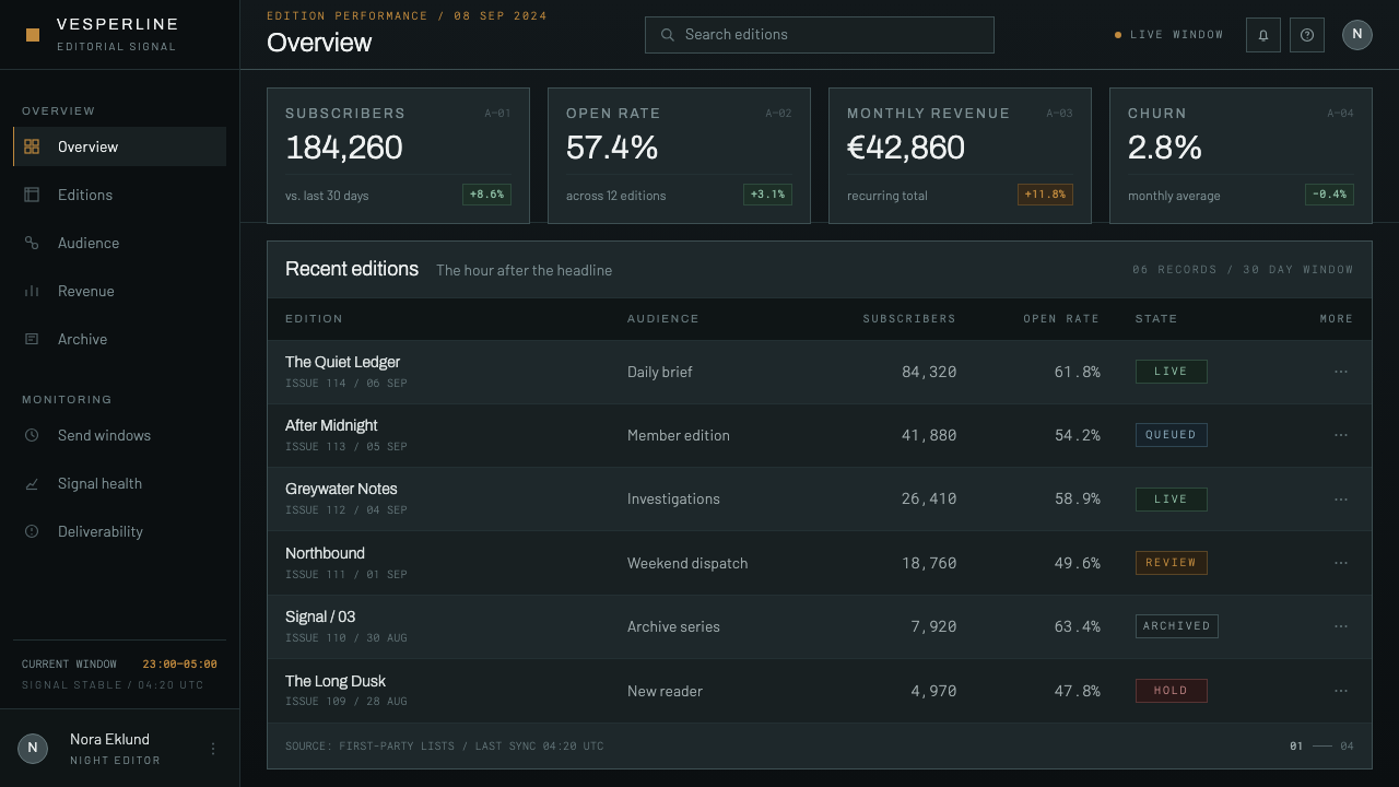
In web interfaces, the style suits dark-mode dashboards, media and streaming products, security and monitoring tools, and cinematic landing pages. Surfaces share one cold tonal family, controls are outlined hairlines rather than solid fills, and hover and transition states use slow fades. Keep body text in a plain, comfortable setting; the tracked capitals are for headings, labels and navigation only. Reserve the warm accent for one primary action per screen.
For editorial and marketing work, the style fits crime and thriller promotion, true-crime podcasts, documentary and investigative journalism, and brands that want a serious, slightly austere voice. Lead with a single strong graded image, put the headline low and flush left, and let the text breathe. Campaign pages can borrow the title-card rhythm — one image, one line, one pause — instead of crowding the viewport with blocks.
The common mistake is confusing the grade with a loud teal-and-orange look. The Nordic noir treatment withdraws colour, it does not saturate it; shadows lose their chroma, and warm tones appear only as one small lamp. Other frequent errors are setting long paragraphs in tracked capitals, which makes them unreadable, adding glows or neon edges that contradict the hairline discipline, and using bright, heavy sans type that crushes the image it sits on.
Nordic Noir Titles — FAQ
Is Nordic noir the same as the teal-and-orange cinematic look?
No. Teal-and-orange pushes two complementary hues to high saturation so that skin and sky stand out against each other. Nordic noir pulls saturation down, keeps the whole frame in a narrow cold blue-green range, and allows warmth only as one small light source such as a sodium lamp. The effect is austere and withdrawn rather than glossy.
Does this style need a photograph to work?
The image helps, because the style originated as a grade applied to footage of a night landscape. Without a photograph, you can still carry it with a flat dark field of the same cold temperature, hairline rules and a single warm point. What you should avoid is substituting a bright stock image or a decorative gradient, which would break the tonal family.
Why are the capitals so small and widely spaced, and is that readable?
Small, tracked capitals are legible for short strings and read like an inscription, which is exactly what a title, label or credit is. They are not suited to paragraphs. Use the treatment sparingly, keep contrast comfortable against the graded dark, and set any running text in a normal, readable setting.
How is it different from Scandinavian design more broadly?
Scandinavian domestic design is usually associated with light, warm wood, soft textiles and a friendly minimalism. Nordic noir is the dark counterpart: the same region, but a screen-based, cold, institutional mood drawn from crime drama. They share restraint and an economy of means, but they pursue opposite feelings.
Can the style work in a light theme?
It is fundamentally a dark system, because the whole look depends on a graded night frame. A light version would lose the atmosphere that defines it. If a light surface is needed, keep it as a small contained panel inside a dark page and carry over the hairlines, the tracked capitals and the single warm accent.
Related design styles
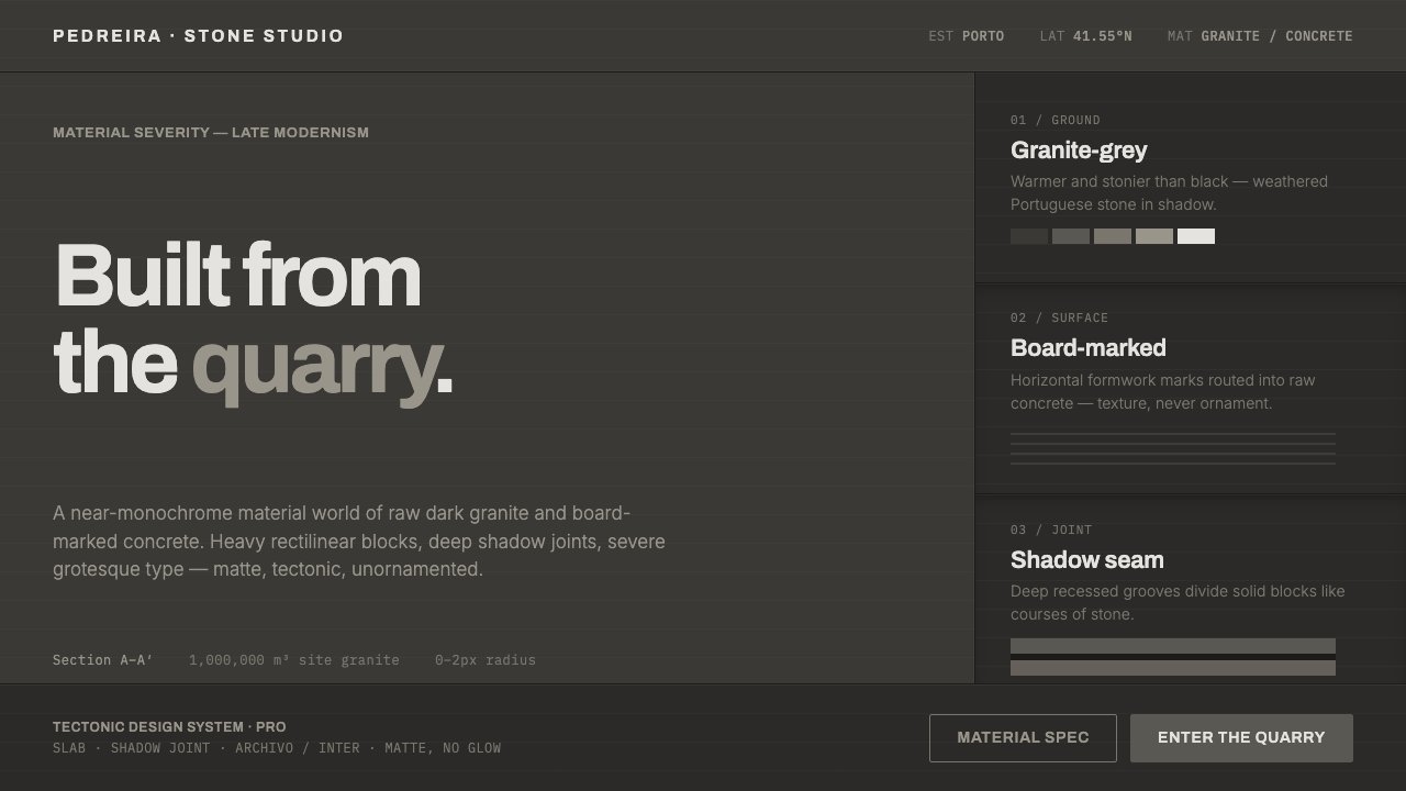 Souto de Moura GraniteArchitecture as raw matter. Dark Portuguese granite ground, board-marked conc…
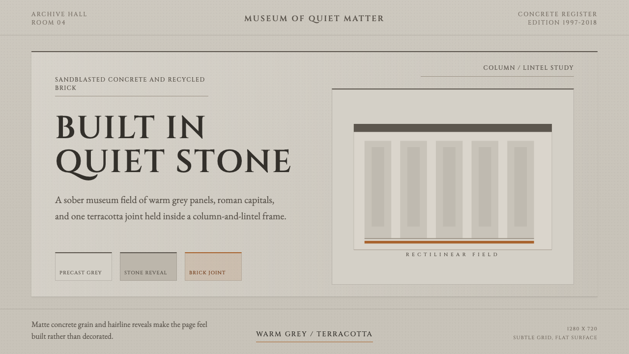 Chipperfield Museum GrayMuseum gravity, rendered quietly. Warm concrete grey, roman capitals, one ter…
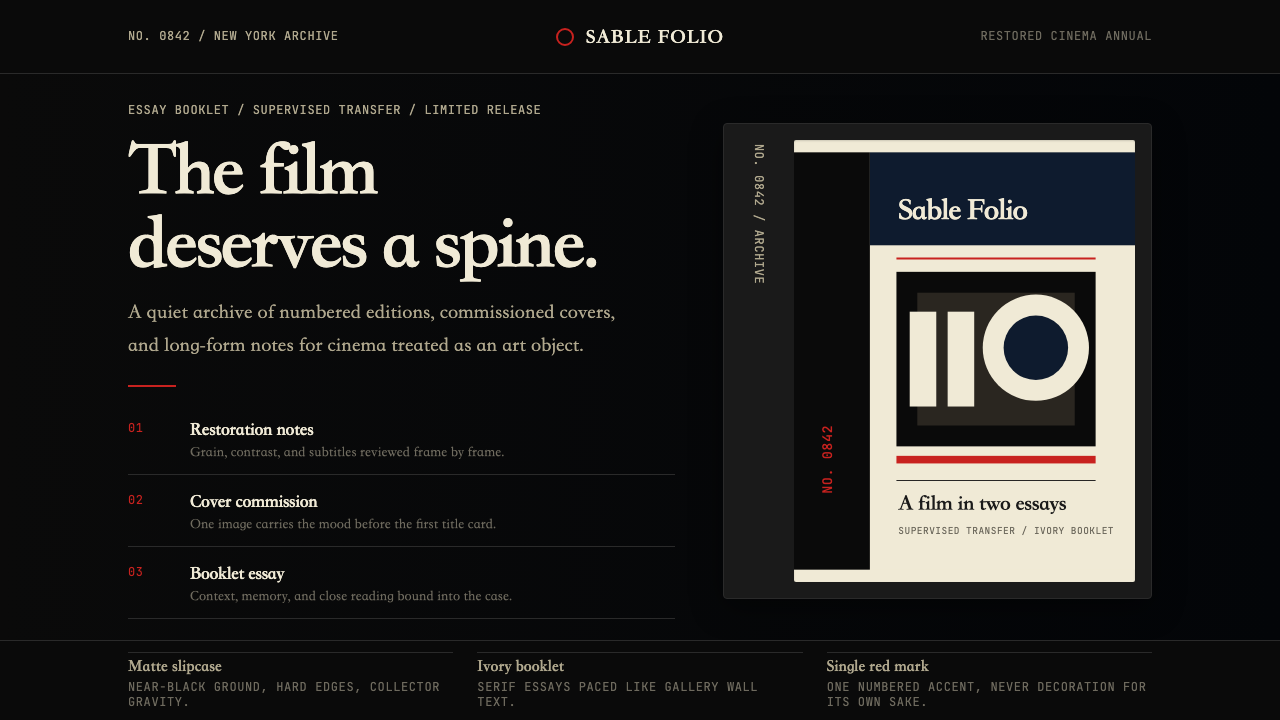 Criterion CollectionMuseum-grade cinema. Matte black, ivory serif, and one red numbered spine set…
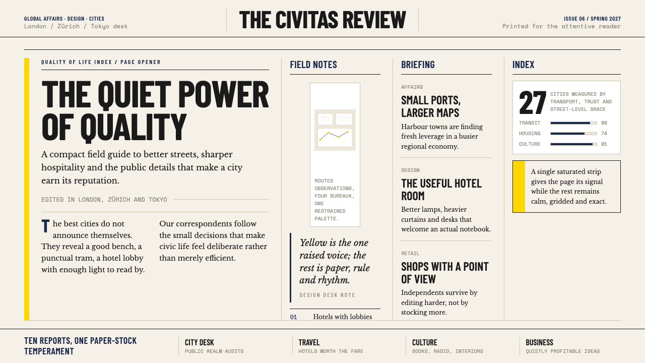 Monocle MagazineQuiet authority. Yellow spine, warm paper and dense ruled columns speak at li…
 Norwegian Fjord TourismMonumental, not loud. Fjord blue, glacier-white panels, and one stave-red acc…
 Speculative DesignRefuses to seduce. Cool-grey wall, Inter labels, matte concept objects — the…