What is Nike "Just Do It" (1988)?什么是 Nike "Just Do It" (1988)?
Nike's 1988 campaign condensed athletic ambition into three words — and a visual system of black, white, and one electrifying flash of color that has never stopped commanding.耐克1988年的广告把运动的野心压缩进三个字——以及一套从未停止发号施令的黑白视觉系统与一击令人振奋的色彩闪光。
Nike "Just Do It" (1988) in briefNike "Just Do It" (1988) 速览
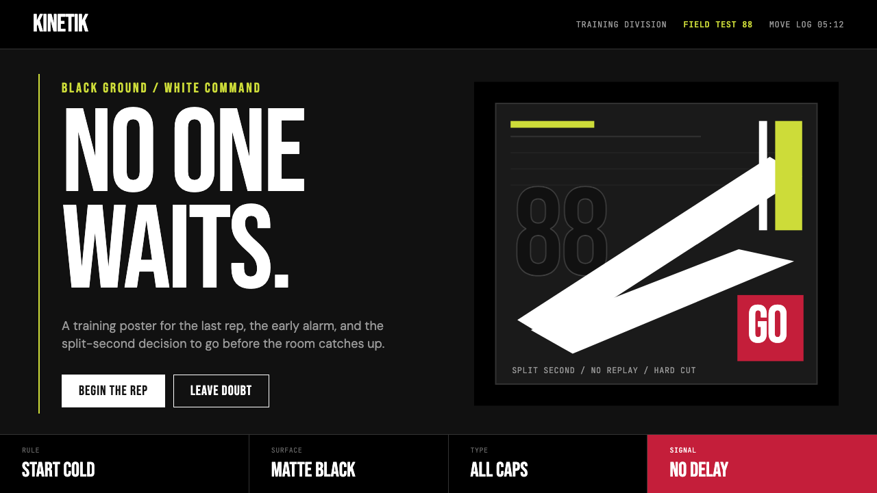
Nike's 'Just Do It' visual identity is the defining athletic design language of the late twentieth and early twenty-first century. Its vocabulary is spare to the point of severity: a deep black or white field, a single curved white Swoosh, full-bleed action photography, and condensed uppercase letterforms that shout rather than speak. The palette introduces color only as a deliberate strike — a volt-yellow accent, a heritage orange-red — never as ambient decoration.耐克「Just Do It」视觉识别体系是二十世纪末与二十一世纪初最具定义性的运动设计语言。它的词汇量少到近乎严苛:深邃的黑色或白色底面、一只弯曲的白色对勾、充满版面的动作摄影,以及凝缩的大写字体——与其说是在说话,不如说是在命令。色彩只以蓄意的一击方式出现——荧光黄的强调、传承橙红的瞬间——从不作为环境性装饰。
The power of the system lies in what it omits. There are no gradients softening the background, no ornamental frames around the athlete, no explanatory subtext competing with the headline. Every element earns its presence by being load-bearing: the photograph carries narrative, the type carries command, the Swoosh carries brand recognition, and the surrounding negative space carries intensity. Remove any element and the construction collapses.这套系统的力量在于它的省略。背景没有渐变柔化,运动员周围没有装饰性边框,没有与标题竞争的说明性副文字。每一个元素都因承重而获得存在资格:照片承担叙事,文字承担命令,对勾承担品牌辨识,环绕四周的负空间承担张力。去除任何一个元素,整个构造就会坍塌。
Visually, the identity operates at two simultaneous registers — documentary and mythological. The photography is cropped and framed to feel immediate and kinetic, as though the camera just caught the decisive moment. But the graphic system around it — the pure fields of black, the commanding type — elevates the athlete into archetype. The result is a design language that feels both personal and universal, both fleeting and permanent.在视觉上,这套识别体系同时在两个维度运作——纪录性与神话性。摄影的裁切与构图营造出即时感与动势感,仿佛相机刚刚捕捉到决定性瞬间。但围绕其运作的图形系统——纯粹的黑色底面、命令式字体——将运动员提升为原型人物。结果是一种设计语言,既个人又普世,既转瞬即逝又恒久不变。
See the Nike "Just Do It" (1988) design system查看 Nike "Just Do It" (1988) 完整设计系统
Where does Nike "Just Do It" (1988) come from?Nike "Just Do It" (1988) 从何而来?
Nike was incorporated in 1971 in Beaverton, Oregon, evolving from Blue Ribbon Sports, a company Phil Knight had started in 1964 to import Japanese running shoes. That same year, graphic design student Carolyn Davidson was commissioned to create a logo. Knight reportedly said he did not love it, but paid thirty-five dollars for it and put it into production. The form she designed — a curved, wing-like check mark suggesting motion — was originally called the 'Stripe.' The name 'Swoosh,' which would become one of the most recognizable marks in commercial history, came later, coined internally at the company.耐克于1971年在俄勒冈州比弗顿注册成立,前身是菲尔·奈特于1964年为进口日本跑鞋而创办的蓝带体育公司。同年,平面设计学生卡罗琳·戴维森受托设计一个标志。据说奈特表示并不喜欢这个设计,但仍以三十五美元买下并投入生产。她设计的这个形态——一个带弧度、形似翅膀的对勾,暗示运动感——最初被称为「条纹」。「对勾」这个后来成为商业史上最具辨识度标志之一的名字,是公司内部之后才起的。
Through the 1970s and early 1980s, Nike built its reputation on performance product and athlete endorsements, but its advertising remained conventional. The pivotal shift came in 1988, when the Portland advertising agency Wieden+Kennedy — already Nike's creative partner — was preparing a national campaign. Dan Wieden, the agency's co-founder, was reportedly struck by the last words of convicted murderer Gary Gilmore before his 1977 execution: 'Let's do it.' Wieden transformed this into 'Just Do It' and applied it to a campaign that launched with an eighty-year-old marathon runner named Walt Stack. The tagline was designed to be universal — applicable to every athlete at every level, from the elite to the ordinary.整个1970年代至1980年代初,耐克凭借高性能产品和运动员代言建立起声誉,但其广告依然循规蹈矩。转折点出现在1988年,波特兰广告公司Wieden+Kennedy——已是耐克的创意合作伙伴——正在筹备一场全国性广告战役。公司联合创始人丹·维登据说受到了已定罪杀人犯加里·吉尔摩于1977年执行前最后一句话的触动:「Let's do it。」维登将其转化为「Just Do It」,并将其用于一场以一位八十岁马拉松跑者沃尔特·斯塔克为主角的广告战役。这句口号被设计为普世的——适用于每一位运动员、每一种水平,从精英到普通人。
The broader visual identity that 'Just Do It' inhabits was shaped across the late 1980s and 1990s as Nike grew from a running-shoe company into a global sports conglomerate. Tinker Hatfield, Nike's most celebrated footwear designer, contributed to the visual culture by designing shoes — the Air Max series, the Air Jordan line with Michael Jordan — that became as visually iconic as any graphic element. The black-dominant, high-contrast aesthetic became associated with Nike's premium positioning and its stable of elite athletes: Michael Jordan, Bo Jackson, Andre Agassi, and later Tiger Woods, Serena Williams, and LeBron James.「Just Do It」所栖居的更广泛视觉识别体系,是在1980年代末至1990年代耐克从跑鞋公司成长为全球体育集团的过程中逐步成形的。耐克最负盛名的鞋类设计师廷克·哈特菲尔德,通过设计鞋款——Air Max系列、与迈克尔·乔丹合作的Air Jordan系列——为整体视觉文化作出了贡献,这些鞋款与任何平面元素一样具有标志性的视觉力量。以黑色为主、高对比度的美学,与耐克的高端市场定位以及其精英运动员阵容紧密相连:迈克尔·乔丹、博·杰克逊、安德烈·阿加西,以及后来的老虎伍兹、塞雷娜·威廉姆斯和勒布朗·詹姆斯。
Wieden+Kennedy developed a film and print advertising language to match: athlete close-ups in high contrast, minimal text, the Swoosh placed without a wordmark, and the tagline occupying its own visual field with nothing competing for attention. By the early 1990s, the 'Just Do It' campaign had contributed to Nike's revenue growing from approximately eight hundred million dollars to over four billion dollars in under a decade. The visual system had become inseparable from the cultural mythology of sport itself — not just a brand, but a posture and a set of values that millions of people wanted to claim as their own.Wieden+Kennedy发展出一套与之配套的影像与印刷广告语言:高对比度的运动员特写、极简文字、对勾标志不附带文字标识单独出现、口号独占一片视觉空间而无任何元素与之竞争。到1990年代初,「Just Do It」广告战役助力耐克营收在不到十年间从约八亿美元增长至逾四十亿美元。这套视觉系统已与体育本身的文化神话融为一体——它不仅是一个品牌,更是一种姿态和一套价值观,数以百万计的人希望将其据为己有。
What defines the Nike "Just Do It" (1988) look?Nike "Just Do It" (1988) 的视觉特征是什么?
Color色彩
The foundational palette is extreme: pure black grounds against pure white marks, or the reverse. Color is introduced not as a fill or ambient hue but as a singular accent — a volt-green yellow, a blazing orange-red, a clear sky blue — deployed in a single element per composition. This 'one-strike' color logic means the accent always reads as a decision rather than a decoration. When multiple colorways appear across a campaign, each colorway is disciplined to a single accent, never a gradient or a blend.基础色板极为极端:纯黑底面配纯白标志,或反之。色彩不作为填充或环境色调引入,而是作为单一强调——荧光黄绿、烈焰橙红、晴空蓝——在每一张构图中仅部署于一个元素。这种「一击」色彩逻辑意味着强调色永远被读解为一个决定,而非一种装饰。当一套广告战役中出现多种配色版本时,每种配色都被约束为单一强调色,绝无渐变或混合。
Typography字体排印
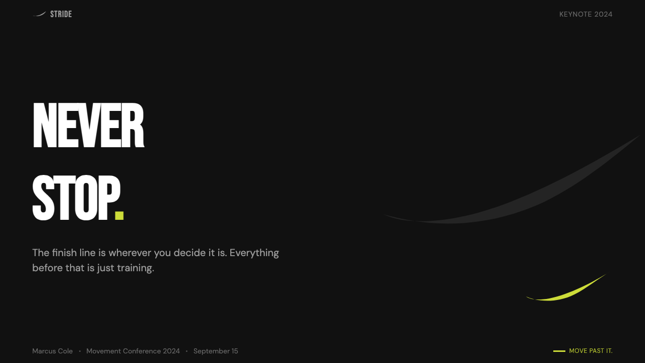
Uppercase, condensed letterforms dominate all headline and campaign text. Letters are set tightly — tracking reduced to near-zero — so that words read as solid graphic blocks rather than sequences of individual characters. This condensed, close-set approach maximizes the visual weight of short phrases like the three-word tagline. Body copy, when it appears, is set in a neutral, highly legible grotesque at a much smaller scale, creating extreme size contrast that reinforces the hierarchy: command first, detail secondary.大写、凝缩字形主导所有标题与广告文字。字母间距收紧至几乎为零,使词语读起来像实心的图形块,而非一连串单个字符。这种凝缩、紧排的方式最大化了短短三个词的口号的视觉分量。正文(若出现)以远小得多的字号排印中性的高可读性无衬线字体,形成极端的尺寸对比,强化层级关系:命令在前,细节在后。
The Swoosh Mark对勾标志
The curved check mark — the Swoosh — functions as both a brand identifier and a compositional anchor. In Nike's mature visual identity, it frequently appears without any accompanying wordmark, relying entirely on its form to communicate brand. The Swoosh is often placed asymmetrically: in a corner, at the edge of a photograph, or as the sole graphic element on a black field. Its directional quality — the mark reads left-to-right, curving upward at its tip — reinforces the forward-motion narrative of the whole visual system.弯曲的对勾标志——Swoosh——既是品牌识别符,也是构图锚点。在耐克成熟的视觉识别体系中,它频繁地在没有任何文字标识伴随的情况下单独出现,完全依靠自身形态传递品牌信息。对勾常以非对称方式放置:在角落、在照片边缘,或作为黑色底面上唯一的图形元素。其方向性——标志从左到右延伸,末端向上翘起——强化了整套视觉系统的向前运动叙事。
Photography and Cropping摄影与裁切
Athletic photography is treated as the primary narrative carrier, but it is rigorously controlled in how it enters the composition. Images are cropped tightly — often showing the athlete in extreme close-up or cutting away limbs and background — to isolate the peak of a gesture or the expression of effort. The frame is frequently filled edge-to-edge with no breathing room between the photograph and the border. High-contrast processing emphasizes muscle definition, sweat, and texture. The result feels immediate and urgent rather than composed and considered.运动摄影是主要的叙事载体,但在进入构图的方式上受到严格控制。图像被紧密裁切——往往是运动员的极端特写,或切掉四肢与背景——以孤立动作的峰值或用力的表情。画面频繁地从边缘填满整个版面,照片与边框之间没有任何喘息空间。高对比度处理强调肌肉线条、汗水与质感。结果是一种即时感与紧迫感,而非经过布置与深思熟虑的冷静构图。
Negative Space as Pressure负空间即压力
Where negative space does appear in Nike's visual language — particularly in product photography and brand-only compositions — it functions not as breathing room but as pressure. A small shoe floating in an enormous field of black does not feel comfortable; it feels exposed and tense. The empty space is charged rather than restful. This is the inverse of most minimalist design, which uses negative space to create calm; in the Nike system, emptiness is an intensifier.当负空间出现在耐克视觉语言中时——尤其是在产品摄影和纯品牌构图中——它的功能不是提供喘息,而是施加压力。一只漂浮在巨大黑色底面中的小鞋子,感觉不是舒适,而是暴露与紧张。空白空间是带电的,而非安宁的。这与大多数极简主义设计截然相反——极简主义用负空间制造平静;而在耐克系统中,空旷是一种强化剂。
Scale and Simplicity尺度与简洁
The visual system is designed to work at every scale from a billboard to a shoebox hang tag, and this scalability is not incidental — it is baked into the design logic. By limiting the system to one mark, one typeface treatment, one accent color at a time, and full-bleed photography, the design avoids any element that would fail at small sizes or become illegible in translation across media. The fewer the elements, the more any individual element can be scaled aggressively without creating visual noise.这套视觉系统被设计为在每一种尺度下都能运作——从广告牌到鞋盒挂牌——而这种可扩展性不是偶然的,而是内建于设计逻辑中的。通过将系统限制为一个标志、一种字体处理方式、一次一种强调色,以及充满版面的摄影,设计避免了任何会在小尺寸下失效或在跨媒介转换中变得难以辨认的元素。元素越少,任何单一元素就越能被大胆地放大而不产生视觉噪音。
Command Over Invitation命令而非邀请
The tonal register of every element in the system is imperative, not interrogative or suggestive. Headlines are statements, not questions. The tagline is a command, not a brand promise. The Swoosh does not suggest belonging; it asserts it. This design posture — which made the style controversial in some cultural contexts — is integral to the visual language, not separable from it. Softening the typography, adding a question mark, or warming the color palette would not produce 'a warmer Nike'; it would produce a different identity entirely.系统中每个元素的语调都是祈使式的,而非疑问式或建议式的。标题是陈述,不是问句。口号是命令,不是品牌承诺。对勾标志不是在暗示归属感,而是在宣告它。这种设计姿态——它让这种风格在某些文化语境中颇具争议——是视觉语言不可分割的组成部分,无法与之剥离。将字体柔化、加上问号、或将色板暖化,不会产生「更温暖的耐克」,而会产生一套完全不同的识别体系。

See the Nike "Just Do It" (1988) design system查看 Nike "Just Do It" (1988) 完整设计系统
Who shaped Nike "Just Do It" (1988)?谁塑造了 Nike "Just Do It" (1988)?
Knight co-founded Blue Ribbon Sports in 1964 and renamed it Nike in 1971. His vision of building an authentic athlete's brand — rooted in performance rather than lifestyle — shaped the company's early identity and determined the strategic choices that made the 'Just Do It' campaign possible. Knight's autobiography, 'Shoe Dog,' published in 2016, offers a firsthand account of the decisions and relationships that built the Nike visual and cultural empire, including the company's early commitment to endorsing elite athletes and making product quality the foundation of brand credibility.奈特于1964年联合创办蓝带体育公司,并于1971年更名为耐克。他打造一个真实运动员品牌的愿景——根植于性能而非生活方式——塑造了公司早期的身份认同,并决定了使「Just Do It」广告战役成为可能的战略选择。奈特于2016年出版的自传《鞋狗》提供了构建耐克视觉与文化帝国的决策与关系的第一手叙述,包括公司早期对签约精英运动员的承诺,以及将产品质量作为品牌公信力基础的坚持。
Davidson was a graphic design student at Portland State University when Phil Knight commissioned her in 1971 to create a logo for the shoe company's new line of cleats. She produced the Swoosh — a curved, winged form suggesting speed and forward motion — for thirty-five dollars. In 1983, Knight gave her a diamond ring engraved with a Swoosh and a parcel of Nike stock, a gesture of retrospective recognition. The Swoosh Davidson designed has remained essentially unchanged across more than five decades, making it one of the most durable and successful logo designs in commercial history.1971年,戴维森还是波特兰州立大学的平面设计学生,菲尔·奈特委托她为这家鞋业公司的新款钉鞋系列设计一个标志。她以三十五美元创作了对勾——一个弯曲的、翼状的形态,暗示速度与向前运动。1983年,奈特将一枚刻有对勾的钻石戒指和一批耐克股票赠予她,作为事后的认可。戴维森设计的对勾在五十余年间基本未变,使其成为商业史上最持久、最成功的标志设计之一。
Wieden co-founded Wieden+Kennedy in Portland in 1982 and became Nike's most consequential creative partner. His coinage of 'Just Do It' in 1988 — reportedly derived from condemned killer Gary Gilmore's final words — gave the brand its defining verbal identity and established a template for advertising that was provocative, emotionally raw, and athlete-centric rather than product-focused. Wieden's approach of treating Nike campaigns as cultural statements rather than sales messages influenced the entire subsequent generation of sports advertising and made Portland an unlikely capital of American advertising creative culture.维登于1982年在波特兰联合创办Wieden+Kennedy广告公司,成为耐克最具决定性影响的创意合作伙伴。他于1988年创造的「Just Do It」——据说来源于死刑犯加里·吉尔摩临刑前的最后一句话——赋予了品牌其定义性的语言身份,并为广告创意建立了一套模板:挑衅的、情感上赤裸的、以运动员为中心而非以产品为焦点。维登将耐克广告战役视为文化宣言而非销售信息的做法,影响了此后整整一代体育广告人,并使波特兰出人意料地成为美国广告创意文化的重镇。
Hatfield trained as an architect under Nike founder Phil Knight at the University of Oregon before joining Nike's design team in 1981. His shoe designs — particularly the Air Max line (which broke convention by making the air cushioning unit visible through the sole) and the ongoing Air Jordan series — became central objects in the Nike visual mythology. Hatfield's footwear did not merely support the 'Just Do It' era aesthetically; his designs became the subject matter of the campaign's photography, making the product and the identity inseparable.哈特菲尔德在俄勒冈大学师从耐克创始人菲尔·奈特学习建筑设计,之后于1981年加入耐克设计团队。他的鞋款设计——尤其是打破惯例、将气垫单元透过鞋底外露的Air Max系列,以及延续多年的Air Jordan系列——成为耐克视觉神话的核心实物。哈特菲尔德的鞋款不仅在美学上支撑了「Just Do It」时代,他的设计本身也成为广告战役摄影的主角,使产品与识别体系融为不可分割的整体。
Jordan signed with Nike in 1984 as a rookie and became the athlete most completely embedded in the Nike visual identity across the 'Just Do It' era. His silhouette — the Jumpman logo, derived from a 1984 promotional photograph — became a sub-brand of Nike that functions as a self-contained visual system. Jordan's visual presence in Nike campaigns defined the template for athlete-as-icon advertising: minimal context, maximum intensity, the athlete's body treated as a graphic element as much as a human presence.乔丹于1984年以新秀身份与耐克签约,成为「Just Do It」时代与耐克视觉识别体系融合最为彻底的运动员。他的剪影——「飞人」标志,源自一张1984年的宣传照片——成为耐克旗下的一个子品牌,自成一套视觉系统。乔丹在耐克广告战役中的视觉形象定义了「运动员即图腾」广告的模板:极简的情境、极致的张力,运动员的身体既是人的存在,也是一个图形元素。
How do you use Nike "Just Do It" (1988) today?今天怎么用 Nike "Just Do It" (1988)?
Applying the Nike 'Just Do It' visual language to designed artifacts requires understanding what the system actually does: it uses extreme constraint — one color at a time, one typeface weight, minimal copy — to concentrate attention and create a sense of urgency. It is not a minimalist system in the soft, breathing sense; it is a high-pressure system where every element is at maximum load. This distinction matters enormously when applying the style, because adding elements 'for balance' will diffuse the tension the style depends on.将耐克「Just Do It」视觉语言应用于设计作品,需要理解这套系统实际上在做什么:它用极端的约束——一次一种颜色、一种字重、极简的文案——来集中注意力、制造紧迫感。它不是那种柔和、有呼吸感的极简主义系统,而是一套高压系统,其中每个元素都处于最大负载之下。这一区别在应用这种风格时至关重要——因为「为了平衡」而添加元素,会消散这种风格所依赖的张力。
For presentation slides, the style works most powerfully on cover pages and section dividers. A cover should commit to a full-bleed image — ideally high-contrast and action-oriented — with the title in condensed uppercase occupying its own visual zone at the bottom or top, separated from the image by pure black or pure white. The presentation tagline, if there is one, should sit alone with substantial empty space around it: not centered, but placed with intention. Content slides should resist the temptation to add color; a strict black-and-white or one-accent system across all content slides will produce more coherent results than varied palettes. Data visualizations benefit from high-contrast treatment — solid bars, bold axes, a single accent color for the key data series.对于演示文稿,这种风格在封面页和章节分隔页上最为有力。封面应当投入使用充满版面的图像——理想情况下是高对比度、充满动势的——标题以凝缩大写占据底部或顶部独立的视觉区域,以纯黑或纯白与图像分隔。如果有演示口号,它应当孤立存在,四周环绕充裕的空白:不是居中放置,而是有意图地定位。内容页应当抵制添加色彩的诱惑;在所有内容页面上保持严格的黑白系统或单一强调色,会比色板多变的方案产生更为连贯的结果。数据可视化受益于高对比度处理——实心柱条、粗重坐标轴、以单一强调色标示关键数据系列。
For web interfaces, dashboards, and pricing pages, the style translates well when the product has a performance or achievement orientation. The approach: commit to a near-black or pure black primary background, use white text for all readable content, and assign the accent color exclusively to calls to action, active states, and primary metrics. Navigation should be purely typographic — condensed uppercase labels, no icon decoration beyond directional chevrons. Card components should have hard edges, not soft shadows; borders should be visible, not dissolved into the background. The style struggles in applications requiring warm guidance or nurturing tones.对于网页界面、仪表板和定价页面,当产品具有性能导向或成就导向时,这种风格具有良好的适配性。方法如下:采用近黑或纯黑主背景,所有可读内容使用白色文字,将强调色专门保留给行动号召按钮、激活状态和主要指标。导航应当是纯字体式的——凝缩大写标签,除方向性箭头外无图标装饰。卡片组件应当是硬边的,而非软阴影;边框应当清晰可见,而非融入背景。这种风格在需要温暖引导感或关怀语调的应用中表现欠佳。
For editorial and marketing work, the style supports bold information hierarchy and benefits from the same constraint discipline applied to slides. A marketing page in this idiom works best as a sequence of full-width sections alternating between black-ground and white-ground, with photography that is always cropped to the edges of its section and never floated with margins. The accent color — used for a single button, a single metric, a single pull-quote highlight — should appear no more than once or twice per page to preserve its impact. Headlines should be short, declarative, and set in condensed uppercase at a scale that reads as a physical commitment.对于编辑与营销内容,这种风格支持强劲的信息层级,并受益于与幻灯片相同的约束纪律。这种风格的营销页面最佳做法是以一系列全宽区块交替呈现,黑色底面与白色底面交替出现,摄影图像始终裁切至所在区块的边缘,而非以边距浮置。强调色——用于单个按钮、单个指标、单个引言高亮——每页出现不超过一到两次,以保留其冲击力。标题应当简短、陈述式,以凝缩大写排印,字号大到让读者感受到一种身体性的承诺感。
A common mistake when applying this visual language is treating the dark palette and condensed typography as the style, while omitting its most essential characteristic: relentless discipline. Designers often introduce a second accent color 'for variety,' soften the photography with overlays or vignettes, or add a subhead wherever silence would serve better. Each of these additions is precisely what the style argues against. If applying this system feels too sparse, the instinct should not be to add elements — it should be to interrogate whether each existing element is truly necessary and whether the photography is strong enough to carry the emotional weight that copy would otherwise compensate for.应用这套视觉语言时最常见的错误,是将深色色板和凝缩字体当作风格本身,而忽略了它最本质的特征:毫不妥协的纪律。设计师经常「为了变化」引入第二种强调色,用叠加层或暗角柔化照片,或在沉默本应是更好选择的地方添加副标题。每一种这样的添加,恰恰是这套风格所反对的。如果应用这套系统感觉过于稀疏,本能反应不应该是添加元素,而应该是追问:每一个现有元素是否真的不可或缺?以及摄影是否足够有力,能够承载原本需要文案去补偿的情感重量?
See the Nike "Just Do It" (1988) design system查看 Nike "Just Do It" (1988) 完整设计系统
Nike "Just Do It" (1988) — FAQNike "Just Do It" (1988) · 常见问题
Is the Nike style the same as general sports branding?耐克风格等同于一般的运动品牌设计吗?
No. Nike's visual language is distinctive and not representative of sports branding as a category. Most sports brands use gradients, multi-color palettes, dynamic angles, and energetic texture overlays — effects that signal 'sport' through visual noise. Nike's system does the opposite: it achieves urgency through reduction and contrast rather than addition. The Swoosh identity is closer in discipline to a luxury fashion house than to a typical athletic brand. Adidas's three-stripe system, Under Armour's shield mark, and Puma's leaping cat all operate on different visual logics, even when they share the dark-background, condensed-type tendency that Nike popularized.不。耐克的视觉语言是独特的,并不代表运动品牌这一类别的整体面貌。大多数运动品牌使用渐变、多色色板、动感角度和充满能量的质感叠加——这些效果通过视觉噪音来传递「运动感」。耐克系统则恰恰相反:它通过减法与对比而非加法来实现紧迫感。对勾识别体系在设计纪律上更接近奢侈时装品牌,而非典型的运动品牌。阿迪达斯的三条纹系统、安德玛的盾牌标志、彪马的跳跃豹形——即便它们与耐克共享了深色背景和凝缩字体的倾向,也各自运作在不同的视觉逻辑之下。
Can this style work for a non-athletic brand or product?这种风格能用于非运动类品牌或产品吗?
Yes, with significant caveats. The Nike visual language is not intrinsically about athletics — it is about commanding authority, urgency, and the posture of high performance. These qualities translate to any context where the user or audience is expected to take action, make a commitment, or meet a challenge: fintech platforms, productivity tools, B2B enterprise software, political campaigns, and certain luxury goods have all borrowed effectively from this visual grammar. The system fails, however, when the product's fundamental promise is comfort, ease, or nurturing — attempting to communicate warmth through a black-dominant, command-register design system creates an uncomfortable tonal contradiction that audiences detect immediately.可以,但有重要前提。耐克视觉语言本质上不是关于运动的——它是关于命令式权威、紧迫感,以及高性能的姿态。这些品质可以迁移到任何期待用户或受众采取行动、作出承诺或迎接挑战的语境中:金融科技平台、生产力工具、B2B企业软件、政治竞选,以及某些奢侈品都曾有效地借用这套视觉语法。然而,当产品的根本承诺是舒适、轻松或关怀时,这套系统就会失效——试图通过黑色主导、命令语调的设计系统传递温暖感,会产生一种受众立即能感知到的令人不舒适的语调矛盾。
How do you use this style without making it look like an obvious Nike imitation?如何使用这种风格而不让它看起来像是在直接模仿耐克?
The Swoosh is Nike's and should never be appropriated. Beyond that, the visual principles — extreme contrast, condensed uppercase type, one-accent color, full-bleed photography, hard edges — are a design language, not a trademark, and can be used independently. The key is to derive the specific visual choices from your own content rather than copying Nike's exact compositions. Use your own photography with your own cropping logic. Choose an accent color that is meaningful to your brand. Set your type in a different typeface that shares the condensed, weight-forward quality without imitating the specific cuts Nike uses. The underlying system will read as high-performance and urgent without triggering a brand attribution reflex.对勾标志属于耐克,绝不应被挪用。除此之外,极端对比、凝缩大写字体、单一强调色、充满版面的摄影、硬边处理——这些是一种设计语言,不是商标,可以独立使用。关键在于从你自己的内容中衍生出具体的视觉选择,而非复制耐克的具体构图。使用你自己的摄影和自己的裁切逻辑。选择一种对你的品牌有意义的强调色。选择另一种字体排印——分享同样的凝缩、字重前置特质,但不模仿耐克所用的特定字体切割。底层系统依然会传递出高性能与紧迫感,而不会触发品牌归因的本能反应。
How does this style handle text-heavy or complex information?这种风格如何处理文字密集或信息复杂的内容?
Poorly, if applied literally. The Nike visual language is optimized for short, declarative communication — taglines, headlines, athlete names, product names. Applied to dense explanatory text, the condensed uppercase treatment becomes illegible, and the extreme contrast can cause eye strain at reading lengths. The correct adaptation is to separate the system into two tiers: apply the full intensity of the style to headlines, section markers, and call-outs, while shifting body text to a well-spaced, normally-weighted grotesque with adequate line height and a slightly softened background tone. This preserves the style's command presence at the hierarchy's top without making the document unreadable.如果照字面应用,则表现欠佳。耐克视觉语言是为简短、陈述式传播而优化的——口号、标题、运动员姓名、产品名称。应用于大段说明性文字时,凝缩大写处理会变得难以辨认,极端对比在阅读长度上也会引起视觉疲劳。正确的改编做法是将系统分为两个层级:对标题、章节标记和引文应用这种风格的全部强度,同时将正文转换为行距充足、字重正常、背景色调略微柔化的无衬线字体。这在保留风格在层级顶端的命令式存在感的同时,不至于使文档变得难以阅读。
Does the style work in light-background or white-dominant layouts?这种风格能用在浅色背景或以白色为主的版面上吗?
Yes — Nike's own identity uses both polarities. White-ground layouts in this system follow the same logic as black-ground layouts, but with inverted contrast: black type and the Swoosh read as the dominant graphic mass against white, and the accent color becomes even more prominent when surrounded by white rather than black. The key discipline is the same in both cases: one dominant field, one mark, one accent, maximum type scale for the primary message. A white-ground layout in this style should never feel soft or approachable; it should feel clean and uncompromising, as though every element has been stripped away until only what is essential remains.可以——耐克自身的识别体系两种极性都会使用。这套系统中的白色底面版面遵循与黑色底面版面相同的逻辑,但对比关系颠倒:黑色文字和对勾标志在白色背景上读为主导性的图形质量,而强调色在被白色而非黑色环绕时反而更加突出。两种情况下的关键纪律是相同的:一个主导底面、一个标志、一种强调色、主信息字号最大化。这种风格中的白色底面版面永远不应该感觉柔和或平易近人;它应该感觉干净而毫不妥协,仿佛每一个元素都已被剥除,只留下不可或缺的部分。
Related design styles相关设计风格
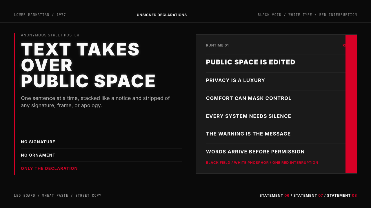 Jenny Holzer Truisms (1977)Austere declarations. White all-caps on black, cut by a single red warning.克制宣言。黑底白字,全大写排成LED板,红色只作警示。
 Cartoon Network 90s BlocksKids-cable noise, squared. Black-white checkerboards crash into hot-yellow Bu…方块化的儿童有线电视噪音:黑白棋盘撞上热黄 Bungee 字块。
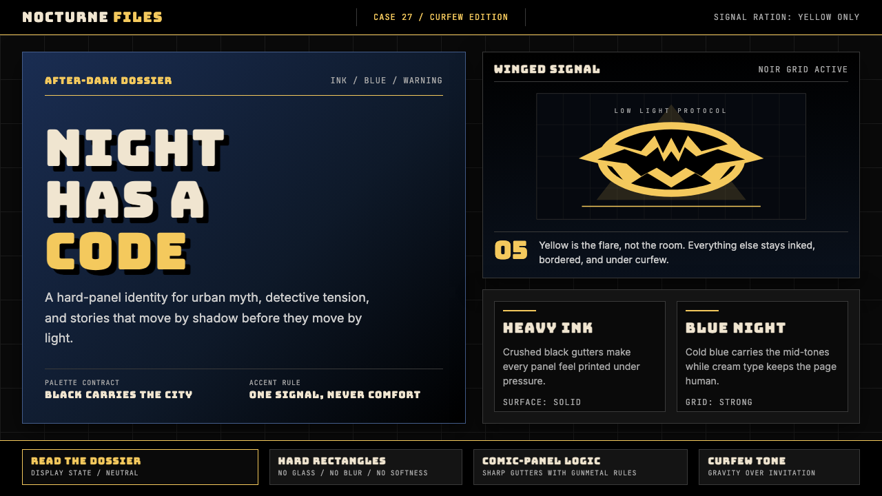 DC Comics Batman NoirGravity, not cheer. Black panels, Gotham blue, and one bat-yellow signal cut…重力而非欢愉:黑色分镜、哥谭蓝与一束蝙蝠黄切开夜色。
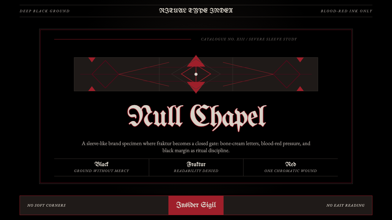 Death Metal BlackletterUnreadable by design. Bone fraktur on black, cut by one blood-red geometric s…以难读划界:黑底骨色哥特字,被一道血红几何符印切开。
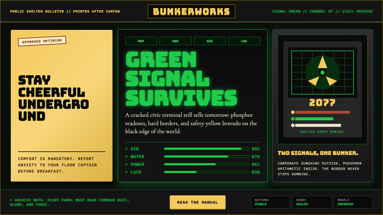 Fallout Vault-Tec Pip-BoyIrradiated optimism. Vault yellow and CRT green lock into a bordered bunker g…辐照乐观主义:避难所黄与CRT绿嵌入硬边地堡网格。
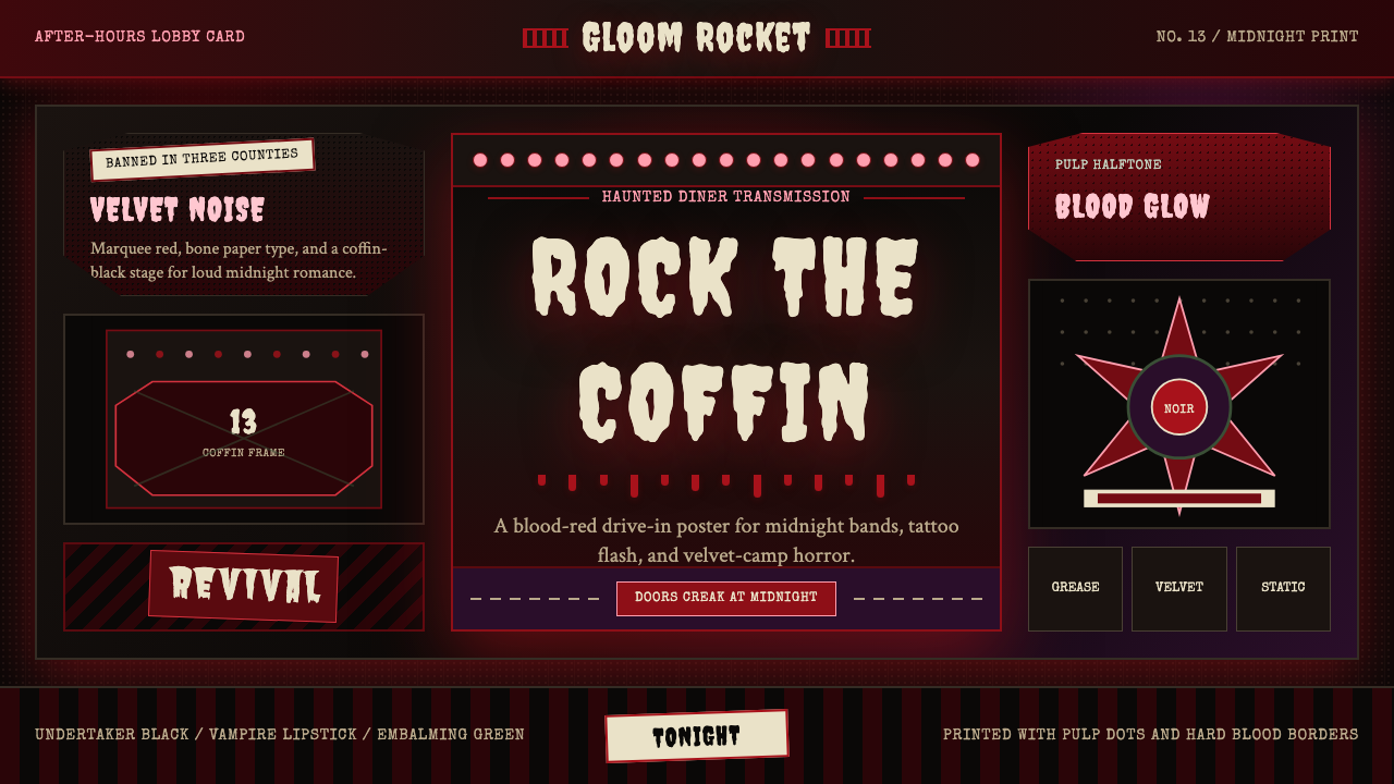 Gothabilly Horror RevivalHaunted swagger. Blood-red marquee type, coffin frames, and pulp halftone on…闹鬼的摇滚张扬:血红跑马灯字、棺材框与黑底半色调。