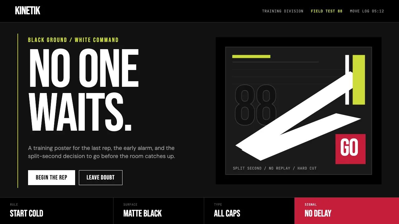
About Nike "Just Do It" (1988)
Nike's "Just Do It" era is the most recognized athletic identity on earth — a black ground, a single white Swoosh, a hero athlete in mid-action, and Futura Bold Condensed shouting in ALL CAPS. Born in Beaverton in 1971 and galvanized by Wieden+Kennedy's 1988 campaign, it turned a shoe company into a cultural institution.
The visual language is brutal simplicity. No gradients, no ornament, no playfulness. Full-bleed photography crops carry narrative; type carries command; negative space carries intensity. When color enters, it is punched — a Volt-yellow flash, a heritage red — never decoration. The design says: move, or get out of the way.
- Origin
- Beaverton, Oregon / Portland, Oregon
- Era
- 1971 Swoosh designed; 'Just Do It' campaign launched 1988; visual identity mature 1990s–2024
- Key figures
- Phil Knight · Carolyn Davidson · Dan Wieden · Tinker Hatfield
- Movements
- Athletic branding · Sneaker culture · Swoosh minimalism
Nike "Just Do It" (1988) design spec
Colors
Typography
The other 11 sections — buttons, cards, spacing, motion, techniques and more — open once you unlock. Download the DESIGN.md or send it to your AI in one click. Unlock once, yours forever.
Sign up nowStyles similar to Nike "Just Do It" (1988)
Also inspired by brands & products, with a close feel.
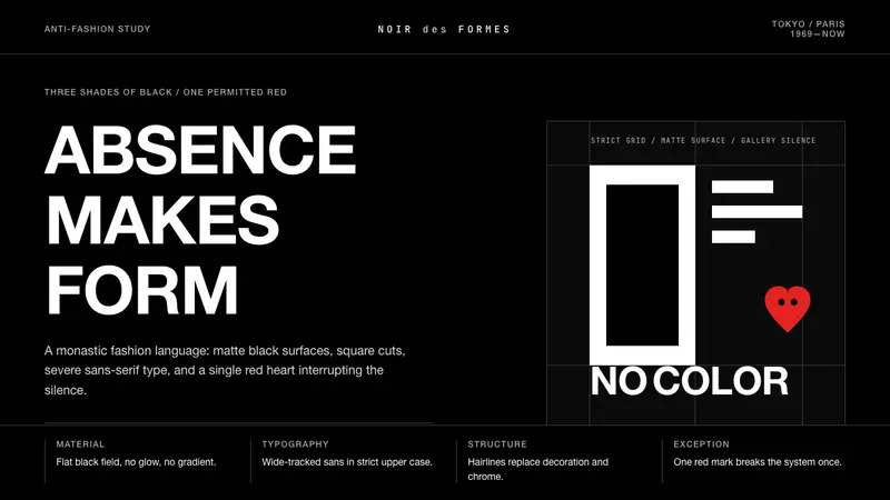 Comme des Garçons (Rei Kawakubo)Austerity becomes the event. Pure black, wide sans type, and one red heart break the silence.
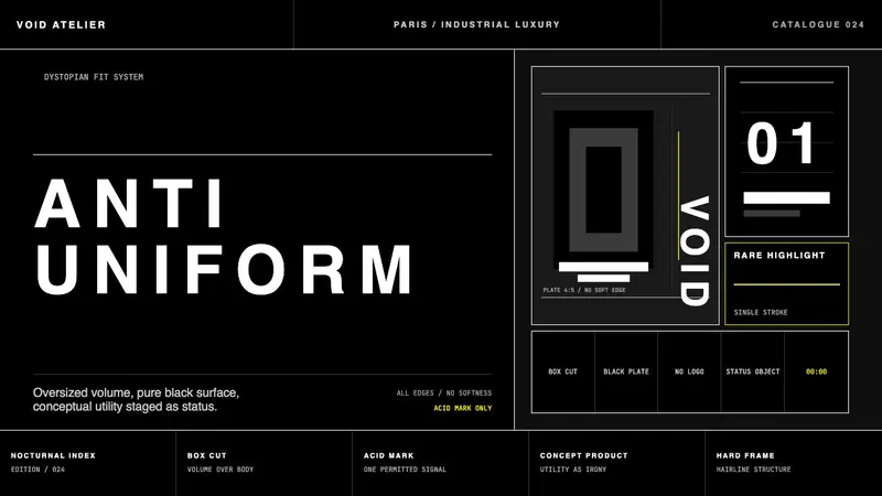 Balenciaga (Demna era)Threatening restraint. Black grids, white hairlines, spaced sans at brutal scale.
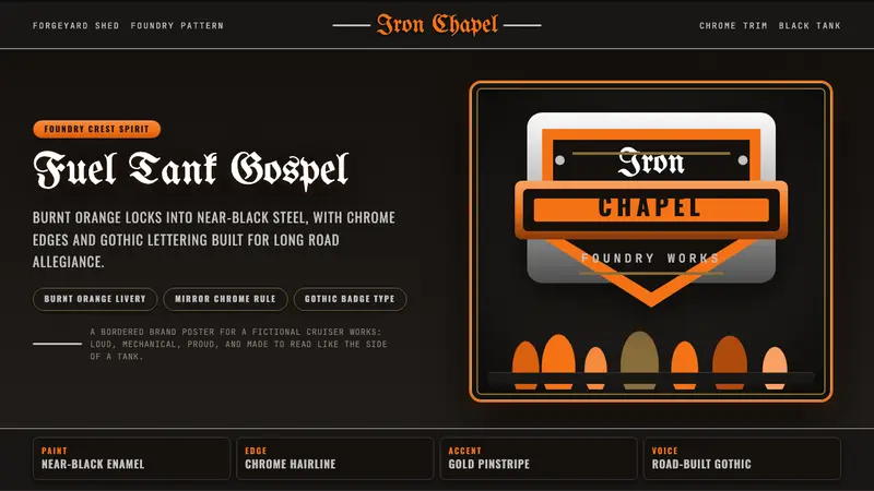 Harley Orange & BlackBuilt like a tank badge. Burnt orange, chrome hairlines, gothic type on near black.
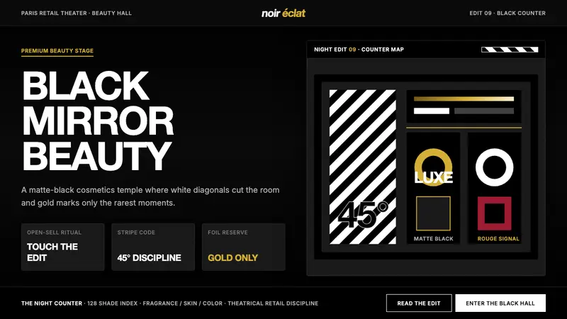 SephoraBlack is the stage. White 45° stripes and restrained gold foil make cosmetics feel theatrical.